
Fine line clock tattoos have flooded feeds, but on the hand they rarely age like the photos. The right approach is to go bold, use clear negative space, and pick placements that take friction into account. Below are 27 hand-focused clock designs that lean into durability and personality, with what to tell your artist, how they heal over time, and small wardrobe moves that help you show them off.
1. Bold Pocket Watch on Back of Hand
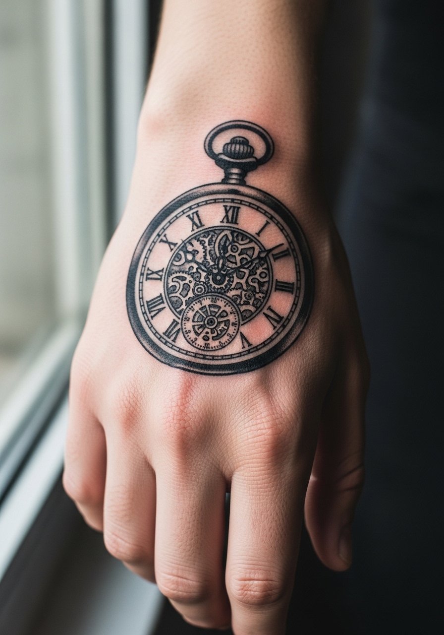
The pocket watch reads like a statement and it works well on the back of the hand because the flat canvas lets bold outlines sit clean. I recommend asking your artist for simplified numerals and thicker hands so the face keeps legibility through daily wear. Expect the first six months to have crisp contrast. By year two the numerals soften if the linework is too tight. Common mistake is asking for tiny Roman numerals; they tend to blur. Session feels quick but sensitive. For showing it off, rolled sleeves and a thin chain bracelet frame the watch without crowding the design.
2. Oversized Minimal Clock Across Knuckles
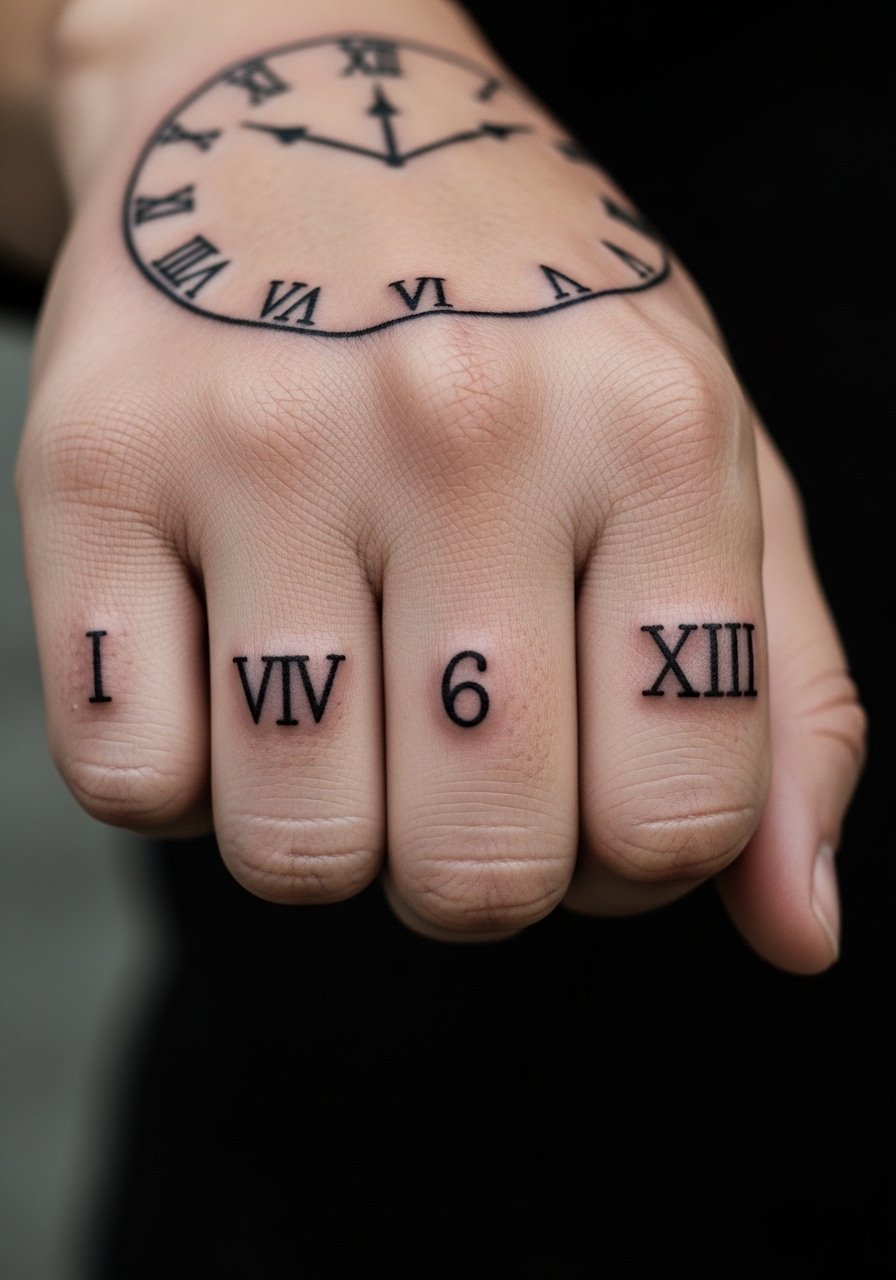
A knuckle-spanning clock reads graphic from across a room and it ages like other knuckle work, meaning heavy lines hold better than micro detail. Tell your artist to block out the numerals with broad strokes and avoid tiny serif work. Pain spikes with each knuckle pass, so expect short sharp passes with breaks. The biggest mistake is cramming a full face into the knuckles. In six months the edges should still read solid. For session ease, wear a short-sleeve button shirt you can roll up so the artist can position your hand comfortably.
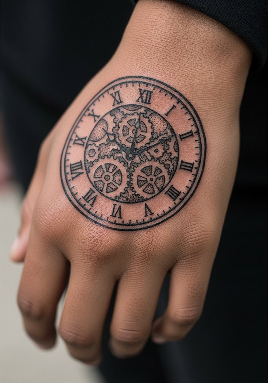
3. Geometric Gear Clock on Thumb Webbing
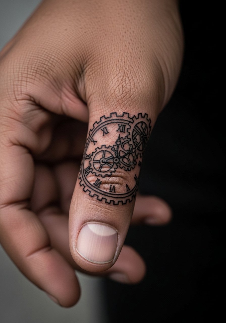
This placement uses the webbing between thumb and index for a small gear-faced clock that looks mechanical and modern. Fair warning, skin here moves a lot, so ask for bold contrast and a small gap between gear teeth to prevent merging. Artists split on tiny detail in the thumb webbing. One camp avoids fine spokes because they blur quickly. The other camp says bold, separated teeth last well. The session is short but fiddly. For comfort, wear a loose short-sleeve tee so your arm can rest without pressure.
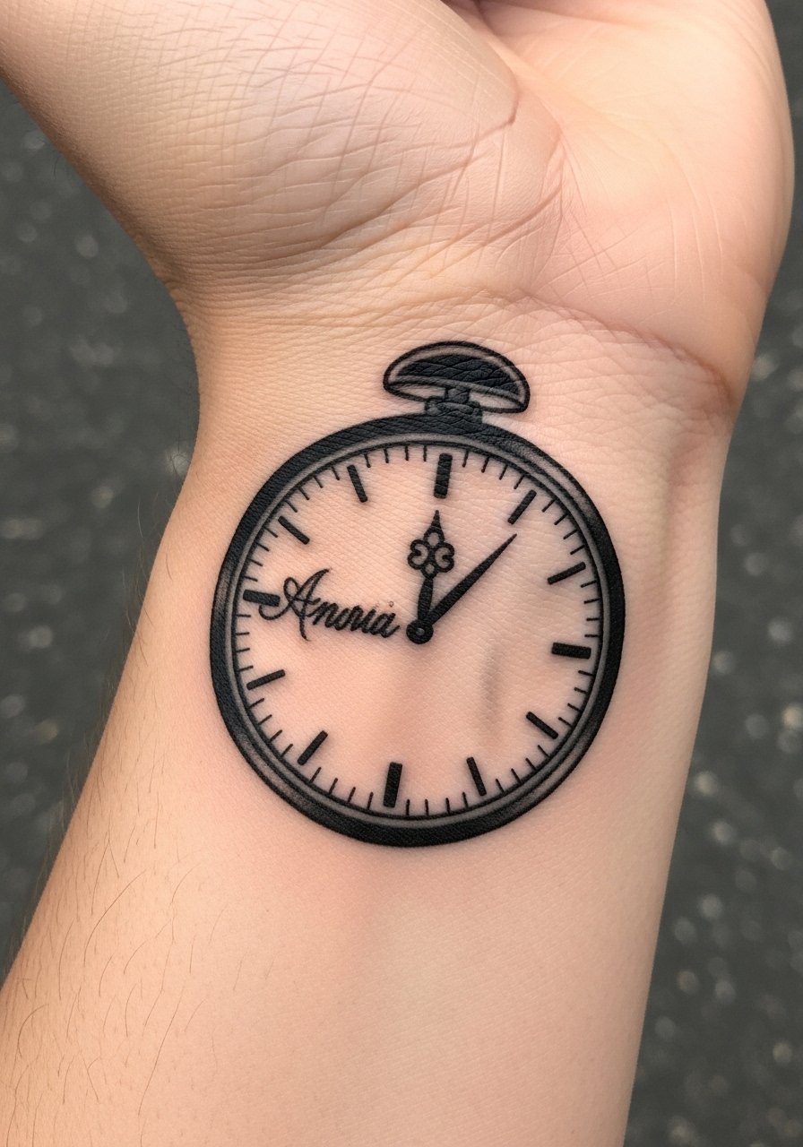
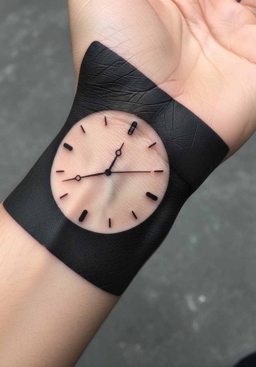
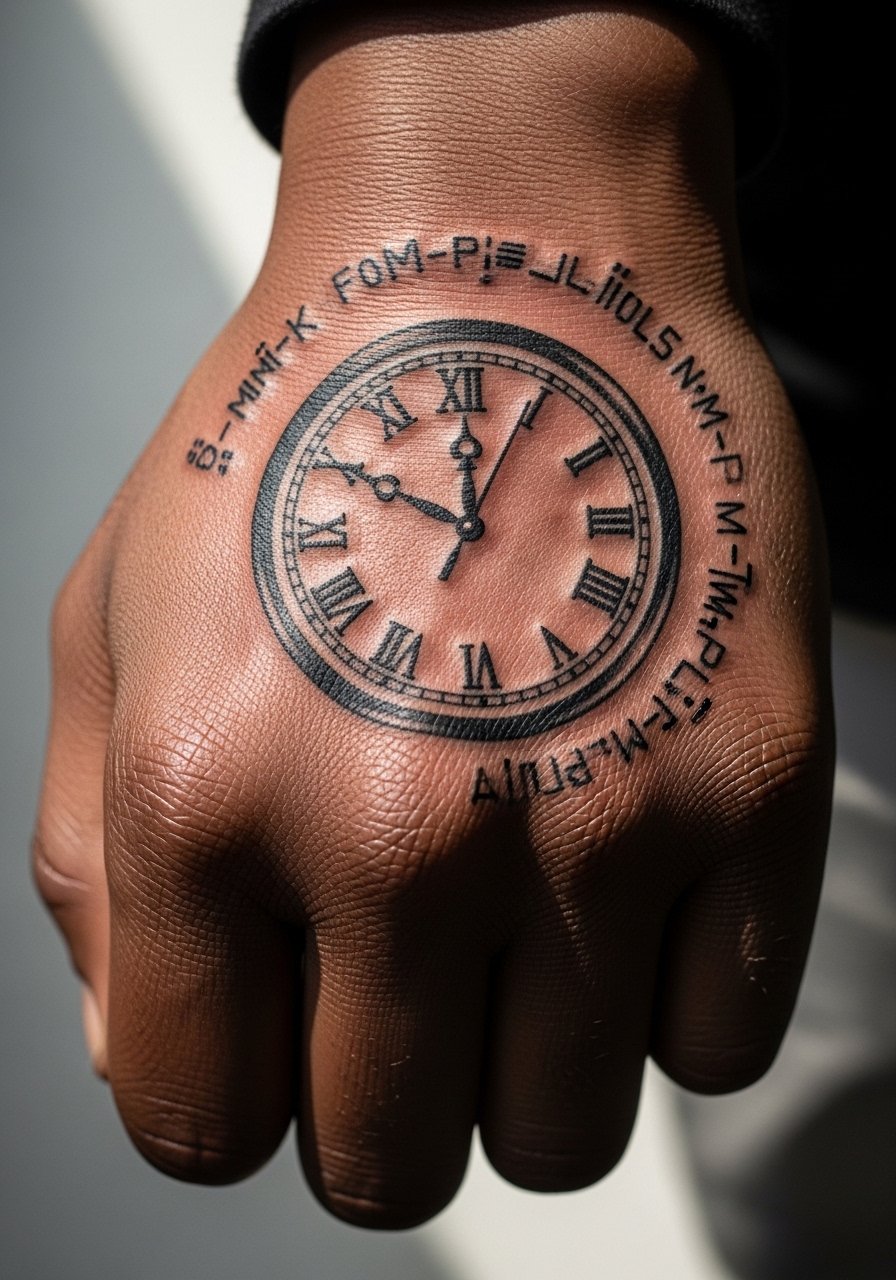
4. Roman Numeral Wrist Band Clock
A wrist-band clock reads like jewelry and avoids the constant wash zone of the palm. Ask for increased spacing between numerals and heavier band edges to resist blurring. A common mistake is too tight detail in the band pattern; that softens by year three. At six months the band looks like crisp ink. At two years tiny flourishes often need touch-up. The session is low to moderate pain. Pair it with a minimal leather cuff when you want it to read like an accessory.
5. Compass Clock at Base of Thumb
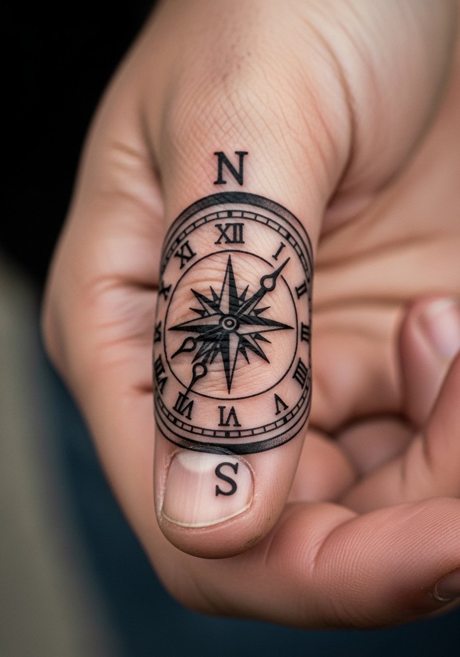
A compass-clock hybrid sits neatly at the thumb base and benefits from heavy cardinal marks rather than tiny ticks. Tell the artist to prioritize saturated black for the compass points and to avoid miniature flourishes in the center. The biggest mistake is asking for micro lettering there. Expect tenderness during the session because the area is thin on padding. Over time, broad black points hold while thin center lines may need a touch-up around year two. For showing it off, wear a simple ring that sits near the base of the thumb.
6. Art Deco Clock Over the Metacarpal
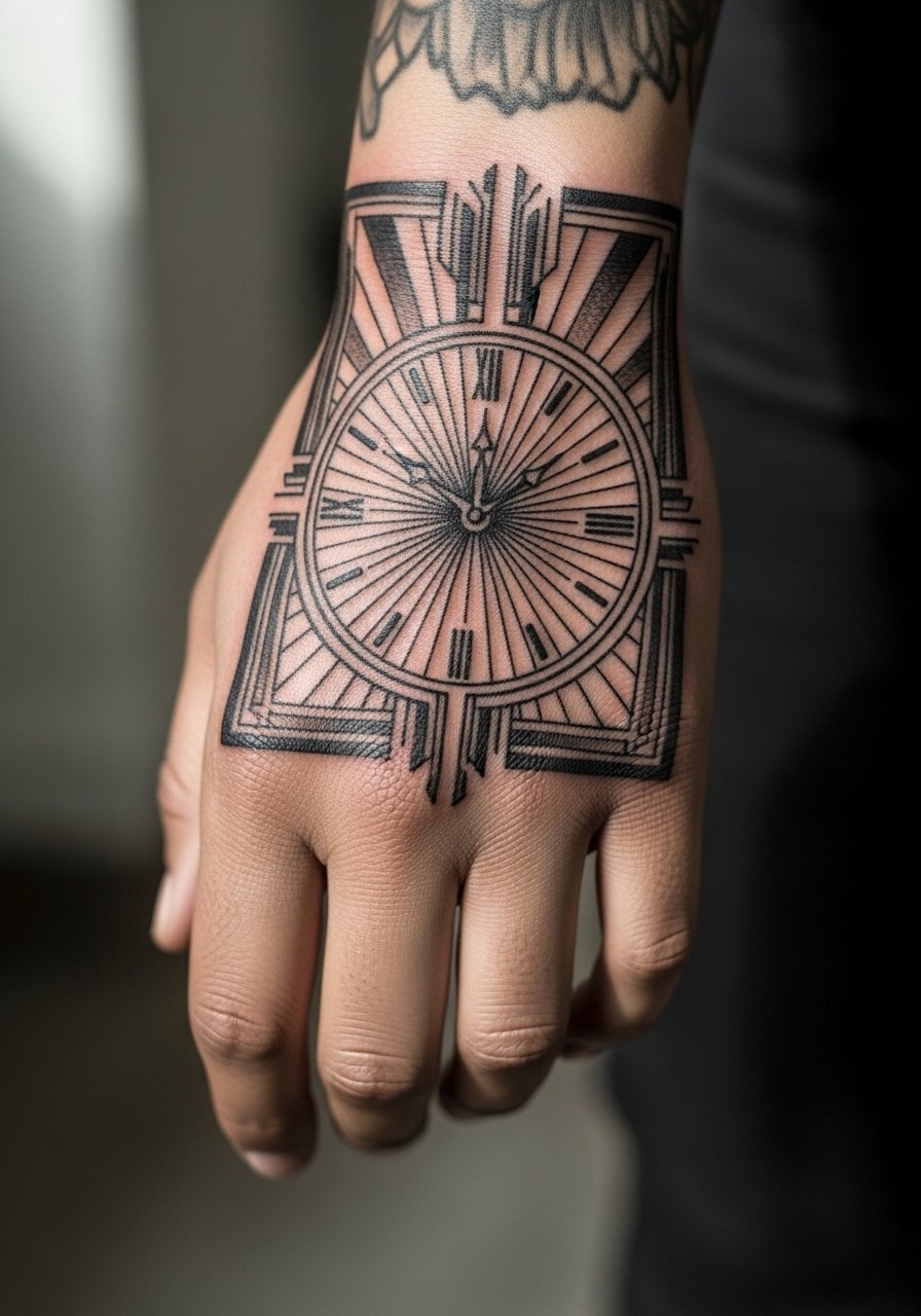
Art Deco scales up beautifully on the hand because bold geometry survives friction. Bring photos that show exact line weight to the consultation and tell the artist you want open negative space between the rays. Mistakes happen when people request delicate deco filigree on the hand. That fine work softens into a wash. At six months the graphic lines read strong. By year three, tight filigree fades. The session is moderate and takes patience. When you want to highlight it, wear a rolled sleeve linen shirt so the hand sits exposed without feeling staged.
Studio Day Picks
Hands and wrists are exposed to constant movement and water, so a few practical items make the session and first week easier to manage.
-
Stencil transfer paper kit. Lets you test placement and scale on the exact hand area, which is critical for knuckle and thumb placements.
-
Topical numbing cream. Applied as directed before the appointment it makes short, sensitive passes on knuckles and webbing more tolerable.
-
Thin protective film roll. Useful for covering finger and wrist tattoos during the first day to reduce friction from typing and handwashing.
-
Fragrance-free body wash. Gentle cleansing helps the fine edge work in the clock faces keep contrast without irritation.
-
Aquaphor healing ointment. A thin layer in the first few days helps prevent excessive scabbing on the thin skin of the hand without trapping too much moisture.
7. Skeleton Hand Clock on the Back of Hand
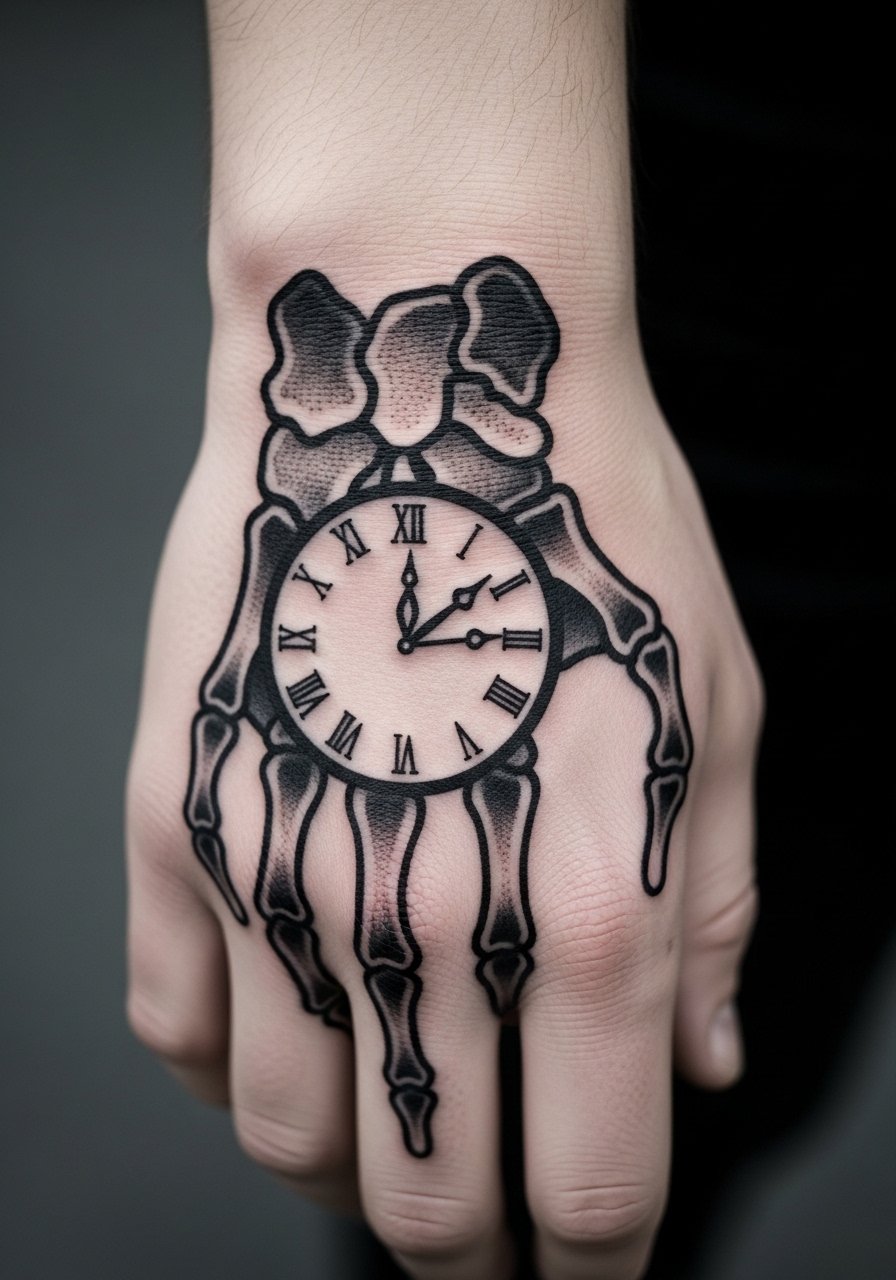
This design pairs a clock face with skeletal elements for a striking graphic. I advise asking your artist to keep bone lines broad and to avoid micro cracks inside the bones. The mistake is adding tiny shading that the hand will wash away. The session can be longer because of layered blackwork, and it may feel intense in spots near knuckles. At two years the silhouette remains strong if the negative space was respected. For outfits, contrast this with a black leather bracelet so the hand reads like part of your daily kit.
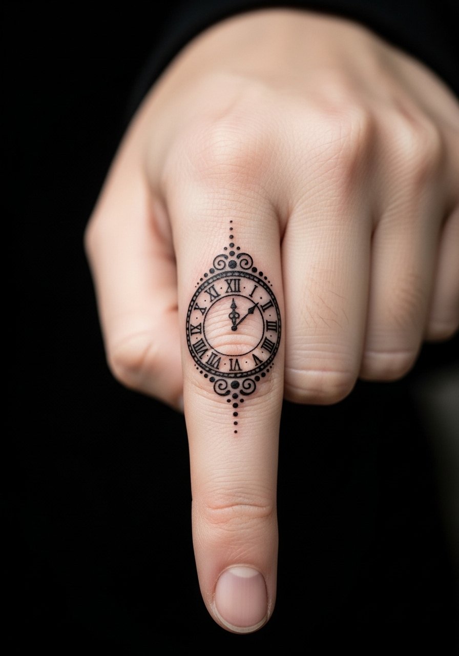
8. Tiny Pocket Clock on Side of Index Finger
Side-of-finger clocks look intimate and discrete. They need thicker numerals and open spacing so the tiny face does not turn into a blurred dot after a year. The common mistake is expecting micro numerals to stay sharp. Expect touch-ups earlier on fingers than other hand placements. The session is short and sharp. For the appointment, consider a thin knit glove you can pull off easily to protect the area walking home if needed.
9. Ornamental Sun Clock on the Wrist Side
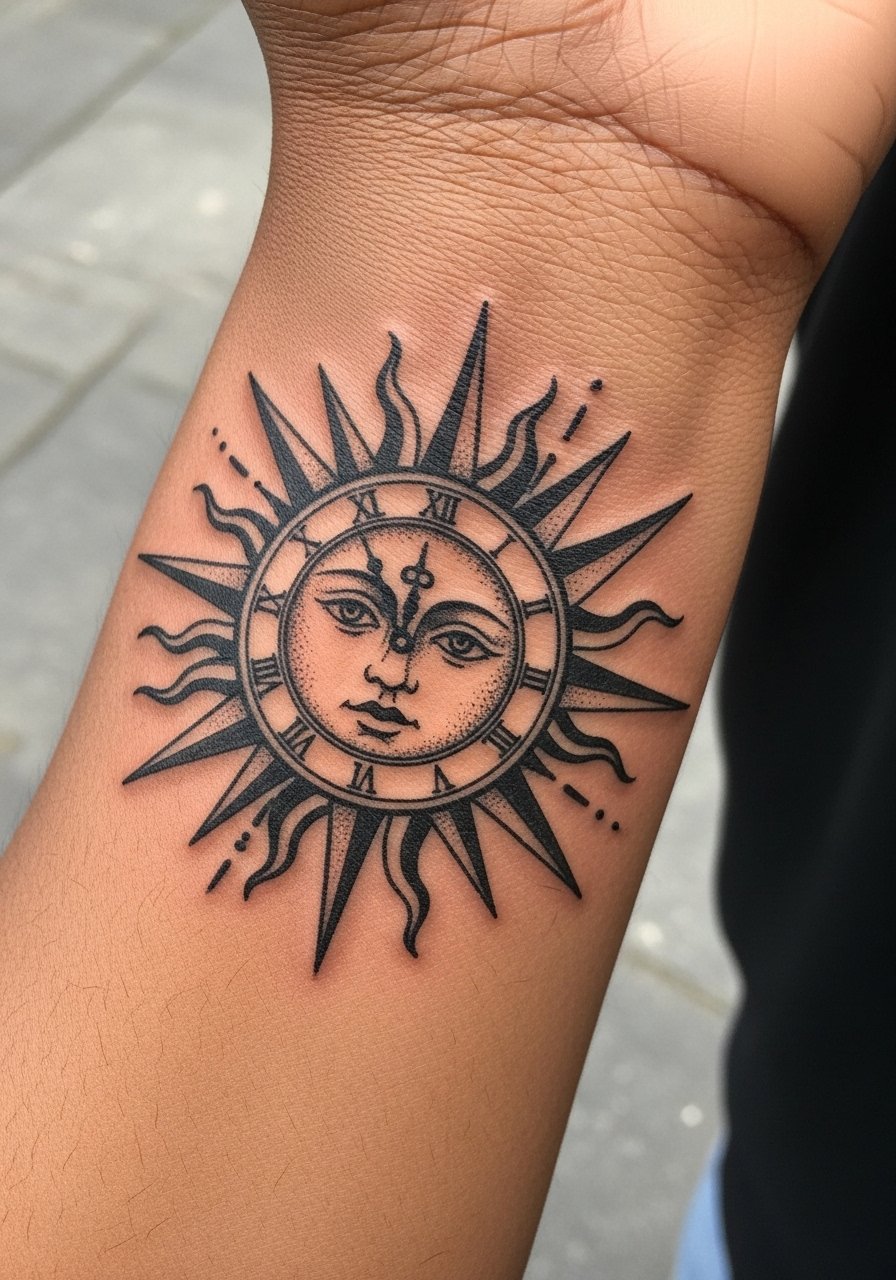
A sun motif built around a clock face benefits from bold rays and central negative space. Tell your artist to keep the central numerals minimal and to anchor the rays with small gaps. People err by stacking too many tiny dots inside the rays. Expect more fading where the tattoo meets bracelets and watches. The session is medium and can tingle near the tendon. To show it off, wear a simple cuff watch with a thin band that does not scratch the rays.
10. Scripted Timepiece at Wrist Crease
Integrating script into a clock face at the wrist crease can be elegant, but the crease moves constantly so keep the lettering bold and avoid tiny serifs. The main mistake is requesting thin cursive inside a small face. At six months the script will still be readable if the artist used heavier strokes. The session is sensitive since the crease flexes. For the appointment, wear a zip-up hoodie you can slide off easily so the wrist is accessible and comfortable.
11. Nautical Clock with Compass Points on Backhand
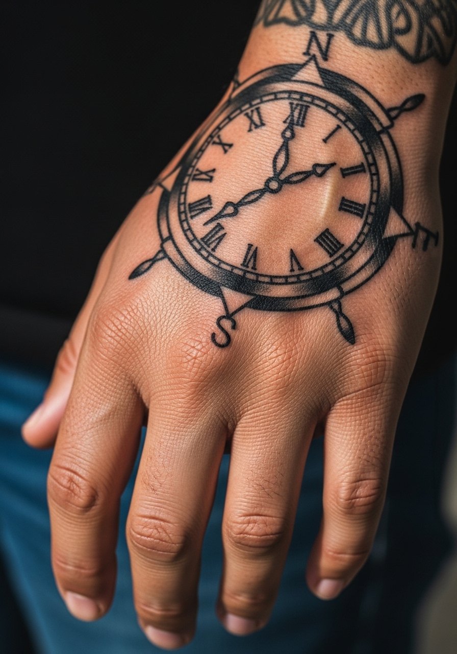
A nautical clock reads like traditional flash and ages similarly well because bold black lines and simple fills hold. Ask for larger compass points and open face to reduce merging. A frequent error is over-shading the face, which softens into a gray patch. Sessions will include short breaks for comfort on knuckles. Ten years later the silhouette often still reads if saturation was prioritized. Pair it with a canvas strap bracelet to lean into the maritime feel.
12. Dotted Stipple Clock Over Metacarpal
Stipple shading can give a clock face soft depth while avoiding solid fills that age into flat patches. Because stipple relies on many tiny dots, ask for slightly more spacing between clusters so it does not compress. The mistake is requesting ultra-fine stippling in high-friction zones. At two years, well-spaced stipple keeps a textured look. Sessions require patience and the sensation is repetitive tapping. For outfits, a lightweight knit sweater with cuff rolled frames the metacarpal without obscuring the work.
13. Neo-Traditional Clock with Floral Wrap
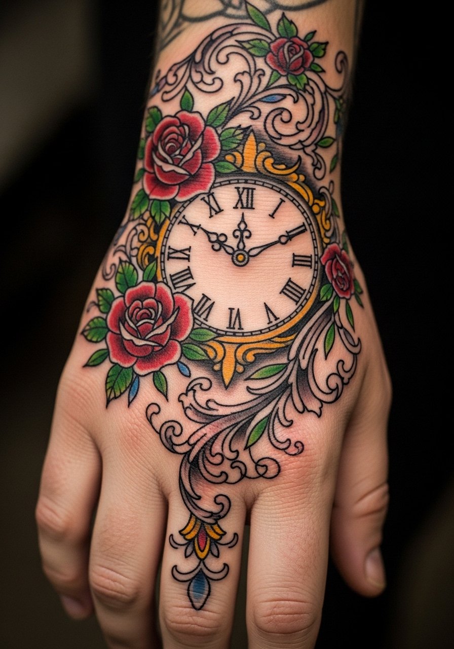
Neo-traditional works well because heavy outlines protect the saturated areas that meet daily abrasion. Tell your artist to separate flowers from the face with clean gaps. A common mistake is packing too many color gradients into the petals on the hand. You will feel more vibration when the needle hits flower edges. Over time solid regions keep their pop longer than delicate color blends. For show-off dressing, try a short-sleeve linen shirt in neutral tones so the florals read as part of the outfit.
14. Blackout Partial Clock Accent
A partial blackout approach uses heavy black to frame a clock face cut out of the block. It will age predictably because large black areas remain consistent. The main mistake is too many tiny negative details inside the blackout. At six months the contrast is stark. The session is longer and can be intense. Some people worry blackout prevents future additions, but strategic negative windows give you flexibility. For wardrobe balance, a wide leather band bracelet keeps the hand grounded stylistically.
15. Tiny Roman Clock Dot Work on Finger Side
Finger-side placements are tiny and need simplified numerals and open face. The typical error is adding micro ticks that dissolve into a smudge. Touch-ups for fingers are common after a year because the skin regenerates faster. Sessions are brief but may sting. When booking, ask the artist how they handle finger touch-ups. For subtle display, wear a simple band ring that complements the clock without covering it.
16. Solar Eclipse Clock at Thumb Base with Negative Space
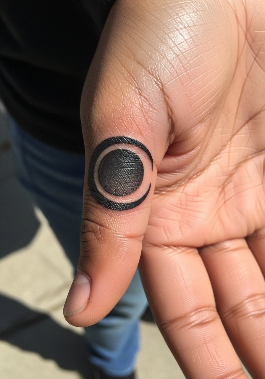
Using negative space like an eclipse around a clock face brings drama and keeps lines thick where they matter. Tell your artist to avoid tiny rays inside the negative crescent. The debate exists about tiny detail around joints. One camp says keep it bold, the other trims detail and focuses on shape. The session is short but precise. Over time the silhouette holds if spacing is generous. Wear a minimal leather slip-on or nothing at all to keep the thumb area visible.
17. Mechanical Clock Gears Integrated with Knuckle Rings
Integrating gear shapes with knuckle ring placement creates the illusion of jewelry and it ages like heavy linework typically does. Ask for simplified gear teeth and clear separations so the forms do not merge. The common mistake is adding tiny screws and rivets that the hand cannot keep. Expect short, repeated passes and a few breaks. At two years the ring illusion usually remains readable. Pair it with thin metal rings rather than chunky bands so both the ink and metal read together.
18. Clock Face with Morse Code Time on Outer Edge
Morse code around a clock gives a concealed message and suits hands because the code is graphic rather than detailed. Request larger dots and longer dashes so the script does not compress. The mistake is running the code too close to the face where it collides with numerals. Sessions feel quick for the code line itself. Over time the code remains legible if spacing is respected. For subtle styling, wear a thin wrap bracelet to sit beside the outer edge without rubbing it.
19. Vintage Keyhole Clock at Thumb Knuckle
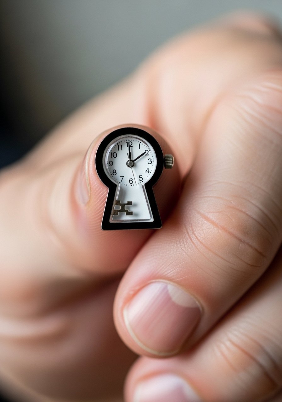
A keyhole silhouette across a knuckle creates a focal point that tolerates broad lines. Tell your artist to keep the hole negative and the outer border saturated. The common mistake is filling the keyhole with fine shading. Expect the knuckle area to feel sharp during the session. At two years, saturated borders still read clearly. For post-session comfort, bring a soft cotton glove to protect the spot while it settles.
20. Minimalist Digital Clock on the Side of the Hand
Digital-segment tattoos need blocky segments rather than thin lines to survive hand life. A frequent error is using delicate segments that round out into blobs. In consultation, specify segment thickness and ask for testing on similar skin. The session is short. Over time you may need minor touch-ups to maintain crisp segment edges. For daily wear, a lightweight beaded bracelet sits near the digits without causing abrasion.
21. Heraldic Clock Emblem on Backhand
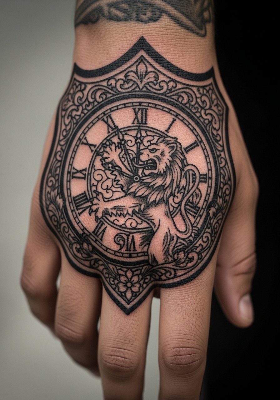
Heraldic clocks with shields work because the strong frames protect interior elements. Ask your artist to emphasize the shield border and to keep interior symbols simple. The mistake is requesting ornate filigree that collapses under daily wear. Sessions may be longer for fills. After a few years the emblem form sustains better than internal decoration. For a cohesive look, wear a textured leather cuff that mirrors the emblem shape.
22. Pocket Watch Fragment Peeking from Palm Edge
Edges that peek from the palm can feel intimate and protected, but they face wear from handling. Ask your artist to anchor the fragment with bold bordering and avoid tiny inner details. The common mistake is expecting the palm edge to keep tiny text or filigree. Sessions here involve awkward hand positioning. Over time, bold anchors remain while thin interior lines fade. For showing, a short-sleeve tee with an easy roll keeps the reveal casual.
23. Clock Face with Constellation Markers on Hand Back
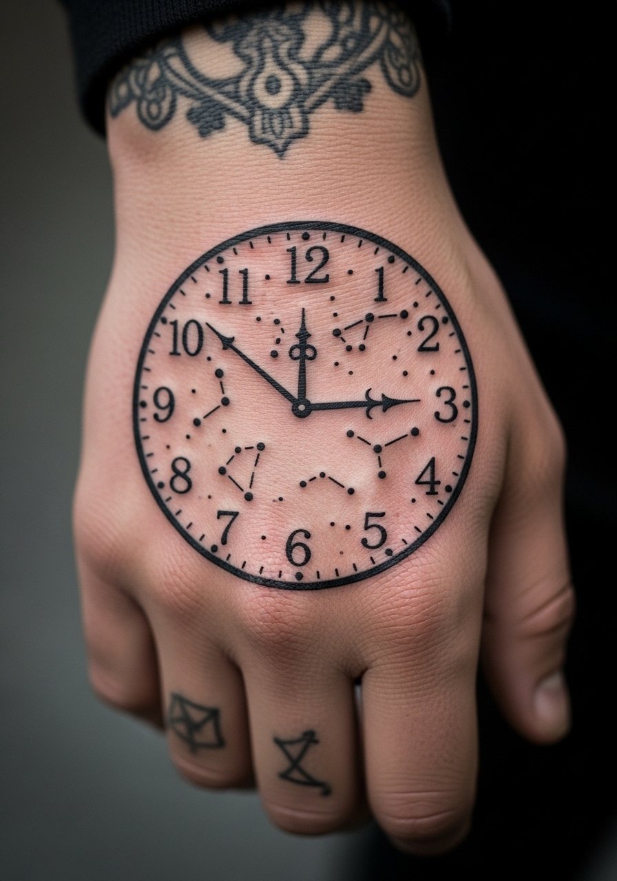
Constellation markers give a starry accent that pairs well with a bold clock face. Make sure dots are slightly larger than you think so they do not vanish over time. The mistake is overloading the clock with tiny stars that join into a gray area. Sessions are steady and the feeling is constant. After a couple of years, the dots hold if they were intentionally sized. Pair it with a thin star pendant necklace that sits nearby for thematic resonance.
24. Surreal Melting Clock Across the Hand Surface
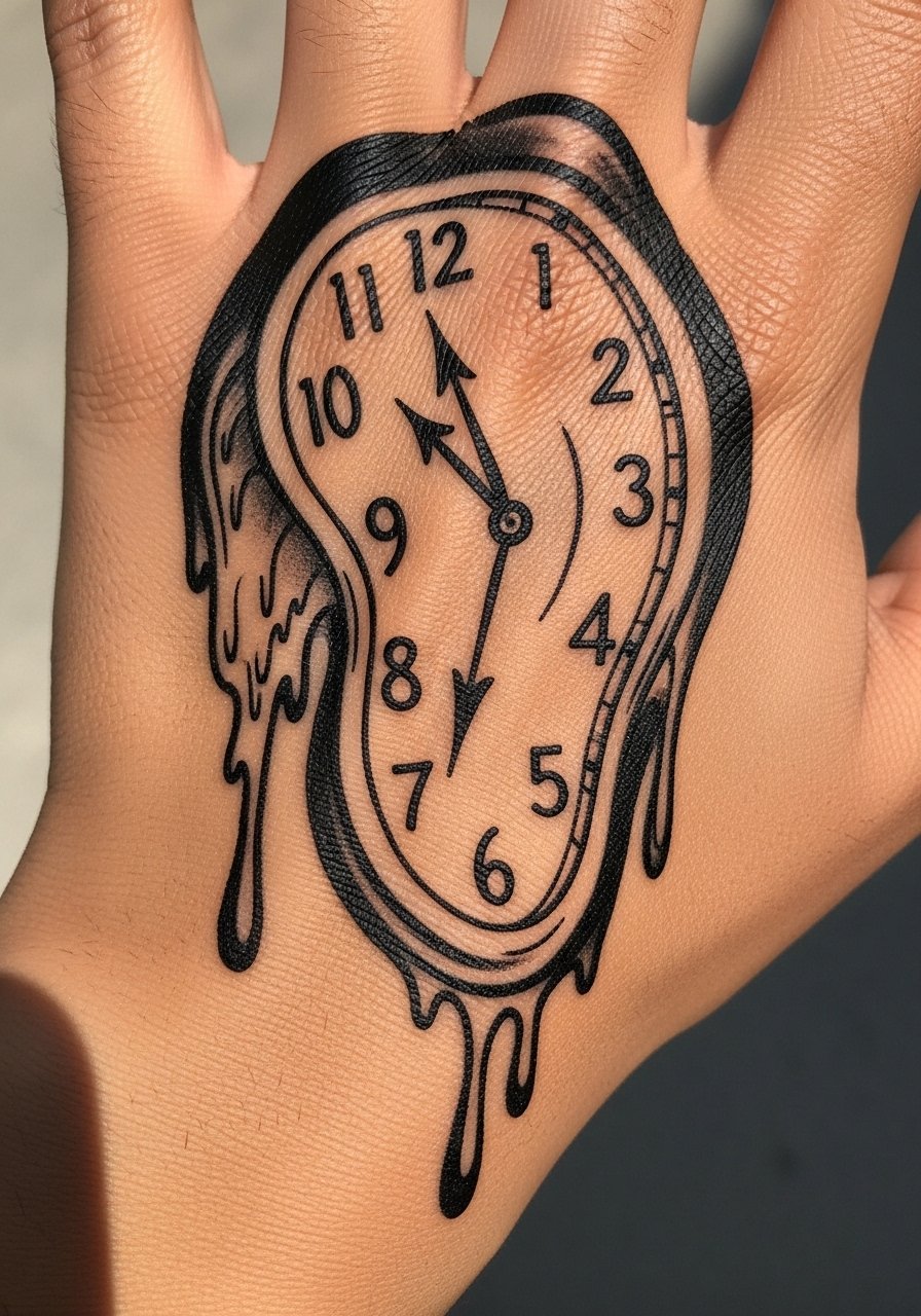
Surreal melting forms need bold outlines around the drips so the shape remains readable as the skin shifts. The mistake is relying on tiny interior shading to define the melt. Artists split on how much interior detail helps longevity. One opinion favors pared-back silhouettes. The other supports more shading if the outlines are strong. Sessions will be longer for flowing shapes. For a curated look, wear a stack of thin silver rings that mimic the drip lines.
25. Clock Face Framed by Lace on Backhand
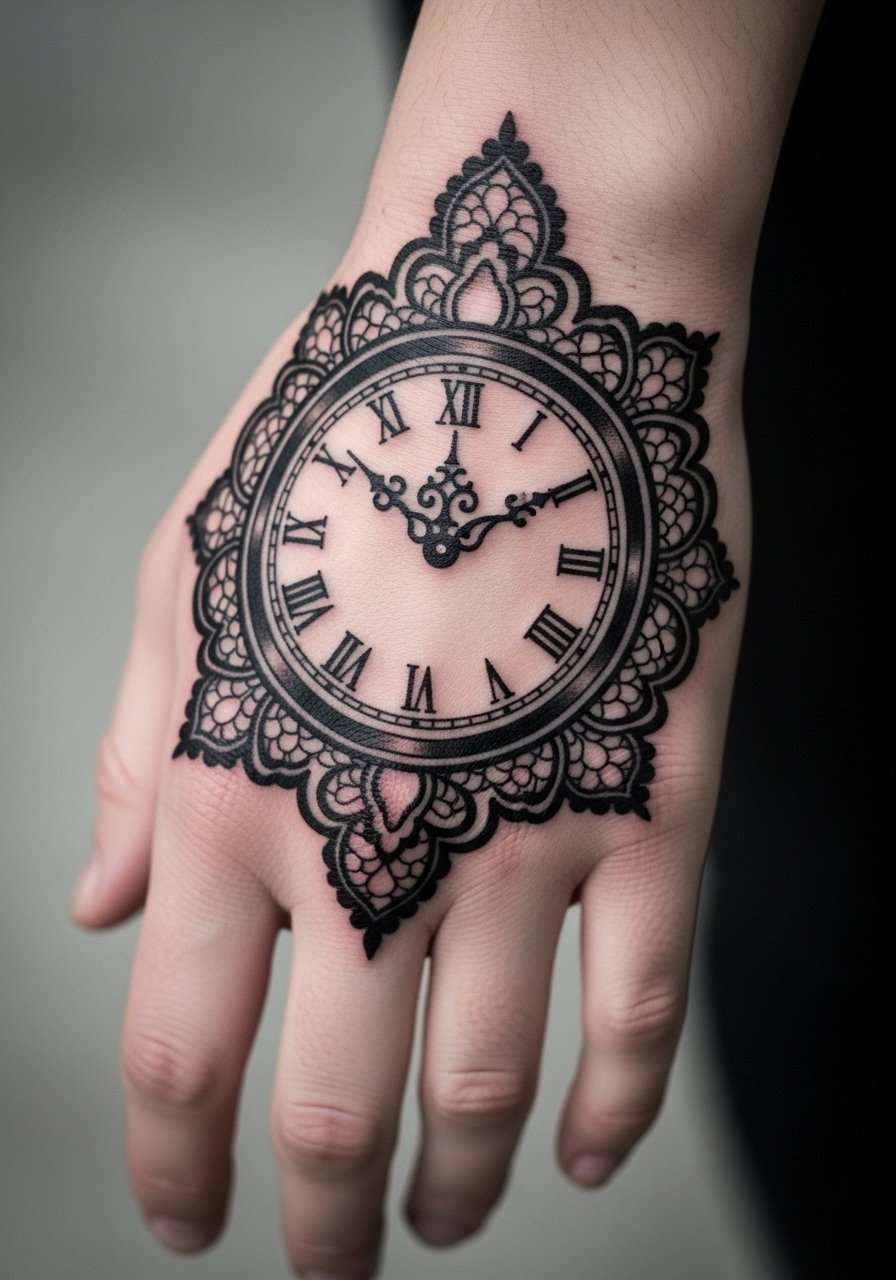
Lace accents are tempting but too-fine lace on hands blurs into texture. Ask for simplified lace with larger loops and clear negative gaps. The common mistake is tiny mesh details. Expect the session to be delicate and to take breaks. Over time the lace reads as a pattern rather than filigree when done correctly. For evening wear, a slim chain bracelet keeps attention on the framed face without covering it.
26. Tattooed Watchband Illusion around Wrist and Backhand
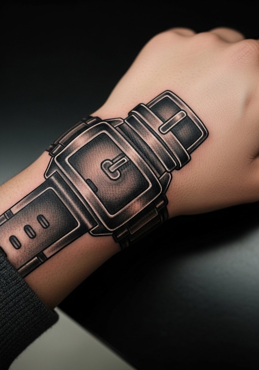
A watchband illusion tattoo works if the strap has bold edges and the buckle is simplified. Avoid tiny stitch details that the hand cannot preserve. A common mistake is over-rendering texture into the strap. Sessions can be moderately long because of the wrapping nature. Over time the edges delineate the band while internal texture fades. For practical show-off, pair it with a light leather watchband to mirror the ink.
27. Calendar Clock with Date Window on Side of Hand
A clock with a date window is a neat personal option but the tiny date box must be oversized slightly to remain legible. Tell the artist to use a boxed window and thick numerals inside it. The frequent mistake is an undersized date that blurs into the face. Expect the session to include precise single-needle passes for the box. After a couple of years, the boxed number holds better than minute ticks. For discreet styling, a simple matte ring sits beside the window and draws the eye.
Frequently Asked Questions
Q: Will a bold clock on my hand need touch-ups more often than a forearm piece?
A: Yes, hand pieces face more friction and washing so touch-ups are more likely. Bold lines and open negative space reduce the need, but plan on at least one touch-up within the first two to three years for most hand clocks. How often depends on your daily habits and sun exposure.
Q: Is there a style of clock that holds better specifically on knuckles?
A: Heavy, simplified numerals and broad outlines hold best on knuckles. Tiny detail and thin numerals tend to blur. Ask the artist for separated strokes and negative space between elements so the knuckle movement does not compress the design.
Q: How should I dress to protect a fresh hand clock during the first week?
A: Keep the area free from tight bands and avoid rings that rub the fresh ink. If you need to cover while out, a loose cuff or a soft cotton glove pulled on when necessary helps. For comfort on the way home, bring a breathable wrap that will not stick to the area.
Q: Are fine-line clock faces on the hand controversial among artists?
A: Yes, artists split into two camps. One group says fine line on hands blurs too quickly because of constant motion and washing. The other group argues that with precise depth and slightly increased spacing, fine line can settle acceptably. Ask the artist where they stand and request a portfolio example on similar placements.
Q: Can I get color in a hand clock or should I stick to black?
A: Color is possible but it ages differently on the hand. Saturated single-color fills like a deep red or navy tend to hold better than complex blends. If you want color, request solid blocks and expect touch-ups sooner than for blackwork.
Q: How do I find an artist experienced with durable hand clock work?
A: Look for portfolios that show healed hand or finger work, search hashtags focused on healed work, browse shop portfolios on directory sites, and ask for healed photos during consultation. A shop that has treated multiple hand pieces and shared healed timelines is a good sign.
