
Fine line One Piece motifs look incredible on feeds, but the pieces that still read crisp after years are the ones designed with spacing and placement in mind. Fans often chase tiny character portraits or dense scene panels and then wonder why the linework softens. This collection pulls those lessons into 27 wearable ideas, showing which elements to enlarge, where to use dot work or stipple shading, and how to pair each piece with what you wear so the tattoo actually gets seen.
1. Straw Hat Silhouette on the Inner Forearm
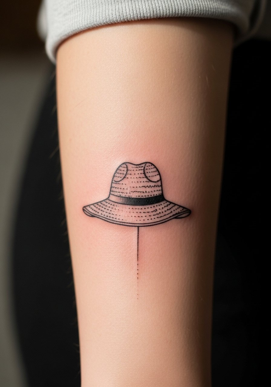
This small silhouette reads like a secret nod to the series while staying legible long term. I've seen tiny logos on the wrist blur into a smudge over two years, so I suggest keeping the silhouette slightly larger than you expect and asking for clean, single-pass linework to avoid excess needle trauma. Pain is low on the inner forearm and sessions are short, often a single 30 to 60 minute pass. For showing it off, rolled sleeves or a loose button-down shirt frame the piece without competing with the thin linework. Expect a light touch-up at year three if you live in high-sun climates.
2. Mini Devil Fruit in Micro-Realism on the Wrist
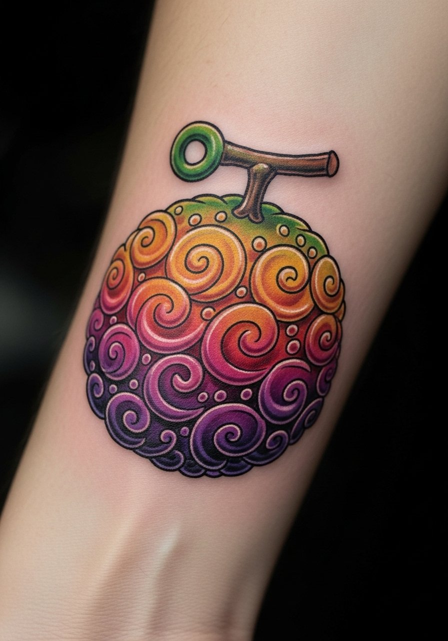
Fair warning: the wrist is a high-friction spot and micro-realism needs room to remain distinct. For this one, tell your artist you want slightly bolder shading and intentional negative space around the seed pattern so the tiny highlights don't vanish. The session is brief but the healing window is fussy because of wrist movement and washing. Blowout risk increases if the artist packs too many micro details into a 1.5 centimeter area. For the appointment, wear a racerback tank you can roll the sleeve up over without rubbing the fresh ink.
3. Nautical Compass with Dot Work on the Calf
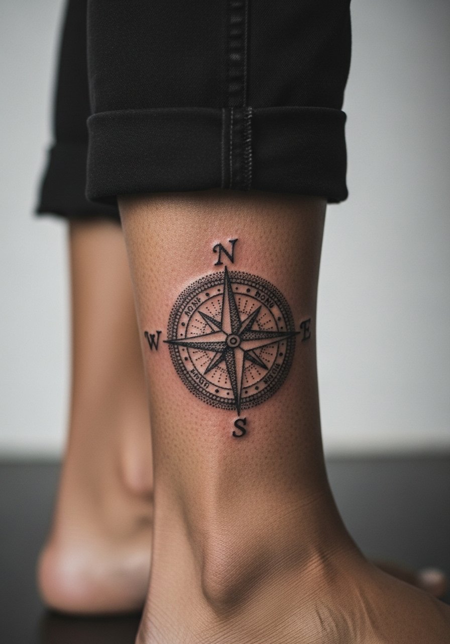
There is a reason calfs take saturation well. The thicker skin and lower friction let stipple shading and dot work keep texture instead of merging. If you want the compass to feel aged without turning muddy, ask for wider spacing between stipples and a firm outer ring in the linework for a long-running silhouette. Calf pieces are medium pain and often take a single two-hour session for this scale. Pair it with cropped pants or sandals to show the art, and try a loose drawstring linen pant for easy access during the session.
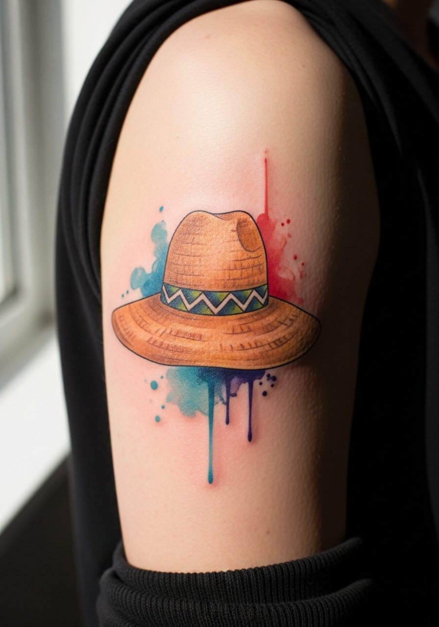
4. Luffy’s Straw Hat with Watercolor Accent on the Shoulder
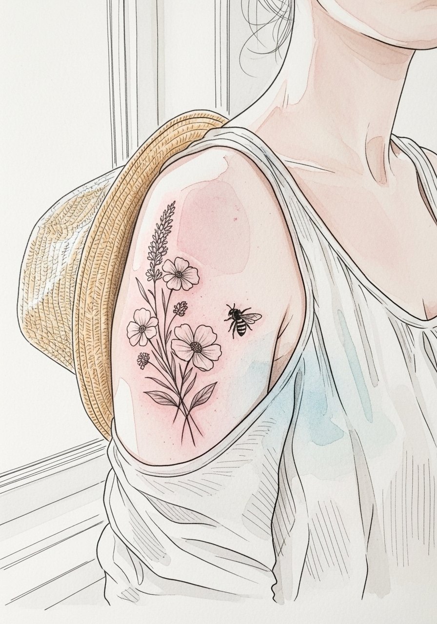
Visual impact lead works here because the shoulder lets color breathe. A watercolor wash looks great fresh but tends to fade faster than saturated color, so request denser saturation at the wash edges and softer feathering toward the shoulder. Session time is often split into outline pass and a shorter coloring pass. The biggest mistake is asking for a pale wash and expecting it to age like a solid fill. For session comfort and easy access, throw on a loose tank top you can pull aside. Expect a touch-up at year two to refresh the watercolor tones.
5. Mini Map Panel Along the Ribcage
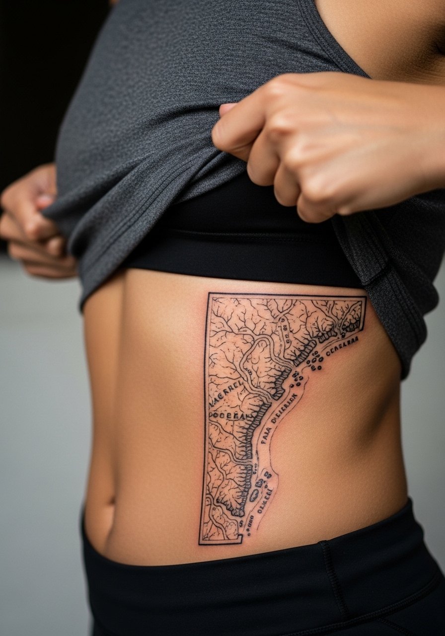
Pain warning lead applies here. The ribcage ranks high on most pain scales, but it is an ideal canvas for narrow panels that follow the body’s curve. Artists split on fine line on ribs. One camp says the constant expansion and compression blur lines within two years. The other camp argues that with proper depth and spacing, fine line settles fine. I recommend asking your artist where they stand and opting for slightly bolder primary lines with lighter internal detail. For the session, wear a cropped athletic top you can lift without changing outfits. Expect longer session breaks and a higher chance of needing a touch-up by year three.
6. Zoro-Inspired Three-Sword Silhouette Across the Collarbone
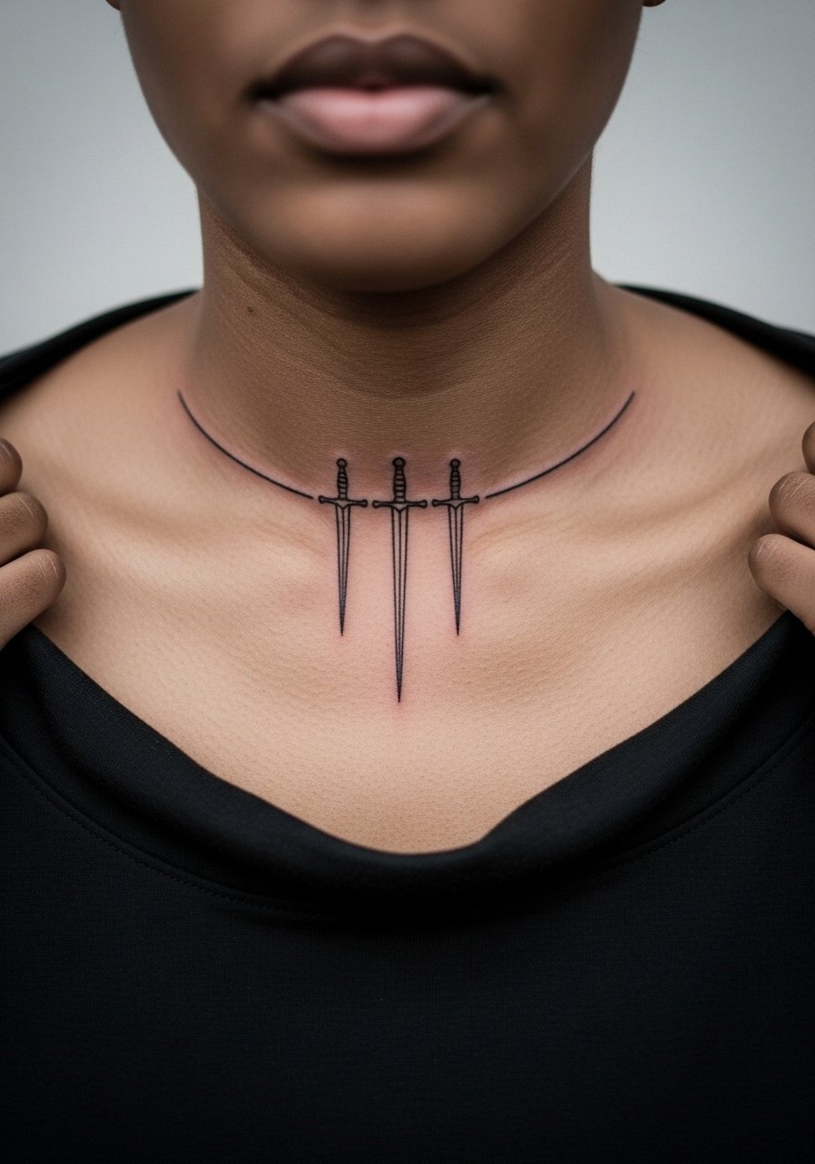
Visual balance is everything for collarbone pieces. The skin there moves with shoulders, so I recommend slightly heavier linework for the sword outlines and delicate stipple shading inside. The pain is medium and sessions are split for comfort. A common mistake is centering the motif too low; on many bodies the collarbone reads smaller than expected so ask for a stencil check while standing. For showing it off in evenings, an open-back midi dress frames the collarbone without covering the linework. Collarbone lines tend to keep shape for years but may need a light touch-up around year four.
Studio Day Picks
The shoulder, ribcage, and calf pieces above all ask for different prep, so bring items that match the placement and keep the first week manageable.
- Stencil transfer paper kit. Lets you preview line placement on curved areas like the ribs and calf before the needle hits.
- Topical numbing cream. Applied as directed, it smooths out longer sessions on the ribcage and collarbone without interfering with the outline pass.
- Thin protective film roll. Helps reduce friction on wrist and ankle pieces while you move through daily tasks.
- Fragrance-free body wash. Gentle cleansing during showers keeps fine line and watercolor edges clear without irritation.
- Aquaphor healing ointment. Thin layers in the first days protect delicate line channels without suffocating the skin.
7. Miniature Thousand Sunny on the Ankle

A tiny ship on the ankle makes for a great discreet fan piece. The ankle moves and sees lots of footwear friction, so I prefer a compact silhouette with a bold outer line and simplified internal detail. Sessions are short and pain is low to medium depending on bone proximity. Avoid hyper-detailed sails at this scale or you will trade crispness for a muddy gray patch after a year. For showing it off, sandals or cropped jeans work best and I like pairing it with a thin anklet chain that doesn't rub the tattoo directly.
8. Devil Fruit Cross-Section on the Upper Thigh
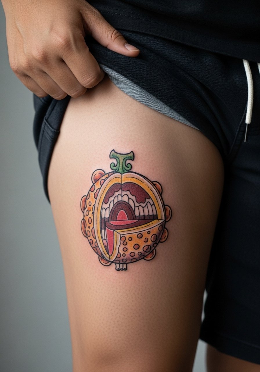
The upper thigh is forgiving for saturated color and micro shading, so you can afford more internal texture here than on wrists or fingers. Consult lead: when you book, ask for a larger stencil so that the internal striations have room to age. The session may be longer because color fills take time. For the appointment, wear high-waisted shorts you can pull aside without discomfort, and consider a loose drawstring linen pant to travel home in. Thigh areas usually hold saturation well with touch-ups only every five years or so.
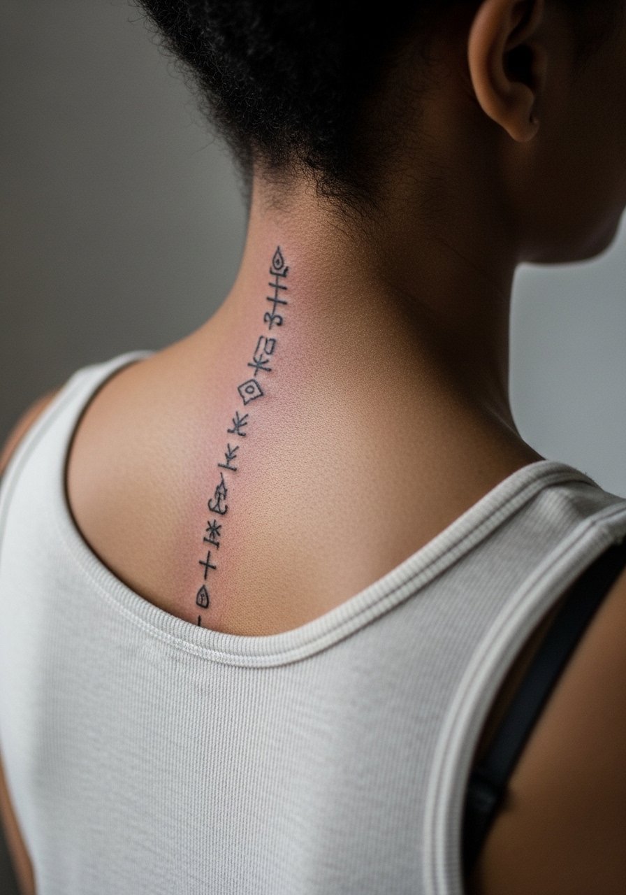
9. Minimalist Map Coordinates Behind the Ear
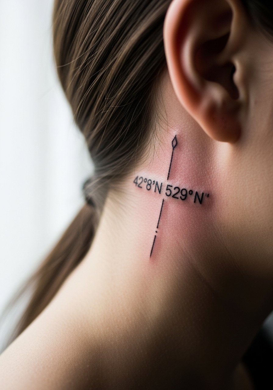
Behind-the-ear placements are intimate and require careful framing. The biggest mistake is asking for several digits in a tiny script; instead, pick short coordinates or a small Roman numeral and make the character height larger. Session time is short but the skin there is thin so the lines can seem crisper initially and soften faster. For revealing it subtly, wear a wide-neck shirt or pull hair up. Keep in mind that some employers still have visible tattoo policies, so think about career considerations.
10. Full Back Panel of the Grand Line Map
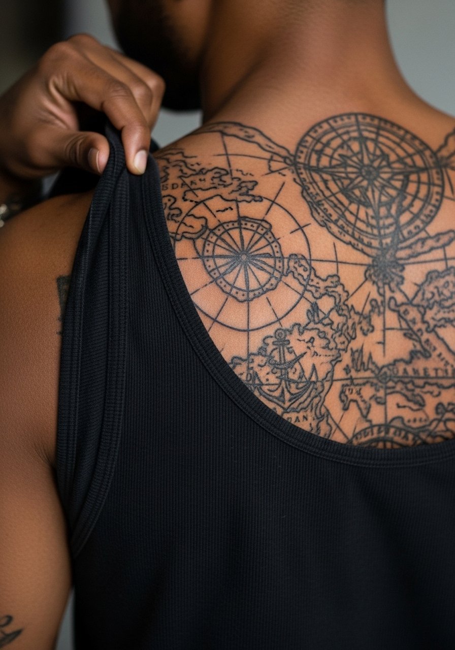
There is something about large panels that rewards patience. A full back map can carry lots of narrative detail without crowding, but it needs a staged approach. I recommend multiple sessions: outline, main fills, then texture passes. Tell your artist you want open negative corridors between islands to prevent merges over time. Pain varies across the back and sessions are long. For sessions, bring loose button-downs you can remove or pull aside. Back panels age well if the soldered lines keep strong saturation; expect long-term maintenance but fewer early touch-ups than micro pieces.
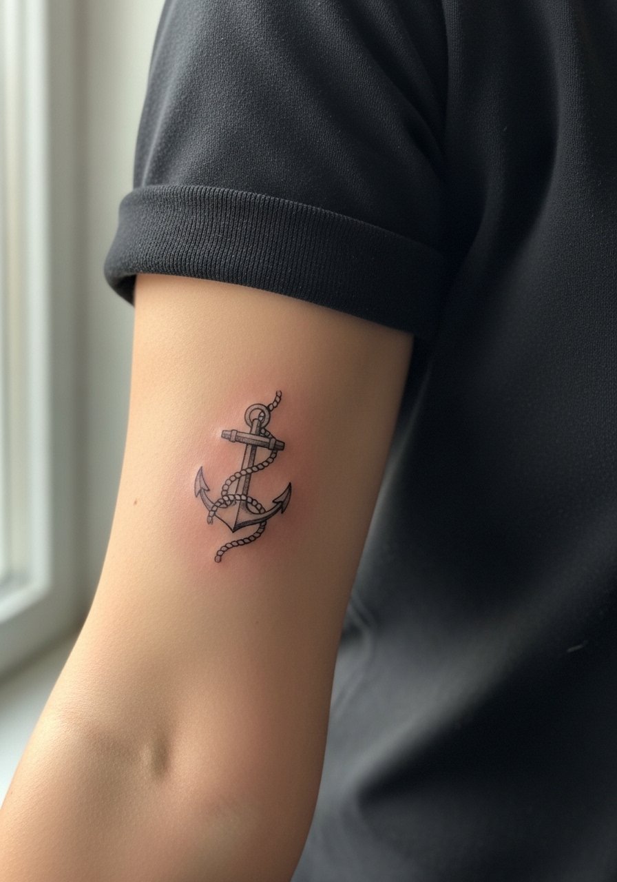
11. Tiny Anchor on the Side of a Finger
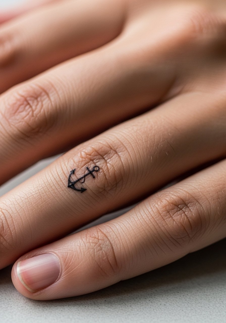
Hand and finger work still divide opinions because of fade and touch-up frequency. The common mistake is too much internal detail in a few millimeters. For a side-finger anchor, keep the linework bold enough to survive constant washing and typing abrasion. Pain is sharp but brief. Expect a touch-up within one year and a tendency for faster fading than arm work. If you want to display the piece, stack with a thin chain ring or minimalist bracelet, but keep jewelry loose to avoid rubbing the fresh ink.
12. Watercolor Straw Hat Crest on the Upper Arm
A watercolor treatment reads dynamic on the outer arm, but bleach-like fades occur if you choose too pale a palette. Aging lead: watercolor needs stronger anchor points in the linework to keep the shape readable in years. Ask for saturated cores with soft washes flowing outward. Sessions are medium length and the arm tolerates color well so you can do the outline and color in one appointment if desired. For casual wear, rolled sleeves or a short sleeve linen shirt show the piece without covering it.
13. Small Crew Emblem Behind the Knee
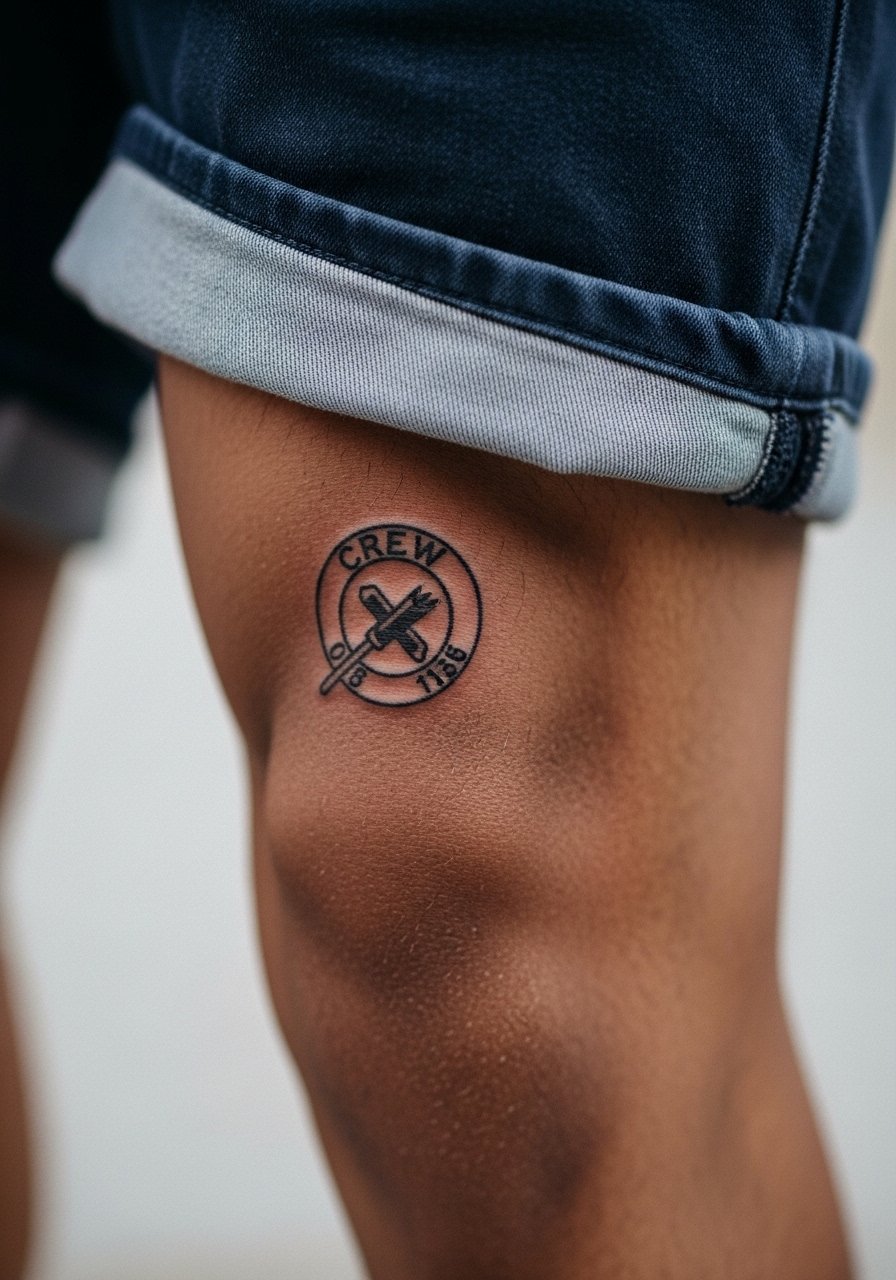
The behind-the-knee spot is underrated and sensitive to motion, so expect more painful passes and longer healing. The visual impact can be strong because the bend of the leg animates the emblem. When consulting, mention mobility and ask for slightly thicker outlines to guard against gaps as the skin settles. For session comfort, bring loose shorts you can shift easily. This placement will likely need touch-ups sooner than the calf because of constant mechanical stress.
14. Negative Space Skull with Rope Frame on the Sternum
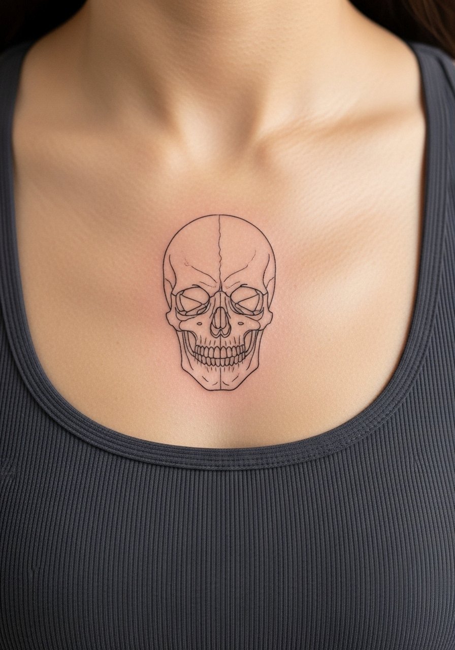
Controversy lead applies here because sternum fine line splits artists into camps. One side says the chest’s stretch and movement erase fine details quickly. The other side argues that controlled needle depth and spacing keep the negative space crisp. If you choose negative space, ask for bolder bordering lines and avoid dense interior dot work. Sessions can be uncomfortable because of bone proximity. Wear a fitted sports bra for the appointment and plan breath-control breaks. Many people prefer a light touch-up around year three.
15. Map Fragment in Micro-Realism on the Inner Bicep
Inner bicep pieces feel intimate and sit near softer skin. The biggest mistake is cramming micro textures into a space that flexes and sweats. Ask for a slightly larger scale with softer stipple shading rather than crisp micro lines. Pain is moderate and sessions are manageable with breaks. For the appointment, wear a tank you can lift without rubbing the fresh work. Inner bicep art ages depending on sweat and friction; plan for a touch-up after a couple of years if you train frequently.
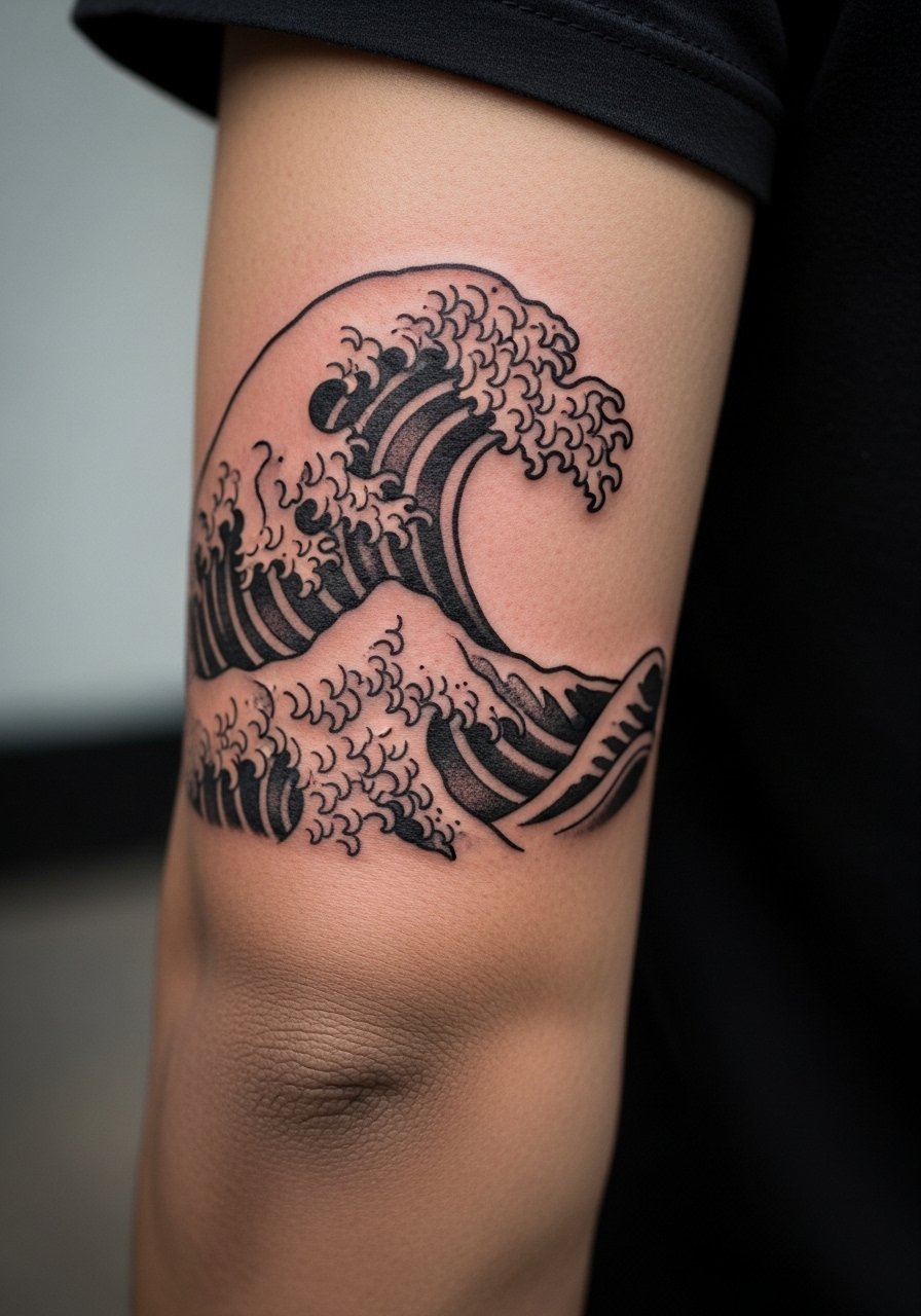
16. Chest Panel of a Ship Breaking Through Waves
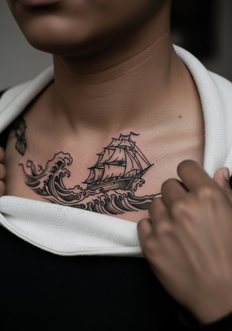
A chest panel reads epic but requires composition that honors breathing and shoulder movement. I advise anchoring the ship with a strong horizon line and using layered saturation for the waves so the dark areas hold. Sessions are longer and the sternum adjacency may increase discomfort. For sessions, a loose button-down you can pull aside keeps access easy. Chest pieces resist early blowout if the artist maintains consistent depth and spacing. Expect the darkest fills to keep shape for many years with occasional refreshes.
17. Tiny Skull and Straw Hat on the Side of the Foot
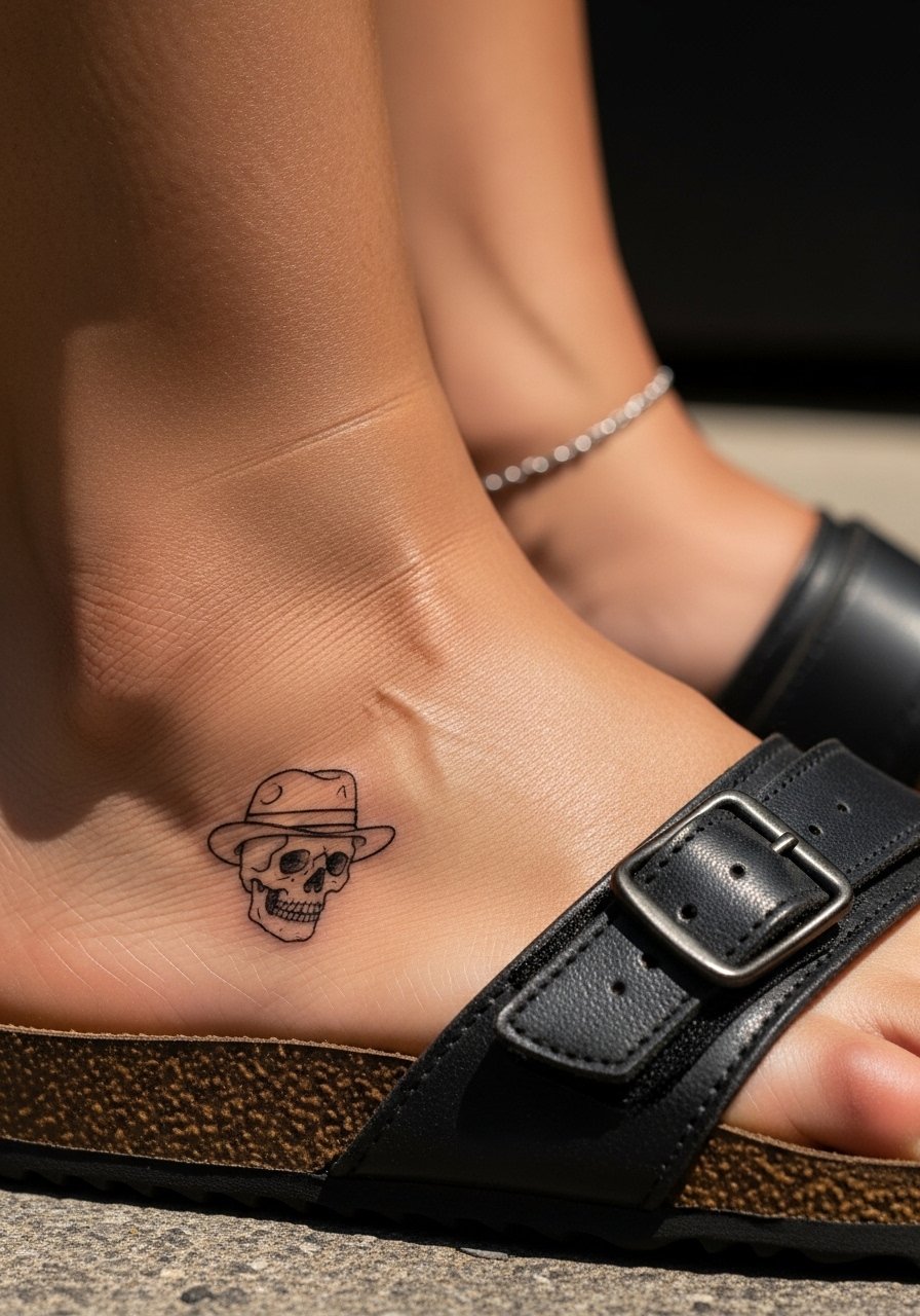
Ankle and foot work take a beating from shoes and walking, so minimalism must be built to survive. The common version that ages poorly is one with thin interior details. Instead, request a slightly thicker outline and simplified features. Sessions are short but healing can be tricky because of friction from footwear. For showing it off, sandals are best and I like a minimalist toe ring that complements without pressing on the design.
18. Sleeve Strip of Character Silhouettes in Linework
A vertical strip of silhouettes suits the forearm and plays with negative space. The mistake is tightening each silhouette too small; the forearm needs breathing room or the shapes merge in a few years. When you consult, ask for a rhythm of alternating solid and open silhouettes to preserve contrast over time. Forearm pain is low and sessions can be split across two visits. For display, rolled-up sleeves or a short sleeve linen shirt keep attention on the sequence.
19. Subtle Script of a Catchphrase Along the Rib Line
Script along the ribs can be gorgeous but it interacts with breathing and stretch. The aging truth is that tiny cursive can blur if letters are too close. I recommend slightly larger letterforms with generous spacing and a test stencil while you stand and breathe. The session is more painful and you'll need breaks. Avoid long sentences at this scale. For the session, wear a cropped top you can lift without changing clothes.
20. Captain’s Crest in Geometric Blackwork on the Upper Arm
Bold blackwork ages well when left to breathe. For geometric crests, the key is consistent saturation and clean linework so solids do not feather into one another. The visual payoff is immediate and from a distance it reads like a single emblem. Sessions are medium-length and often require one solid fill pass and a touch-up. For nighttime outfits, pair with a short sleeve linen shirt to show the arm without overexposing the panel.
21. Micro-Realism Portrait Panel on the Upper Back
Portraiture at micro scale is tempting but treacherous. The inner lesson is to scale up when you want facial clarity. For upper back portraits, the surface area allows more tonal work so instruct your artist to prioritize mid-tone separation and avoid crush fills. Sessions are long and may be split across days. For the day of, a loose tank is ideal. Portraits can look great for years if the contrast remains intact; plan on touch-ups when the mid-tones soften.
22. Minimalist Anchor and Rope on the Bicep
Bicep placements tolerate more saturation and are easy to hide if needed. For a minimalist anchor, ask for a solid outer anchor line and a rope rendered in stipple or whip shading to avoid merging. Sessions are comfortable and often short. For showing it off casually, a rolled sleeve or a loose button-down shirt frames the bicep without crowding the art.
23. Constellation of Small Symbols Along the Spine
Spine work has a unique vertical drama but the skin movement can blur tiny symbols if they are too close. I suggest spacing the constellation with 1.5 times the symbol height between each mark so each one keeps definition. Sessions may be sharp and require two or more short passes. For revealing it, an open-back dress or halter works well and keeps the line visible without strain.
24. Cartoon-Style Panel on the Outer Thigh
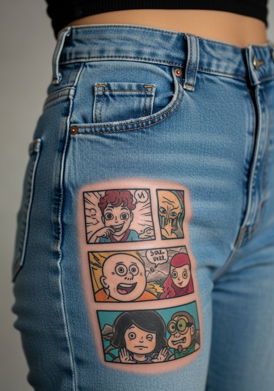
Thigh placements give breathing room for stylized, cartoon panels. The mistake is cramming too many small panels into one thigh section. Instead, pick a trio of moments with clear separations and solid outlines to protect saturation. Sessions are comfortable and often allow for longer color passes. For the appointment, wear high-waisted shorts you can shift easily and consider a high-waisted denim skirt post-session to avoid waistband pressure.
25. Wrist Band of Tiny Icons in Repeat Pattern
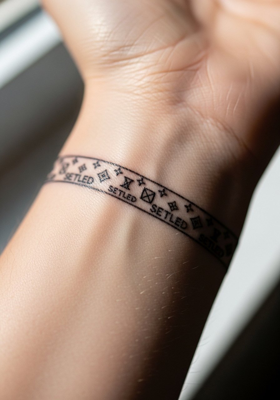
A repeated icon band reads like jewelry and suits wrists well if the icons are simplified. The common error is making each icon too intricate. Keep silhouettes bold enough to resist washing friction. The session is short but expect more fading than upper-arm work. Stack with a minimalist watch or a thin chain bracelet to enhance the band without rubbing the tattoo.
26. Sleeve Accent: Wave Panel Wrapping the Elbow
Elbow-adjacent work moves with a joint and suffers from extra friction, so plan for reinforced outlines and larger shapes that won't collapse into indistinct smudges. The session requires careful movement and likely a slower approach. For comfort, wear a loose button-down shirt you can slide without compressing the area. Expect elbow-facing panels to need touch-ups more often than the shoulder.
27. Hidden Ink: Tiny Coordinate Behind the Collarbone
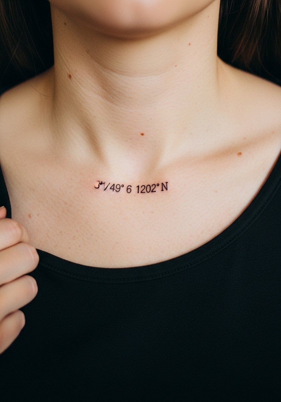
Hidden collarbone tattoos feel personal and sit close to curves, so letter sizing matters. When you ask for coordinates, specify exact characters and request a stencil check standing to confirm placement. Sessions are short and pain is moderate. For post-session comfort, wear a wide-neck top that does not rub the area. These tiny marks age relatively gracefully if spaced and scaled correctly.
Frequently Asked Questions
Q: Will fine line One Piece designs blur faster than bolder styles on the forearm?
A: It depends on scale and spacing. Forearms tolerate fine line better than wrists or fingers, but if you compress detail into a tiny area the lines can merge after a couple of years. Ask for slightly bolder anchor lines with lighter interior detailing to delay that effect.
Q: How should I dress for a ribcage or sternum session to make the artist’s life easier?
A: Wear a cropped top, sports bra, or a shirt you can lift that does not rub the tattooed strip. For ribcage work specifically, a cropped athletic top is ideal because you can expose the area without removing layers. Comfort matters because you'll need breaks.
Q: Do watercolor accents need different maintenance than blackwork panels?
A: Yes. Watercolor tends to fade faster and benefits from denser color at the core and occasional refreshes. Blackwork holds shape longer when saturation and spacing are sufficient. If you love watercolor, plan for a touch-up at year two to keep tones vivid.
Q: Are hand and finger tattoos a bad idea for fans who work in professional settings?
A: Hand and finger tattoos remain visible and some workplaces still restrict them. If your career could be affected, consider placements that are easy to cover like the upper arm or inner bicep. If you go for a finger piece, keep it small and discuss touch-up frequency with the artist.
Q: How do I choose between a micro-realism portrait and a graphic silhouette for a large back piece?
A: Think about viewing distance and storytelling. Micro-realism looks best at larger scale because tone separation needs room. Graphic silhouettes read well from afar and keep the image readable over long stretches of time. If you want both, plan staged sessions to balance detail and longevity.
