
Fine line scripts and tiny banners are everywhere, but they do not all age the same. Fine line that lives on an inner wrist will need a different line weight than the same phrase on a collarbone, and watercolor touches ask for more spacing from the start. Read these 21 small takes on "All You Need Is Love" and you will get placement pros, what to ask your artist in the consult, and real wardrobe tips to show the ink off.
1. Handwritten Cursive on the Inner Wrist
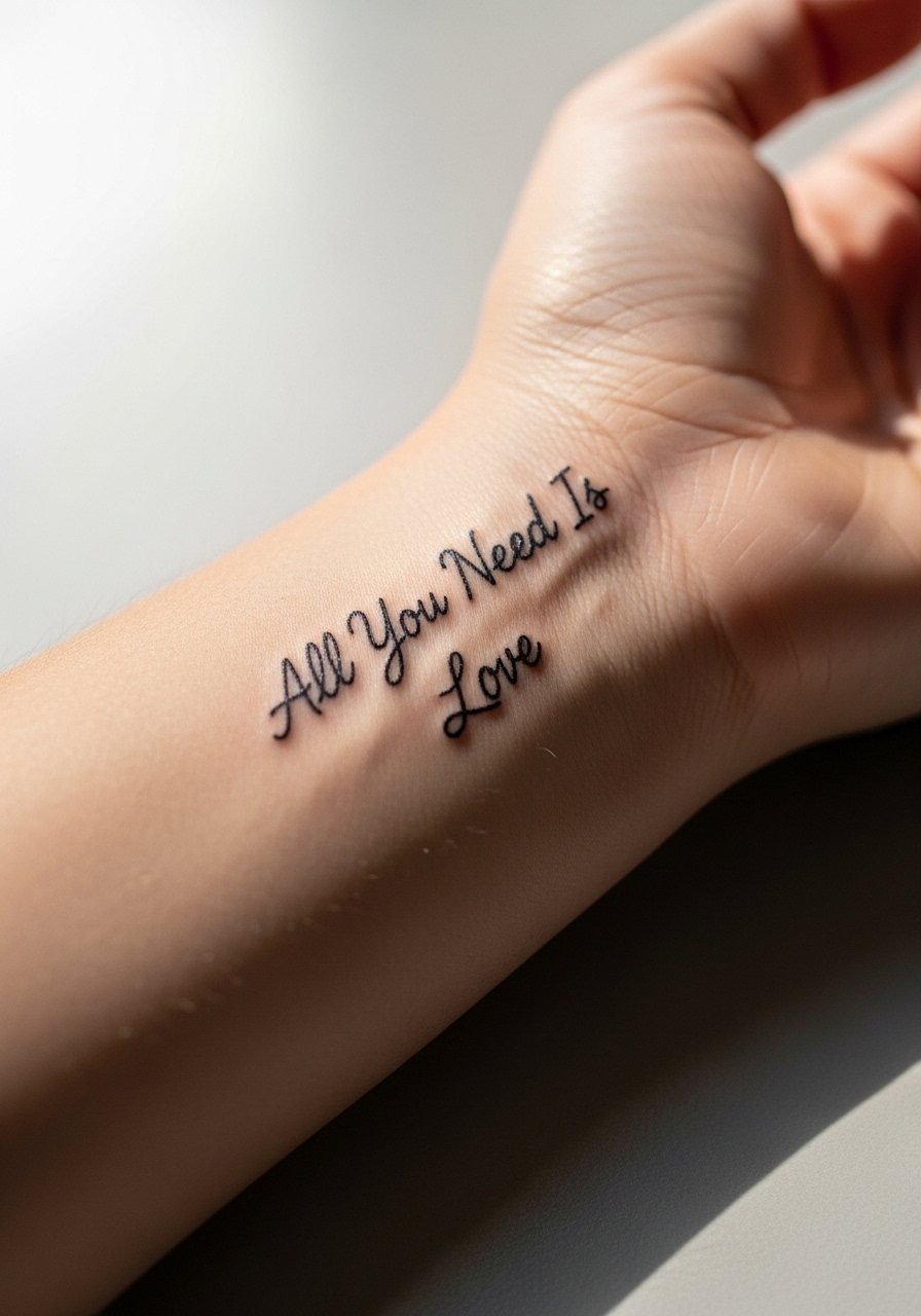
This is the minimalist, personal option people try first. I tell clients to request slightly thicker line weight than their phone mockup so the letters stay legible at year one and beyond. Pain is low and a single-session under 30 minutes usually does it. Common mistake is asking for hairline strokes that vanish after a year on a wrist. For the session wear, take off bracelets and slip on a sleeveless tank so the artist has clear access. To show it off, layer with dainty thin bangle set so the jewelry frames the script without crowding it.
2. Fine Line Phrase with a Tiny Heart on the Inner Forearm
This placement reads well at two to three inches and is a good balance between visibility and privacy. I advise asking for a slightly looser letter spacing during the consult so the letters do not merge as the skin moves. Expect a 45-minute session and mild soreness the next day. A frequent error is squeezing the phrase too narrowly to fit a reference image. For showing it off, roll cuffs up and pair with a rolled cuff chambray shirt that draws the eye to the inner arm and keeps the piece visible without shouting.
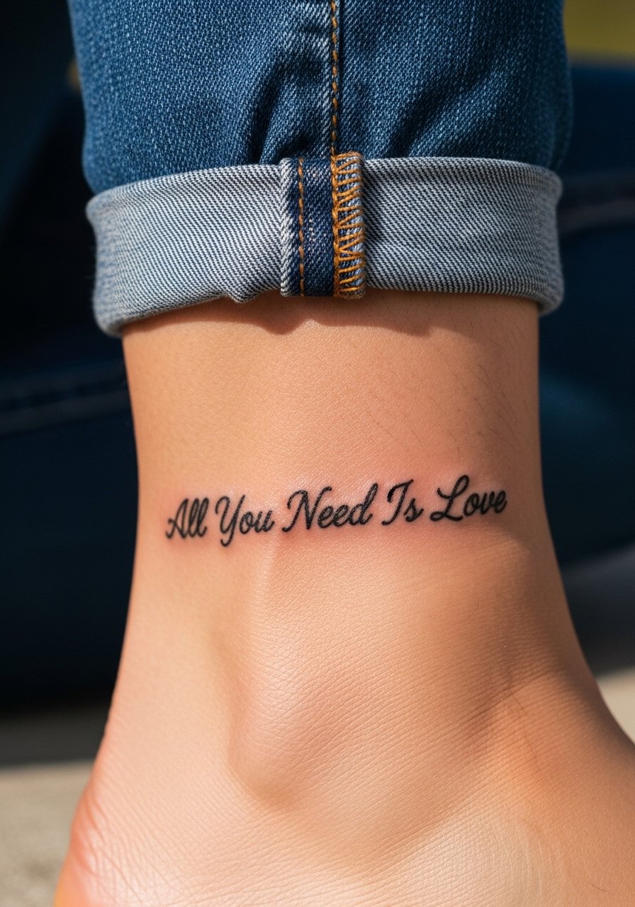
3. Minimalist Single-Line Font on the Ankle
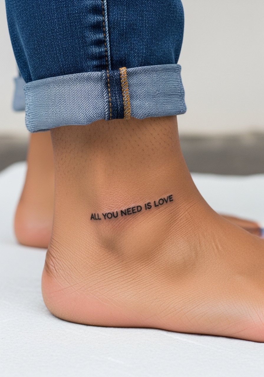
An ankle script scales down well but lives in a high-friction zone from shoes and socks. Tell your artist you want slightly bolder strokes than the reference so the letters do not thin out after healing. Session time is short, under 30 minutes, with moderate discomfort if you sit awkwardly. The usual mistake is placing the text too close to the bone where blowout risk rises. For summer show-offs, cuffed jeans and strappy flat sandals expose the ankle without rubbing the fresh ink.
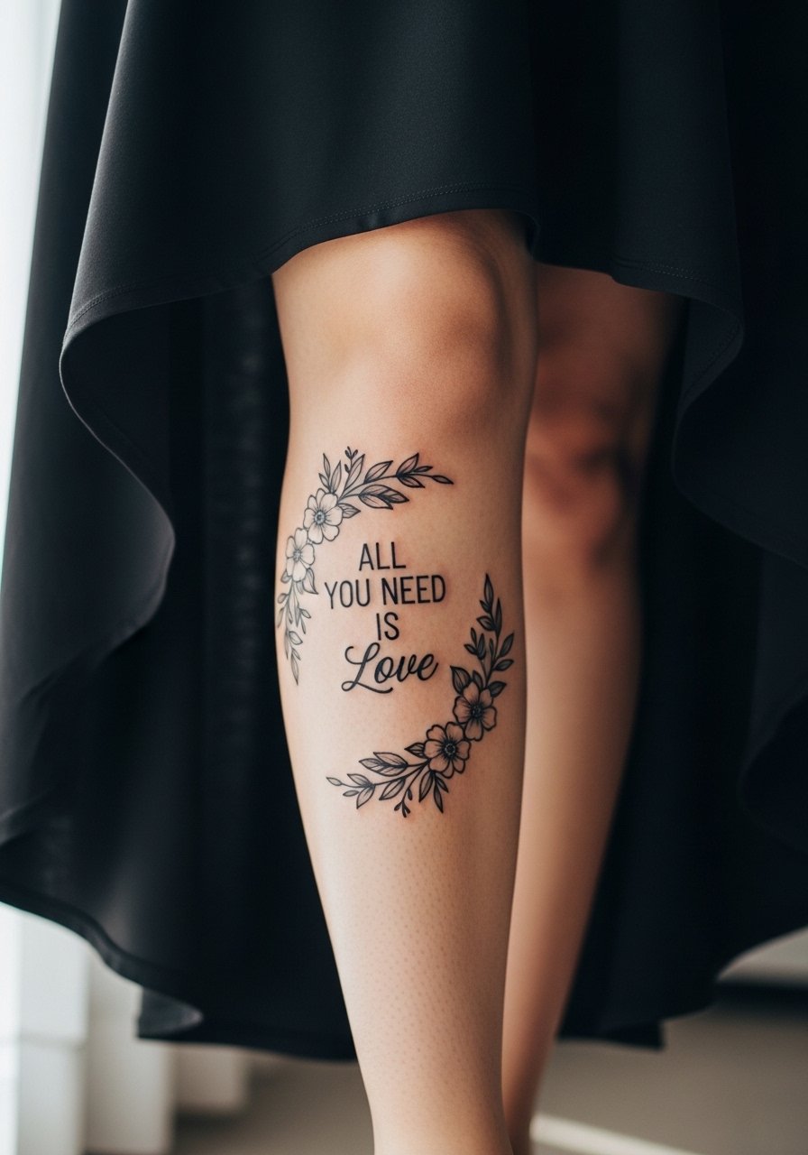
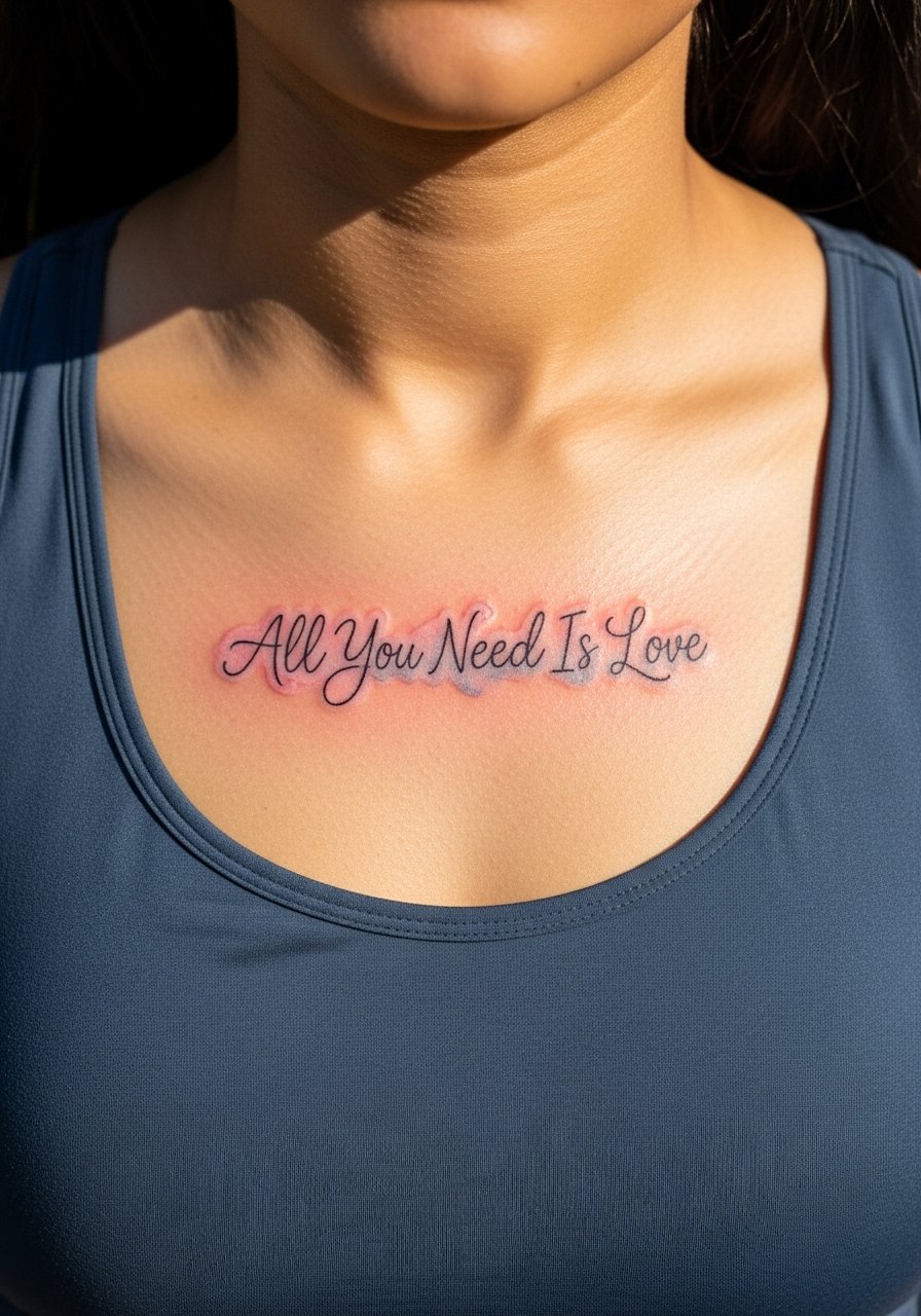
4. Watercolor Phrase with a Floral Wash on the Collarbone
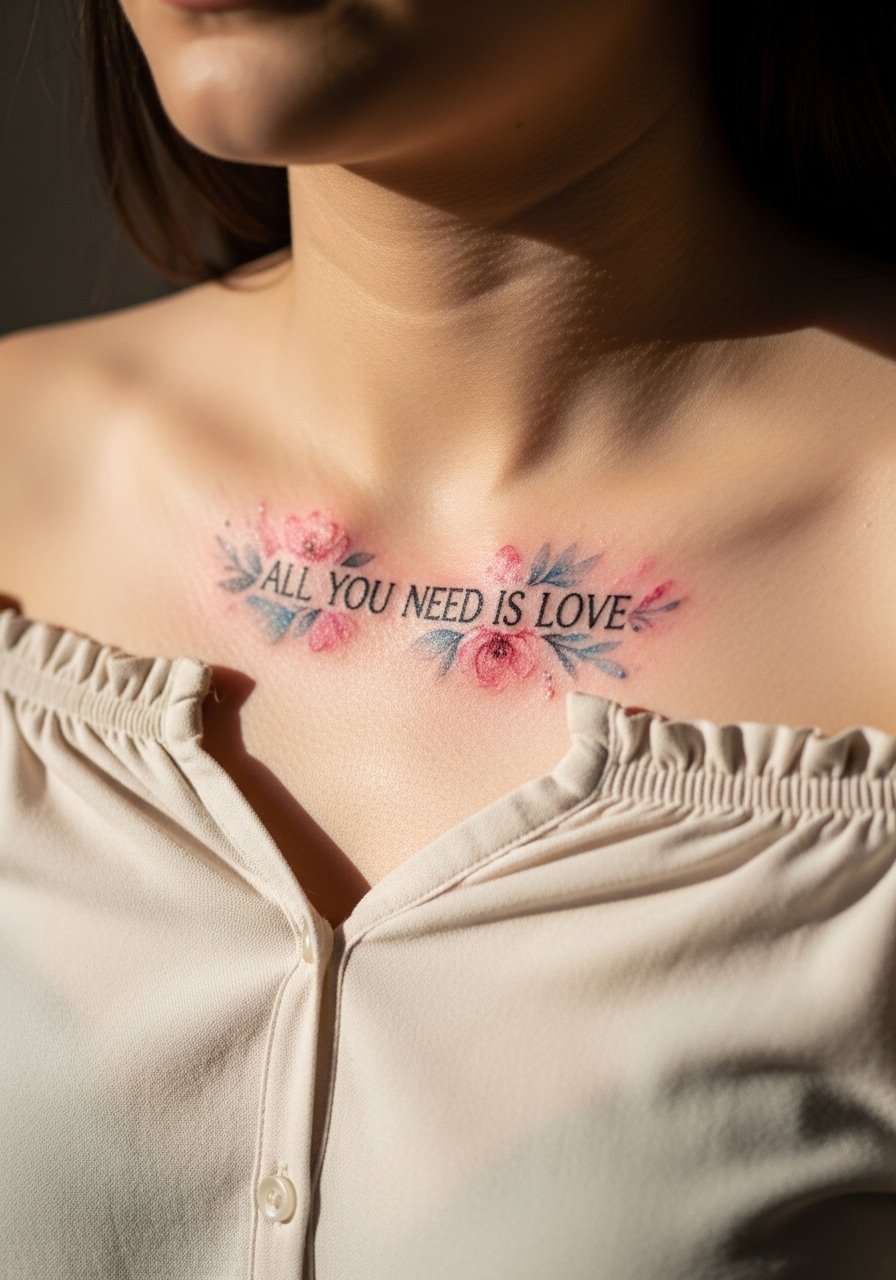
Watercolor adds emotion but asks for more space around letters so the pigment does not bleed into detail. I suggest requesting a muted color palette and clear black outline for the script so the phrase remains readable as the wash fades. Pain is low in this area, but sun exposure makes retention variable. A common version that ages poorly uses saturated reds very close to delicate letterwork. For showing it off, pair with an off shoulder blouse pastel that frames the collarbone and keeps the wash visible.
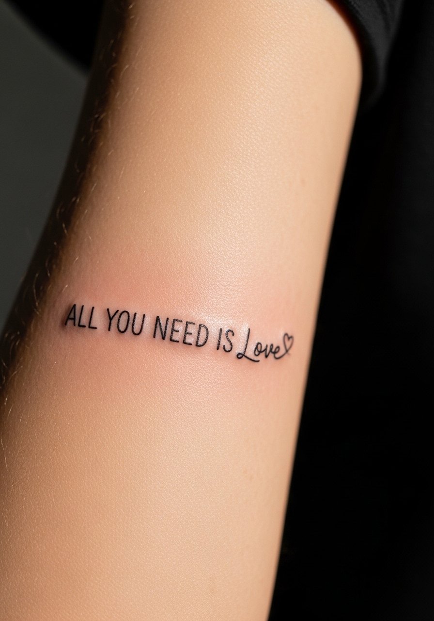
5. Blackwork Geometric Phrase with Interlocking Hearts on Outer Forearm
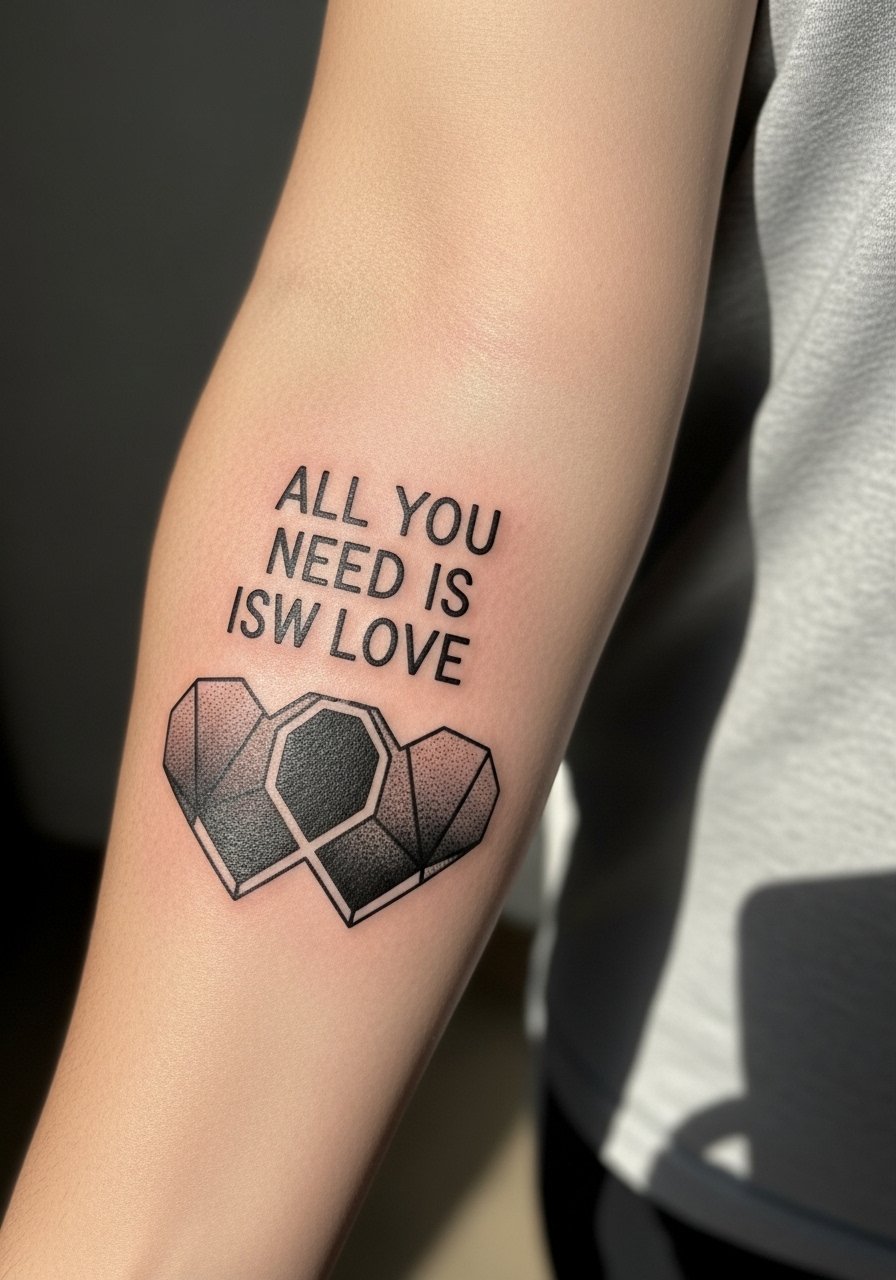
Bold blackwork is the counter to fine-line fading. If longevity matters, ask for saturated fills and clean negative space. This style takes longer than a simple script, often an hour to 90 minutes, and can sting more where the skin folds. The mistake is trying to make this too small; the geometry needs breathing room or the shapes merge. For casual wear, a fitted henley shirt with sleeves pushed up frames the outer forearm without covering the work and looks intentional.
6. Neo-Traditional Banner with Ribbon and Roses on the Upper Arm
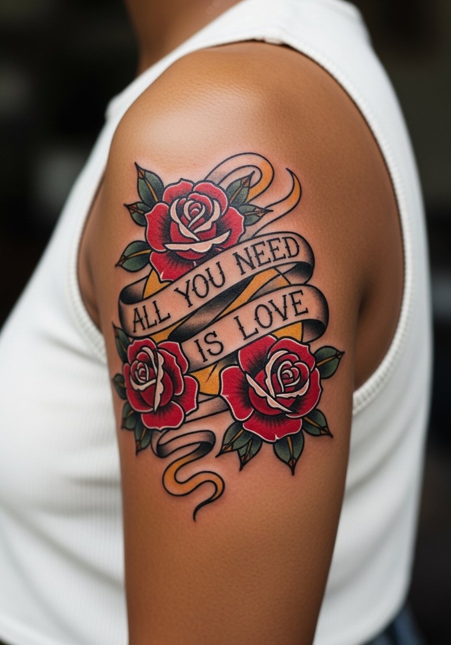
Upper arm pieces are forgiving for beginners and age well because the skin there moves less. Tell your artist you want the banner scaled to the muscle curve, not the flat photo reference. This one commonly goes two sessions if color saturation is a priority. Expect moderate pain and a comfortable chair session. Sleeveless tops make the session easier but for an evening look, a cropped leather jacket over a sleeveless silhouette gives edge without hiding the piece.
Studio Day Picks
The wrist and inner-forearm pieces above heal differently from collarbone and upper-arm work, so a few small items smooth the session and the first week.
- Stencil transfer paper kit. Helps you preview exact placement on skin before the needle starts, which matters for the wrist and ankle scripts listed above.
- Topical numbing cream. Use 30 to 45 minutes before a sensitive spot like the ribcage or inner bicep to reduce immediate pain without compromising linework.
- Thin protective film roll. Keeps small hand and finger pieces cleaner during the first week of washing and daily friction.
- Fragrance free gentle body wash. A mild cleanser reduces irritation around delicate fine-line work while you shower.
- Aquaphor healing ointment. A thin layer for the first few days locks in moisture for tight scripts without clogging the thin needle channels.
7. Dotwork Phrase Framed in a Mini Mandala on the Ribcage

Ribcage work is a commitment because it can be painful and movement affects fine detail. Artists split on whether fine line holds there. One camp says the skin stretch blurs delicate lines within two years. The other camp argues that with correct depth and spacing, fine line can settle nicely. My advice is to pick the dotwork mandala as a buffer around the script so the phrase has negative space to breathe. Expect a longer single session and plan for a touch-up at year two if you want crispness retained. Wear a cropped top the day of the session so the artist can access the area without fuss.
8. Script with Intertwined Hands on the Inner Bicep
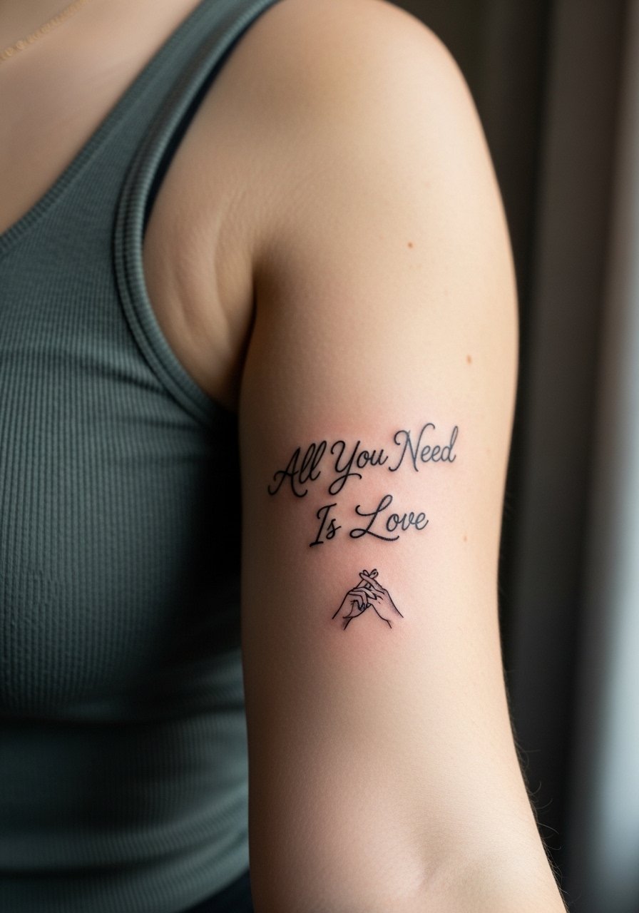
The inner bicep is intimate and soft, which changes sensation and healing. During consults I tell people to show reference for hand placement so the illustration reads as a connection rather than awkward geometry. Typical session time is under an hour and the area can bruise more easily. A common mistake is asking for ultra-thin strokes there; the flesh can blur them faster than on a forearm. For the appointment wear a loose tank you can lift or slide for access without pulling tight across the area.
9. Micro-Realism Phrase on a Vintage Record Label, Shoulder Blade
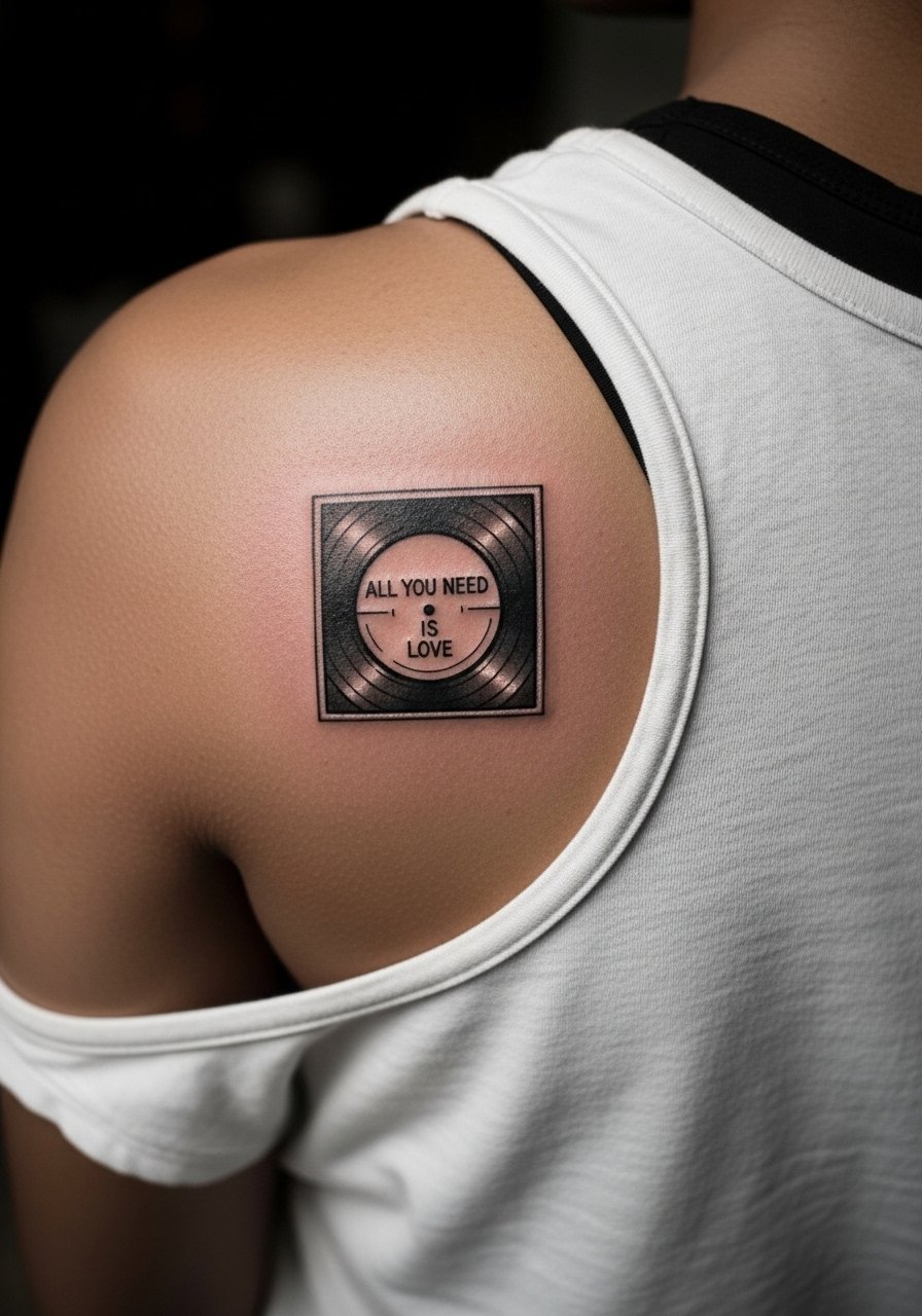
Micro-realism demands crisp contrast at a small scale. Tell your artist you want clear separation between fine text and background shading so the phrase does not disappear into gray washes. Expect a careful one to two hour session with brief breaks. The main mistake is crowding lettering with too many tiny details. For showing it off, sleeveless halter tops keep the shoulder blade visible and let the small label peek out under loose outer layers. Try a sleeveless halter top that keeps the look casual.
10. Ornamental Vine Border Wrapping a Script Around the Calf
Calf wraps follow the body's curve so the design should be drawn to contour, not pasted from a flat image. Expect about an hour for a small wrap and moderate soreness walking for a day. A mistake I see is asking for a tight repeat pattern that becomes visually heavy when the leg moves. For showing this placement off, a high low hem dress or cropped joggers rolled to the mid-calf shows the vine without rubbing the fresh ink.
11. Traditional Bold Heart Banner Across the Forearm
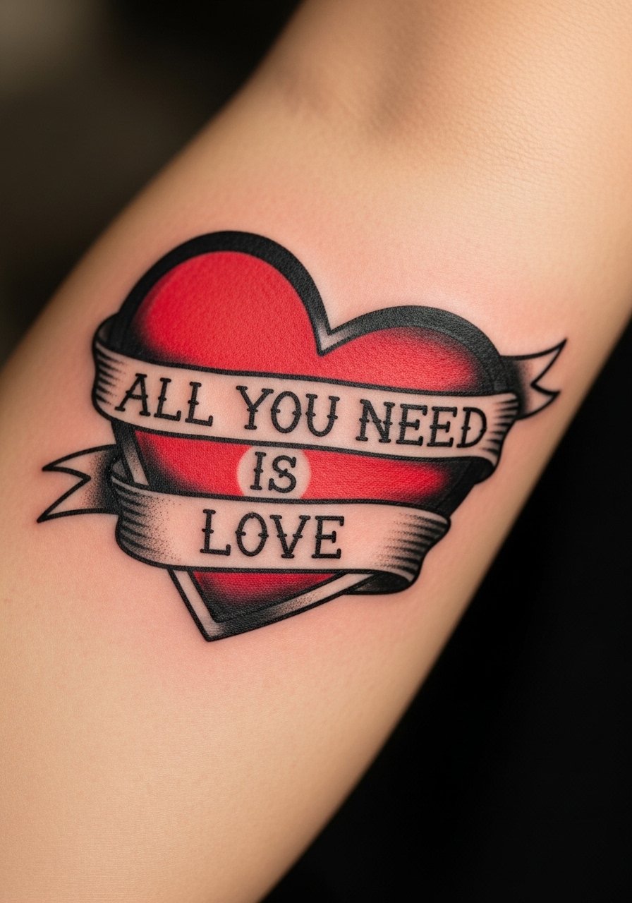
Traditional style is built to age. Thick outlines and saturated fills hold up better than fine script in active zones. If you want visibility that lasts, ask for a clear banner width and solid color fills. Session time is typically 45 to 60 minutes for a small banner and touch-ups are less frequent than with fine line. A frequent error is asking for tiny lettering inside a tiny banner. For everyday framing, a minimalist leather watch on the opposite wrist balances the look without crowding the forearm.
12. Micro Script Ring Around a Finger
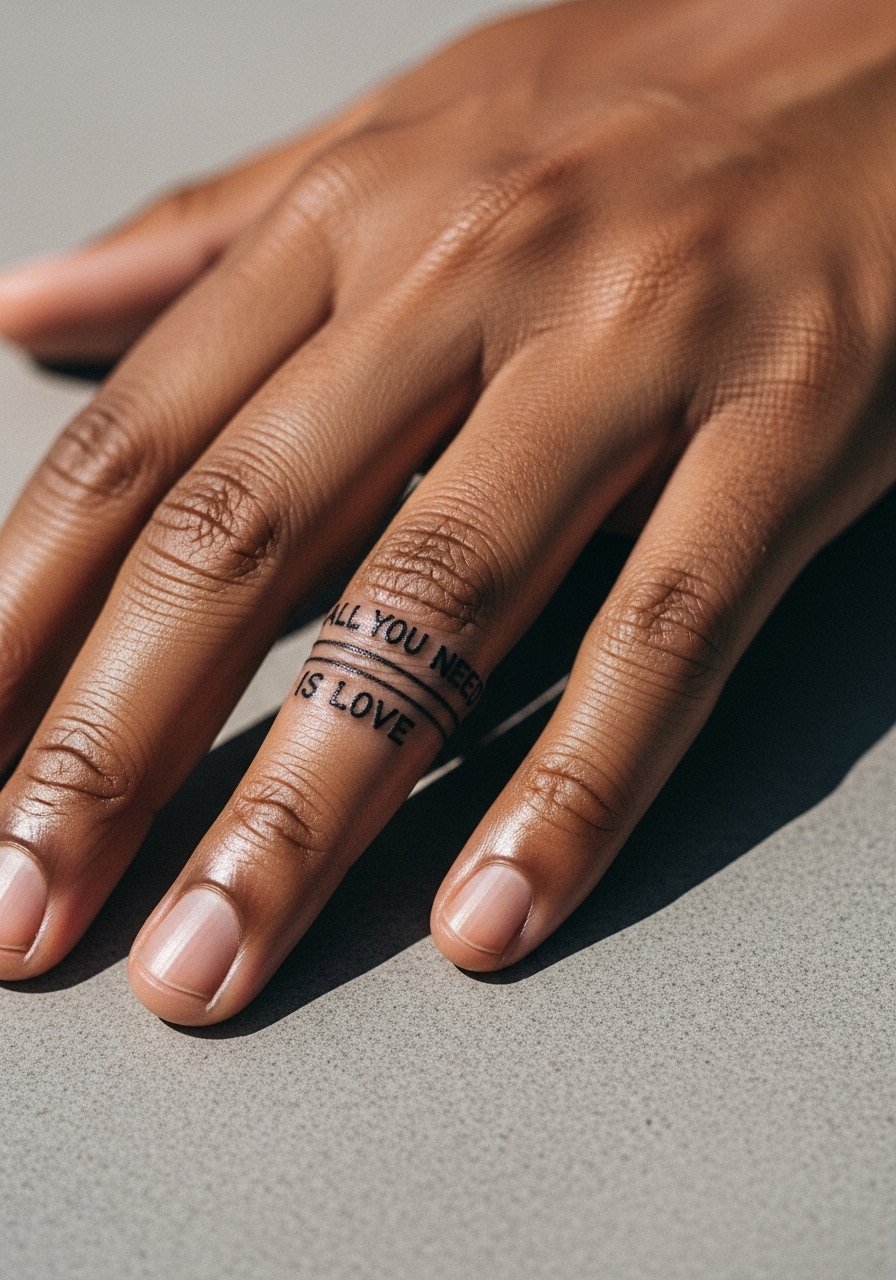
Finger bands are highly visible but they fade faster due to constant washing and skin thickness. I warn people that touch-ups are often needed at year one and again around year three. The mistake is expecting a ring-like permanence without maintenance. Session time is short but the healing is fussy because of movement and friction. Consider this a personal promise piece more than a maintenance-free option. Hand tattoos can still affect employment in some industries, so think about career context before committing.
13. Geometric Frame Turning the Phrase into a Modern Patch on the Outer Forearm

Geometric framing modernizes the phrase and gives the letters room to settle. Tell your artist you want spacing between letters and frame lines so the shapes do not merge as the tattoo ages. This one can be completed in about 60 minutes. A common error is going too small with dense geometry. For casual wear, push up sleeves on a push up sleeve tee to keep the forearm visible and the geometry readable.
14. Tiny Script Below the Hairline Behind the Ear
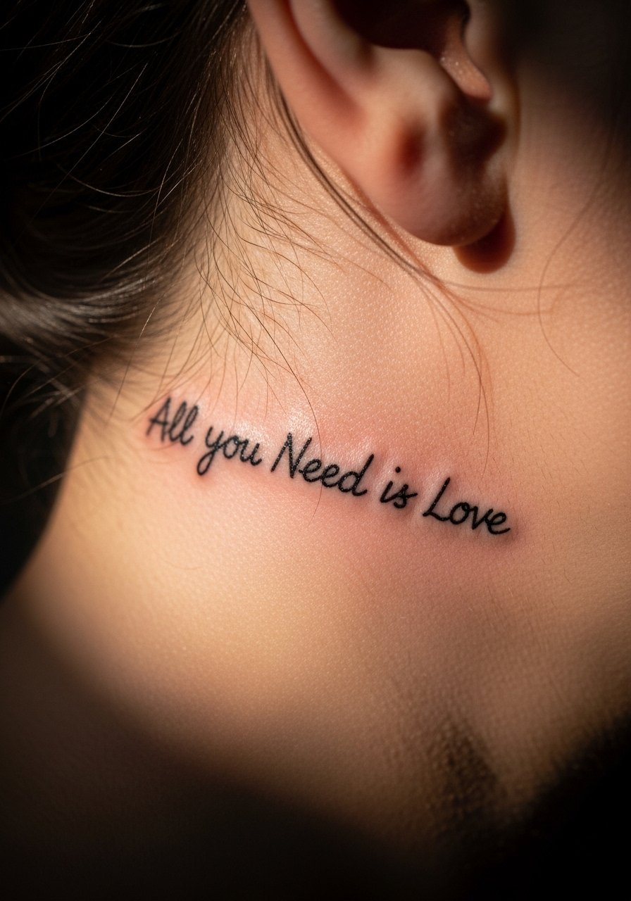
Behind-the-ear scripts are discreet and need careful placement so they sit on skin below the hairline. A key consultation point is how hair will cover or reveal the text depending on your style. The area heals quickly but can be tender. One mistake is asking for too many tiny curls in the letters because the small canvas does not support ornate loops. Keep in mind that short hair or updos will make the tattoo more visible. If you want versatility, plan your hair and accessories around the reveal.
15. Sternum Watercolor Mini Phrase Near the Sports Bra Line
Sternum tattoos require a sports-bra day-of setup so the artist can access the area without full exposure. Watercolor here looks delicate but fades faster because of friction from clothing, so I recommend a muted wash and clear black script for longevity. Pain is above average for many clients and sessions can be slow. The common mistake is commuting straight after with a tight bra that rubs the fresh ink. Bring a loose zip-up or a strapless option for the session day so dressing does not irritate the area.
16. Inner Thigh Script with a Small Floral Accent
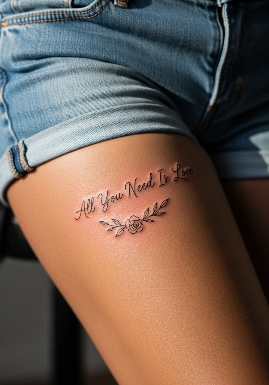
Inner thigh ink is private and can be sensitive while healing. I tell people to expect more swelling and occasional friction from clothing for the first week. A typical mistake is choosing extremely thin script that moves with thigh flesh and blurs. Ask for a modest letter weight and slight spacing so the phrase breathes as you move. For the session, wear loose shorts you can pull up without tight elastic over the area.
17. Small Vertical Spine Script Between the Shoulder Blades
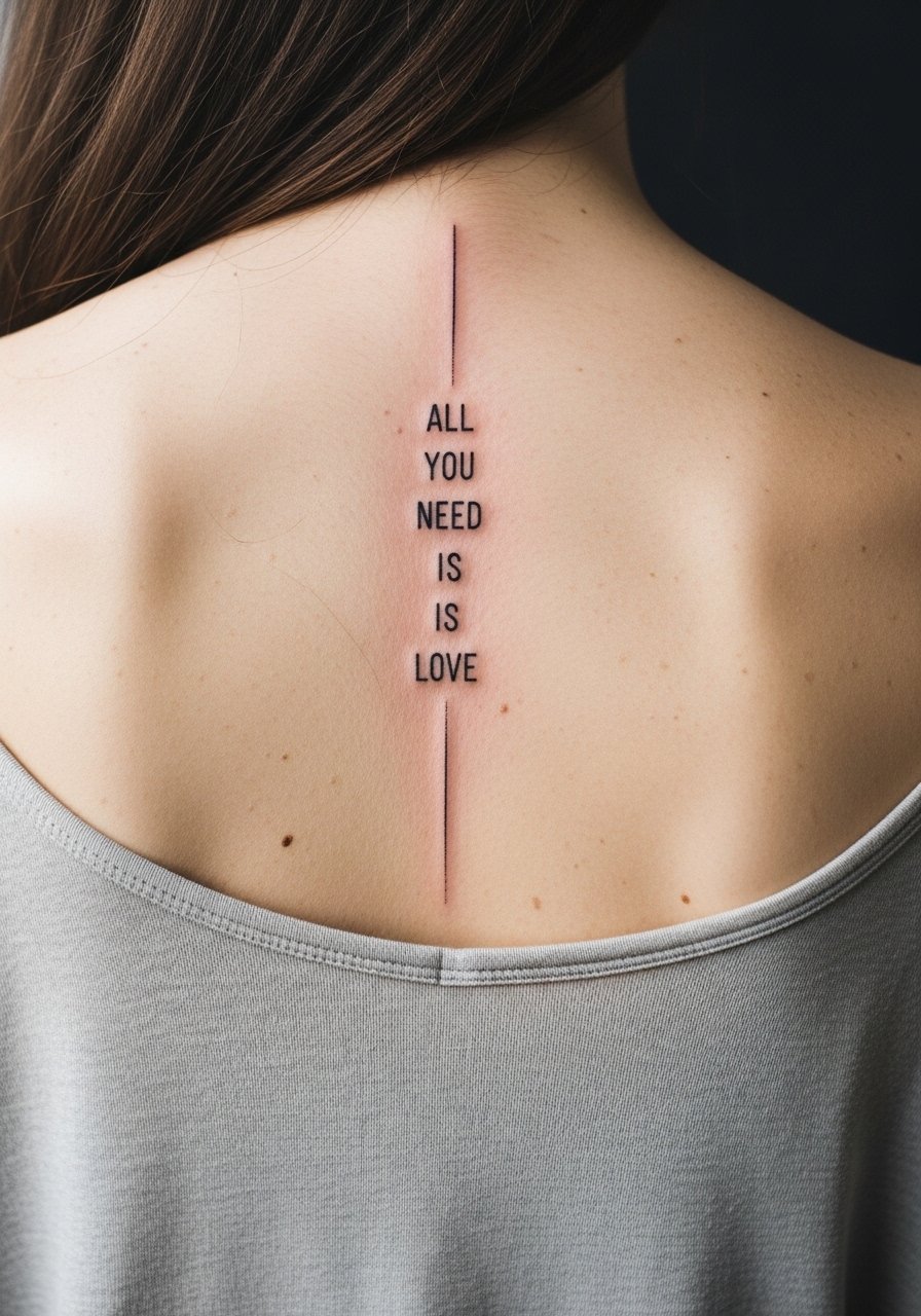
Spine scripts read striking when centered and spaced vertically. Pain varies by spot but expect sharp sensations near the spine. Tell your artist you want slightly thicker strokes than a flat mockup to preserve legibility over time. The frequent error is crowded type that looks fine fresh and then softens into indistinct marks. For showing this off later, open-back dresses reveal the vertical line elegantly, try an open back midi dress when you want to let it breathe.
18. Tiny Script on the Top of the Foot
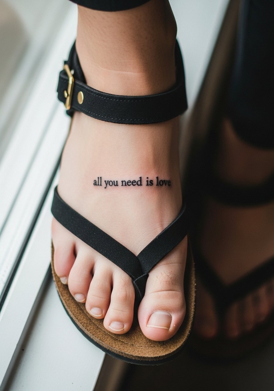
Top-of-foot tattoos are visible and vulnerable to rubbing from shoes, so plan footwear for the first two weeks. I advise clients to request a slightly bolder letter stroke and not to place letters over tendons where movement distorts the script. Sessions are quick but healing is fussy. A mistake is expecting this area to be maintenance-free. For warm-weather showing off, strappy sandals work best and keep pressure off while you heal. Consider pairing the look with strappy flat sandals.
19. Small Script Above the Ankle on the Inner Side
This inner-ankle placement reads like a private signature and is less exposed to toe friction than top-of-foot designs. Ask for clear spacing and a tiny heart or dot to anchor the phrase so it does not look like a smudge when healed. Common problems include sitting too close to the bone where lines can spread. For easy access during the appointment, wear loose pants you can roll; for showing it off, cuffed jeans and low boots expose the area without damage.
20. Continuous Single-Line Script That Wraps Into a Tiny Heart on the Inner Wrist
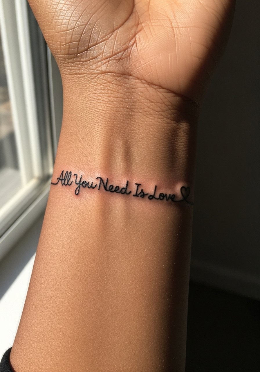
A single-line continuous script is playful and minimal but needs spacing and deliberate looping to remain readable. Tell your artist you want a continuous pass rather than separate strokes so the heart looks intentional, not accidental. Session time is brief and pain is low, but tight loops can blur over time. A frequent mistake is asking for an ultra-thin finish that becomes faint after six months. For the session, remove all jewelry and wear a beige linen tank so the area is accessible and the neutral fabric keeps focus on the wrist.
21. Thigh Wrap: Script Inside a Small Mandala Panel

Thigh wraps are forgiving for detail and age fairly well because the skin stretches less than in high-motion spots. I suggest asking for spacing around the script inside the mandala so the letters do not get lost in dotwork. Sessions can be longer depending on how much ornamentation you want, and pain is usually moderate. A common mistake is trying to compress too much detail into a small patch. For showing the piece, high-waisted jeans you can lower slightly or a rolled jogger pants look casual and let the thigh wrap peek through.
Frequently Asked Questions
Q: Will a fine line "All You Need Is Love" blur faster on darker skin tones?
A: It depends on local contrast and the letter weight. I have seen fine line fade faster where contrast between black ink and skin is lower. Ask your artist to test a slightly bolder stroke in a temporary transfer or with a henna mockup to judge readability before committing.
Q: How often should I expect touch-ups for wrist and ankle scripts?
A: For fine line wrist and ankle pieces plan for a touch-up between year one and year three, especially if you work with hands or wear ankle-strapping shoes. Blackwork or bold banners usually need fewer touch-ups than delicate scripts in those zones.
Q: Does watercolor aging differ by placement compared with black and gray text?
A: Yes. Watercolor washes fade faster with sun and friction, so collarbone or shoulder placements need sunscreen and occasional color refreshes more than black and gray text, which tends to keep its shape longer.
Q: Should I do a temporary tattoo test before committing to script placement?
A: Absolutely. I recommend using a transfer or temporary in the exact spot for a few days so you can see how clothing, movement, and visibility feel in real life. It helps catch placement regrets before the needle ever touches skin.
Q: Are there wardrobe tips for showing off a small collarbone or sternum phrase?
A: For collarbone phrases, off-shoulder blouses frame the area nicely. For sternum work, strapless or sports-bra styles avoid rubbing while healing and let the piece read as intended.
Q: If I want longevity, should I choose blackwork over fine line for the same phrase?
A: If you prioritize how a piece looks after several years, bold blackwork holds up better in high-friction zones. Fine line can be beautiful fresh, but expect maintenance for wrists, hands, and feet. Trust your artist's take on line weight and spacing for the placement you choose.
