
Fine line hand pieces often look fragile on a screen but read deliberate in person, and that matters when you want a matching tattoo that feels private and considered. Small, well-spaced marks on the knuckle or side of the hand usually hold better than dense micro detail, and the right placement keeps the design readable as skin moves. Below are 27 matching hand ideas with what to ask for, how they age, and how to show them off.
1. Matching Tiny Symbol on the Side of the Hand
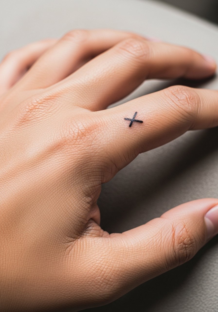
Start with a simple glyph that has meaning for both people, such as a small compass, crescent, or single dot. The side of the hand holds detail better than the pad because movement is less extreme, but it still fades faster than the forearm. Tell your artist you want slightly bolder linework than a typical fine line to avoid early blurring. Pain is moderate and sessions are quick. For showing it off, pair the piece with a thin chain bracelet that sits just below the wrist so attention travels naturally from hand to arm. Avoid requesting dense shading here, it blurs first.
2. Mirror Dots Across Corresponding Fingers
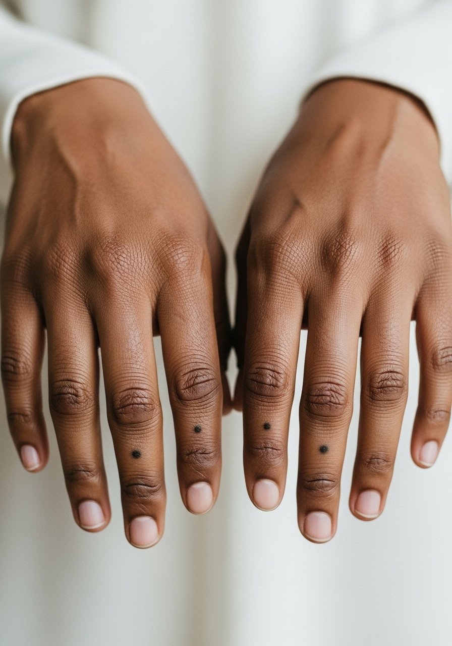
A single dot or a trio of microdots on the same finger of each person reads cohesive without crowding the skin. The dots should be spaced to avoid merging with natural creases, and you should ask for a single-pass solid dot rather than stippled fill. Hands and fingers rub a lot, so expect a touch-up window around year two. Light-weight rings or a minimalist signet ring pair well to frame the dots without hiding them. This design fits friends or partners who want something discreet but shared.
3. Matching Micro-Constellation Across the Knuckles
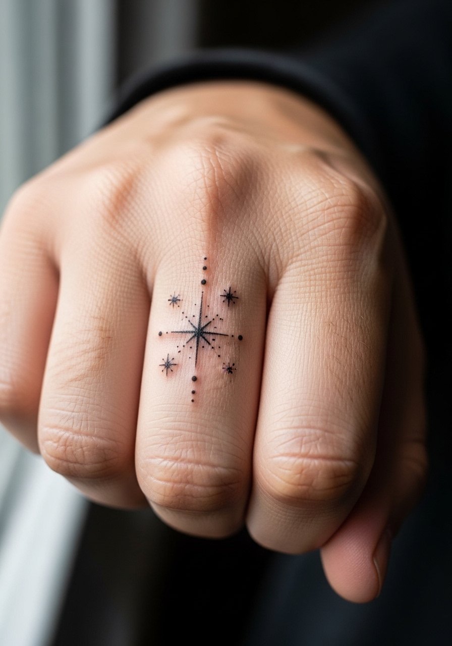
Tiny star clusters follow knuckle lines nicely when you space points to avoid seam collapse. Tell your artist to map the constellation on your knuckles first so the stars avoid creases that cause blowout. Knuckle tattoos are high wear and tend to lose crispness, so plan for a touch-up after a year or two. During sessions expect high sensitivity with short bursts of work. For evenings out, stack with a slim leather bracelet that sits below the knuckles and keeps the constellation visible.
4. Matching Single-Word Script on the Side of the Finger
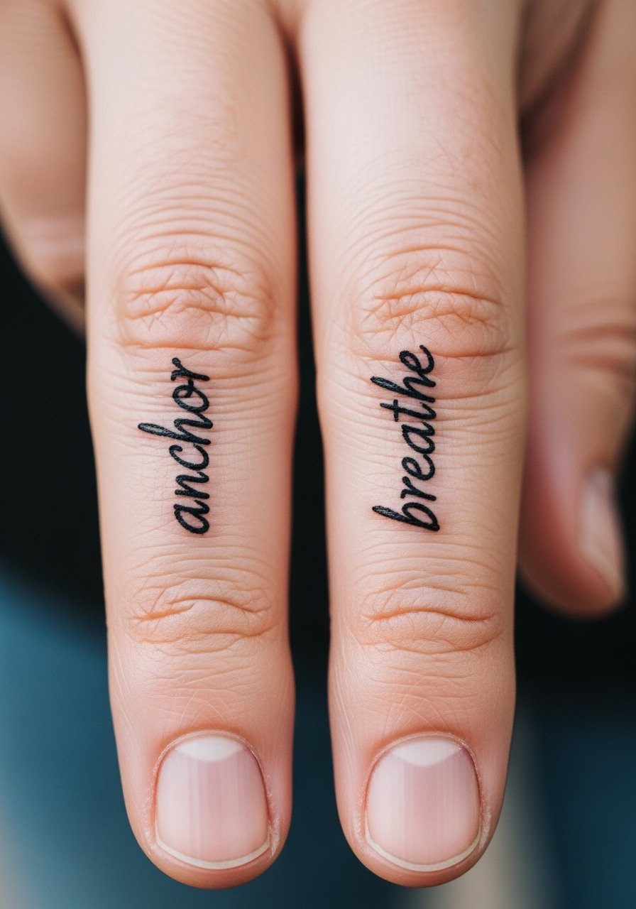
Script along the finger edge reads intimate and stays legible if letters are tall and spaced. Ask for a slightly increased line weight and for letters to avoid the crease zones. The debate about finger script longevity is active. One camp says the skin there moves too much and letters blur quickly. The other camp argues that with proper depth and wider spacing script can settle nicely. Ask your artist where they stand and view healed examples. For showing it off, a delicate ring set keeps the finger visible without crowding the script.
5. Matching Minimal Floral on the Back of the Hand
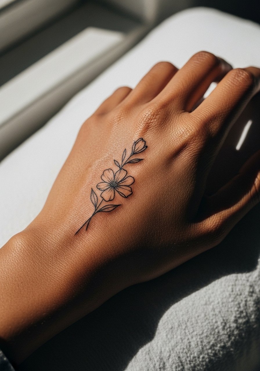
A small sprig or bud on the back of the hand reads organic and frames the knuckle without overwhelming it. Prefer open linework and avoid heavy fill near joints, as saturated areas break down sooner on hands. During consultation, show reference photos that match your style and ask for a single-needle or three-needle grouping for delicate stems. Pain is moderate and session time is short. Pair with a linen button-down shirt with rolled sleeves when you want the piece visible without looking staged.
6. Matching Geometric Negative Space on the Palm Edge
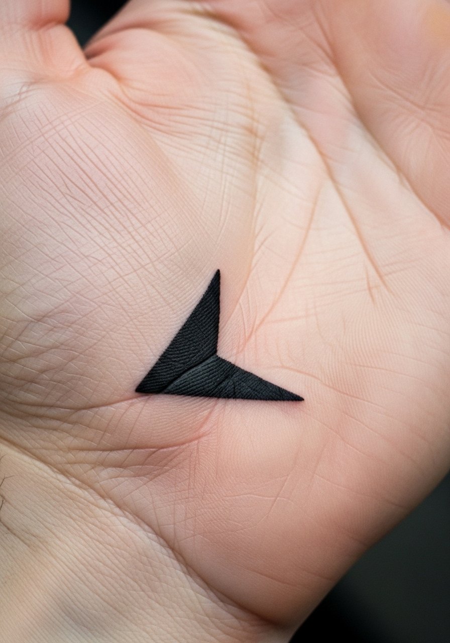
Negative space shapes that sit on the edge where palm meets hand can look crisp if lines are bold and the artist avoids tiny interior detail. Palms and immediate palm-edge areas are high fade zones, and artists split on whether palm work is worth it. One camp accepts repeated touch-ups as part of the design. The other camp discourages palm tattoos for longevity reasons. If you proceed, plan for frequent touch-ups and ask for heavier line weight. For session comfort, wear a short-sleeved shirt you can lift easily. Avoid dense stipple work here.
Pack Smart
Those small back-of-hand and finger motifs above live in high-friction zones, so simple prep and smart products make a big difference in the first week.
-
Stencil transfer paper kit. Lets you preview exact placement on the hand before the needle touches skin, which is crucial for knuckle and finger designs.
-
Topical numbing cream. Applied per the product instructions it can soften the edge for sensitive finger and knuckle sessions without altering linework.
-
Thin protective film roll. A breathable film shields hand tattoos from constant contact during the first 48 hours when scabs form.
-
Fragrance-free gentle body wash. Cleans the area without irritating freshly tattooed hands that are washed often.
-
Aquaphor healing ointment. A thin layer after the first day helps keep fine line work moist without clogging.
7. Matching Tiny Zodiac Glyphs on the Thumb Web
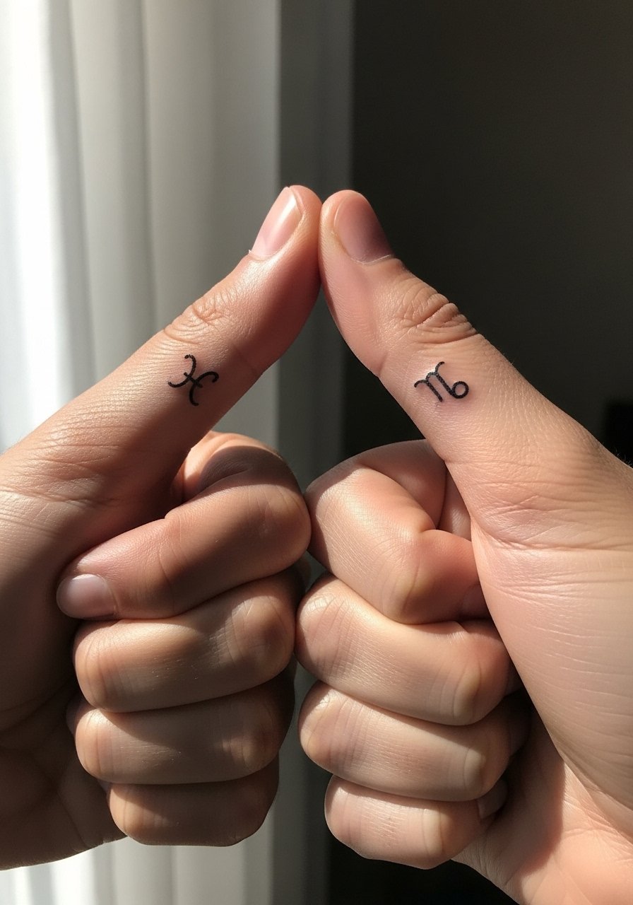
The thumb web is a tucked but visible spot that frames a small glyph well. Ask for clean, simple shapes with modest line weight, because very fine lines tend to merge in this textured skin. Pain levels are moderate and session times are short. These pieces pair well with a racerback tank when showing off your hands casually, or with a fitted glove for cooler months. Avoid micro shading that tries to mimic realism.
8. Matching Barcodes or Coordinate Lines Along Finger Sides
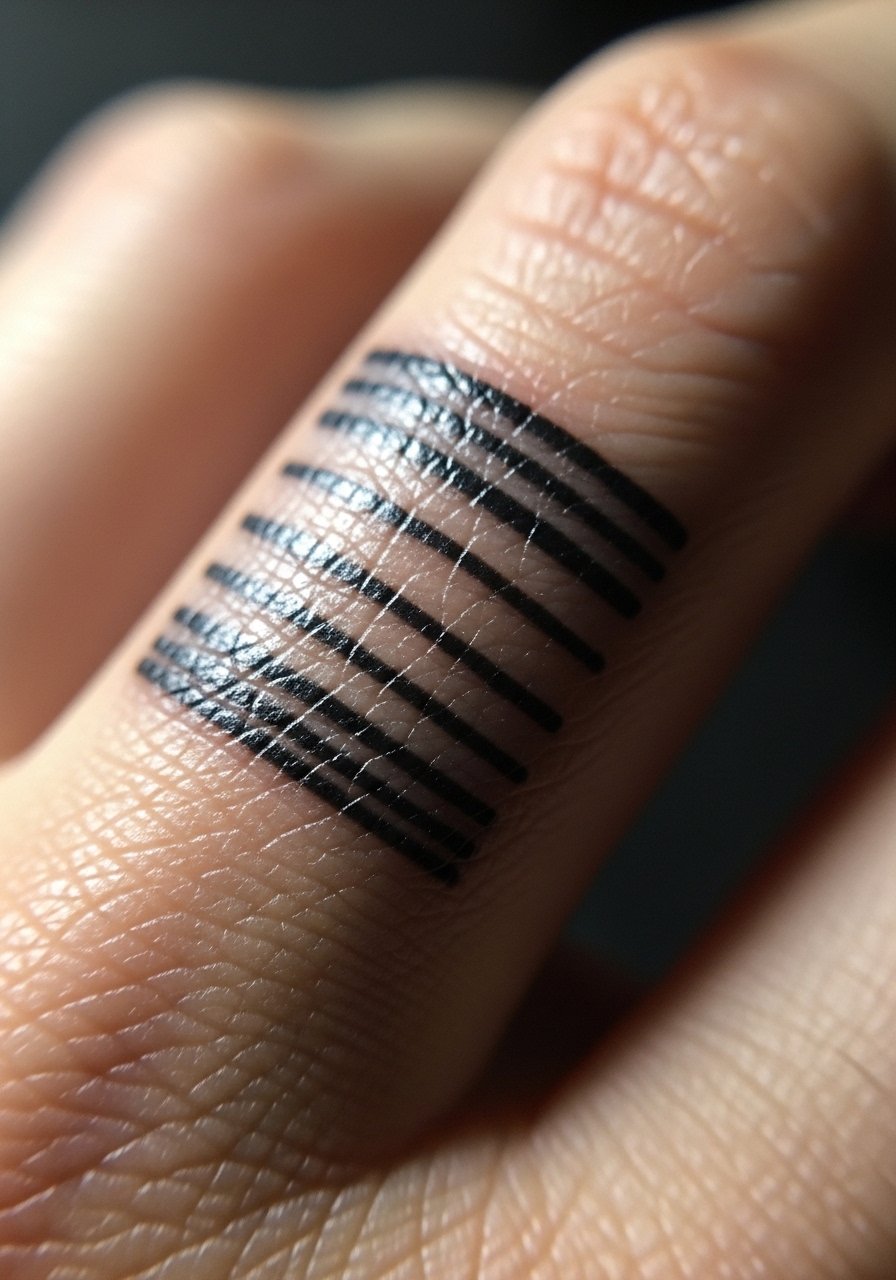
Linear barcode or coordinate marks rely on precise spacing and even pressure to stay readable. Have your artist stencil and check spacing against your finger creases so the lines avoid areas that flex the most. Expect gradual softening and plan for touch-up timelines at year two. These look clean with a single, low-profile band ring that does not overlap the tattoo. Keep the design simple and avoid tiny text along the band.
9. Matching Tiny Animal Silhouettes on the Back of the Hand
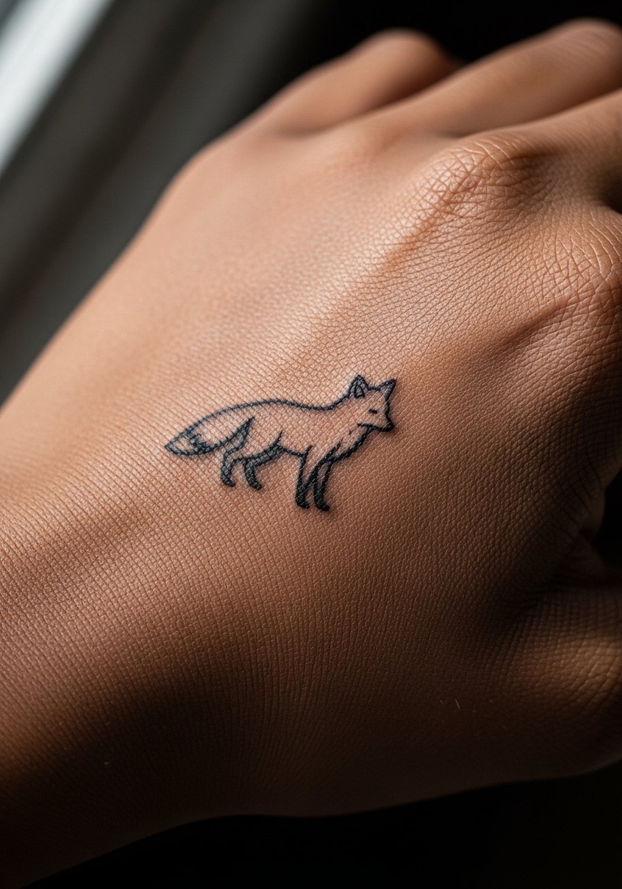
Micro animal silhouettes are personal and photograph well when kept small and bold. Use filled silhouettes rather than fine-detail realism for longevity on the hand. During consultation, pick a scale that reads at arm's length so the shape does not dissolve into a blotch. The session is brief but expect sensitivity when working near the knuckle. For showing it off, a slim leather watch balances attention between the wrist and hand without hiding the silhouette.
10. Matching Minimal Mandala Quarter on the Thumb Side
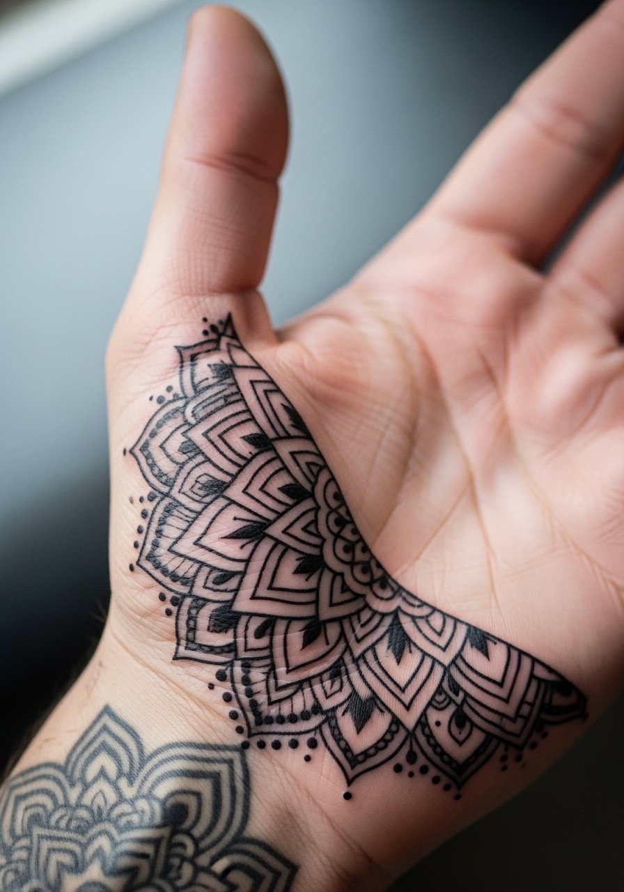
Quarter-mandala motifs echo larger mandalas but use negative space to avoid dense clustering on the hand. This pattern draws from traditional ornament but keep it simplified to respect cultural origins. Ask for an interpretation rather than a direct replication of sacred symbols. Hand placement needs spacing between spokes, and the common mistake is compressing too much detail into a small footprint. Expect the design to soften a bit over time and schedule touch-ups if you want the spokes sharp long term.
11. Matching Thin Line Wave on the Side of the Palm
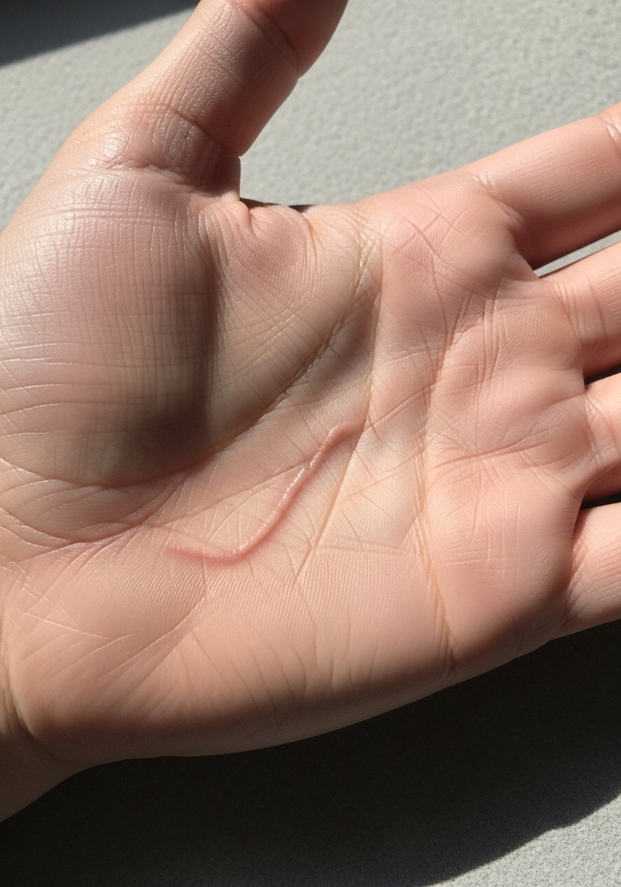
A simple wave or waterline along the palm edge works as a subtle matching motif. The trick is to keep the wave as a single continuous line with slight bolding so it does not vanish against heavy use. Palm-edge work is high friction, which shortens clarity, so expect more frequent touch-ups. For the session, wear a loose short-sleeve tee so your artist can access the area without rubbing. Avoid layering multiple thin lines close together.
12. Matching Tiny Knot or Loop at the Base of the Thumb
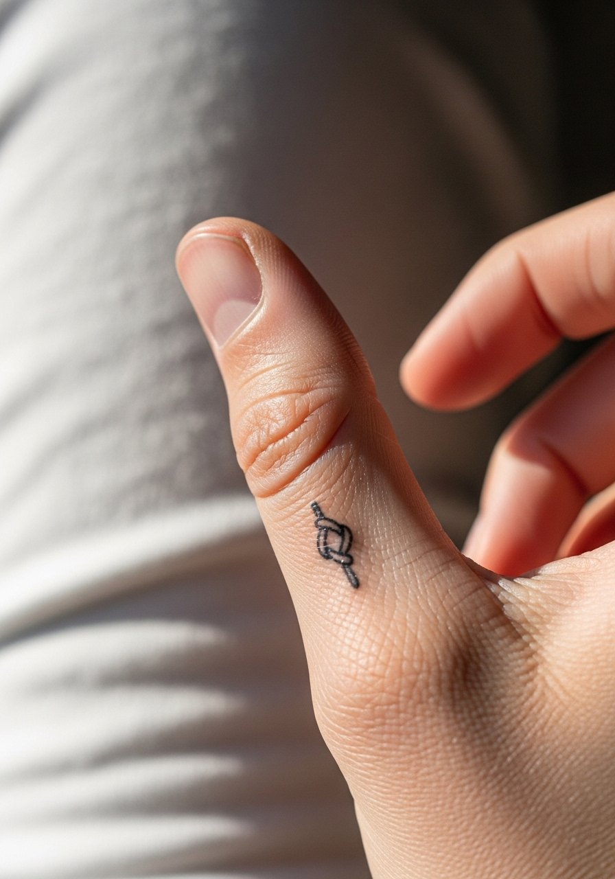
A petite knot symbol near the thumb base reads like a private signet. Ask for compact, slightly rounded lines that sit clear of joint creases. The base of the thumb endures frequent motion, so heavier linework helps the symbol keep its shape. This placement is friendly for people who want something visible but not headline-grabbing. Keep the design minimal and avoid filigree.
13. Matching Micro-Arrow Along the Finger Side
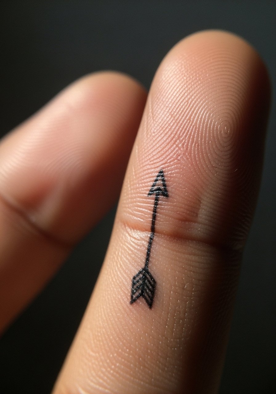
Small directional arrows along the finger side read modern and directional. For longevity, choose a single-stroke arrow with a modest shaft width so the triangular head does not eat into the line. Fingers see constant contact, so expect light blurring after a couple of years. For showing it off, thin stacked rings that do not cross the tattoo are ideal, and a minimalist stacking ring keeps attention on the arrow without covering it.
14. Matching Tiny Lock and Key on Adjacent Hands
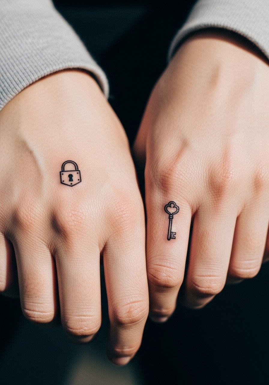
A lock and key pair is literal and sweet when scaled down to simple silhouettes. Keep both elements bold and free of tiny interior detail so they age uniformly. Placement on the back of the hand is visible and will fade faster than arm work. During consultation discuss how large the key teeth should be so they do not wash out. For casual wear, a loose cuff bracelet can frame both pieces neatly.
15. Matching Tiny Crescent Moons Along the Thumb Side
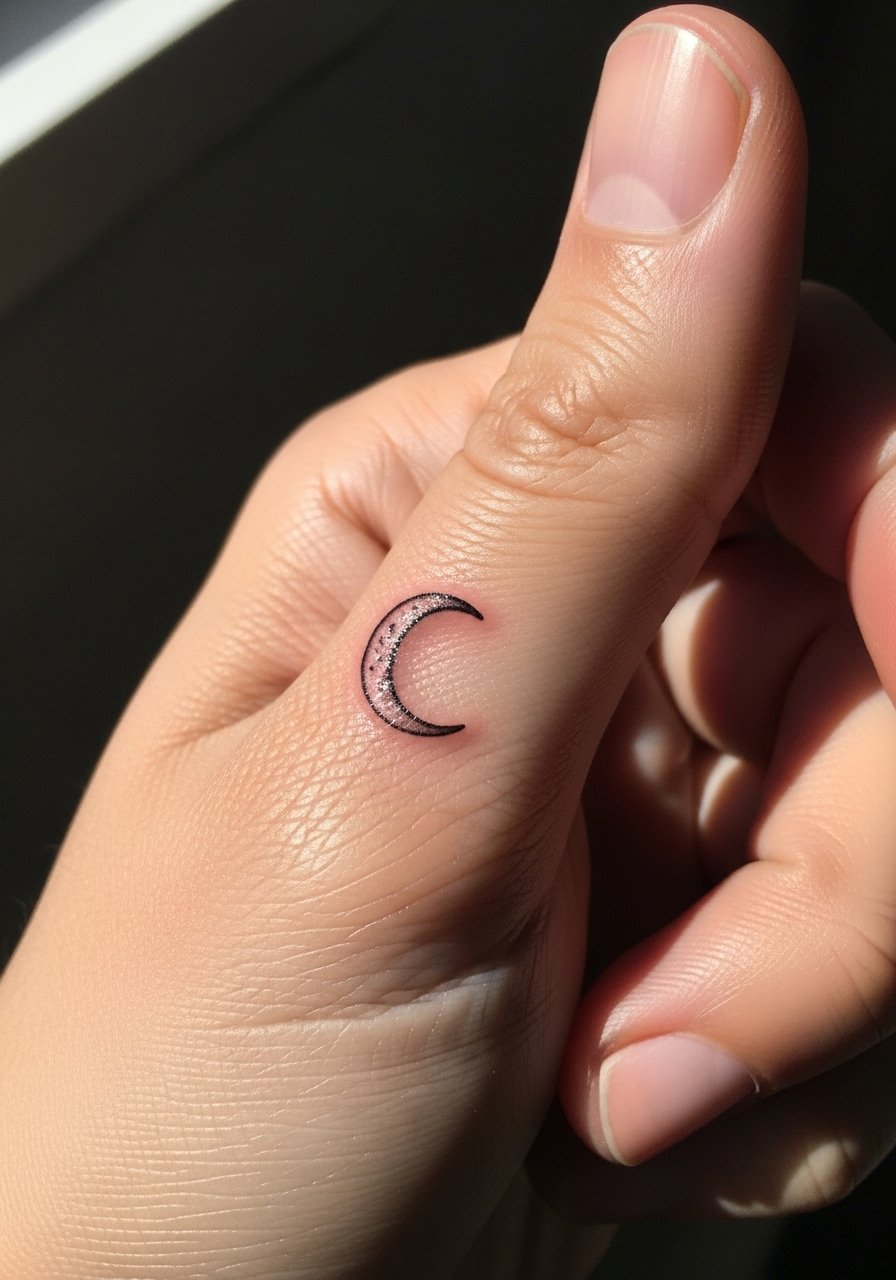
Crescents read well in narrow spaces and stay legible if you ask for a slightly thicker outer line. The common mistake is requesting a hairline crescent that becomes a smudge in months. Hands are exposed to soap and friction, so a moderate line weight makes the design last. For shows or photos, wear an open cuff bracelet that leaves the thumb area unobstructed. Expect a short session and light soreness afterward.
16. Matching Tiny Botanical Sprig Near the Wrist
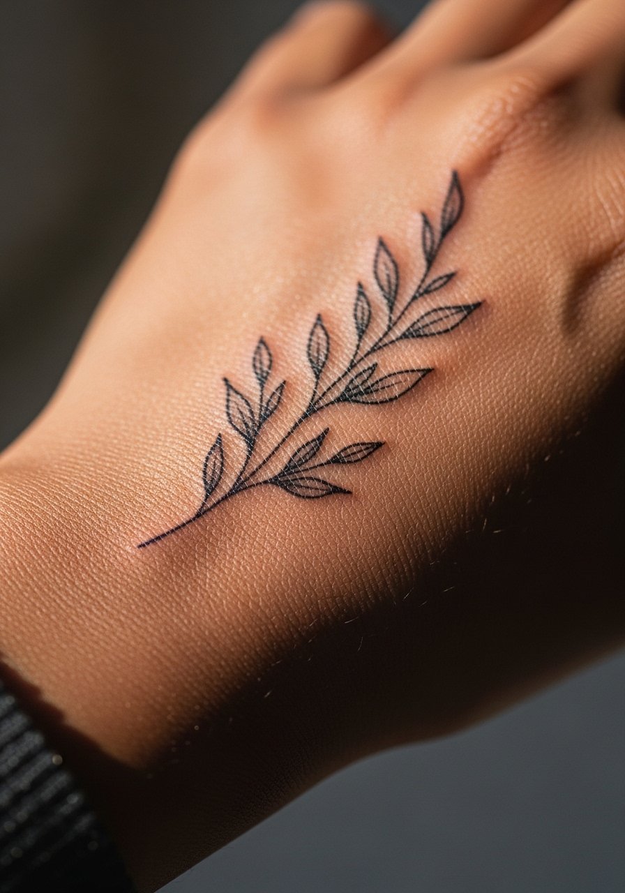
A small sprig by the wrist bridges hand and forearm visually. This area tolerates slightly more detail than fingers, so you can ask for a few leaves with stipple shading. The mistake is cramming heavy shading into tiny leaves; that fills in quickly. For longevity, ask for spacing between leaves and minimal saturation. When showing off, roll sleeves or choose a three-quarter linen shirt to let the sprig peek out.
17. Matching Puzzle Tabs at the Base of the Thumb
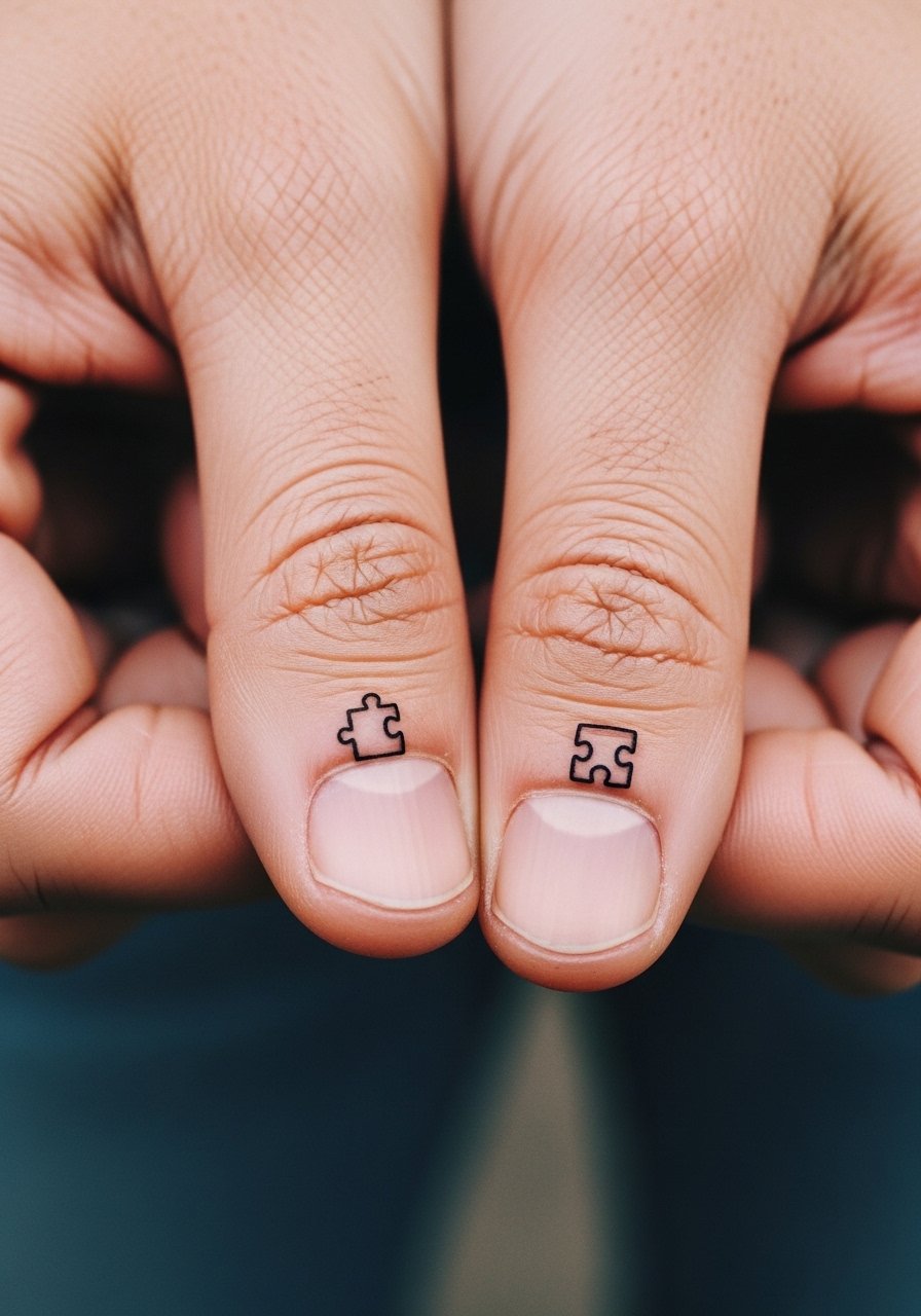
Puzzle tabs are playful and read clearly when kept geometric and bold. They sit where the hand flexes, so keep the tabs simple and avoid interior detail that will blur. These are great for friends who want a visible sign of connection without script. For the session wear a zip-up hoodie you can pull aside to expose only the thumb base. Expect touch-ups within a couple of years.
18. Matching Tiny Roman Numerals on the Side of the Hand
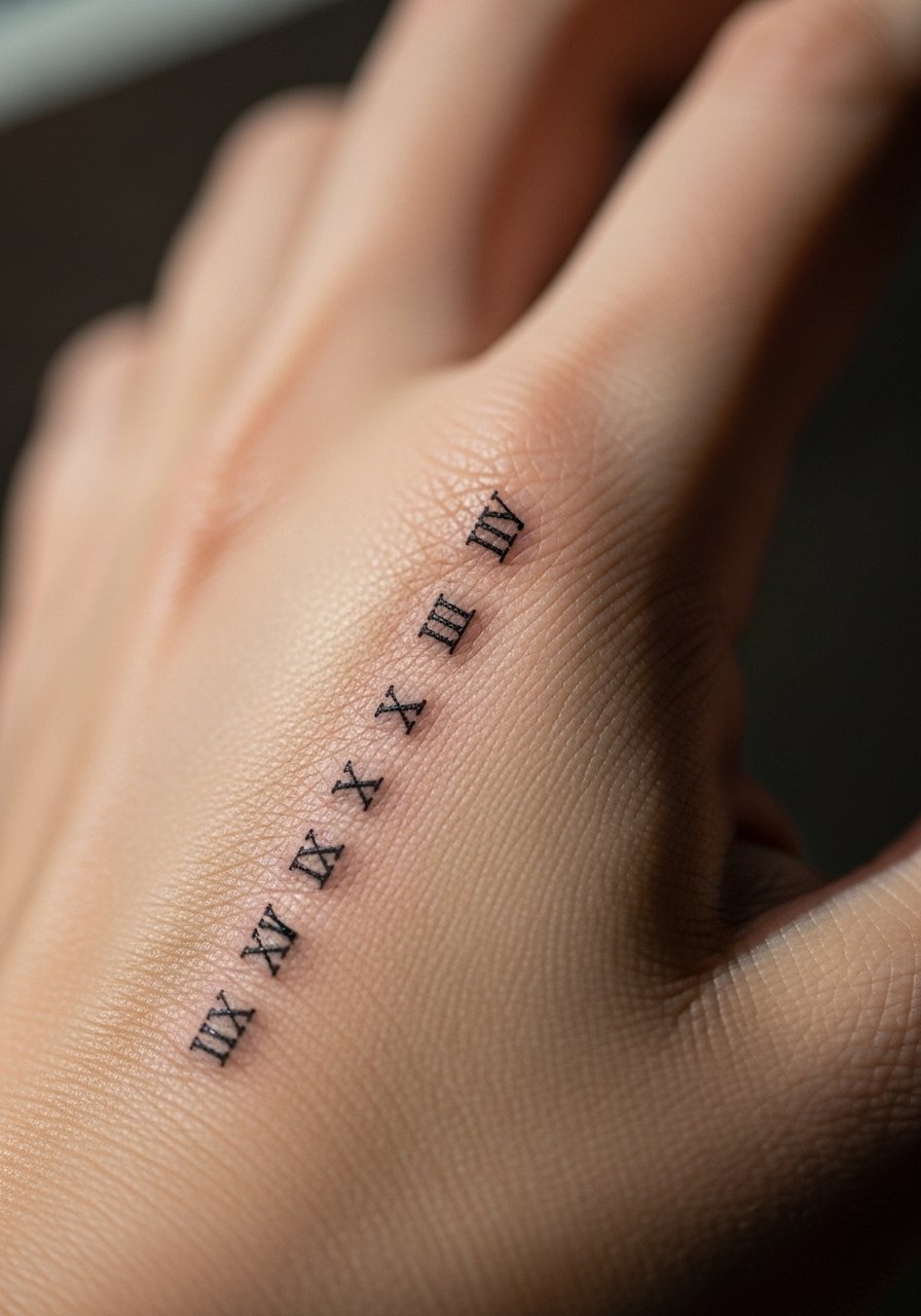
Roman numerals are good for dates that matter to both people. Use narrow, evenly spaced numerals and ask for moderate line weight so the small serifs do not disappear. Hands move a lot, so avoid placing numerals deep into creases. The main mistake is tiny font size that looks crisp at first and unreadable later. Pair with a slim bracelet or a thin chain necklace worn higher up to balance the composition.
19. Matching Tiny Anchor at the Wrist Edge
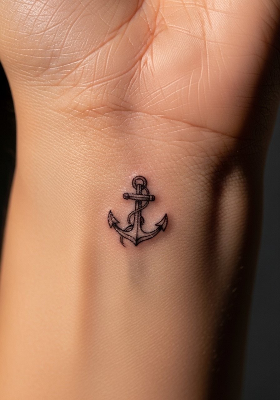
Anchors sit nicely at the wrist edge where they can be both visible and contained. Bold outline anchors outlast detailed shading here, and avoid placing the anchor over tendons that flex a lot. Tell your artist you want a simplified silhouette and ask them to map the placement while you flex your wrist. This placement pairs well with a thin leather strap bracelet that keeps the area visible without covering the design.
20. Matching Tiny Barcode-Style Coordinates on the Side of the Hand
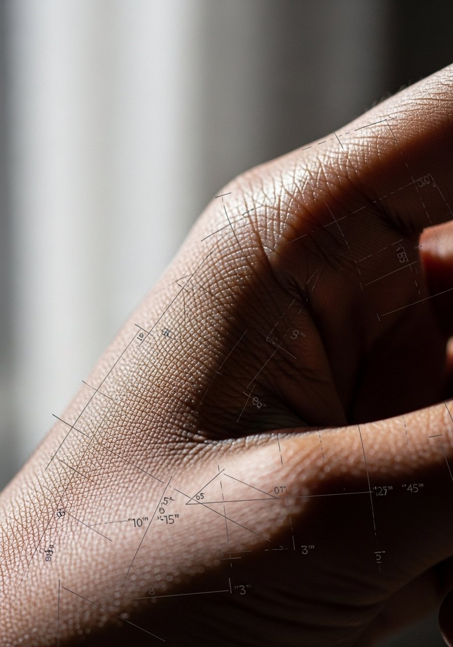
Coordinates or barcode lines that reference a shared place are subtle and modern. Keep the linework bold and avoid micro gaps that collect ink in undesirable ways. Coordinate numbers in tiny text rarely hold on the hand, so stick to simple glyphs or short numerals. For the session, wear a button-down shirt you can pull aside so your artist has clean access. Expect slight blurring over time and plan for a touch-up.
21. Matching Tiny Sun and Moon on Opposite Hands
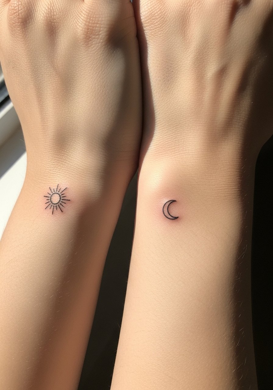
Sun and moon pairings read like a complete set and can be kept very small while remaining readable if you choose solid silhouettes. Ask for flat black fills rather than micro detail to avoid early loss of contrast. The hands are exposed to elements, which affects saturation, so plan for touch-ups later on. For a casual show-off, wear a short sleeve tee or linen top that keeps arms free and the hands visible.
22. Matching Tiny Feather on the Index Finger Side
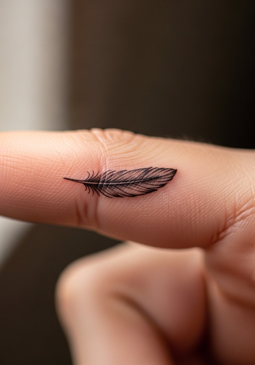
Feathers can be rendered with delicate barbs but fingers demand a simplified feather silhouette to stay legible. Ask for slightly open negative space between barbs and a modest shaft width. Fingers wear quickly, so expect thinning over time. The common mistake is requesting ultra-detailed barbs that fuse into a darker blob. Choose minimal styling instead.
23. Matching Tiny Heart Outline on the Back of the Hand
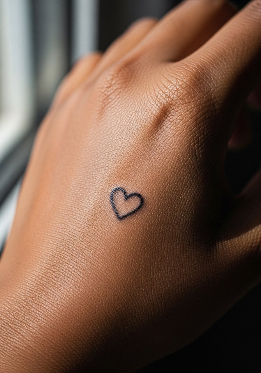
A small heart outline is classic and reads clearly when the outline is bold enough for high-friction zones. Single-line hearts often fade into faint rings if too thin, so request a little weight. This piece pairs well with dainty bracelets and a stacking bracelet set that frames the hand. Expect a short session and light soreness.
24. Matching Tiny Wave Dots Along the Thumb Base
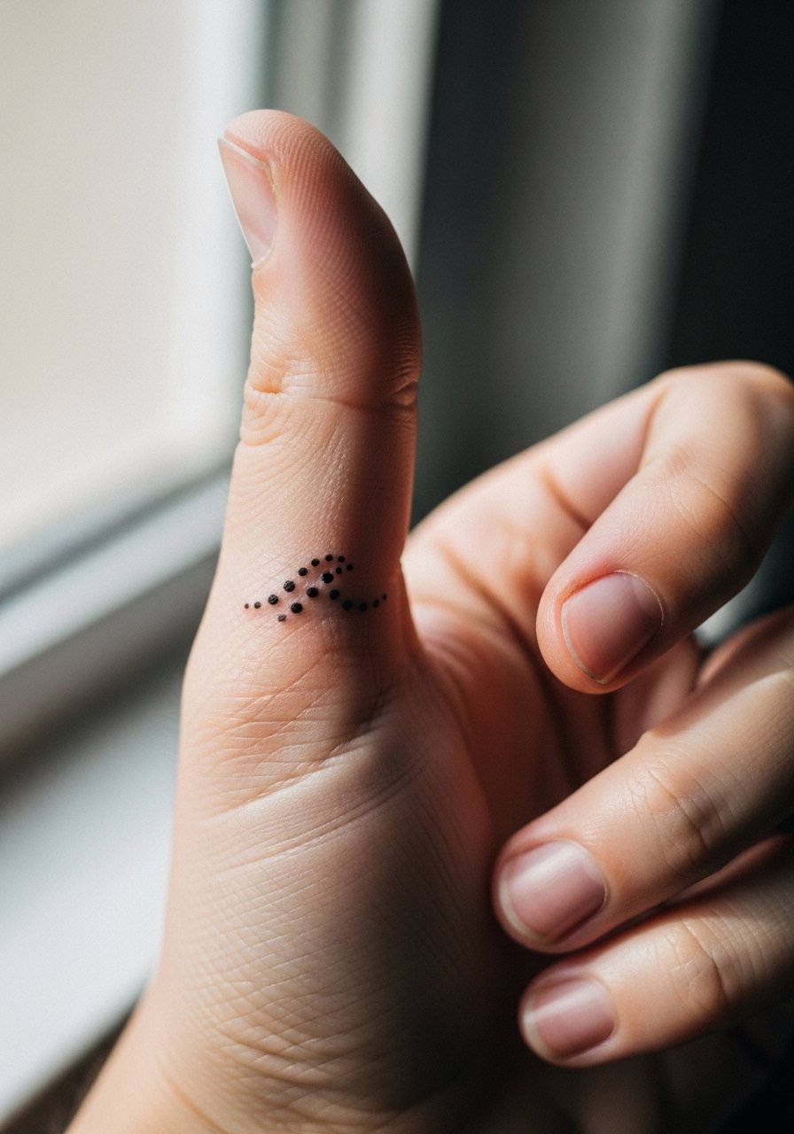
A dotted wave or series of dots at the thumb base is subtle and photographs well. Use dot work that is spaced generously to avoid merging. The mistake is making dots too cramped which accelerates the blurring process. This design is great for travelers or sea lovers and requires minimal session time. For comfort, wear a loose crewneck tee you can adjust during the appointment.
25. Matching Tiny Keyhole Near the Knuckle
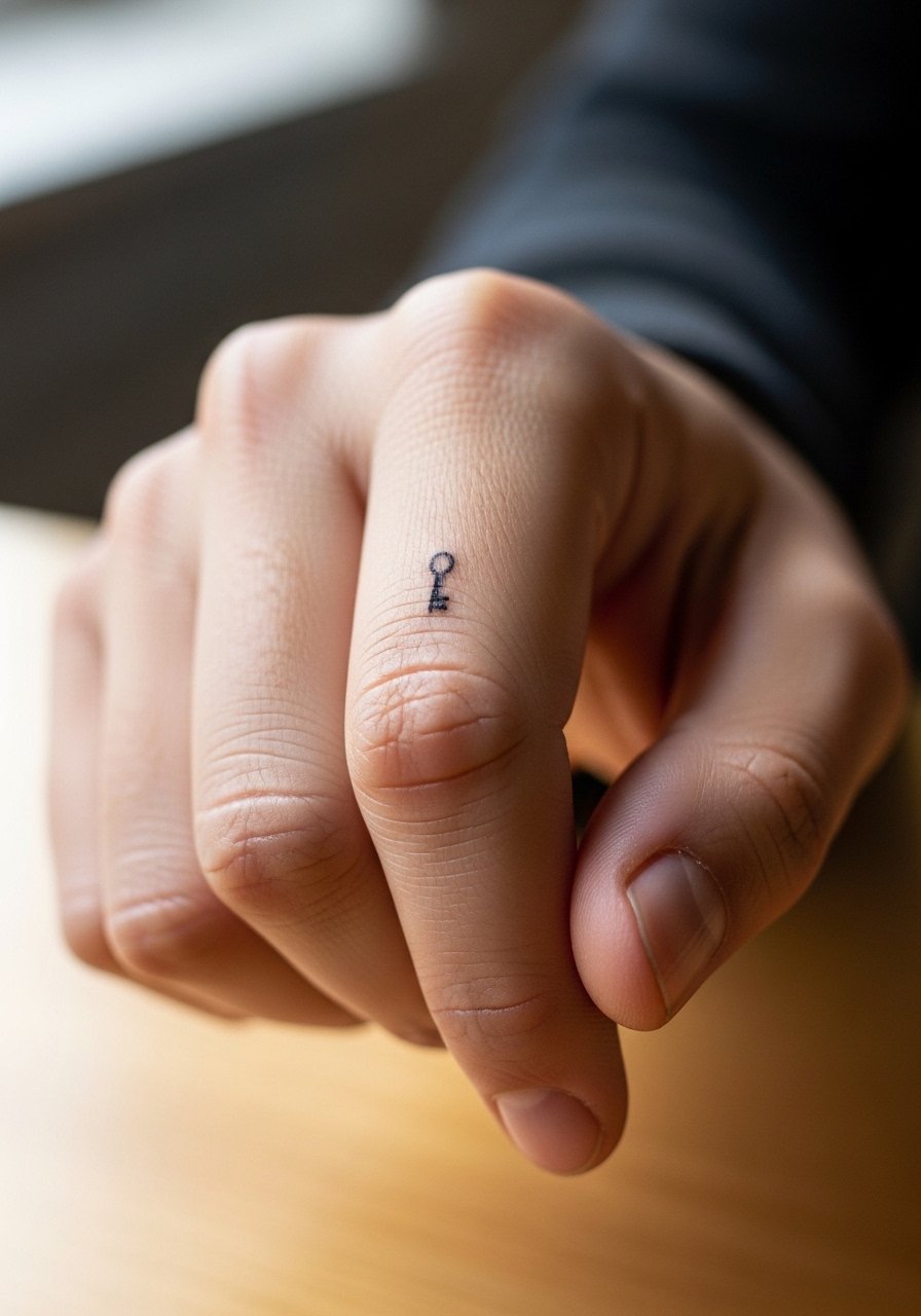
Keyholes need to be simplified to a round hole and a small stem so they remain readable against knuckle texture. Ask your artist to test the size on your hand before inking. Knuckle area work is sensitive and tends to blur, so thicker lines help longevity. For showing it off, a slim signet ring worn on a different finger keeps focus on both ring and tattoo.
26. Matching Tiny Mountain Silhouettes on the Side of the Hand
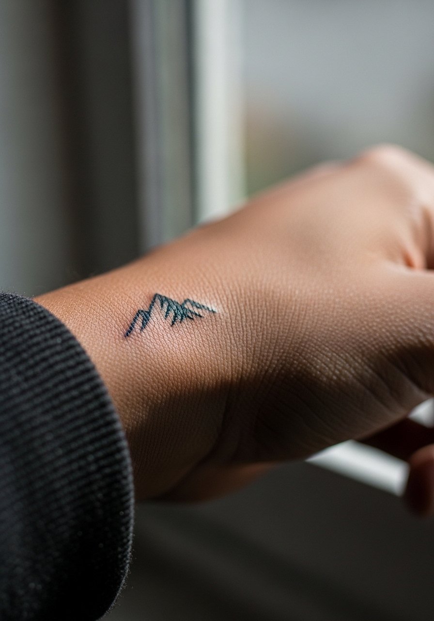
Mountain silhouettes are bold and simple, which suits hand placements well. Keep peaks clear and avoid micro texture that will disappear. Tell the artist you want the silhouette to read from arm's length so the shape stays recognizable as it softens. For photos, a neutral knit sweater with rolled sleeves frames the piece without covering it.
27. Matching Tiny Arrowhead at the Base of the Thumb
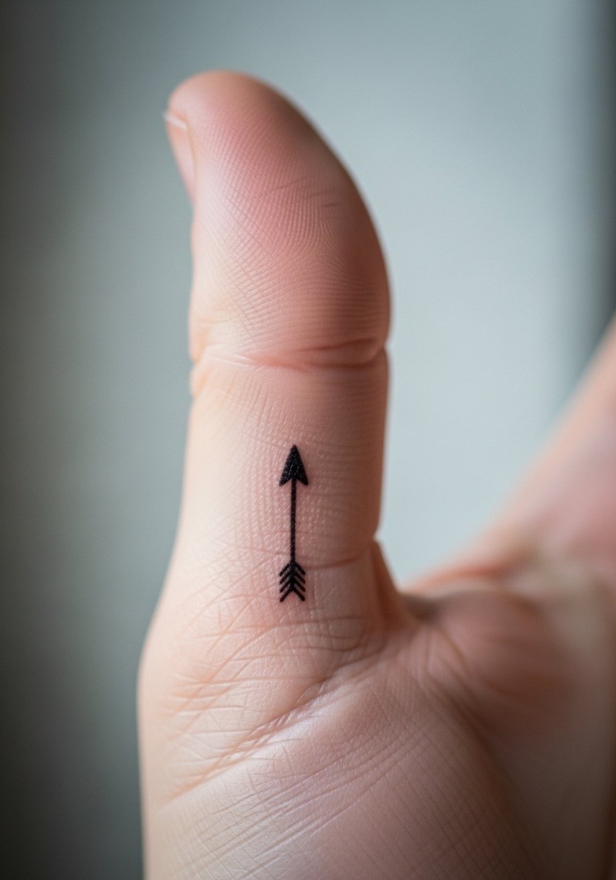
A compact arrowhead is an understated option that ages predictably if rendered as a filled shape rather than with micro detail. The common error is asking for a hollow triangle that loses contrast. Solid fills hold up better on hand skin. For the session, wear a short sleeve top you can pull up so the artist has easy access. This placement is visible and suits those who want a small shared symbol without daily maintenance.
Frequently Asked Questions
Q: How long do matching hand tattoos typically stay crisp before needing a touch-up?
A: Hands and fingers are high-wear areas, so expect visible softening inside two to four years for most fine work. Bold, simplified shapes last longer. Plan for a touch-up before a milestone or if you notice the design losing definition.
Q: Are there professional considerations with hand tattoos I should know about?
A: Yes, some industries remain conservative about visible hand tattoos. Consider how often you want the design visible and whether you can cover it with gloves or jewelry if needed. If career flexibility is a priority, choose placements like the side of the hand that are easier to hide.
Q: Should matching palm tattoos be avoided because they fade quickly?
A: Palms fade more than other spots, and many artists discourage them unless you accept touch-ups as part of the design. One group accepts regular refreshes as part of the look. The other group suggests alternative placements that hold detail better. Ask your artist for healed examples before deciding.
Q: What should I ask during a consultation to make sure matching tiny designs age well?
A: Ask the artist to show healed photos of similar placements and to map the stencil on your hand while you move it. Request moderate line weight for hand placements and clarify touch-up policies. Also ask where they recommend slight scale adjustments to avoid creases.
Q: Can matching finger scripts fade faster than matching scripts on the wrist?
A: Yes, finger scripts experience more friction and movement than wrist scripts, so they tend to blur sooner. If you want script on fingers, choose taller, more widely spaced letters and slightly heavier lines to preserve legibility.
