
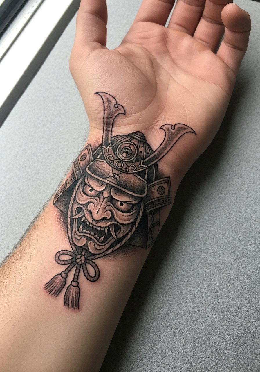
The stencil sat on the inner wrist for a moment while the artist adjusted a curl on the helmet. The client flexed their hand and watched how the armor read when the skin moved. That small check is why wrist pieces need intention, not just a saved photo. Below are 27 ways to wear a Japanese warrior on the wrist, with what to ask for in the consult and how each idea holds up over time.
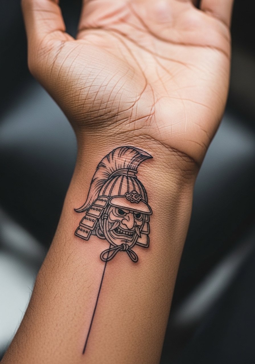
1. Fine Line Samurai Crest on Inner Wrist

I've seen fine line crests read delicate and precise on the inner wrist for the first year, then soften as the skin moves. Ask your artist for slightly heavier linework than a hairline, and request a bit more spacing inside the helmet details so the stipple shading has room to settle. Fair warning, the biggest mistake is requesting micro detail at too-small a scale. Expect touch-up at year two for crisp edges. For showing it off, pair with a thin chain bracelet that sits next to the crest without rubbing the ink.
2. Bold Blackwork Ronin Wrap Around Wrist
There is something about saturated black filling that reads strong from a distance. For a wrist wrap, tell your artist to keep solid blacks concentrated on armor panels and leave negative space around facial features. Pain is mild on the wrist but the inner curve can sting. This version ages well because saturation resists early fading, though edges may soften at year three. A common mistake is over-detailing the armor where the skin creases. For casual wear, a minimal leather cuff complements the heavy black without covering the art.
3. Micro-Realism Warrior Portrait on Top of Wrist
A micro-realism portrait on the wrist looks impressive up close but requires careful placement to avoid distortion from tendons. In consultation, bring straight-on photos and ask the artist to map the portrait so facial elements sit away from bone landmarks. Expect more session time than a simple line piece, and plan for a touch-up at year two as fine gray shading can fade faster. The session feels precise and steady, the top of the wrist is less painful than the inner wrist. Dress the wrist with a cotton cuff watch during photos so the portrait reads framed.
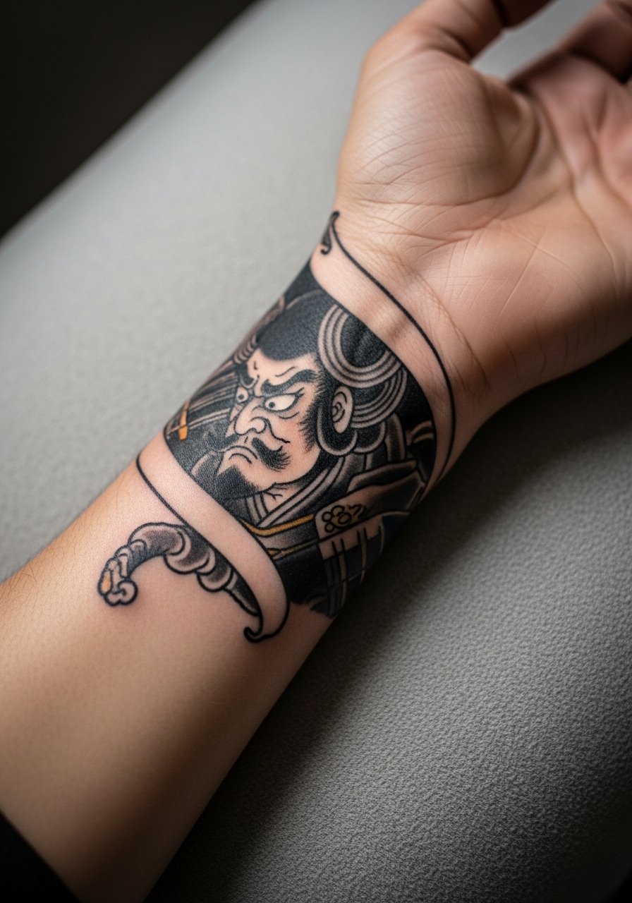
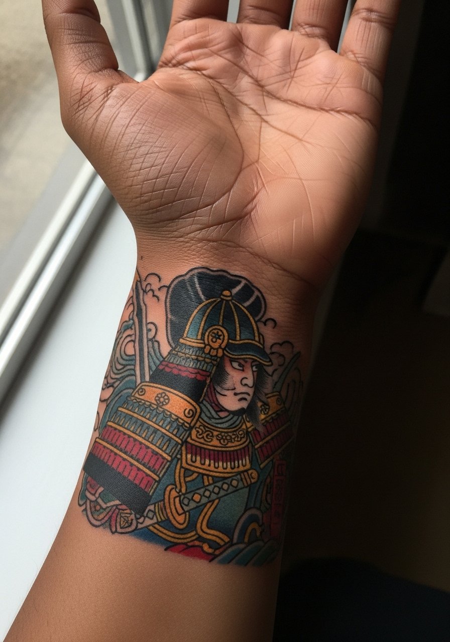
4. Traditional Irezumi-Style Warrior with Wave Background
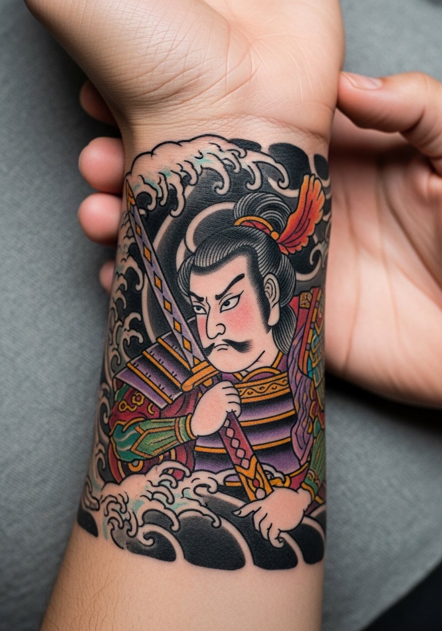
Traditional Irezumi elements translate surprisingly well to the wrist when the composition favors bold shapes over fine detail. Ask the artist to simplify wave patterns into larger blocks of color so the background does not swallow the warrior. There is a debate among artists about color saturation on wrists. One camp argues bold color lasts longer. The other camp says wrist skin loses color faster than the arm. Name both camps and ask which approach your artist prefers. Expect a two-part session if color saturation is high. Pair this with a linen short sleeve shirt rolled at the cuff to show the art.
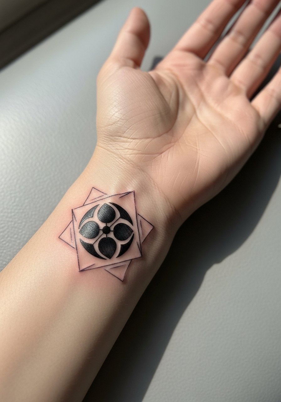
5. Geometric Helmet Detail with Dot Work Highlights
The geometric approach keeps the warrior motif but leans into negative space and dot work, which can age differently than solid shading. Tell the artist you want the stipple shading spaced so dots do not sit inside tiny enclosed shapes. Most mistakes come from trying to cram stippling into areas that need clear linework. Over time the dots soften into texture rather than blur, which can actually enhance the piece visually. The wrist feels like a 3 out of 10 on pain for this style. Wear a stacked dainty bracelet to echo the dot motif without rubbing the tattoo.
6. Minimalist Line Warrior Icon at the Radial Wrist
Minimalist icons look neat on the radial wrist for people who want the symbolism without heavy ink. The crucial instruction for your consult is to pick explicit reference images showing the exact line weight you want. The common error is asking for "very thin" and getting hairlines that blur. Expect touch-up at year three. The radial side tolerates small designs well, but avoid packing in tiny interior details. For showing off, a minimal cuff bracelet sits alongside the icon and keeps attention on the negative space.
Pre-Session Essentials
Those five wrist-focused pieces above all ask for clear access to the area and protection from early friction, so a small kit smooths the appointment and first week.
-
Stencil transfer paper kit. Lets you preview how the warrior crest sits on the wrist and adjust placement before the needle hits skin.
-
Topical numbing cream. Applied as directed it reduces discomfort for tighter wrist lines without changing how the ink settles.
-
Thin protective film roll. Keeps wrist pieces clean during the first days when clothing and watches rub the area.
-
Fragrance-free body wash. Gentle cleansing helps fine line wrist work avoid irritation during showers.
-
Aquaphor healing ointment. A thin layer in the first 48 hours helps keep fine line and dot work from drying into flakes that pull ink.
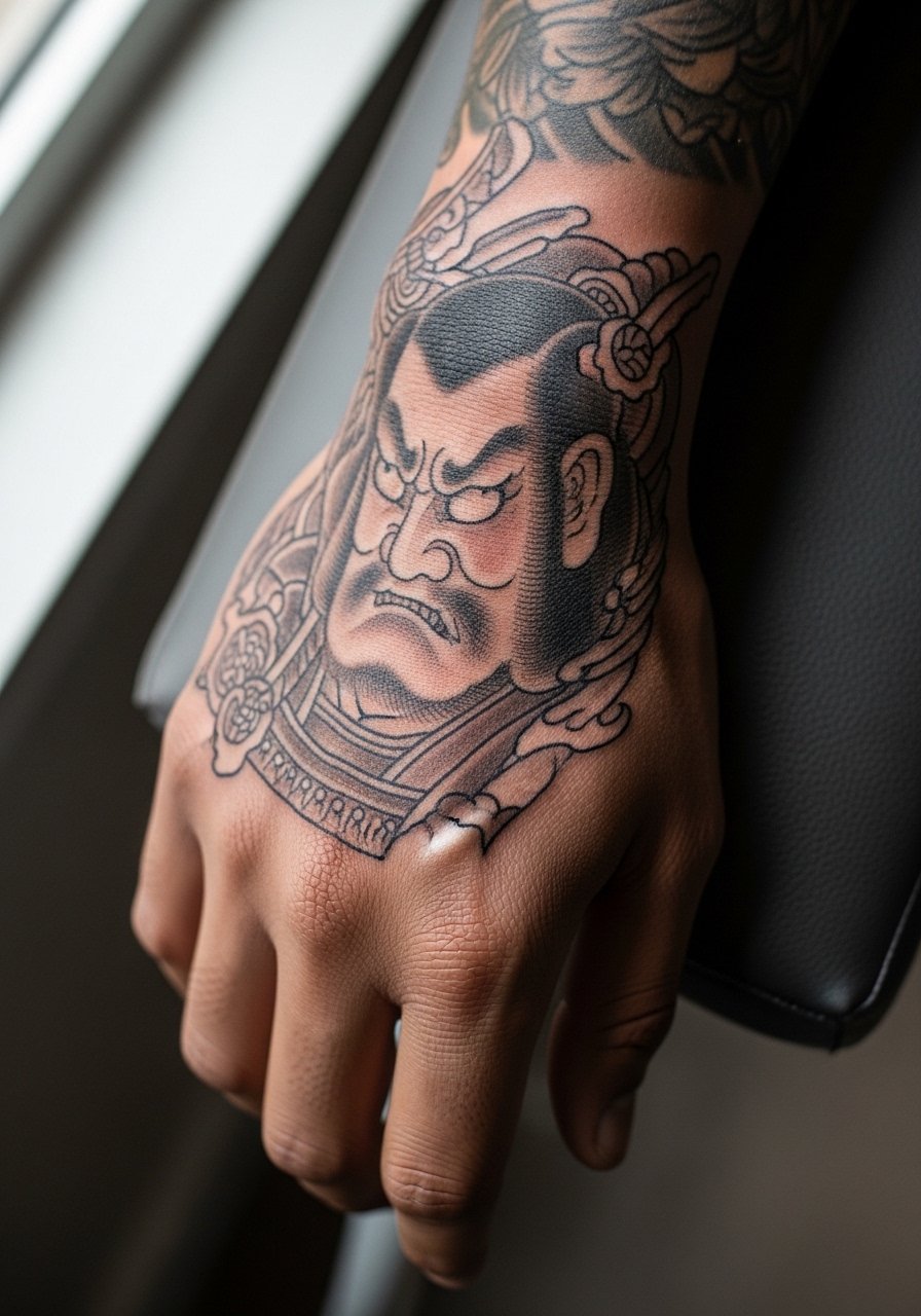
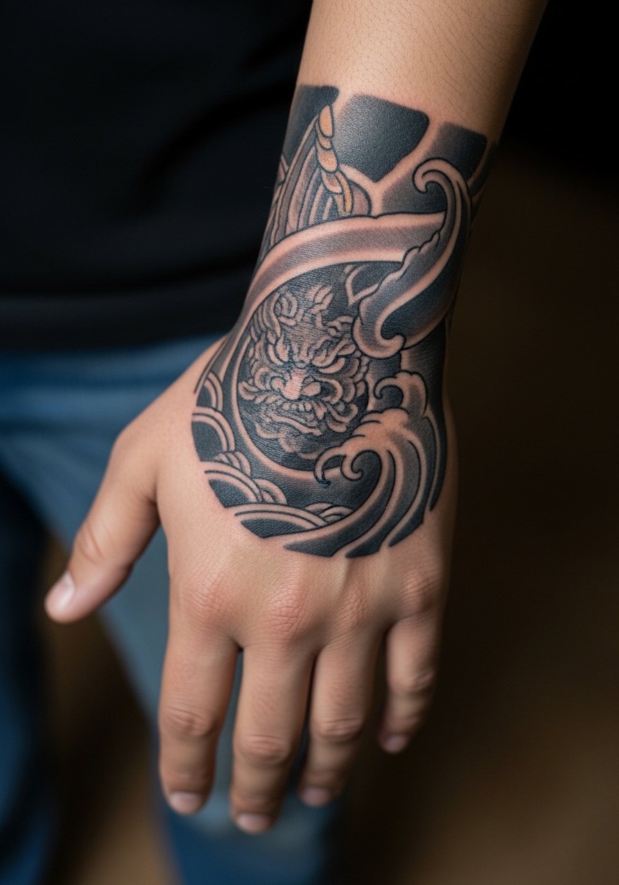
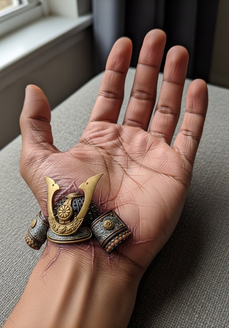
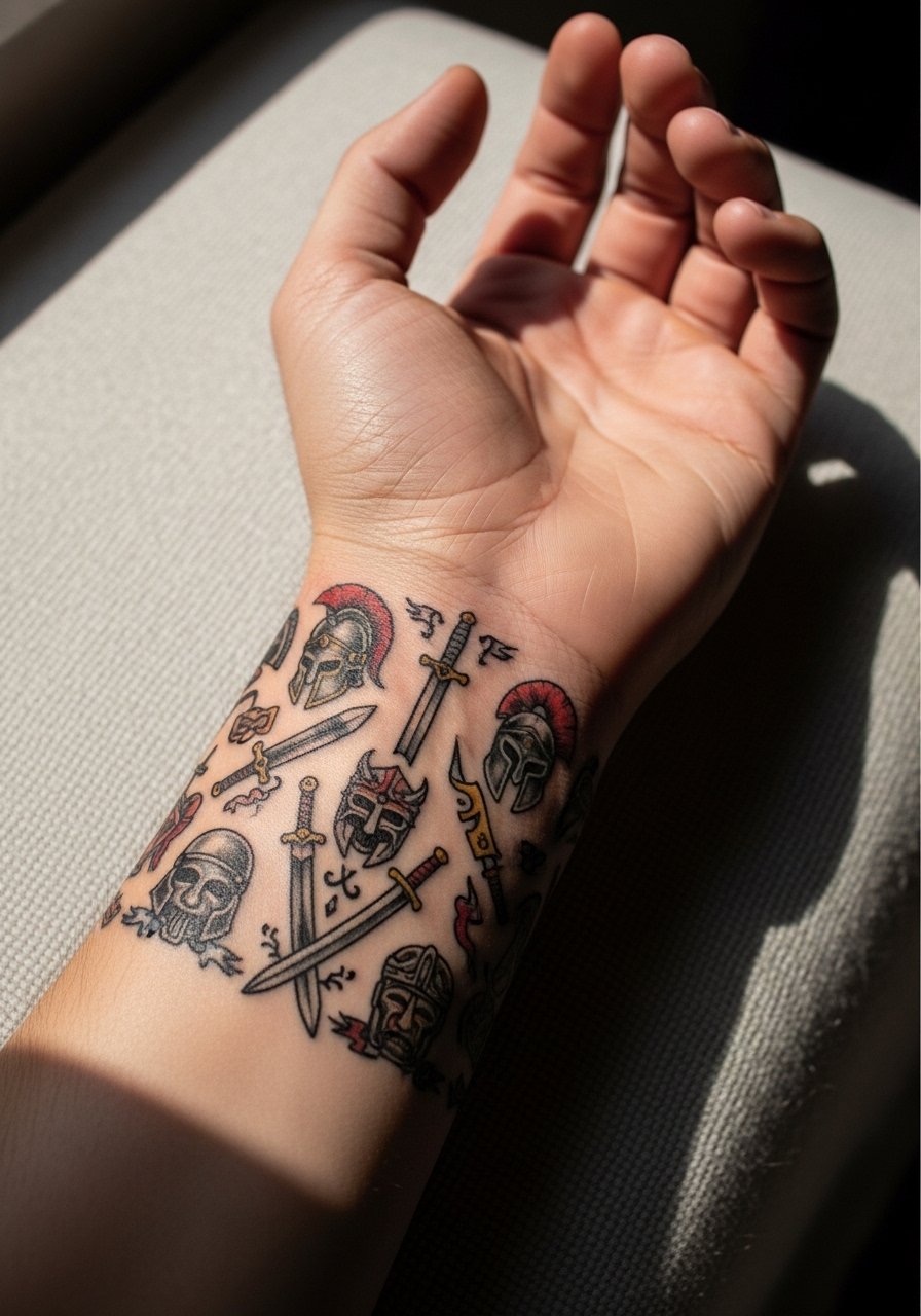
7. Armored Warrior with Red Accents on Dorsal Wrist
When red is used as an accent it helps the warrior read as bold without needing heavy black. In a consult say which reds you prefer, brighter or muted, and ask for test patches for color response on your skin tone. The dorsal wrist sees frequent sun exposure, so expect faster color fade there and plan for a color-refresher in two to three years. A common mistake is oversaturating small red areas which then turn muddy. Wear a racerback tank when photographed so the wrist stands out against bare arms.
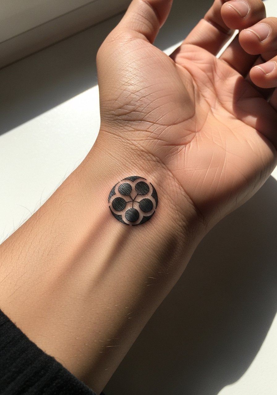
8. Kamon-Style Family Crest with Negative Space
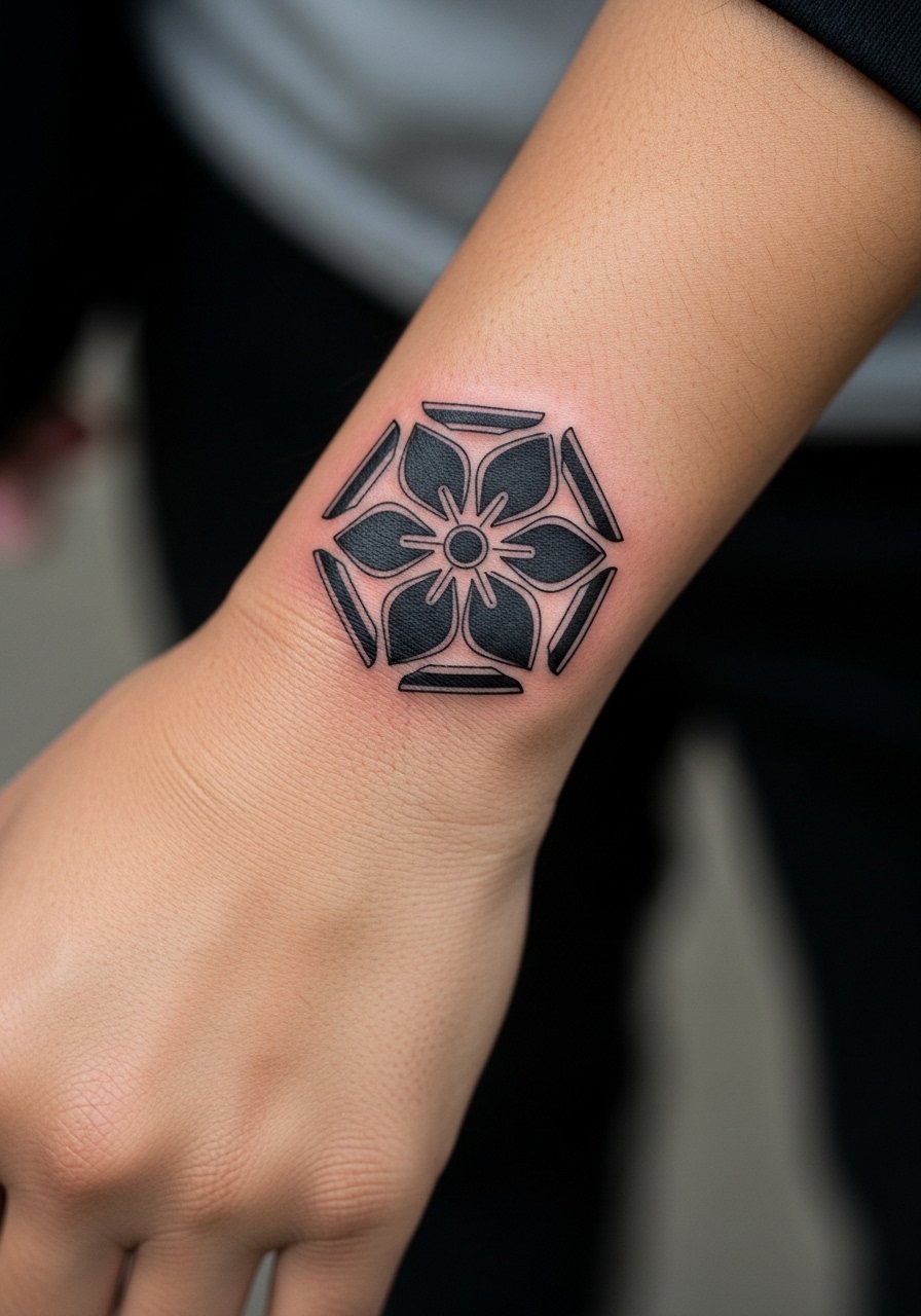
A kamon approach abstracts the warrior into emblematic shapes that fit nicely on the wrist. Tell the artist you want true negative space rather than filled white ink, so the wrist skin gives form. The advantage is that negative-space crests tend to age more gracefully than tiny detailed portraits. The session is short and the pain is low. The main mistake is forcing too many symbols into a palm-sized area. For evenings out, a thin pendant necklace complements the crest without competing.
9. Motion-Blur Samurai Slashing Around the Wrist
A motion-blur design emphasizes movement and suits a wrap that crosses the wrist. In consultation, ask for directional flow that follows your hand movement so the slash does not distort when you bend the wrist. This style avoids dense facial detail, which reduces blowout risk in such a mobile spot. Over time the motion lines soften but keep their visual rhythm. For session comfort, wear a loose short sleeve shirt so the artist has clear access and you do not trap heat.
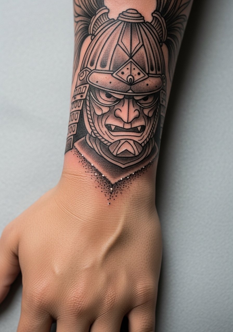
10. Samurai Helmet and Mask with Whip Shading
Whip shading gives texture without dense dot work and can create convincing shadow on a small wrist canvas. Tell your artist to use whip shading for background shadows and reserve solid lines for the helmet rim. A frequent mistake is overusing whip shading in high-motion zones which blurs faster. Expect a touch-up at two to three years to refine contrast. The wrist can sting near tendons, but the session is usually under an hour. Pair it with a minimal leather strap watch that frames the helmet but does not press directly on the ink.
11. Chibi-Style Samurai for Tiny Wrists
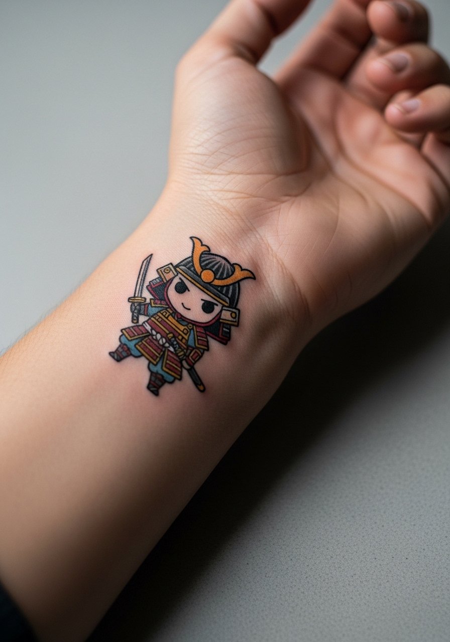
Chibi versions of a warrior scale well for smaller wrists and are forgiving when the design needs to be readable at tiny sizes. In your consult, specify which features are essential and ask the artist to exaggerate those proportions rather than cram realistic detail. The common error is asking for realism in a thumbnail size. These take under an hour and are low on pain. Style it with a slim braided bracelet that adds a playful contrast.
12. Samurai Facing Inward Near Wrist Crease
Placing the warrior to face your palm creates a private orientation that only you see easily. The consult should cover how the design interacts with the crease when the hand moves. Artists debate whether placing faces near the crease increases blur. One group says the constant folding blurs fine features quickly. The other group says careful spacing and slightly bolder linework can prevent that. State the debate to your artist and ask their experience. For the session, a button-down shirt that you can pull aside keeps the area accessible.
13. Samurai with Cherry Blossom Petals Scattered
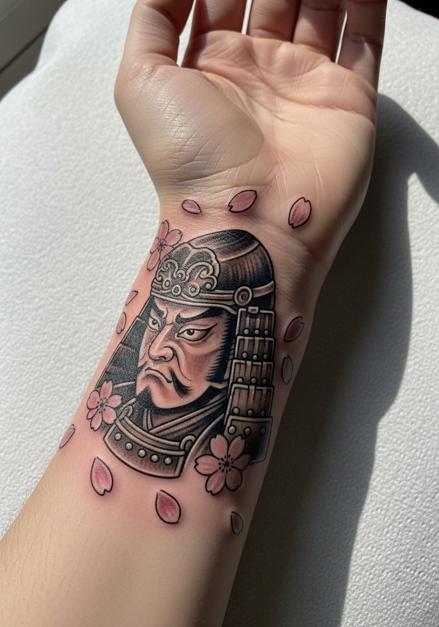
Adding petals gives the composition motion and softens the warrior motif. Tell the artist you want petals as negative space or tiny shaded spots to avoid cluttering the face. A common mistake is overpopulating the wrist with petals that make the main figure read small. Petals age well since they can blur into texture that still reads floral. Plan for a lighter touch-up rather than a full rework. Show it off with a floral print blouse with short sleeves that mirrors the motif.
14. Kintsugi-Inspired Warrior with Gold Ink Accents
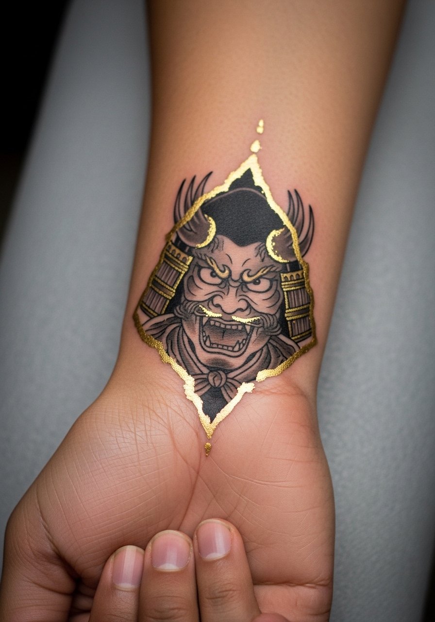
Gold or metallic ink works as an accent if used sparingly around cracks or armor seams. Ask about pigment longevity and how metallics behave on your skin tone. A mistake is expecting metallics to behave like standard inks. They can fade or change hue faster, so plan touch-ups and discuss alternatives like yellow or warm orange to mimic shine. The wrist's movement affects metallic sheen more. For evenings, pair with a thin stackable gold bracelet to catch light in a similar way.
15. Scripted Motto Beneath the Warrior
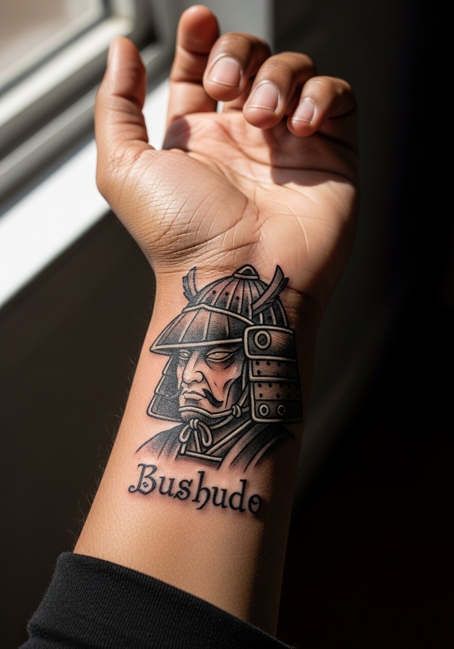
Combining a warrior with a short motto needs exact lettering decisions. Use clear text like a single word or a short phrase and specify font scale in the consult. Lettering near the wrist crease will soften quicker than on the forearm. A common mistake is tiny cursive that turns into an unreadable smudge. Expect to refresh the lettering at year two to keep clarity. For night events, a thin pendant necklace balances the vertical line of the script without covering it.
16. Negative Space Armor Strips That Wrap the Wrist
Using negative space to suggest armor relies on bold surrounding fills rather than interior detail. Tell the artist you want the negative shapes to rest on stretch-free zones and avoid knuckle areas. The advantage is reduced blowout risk since fewer tiny lines are used. Over time the negative areas age like natural skin tone and the surrounding blacks may need touch-ups. The session is efficient and feels less intense than dense color work. Pair with a minimal silicone band if you want a low-profile accessory.
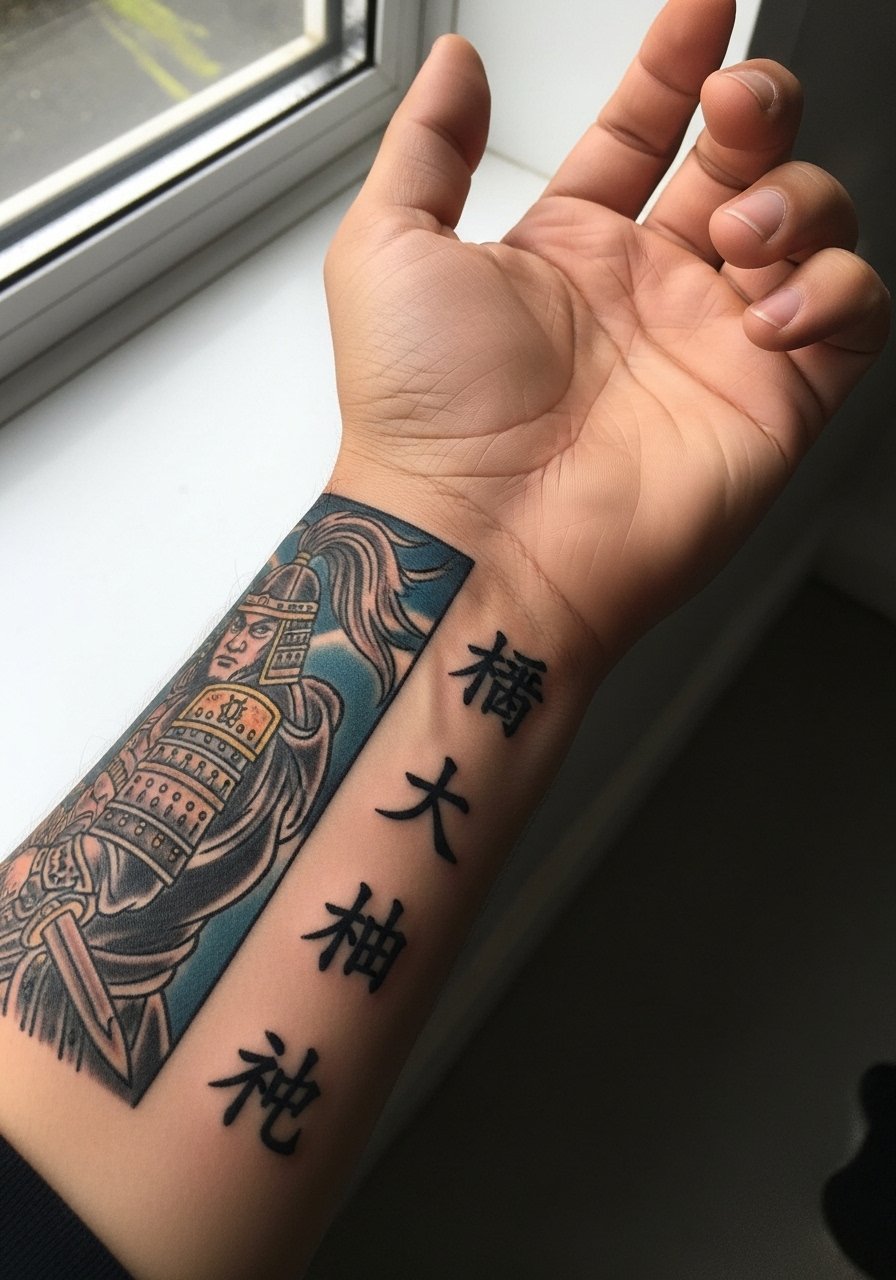
17. Samurai Crest Paired with Tiny Kanji
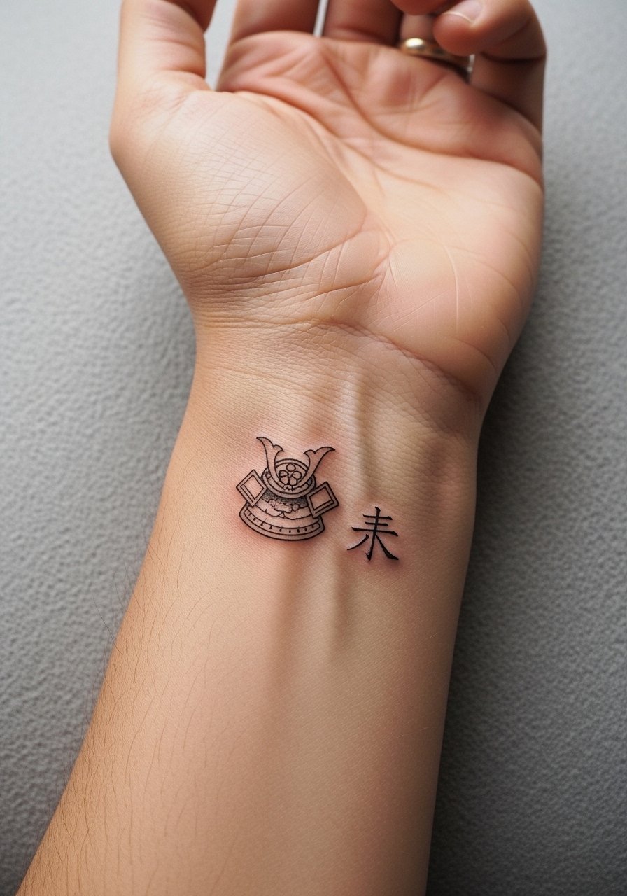
Adding a small kanji next to the crest gives context but asks for accurate text choices. Specify the exact character and font in your reference so the artist can stencil text precisely. Text on wrists softens over time so choose larger, simpler kanji forms for longevity. The mistake is relying on an unclear transliteration. If career visibility matters, remember wrist tattoos are seen easily. Style it with a thin chain bracelet that sits under the kanji without rubbing the ink.
18. Half-Wrist Samurai with Wave Curl Accent
A half-wrist composition places emphasis on one side and leaves breathing room. In the consult ask the artist to anchor the face away from the crease so expression stays readable. The wave curl helps direct attention and allows for broader shading that ages more softly. Mistakes include centering the portrait exactly on the crease which exaggerates distortion. The session is moderate in time. For casual days, wear a rolled-up sleeve shirt so the design peeks out predictably.
19. Monochrome Samurai with Thin Red Line Accent
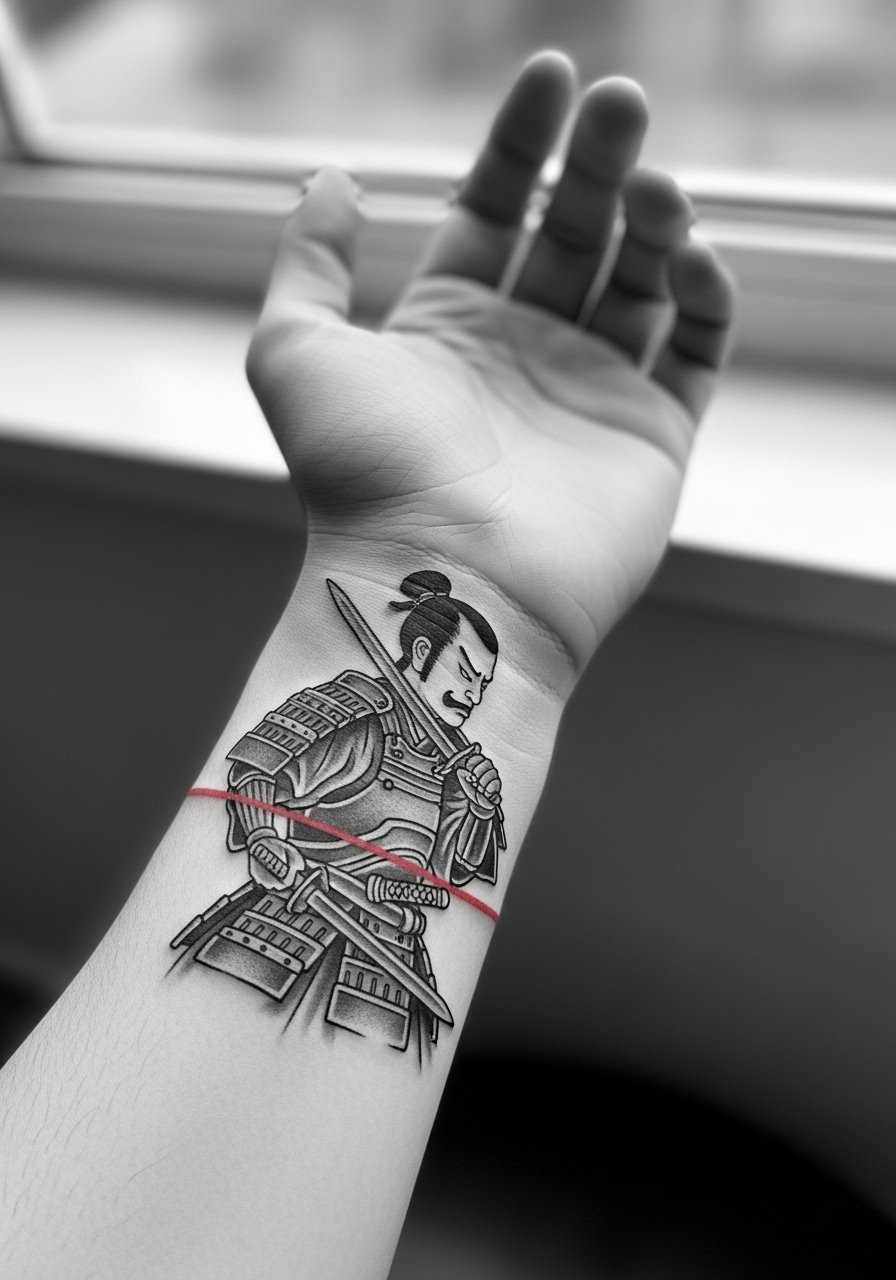
A pure monochrome warrior with a single thin red line can dramatize expression without heavy color work. Tell your artist the exact placement of the red line so it does not sit on a high-motion crease. The debate here is about the thin red line holding up. One camp trusts it if placed in stable skin. The other warns thin color lines vanish faster. Ask which side your artist supports. Plan a targeted color touch-up in a few years. Pair with a simple band ring on the same hand to draw the eye.
20. Split-Wrist Design with Warrior on One Side, Kanji on the Other
A split design balances visual interest and can be shown selectively. In the consult map how the two pieces read when the hand is turned. The main mistake is making both elements overly detailed, which crowds the small canvas. Split layouts often touch up separately as needed. For the session, a loose drawstring pant keeps you comfortable while seated.
21. Warrior Silhouette Filled with Japanese Map Patterns
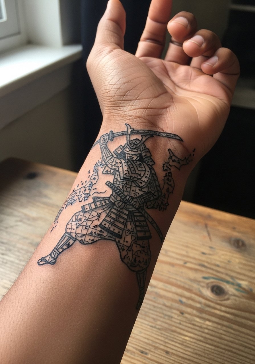
Using a silhouette filled with patterned textures gives the impression of complexity without relying on micro detail. Ask the artist to simplify map elements into larger blocks so the pattern reads at a small scale. The main error is attempting tiny map lines that disappear. The silhouette approach ages gracefully because the silhouette edge remains legible. For photos, slip on a short sleeve tee to frame the wrist.
22. Weathered Ronin with Stippled Beard Texture
Stipple shading creates a textured, aged look that can suit an older warrior theme. Request stippling for beard and shadow and stronger linework for facial contours. Stipple tends to blur into soft texture over years, which suits the weathered aesthetic rather than ruining it. The mistake is using stipple in areas that receive constant friction. The session is patient work and slightly longer. Pair with a woven bracelet to echo the textured feel.
23. Tiny Crest Behind the Wrist Bone
Putting a tiny crest behind the wrist bone feels discreet but takes more careful placement due to the bone prominence. Tell the artist you want the crest just off the bone to reduce discomfort and increase longevity. Tiny placements here can blur faster, so avoid inside detail that needs perfect edges. The session is brief but more painful than nearby soft tissue. For visibility balance, add a slim watch strap that sits above the crest.
24. Warrior Helmet Fragment Near Thumb Base
A fragment near the thumb base gives you an edgy peek of the warrior without a full wrap. In the consult specify which fragment reads best at small scale, like the helmet crest or eyepiece. The mistake is over-detailing curved forms that will distort with thumb movement. Expect the fragment to soften at the edges over time. The session tickles when the needle nears nerves. Style with a thumb ring that frames the fragment during photos.
25. Small Crest with Invisible Ink Accents
Invisible or UV-reactive accents can be a subtle secret that appears under blacklight. Ask the artist about pigment safety and test small patches if available. A mistake is expecting intense glow like a poster. UV accents are typically subtle and need controlled aftercare to last. Plan for occasional touch-ups. Pair this discreet piece with a thin silicone band if you want low friction.
26. Collage Wrist Band of Miniature Warrior Elements
A collage band lets you include many warrior motifs without needing one large focal point. Tell the artist to vary scale so each icon reads at a glance. Crowding everything into the band is the usual error. Collage bands tend to age with character because each element breaks up the visual field. Sessions may be staged across a couple of appointments. For everyday wear, try a rolled-up sleeve sweater to let the band peek out.
27. Small Wrist Flash Inspired by Japanese Armor Plates
Flash-style armor plates work well if you want a quick, strong-looking wrist piece. Ask for slight tweaks so the flash feels personal rather than copied. The mistake is selecting an overly intricate flash designed for larger canvases. Flash pieces are efficient and tend to settle predictably. The session is usually short and feels focused. For a clean post-session look, a cotton wristband keeps friction low while the area heals.
Frequently Asked Questions
Q: Will a fine line Japanese warrior on the wrist blur faster than a bold black one?
A: From what I've seen, fine line tends to soften sooner on the wrist because of constant movement and frequent sun exposure. Bold black holds contrast longer, but heavy black can lose crisp interior detail. Ask your artist to recommend line weight and spacing tailored to your skin and lifestyle.
Q: How should I dress for a wrist session to give the artist access and stay comfortable?
A: Wear short sleeves or a loose button-down shirt you can pull aside. For wrist work a fitted tee or rolled sleeve gives clear access and keeps fabric from bunching against the area during the session.
Q: Are there specific design tweaks to make a warrior tattoo age better on the wrist?
A: Yes. Increase spacing inside dense areas, prefer slightly heavier linework over hairlines, and use bolder shapes for backgrounds. Small text and micro detail are the parts most likely to need touch-ups over time.
Q: Will watches or bracelets ruin a new wrist tattoo during healing?
A: Anything that rubs directly on fresh ink increases scabbing and possible color loss. Remove watches and avoid tight bracelets for the first two weeks. If you must wear a watch, pick one that sits above the tattoo area or use a soft fabric barrier until healed.
Q: How often should I expect to touch up a wrist warrior tattoo?
A: It depends on style and exposure. Bold blackwork might need a light refresh every four to six years. Fine line and color accents often benefit from touch-ups around year two to three. Your artist can give a realistic timeline based on how your skin took the ink.
Q: Is it okay to include culturally specific symbols like family crests or kanji in a warrior tattoo?
A: It is okay if you approach it respectfully. Specify accurate characters and consider slight stylistic variations rather than direct replication in certain religious or culturally sacred motifs. Ask your artist how they handle cultural elements and where they source reference material.
Q: Can I get a UV-reactive accent with my wrist warrior and still expect normal healing?
A: UV accents can heal normally but may require more frequent touch-ups and careful pigment selection. Discuss safety and longevity with your artist, and consider a small patch test if available.
