
Fine line work and bold black shapes both look at home on hands. The tricky part is the way skin, sun, and daily use change those lines over time, and how a small placement can demand big design choices. Read through these 27 hand-focused illustrative ideas and you will get practical direction on placement, what to say in consultation, how each option heals, and when an outfit helps the design sing.
1. Fine Line Constellation Across Fingers
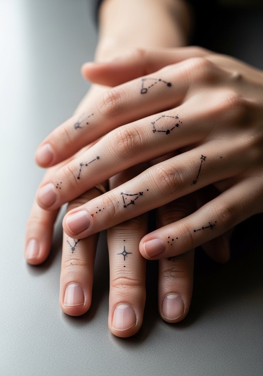
I recommend this when you want subtle detail that reads up close. Fair warning, finger skin is high friction and washes a lot, so expect touch-ups sooner than on an arm. Tell your artist to scale the stars slightly larger than the reference so the dots do not merge after a year. The session is fast but uncomfortable around knuckles. For showing it off, stacked rings or a thin chain ring set frames the tiny pieces without crowding the linework.
2. Single Word Side-of-Finger Script
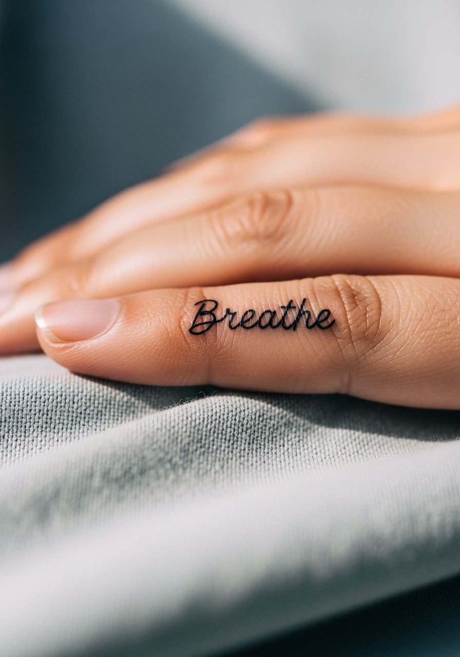
Most people pick a short word for readability and longevity. The biggest mistake is insisting on very fine script that will blur into a smudge on the finger. Ask for slightly bolder single-stroke lettering and a reference showing that weight. Expect a quick, sharp session and a touch-up at year one or two. Hand tattoos sometimes affect hiring choices, so consider placement and career context before booking.
3. Knuckle Icons in a Chain

I've seen knuckle sets that still read clear after three years when the icons were blocky and bold. The common error is dithering toward micro detail across the knuckle surface. Tell the artist you want solid shapes and slightly heavier linework to resist blowout. The session has quick bursts of sharp pain over the knuckle. Pair these with a matte signet ring to keep the eye on the knuckles without competing with the icons.
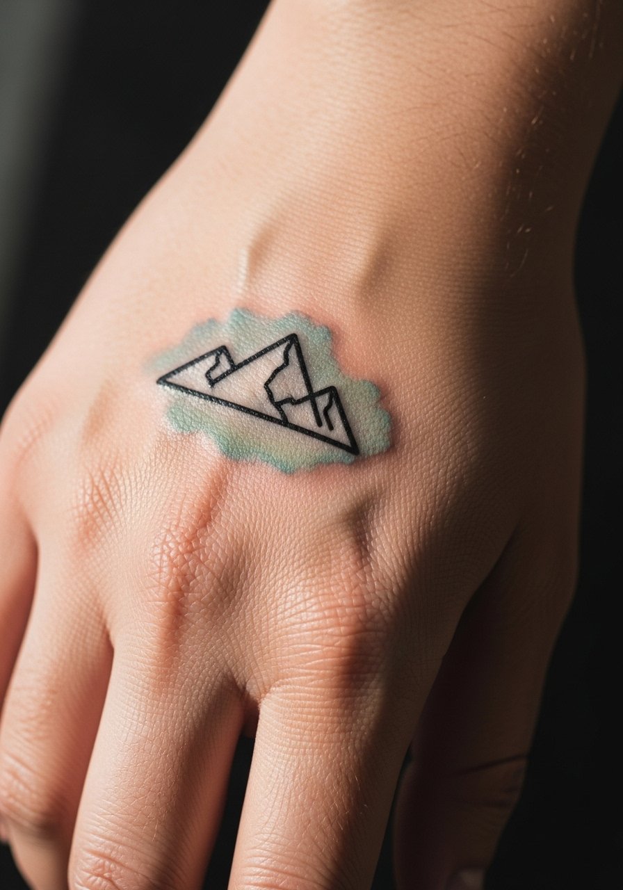
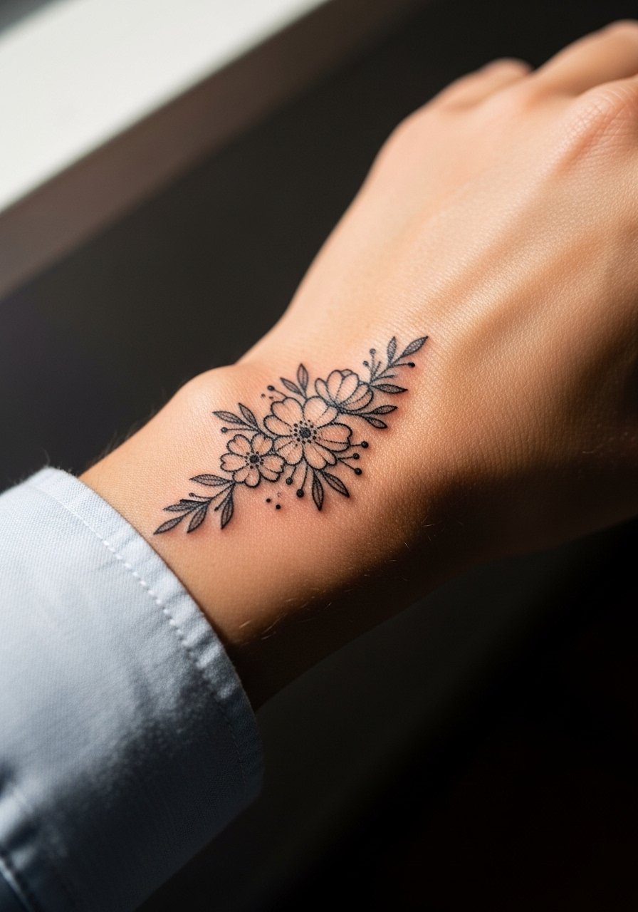
4. Botanical Back-of-Hand Piece
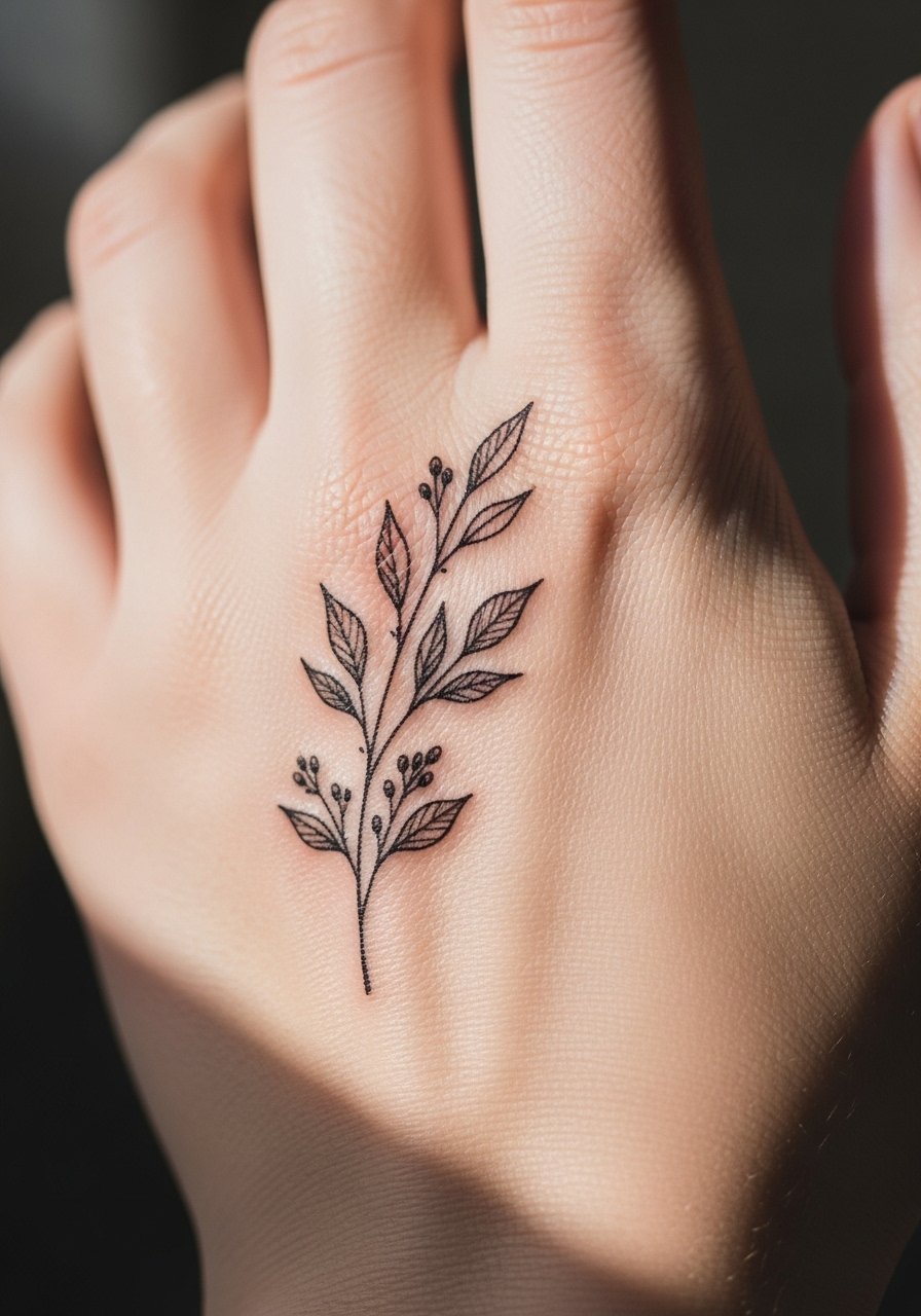
There is something about a sprig of leaves that reads cohesive with wrist and forearm work if you want a partial hand flow. A common mistake is extending too far onto the fingers where movement and wash wear the edges. Ask the artist to stop the composition just shy of joints for longevity. Expect moderate pain and a 60-90 minute session. When you want the piece visible without overexposing it, roll up sleeves or wear a delicate bracelet cuff which complements the botanical linework.
5. Micro-Realism Single Flower on Thumb
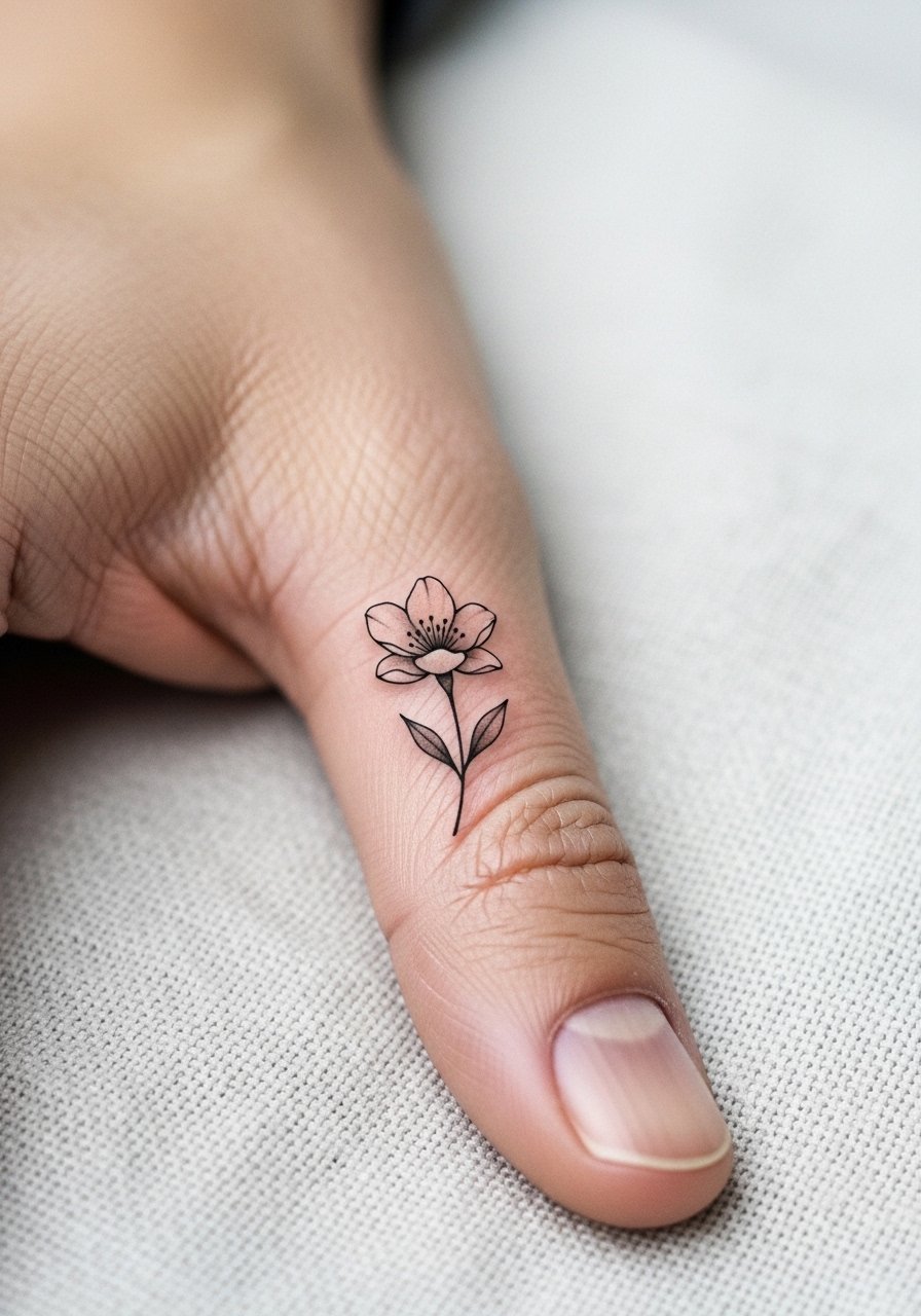
This is a good pick for someone wanting a pocket of visual detail that remains personal. The thumb has thick skin and unique texture, so realistic shading needs slightly more saturation to hold. Tell your artist you want subtle chiaroscuro and to avoid overly soft stippling near high-wear zones. Sessions can be fiddly because the area moves a lot. For the appointment wear, choose a loose button-down shirt you can roll up so the artist has comfortable access.
6. Geometric Palm-Edge Chevron
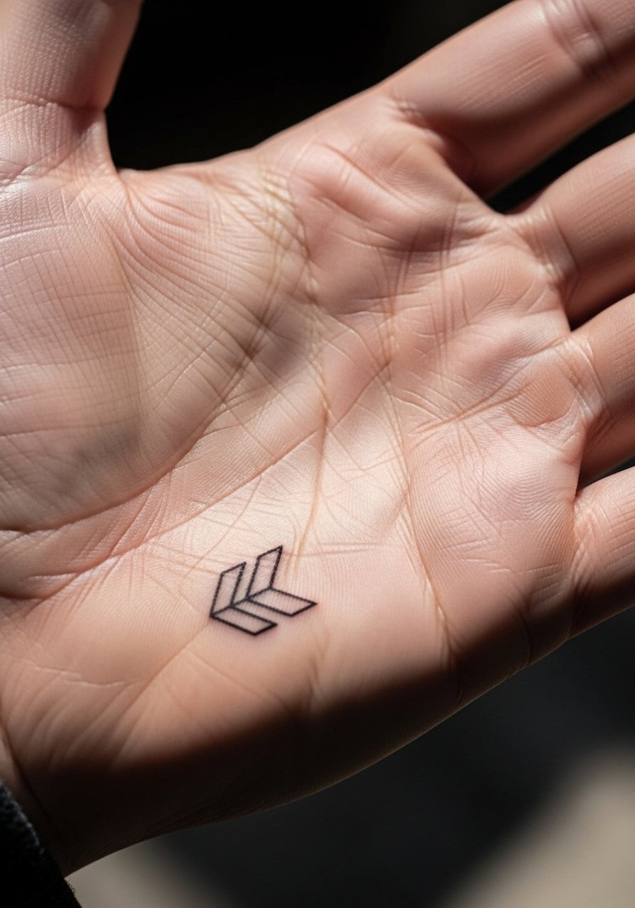
A palm-edge piece reads bold in casual gestures but wears fast if ink sits in skin folds. The error is placing dense geometry into moving creases. Ask to keep the design simplified and to avoid tiny internal linework. Pain is intense while the needle hits the fleshy palm edge. For styling, a short-sleeve tee or rolled cuffs keep attention on the hand and a minimal leather bracelet balances the raw geometry.
Studio Day Picks
The first six ideas above include high-contact zones like fingers, knuckles, and the thumb, so a few small prep and healing items make those sessions and the first week easier.
-
Stencil transfer paper kit. Lets you preview where lines will sit on the hand, which is crucial for small finger and knuckle work.
-
Topical numbing cream. Applied as directed before the session can shave off the sharpest edge during knuckle or thumb work.
-
Thin protective film roll. Ideal for protecting fresh finger and wrist pieces from early friction and frequent handwashing.
-
Fragrance-free gentle body wash. Cleans healing hand tattoos without irritating the linework or adding fragrance that can sting.
-
Aquaphor healing ointment. A thin layer for the first few days helps retain moisture for fine lines while letting the skin breathe.
7. Chain-Link Style Across the Back of Hand
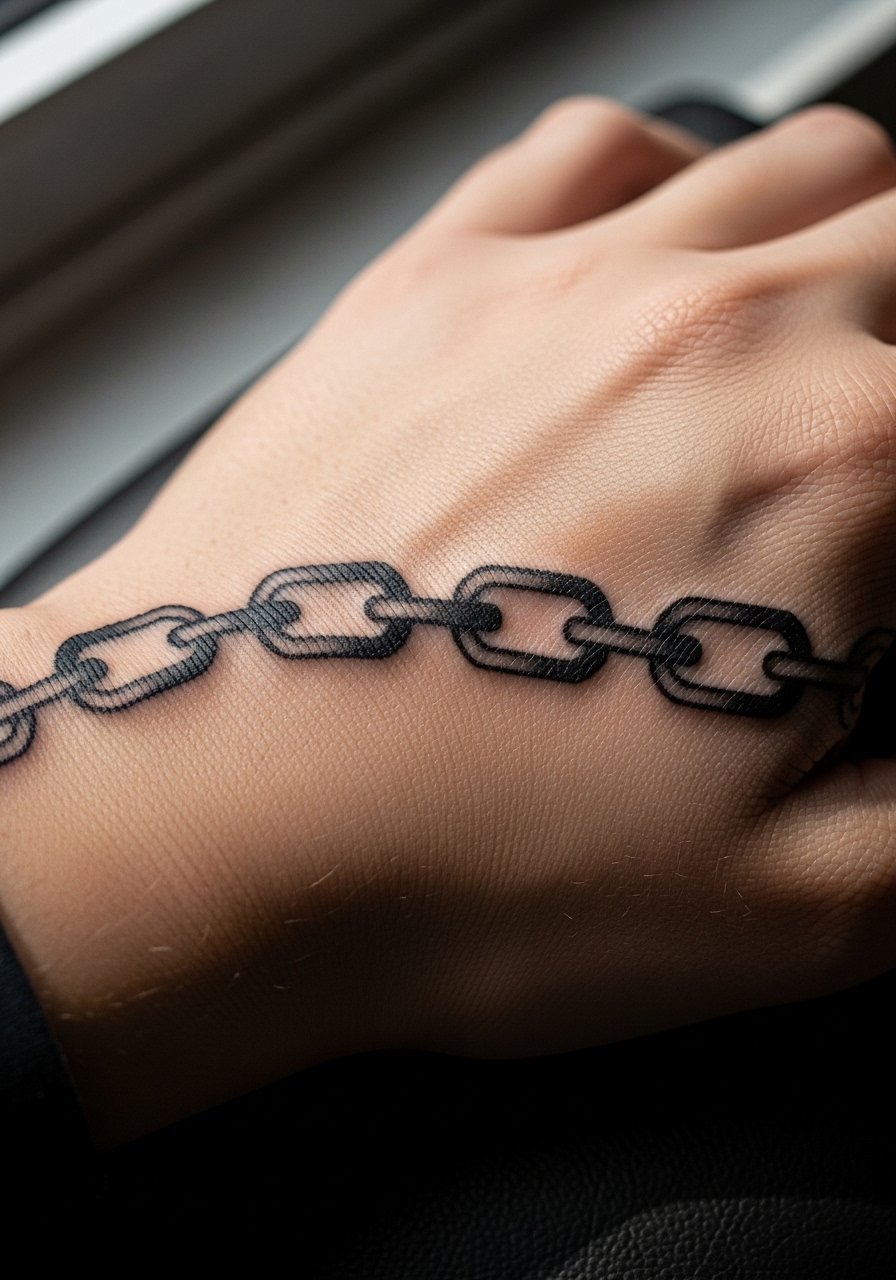
Visual impact lead. Bold chain motifs resist early blur better than hairline details. The mistake is overcomplicating the links with tiny interior shading that will merge. Ask for bold contours and predictable spacing. Sessions often involve longer stretches of work across tendons, which can be sore. For showing the design off, a short-sleeve crop or a structured leather jacket sleeve hit frames the back of the hand without covering it.
8. Dot-Work Mandala Haloing the Wrist
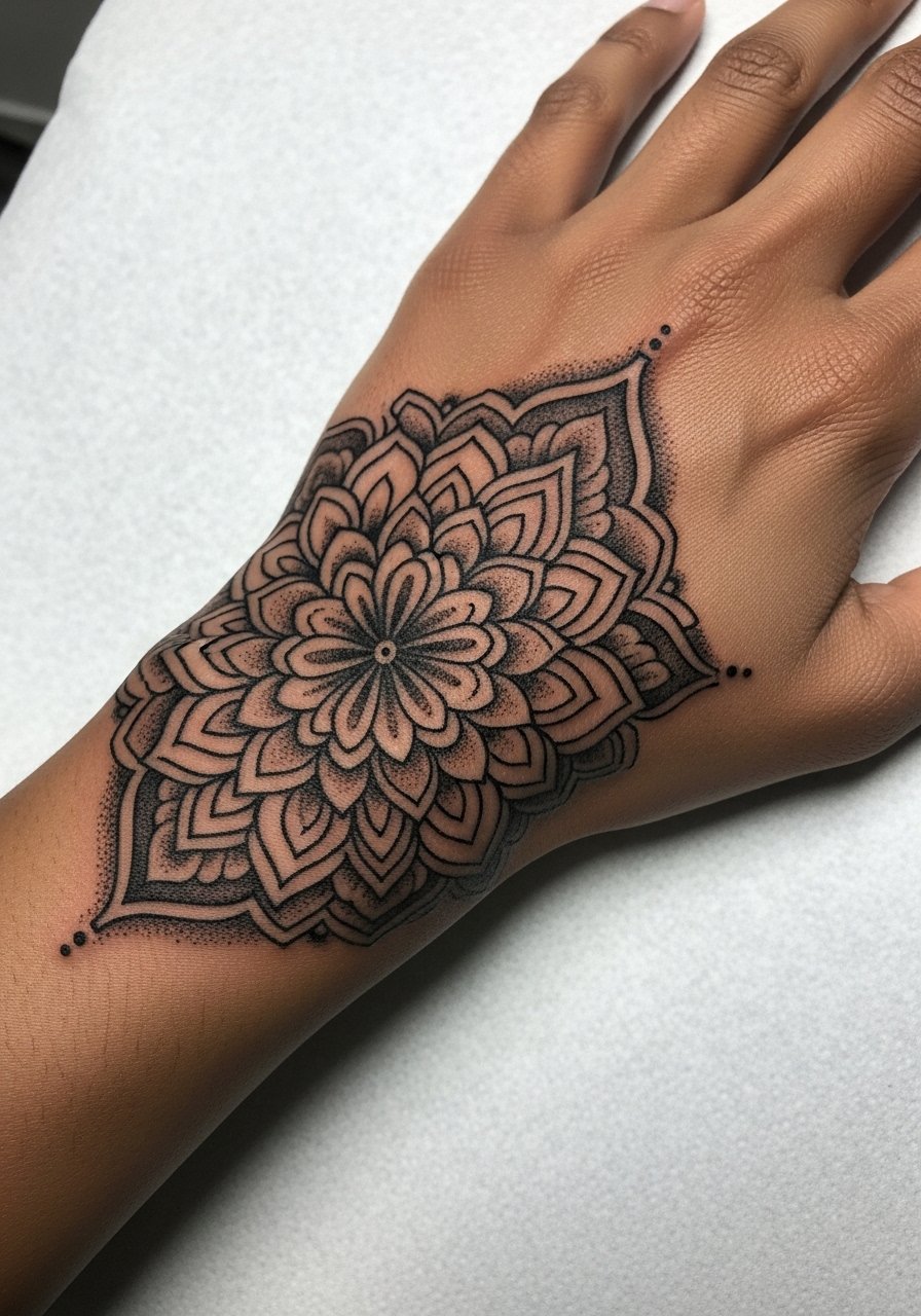
Stipple shading feels tactile and ages softly, but dense dot work too close to the wrist crease can soften. When you want a halo effect, request spacing that lets dots settle without merging. This session is moderate in pain and can be paced across two sittings. For longevity avoid constant bracelet friction that sits over the mandala.
9. Blackwork Panther Silhouette on Back of Hand

Most folks pick black silhouettes when they want something graphic that reads at a distance. The common mistake is too-small fill areas which can appear patchy as ink settles. Ask for even saturation and a single-session bold fill to minimize patchiness. Expect a steady buzzing pain during saturation. Pair this with a bold matte ring to echo the silhouette without crowding the palm.
10. Script Wrap From Wrist to Side of Hand

Consultation lead. When you plan a wrap, bring examples that show exactly how the script meets the wrist edge. Tiny loops near the base of the thumb are risky because of movement. Ask the artist to anchor letters with slightly heavier downstrokes. The session crosses two different skin zones so expect variable sensitivity. For showing it off, a cuff bracelet that sits above the script keeps the layout visible.
11. Minimalist Geometric Palm Tattoo
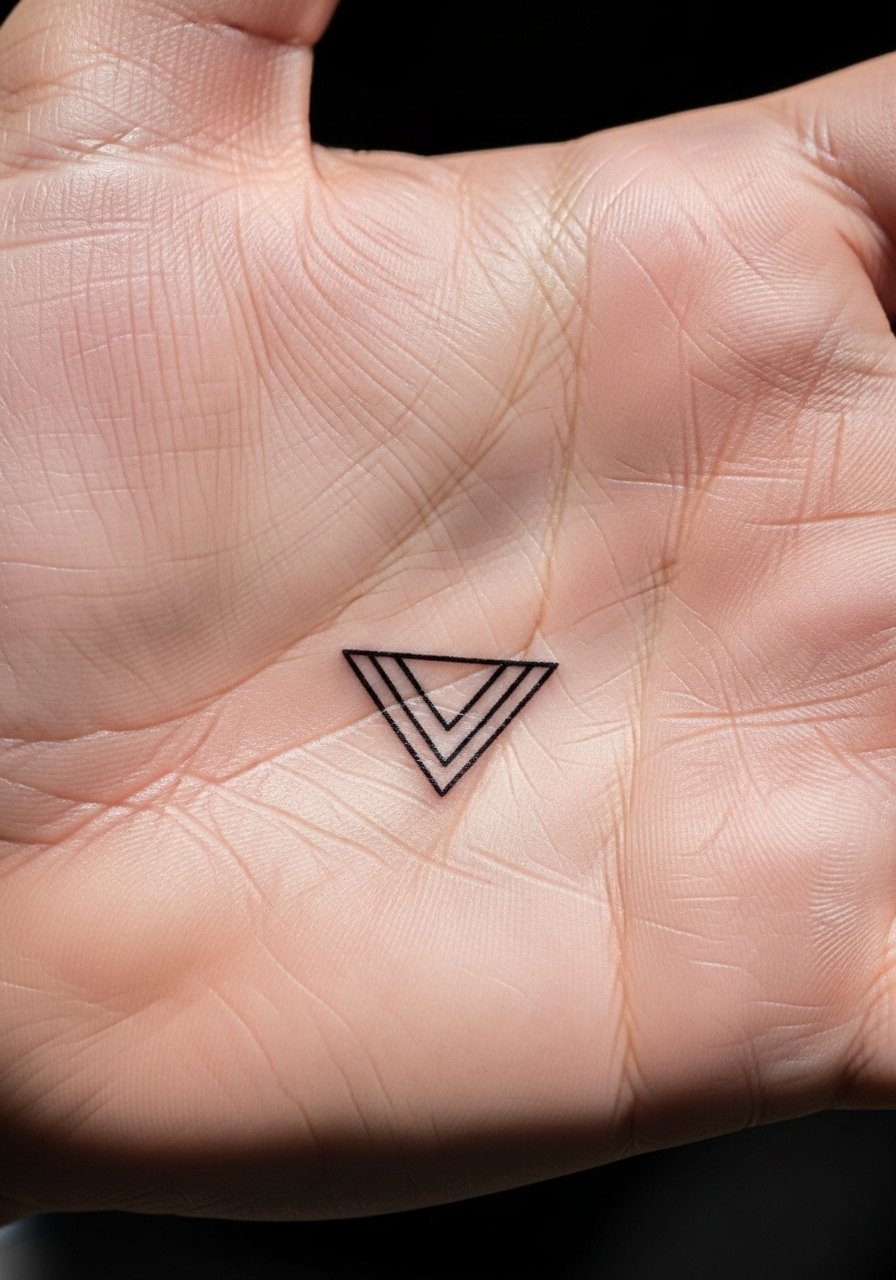
Mistake lead. The palm is a notoriously unstable canvas because skin regenerates and thick calluses can push ink out. The artists who do palm work either accept frequent fading and touch-ups or simplify the geometry to bold single strokes. If you want the look, choose simple geometry and plan for a revisit at year one. For the session pick a shirt with sleeves you can roll, like a casual linen button shirt so the artist can position your arm comfortably.
12. Watercolor Splash Accent on the Back of Hand
Aging/healing lead. Watercolor-style pigments on hands tend to fade faster than on less exposed areas. The version that holds better uses restrained washes anchored by crisp linework. Discuss with your artist which pigments have better staying power on hands. The session blends line and color work so expect a longer chair time. Protect the area from heavy sun exposure while healing.
13. Single Dot Accent by the Thumb Joint
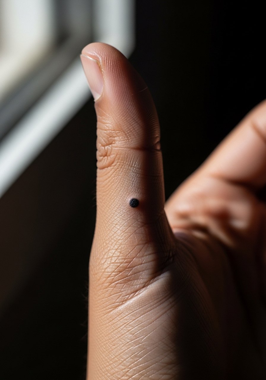
Personal observation lead. A single dot can read intentional when placed thoughtfully, but scale matters. Too small and it becomes invisible after a year. Ask for a dot that reads bold enough to hold under skin movement. The session is very quick and sharp. For minimal jewelry that highlights the dot try a thin chain bracelet worn on the opposite wrist so attention returns to the subtle mark.
14. Illustrated Animal Paw on the Side of Hand
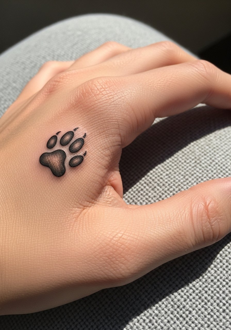
Visual impact lead. Paw motifs that use clean outlines and small internal shading age more reliably than heavily stippled tiny details. A common mistake is over-detailing pads which blur after movement. Ask the artist to keep the pads suggestive rather than densely shaded. The session feels similar to other hand placements with sharp moments. This design reads well with casual outfits and low-profile jewelry.
15. Micro-Realism Eye Above the Thumb
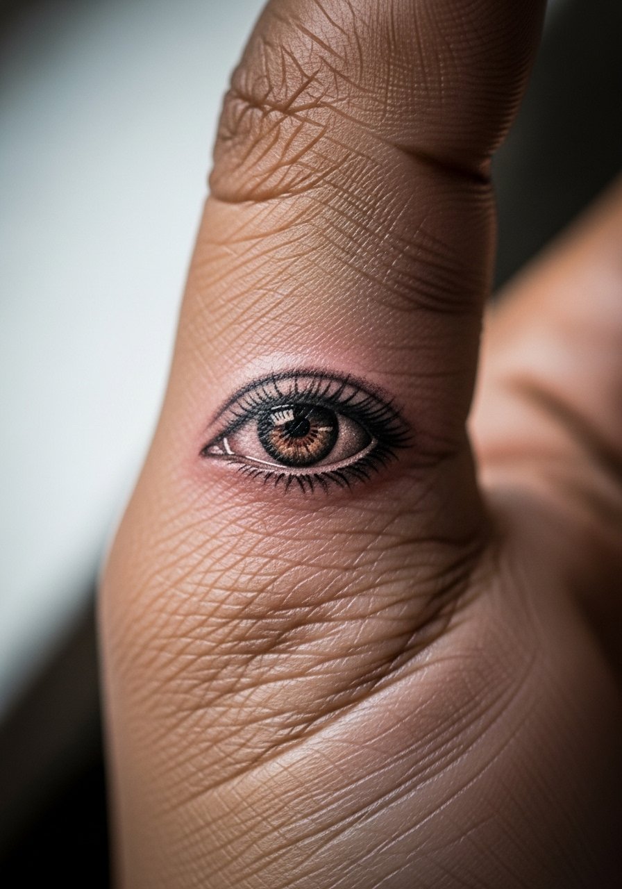
Mistake lead. Micro-realism on hands can look incredible fresh but tends to lose crispness faster than on torso skin. If you want realism, request slightly higher saturation and simpler contrast so the main features remain legible as the skin ages. Touch-ups are common at year two or three. For the session wear a short-sleeve tee to allow unrestricted access and a relaxed pose.
16. Floral Wrist-to-Hand Anchor
Pain warning lead. The wrist crease area has thinner skin and hits differently than the hand pad. Most problems come from trying to cram dense petals into the crease. Ask for airy spacing and slightly larger petals near the wrist. The session can be a mix of delicate strokes and heavier spots of saturation. For showing the piece, sleeves rolled to the forearm or a delicate chain bracelet complements the cluster.
17. Black Line Arrow Along the Index Finger
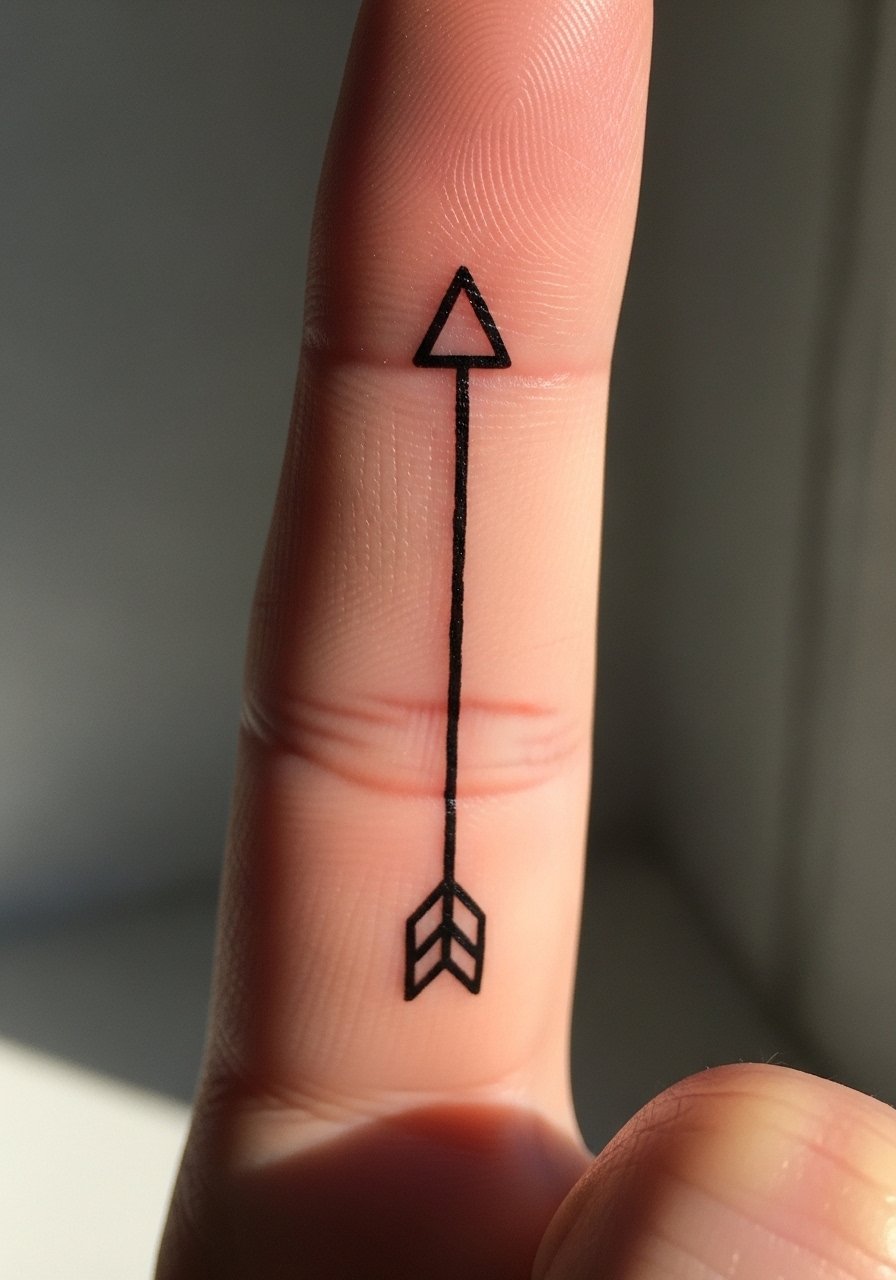
Consultation lead. Arrows look tidy when centered and sized to the finger length. The common mistake is overthinning the shaft which leads to early blur. Ask to keep the shaft balanced and the tip slightly heavier. The session is short and sharp. Access tips for the artist include a comfy chair and a fingerless glove for the non-tattooed hand to stabilize your posture during the work.
18. Minimal Crescent Moon on the Back of Hand
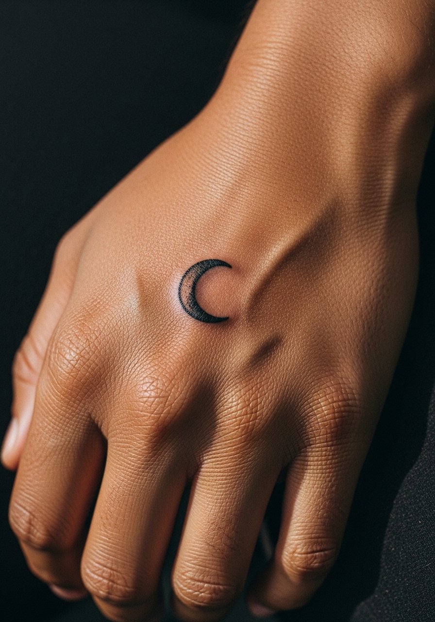
Aging/healing lead. Single-shape motifs like moons hold up when bold enough to avoid merging into skin texture. The mistake is picking an ultra-thin crescent. Ask for a slightly thicker crescent and even edge definition. The session is quick and manageable. For wardrobe pairings, open cuffs or rolled sleeves keep the moon visible without overexposure.
19. Illustrated Keyhole at the Base of the Palm
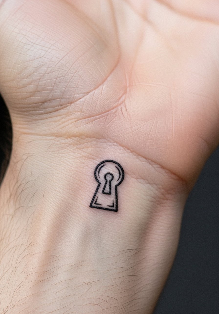
Controversy lead. There are two camps on small symbolic motifs in high-movement zones. One group says these pieces should be avoided because they require frequent touch-ups. The other group argues that with deliberate spacing and saturation they can last with modest maintenance. Ask the artist how often they plan touch-ups for palm-adjacent work and make a decision with that timeline in mind. The session can be brief but the aftercare period matters.
20. Lace-Inspired Linework Across the Back Hand
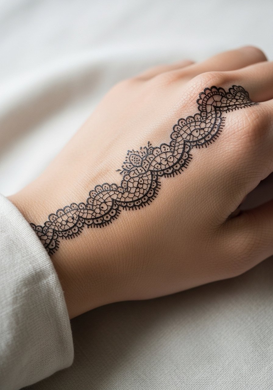
Visual impact lead. Lace motifs look delicate but need breathing room between lines. The error is dense filigree that resolves into a blotch over time. Ask for simplified repeats and slightly heavier primary lines so the pattern keeps its shape as it heals. Sessions can be longer because of the detail. Pair the look with a thin chain bracelet for a vintage feel that does not compete.
21. Tiny Geometric Band Around the Thumb Base
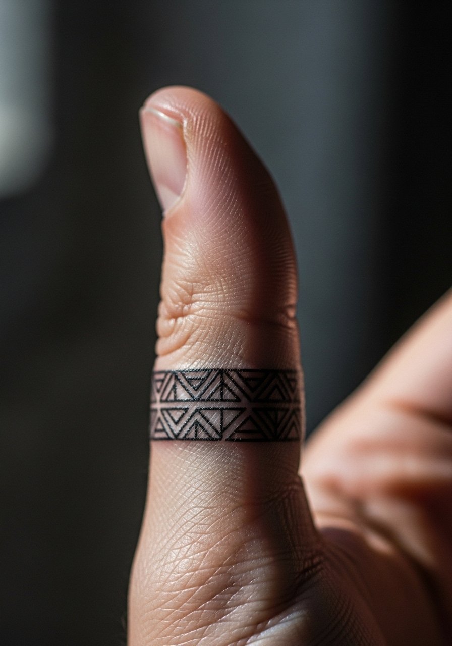
Mistake lead. Rings and bands around thumbs can fade quickly if placed over flex points. The safe route is modest width with clear negative space. Ask for a band that is slightly wider than your initial impulse. Sessions are short but precision is key. For showing it off, pair with a minimalist gold band on another finger for balance.
22. Tiny Anchor Near the Wrist Tendon
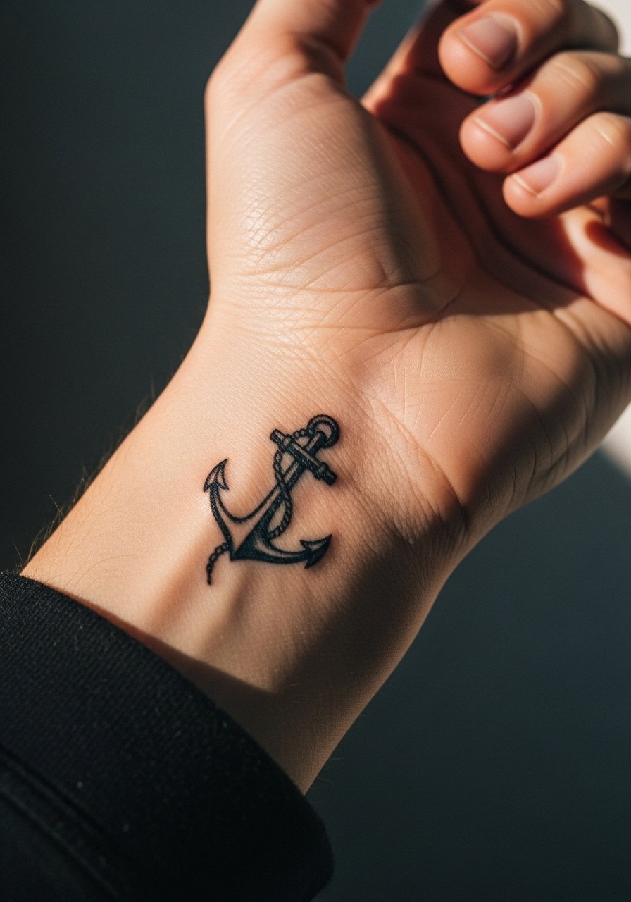
Personal observation lead. Anchors with negative space age better than fully filled micro anchors in this zone. The typical mistake is adding too many internal lines that soften. Ask for a simple silhouette with one or two inner accents. The session is quick and pinchy. Keep the area away from tight bracelets during the first month.
23. Illustrated Feather Along the Side of Hand
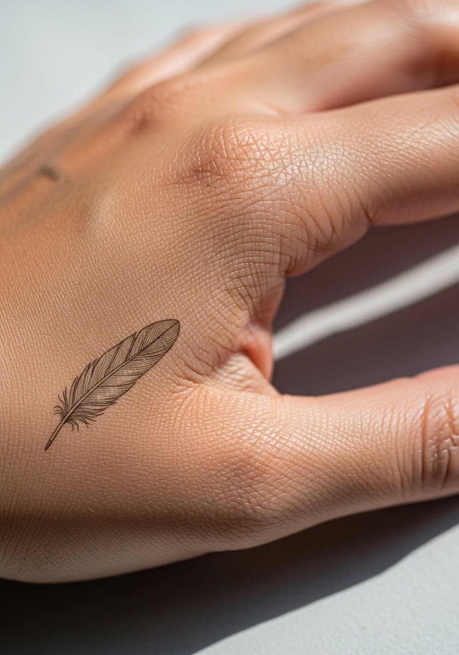
Styling lead. Feathers look graceful when they follow natural hand lines and stop before finger joints. The mistake is forcing length onto joints which causes distortion during movement. For the appointment wear a loose tank top so you can relax your shoulder and keep the hand steady while the artist works.
24. Tiny Portrait Medallion on the Top of the Hand
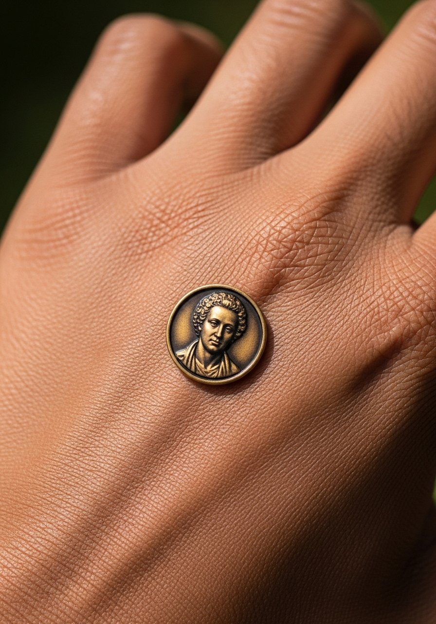
Mistake lead. Portraiture on hands is ambitious because details soften faster here than on the chest or arm. If you insist, simplify facial features and prioritize strong contrast over micro texture. Touch-ups are likely in a couple of years. The session will require steady hands and careful pacing from the artist.
25. Coordinates Script Along the Finger Edge
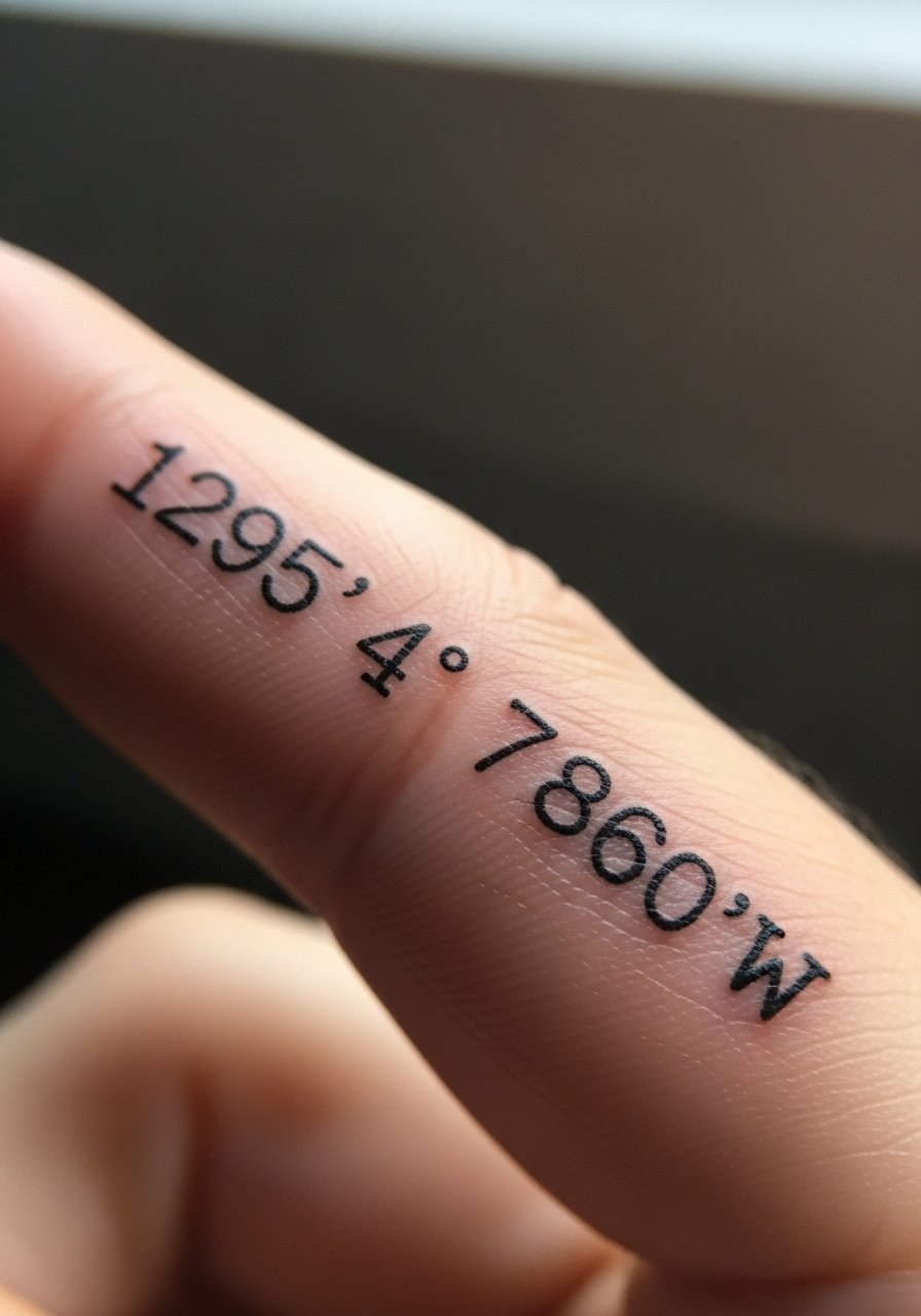
Consultation lead. When text lives on a narrow edge, spacing and font choice decide legibility. Ask for a clean monospace style and to see a stencil applied while moving the hand so you can check how it reads. The session is quick but precise. For daily wear pick minimal rings that do not rub the edge and consider a thin chain pendant to balance simplicity.
26. Illustrated Tiny Ship Silhouette Near the Thumb
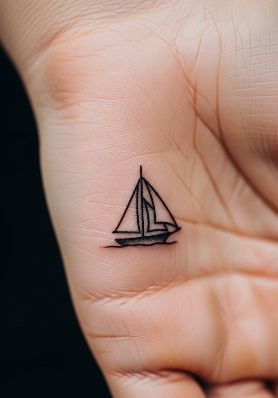
Aging lead. Block silhouettes like ships hold up well if the hull is not rendered with tiny internal lines. The mistake is trying to pack nautical details into a tiny area. Ask for a bold silhouette and clear negative space. Sessions are short but require exact placement. For travel-friendly shows, pair the design with a casual rolled sleeve.
27. Single Tiny Star at the Finger Tip
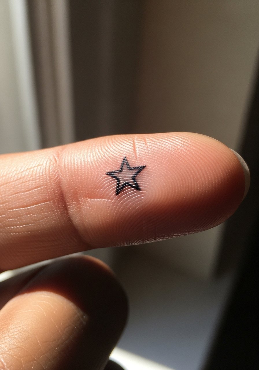
Personal observation lead. Fingertip tattoos are the most ephemeral of hand placements because of constant abrasion. The two camps are clear. One group discourages fingertip work entirely because the ink usually vanishes. The other group will do it knowing you accept frequent touch-ups. If you want a fingertip star, accept the maintenance schedule and plan touch-ups from the start. For the session wear a cropped tee so your arm can rest comfortably.
Frequently Asked Questions
Q: Will fine line hand tattoos blur faster than bold blackwork?
A: In my experience, fine line pieces on hands tend to require touch-ups sooner because daily wear and washing soften thin strokes. Bold blackwork trades crisp fine detail for longevity because heavier lines and saturated fills resist merging under the skin. Match the aesthetic you want with the realistic maintenance you are willing to commit to.
Q: Can I get a palm or fingertip tattoo and expect it to last?
A: It depends on your tolerance for maintenance. Palm and fingertip tattoos often fade faster and may need touch-ups every one to three years. Some artists recommend simplified, bold designs if you want longer life. Ask artists about their experience with those specific zones before booking.
Q: Are hand tattoos risky for professional settings?
A: Hand tattoos still make a difference in some workplaces. Two views exist. One argues that visible hand ink can close doors in conservative fields. The other says norms are shifting and many workplaces are fine with tasteful pieces. Consider the placement and your career timeline when choosing size and visibility.
Q: How should I prepare for a hand or finger session day?
A: Wear comfortable clothing that allows your arm to rest and the artist to access the hand easily. Loose short sleeves or a button-down you can roll work best. Bring snacks and a plan to keep your hand steady during short but intense bursts of work.
Q: Do colored inks hold up on hands as well as black?
A: Colors generally fade faster than black on high-contact areas. If you prioritize color choose more saturated pigments and discuss realistic expectations for touch-ups. Anchoring color with crisp black linework extends perceived longevity.
Q: Where should I look to find an artist experienced with tiny hand details?
A: Explore local convention rosters, specialty directories, and community threads that highlight portfolios. Hashtags and shop directories let you see healed photos that show how small work on hands looks months after the session.
