
Fine line sleeves are trending, but what holds up on an arm a decade from now is often the opposite of what gets the most likes on launch day. Expect trade-offs around pain, longevity, and how much time you actually want to sit in the chair. Read the options below and you will see which illustrative sleeve choices balance detail with durability, and what to ask before the stencil hits skin.
1. Micro-Realism Narrative on Inner Forearm
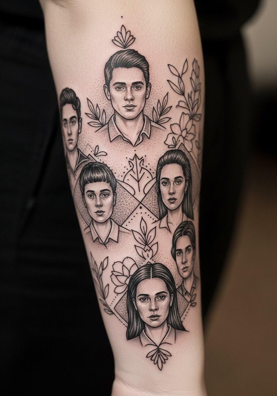
I recommend this when you want a sleeve that reads like a series of scenes rather than one dense panel. Tell your artist to plan negative space between motifs so the tiny portraits do not merge by year three. Expect a moderately sensitive session on the inner forearm and plan for two sessions totaling about four to six hours. Common mistakes are asking for portrait size too small and skipping a touch-up. At six months the stipple holds, at two years some dot work softens, and by five years you may need a touch-up to restore crisp pupils. For showing this off, roll up a loose button-down shirt to frame the forearm without covering the composition.
2. Bold Line Illustrative Full Sleeve with Block Saturation
There is a split among artists about how illustrative sleeves should balance line weight and saturation. One camp prefers heavy outlines and deep black panels to age into solid shapes. The other camp favors thinner contours and more shading for finer detail. I side with planning broad anchors of black first, then layering details, because saturation resists blowout and sun fade. Pain is moderate along the outer arm and shoulder. Sessions usually break into two to three visits. Wear a loose tank top to the appointment so the artist can work the shoulder without tugging at fabric.
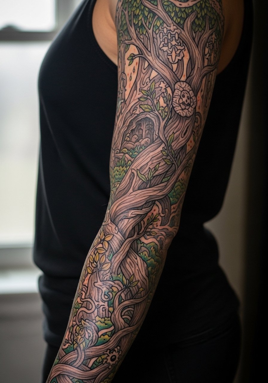
3. Botanical Illustrative Sleeve That Wraps the Bicep
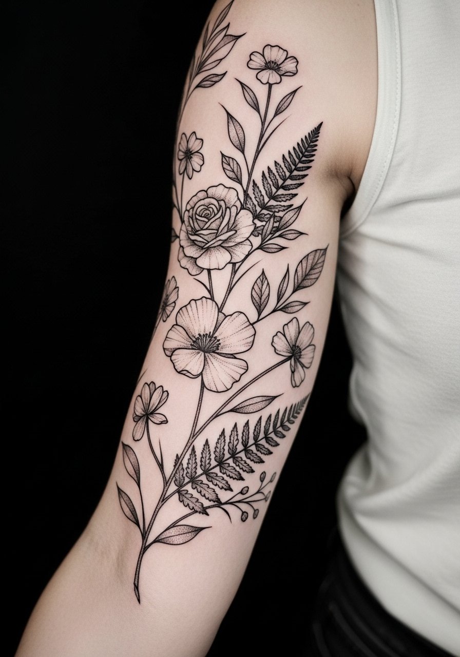
I've seen botanical sleeves age well when artists leave breathing room around leaves and stems. The biggest error is cramming detailed leaf veins into thin bands. During consultation ask for simplified veinwork and heavier stems that will keep shape as skin shifts. Sessions are medium pain with a three to five hour first sitting. At six months the stems settle, at two years fine veins may blur, and occasional touch-ups on linework keep the composition crisp. Pair this with rolled sleeves for reveal looks. If you plan to show it off on nights out, a short-sleeve linen shirt keeps the arm visible without competing patterns.
4. Script and Illustration Combo Along the Inner Arm
Fair warning, script and tiny illustrative motifs on the inner arm demand precise spacing. The common mistake is requesting very thin lettering next to tiny icons. Ask for slightly bolder letterforms that match the linework scale of surrounding art. Expect higher sensitivity on the inner arm and plan for short sessions focused on linework first. In the first year the script reads sharp, by year three thin strokes may soften and need a touch-up. For the session, wear a loose long-sleeve you can roll up so the artist has full access without compressing the skin.
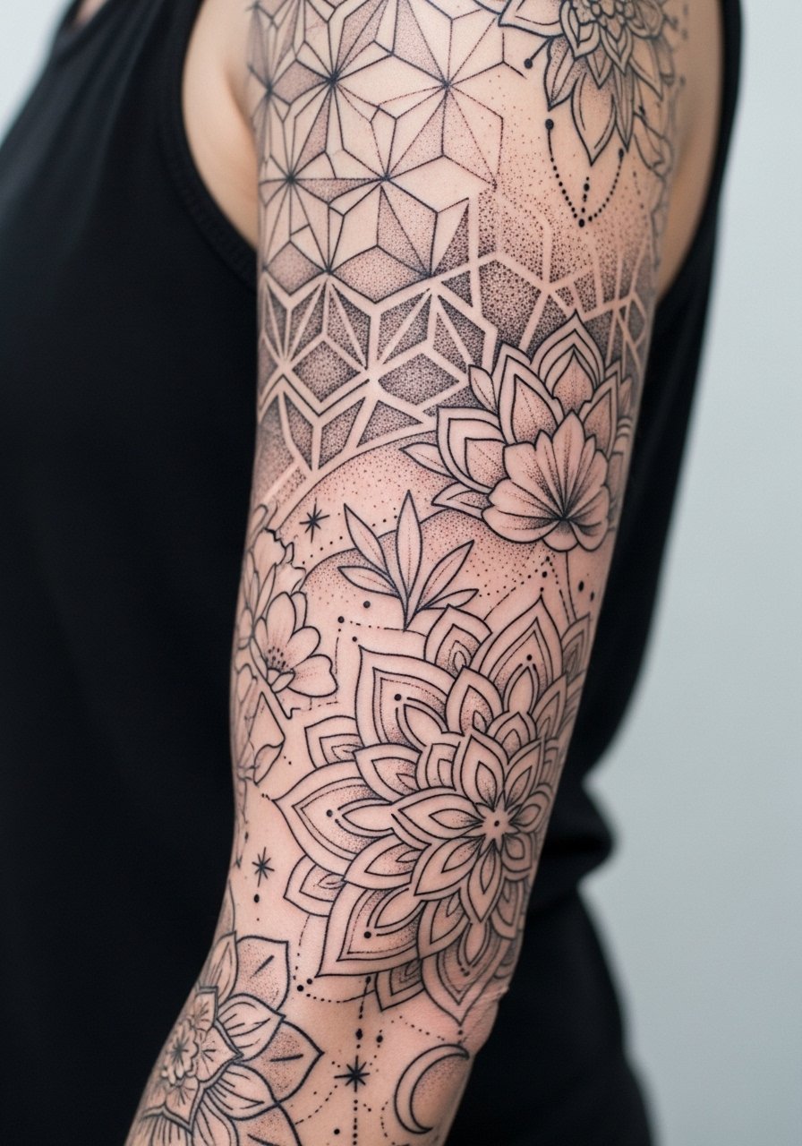
5. Narrative Sleeve with Negative Space Panels
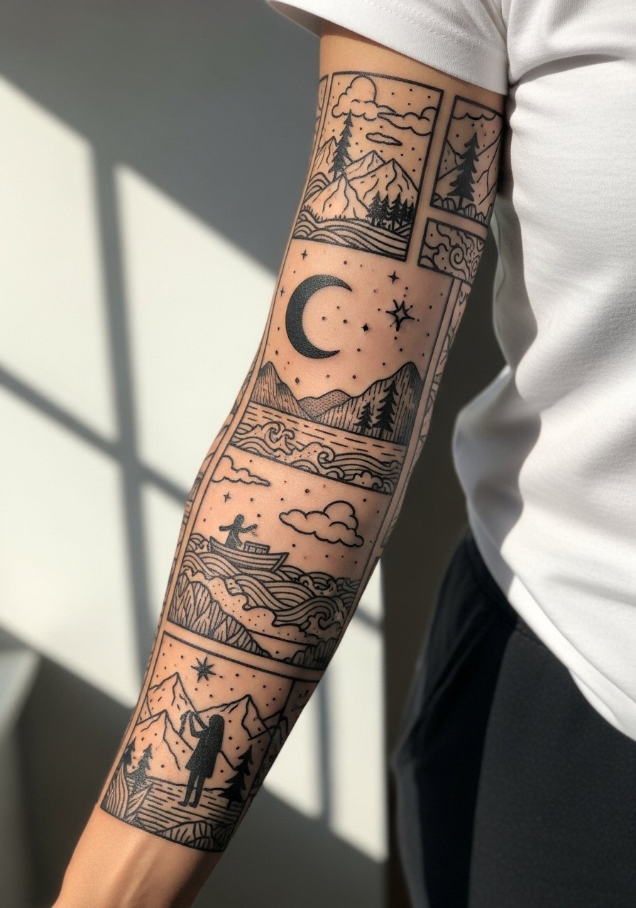
There is a practical benefit to designing illustrative sleeves with intentional negative space between scenes. It reduces the risk of elements bleeding together as the ink settles and it gives you visual rest when you glance down. Tell your artist you want "breathing fields" between motifs and ask for mockups showing the sleeve from multiple angles. Sessions vary but expect at least three visits for a full wrap. The biggest rookie mistake is packing in background shading everywhere. For revealing the panels in warm months, a short-sleeve henley frames the arm without hiding the negative space.
6. Black-and-Grey Illustrative Sleeve with Stipple Shading
Stipple and dot work can create depth without heavy saturation, but they demand time. Expect longer session hours and a patient artist. The wrong request is pushing for dot shading at too small a scale. Ask for slightly larger stipple gaps so texture remains distinct after healing. Blowout risk is lower than with dense whip shading, but UV exposure still erodes contrast. Touch-ups at year two or three are common for high detail areas. For the session wear a loose short-sleeve shirt you can pull aside. Trust your artist on spacing and dot density unless you see the same healed work in their portfolio.
Studio Day Picks
The outer and inner arm approaches above demand different prep and first-week supplies, and a small kit eases the chair day and the initial healing window.
-
Stencil transfer paper kit. Lets you preview layout directly on skin which helps avoid scale mistakes for narrative panels and script placement.
-
Topical numbing cream. Applied before the session to ease inner arm sensitivity without changing how the needle lays ink.
-
Thin protective film roll. Useful for wrist and forearm pieces that rub on clothing during the first week.
-
Fragrance-free gentle body wash. Cleans the area without stripping oils that help a fine-lined sleeve heal evenly.
-
Aquaphor healing ointment. Thin layers in the first few days trap moisture for intricate linework and prevent scabbing that could lift pigment.
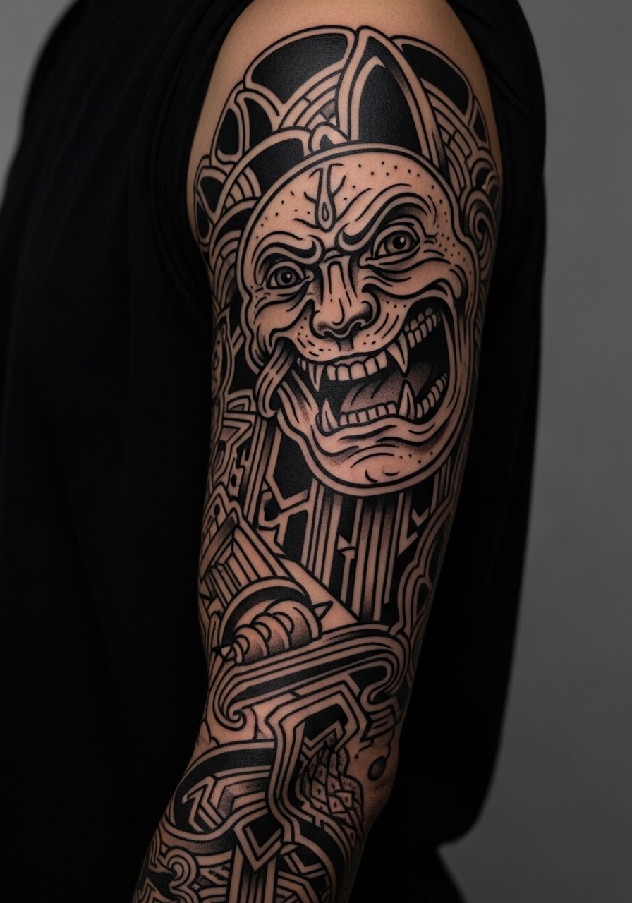
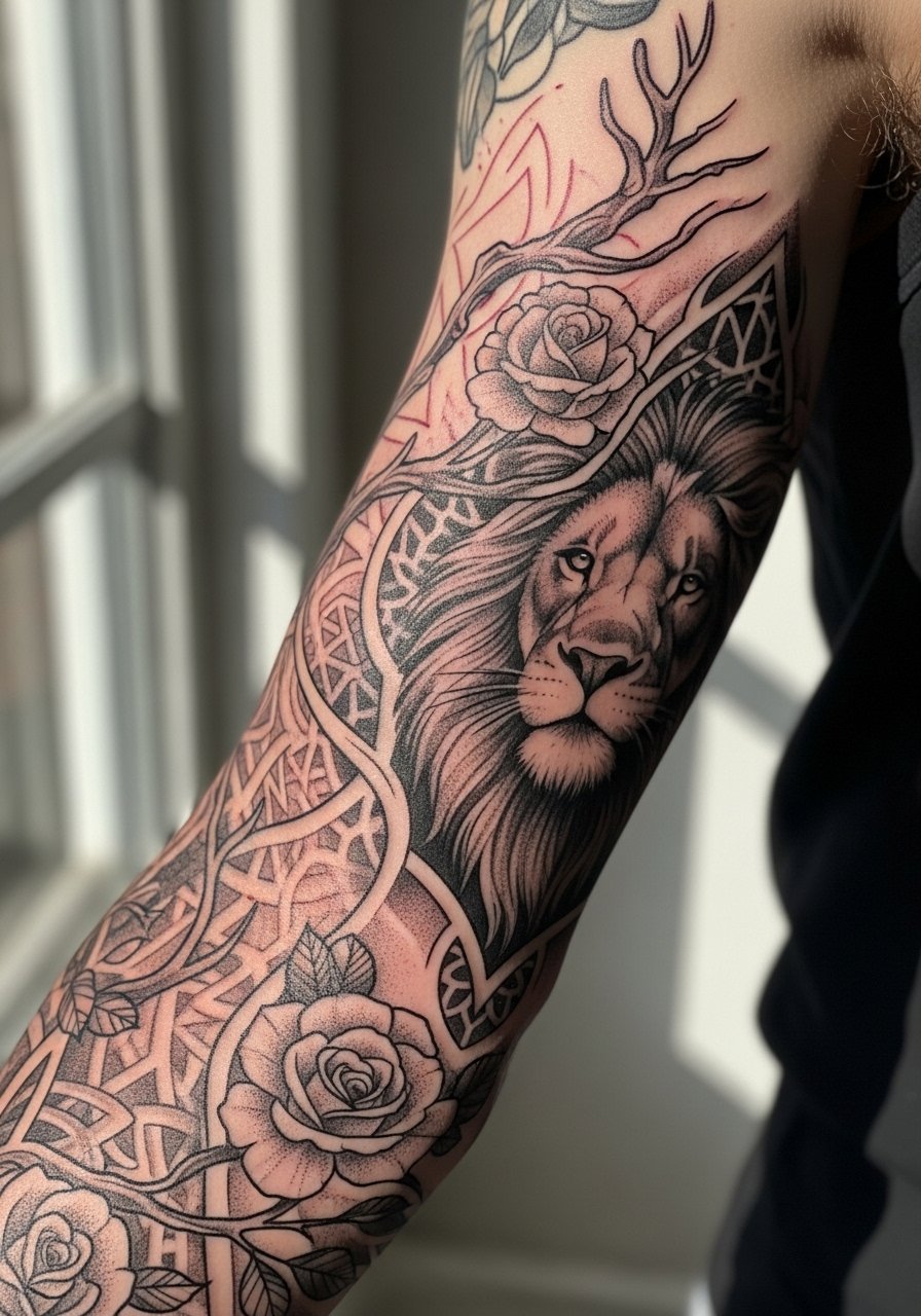
7. Sleeve That Mixes Illustrative Realism with Geometric Frames
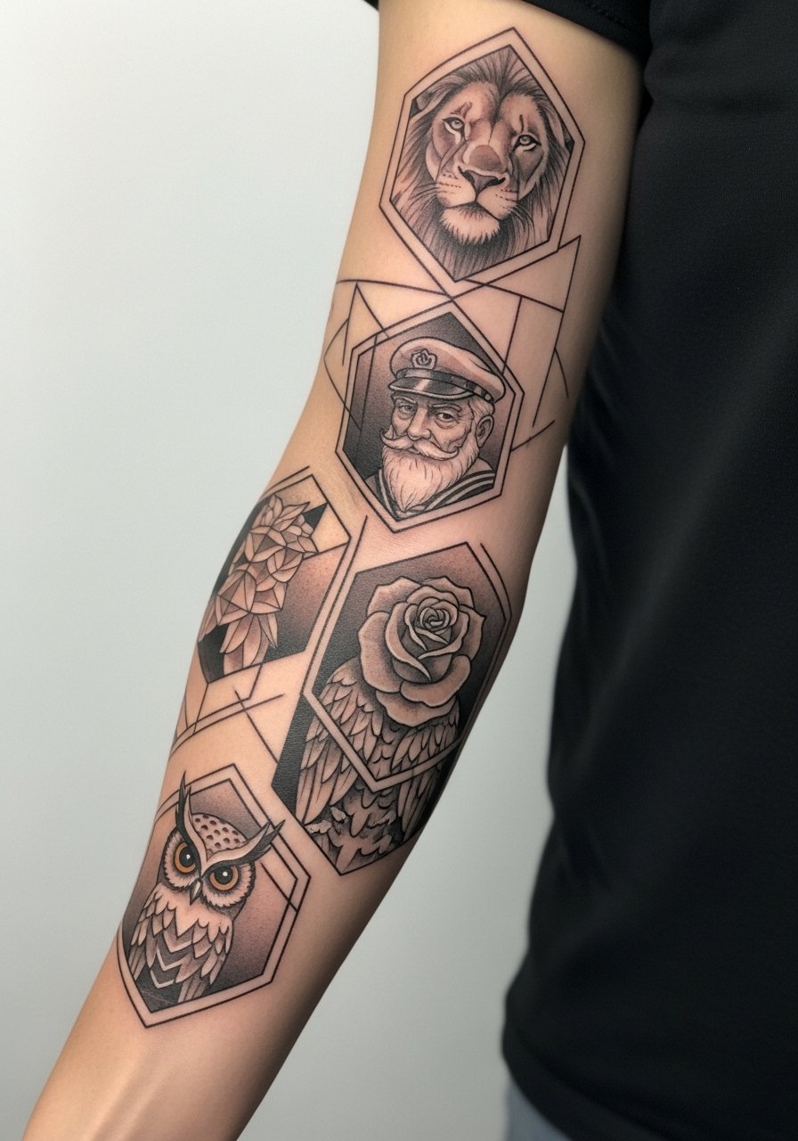
When realism meets geometry you get contrast that reads from a distance. The common debate is whether mixing styles weakens overall cohesion. One side says strict cohesion keeps sleeves readable. The other side argues contrast creates focal points. I recommend clear geometric separators and consistent line weights so realism does not vanish into patterned areas. Sessions are longer and often split between portrait detail days and linework days. Expect touch-ups on portrait highlights at year three. For show-off outfits, a rolled-sleeve denim jacket frames the panels without hiding the panels.
8. Forearm-to-Wrist Chain-Link Illustrative Sleeve
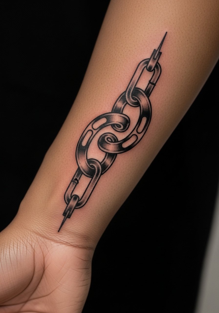
The wrist area has higher friction and tends to fade faster. If your sleeve extends to the wrist, ask for slightly bolder terminal lines and pockets of saturation where the chain links meet the hand. Expect a high-touch environment in the first week because soap and movement will test the work. Pain is higher at the wrist bones. Many people underestimate how sleeves that terminate near the hand age. Plan for a protective film during sleep and expect a touch-up sooner than upper-arm panels.
9. Comic-Style Illustrative Sleeve with Bold Panels
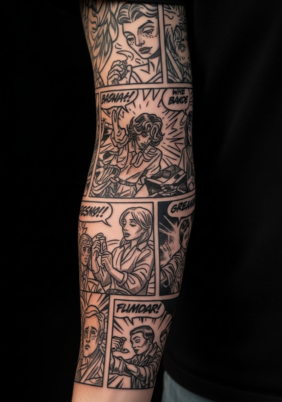
There is an immediate visual punch to comic-style panels when black outlines are used to isolate scenes. The mistake people make is asking for too many tiny frames. For longevity, scale up panels and keep bold anchors. Sessions feel fast when there is a lot of solid black, because saturation goes in in big passes. Expect less frequent touch-ups than micro-detail sleeves. To wear this casually and show the composition, a vintage graphic tee with rolled sleeves keeps attention on the bold panels.
10. Surreal Illustrative Sleeve with Floating Motifs
Surreal sleeves rely on strong composition to avoid looking disjointed as they age. I advise mapping the flow of motifs so movement reads when the arm bends. The common error is scattering elements without an underlying rhythm. Sessions are variable, usually multiple shorter visits to ensure placement works in motion. Blowout risk is moderate where thin strokes cross soft tissue. Expect subtle softening at two years and plan a targeted touch-up rather than a full redraw. For studio comfort bring a light zip hoodie you can remove easily.
11. Sleeve Using Whip Shading for Smooth Transitions
Whip shading creates smooth tonal transitions and can make illustrative work feel painterly. The downside is dense whip shading can fade into a muddy gray without UV protection. Ask your artist for layered shading with some stipple contrast to hold texture. Sessions often involve long gradient passes and a separate outline session. The common mistake is asking for ultra-smooth gradients at too small a scale. To keep edges visible over time, plan minimal direct sun exposure and wear a lightweight long sleeve shirt when outdoors.
12. Sleeve That Incorporates Negative Space Lettering
Negative space lettering works when the letterforms are large enough to remain distinct as skin ages. The frequent error is putting narrow counters into busy backgrounds. Tell your artist to test letter width on the stencil and view it from arms-length. Pain and session times are similar to other forearm work. At 6 months the letters usually read clean, at 2 to 3 years thin counters narrow. If your job requires occasional concealment, consider longer sleeves or a neutral overshirt you can quickly button up.
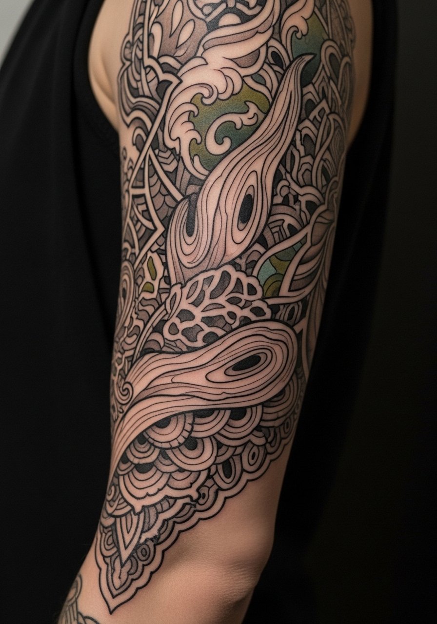
13. Sleeve with Layered Illustrative Textures and Dot Work
Layered textures add depth without relying solely on black fills, but they require restraint. The mistake is overlapping too many textures in a single plane. During consultation ask the artist to label each texture area on the reference so the plan is clear. Sessions are detail-heavy and feel slower because of dot work pacing. Expect touch-ups on dense texture zones after a couple of years. For session comfort wear a loose cotton tee that allows the artist to move around the arm easily.
14. Full Sleeve That Tells a Single Visual Story Around the Arm
A continuous narrative sleeve asks for intentional pacing from the top down. The common error is trying to cram too much plot into a narrow band. Ask for storyboard sketches so the flow of scenes works with muscle movement. Sessions are long and often scheduled over several months. As the sleeve ages, scenes with heavy fine detail will need targeted refreshes. If you are concerned about workplace visibility, plan outfits that can conceal or reveal sections with easy layering.
15. Illustrative Sleeve with Accent Color Washes
Adding restrained color washes gives an illustrative sleeve pop without risking full-color fade problems. The controversy here is whether washes age faster than solid color. One group accepts periodic re-saturation as part of ownership. The other group prefers pure black-and-grey to avoid that maintenance. My suggestion is one or two accent tones used sparingly in low-friction zones. Sessions include color topping after linework heals slightly. For evening reveal looks a rolled-cuff blazer or short-sleeve button shirt lets the accent color sit against cleaner fabrics.
16. Minimal Illustrative Sleeve for Subtle Presence
There is a misconception that minimal illustrative sleeves are low maintenance. They can be high maintenance when placed across areas that flex often. The mistake I see is choosing tiny motifs that lack scale from the start. Ask for slightly increased line weight and spacing so the minimal elements remain legible at year five. Sessions are shorter but might require frequent touch-ups. For the appointment pick a stretch cotton shirt you can slide off without tugging the sleeve area.
17. Sleeve That Blends Illustrative with Traditional Anchors
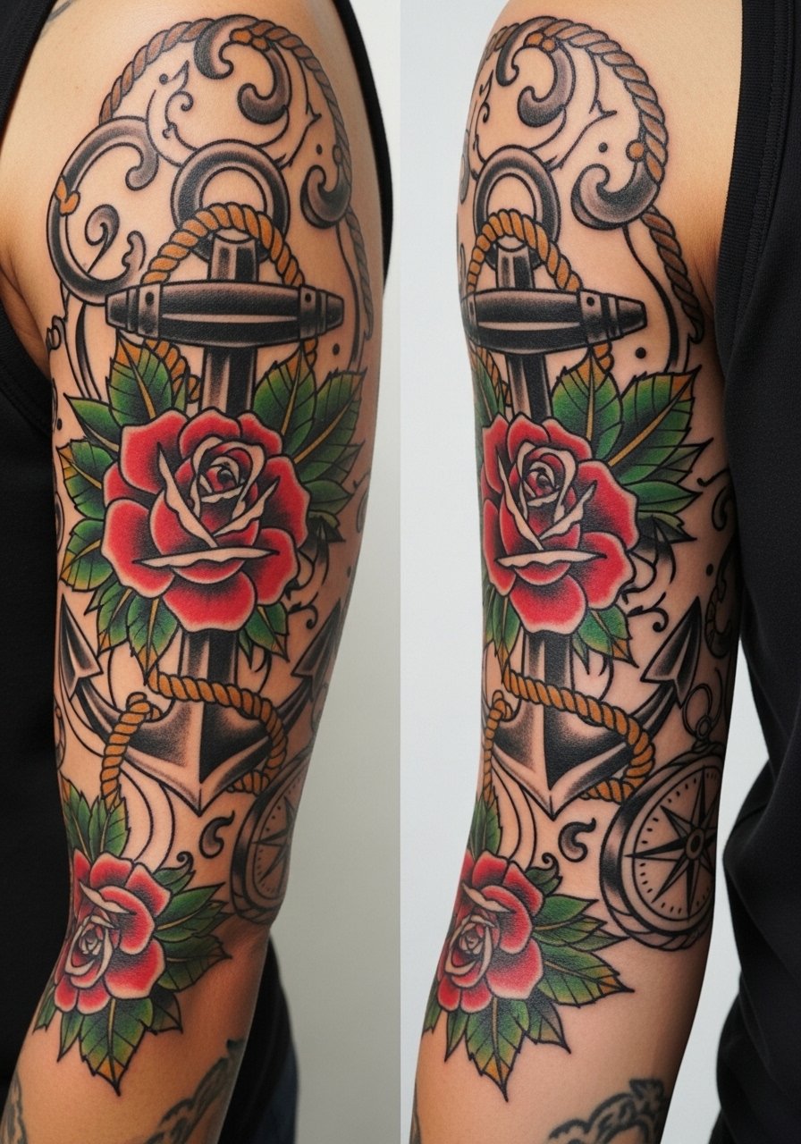
Blending illustrative detail with traditional anchors creates readable focal points that age predictably. The usual error is mismatched line weights between anchors and surrounding illustration. Ask your artist to show healed examples of their blended work. Sessions often split into anchor passes and detail passes. Traditional anchors help the sleeve read well from across a room and they minimize visible loss as the piece heals and ages. If you want a simple evening reveal, a short-sleeve oxford shirt frames the arm while keeping focus on anchor motifs.
Frequently Asked Questions
Q: Will a highly detailed illustrative sleeve blur faster than a bold blackwork sleeve?
A: Yes, highly detailed illustrative sleeves with very thin strokes tend to soften sooner than bold blackwork because tiny lines have less tolerance for skin movement and UV exposure. If you want detail that lasts, ask the artist to build in bold anchors and leave breathing room around the finest strokes. Expect touch-ups at year two to three for the most intricate zones.
Q: How should I prepare clothing-wise for a full-arm illustrative session that includes shoulder work?
A: Wear clothing that gives the artist full access without pulling at the shoulder. A loose tank or a button-down you can wear open works well. Avoid tight sleeves and full shirts you must remove over your head during the first sitting.
Q: Are forearm sleeves OK for jobs that still have conservative dress codes?
A: Many people with visible forearm sleeves manage conservative work by choosing long sleeves for the office and revealing art in casual settings. If you expect frequent client-facing meetings, consider sleeves that stop above the wrist so concealment is easier.
Q: How long are typical sessions for an illustrative full sleeve and how many visits should I budget?
A: Most illustrative full sleeves break into multiple sessions. A common breakdown is four to eight visits depending on complexity. Plan for a few long sessions and several shorter detail or color sessions. Your artist can give a realistic timeline after the consultation.
Q: Do illustrative color washes need different aftercare than black-and-grey linework?
A: The early care is similar, but color washes can show uneven fading if exposed to sun often. Keep the area covered in direct sunlight for the first months and use sunscreen on healed work. For the first week avoid friction and heavy sweating so color settles evenly.
Q: How do I choose between mixing styles versus committing to one cohesive illustrative approach?
A: Think about how you want the sleeve to read at a glance. Mixed styles can create contrast and focal points but demand careful planning. Ask to see healed examples from the artist that show mixed pieces. If you want a safer longevity bet, choose cohesive line weight and shared motifs that tie the sleeve together.
