
Fine line hand fillers look delicate in photos, but hands get washed and bumped every day, so the best small designs balance crisp linework with enough saturation to age well. Below are 21 hand-specific gap fillers that actually read as intentional work, not random dots. Each idea includes what to ask your artist, how it heals over time, and, when it fits, what to wear to show it off or make the session easier.
1. Dots and Tiny Stars in the Web Spaces
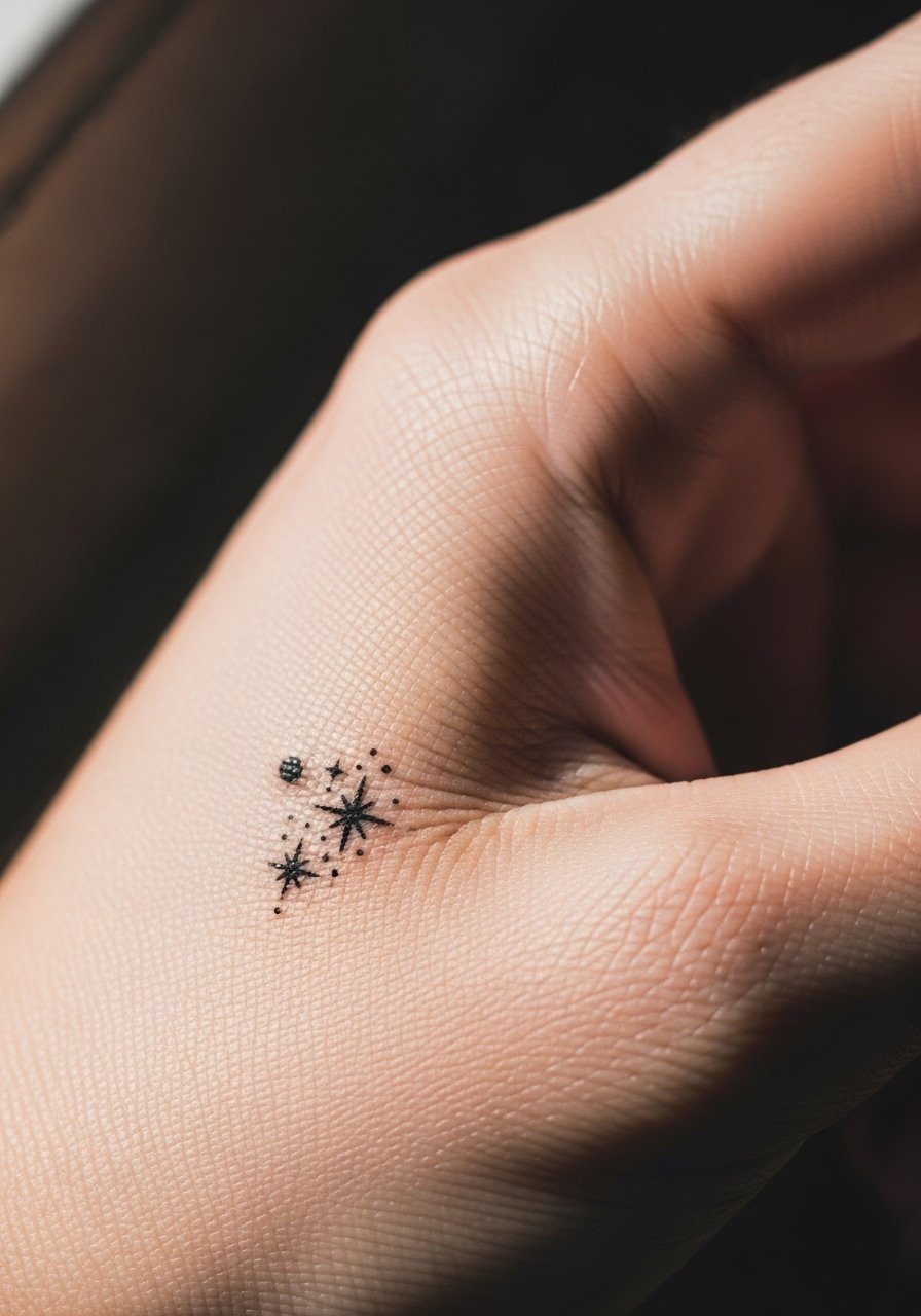
Dots and tiny stars work well in hand web spaces because they are micro in size and do not compete with larger nearby pieces. Ask the artist for slightly thicker single-needle dots and short star rays so the marks keep shape after a year. The common mistake is requesting hairline pin dots that look perfect day one and merge within months. Expect the first six months to show crisp contrast, at year two the faint dots will soften, and by year five you may want a touch-up. For showing this off, pair a slim leather cuff or a minimalist hand chain. Wear a sleeveless top to your appointment for full access and to avoid sleeve pressure.
2. Celestial Moons and Tiny Planets Between Knuckles
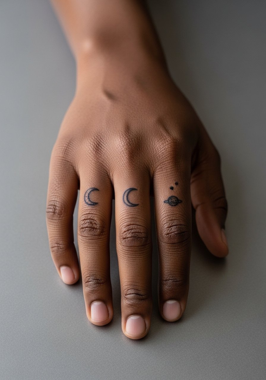
Small moons or planets fit the knuckle gaps and back of hand spaces without overwhelming nearby work. In consultation say you want bold silhouettes with subtle dot shading rather than ultra-fine ornamentation. Artists debate fine line versus bold saturation for knuckles. One camp insists on bolder lines for longevity, the other argues expert fine line can settle well. Name this debate directly in your consult and ask where the artist stands. Knuckle pieces feel sharp during the session but heal quickly because of thin skin. To style, layer delicate chain rings on other fingers and wear a cream linen shirt rolled to the elbows to frame the back of the hand.
3. Feather or Single Leaf Along the Side of the Hand
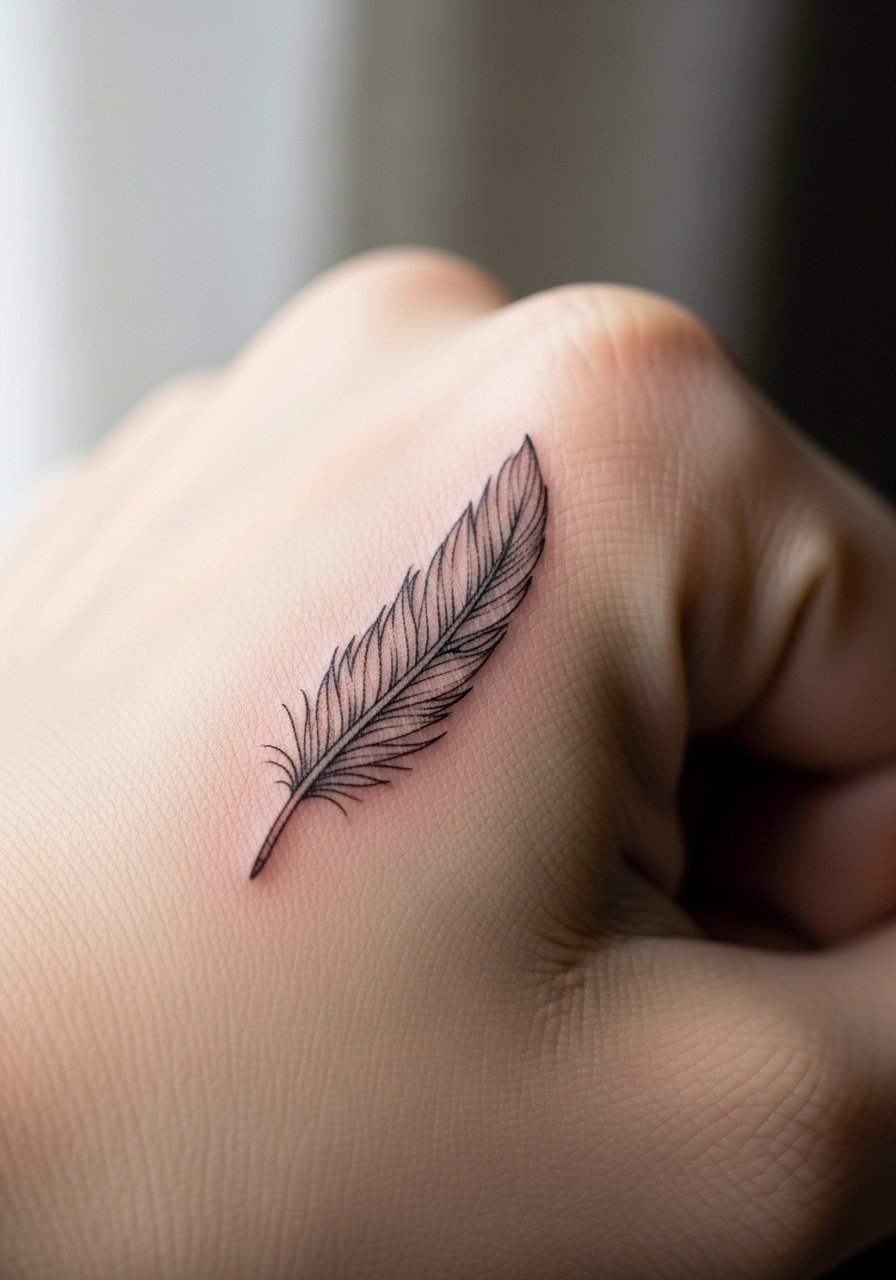
A feather or leaf bridges awkward negative space and follows the natural flow of tendons. Tell your artist you want a tapered quill with stipple shading for texture and to avoid heavy solid fills that age into blobs. The most common mistake is too-small veins in the feather that disappear under daily wear. This placement rates moderate on the pain chart because of thinner skin, but the session is short. For showing it off, pair with a thin gold bangle on the opposite wrist and wear a loose tank or sleeveless top to give the artist clear access.
4. Tiny Butterfly or Bee on Finger Sides
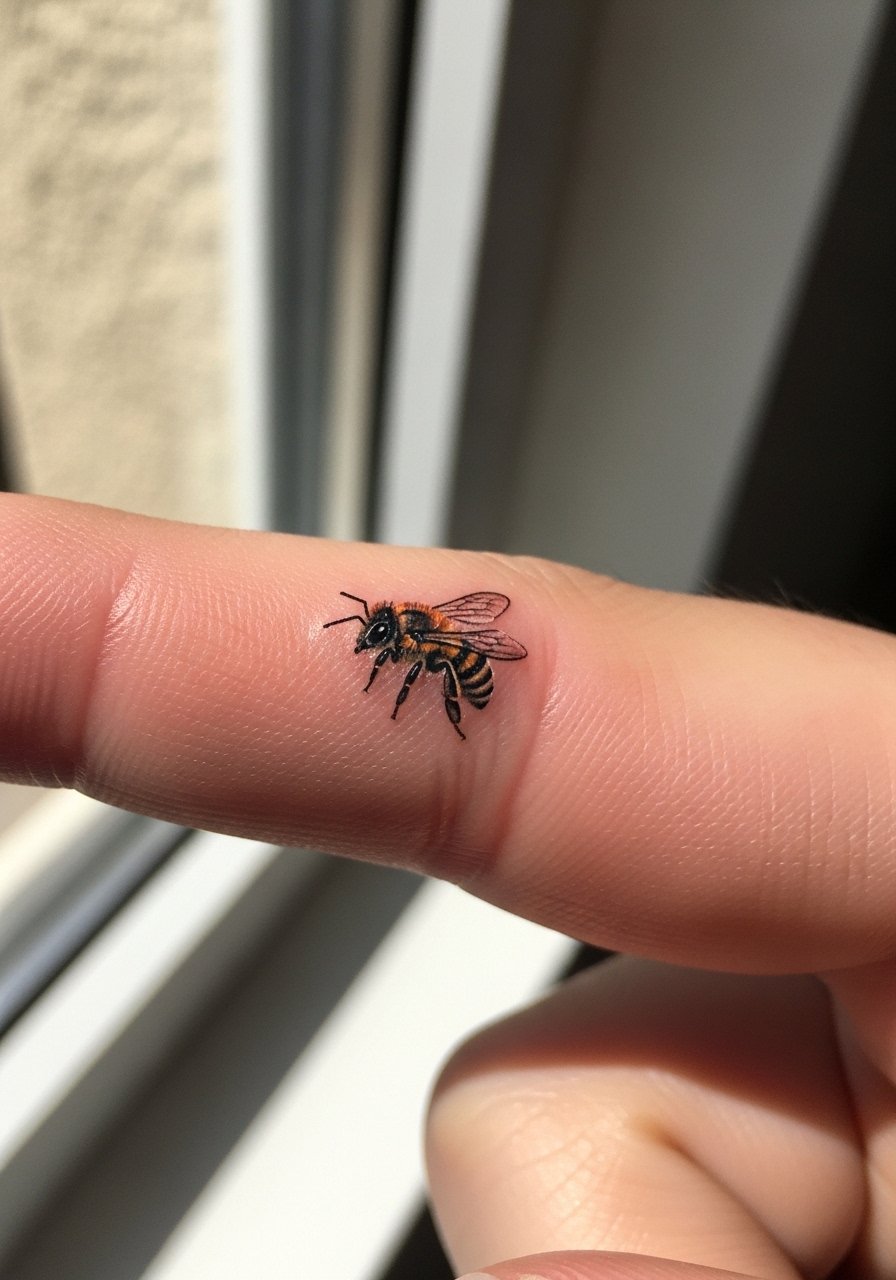
Micro-realism animals like butterflies or bees add movement between larger pieces and translate well to small finger gaps. Ask for slightly simplified wings and avoid hyper-detail that cannot be maintained in such a small scale. A common mistake is insisting on full color for a design that needs just a color punch to remain legible. Finger sides get frequent friction and may need touch-ups sooner than back-of-hand work. Session discomfort is mild but expect sensitivity. For session wear pick a loose tee and remove all rings. To show off the design, a dainty chain ring set draws attention without covering the tattoo.
5. Ornamental Swirls That Bridge Knuckle to Wrist

Abstract swirls and waves help visually connect disparate tattoos by providing movement across gaps. During consultation ask for varied line weight and subtle dot work to create texture rather than solid fills. The mistake is packing too much detail into a tiny arc which leads to fuzziness in two years. This placement needs a balance of saturation and negative space to withstand constant hand use. Expect the session to be short but the healing to require careful washing. Pair the finished piece with matte black rings for contrast and choose a tank top or short sleeves for the appointment.
6. Tiny Music Note or Clef Near the Palm Edge
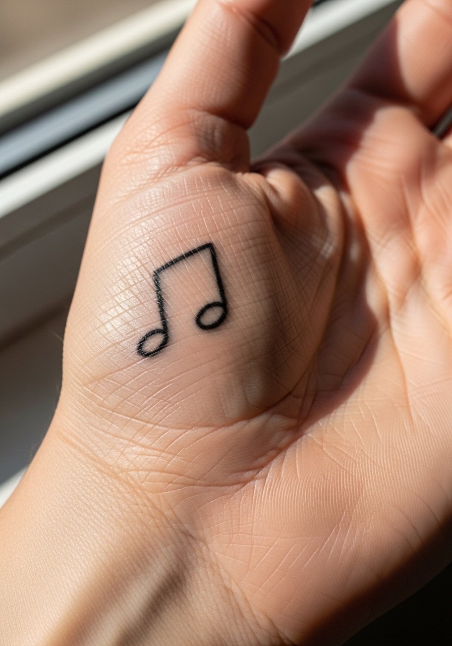
A small music note is perfect for wrist-to-hand transition gaps and reads like an intentional accent. Tell the artist you want bold single-line work rather than thin script so the note holds shape. People often ask for ultra-delicate scripts that fade too fast on palms and edges. Palm-adjacent placements experience friction and may lighten sooner, so expect minor touch-ups within a couple of years. For showing this off, minimal stud earrings and a neutral thumb-hole hoodie keep attention near the wrist without overpowering the design. Wear short sleeves for the session so the artist can position your hand comfortably.
Pre-Session Essentials
The tiny hand pieces above heal differently from larger arm work, so a few small items smooth out the session and the first week.
-
Stencil transfer paper kit. Lets you preview and reposition the exact placement on fingers and web spaces before the needle goes down, which is crucial for symmetrical micro work.
-
Topical numbing cream. Applied as directed before the session it reduces sharpness on knuckles and web spaces without interfering with linework.
-
Thin protective film roll. Protects finger and palm-edge tattoos from constant contact during the first 48 hours of healing.
-
Fragrance-free body wash. Gentle cleansing keeps tiny linework intact while avoiding irritation from scented products on fresh hand pieces.
-
Aquaphor healing ointment. A thin layer on day one helps protect delicate single-needle lines without clogging the area.
7. Tiny Traditional Eagle or Shark Head on Back of Hand
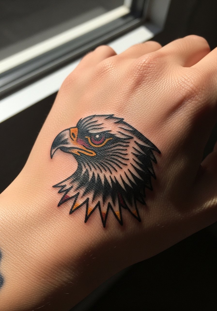
Traditional motifs like a compact eagle or shark head are bold micro icons that age well on the back of the hand. Ask for stronger linework and simple color blocks rather than complicated gradients. The common error is shrinking a traditional flash down to micro size without increasing line weight, which leads to blurring. These designs tolerate washing better than fine script. The session feels punchy because the back of the hand has thin skin, but a one-session approach is typical. Style it with stacked signet rings or fingerless leather gloves for a vintage vibe and wear short sleeves to the appointment.
8. Message-in-a-Bottle Icon Near Palm Edge
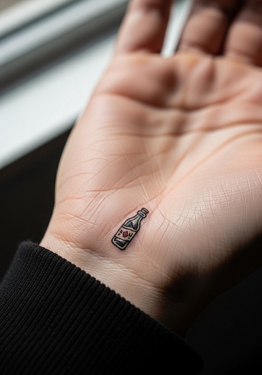
A message-in-a-bottle sits neatly in finger gaps or near palm edges and reads as a compact narrative. In consult specify simplified contours and restrained color fills so the bottle remains readable after healing. The mistake is over-detailing the contents at a scale that cannot be preserved. Palm-edge locations see lots of friction and may flatten color faster than back-of-hand work. For showing this, a neutral hoodie with thumb holes gives glimpses without covering the tattoo completely. Remove jewelry for the session so the artist can place your hand flat during work.
9. Watercolor Floral Sprigs That Bridge Wrist to Hand
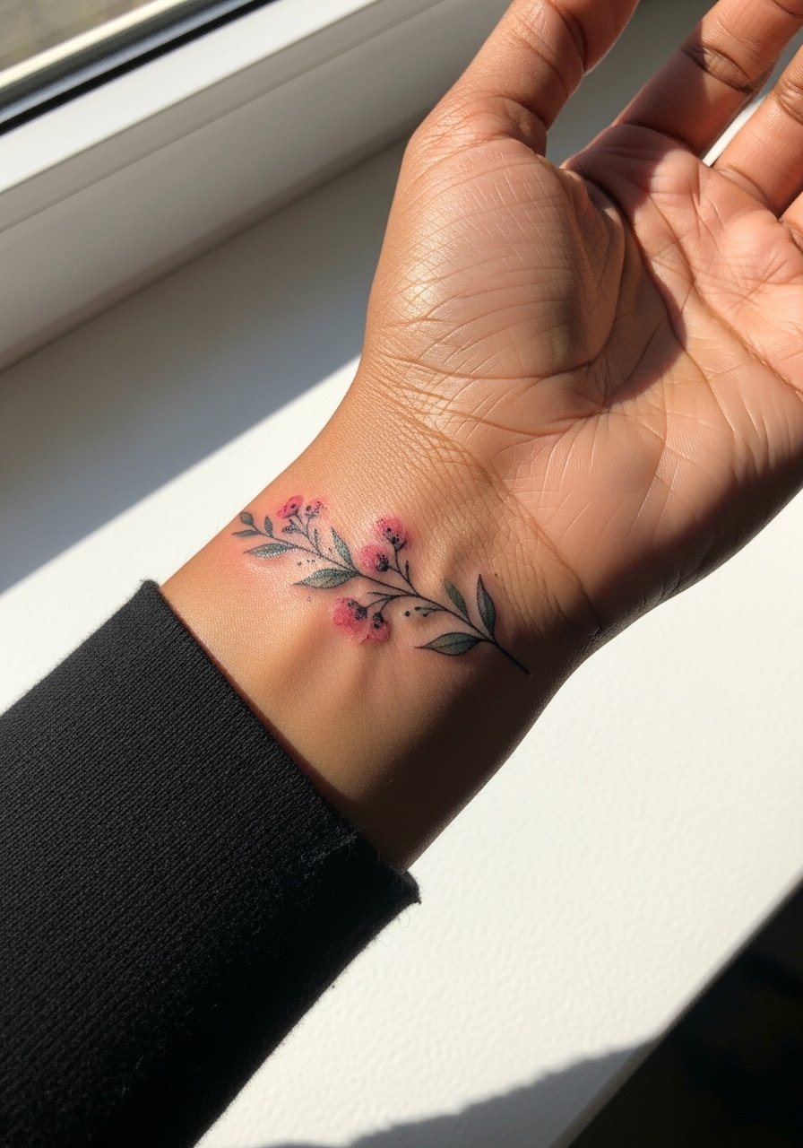
Watercolor floral connectors bring soft color between a wrist piece and hand tattoos but require careful spacing. Tell the artist you want color transitions limited to sparse washes and a stronger outer line near high-friction areas. The common mistake is full watercolor washes that fade into patchy tones on hands. Expect the colors to soften markedly by year two, and plan a color refresh if you want sustained vibrancy. For show-off pairing consider a thin bangle stack opposite the design and wear a sleeveless or button-down open shirt to the session for easy access.
10. Geometric Blackwork Accent on the Side of the Hand
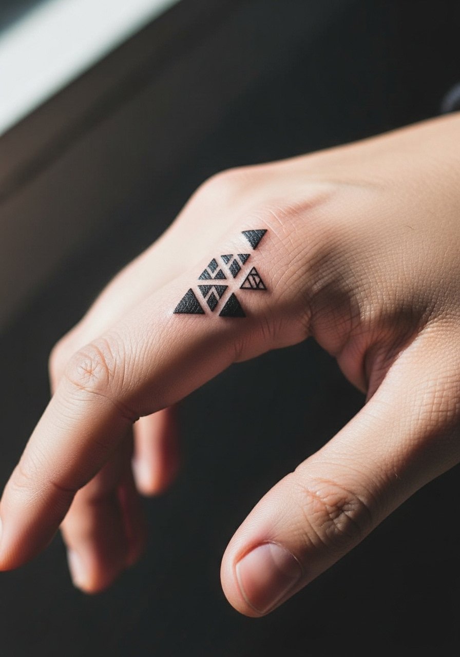
Geometric shapes read intentional and tidy in side-of-hand gaps, and they help anchor asymmetrical sleeves. During consultation say you want breathing room between lines so the geometry maintains clarity. The biggest mistake is making lines too close; dense patterns on hands merge over time. Expect a two-year touch-up window for thin linework, and more spacing equals longer visual life. Pair the finished design with matte black rings and a clean white crew tee to keep the aesthetic minimal. Wear a tank top for the session so the artist can steady your hand.
11. Tiny Anchor or Ship Wheel in Finger Gaps
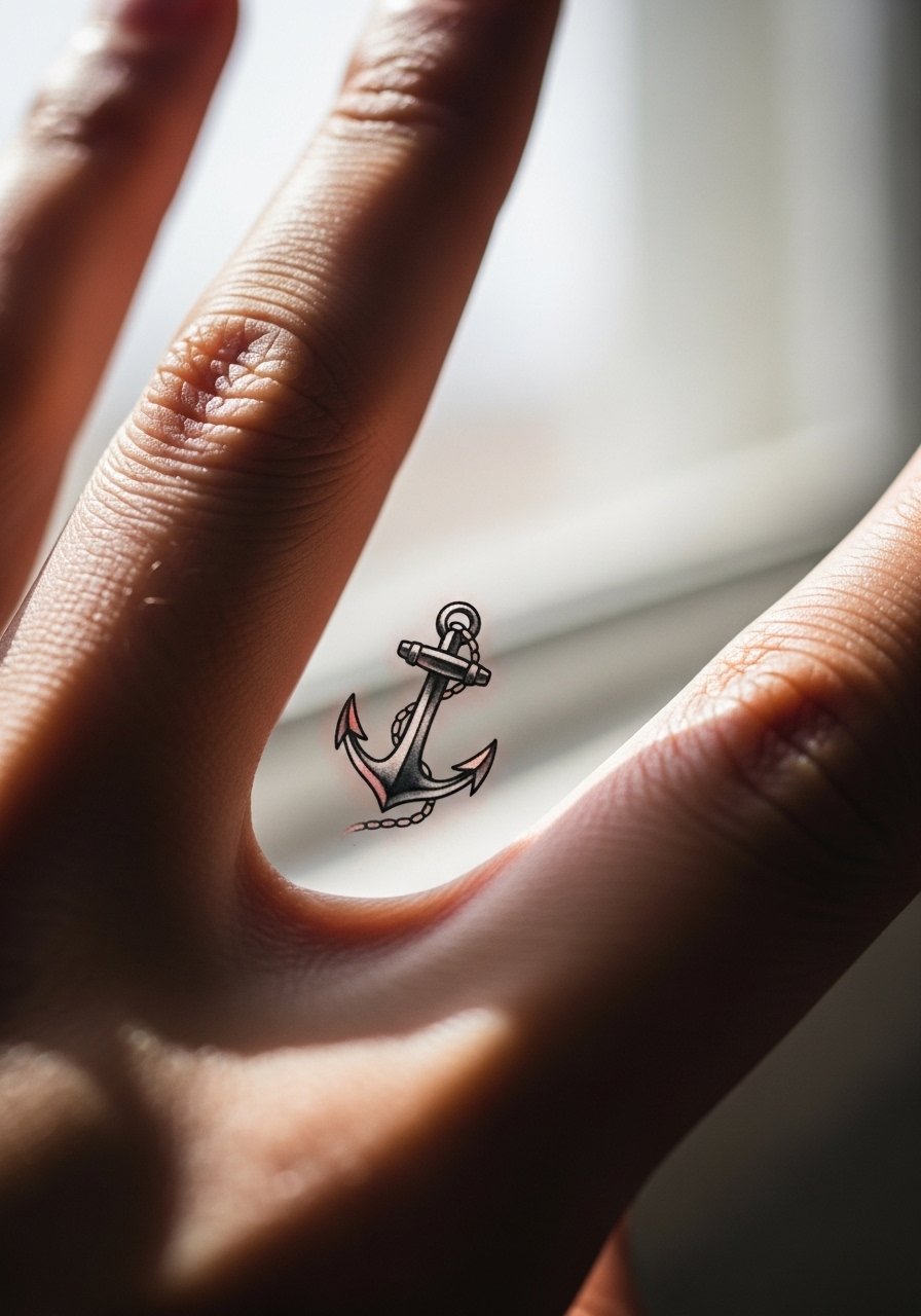
Nautical icons fit palm edges and finger gaps while giving a compact theme to sleeve projects. Ask for simplified shapes and avoid tiny interior ornamentation that cannot be held at micro scale. A mistake people make is insisting on heavy color fills on moving parts of the hand, which fade unevenly. These spots are more prone to early fading, so expect touch-ups sooner than forearm work. For showing off, consider a minimalist hand chain or dainty rings and wear a loose short-sleeve shirt for your appointment.
12. Tiny Script Word Along the Side of a Finger
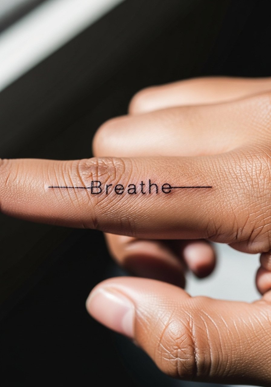
Single-word scripts placed in finger gaps need deliberate sizing and font selection to avoid blurring. Tell your artist you want medium-weight lettering with slightly wider spacing between characters so each letter keeps definition. The common error is choosing an ornate font that crumbles into illegibility. Side-finger placements suffer from rubbing and sun exposure, so expect to revisit the linework. For the session remove all rings and wear a loose tee to let the artist position your hand comfortably. A layered chain necklace draws attention upward while keeping the fingers visible.
13. Micro Mandala Dot Work on the Back of the Hand
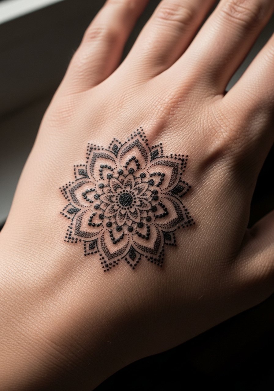
A tiny mandala of stippled dots can visually connect larger motifs around it by acting as a focal point. Ask for increased spacing between concentric dot rings and avoid super-dense centers that fill in later. Artists split on tight dot fields on hands; one view favors heavy spacing to avoid merging, the other believes expert stippling can maintain fine gradations. Name that split in your consult and ask how they space dots. Expect the piece to soften at two years. Style with a slim leather cuff on the opposite wrist and wear a loose button-down to the appointment.
14. Aquatic Swirl Connector Near Finger Gaps
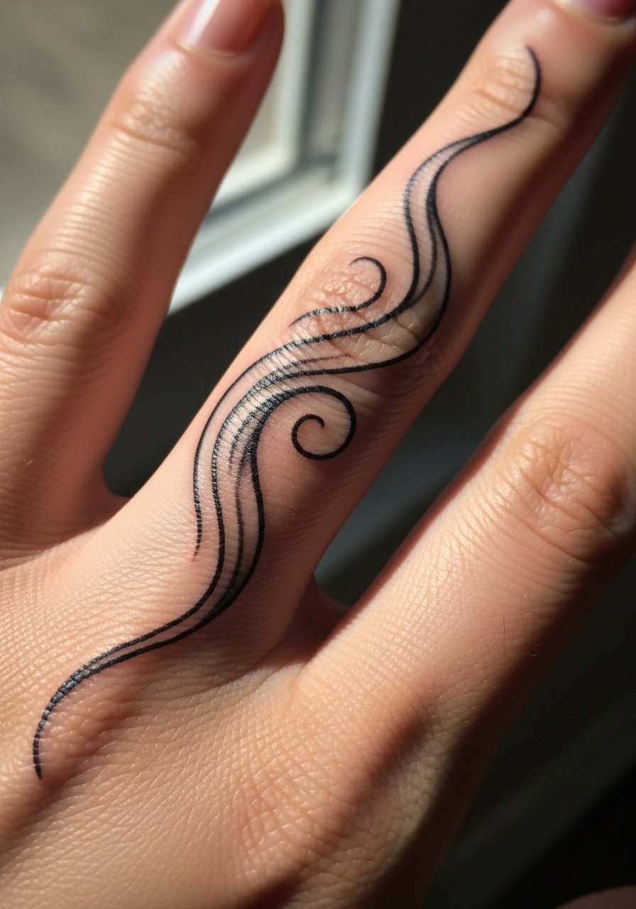
Aquatic swirls are an underused way to blend marine-themed pieces or to add motion between static icons. During consultation request flowing whip shading and avoid heavy black fills that can stiffen the movement. The common mistake is mapping a rigid pattern that clashes with hand motion. These areas move constantly, so flexible curvature helps the design read longer. For showing off, pair with bare fingers opposite and pick a monochrome silk scarf for evening looks. Wear a loose tee without jewelry to the session.
15. Tiny Key or Lock on the Thumb Base
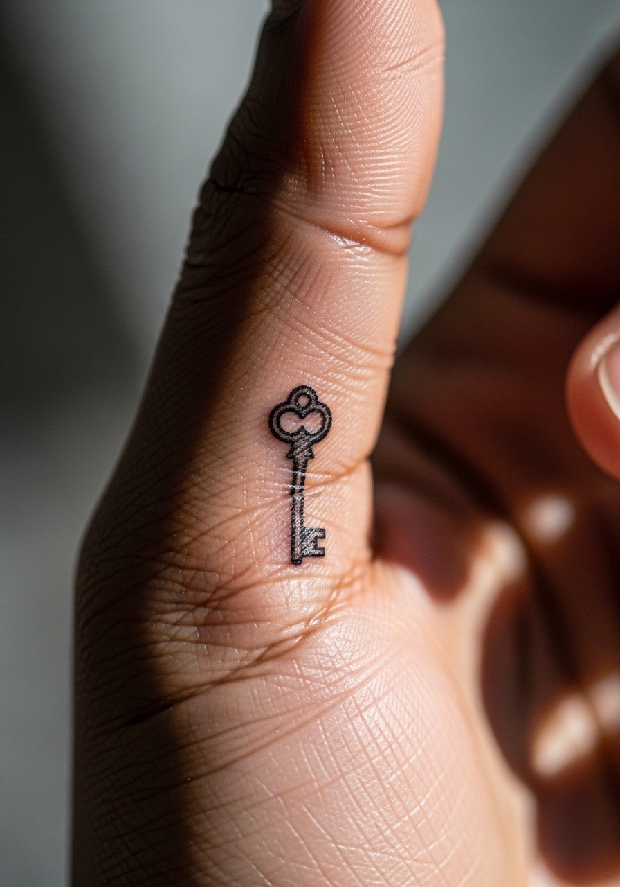
Keys and locks are compact symbols that sit neatly by the thumb base and web spaces. Ask the artist for schematic outlines with minimal interior detail so the silhouette stays crisp. A common error is asking for filigree that cannot persist at tiny scale. Thumb-base placements see frequent movement and touch, so plan a touch-up in the first 18 months. To show it off, use delicate chain rings on adjacent fingers and wear a short-sleeve shirt for the session for easy hand positioning.
16. Tiny Compass Rose Bridging Knuckle Spaces
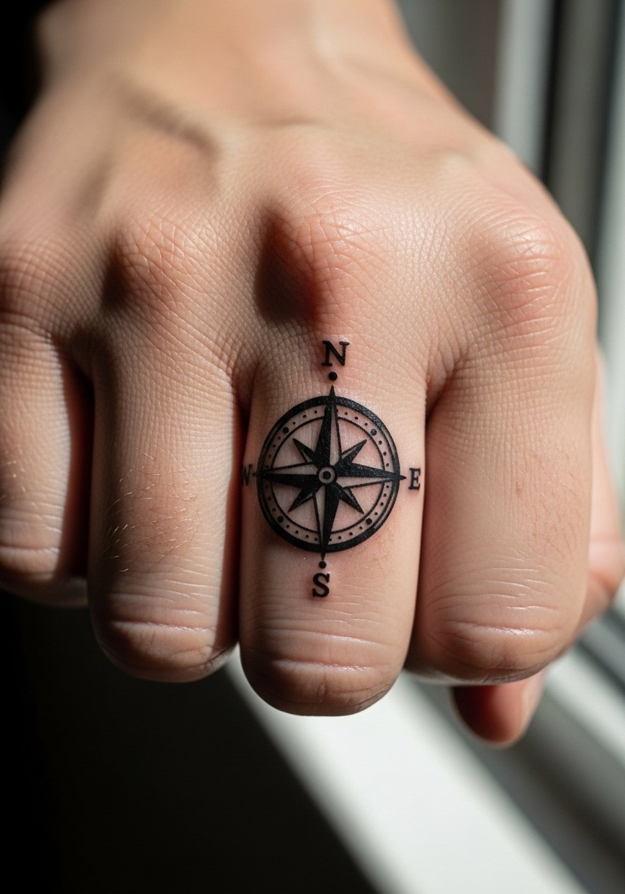
A compact compass rose anchors travel-themed sleeves and fits well in central back-of-hand gaps. Tell the artist you want a clear outer ring and simple internal elements to keep the design legible over time. The mistake is crowding the center with tiny details that darken into a blotch. Knuckle-adjacent compass pieces can feel sharp during needling but usually finish quickly. For show-off styling pick a slim leather cuff on the other wrist and a vintage band tee. Plan on short sleeves for the appointment.
17. Minimalist Crescent Rows Across Knuckles
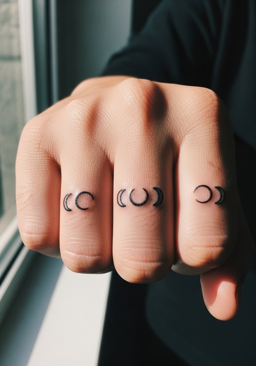
Multiple tiny crescents across knuckles create rhythm and help mask uneven spacing from older tattoos. Clarify with your artist that each crescent needs slight size variation to account for skin contours rather than forcing uniformity. The frequent mistake is insisting on identical shapes that warp with hand movement. Expect the need for a light touch-up within one to two years if the lines are thin. Pair with dainty chain rings on non-tattooed fingers and wear a loose tank to the session so the artist can keep your hand steady.
18. Tiny Script Coordinates on the Side of the Hand
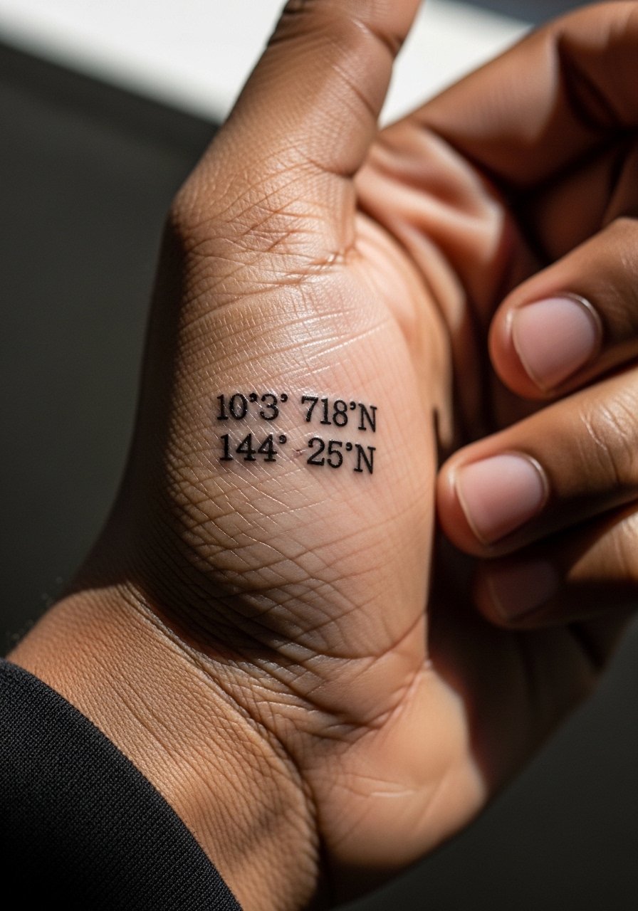
Coordinates work as discrete gap fillers and carry personal meaning without heavy visual weight. Specify monospace or thin serif fonts so digits remain readable and ask for slightly larger kerning than you think you need. The error is choosing very small digits that blur together. Side-of-hand numbers face sun exposure and friction, so expect them to fade faster than deeper placements. For showing this off choose a cream linen shirt rolled to the elbow and a dainty chain ring. Remove jewelry and avoid lotions before the session.
19. Tiny Floral Connector Cluster at the Wrist Bridge
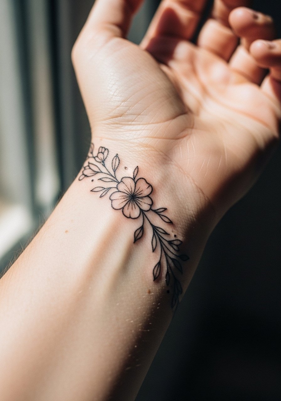
A small floral connector smooths the visual jump between a wrist bracelet piece and hand tattoos. Tell your artist to design petals with negative space and small stipple shadows rather than full color fields, especially if the area sees frequent wear. A common mistake is making the blooms too tight, which leads to loss of petal separation. Expect natural softening of the petals after a year and plan a refresh if you want crisp detail. Style with a thin gold bangle stack opposite and wear a boho blouse or sleeveless top to the session for access and aesthetic harmony.
20. Tiny Scripted Music Bar Near Palm Edge
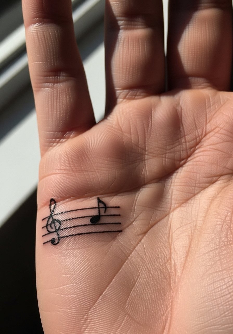
A micro music staff straddling the palm edge gives a linear rhythm between larger wrist pieces. Ask for a simplified bar with increased line weight so the staff does not blur. The typical mistake is too many ticks on the staff that become indistinguishable. Palm-adjacent locations react to hand movement and washing, so expect earlier fading in the staff lines. For session wear choose short sleeves and keep palms clean. A thumb-hole hoodie or minimal stud earrings help frame the wrist when you want to show the detail.
21. Abstract Swirl or Wave Tailored to Hand Movement
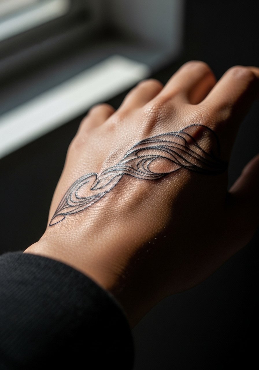
Designing an abstract swirl with hand motion in mind means the pattern reads consistently whether your hand is open or closed. During consultation ask the artist to map the flow along tendons and to leave negative gaps where skin flexes. The common mistake is forcing a rigid ornament that breaks when the hand moves. Expect a short session and moderate sensitivity. For showing this off wear a matte black ring set on the opposite hand and a clean white tee to keep focus on the curving line. Ask the artist how they plan for movement so you both agree on scale.
Frequently Asked Questions
Q: Will fine line gap fillers on my hand blur faster than traditional bold icons?
A: Fine line tends to soften sooner on hands because the skin and constant friction make thin lines spread. Traditional bold icons hold pigment better over time. The honest middle ground is medium-weight linework with planned negative space, and ask your artist about their touch-up timeline during consults.
Q: How often should I expect to need touch-ups for finger and web space fillers?
A: Finger and web spaces typically need touch-ups sooner than forearm work. From what I've seen, many people revisit their artist between one and two years for micro work on fingers. Plan a maintenance budget and check how the artist prices single-session touch-ups.
Q: Are there placements on the hand that artists avoid for fine detail?
A: Yes. Knuckles and palm-facing edges are tricky for dense detail because of thin skin and movement. Many artists prefer bolder outlines in those spots. Ask the artist directly where they would simplify detail for longevity.
Q: What should I wear to a hand tattoo appointment where multiple fingers or the back of the hand are being worked on?
A: Wear short sleeves or a loose tank so your arm rests flat without sleeve pressure. Remove all rings and bring a small snack if you tense up easily. For showing the healed piece later, a dainty chain ring set can highlight finger gaps without covering them.
Q: Can small color accents be used in hand gap fillers without fading into patchy spots?
A: Sparse color accents can work if used as tiny pops and placed away from constant friction zones. The trick is to limit saturated fields and ask for color placement that complements black outlines. Expect that colors will soften and may need refreshes sooner than black ink.
