
Fine line script is trending, but the pieces that age into something the wearer still loves are the ones planned with placement, spacing, and wardrobe in mind. Pick the right body spot and you get a quiet reminder that reads clean at year five, not a smudge you hide. Below are 21 feminine takes on the phrase "This Too Shall Pass," each one with what to tell your artist, how it heals, and the clothes that make it sing.
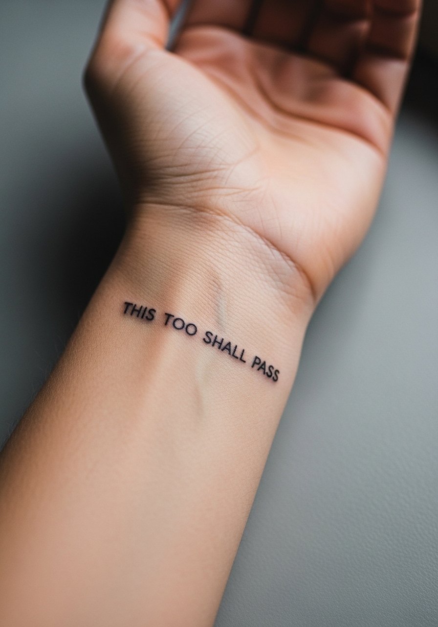
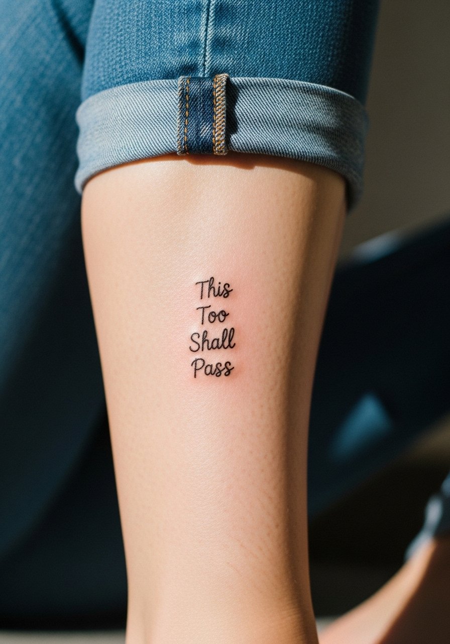
1. Fine Line Script on the Inner Forearm
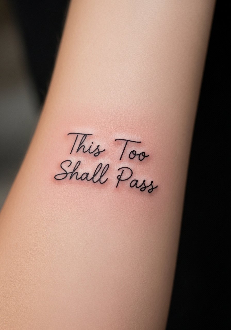
I recommend a slim, slightly slanted cursive here when you want the quote visible and readable from across a coffee table. Tell your artist to space the letters a bit wider than a text-screenshot reference so the negative space prevents early merging. Expect moderate pain for the inner forearm and a one- to two-hour session depending on size. A common mistake is asking for ultra-tiny script to fit on a wrist then scaling it up for the forearm, which ruins proportion. At six months the ink should look crisp. By year three plan for a light touch-up, especially if you spend time outdoors. For showing this off, pair it with a rolled-sleeve linen shirt and a thin chain pendant necklace that sits just above the script.
2. Tiny Script Behind the Ear, Below the Hairline
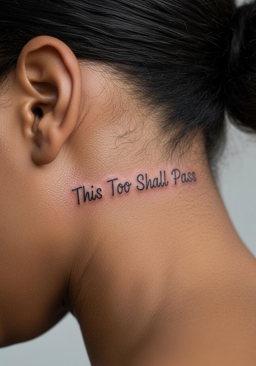
This placement is intimate and easy to conceal with hair. Expect a quick session under 45 minutes and sharp sting from the thin skin. When consulting, request a slightly bolder lineweight so the tiny letters do not bleed into one another as the skin settles. A frequent mistake is demanding microlettering with extremely thin strokes, which loses legibility fast. Because the area moves with hair and shampooing, touch-ups are common at year two or three. If your workplace requires discretion, this is a useful spot. Mention to your artist you want the text curved to follow the natural skull contour for a more organic read.
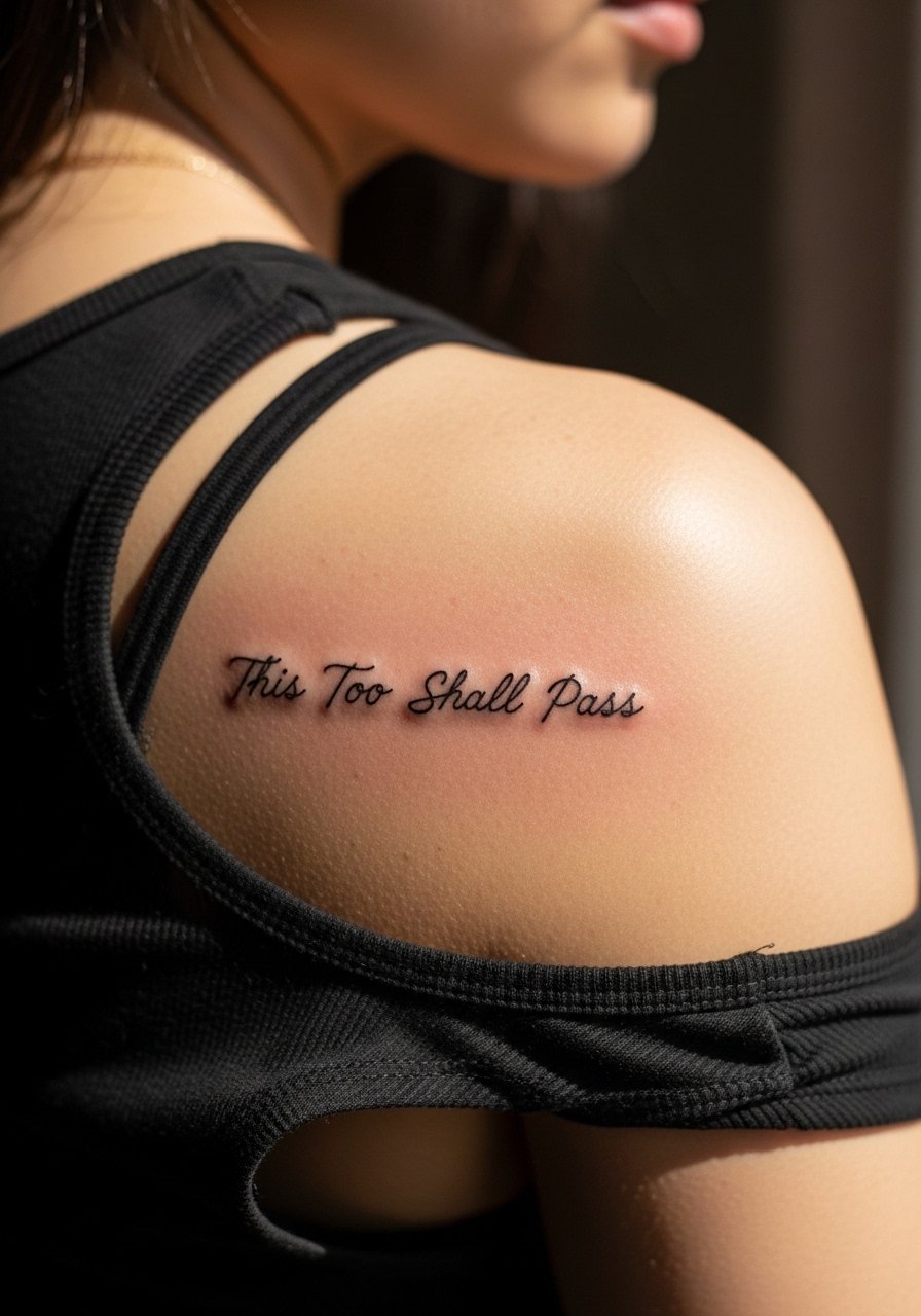
3. Curved Script Along the Collarbone
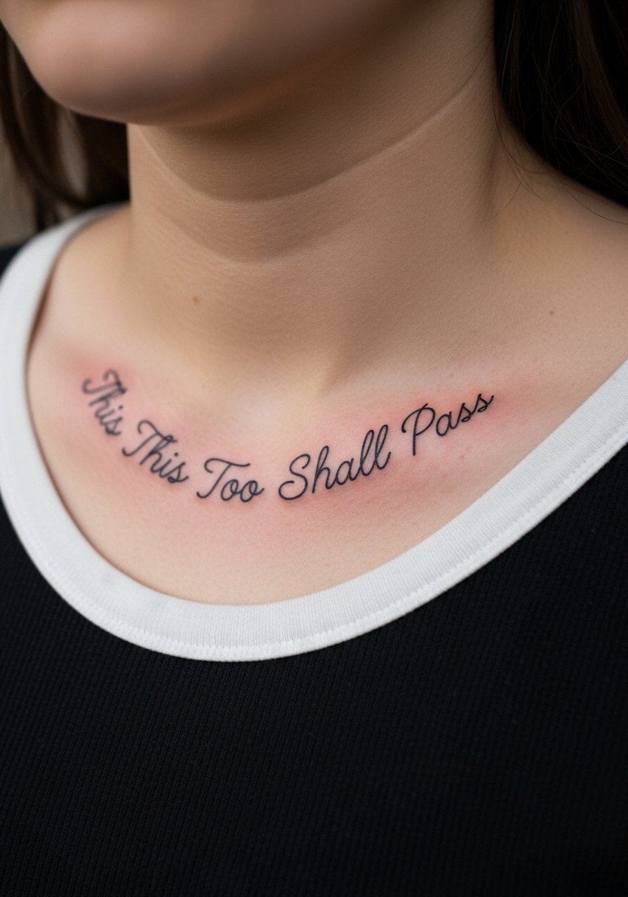
I've seen curved collarbone scripts read like jewelry when spacing is handled right. Ask for the quote to arc gently so it lives in the hollow of the clavicle rather than sitting flat across muscle. The session is low to moderate pain and often under an hour. A typical error is centering the text too high, which makes it hard to hide if desired. At six months lines will still be sharp. Expect the possibility of a tiny softening by year three if you get a very delicate hand. Pair with open-back midi dresses or a racerback tank to let the curve show.
4. Center Sternum Mini Quote
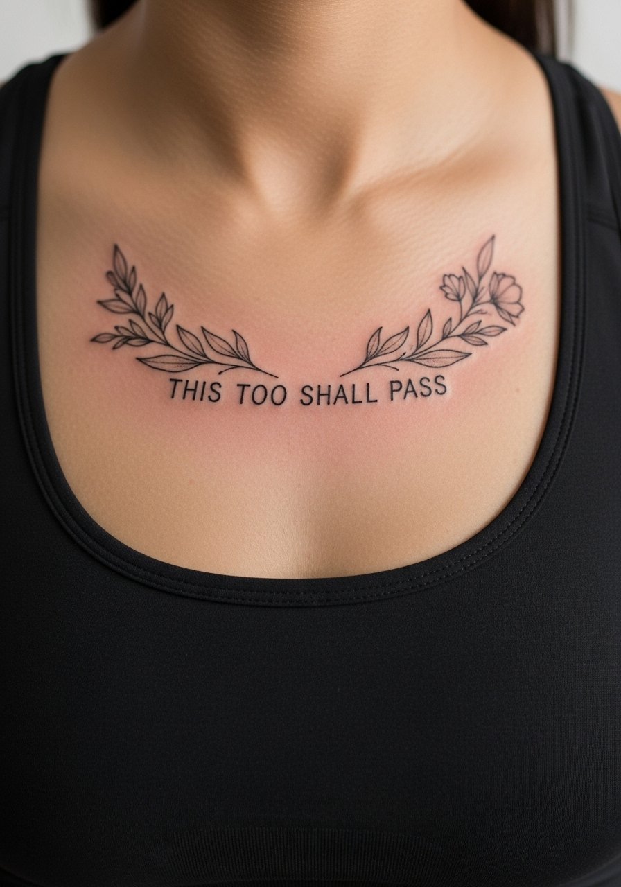
Fair warning: sternum work is higher on the pain scale, and the skin there breaths and moves differently than limbs. When you book, ask for a session plan that spaces the quote vertically with a slight floral accent above or below to anchor it. The common mistake is requesting dense lettering in the center where swelling will blur edges during healing. This placement benefits from a practitioner experienced with chest anatomy. Healing can look tight at two months and mellow by year two. For the session wear, pick a zip-up hoodie or strapless top so access is easy and comfort is preserved.
5. Wrist Wrap Script That Follows the Bone
The wrist shows the quote in a compact, wearable way and it reads like a bracelet when the line follows the bone. Tell the artist you want a slightly heavier initial pass to compensate for the high-movement area. People often ask for ultra-fine lines on the wrist and then regret it as letters blur. Expect a short session, high visibility, and friction from watch straps during healing. Plan for a touch-up at around year two. For showing it off, stack dainty bracelets or a minimalist watch and consider the thin chain pendant necklace look that keeps attention on the wrist and collar area simultaneously.
6. Ankle Chain Quote That Reads Like an Anklet
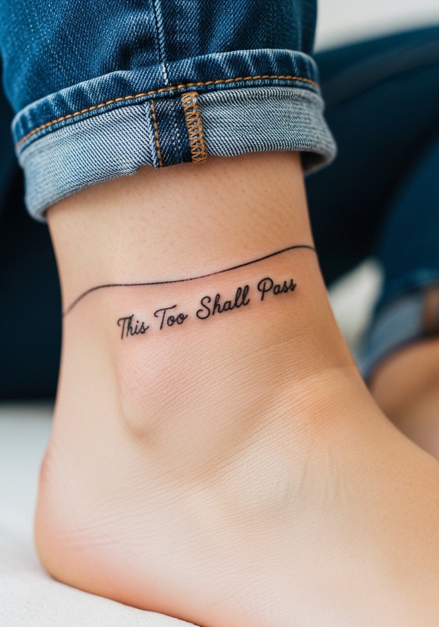
This design mimics jewelry and works if you want something easily hidden with socks or shoes. The ankle has thin skin over bone, so tell your artist to avoid very tight lettering and instead space the phrase for longevity. The session is relatively short but can feel sharp when the needle crosses bony spots. A common mistake is placing the script so low it rubs constantly against shoe collars. Expect the need for a light touch-up at year three depending on footwear friction. Show it with rolled jeans or sandals and a simple anklet-style bracelet to echo the idea.
Pre-Session Essentials
The ankle and wrist pieces above need different prep than sternum or collarbone work, so a small kit smooths the session and first week.
-
Stencil transfer paper kit. Lets you preview line spacing on skin, which is useful for collarbone and wrist scripts that depend on precise placement.
-
Natural healing balm. A gentle, plant-based option for maintaining moisture during the initial seal, especially helpful for low-friction ankle and wrist areas.
-
Breathable protective film roll. Keeps small areas like finger and ankle pieces clean from friction during the first few days.
-
Fragrance-free gentle body wash. Cleanses healing lines without stripping oils that help fine-line work settle.
-
Aquaphor healing ointment. A thin layer for the earliest days locks in moisture for delicate script without clogging pores.
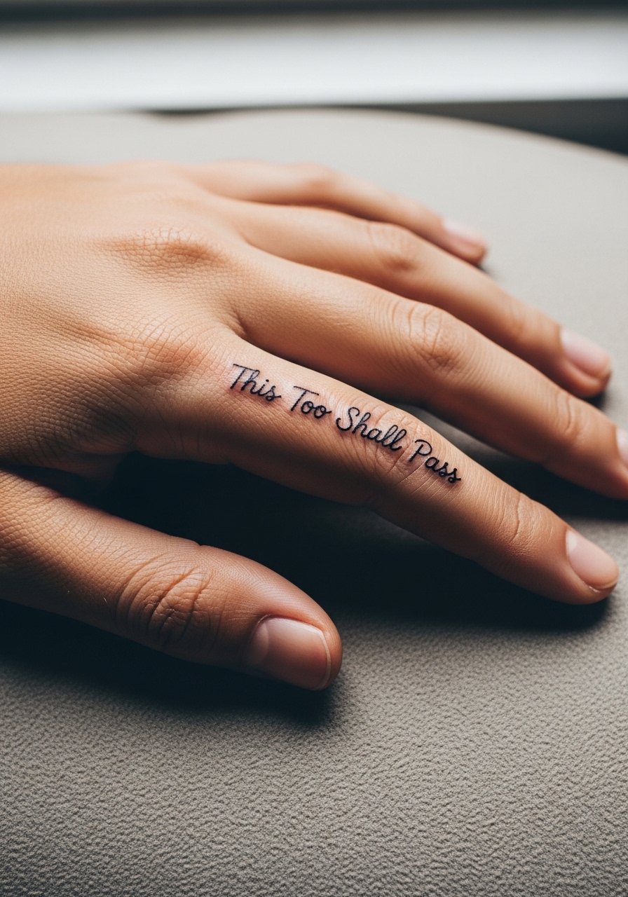
7. Side-Finger Micro Script Along the Index
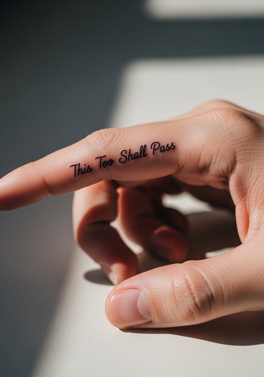
Finger-side text feels private and reads when you gesture, but longevity is the key concern. The skin there regenerates and is exposed to constant washing. Tell your artist you want slightly bolder strokes and discuss realistic touch-up timelines. Artists split on finger pieces for script. One camp says fingers blur within a year because of high wear. The other camp says with deep enough saturation and scheduled touch-ups the text can last. Ask where your artist stands. Sessions are short but expect higher fade and more frequent touch-ups. If your job requires conservative hands, weigh that in. The session feels raw because of thin tissue, and early aftercare is critical.
8. Vertical Ribcage Script That Flows with the Ribs
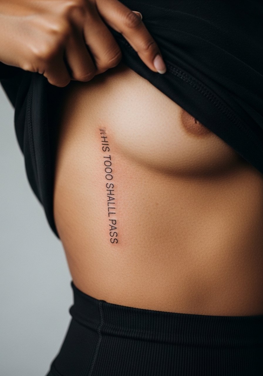
Ribcage script reads intimate and elongated when the quote follows the rib line. Pain here is high, so expect a longer appointment and breaks. Artists disagree sharply about fine line on ribs. One group argues the constant skin stretch makes fine line blur within two years. The opposing group says spacing and correct needle depth allow fine line to settle well. The honest approach is to ask your artist which camp they are in and see healed examples of comparable work. A common mistake is crowding the letters to fit a narrow rib stripe. When healed, these vertical pieces can look elegant for years if planned with spacing and touch-ups in mind.
9. Shoulder Blade Crescent Script That Peeks Out
This placement is excellent for a quote you want to reveal selectively. I often tell clients to curve the text slightly to follow the scapula so movement keeps it readable. The session is moderate and often painless compared with ribs. Avoid requesting micro-lettering that disappears under clothing friction from straps. Expect the first six months to show crisp lines and a softening after two to three years if you sleep often on that side. Pair with open-back tops or a loose button-down shirt you can pull aside during the session.
10. Inner Bicep Hidden Script
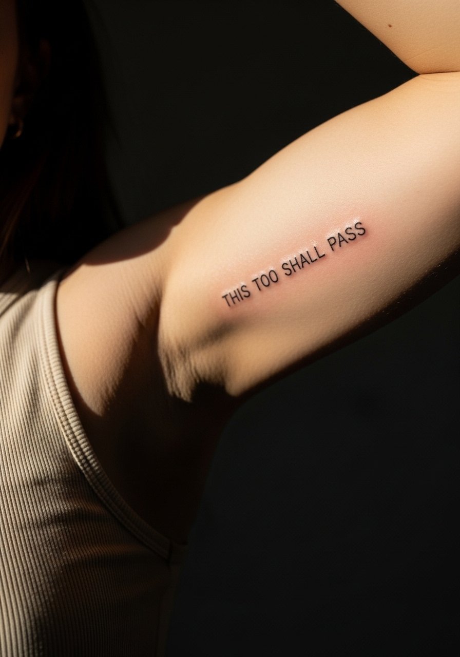
The inner bicep gives a private placement with a long canvas for flowing script. Pain can spike because the skin is thin and sensitive. Ask for slightly rounded letters to avoid edges that blur as muscle moves. A typical mistake is placing text too close to the armpit crease where sweat and friction slow healing. Healing at six months usually keeps shape, though a touch-up at year two is common if you train frequently. For the session wear, pick a loose tank or a shirt with sleeves you can easily remove and replace without tugging the new ink.
11. Outer Thigh Flowing Script That Sits with Shorts
Thigh pieces enjoy low friction and show-off potential with skirts and shorts. I tell people to use the thigh when they want a larger, more calligraphic version without the constraint of small lettering. The session is moderate and can run longer for bigger scripts. A common error is asking for too fine a script when a slightly bolder hand will hold better over time. At two years the lines should remain readable with minimal touch-ups. For session comfort, wear loose drawstring shorts so you can roll or shift fabric without pressure on the area. Pair with short skirts or high-cut denim to reveal the flow.
12. Nape Script That Peeks above a Collar
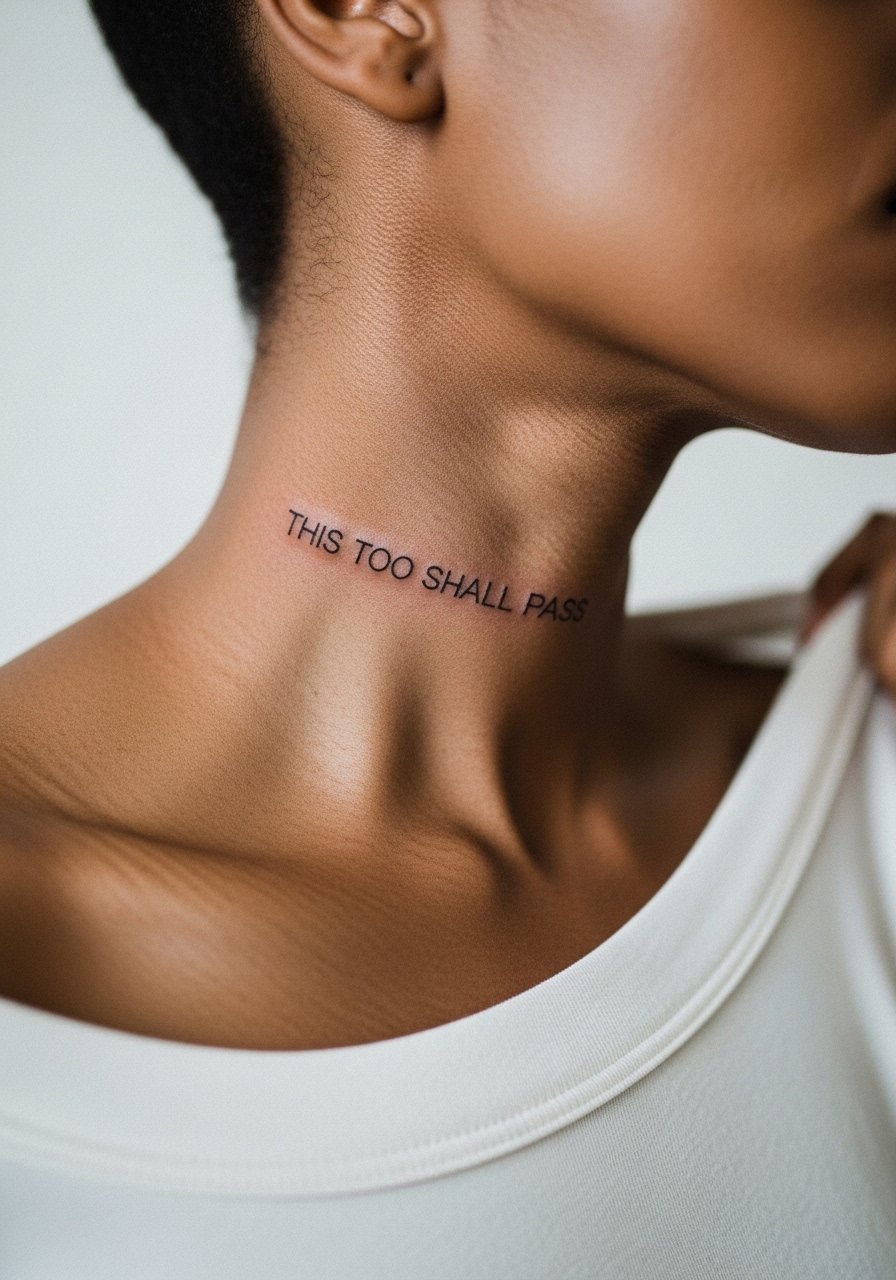
Neck script reads bold despite its small size because clothing frames it. Pain is brisk and visibility is higher than people expect. Discuss exact placement with your artist and ask to preview the stencil in several head positions. A common mistake is centering the text where natural neck folds occur, which can warp the wording as you move. Expect touch-ups sooner than for limb work. This placement can have career implications, so weigh that honestly. When healed, it looks chic with crewneck sweaters or a thin chain pendant necklace sitting just above.
13. Foot Arch Whisper Script
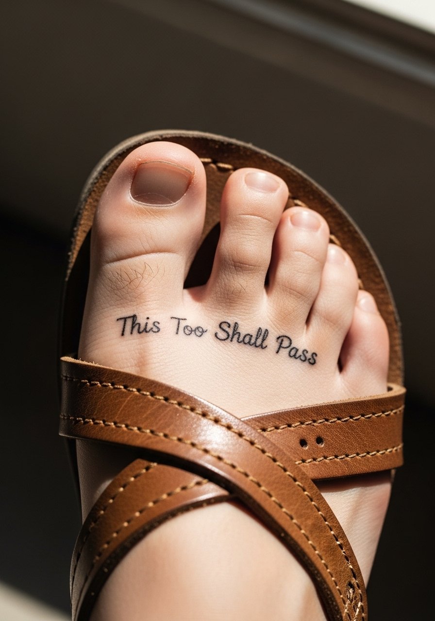
The foot arch keeps the quote private and tactile, but it is notorious for fading because of movement and shoe friction. Plan for bolder strokes and accept repeat touch-ups may be needed within two years. The session can be more uncomfortable when the needle crosses the arch. A mistake is asking for thin, decorative lettering that cannot withstand constant flex. Aftercare matters here; avoid closed shoes for the first two weeks when possible. This spot is great if you want a reminder that is felt as much as read.
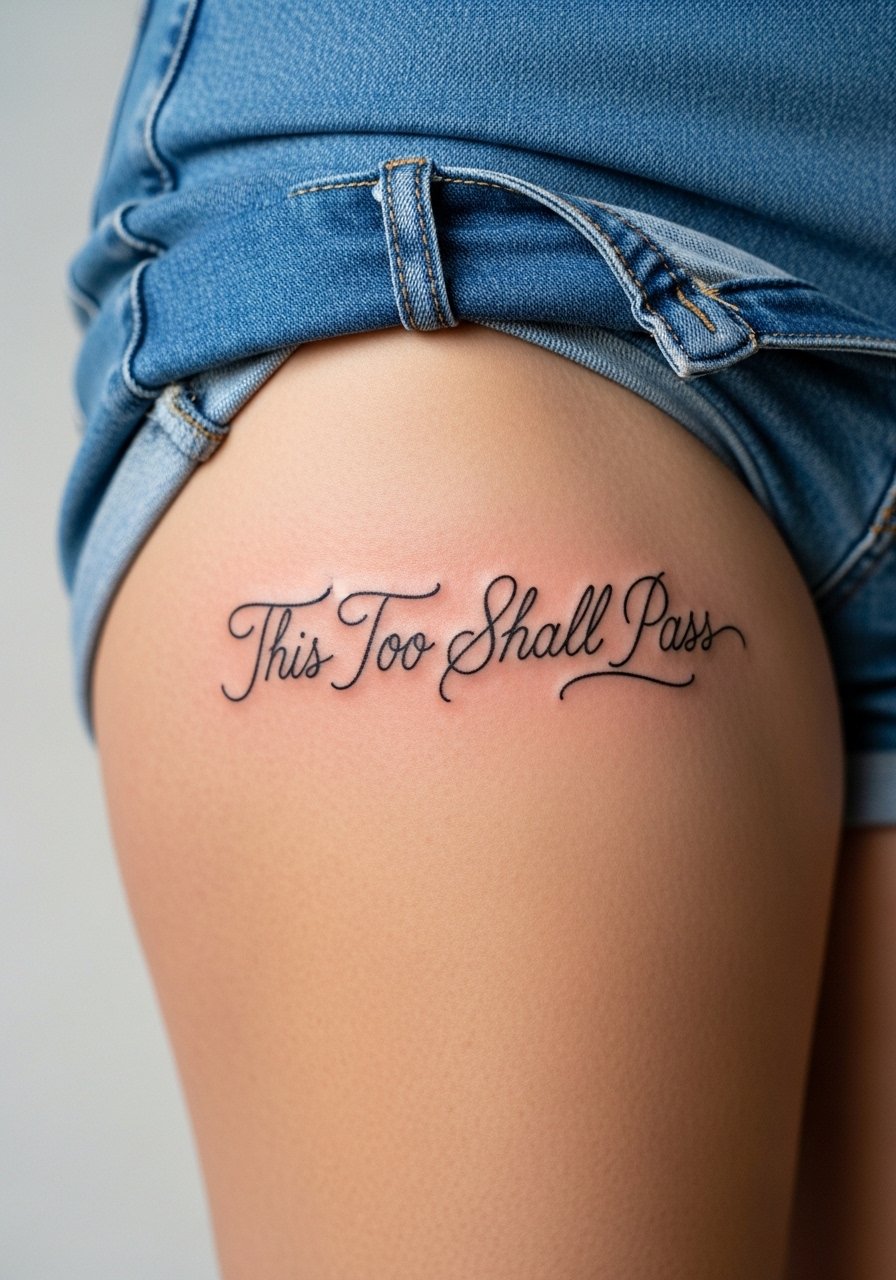
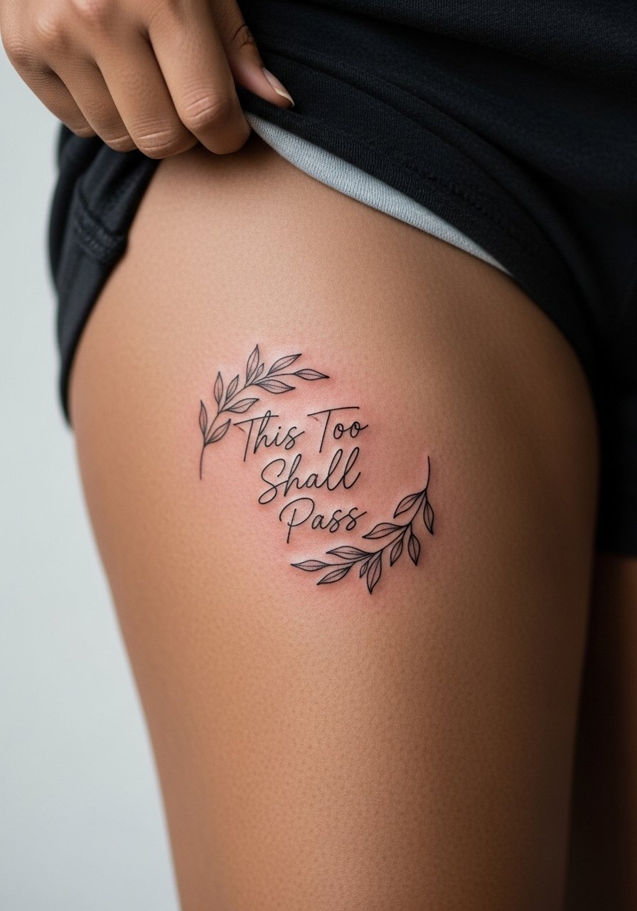
14. Hip Crescent Quote That Peeks with Swimwear
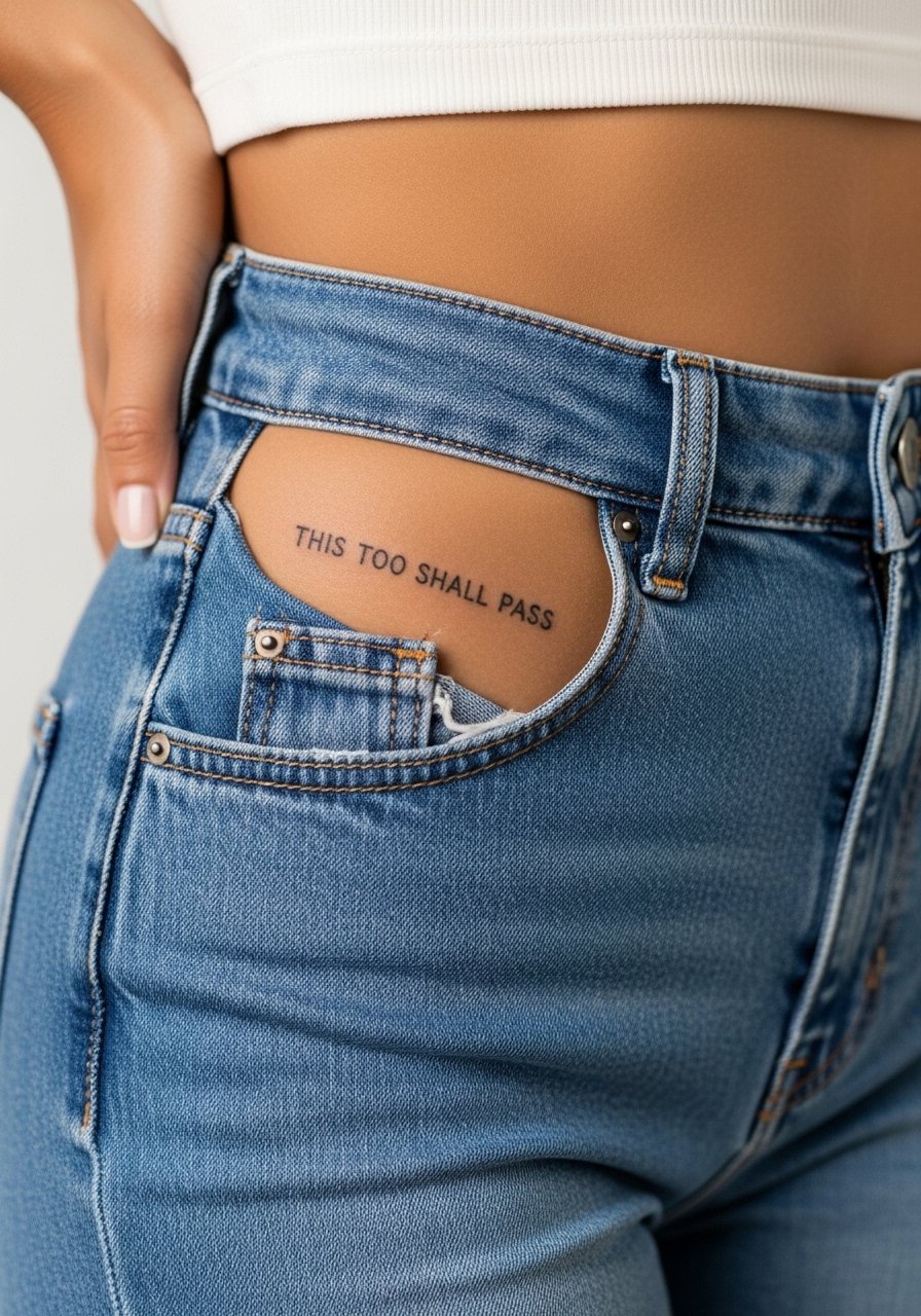
Hip quotes sit where they feel like a secret accessory. The area moves with clothing and sitting, so request slightly wider letter spacing. A common error is placing the script too low where waistbands rub constantly. Sessions are low to moderate pain and usually quick. Healing at six months should retain shape if friction is minimized. Wear high-cut bottoms or swimsuits for show-off moments, and consider loose waistbands during the first week to prevent scabbing disruption.
15. Lower Back Ribbon Script That Reads Horizontally
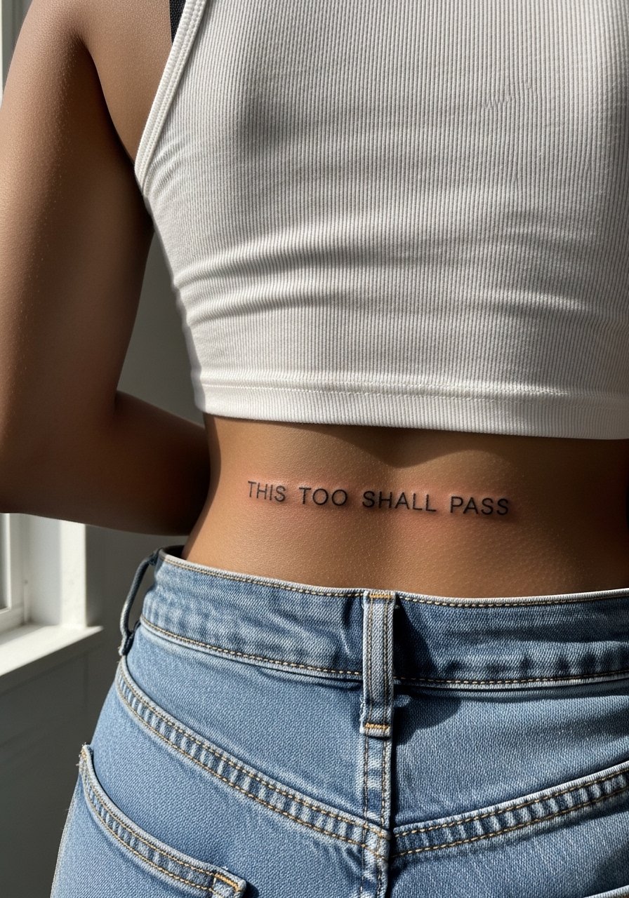
Lower back placement lends itself to a ribbon-like horizontal read that works with high-waisted silhouettes. Tell the artist you want the text to sit just above the waistline so it peeks when you wear low-rise or cut-out garments. A common mistake is centering the text too low where belt friction occurs. Sessions can feel unpleasant near the spine, though many find it tolerable. Expect the first year to be stable with a possible lightening around year three. Pair with low-rise jeans or crop tops to let the line sit naturally at the small of the back.
16. Inner Wrist Vertical Script That Hugs the Tendons
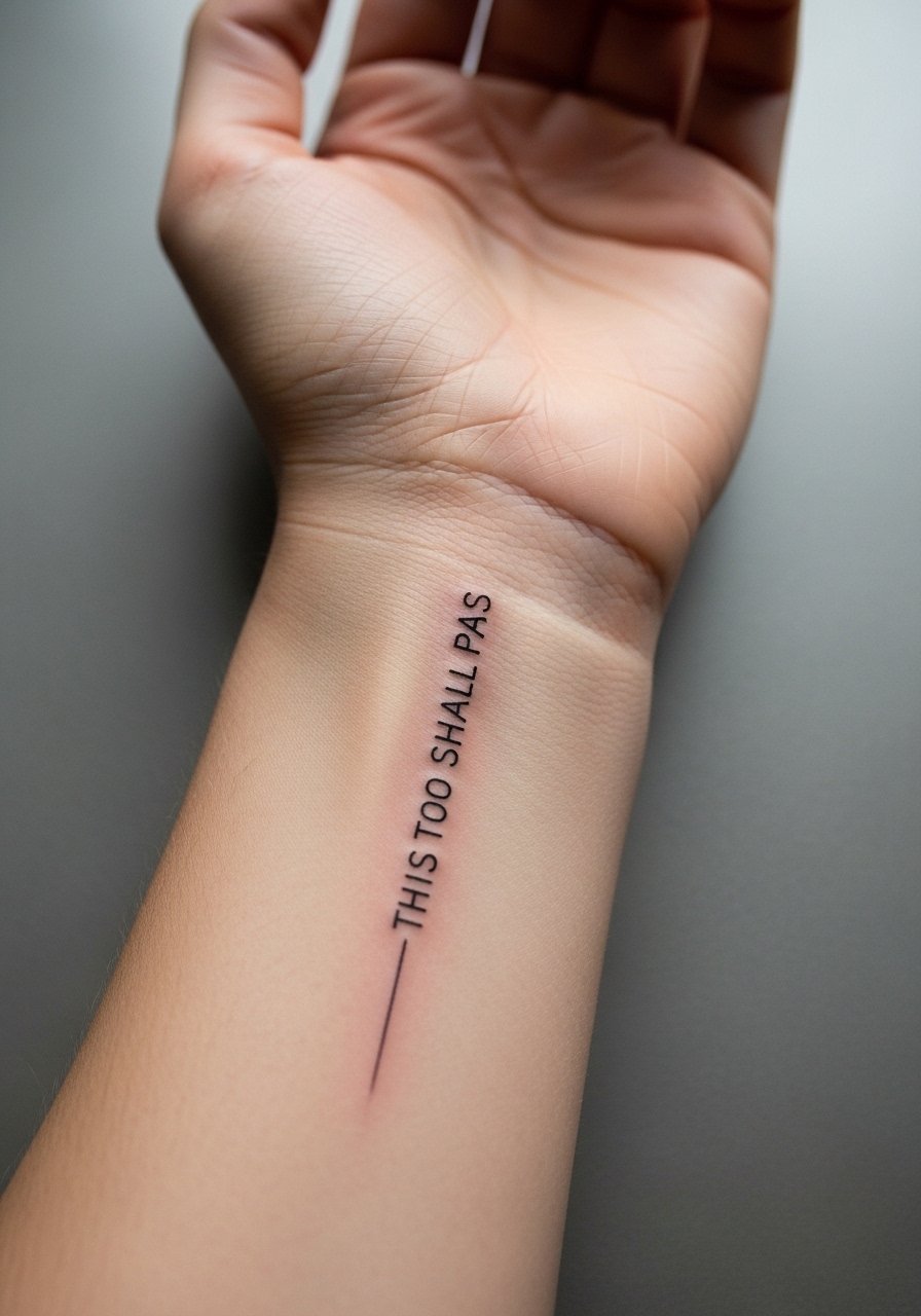
A vertical inner wrist piece reads like a secret note when held palm-up. I tell clients to keep letters taller than they think for better legibility as the wrist flexes. The area is prone to fading from constant handwashing and sun, so plan for touch-ups at year two. Avoid too-small caps that turn into smudges. The session is short but the sting is noticeable. Wear a loose long-sleeve the first day to prevent fabric friction and style with thin stackable rings to complement the vertical line.
17. Calf Vertical Quote for Cover and Reveal
The calf provides a stable canvas that ages well because it sees less friction and sun than forearms or hands. Ask your artist to elongate letterforms slightly so the line reads at a glance if you wear dresses. A common mistake is compressing the quote to fit narrow designs, which makes each word harder to read. Sessions here are comfortable and allow for longer, more flowing script. At two years you should see minimal change. Pair with mid-length dresses or rolled jeans to reveal the vertical flow.
18. Inner Thigh Whisper Script for Private Reminder
Inner thigh text feels private and intimate, and it tolerates slightly larger lettering because the skin area is generous. For consultations, request a design that follows muscle lines and avoids placing text directly on stretch-prone zones. The session can be tender because of sensitivity, but healing tends to be stable if friction from clothing is minimized. A common mistake is choosing ultra-small script that becomes unreadable once the skin relaxes. Expect touch-ups on an as-needed basis depending on activity and weight changes.
19. Finger Base Wrap Quote That Mimics a Ring
Finger base wraps read like permanent jewelry, but they fade faster than limb pieces. Artists split on whether thin wraps survive long term. One group warns the skin and joints make crisp lines impossible. The other group recommends thicker strokes and accepting a touch-up schedule to maintain the look. If you choose this spot, ask for bolder initial strokes and plan for a touch-up within a year. Frequent hand washing and ring friction are the main enemies. Style with thin stacking rings that echo the script, and consider linking a delicate ring set to complete the look.
20. Vertical Spine Script Along the Vertebrae
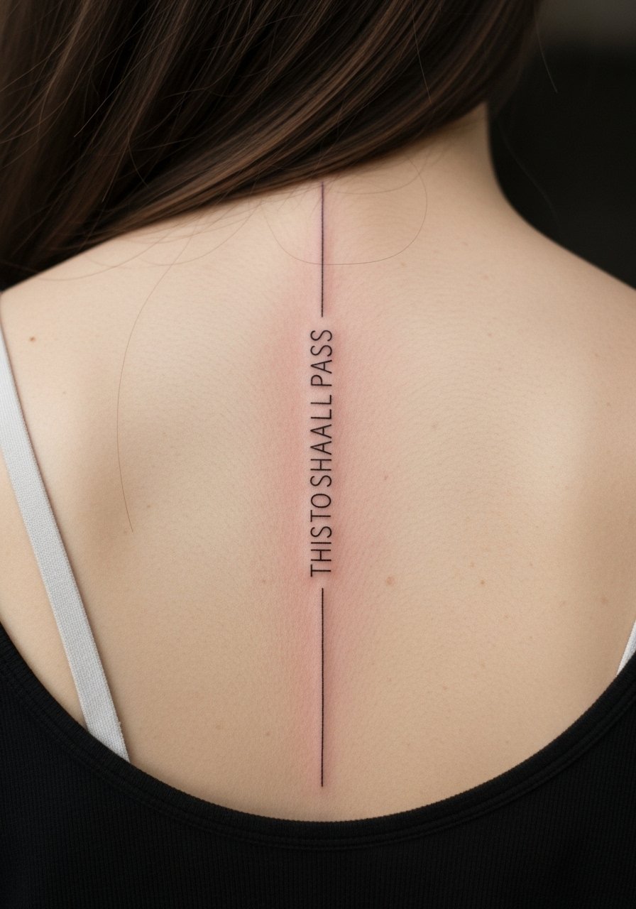
Spine scripts read dramatic and symmetric when centered. The session is more intense because you sit for a longer period. When you consult, ask for a steady vertical composition and avoid overly ornate flourishes that jam into vertebral spacing. A common mistake is asking for continuous tiny letters that blur where the back shifts. Expect crisp lines at six months and minimal change if you protect against sun exposure. For show-off moments, wear open-back dresses or halter tops to reveal the vertical line.
21. Upper Arm Typewriter Script for a Classic Feel
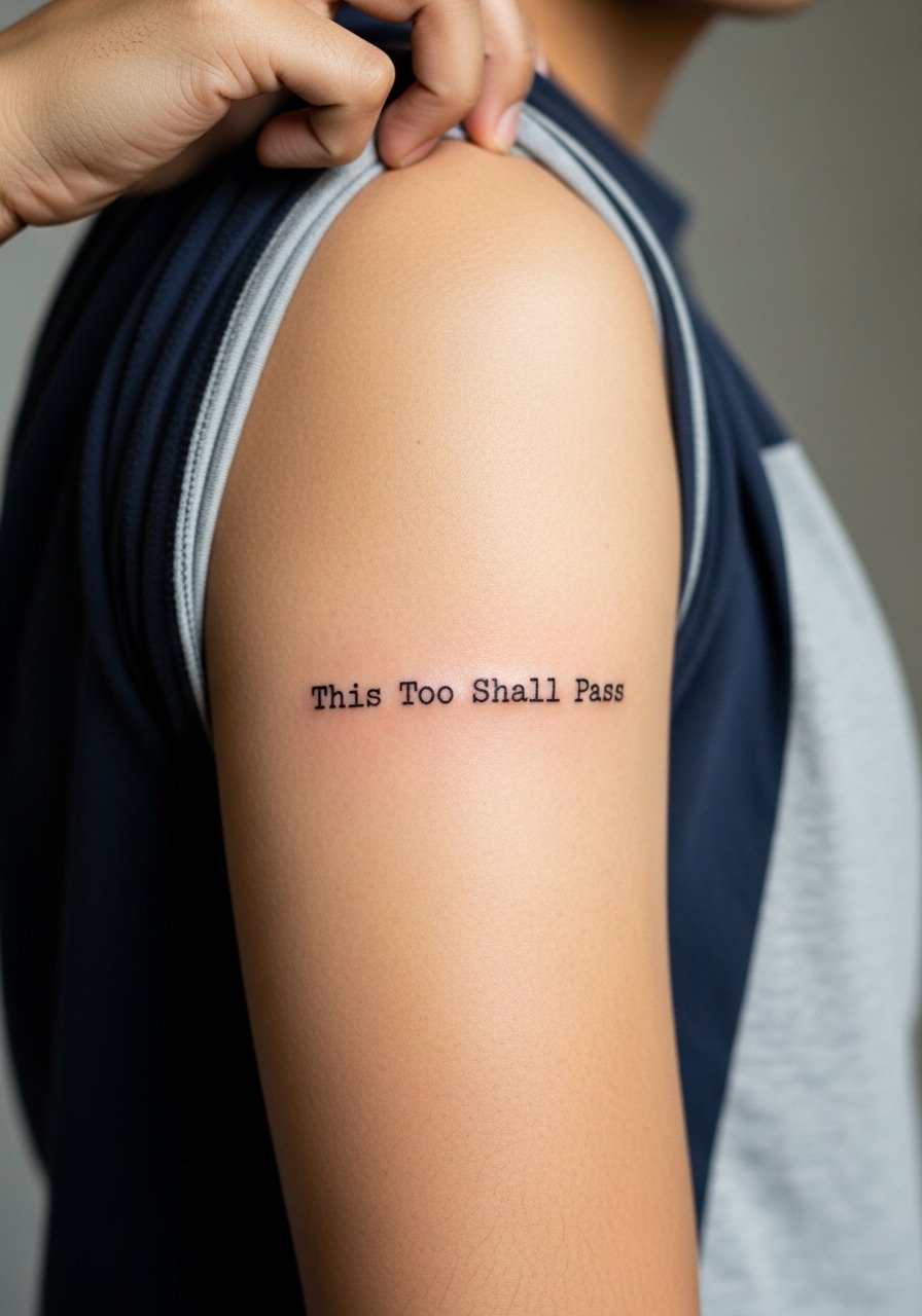
The outer upper arm is forgiving and holds typewriter or monospaced lettering well. I recommend a slightly thicker stroke so the font reads clearly over years of sun exposure. This placement feels like a classic choice with lower pain and longer sessions available if you want added flourish. A frequent mistake is forcing a small font into this space when a more spaced layout will read better. Expect the piece to age gracefully with occasional sun protection. Pair the look with short sleeves or a simple tee that frames the script.
Frequently Asked Questions
Q: Will fine line script on the ribs blur faster than on the forearm?
A: It depends on placement and spacing. Ribs stretch and flex more with breathing, which increases the chance of fine lines softening. The forearm has steadier skin and is generally kinder to detail. Ask your artist for wider letter spacing and to show healed examples of ribcage work so you can judge their approach.
Q: How often should I plan touch-ups for finger or hand-based "This Too Shall Pass" tattoos?
A: From what I have seen, expect at least one touch-up within the first year and periodic refreshes after that. Fingers and hands face constant washing and friction, so plan for more maintenance than limb work. If you want lower upkeep, move the quote to the side of the hand or the inner wrist instead.
Q: What should I wear to a sternum or ribcage appointment to make the session easier?
A: Choose a fitted sports bra or a zip-up hoodie that you can pull aside without exposing more than the tattoo zone. For sternum work, a strapless or bandeau-style top is ideal. If you prefer, a loose button-down shirt pulled to one side works well and keeps you comfortable during breaks.
Q: Does the exact phrase "This Too Shall Pass" need a special font to age well?
A: Not necessarily. The key is lineweight and spacing. A slightly bolder, cleaner script will age better than a hairline cursive. If you prefer a typewriter or serif look, those can hold up well because the shapes are simple and robust.
Q: Are there placements I should avoid if I want minimal maintenance?
A: High-friction spots and areas exposed to constant sun like the top of hands, fingers, and feet need more upkeep. Seek placements with stable skin such as the outer upper arm, calf, or shoulder blade for lower maintenance.
