
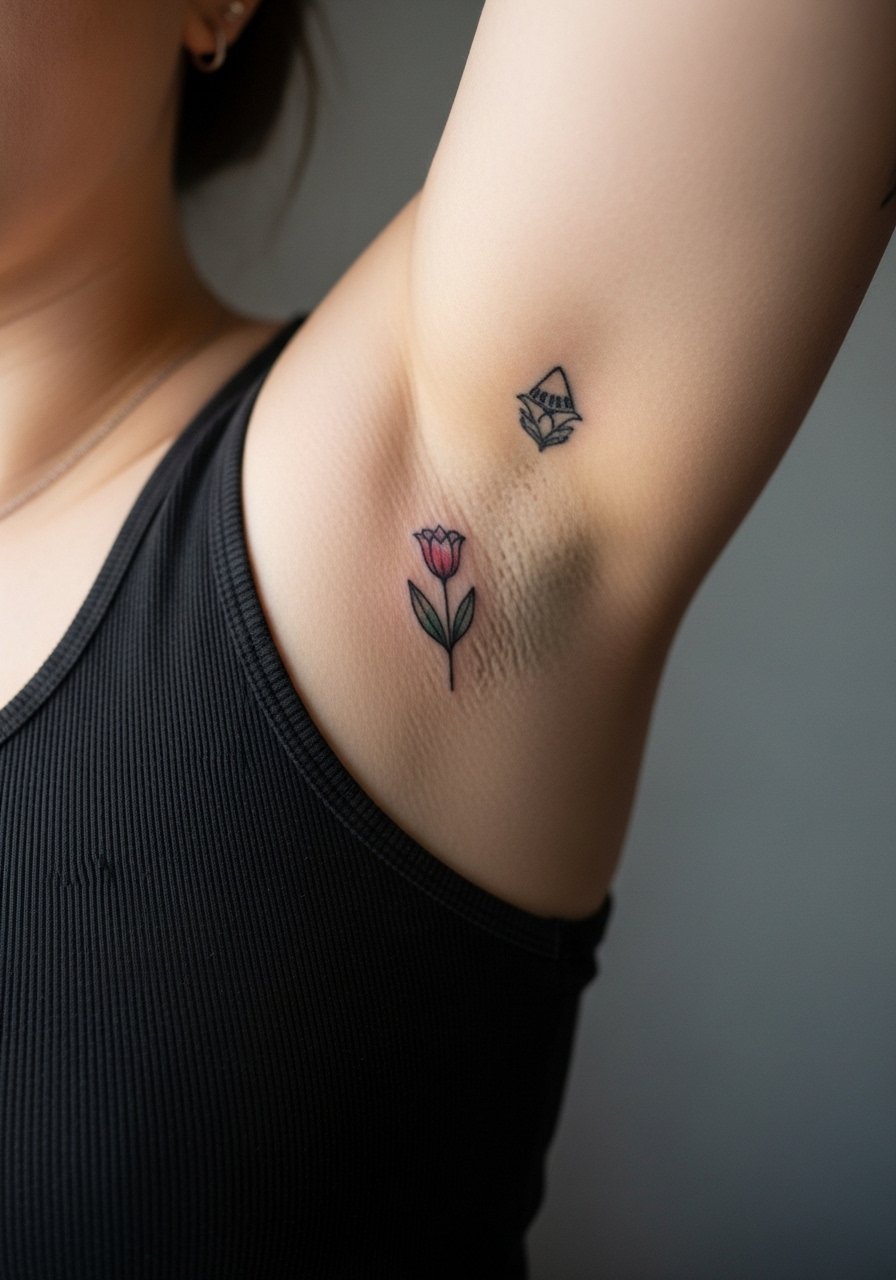
Sitting in the chair and watching color hit skin changes what you expect from an image on a phone. Bright ink reads differently under salon lights and it ages differently in sunlight. Pick pieces that speak to a moment or a value, not just to a trend, and plan for how the color will live on your body for years. Below are 27 colorful, meaningful ideas with notes on aging, consultation cues, wardrobe pairings, and the real mistakes I see in consultations.
1. Fine Line Botanical on Inner Forearm
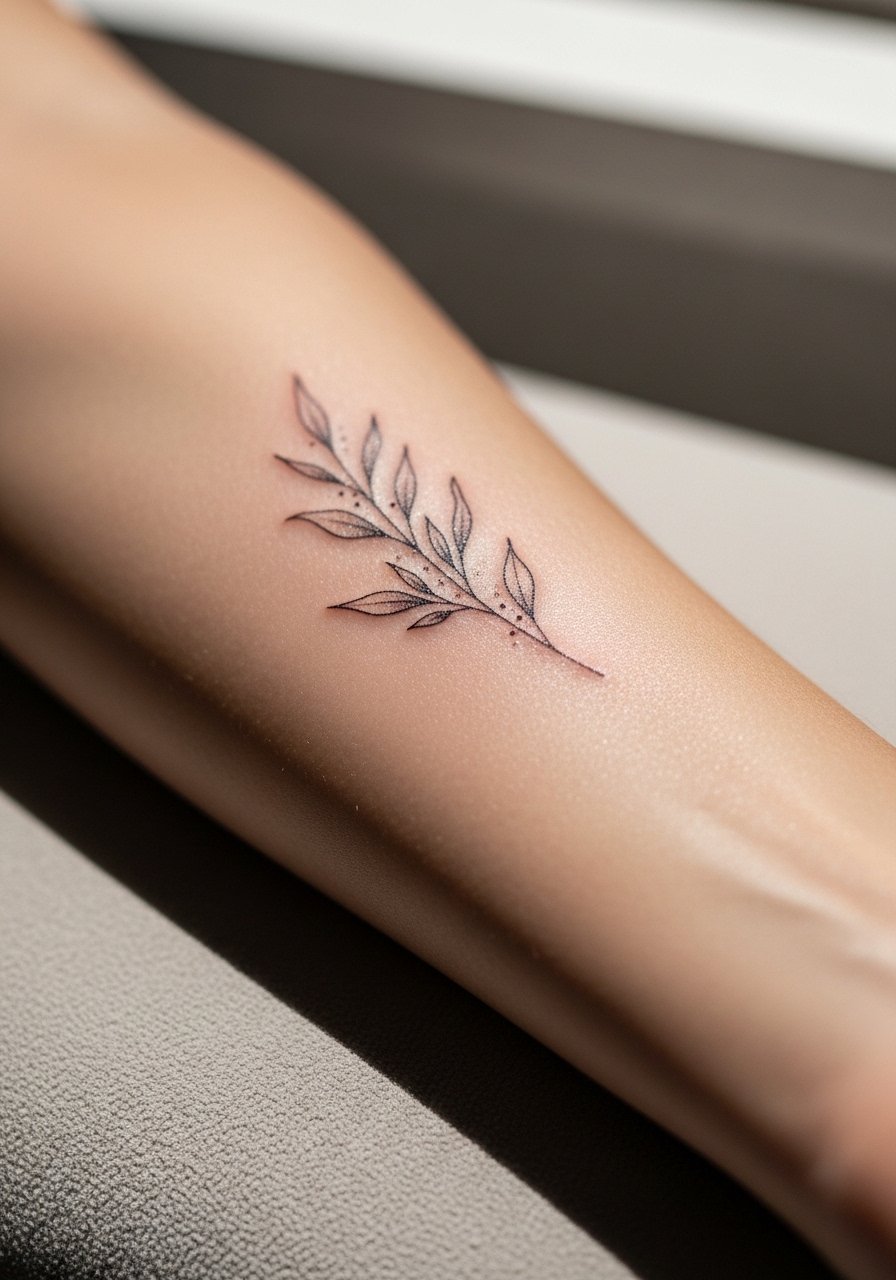
I open with this because the inner forearm is where color and text meet daily life. I recommend a narrow botanical with selective saturation in the leaves rather than full wash color. Tell your artist you want anchoring linework and small blocks of saturated green and rust so the shapes keep reading after touch-ups. Common mistake is asking for tiny, watercolor fills that spread and need work at year two. Pain is low, sessions run 60 to 90 minutes, and expect a touch-up at year three. For showing it off, roll sleeves to reveal a loose button-down shirt.
2. Micro-Realism Wolf Head on the Bicep
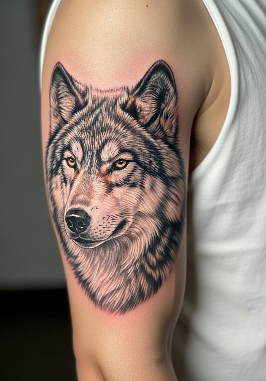
I've seen color realism work best when contrast is built into the plan from consultation. Ask for preserved highlights and saturated midtones rather than thin layers of blended pigment that can gray out. The bicep tolerates long sessions, so plan for two sittings of two to three hours for a clean color gradation. Common mistake is pushing for hyper-detail in one session which fatigues skin and dulls saturation. For session comfort wear a loose tank top so the artist can work unimpeded.
3. Watercolor Koi on the Ribcage
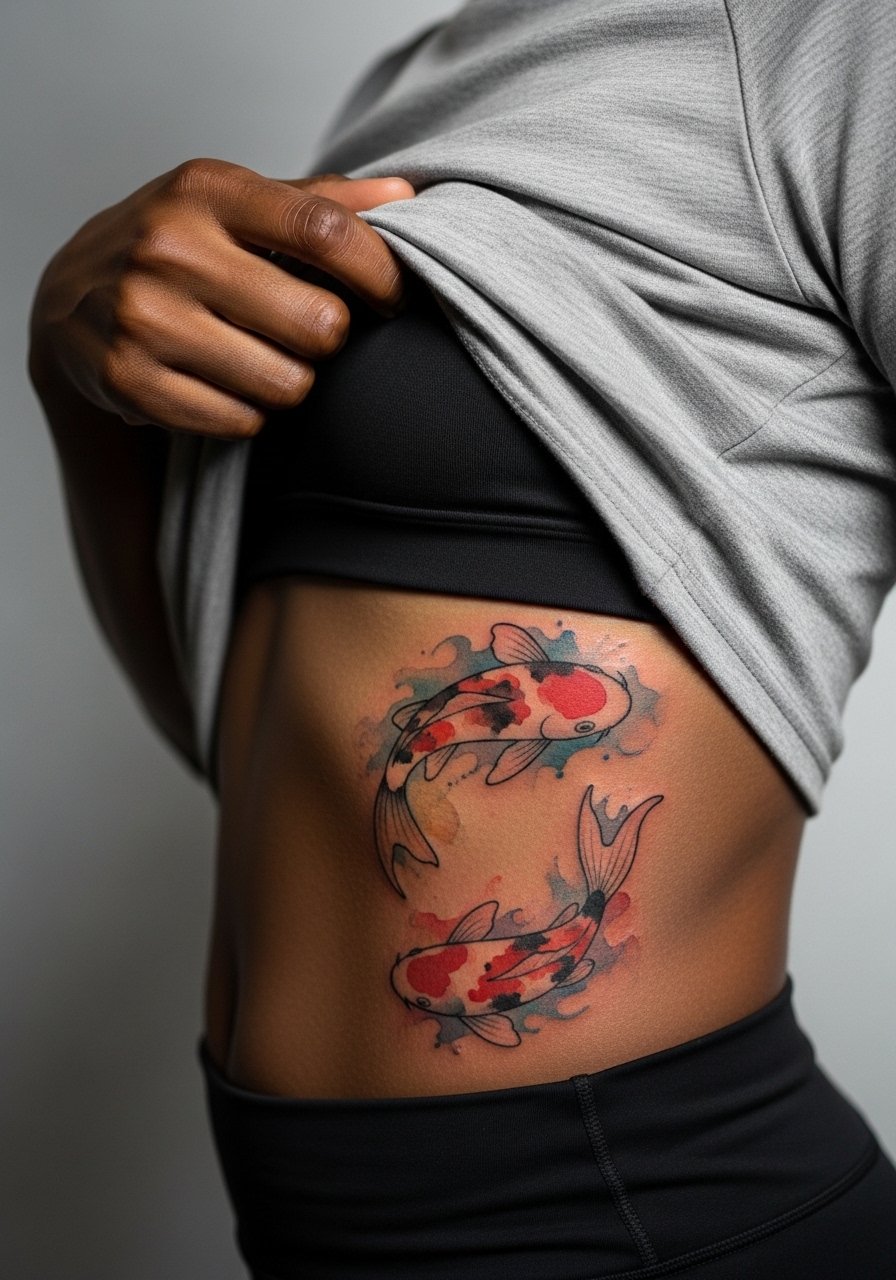
Fair warning, the ribcage is a high pain zone, and watercolor here invites debate. One camp says watercolor fades into a bruise-like wash after a few years. The other camp argues that careful saturation and layered touch-ups keep the colors readable. If you lean toward this idea, tell your artist you want defined edges with diffused fills so the silhouette holds as color softens. Sessions feel stop-and-start because of the pain. Expect a follow-up touch-up at year two for color refresh. For session logistics bring a zip-up hoodie you can easily pull aside.
4. Traditional Rose with Color Fill on Upper Arm
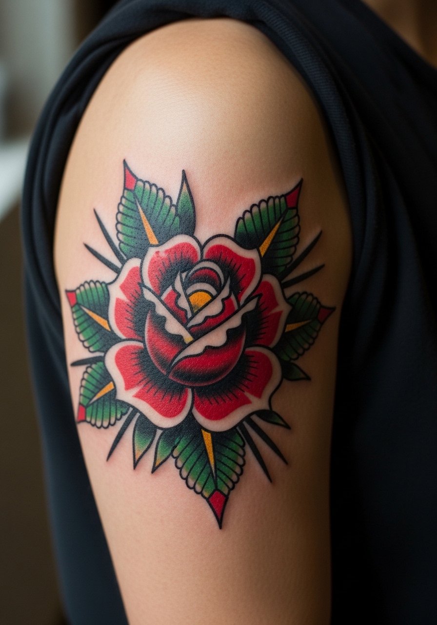
There is something about saturated traditional color that ages reliably. Heavy outlines protect the color from early blurring and the fills hold as saturation ages into tone. Tell your artist you want punchy outlines with dense red and deep green saturation. A common error is shrinking the motif to fit a smaller space which reduces line breathing and increases blowout risk. Sessions are usually one to two hours and pain is moderate. Pair this with a rolled-sleeve linen shirt to show the piece without hiding it.
5. Geometric Mandala on Upper Back
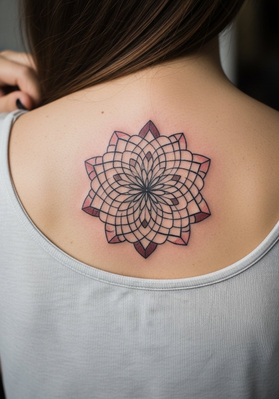
Most people underestimate the scale a mandala needs to age well. If you want color, ask for larger negative spaces between concentric elements so dots and stipple shading do not merge. The upper back is forgiving on pain, but the session needs careful sitting positions. A typical misstep is requesting a complex mandala at a small scale which becomes a muddle in a few years. Plan for two sessions if you want vivid color. For showing it off, an open-back shirt frames the center without distraction.
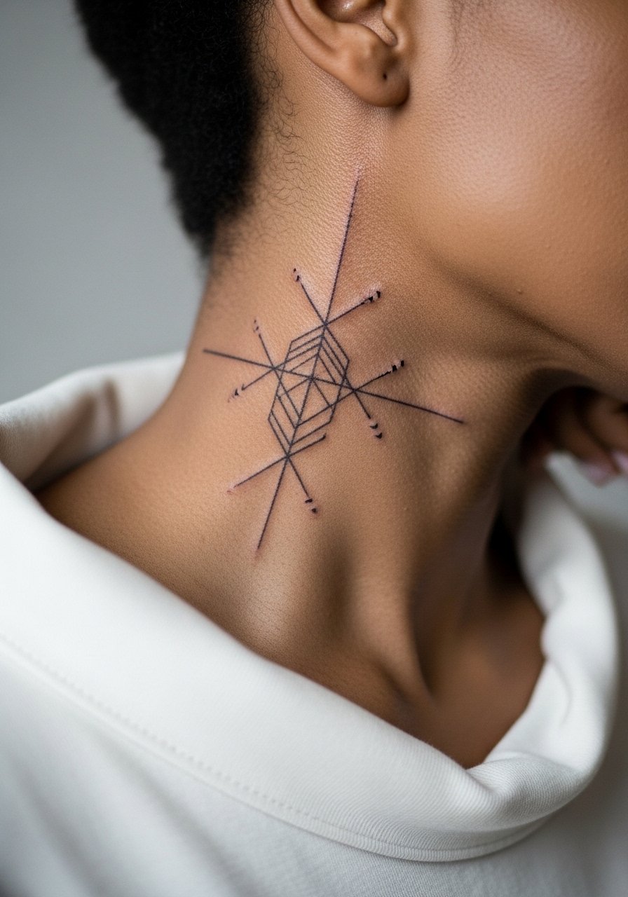
6. Constellation with Color Accents on the Wrist

Wrist pieces are visible and fragile. The key is to use small color pops in the stars and keep linework slightly weightier than invisible. In consultation say you want micro color nodes with solid anchor points. The mistake I see is ultra-thin lines without anchors which blur by year two. Pain is low but expect a quick touch-up within 12 to 24 months. During the session wear a minimalist watch you can remove easily so the artist has access.
Pack Smart
The chest and wrist pieces above heal differently, so a few small items smooth out the session and the first week.
-
Stencil transfer paper kit. Lets you preview line placement on skin so the forearm and wrist pieces above land where you expect.
-
Topical numbing cream. Applied before a rib or sternum session eases the needle shock and helps you sit through longer color washes.
-
Thin protective film roll. Useful for finger and wrist work where daily washing and friction threaten fine color.
-
Fragrance-free body wash. Cleans healing areas gently without stripping pigment on delicate colorful fills.
-
Aquaphor healing ointment. A thin layer for the first days helps keep small, colorful linework from drying into flakes that pull color.
7. Neo-Traditional Swallow on the Shoulder
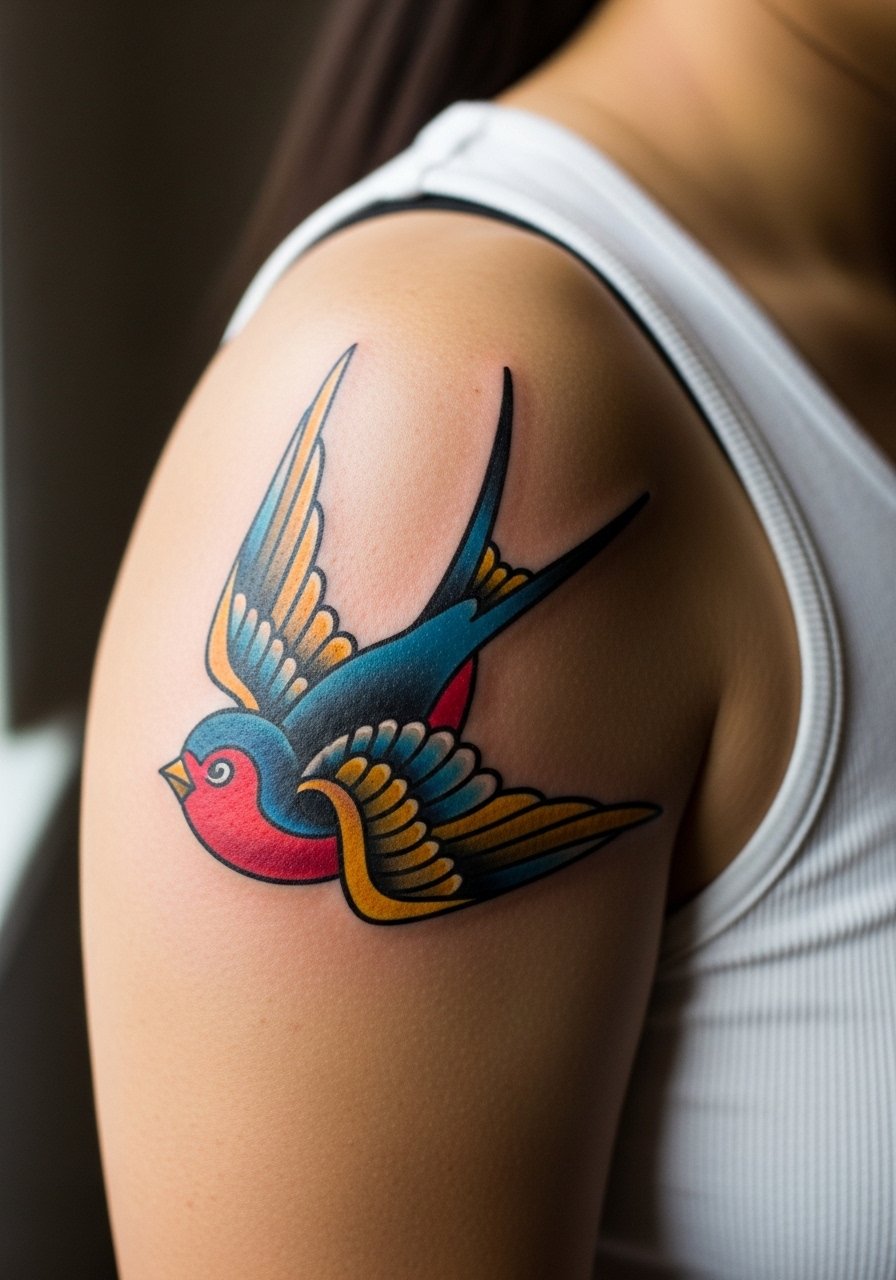
This placement reads well at arm length and survives summer shirts. For longevity ask for saturated fills with slight texture in the wings so the bird keeps shape as colors mellow. The common mistake is pushing too many tiny color gradients which become indistinct after sun exposure. Sessions are one to two hours and pain is low to moderate. For the studio wear a loose button-down shirt you can slide off easily. Pair the finished piece with a canvas field jacket to frame the shoulder.
8. Color-Blocked Abstract on Mid-Calf
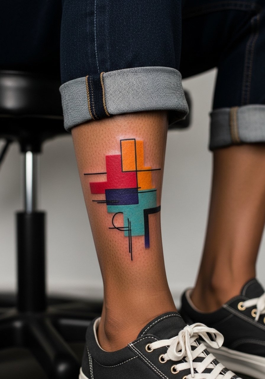
There's visual impact in simple color blocks, and they age predictably when the shapes are bold and not overly detailed. Tell your artist you want clean negative edges between blocks and a limited palette so saturation stays cohesive. A common error is tiny interlocking shapes that bleed into each other. Calf sessions are comfortable and allow longer sittings, so plan for one or two sessions depending on size. For showing it off try rolled pant cuffs and a loose linen drawstring pant.
9. Micro-Realism Hummingbird on the Chest
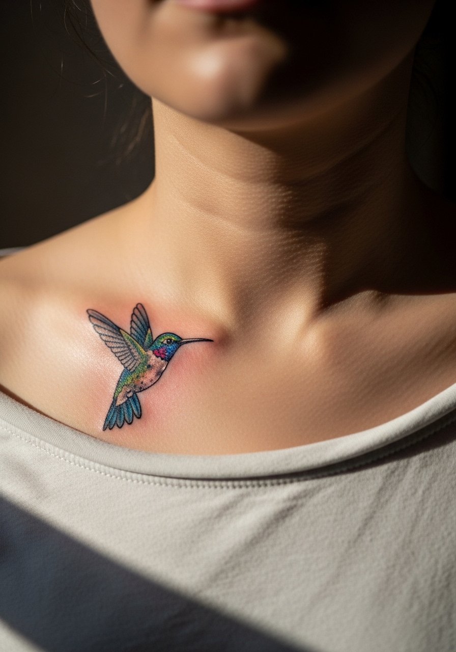
Most micro-realism on the chest requires contrast planning so color does not wash. Ask for crisp highlights and slightly heavier outlines around the key feathers. The chest moves with breathing so small details can blur faster than on a flat surface. A typical mistake is packing too many tiny feathers into a little space. Expect a touch-up at year two if you want peak color. For session ease wear a wide-neck shirt you can shift without fully undressing.
10. Stained-Glass Window on the Upper Arm
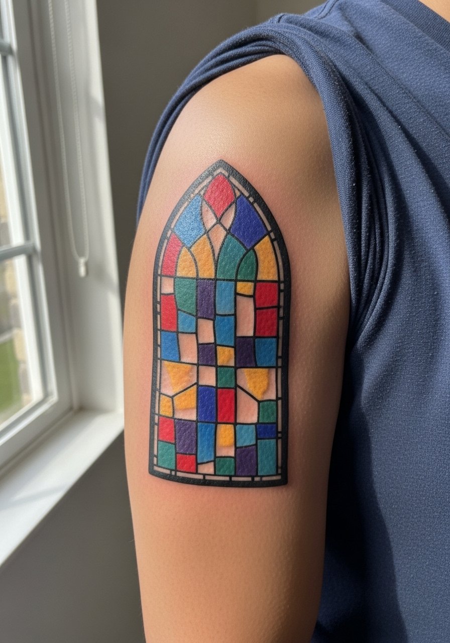
The trick with stained-glass motifs is to use bold outlines that separate color panes and to choose a palette that reads at a distance. Tell your artist you want color islands with black or dark outlines to preserve contrast as pigment ages. A common misstep is using pale washes that fade into each other. Sessions are moderate in pain with one to two sittings. Show it off with a short-sleeve linen shirt.
11. Script with Color Wash on the Collarbone
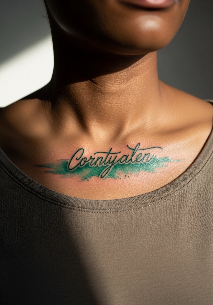
Aging is the main concern with collarbone script. The area shifts with movement so pick letterforms with modest thickness and add a soft color wash beneath to give depth. Tell your artist you want the script slightly bolder than your initial vision so it reads at year three. A mistake is asking for ultra-fine script that needs constant touch-ups. Pain is moderate and sessions are short. To frame this, layer a thin chain pendant necklace so the text sits just above it.
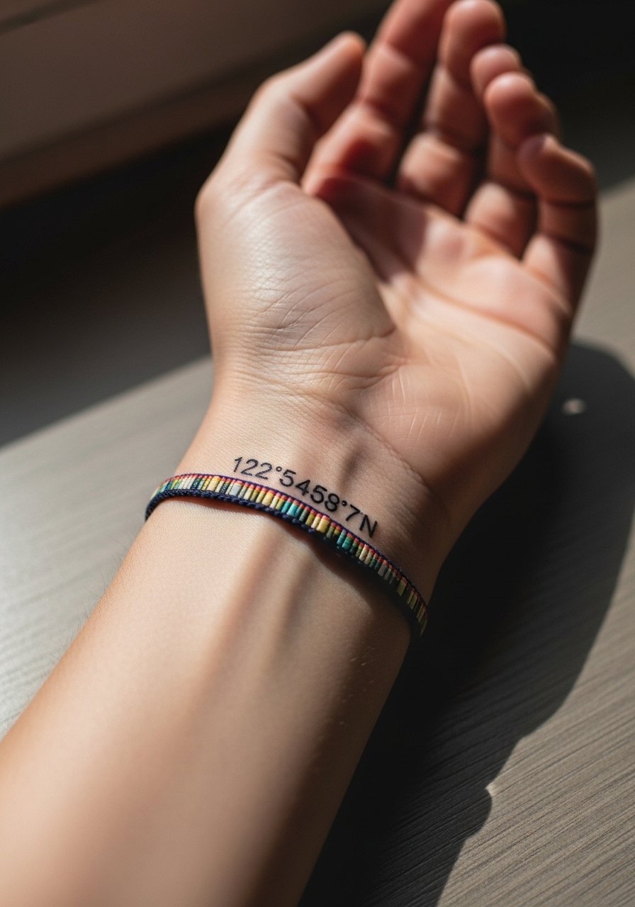
12. Colorful Map Coordinates on the Inner Wrist
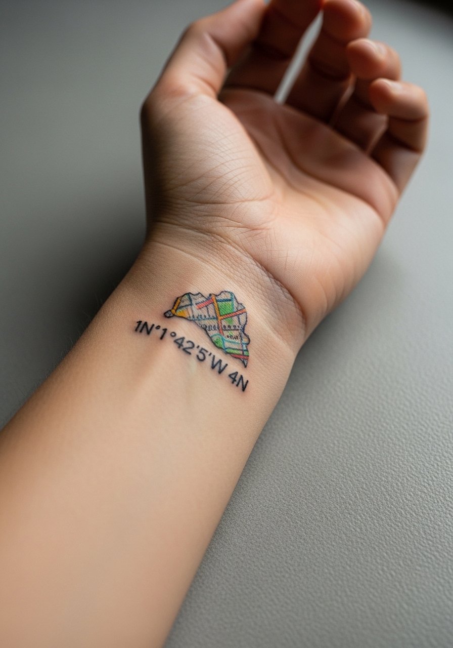
Coordinates read as a subtle personal marker when placed on the inner wrist. Use a single color accent behind the numbers to keep the attention on the meaning. Tell your artist to space numerals for legibility and to use a tiny bit of saturation behind instead of heavy fills. Common error is squeezing numerals together which creates blurring. Pain is low and sessions are quick. For showing off, consider pairing with a thin leather bracelet.
13. Neo-Japanese Koi Sleeve Accent
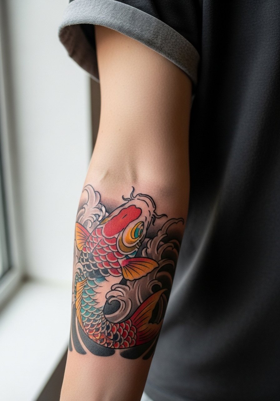
Neo-Japanese color performs when the composition respects breathing room between scales and background waves. In consultation say you want dense color in the koi and a softer, less saturated background so the fish remains the focal point. A mistake is packing heavy detail into the negative space which competes with the subject. Expect multi-session work and ongoing touch-ups as needed. For the session wear a short-sleeve tee so the artist has clear access.
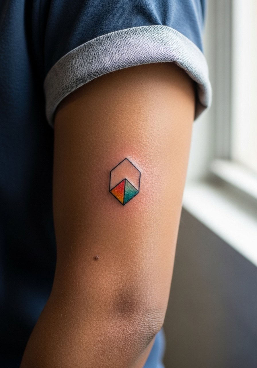
14. Color-Shift Geometric on the Calf
Visual depth in color-shift geometry depends on high-contrast anchors. Ask for distinct transition points rather than tiny blended steps that can muddy. The calf is forgiving on pain and great for longer sessions. A common mistake is asking for too many subtle gradients, which lengthens sessions for diminishing returns. Expect solid longevity if you limit the palette to three or four colors. Show it off with rolled jeans and a canvas sneaker.
15. Colorful Portrait Mini on the Inner Bicep
The inner bicep is a tender spot that holds detail when the session is paced. For color portraits ask for slightly simplified palettes and clear shadow anchors so facial planes remain readable. A common mistake is packing hyper-detail into a tiny space which fades into mush. Expect a two-hour session with possible follow-up. For comfort wear a loose tank top you can lift without strain.
16. Folk-Art Sunflower on the Hand
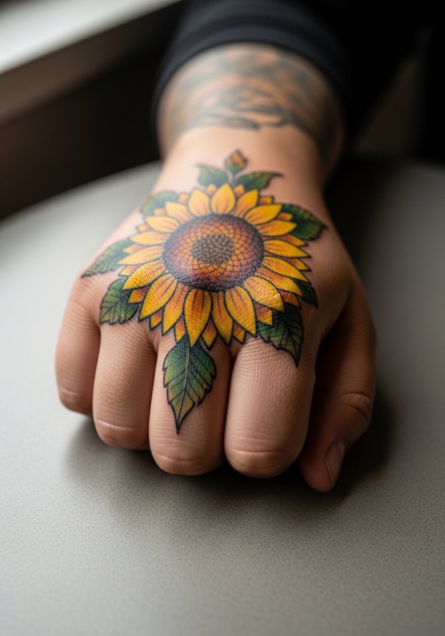
Hand tattoos carry extra risk because of constant wash and friction. The trick is to use bold color blocks and strong outlines to slow fading. Tell your artist you accept bolder shapes in exchange for longevity. A mistake is asking for fine gradients on the hand which need frequent touch-ups. Pain is notable and the session is short. Hand tattoos still affect some hiring decisions, so think about career context before committing. For showing off choose a minimalist ring set that complements color without crowding.
17. Color-First Skull on the Calf
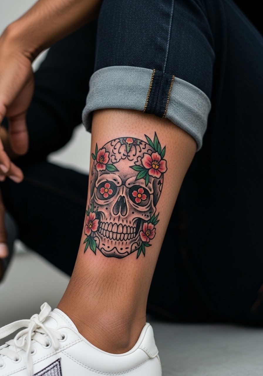
Skull motifs can carry weight when paired with bright florals. I advise saturated complementary colors and clear negative space inside the eye sockets so detail remains crisp. A common error is over-detailing the teeth and surrounding textures which age poorly. The calf tolerates longer sittings and color holds well here. For session ease wear loose drawstring pants so you can roll the leg without pressure.
18. Watercolor Peony on the Sternum

Sternum watercolor is intimate and beautiful, but it tests color longevity. One camp believes watercolor here fades into an undefined blur. The other camp points to layered saturation with touch-ups as the path to lasting clarity. If you pick sternum color, request defined petal edges and gradual fills rather than diffuse blotches. Sessions hurt more and require multiple breaks. Expect at least one touch-up within two years. For the session wear a fitted sports bra so the artist can work without full disrobing.
19. Colorful Mountain Range on the Outer Forearm

There's a clean look to color-blocked landscapes that travel well across the forearm. Ask for layered color bands with a small, saturated gradient at the ridge line so distance reads even as pigments soften. A frequent mistake is compressing too much topographic detail into a narrow band. Forearm pain is low and sessions are short. For showing it off roll sleeves and wear a racerback tank or a short-sleeve shirt that frames the work.
20. Color-Accent Geometric on the Neck
Neck tattoos require career foresight and careful scale decisions. Use color accent sparingly so the piece reads like an integrated shape rather than a painted patch. Ask your artist about long-term visibility and how the color will migrate over time. A common mistake is choosing tiny color dots that blur. Pain can be high and sessions short. For the session wear a wide-neck shirt you can adjust without full removal.
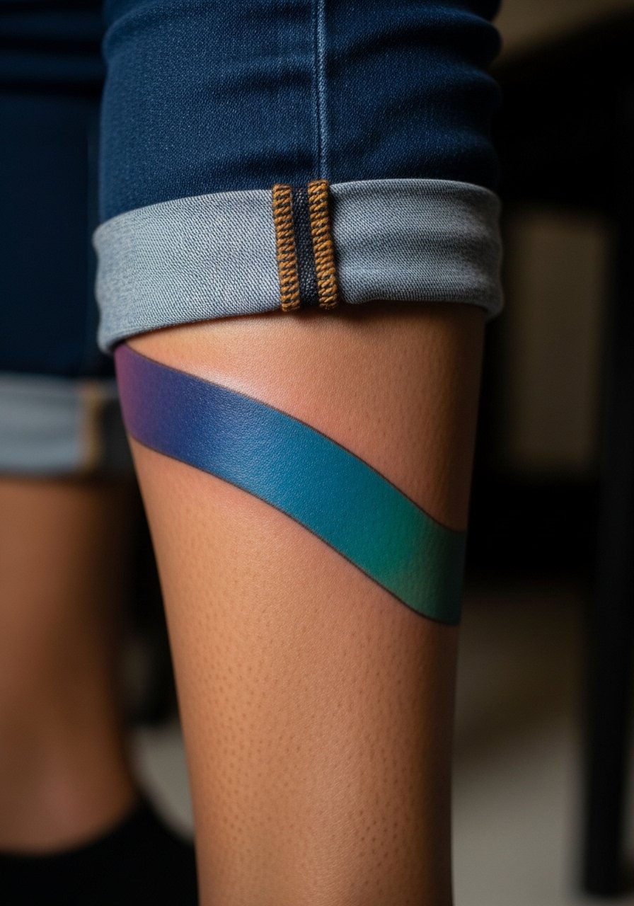
21. Color-Soaked Mandala on the Thigh
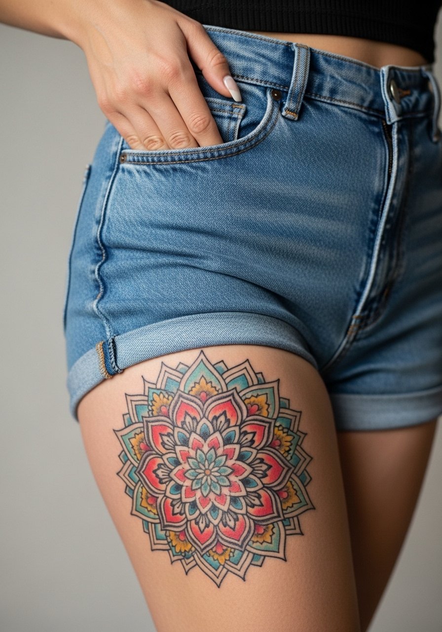
Thigh placements protect saturation well because they get less UV and friction. For vibrant mandalas use a balanced palette and plenty of negative space around dense elements. The mistake is compressing concentric rings too tightly which leads to merging over time. Sessions are comfortable and allow for long stints of detailed color work. During the appointment wear high-waisted shorts you can shift to expose the area.
22. Chromatic Wave on the Side Rib
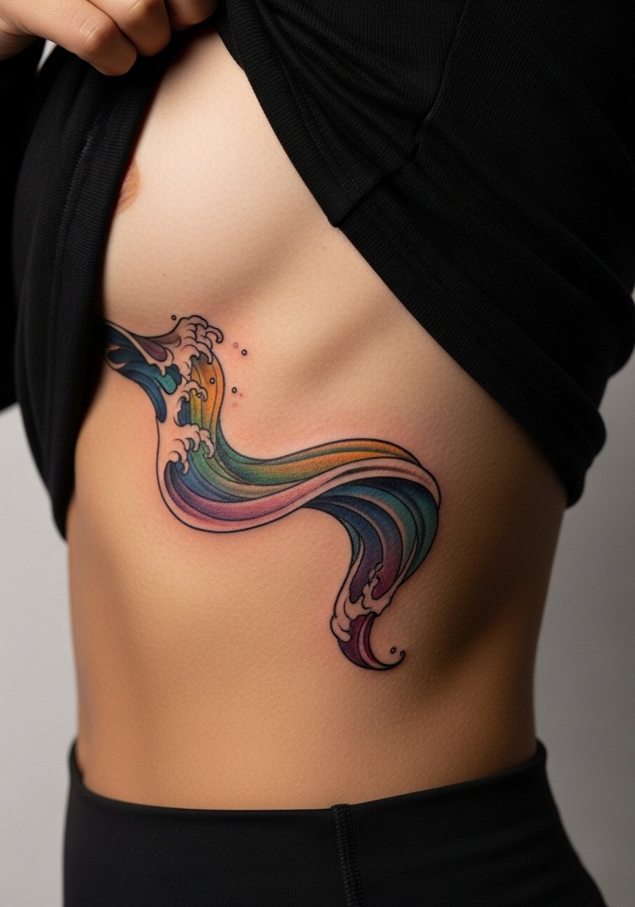
Side ribs are sensitive and the skin moves a lot. If you want a flowing wave, choose bold color bands with clear separations rather than soft blends that can bleed. Artists split on whether fine blending on ribs holds, so ask where they stand. A common error is asking for fine gradients in a single session which fatigues the skin. Expect pain and a likely touch-up. For the session bring a zip-up hoodie you can open to access the area.
23. Color-Block Arrow on the Ankle
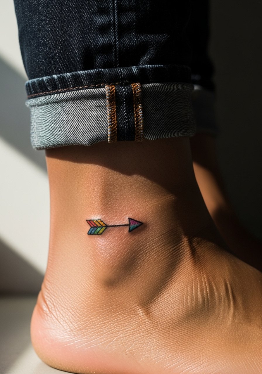
Ankle tattoos endure abrasion, so keep color-block areas bold and avoid tiny color gradients. Tell your artist you want a single saturated color block behind the arrow to ensure longevity. A common mistake is requesting tiny fill details that disappear with walking and shoe friction. Sessions are quick and pain is moderate. For the session wear shoes you can slip off and jeans you can roll up so the artist has space to work.
24. Polychrome Compass on the Upper Back

Upper back compasses do well when color is used to separate cardinal points and to anchor shadow. Ask for clearly defined color zones with a darker ring around the compass so it reads at arm length. A mistake I see is picking ultra-small compasses that require retouching. Sessions are low to moderate pain. For the appointment wear a tank top you can slide slightly for access.
25. Colorful Script Above the Hip
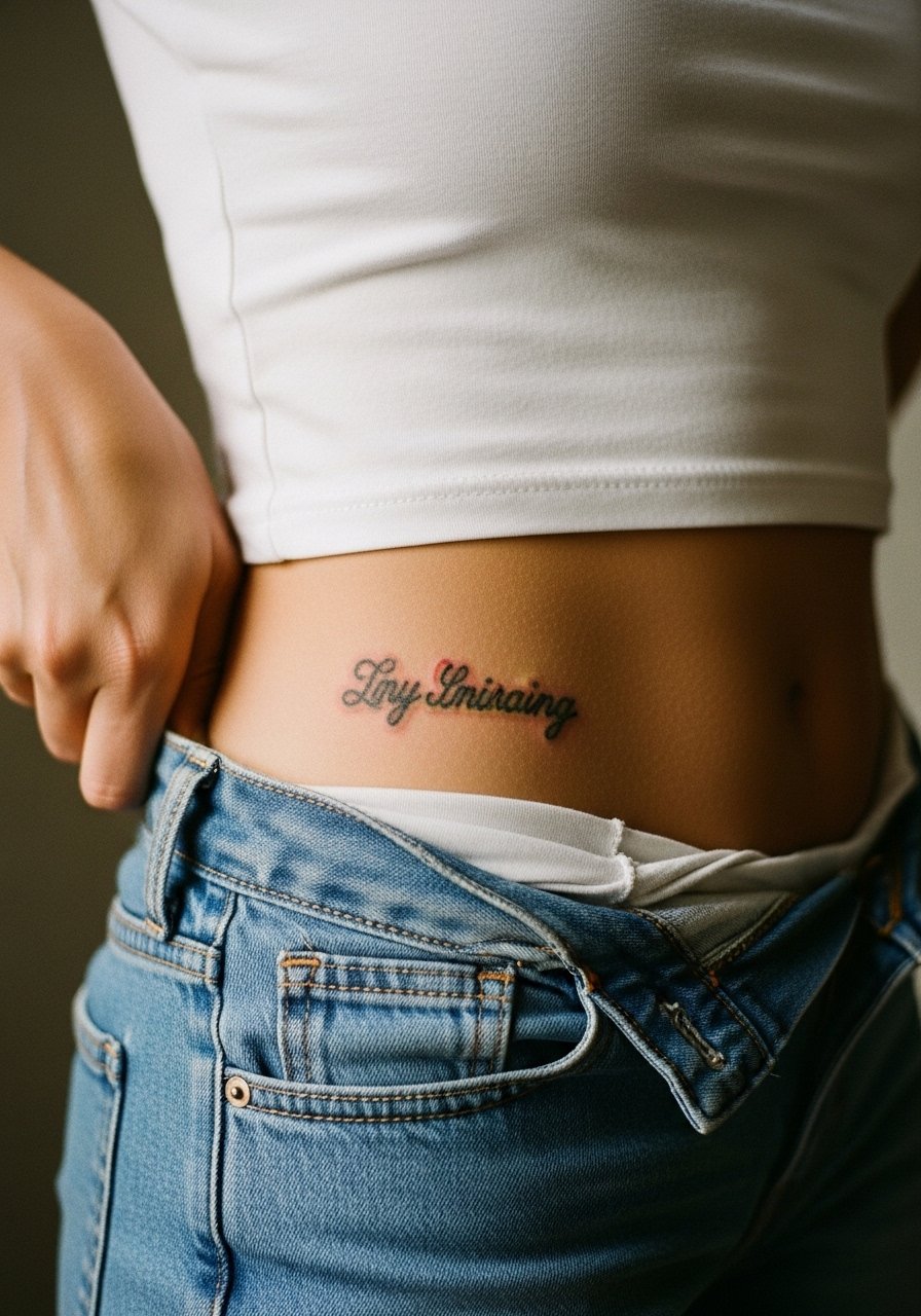
Hip script can be intimate and meaningful. Because the area moves with clothing choose slightly heavier letterforms and a thin color wash to enhance the line. A common mistake is asking for ultra-thin script which blurs where fabric rubs. Pain is moderate and sessions are short. For the session wear high-waisted leggings you can lower slightly without full undressing.
26. Color-Accented Geometric Sleeve Link
When you build a sleeve with pops of color, plan anchor pieces that can age independently so the sleeve remains coherent if parts need refresh. Tell your artist which segments you expect to be most visible so they prioritize saturation there. A common error is trying to make every panel equally detailed, which doubles the maintenance. Sessions will be multiple and may be spaced months apart. For the shop wear a short-sleeve tee you can roll up easily.
27. Colorful Coordinate Band Around the Wrist
A wrist band with color and coordinates can feel like a wearable memory. Use a narrow saturated band and slightly bolder numerals to prevent smudging. The mistake is insisting on ultra-fine numerals that compress. Expect a small touch-up within a year. For session comfort keep a minimalist watch strap handy to swap after the appointment.
Frequently Asked Questions
Q: Will colorful fine line tattoos blur faster than bold traditional color work on areas like the ribs or forearm?
A: From what I've seen, fine line color relies on spacing and deliberate saturation. Bold traditional color tends to age into tone more predictably. On ribs the skin movement increases blur risk, so ask the artist which approach they prefer for that placement and expect a touch-up sooner with fine work.
Q: How should I dress to a session for a sternum or upper chest watercolor piece?
A: Wear a fitted sports bra or wide-neck top you can shift without full removal. That keeps you comfortable and gives the artist clear access. A fitted sports bra is usually the easiest option.
Q: If I want a colorful sleeve, how many sessions and touch-ups should I realistically plan for?
A: Plan multiple sessions spaced weeks to months apart for saturation and layering. Touch-ups depend on lifestyle and sun exposure but expect at least one color refresh within two to four years for heavily saturated areas.
Q: Are there cultural concerns I should consider for mandalas or Japanese-inspired color pieces?
A: Yes. Mandala and Japanese motifs have cultural contexts. Some people choose to adapt motifs respectfully instead of copying sacred designs verbatim. Discuss inspiration and intent with your artist and consider slight variations that honor the source.
Q: Do colored tattoos need different long-term care than blackwork?
A: The main difference is that color shows fading and shifts in tone more obviously. Sun protection and periodic touch-ups help. I tell people to prioritize sunscreen on visible pieces and plan for maintenance rather than assuming color is permanent.
Q: Can I get a meaningful color tattoo in a workplace that is conservative about visible ink?
A: You can, but placement matters. Consider chest, upper back, or thigh for private pieces, or small wrist work you can cover with a watch and sleeves when needed. Think about career timelines and whether you want a piece that stays hidden at work.
