
Fine line collarbone crosses look fragile under studio lights and as they age, yet the ones that still read crisp after three years usually started with room between strokes, slightly heavier anchor points, and a plan for a touch-up. Expect sharp stencils, honest talk about placement over bone, and a short session that rewards careful spacing. Below are collarbone cross designs that balance showing off, longevity, and how they feel in the chair.
1. Minimal Fine-Line Cross at the Collarbone
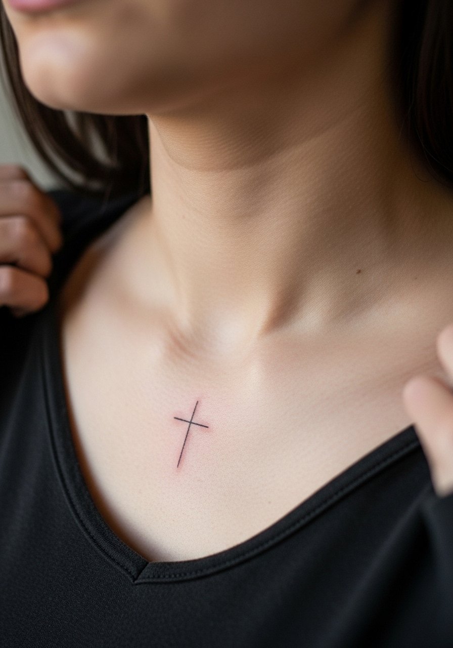
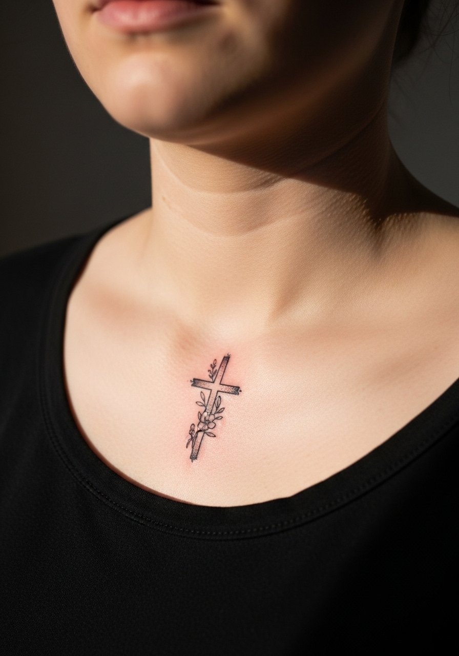
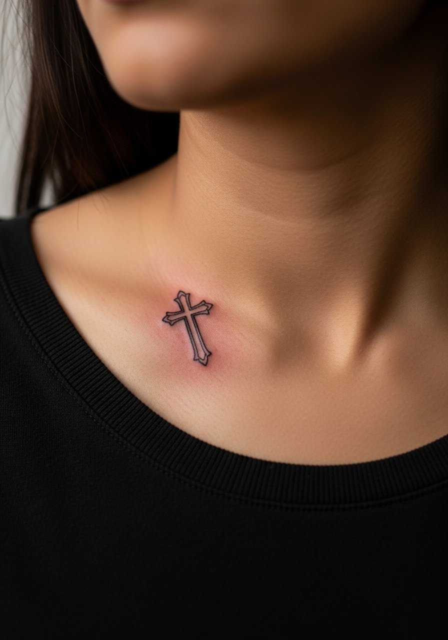
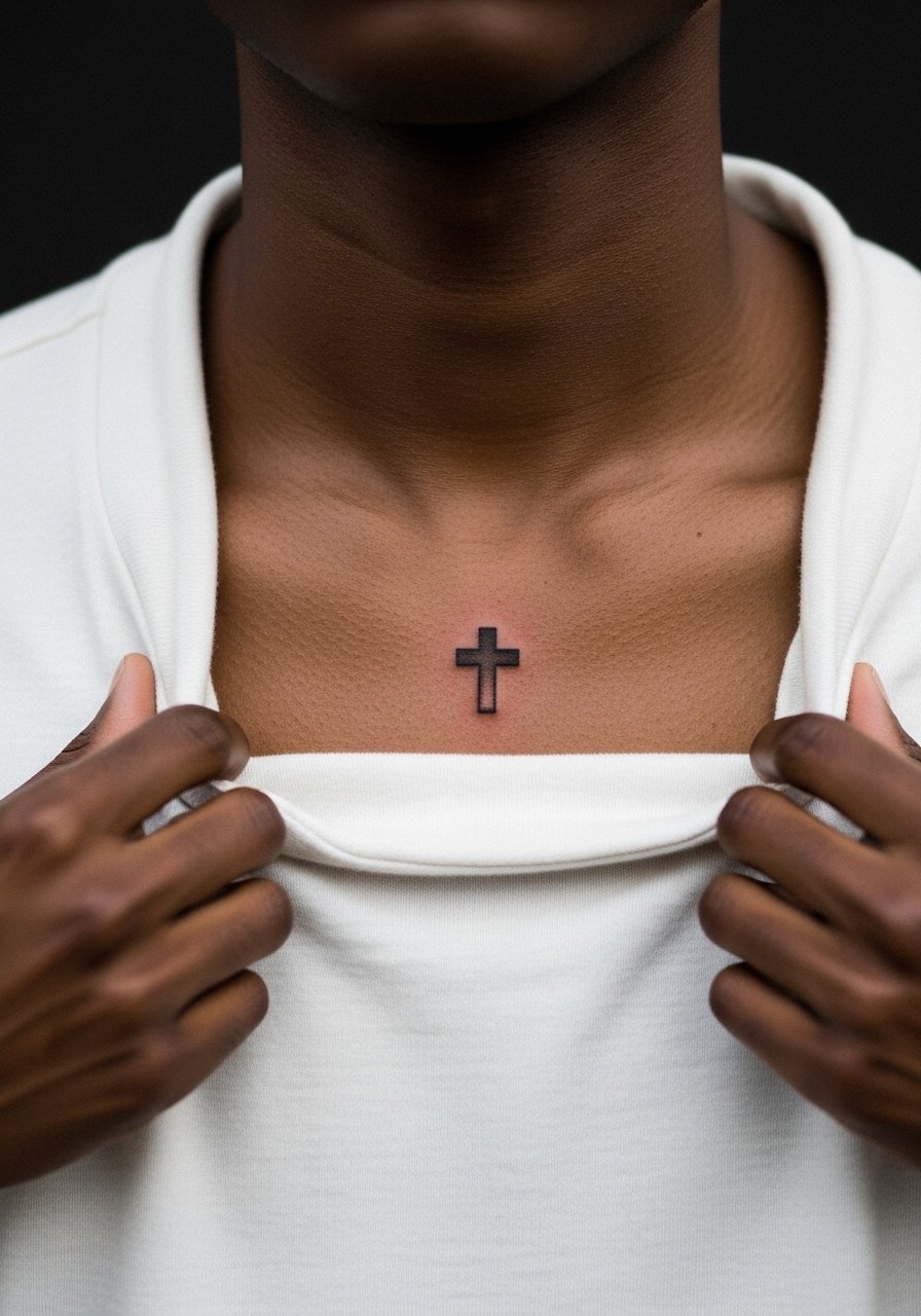
A single-stroke micro cross placed right above the clavicle reads like jewelry. I recommend it for anyone who wants subtlety without a necklace. Tell your artist you want slightly heavier anchor points at the base of the cross so the arms stay visible as the ink settles. Fair warning, the collarbone is bony and sensitive so expect a short sharp sting and a session under 45 minutes. The biggest mistake is asking for lines too close together. That invites blurring as the skin moves. For showing it off, pair with a wide-neck shirt that frames the area and a thin chain pendant to sit just above the ink.
2. Bold Blackwork Cross with Solid Fill
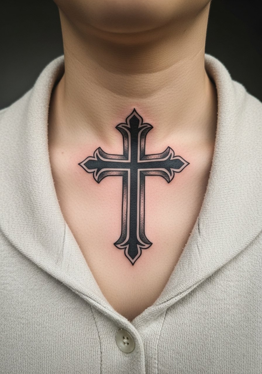
This saturated cross uses heavy linework and solid black fill to age into a strong silhouette. I suggest it when you want an anchor piece that still reads from a distance. In consultation, ask for slightly larger scale than your phone mockup, because heavy saturation on a tiny spot can feel cramped over time. Pain is moderate because the artist will pass over the bony ridge with packed shading. Blowout risk is lower than with ultra-fine lines, but if the needle goes too deep the solid can spread. Expect a touch-up around year two for saturation, and wear a loose off-shoulder top during the first week to avoid fabric rubbing.
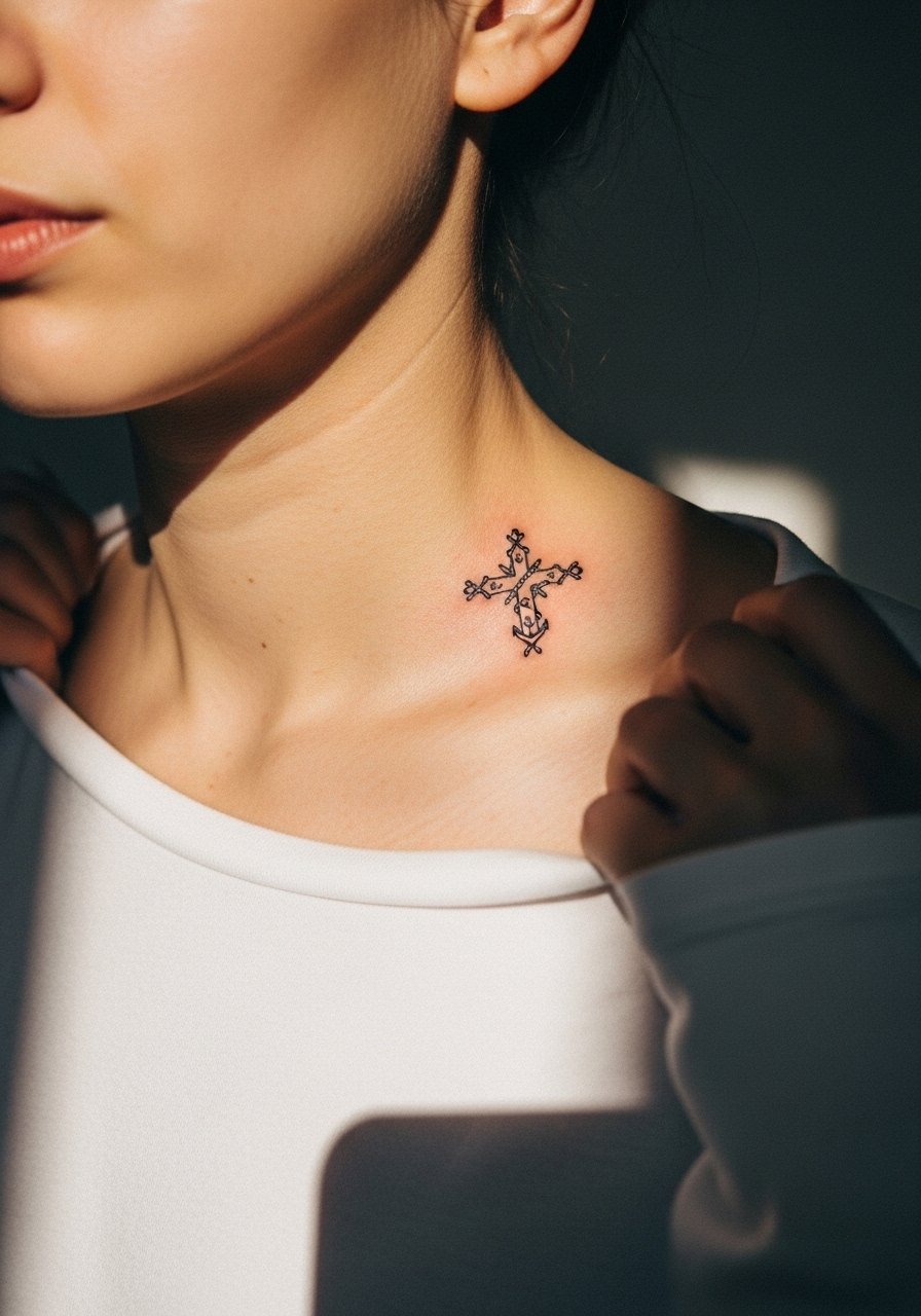
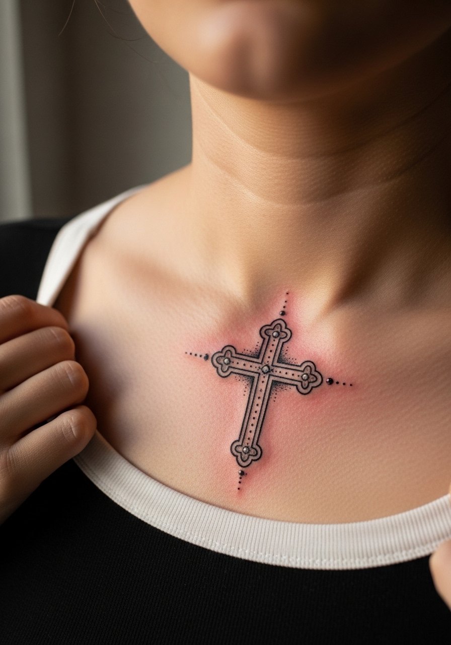
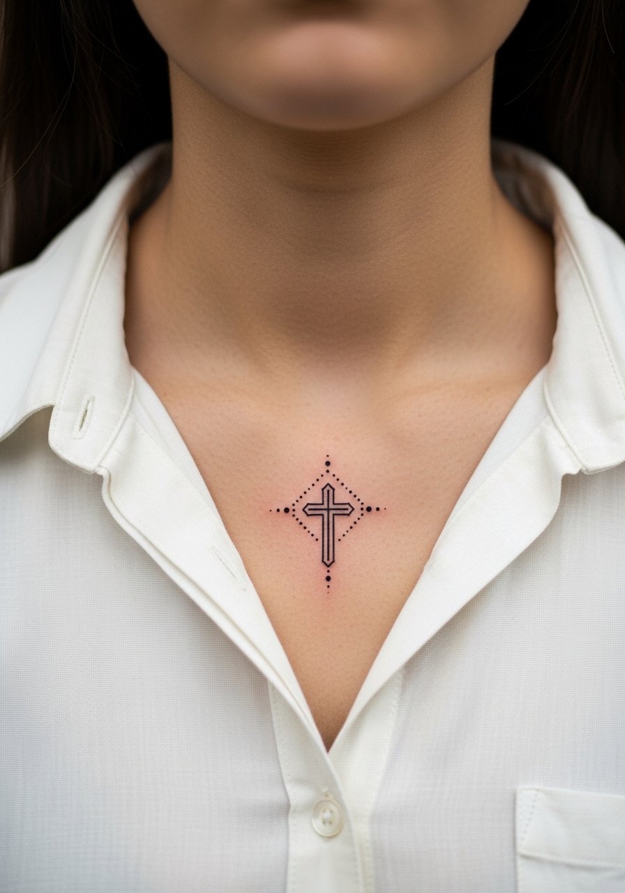
3. Dot-Work Cross with Halo Detailing
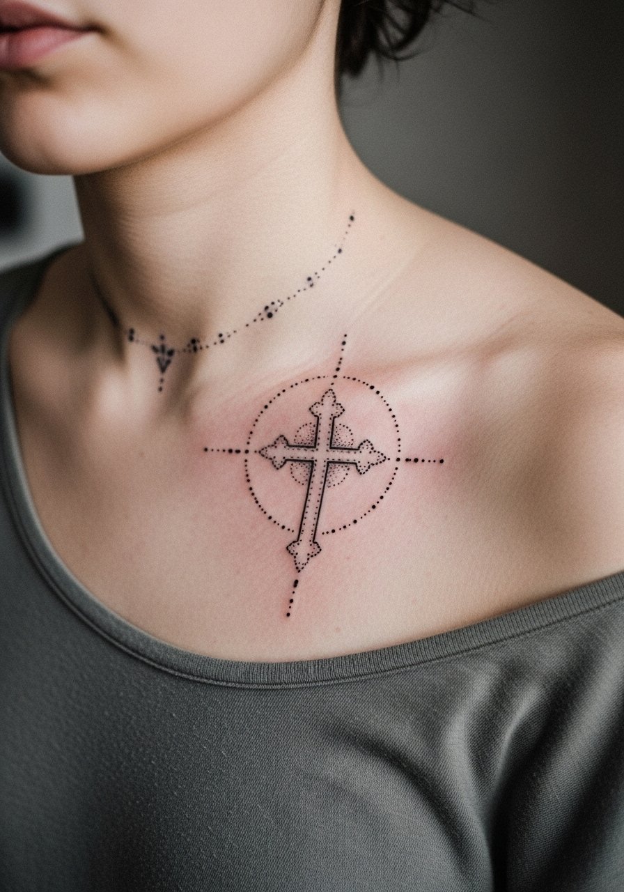
Dot work gives a delicate texture that reads like subtle shading rather than a hard fill. This is a choice if you want the cross to feel soft while keeping clear edges. Ask the artist for stipple shading that tapers away from the cross so it does not clump near the bone. The session feels like repeated light taps instead of long passes. A common error is over-concentrating dots too close to the linework. That causes the halo to dull into a smudge after a couple of years. For nights out, style with a thin chain pendant necklace that sits above the dotted halo so the ink remains the focal point.
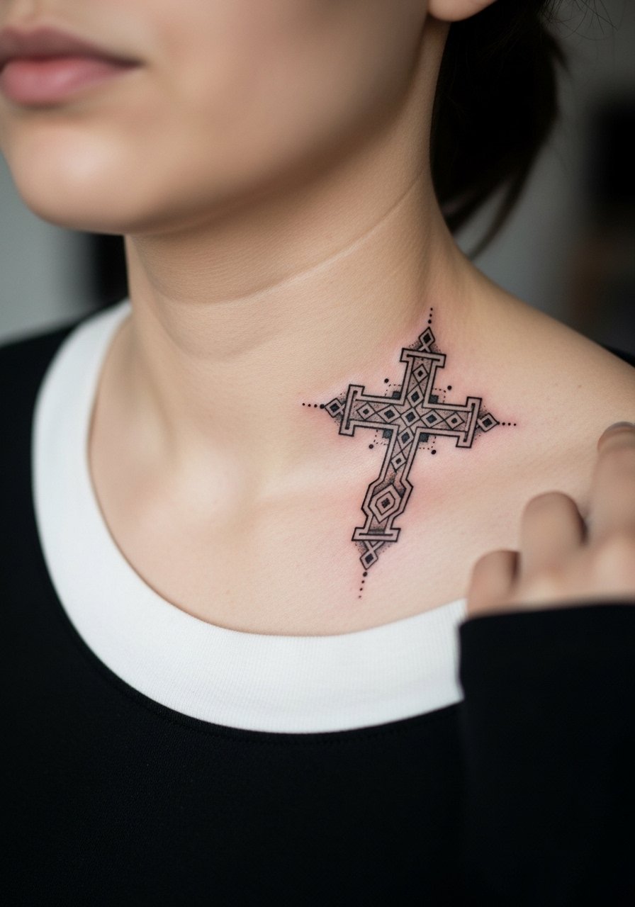
4. Filigree Cross with Negative Space Accents
An ornate cross with filigree leans decorative and pairs well with dressier looks. This design benefits from purposeful spacing so the negative areas do not close up as the piece heals. There's a debate among artists about how much detail the collarbone can hold. One camp says the thin skin and movement blur fine ornament within a few years. The other camp replies that careful line weight and deliberate spacing keep the filigree readable. Ask where your chosen artist stands and request a slightly larger scale than you think you need. Session time runs longer because the artist works slowly around tiny negative spaces.
5. Micro Roman Numeral Cross
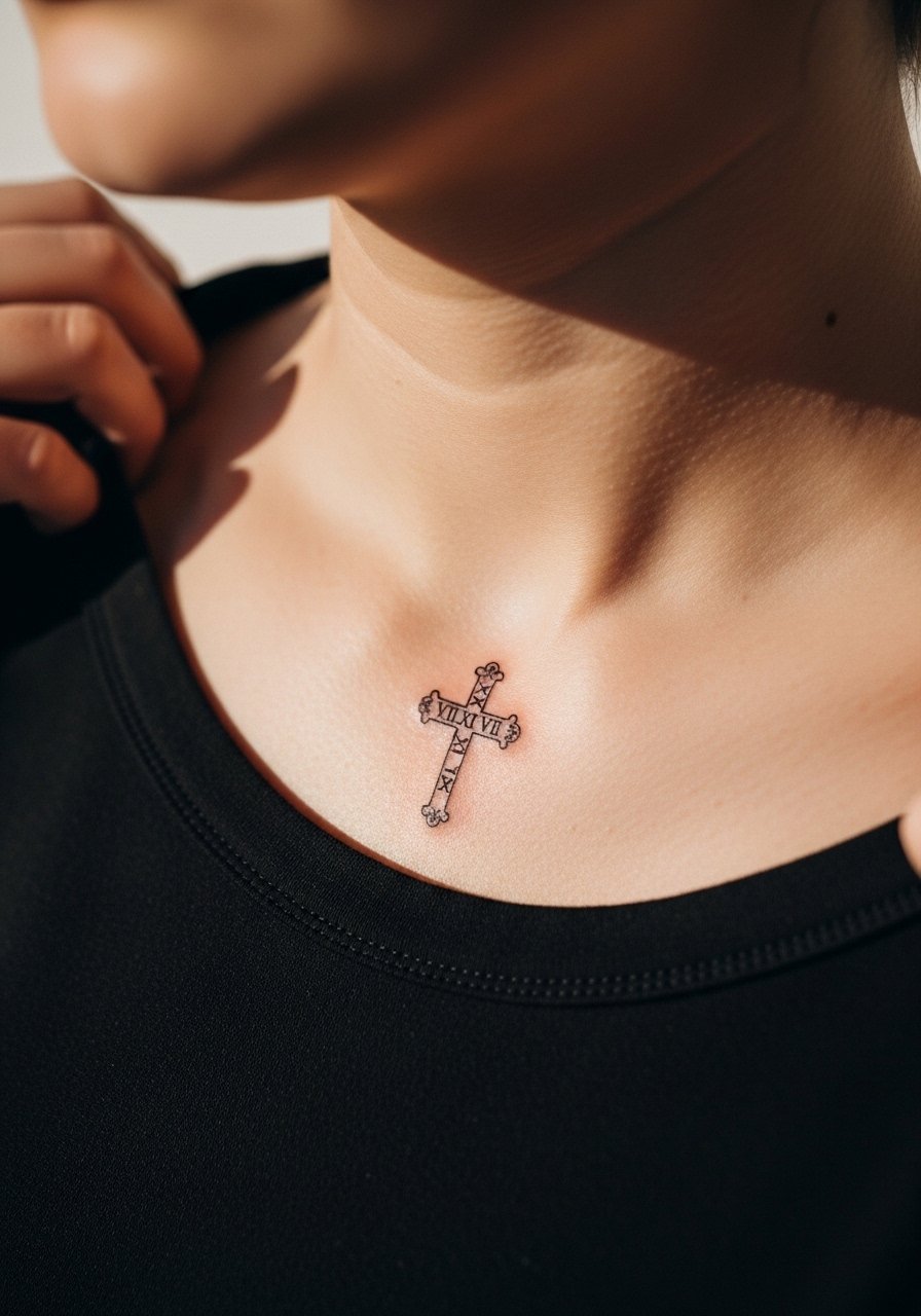
Combine a small cross with a short date in Roman numerals for a personal, low-profile piece. Exact text must be specified in your stencil so the artist reproduces the numerals correctly. Tell your artist you want the numerals slightly spaced away from the cross to prevent merging. Pain is noticeable near the bone but the whole session is brief, usually under an hour. A classic error is packing the numerals too close to the cross; that is what forces touch-ups later. Style it with a thin chain pendant or a subtle collar that keeps attention on the ink.
6. Cross with Fine Chain Motif Along the Collarbone
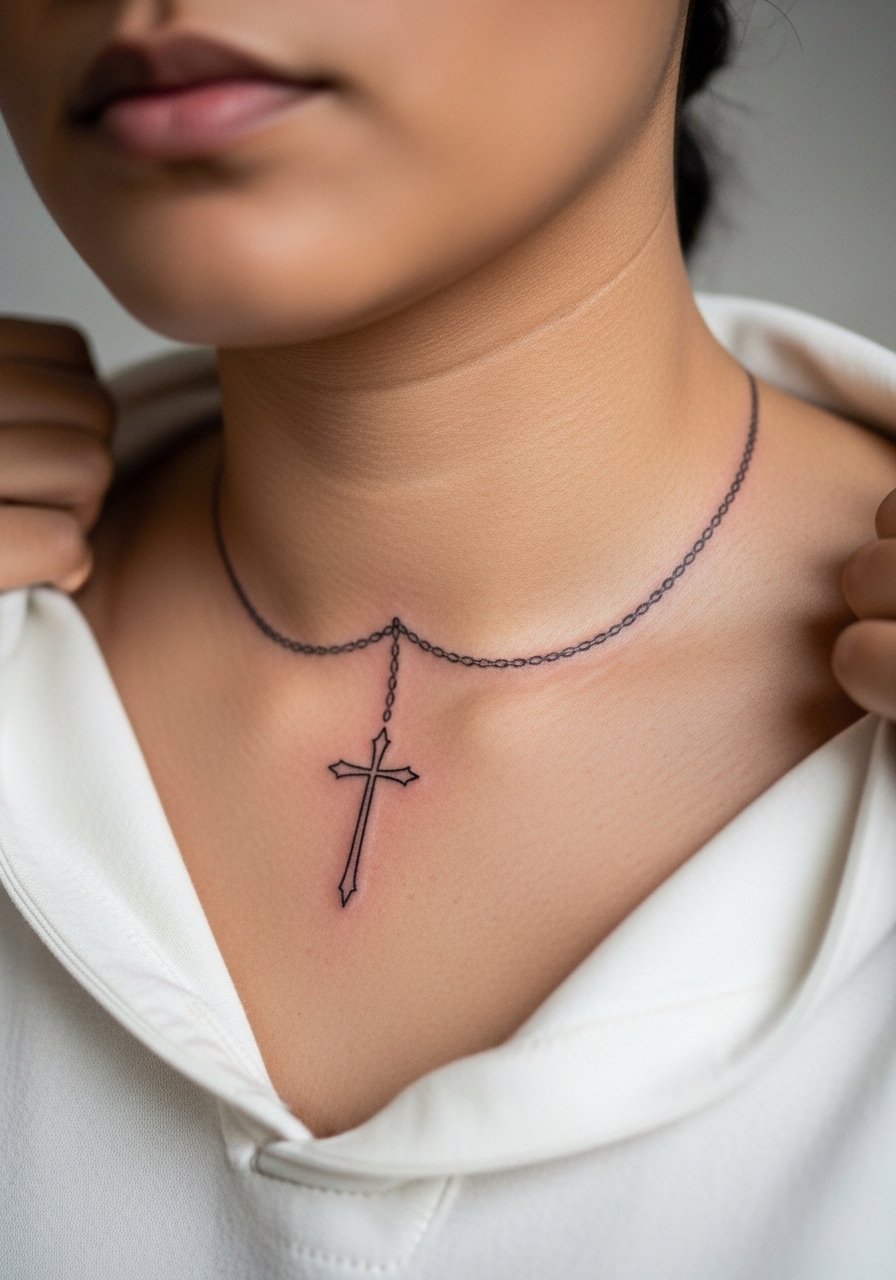
This design uses a small cross as a pendant motif sitting on a tattooed chain that follows the collarbone curve. It is ideal for people who like the idea of a built-in jewelry effect. During consultation, show reference images of chain spacing and ask the artist to keep links open rather than tightly packed. The collarbone moves with breathing and shoulder motion so spaced links hold up better. Session time depends on chain length but expect one to two hours. For showing it off, an off-shoulder top frames the piece like real jewelry.
Studio Day Picks
The collarbone pieces above sit close to clothes and jewelry, so a few targeted items smooth the session and the first week.
-
Stencil transfer paper kit. Lets you see how the cross and chain sit on the bony curve before the needle goes down, which helps avoid surprises.
-
Topical numbing cream. Applied per the product directions it takes the edge off collarbone sensitivity for short sessions.
-
Thin protective film roll. Useful for keeping the area clean under collars and during the first showers if your shirt rubs the site.
-
Fragrance-free gentle body wash. Cleans the collarbone area without stripping ink or irritating fresh linework.
-
Aquaphor healing ointment. A thin layer in the first days helps the fine lines settle without heavy residue that can trap bacteria.
7. Geometric Cross with Clean Linework
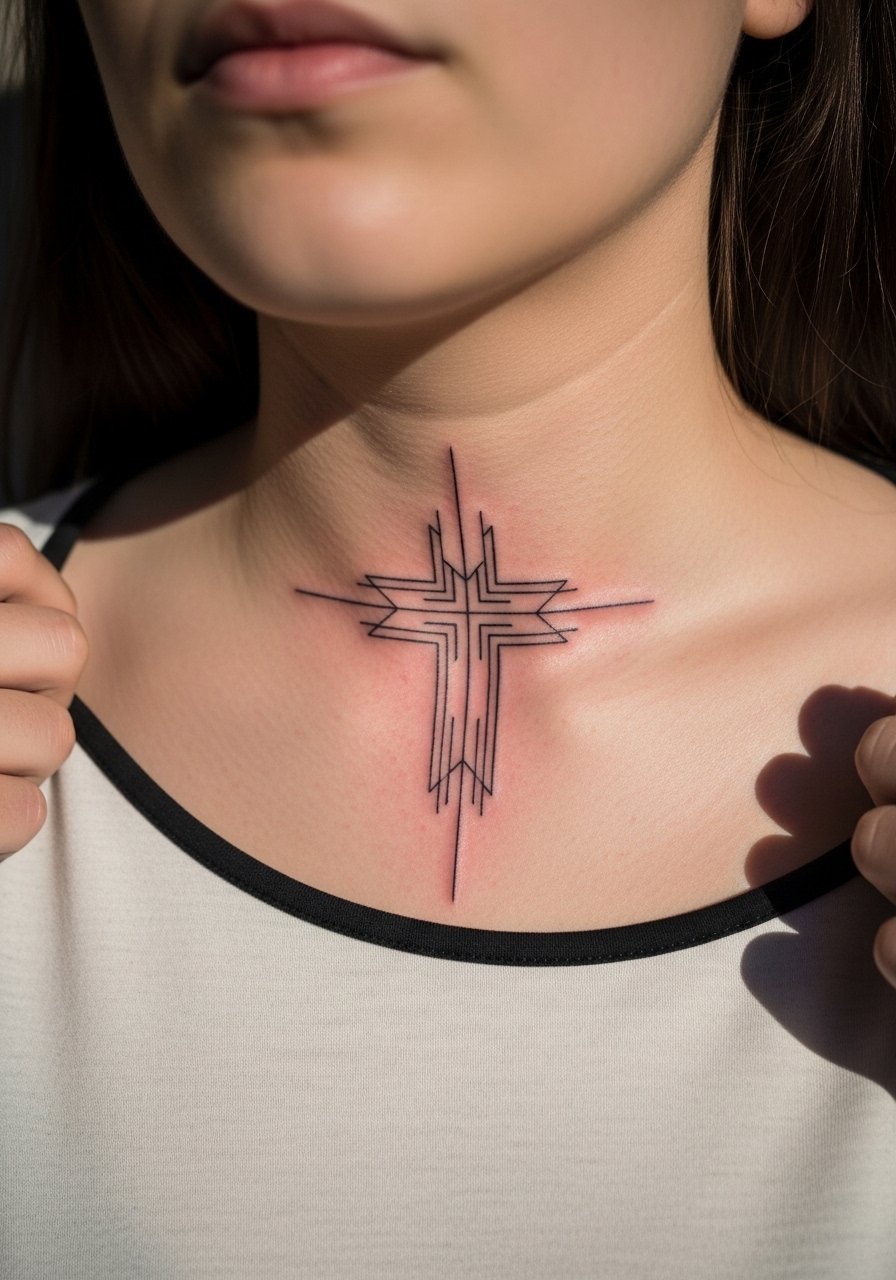
A geometric cross reads modern and deliberate. It suits people who like crisp, architectural shapes. When you bring references, point out the exact line weight you want because geometric shapes can look fragile if the lines are too thin on the collarbone. The pain is sharp for short intervals while the artist defines corners. The common mistake is scaling the geometry too small. Small angles and tight intersections blur as the skin shifts. For longevity, expect a touch-up at year three depending on sun exposure, and ask your artist to leave slightly thicker anchor lines at intersections.
8. Watercolor Wash Cross with Minimal Linework
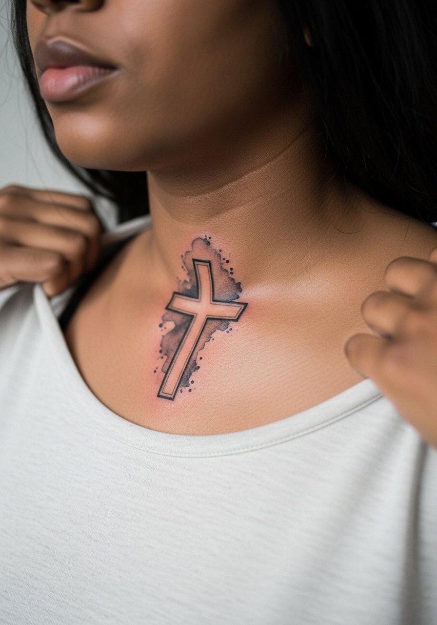
Watercolor crosses rely on color wash rather than heavy linework. They look painterly while balancing a light black anchor. If you have darker skin, ask for higher saturation and deeper contrast in the outline so the color remains visible over time. Expect a different healing path than a fine line piece. Colors fade faster on exposed spots and need touch-ups earlier. The main mistake is using too many blended hues in a tiny collarbone zone. For session day, wear a wide-neck shirt you can pull aside easily so color layering happens without smearing.
9. Minimal Cross with Floral Accent
Adding a single floral sprig softens a cross and makes it feel personal without crowding the collarbone. I usually suggest keeping floral details off the central intersection and instead rooting them at the base so the cross remains the focal point. The session is gentle and often under an hour. People often ask for dense shading in the flower which can overshadow the cross. Keep stipple shading light and leave breathing room between petals. A thin chain pendant worn above the piece complements the motif for evenings out.
10. Gothic-Inspired Small Cross with Script Tag
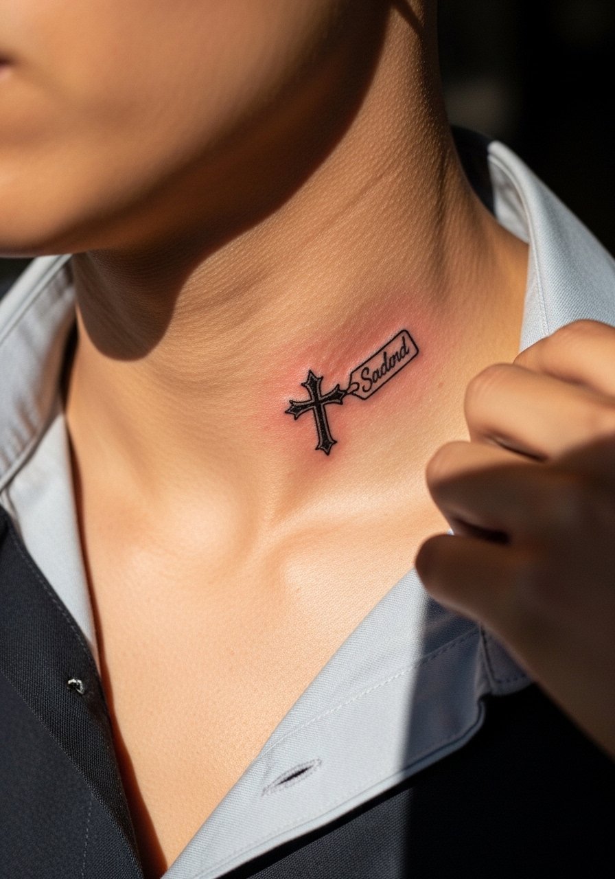
A gothic cross paired with a one-word script creates a narrative feel without taking much space. When you ask for script near a cross, specify exact lettering and spacing. Image generators and stencils otherwise produce odd kerning. The collarbone shape can distort letters so the artist may suggest a slight curve that follows the bone. Pain is brisk but the session is short. A frequent error is asking for overly thin script next to fine cross lines. Ask for modest line weight to keep both elements legible as they age. For showing it off, a slightly open button-down or off-shoulder top frames the script and cross together.
11. Anchor Cross with Tiny Nautical Motifs
This is for anyone who wants the cross plus subtle sea references. Tell the artist which motif should read as secondary so the cross keeps priority. Nautical lines tend to blur if packed tightly, so keep the rope loops open. Sessions for small combined motifs usually finish under 90 minutes. A misstep clients make is squeezing multiple tiny symbols into the same patch of skin. Scale up slightly and space elements for longevity. Pair with a thin chain pendant rather than chunky jewelry so the motifs remain visible.
12. Celtic Knot Cross with Interlaced Arms
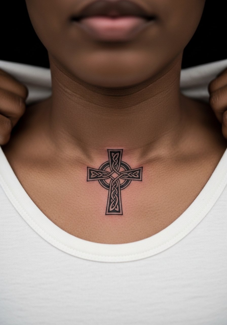
Celtic knotwork offers pattern density that needs extra care on the collarbone. The key is spacing. Knot arms must have generous intervals so the lines do not merge as the skin settles. The session requires deliberate linework and takes longer than a simple cross. One common mistake is insisting on traditional knot density at micro scale. If the artist warns that scale needs to increase, listen. Expect a touch-up for tight intersections around year two or three. This design benefits from slightly bolder anchor lines to preserve the maze-like look.
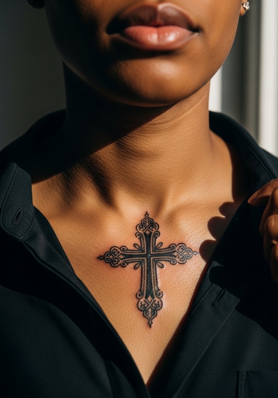
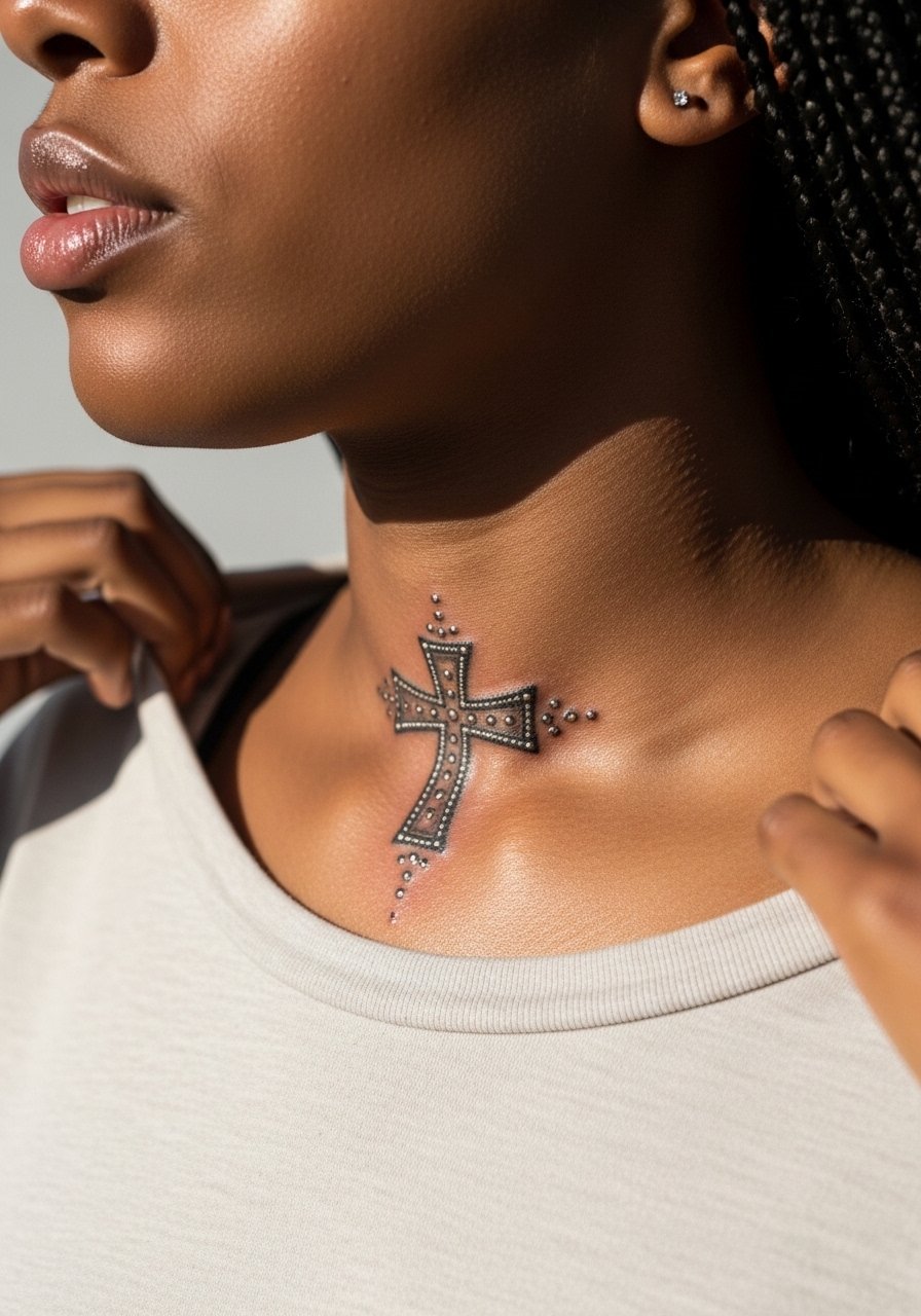
13. Ornate Latin Cross with Tiny Gem Dots
An ornate Latin cross with tiny dot accents reads like jewelry without real stones. Ask the artist to place dots where they act as highlights rather than crowd negative space. Pain is sharp around the bone but the detailing is mostly light taps, which some people find tolerable. A common error is clustering too many dots close to filigree. That creates a grainy look as the piece heals. For showing off, wear a thin chain pendant that complements the dotted highlights without covering them.
14. Asymmetrical Cross Tilted Along the Clavicle
Tilting the cross to echo your natural clavicle line gives movement to a static symbol. This approach works best when the artist previews the stencil in dressing room light because the tilt reads differently on a flat screen. The session is short. Mistakes happen when people ask for extreme tilt without considering garment lines. If you want asymmetry, try a modest rotation so the cross reads intentional, not crooked. Ask the artist to apply the stencil and walk around to see how it looks when you stand, sit, and reach.
15. Byzantine Cross with Small Geometric Inlays
Byzantine motifs bring historic geometry without being literal. For this, prioritize clear separation between inlays and the cross outline. In consultation, request reference photos that show line weight in similar placements rather than just on larger chests. The collarbone will soften tiny internal angles, so widen them slightly at the stencil stage. Sessions are moderate in length because of tight detailing. A frequent client mistake is insisting on intricate inlays at micro scale, which loses definition. For evening wear, a thin chain pendant keeps the focus upward.
16. Minimal Block Cross with Negative Space Border
A block cross with a reserved negative border uses contrast to make a small piece feel intentional. Tell your artist you want the outer border slightly wider than your first instinct so the negative gap remains as the ink settles. The session can be brisk since fill is straightforward. The main risk comes from heavy packing that goes too deep. That causes the crisp negative band to soften into a gray halo. Expect a touch-up for solid fills after one to two years, depending on sun exposure.
17. Tiny Cross with Crescent Moon Accent
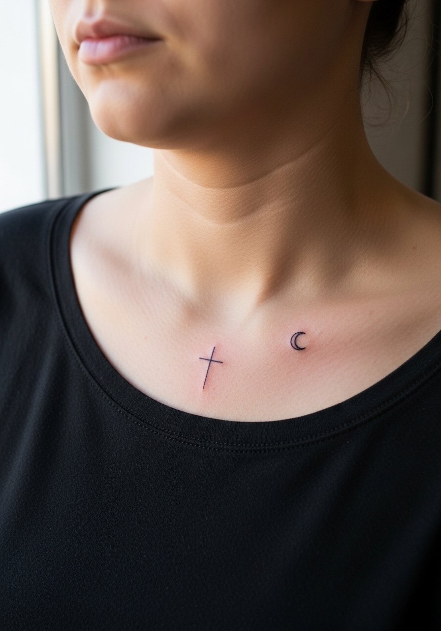
Pairing a cross with a tiny moon gives the piece symbolic duality without enlarging the canvas. Specify which element should be dominant so the artist spaces them accordingly. The collarbone can distort small curves so the moon may need a hair more space than it appears on-screen. Sessions for paired micro-symbols are short. A common mistake is asking for overlapping details that the skin cannot hold. For layering with accessories, a thin chain pendant sits neatly above the duo.
18. Script-Wrapped Cross Along the Clavicle Curve
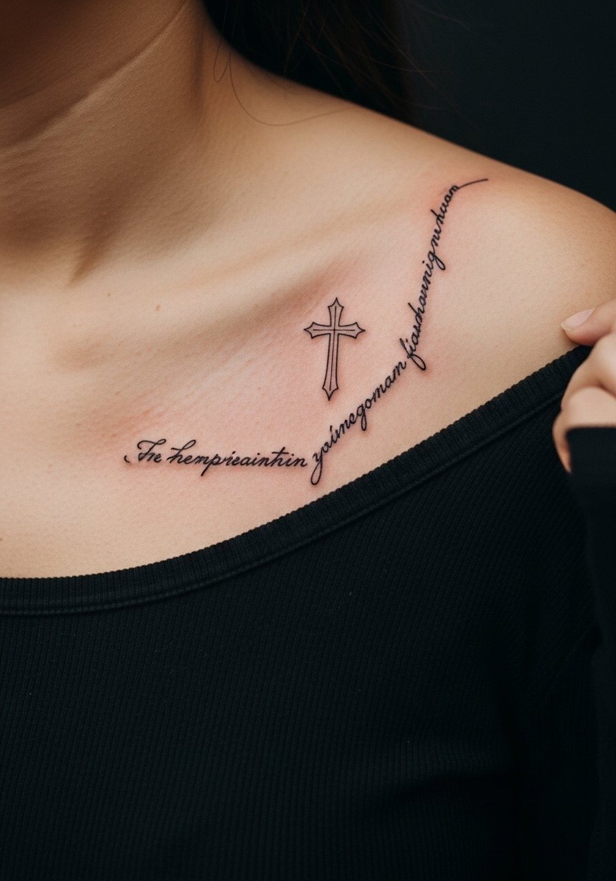
Wrap a one- to two-word script around the cross for a phrase-like effect. Exact wording and punctuation must be in the stencil so the artist reproduces it accurately on curved skin. The collarbone's curve will change how script sits so ask the artist to draft several positions. Sessions are quick but require care for legibility. The usual mistake is choosing cursive that is too ornate for a micro scale. Pick a clean, readable script and request slightly bolder strokes to weather sun and friction better.
19. Byzantine Tiny Cross with Metallic Dot Highlights
Metallic dot highlights mimic studs without real hardware. Ask for high-contrast dot placement so the "metal" reads as highlights rather than scattered pixels. This is a detail-focused piece and takes patience in the chair. The most common error is overusing highlight dots which distract from the cross silhouette. Keep highlights sparse and strategically placed. For low-key showcase, wear a wide-neck shirt that reveals the collarbone line and keeps attention on the ink.
20. Broken Line Cross with Intentional Gaps
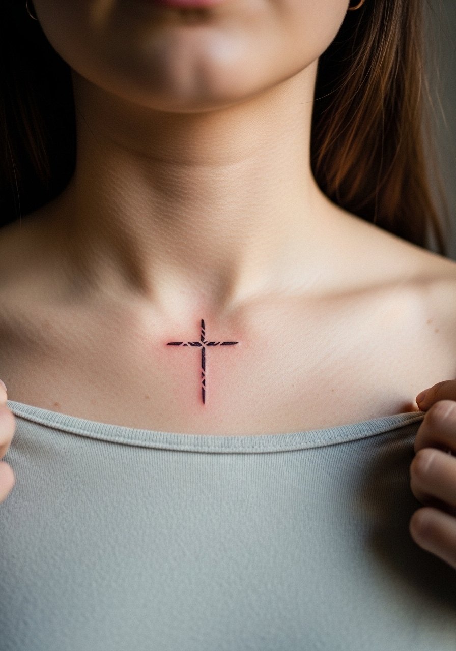
Using interrupted strokes creates a modern, airy cross that reads minimalist while still being readable. Tell the artist exactly how large you want each gap and how many strokes per arm so the visual rhythm survives healing. Sessions are quick but require steady spacing. Common mistakes include making the gaps too small which removes the intended break as the lines soften. Expect a touch-up at year two if you want the breaks to remain crisp.
21. Tiny Latin Cross with Micro Dot Border
A micro dot border creates a subtle frame that lifts a very small cross visually. Ask the artist for dot spacing that echoes the cross scale rather than a dense halo. The session feels like a mix of linework and precision dots. A frequent error is demanding border density that competes with the cross itself. Keep the border airy so the cross remains dominant. For an everyday look, pair the piece with a thin chain pendant that sits above the frame.
Frequently Asked Questions
Q: How painful is a collarbone cross compared with other placements like the forearm or upper arm?
A: The collarbone sits over thin skin and bone so it is commonly described as sharper than the forearm. Sessions are usually short which helps. A quick numbing topical can make a big difference for sensitive people. Wearing a loose wide-neck shirt to the appointment makes access easier and keeps the experience more comfortable.
Q: Will fine-line crosses blur quickly on the collarbone and need touch-ups?
A: Fine line work on collarbones can blur sooner than bold blackwork because the skin there moves and is thin. One group of artists recommends slightly heavier anchor points and intentional spacing so fine lines age better. Another group says that any very fine line will need touch-ups around year three. Ask your artist how they approach spacing and plan for a touch-up if you want long-term crispness.
Q: What should I wear to the studio for a collarbone tattoo session?
A: Come in a wide-neck shirt or an open-collar button-down you can pull aside easily so the artist has clear access without you being cold. Avoid tight straps that press against the clavicle during the first week when the area is most sensitive.
Q: Do collarbone tattoos affect professional settings since they are so visible?
A: Collarbone tattoos are visible with many necklines so think about how they align with your typical wardrobe. Some workplaces are fine with visible ink. Others prefer covered collars. If you are unsure, place the cross slightly higher or lower on the bone so it can be shown or hidden by different necklines.
Q: How does sun exposure affect small collarbone crosses and what can I do to protect them?
A: UV exposure fades all tattoos faster. The collarbone is often partially exposed so plan to use sun protection once healed and out of the initial care window. Regular sunscreen on healed ink keeps saturation longer and reduces the need for early touch-ups.
