
Sitting in the chair, the stencil sits on your bicep and the hum starts, and you realize the curve of your arm changes everything. Bicep pieces read differently at the gym, under a sleeve, and in sunlight. This list pulls together clean references a man can bring to a consult, what to ask for in the stencil, and how the design will age so you leave the studio with a plan, not just a pretty picture.
1. Micro-Realism Portrait on the Inner Bicep
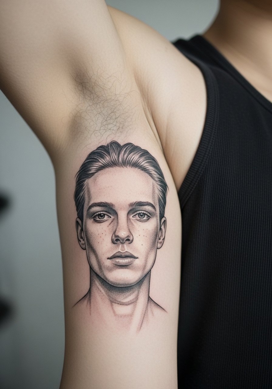
I've seen micro-realism portraits sing on the inner bicep when scaled to the curvature of the muscle. Tell your artist you want the eyes as the focal point and to map the stencil along the muscle belly so the face doesn't distort when you flex. Pain is higher on the inner arm, expect a sharper buzz for longer than on the outer bicep. The common mistake is asking for too much tiny detail packed into a small oval. At six months the shading reads soft, at two years the faintest details may need a touch-up. For the session wear a racerback tank top so the artist can access the inner arm without the shirt bunching.
2. Bold Blackwork Band Wrapped Around the Mid-Bicep
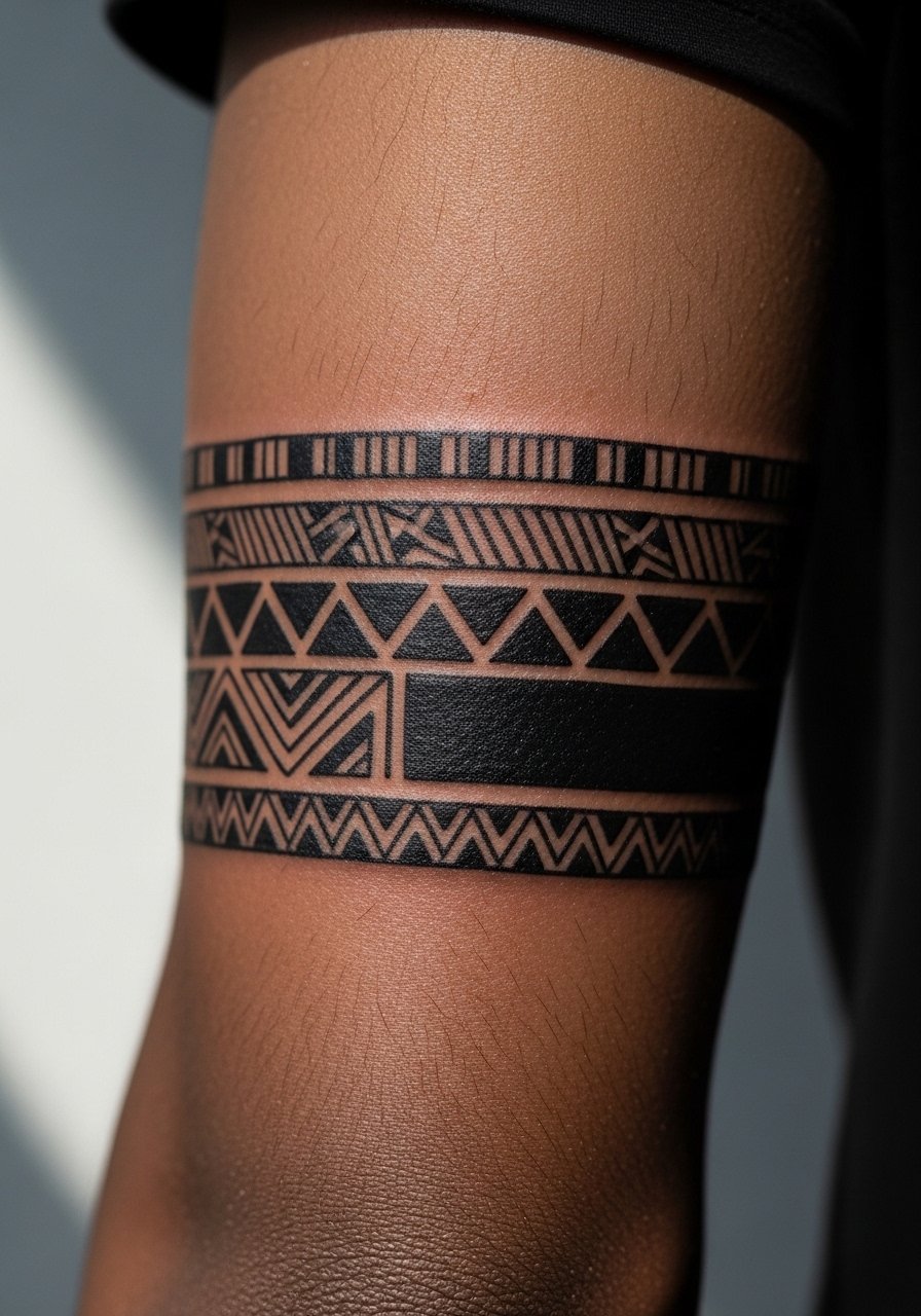
There is a satisfying simplicity to a saturated black band on the bicep. In consultation, ask for clean negative-space edges and for the artist to sketch the wrap at rest and with a flexed arm. Expect moderate pain for ringed work because the needle crosses over muscle contour repeatedly. Blowout risk exists if linework is pressed too deep, so tell the artist you want bold saturation without aggressive needle depth. At year two the block will remain readable if the saturation is dense from the start. Pair this with sleeveless tees for showing off, and for session comfort wear a loose button-down shirt you can slide off the arm easily.
3. Fine Line Script Along the Outer Bicep Curve
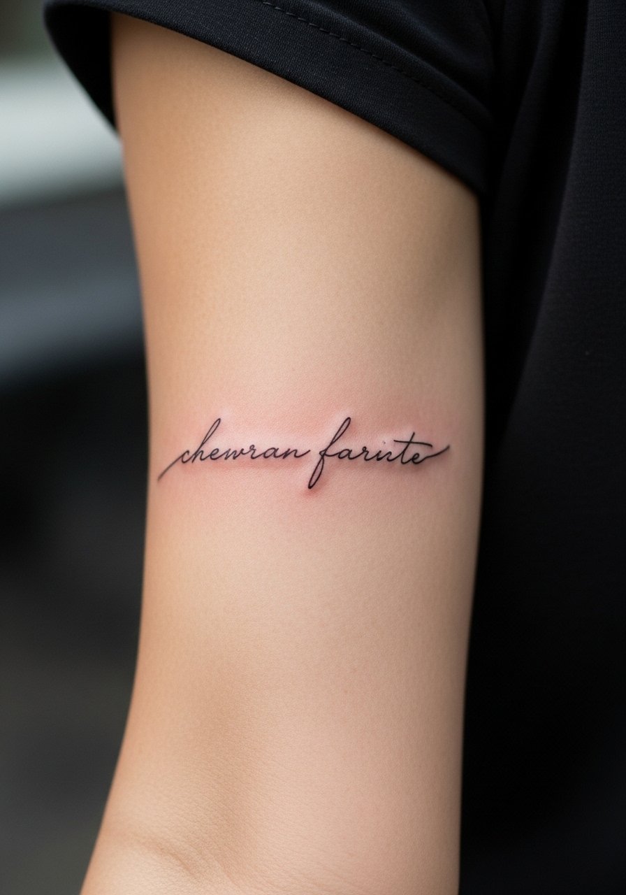
Fine script follows the bicep curve nicely, but size matters more here than most people expect. When you sit with the artist, show the exact font size and ask for slightly heavier line weight than your initial impulse. Small, ultra-fine letters on moving skin are prone to blur by year three. A common mistake is requesting full-sentence script at a tiny scale. Plan for a touch-up around year two for line redefinition. Session pain is mild to moderate and the sitting is short. For daytime wear, a short-sleeve henley frames the outer bicep without covering the text.
4. Geometric Mandala Half-Panel Near the Peak of the Bicep
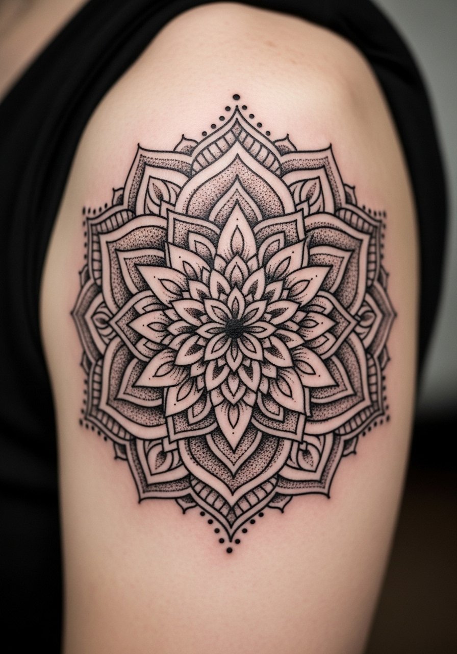
There is a visual logic to placing a mandala at the bicep peak where the roundness reads like a natural canvas. During consultation, ask the artist to leave breathing room between concentric details. The mistake is compressing too many rings into a small diameter, which blurs with time. Stipple shading ages gracefully if spaced correctly, and dot work holds better than dense whip shading in this placement. Expect a medium-length session because the symmetry demands precision. This style looks sharp with rolled sleeves, so pair it with a rolled linen shirt when you want to show it off.
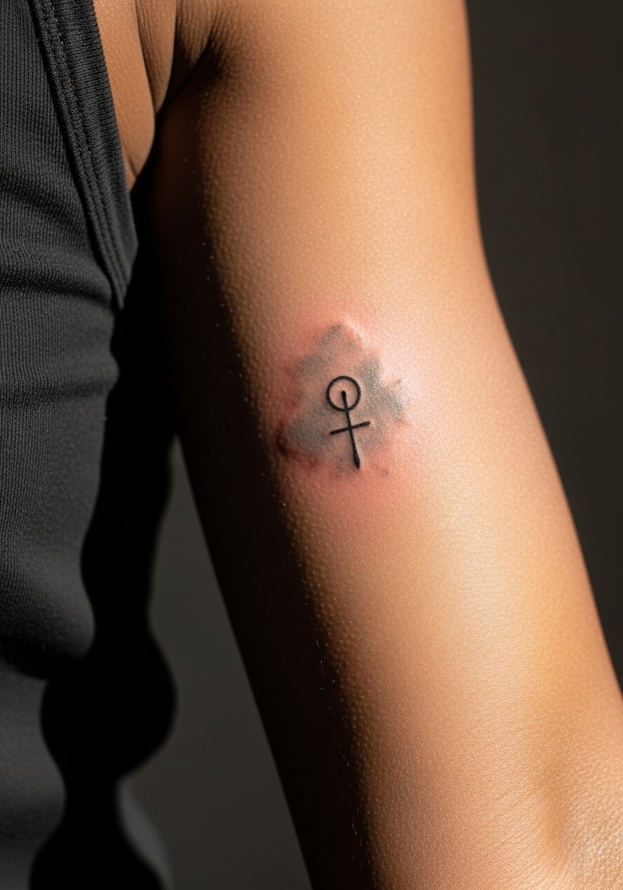
5. Minimalist Arrow Along the Inner Edge
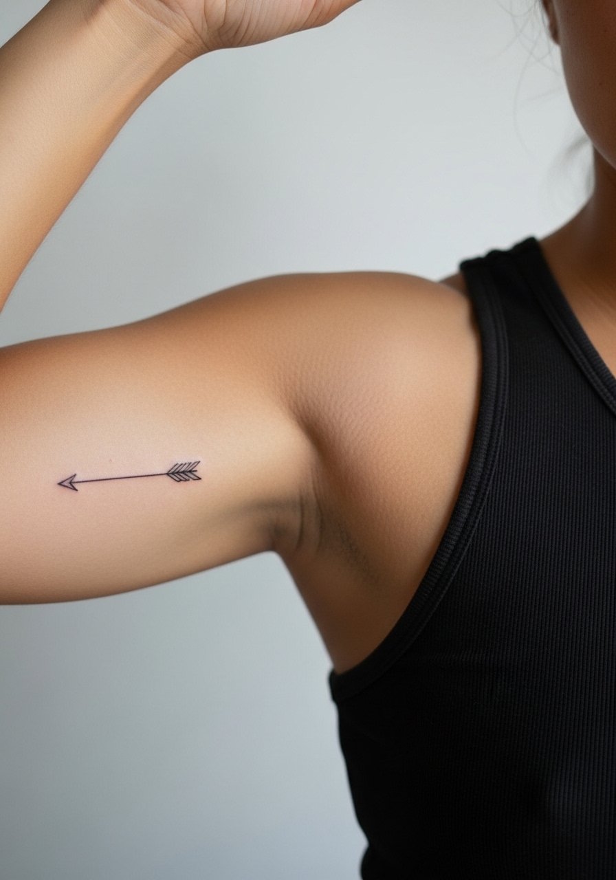
A tiny arrow is deceptively simple. Tell your artist you want a continuous stroke with consistent linework and to test the stencil angled slightly toward the shoulder so the tip follows the arm when relaxed. Pain is higher on the inner edge, but session time is brief. The usual error is picking a line weight so thin that it disappears after healing. At six months it should retain shape, and a touch-up at year two keeps it crisp. For the appointment wear a sleeveless gym hoodie you can pull aside without removing layers.
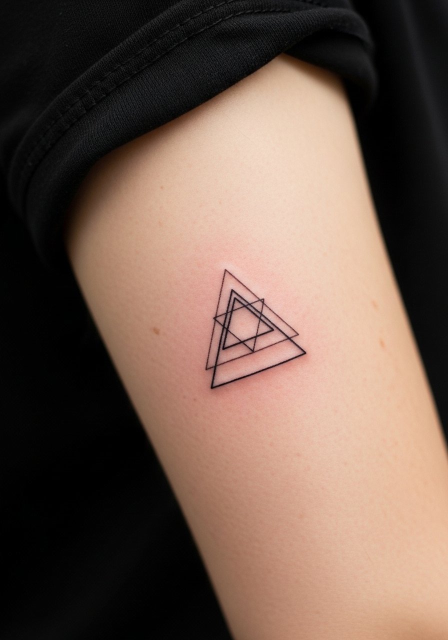
6. Micro-Geom Compass Centered on the Outer Bicep
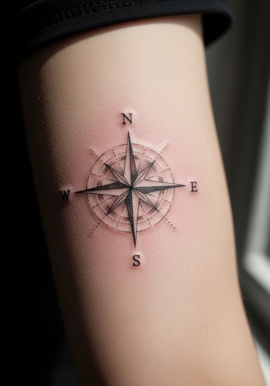
The compass works as a small central anchor on the outer bicep when not over-detailed. Ask the artist to simplify inner ticks and to prioritize bold cardinal points so the symbol reads at a glance. Visual clarity at six months is good, at two years the thin ticks may fade unless slightly bolder to start. A common mistake is packing tiny decorative flourishes that age into mud. Session pain is low and it usually fits into a single short sitting. For evenings out try a short-sleeve oxford shirt with the sleeve hit just above the piece.
Studio Day Picks
The inner and outer bicep pieces above have different access needs and friction risks, so a few targeted items smooth the session and the first week.
-
Stencil transfer paper kit. Lets you and the artist test placement on your arm curve before the needle touches skin, helpful for wrap and compass pieces.
-
Topical numbing cream. Used carefully before an inner bicep session it reduces the edge on sensitive spots without affecting linework.
-
Thin protective film roll. Keeps fresh bicep work clean during the first few days when shirts and backpacks can rub the area.
-
Fragrance-free gentle body wash. Cleanses the bicep zone without stripping natural oils that help fine line and micro shading settle.
-
Aquaphor healing ointment. A thin initial layer soothes the skin and maintains a moist healing environment for detailed bicep work.
7. Traditional Rose with Subtle Whip Shading on the Outer Bicep
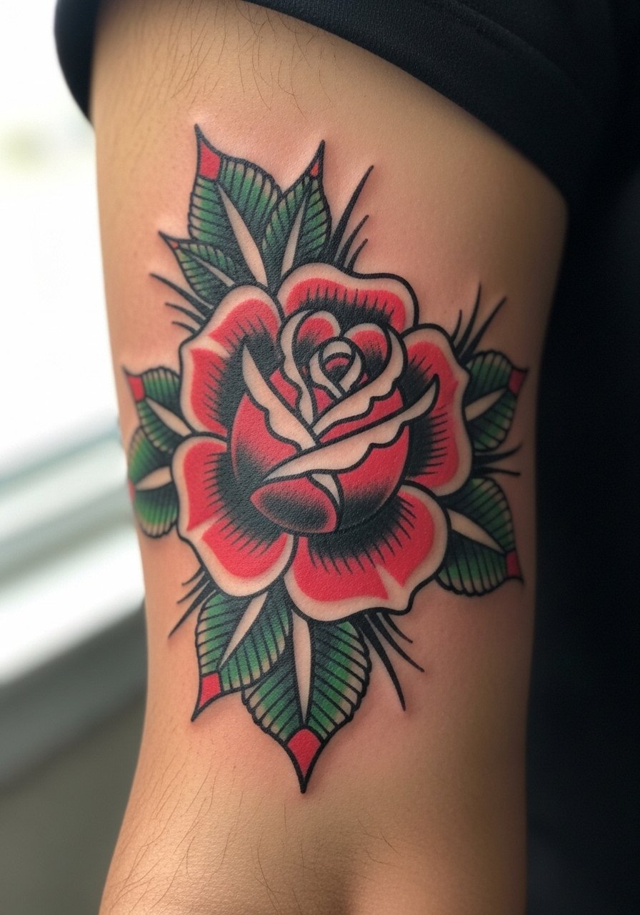
A traditional rose reads well on the bicep thanks to defined linework and solid saturation. Tell your artist you prefer slightly wider petals and consistent black anchors to avoid early edge softening. The common mistake is asking for thin outlines and dense interior details that do not translate well on curved muscle. At two years this style generally holds better than fine line work because of the saturation and strong borders. Session time is moderate and the sensation is steady. For showing it off, a rolled short-sleeve tee frames the petals without hiding the piece.
8. Negative Space Crescent with Dot Work Accent
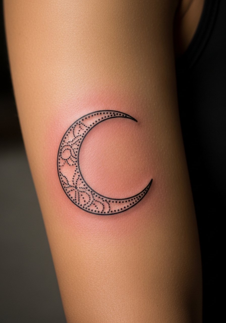
Negative space pieces rely on crisp linework and intentional gaps. Ask your artist to plan the negative fields in stencil form so no area is left ambiguous. The mistake is assuming negative space will stay bright on heavily pigmented skin without proper contrast. Dot work ages nicely on the bicep when spacing is generous because the dots keep texture without over-saturating. Expect a longer dot work pass and light stinging in spots where the needle repeats. This design pairs well with a v-neck tee that keeps attention on the arm instead of the torso.
9. Single-Needle Fine Line Mountain Range Along the Upper Bicep
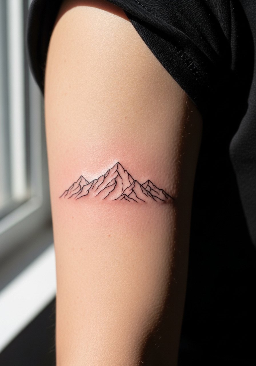
Fine line mountain ranges read like a subtle statement on the upper bicep when scaled correctly. In consult, ask the artist for slightly bolder apex lines so peaks hold over time. There is an ongoing split in the community about single-needle work on moving skin. One camp says single-needle on arms blurs fast. The other camp says if depth and spacing are right it can hold for years. Ask the artist how their single-needle work has aged before booking. Pain is mild and session time is short. For the session wear a zip-up hoodie you can slide off without stretching the area.
10. Scripted Coordinates Wrapped Around the Inner Bicep
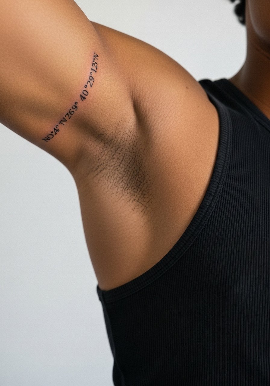
Coordinates make for a personal but low-profile bicep piece. Specify exact text to your artist and show the exact font height. Text on the inner bicep is prone to softening if lines are too hairline thin. The common mistake is using ornamental fonts without considering how they age. Expect a medium pain level and short session length. At five years you may want a line refresh if the skin shifts. This design looks tidy with a crew-neck tee that keeps attention on the arm.
11. Small Blackwork Animal Silhouette Near the Bicep Peak
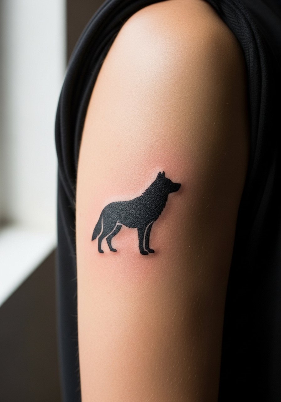
Solid black silhouettes are forgiving on the bicep because they depend on shape not minute detail. Tell the artist you want solid saturation and crisp negative contours around the silhouette. The error is asking for micro-detail inside the fill which disappears with time. Expect low to moderate discomfort and a quick sitting. Saturation tends to stay readable at year five if the fill is dense. For casual looks pair it with a muscle-fit tee that follows the arm line.
12. Abstract Line Cluster Flowing with Muscle Grain
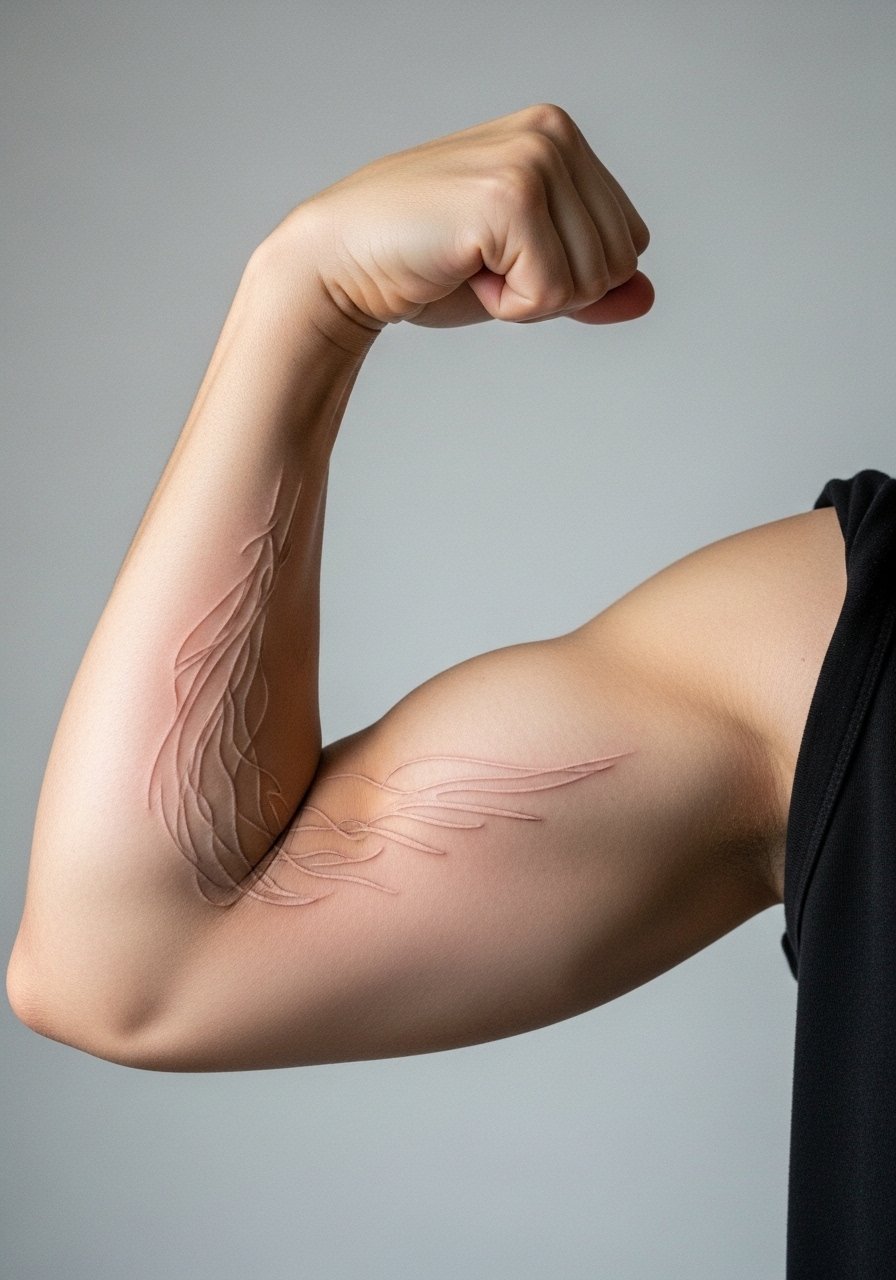
Abstract lines that follow muscle grain take advantage of the bicep curve. During the consult, have the artist trace muscle movement in both relaxed and flexed states so the lines sit naturally. The common mistake is imposing straight geometric lines across a rounded surface which creates distortion. Expect the session to be about mapping and light line passes. Over five years the piece keeps character if lines are slightly bolder than your first instinct. This design pairs well with a button-up short sleeve you can roll without creasing the tattoo.
13. Watercolor Wash Accent Behind a Small Bicep Symbol
Watercolor accents add color without heavy outlines when done with restraint. Ask for the wash to be used as background color only, not as the primary detail. The two camps argue about watercolor on men who sweat frequently during sports. One group says the style needs frequent touch-ups. The other group says careful placement and lighter pigment avoid early patchiness. Expect the wash to fade faster than black linework and plan for a color refresh at year three. For session comfort wear a performance tank that exposes the bicep and wicks sweat during longer sessions.
14. Tiny Geometric Stack Close to the Inner Elbow Edge
Small stacked geometrics sit nicely near the inner elbow edge when kept simple. Ask your artist to leave spacing between shapes so they do not merge with skin movement. A common mistake is placing clustered shapes too close to the folding skin, which increases blowout risk. This spot feels sharper during the tattoo and the session may require short breaks. At two years the crispness depends on spacing and touch-up history. Wear a short-sleeve button shirt to let the tiny stack peek out without crowding.
15. Scripted Mantra Following the Inner Bicep Longitudinally
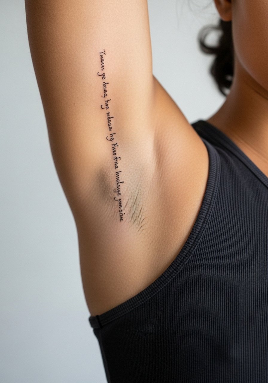
A longitudinal mantra reads like a subtle band along the inner bicep when spaced properly. In the consult request kerning tested on the curved template so letters do not compress on flex. The mistake is picking a dense paragraph of text for a narrow vertical zone. Expect heightened sensitivity and a longer sitting than a single short line. Linework will likely need a touch-up by year three to maintain clarity. For travel to the shop wear a light zip hoodie that you can remove easily without rubbing the fresh work.
16. Single-Needle Flora Sprig Nestled Along the Inner Arch
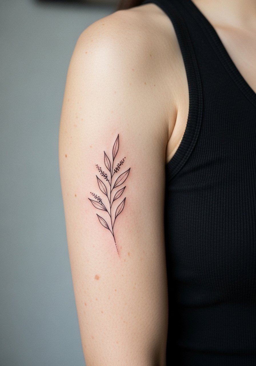
Botanical sprigs translate well to the inner arch when the artist adapts stem curvature to the arm. Ask them to plan stem flow so leaves rest in negative space and do not overlap high-motion zones. Single-needle flora is prone to softening, so request slightly denser veins in the first session. Expect moderate pain and a careful hand for shading. At two years you may want a tiny touch-up to restore petiole definition. This placement is intimate, so think about your environment and career before committing.
17. Patchwork Flash Panel of Clean Line Symbols Across the Bicep
A curated flash panel across the bicep gives variety while keeping a cohesive language. When you book, bring a printed layout and ask the artist to space motifs so each has breathing room. The common error is packing multiple tiny pieces without consistent lineweight which makes the panel look mismatched after healing. Session time depends on the number of motifs and the most sensitive spots usually determine breaks. Over time the panel reads well if the lines are balanced and touch-ups are done selectively. For the session, wear a loose drawstring pant and a sleeveless top so the artist can move around you without pulling fabrics.
Frequently Asked Questions
Q: Do fine line bicep tattoos blur faster than bold blackwork on the same arm?
A: From what I have seen, fine line pieces tend to soften sooner than bold blackwork because they rely on thin channeling of ink. Placement and sun exposure matter more than style alone. Ask the artist about line weight and touch-up timelines in consultation.
Q: How should I prepare clothing-wise for an inner bicep session?
A: Wear a top that exposes the inner arm without pulling across it. A racerback tank or a zip-up hoodie you can remove works best so the artist has clean access. Bring a loose shirt for after the session to avoid friction on the fresh ink.
Q: If I want color accents on my bicep, what should I ask in the consult?
A: Ask the artist to place color as an accent behind strong black anchors or to use subdued washes rather than heavy fills. Mention your skin tone so they can show how saturation will read now and as it fades.
Q: Will exercise affect healing for a new bicep tattoo?
A: Light movement is fine, but heavy weight training that causes friction with straps or compresses the area will irritate healing ink. Plan to scale back on exercises that rub the bicep for the first one to two weeks.
Q: How visible are bicep tattoos in professional settings and can clothing help?
A: Bicep tattoos are easy to conceal with a short- or long-sleeve shirt. If you prefer occasional visibility, choose sleeve lengths thoughtfully and consider where the design sits relative to shirt hems. A collared short-sleeve in neutral tones keeps the look tidy.
Q: How do I find a bicep-specialist artist without relying on social handles?
A: Use local shop directories, convention lineups, and community threads that discuss healed portfolios. Look for photos of healed bicep work and ask shops about healed-after photos before booking.
