
Fine line scripts dominate saved boards right now, but they do not all behave the same on real skin. Trends make certain placements look irresistible, and reality shows you which combos hold up. If you want a faith-forward phrase like "This too shall pass" that still reads clearly at year five, pick the style, size, and location with care. Below are 27 concepts that start with practical choices and finish with how to show the work off.
1. Inner Forearm Fine Line Script with Minimal Flourish
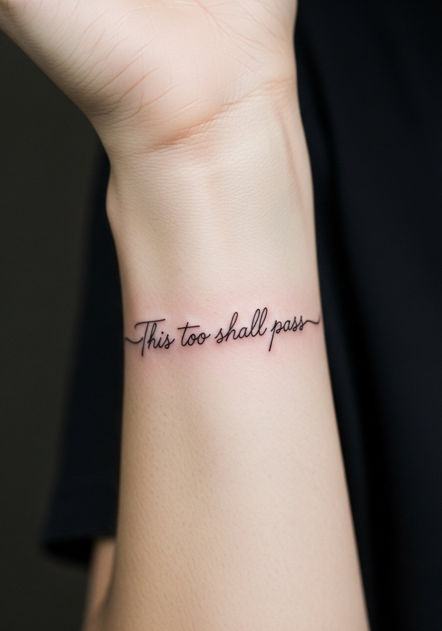
I recommend this when you want readability and a low session time. Fair warning, the inner forearm is a sun-exposed zone so plan for touch-ups around year three depending on your sun habits. Tell your artist you want single-needle linework with a slightly bolder baseline than the fanciest scripts. The common mistake is asking for micro script that shrinks into an illegible streak after a year. Session pain is a 3 out of 10 for most people and the sitting usually runs under an hour. For showing it off, roll sleeves and pair with a rolled linen shirt or a minimalist watch to keep attention on the linework.
2. Wrist Single-Word Script with Dot Work Accent
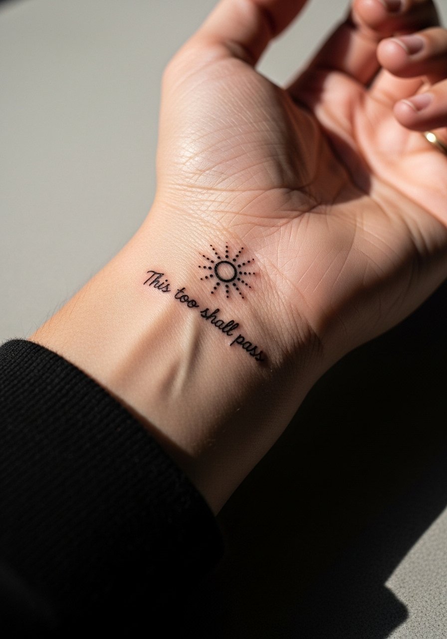
Wrist pieces read intimate and they get a lot of friction from clothing and washing. The best version keeps the script horizontal and slightly larger than what looks perfect on a screen. Ask for shallow but consistent needle depth to avoid blowout. Expect more touch-ups than on larger skin areas because wrist skin moves constantly. The session is quick but uncomfortable for some at a pain of 4 to 5 out of 10. Pair small wrist scripts with stacked dainty bracelets and a thin chain bracelet to frame the phrase without crowding it.
3. Side Rib Script in a Curved Line
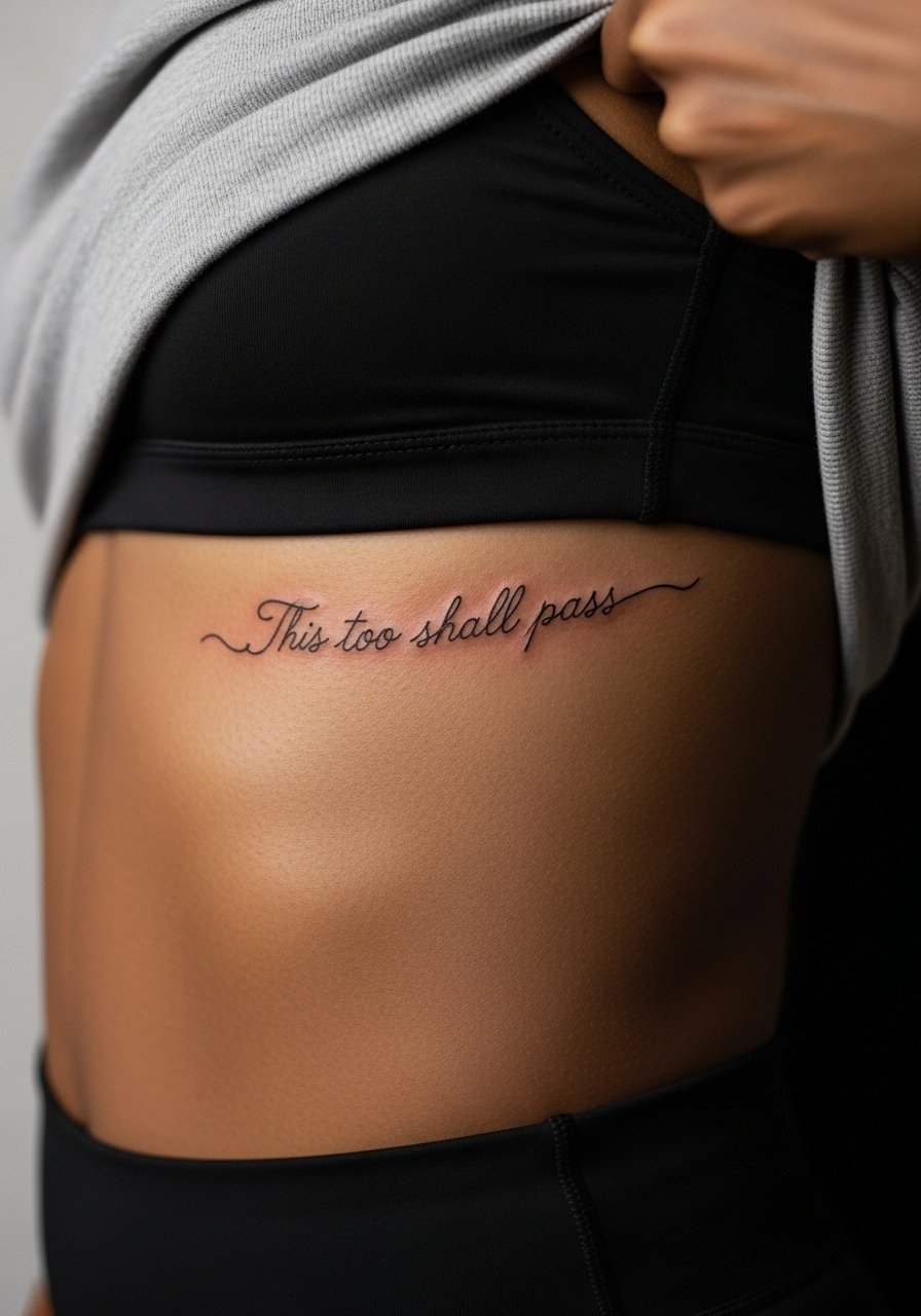
Fair warning, ribs are an 8 out of 10 on most pain scales. Artists are split on fine line here. One camp says the skin stretch blurs lines within two years. The other camp says with correct needle depth and spacing it settles fine. Ask your artist where they stand and request a slightly more open script spacing to give the letters room to age. The common mistake is shrinking the phrase to fit aesthetic ideals without spacing for future settling. Session time can be one long sitting or two shorter ones based on your tolerance. For the appointment wear a zip-up hoodie you can pull aside so the artist has clean access.
4. Collarbone Script Framed by Minimal Dots
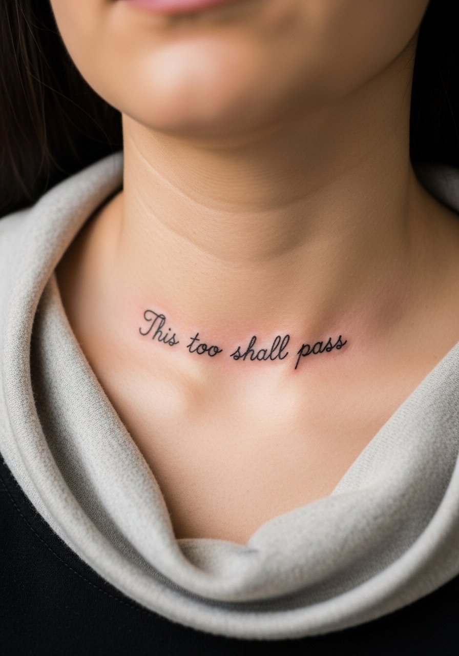
Collarbone pieces photograph well and age nicely if the lines are not packed too tightly into the bone shadow. Tell your artist to lift the baseline slightly away from the clavicle to prevent ink loss along the ridge. The mistake people make is pushing for ornate cursive that sinks into the clavicle and blurs. This one feels like a 3 out of 10 pain wise and usually fits comfortably into a 45 to 75 minute slot. For evenings out, pair it with an open-back midi dress or a thin chain pendant necklace that sits above the script.
5. Small Script Behind the Ear with Floral Accent
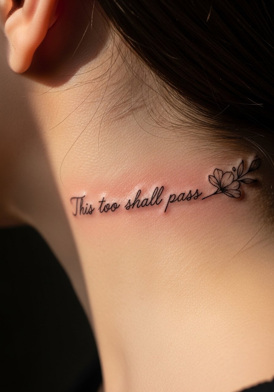
Behind-the-ear placements need careful framing because the area is small and the skin curves where the hairline meets the neck. Mention to your artist that you want the phrase on the skin behind the ear, below the hairline. The mistake is demanding full cursive on a tiny patch which often looks cramped and becomes illegible. Pain is mild but localized, usually a 3 to 4 out of 10. For the session keep hair up and wear a wide-neck shirt so the artist can work without tugging at your hair. Consider the visibility in professional settings before booking.
6. Vertical Sternum Script With Botanical Linework
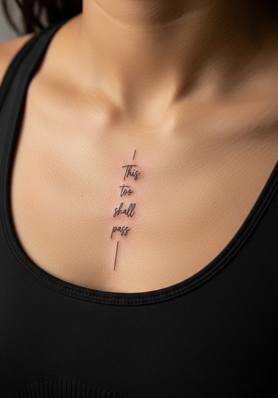
Sternum placements are intimate and the skin here reacts differently to needle depth. The session tends to be more painful and may require breath-work to relax. A common problem is asking for ultra-thin letters that fade into the natural shadow of the sternum. Ask for a slightly heavier baseline and a vertical layout so the phrase follows the chest line. Expect a 6 to 8 out of 10 pain rating and a session that might be split into two appointments. For the day, wear a fitted sports bra so the artist can access the area with minimal fuss.
Pre-Session Essentials
The wrist and sternum pieces above need different prep than the forearm and chest ideas, so a short kit smooths the session and the first week.
-
Stencil transfer paper kit. Lets you preview line placement on skin, especially handy for the collarbone and rib placements listed above.
-
Topical numbing cream. Applied 45 minutes before reduces discomfort for sternum and rib sessions without affecting line quality when used correctly.
-
Thin protective film roll. Useful for wrist and hand pieces that face friction and frequent washing in the first days.
-
Fragrance-free gentle body wash. Cleanses healing areas without irritating the delicate script lines.
-
Aquaphor healing ointment. Thin layers in the first few days help keep fine line work hydrated and balanced during initial sealing.
7. Tiny Finger Script Along the Side
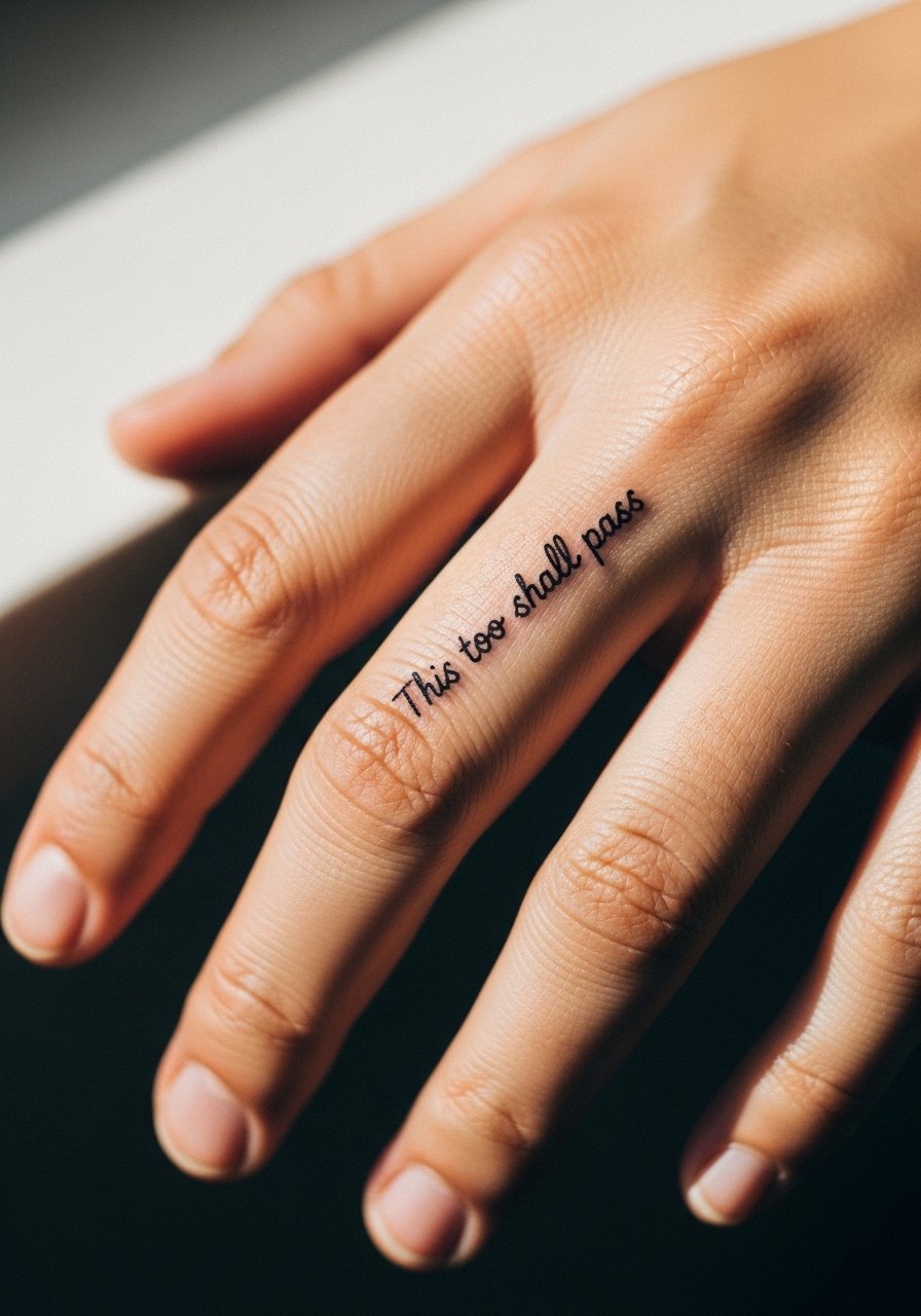
Finger tattoos are notorious for fast fading because of skin turnover and constant use. Expect touch-ups as early as year one. Artists fall into two camps on finger script. One group says avoid script on fingers entirely because the lines often blur. The other group says bolder, slightly wider lettering can survive with maintenance. Ask your artist about spaced lettering and accept that annual touch-ups are likely. Sessions are short but uncomfortable with a 5 to 7 pain estimate for some. For showing the piece, wear a delicate stacking ring set that complements the tiny script without covering it. Keep in mind some workplaces still frown on visible hand tattoos.
8. Inner Bicep Script Hidden When Arms Are Down
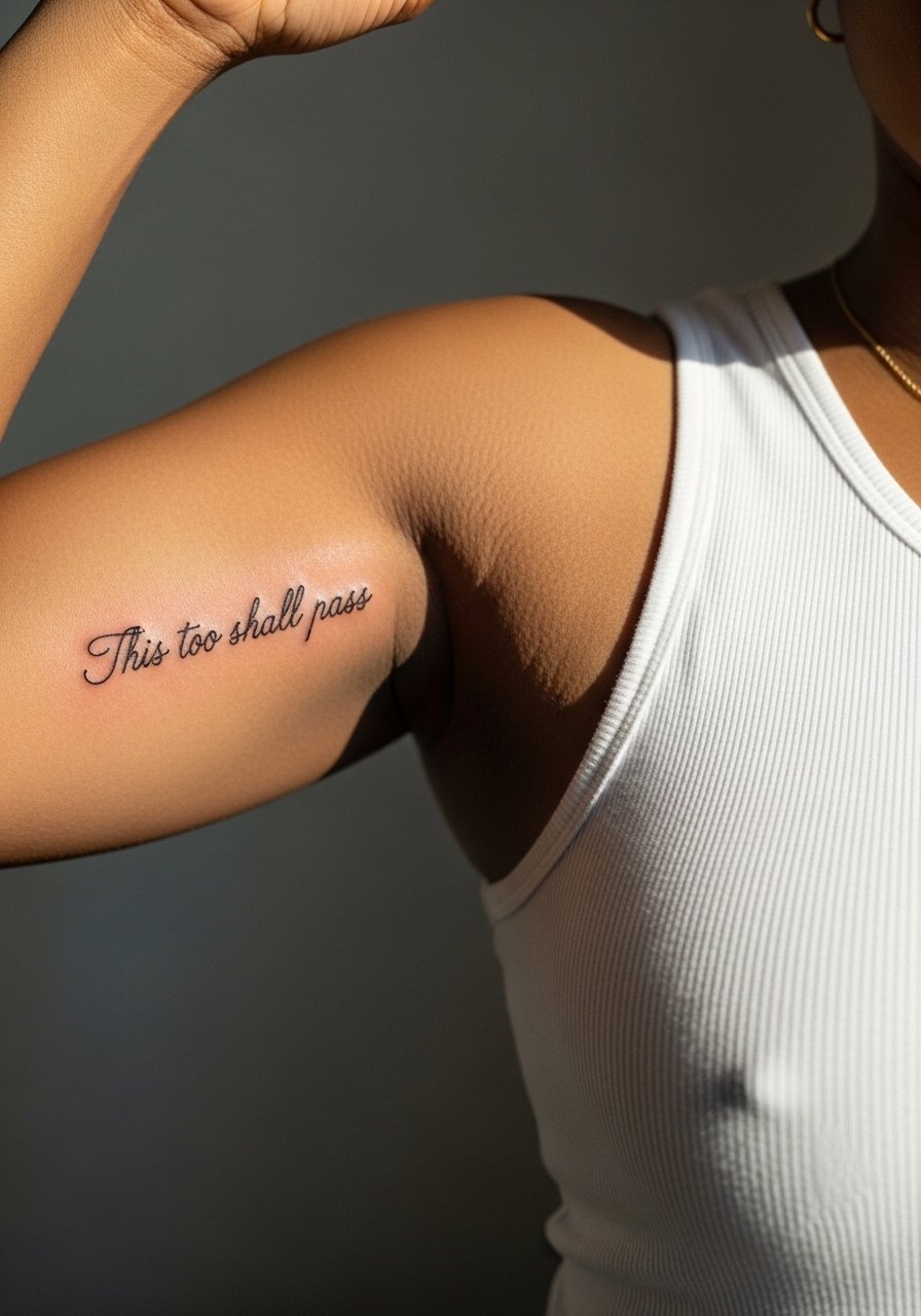
The inner bicep keeps a script private yet accessible. It handles larger lettering better than fingers or wrists. The skin is softer so blowout risk is present if the needle is pushed too deep. Tell your artist you want moderate spacing and a gentle curve that follows the muscle. Sessions are medium in length and pain usually rates a 4 to 5 out of 10. A common mistake is asking for extremely fine single-needle text which often spreads. For the appointment, a sleeveless tank top that you can lift slightly is best.
9. Side Wrist Wrap Script with Chain Illustration
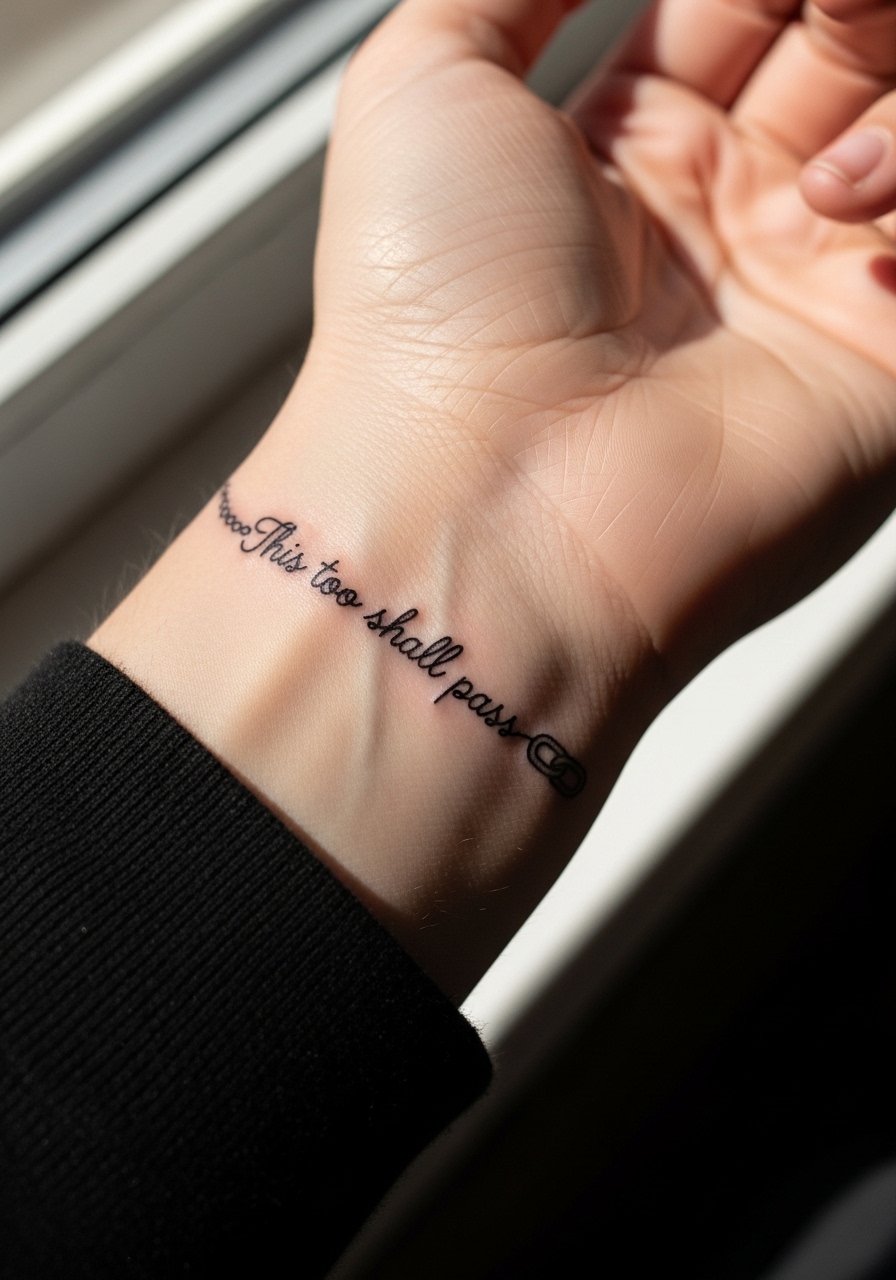
This design looks intentional and can feel like a permanent bracelet. The side-of-wrist area experiences frequent rubbing so the chain detail should be simple. Ask your artist to place the phrase where it avoids the crease between the wrist and hand to preserve legibility. The main mistake is overcrowding the chain detail into a tiny band which becomes a blur. Sessions are short and pain is usually 3 to 4 out of 10. Pair this with a thin chain bracelet rather than chunky pieces so both elements read clearly.
10. Calf Script with Micro-Realism Shadow
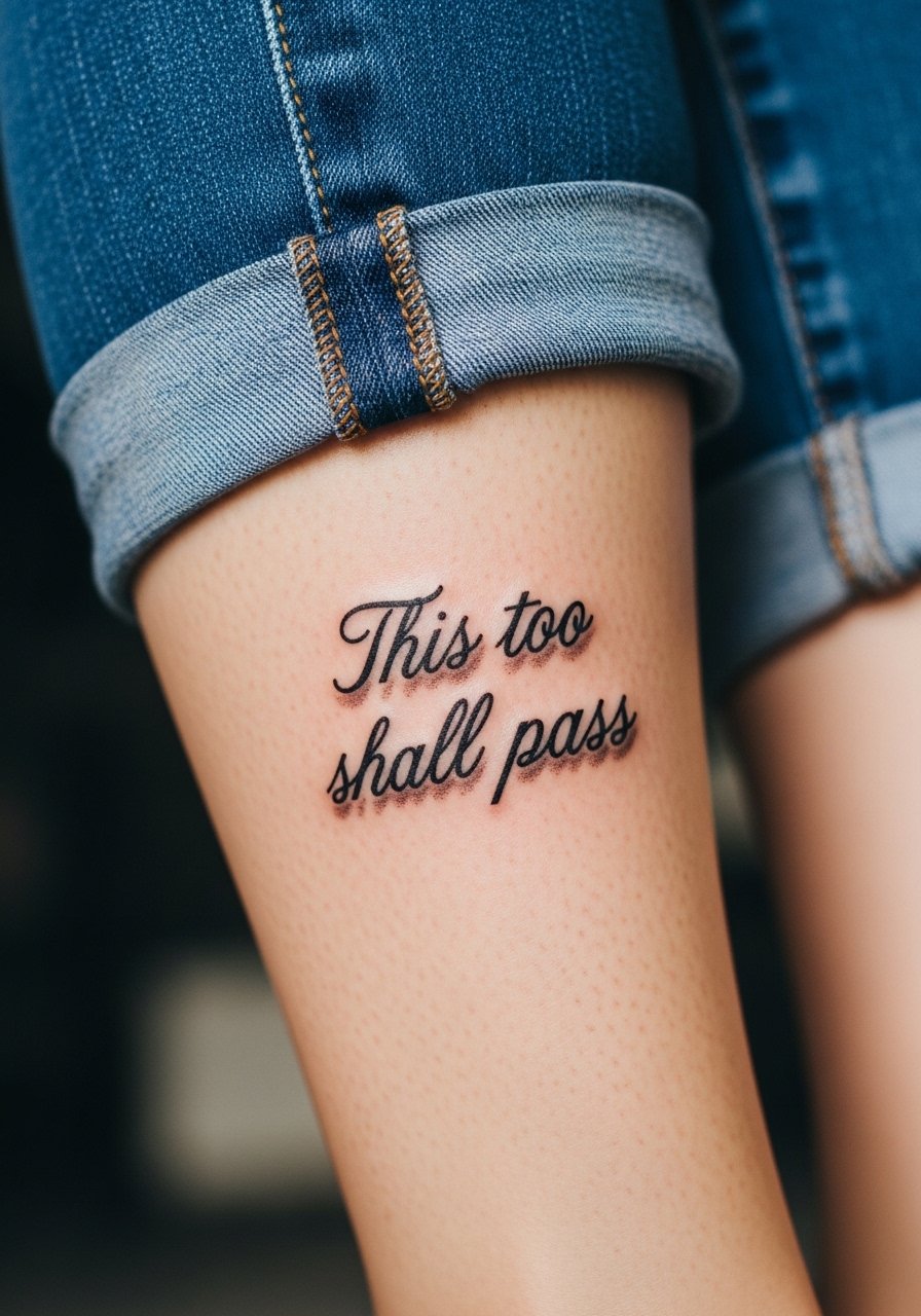
Calf placements give room to let script breathe and allow for slightly heavier saturation that holds longer. Micro-realism shading beneath letters can create a soft lifted look but too much shading will age into a muddy patch. Tell your artist you want minimal shadow only to lift the script, not to fill behind it. Pain is mild for most people and sessions run around 45 to 90 minutes. For showing off, wear jeans rolled up or a long skirt with a side slit so the phrase appears intentionally in motion.
11. Small Script on the Back of the Neck
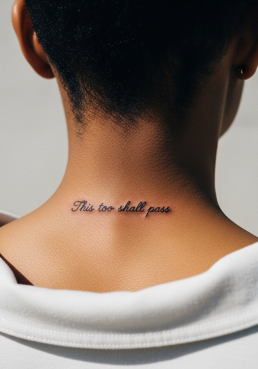
Neck pieces are visible and can affect professional perceptions. The back of the neck is a spot where the script can be kept narrow and discreet. Ask your artist for a clean, slightly bold baseline to withstand neck movement. The common mistake is choosing ultra-thin lettering that disappears as hairlines and clothing rub the area. Pain is moderate and sessions are brief. For the day of your appointment wear a wide-neck shirt you can pull aside easily.
12. Ribcage Script with Crescent Moon Accent
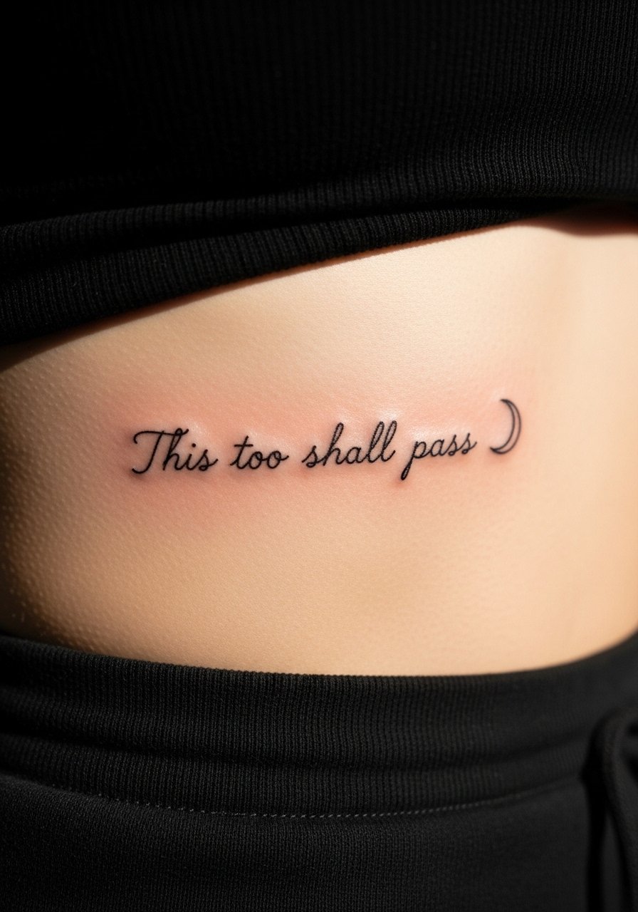
Ribcage work ages differently based on skin movement. Again, artists split into two camps on fine script here. One camp warns that the stretch and compression of the ribs create early blurring. The other camp believes careful spacing and the right depth keep it legible. I advise wider letter spacing and a tiny decorative moon that does not crowd the words. Pain is high and sessions may be broken up. For the session choose a cropped athletic top that you can lift without tugging.
13. Sternum Mini Quote with Symmetric Dots
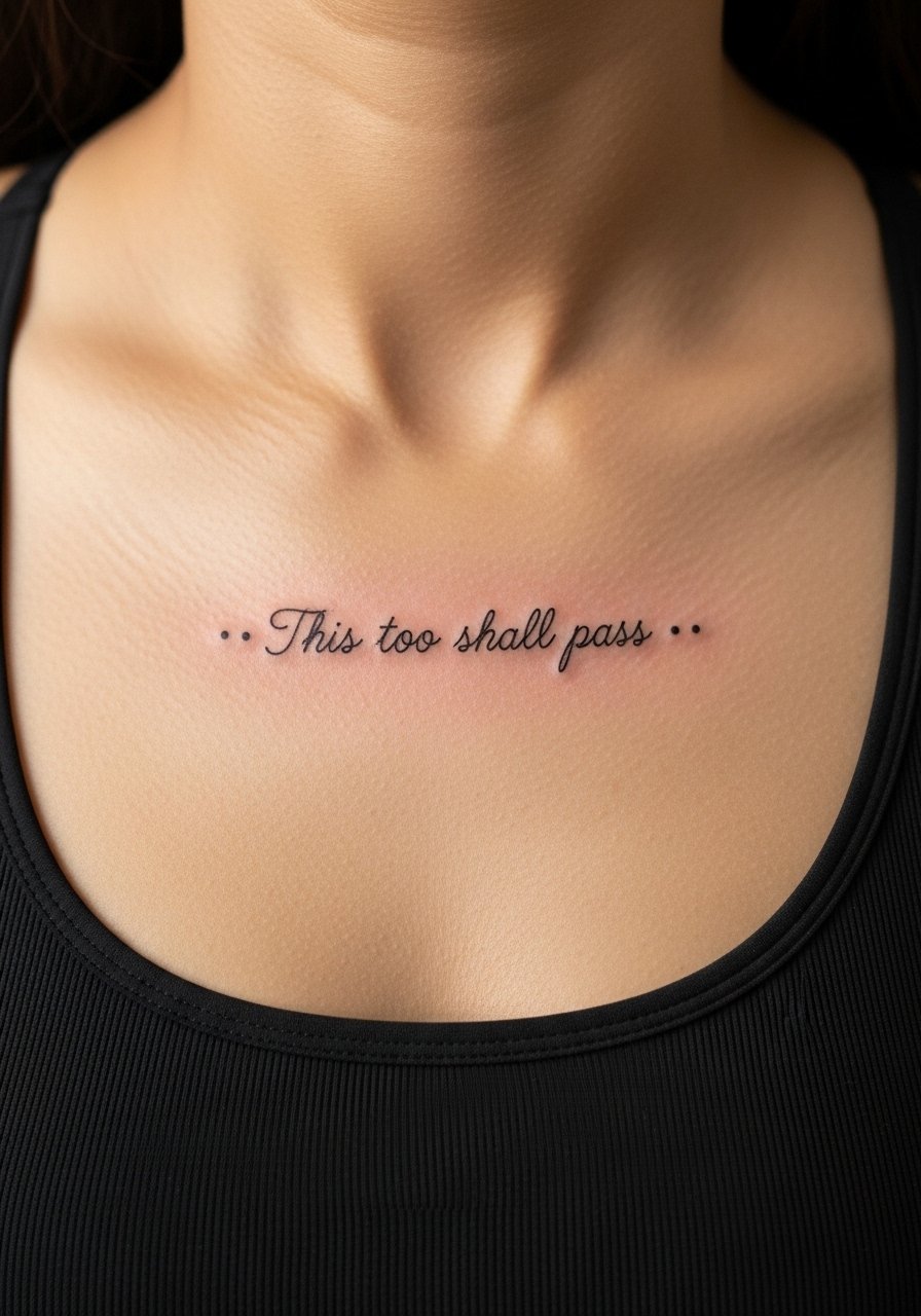
Centering the phrase above the sternum emphasizes the core meaning. Make sure the letters are not tucked into the shadow lines of the chest. The mistake is tiny lettering that becomes invisible when the torso moves. Pain is significant and sessions can be emotionally intense for some. Ask your artist for a slightly heavier weight around the baseline. For the appointment wear a bandeau or fitted sports bra so access is simple.
14. Minimalist Ankle Script Along the Bone
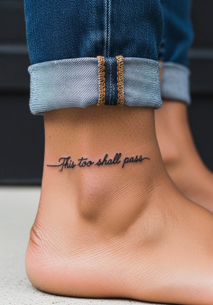
Ankle tattoos take constant friction from socks and shoes which affects healing. Larger script with open spacing lasts longer here. The usual error is shrinking the quote to a tiny line across the ankle which fades quickly. Pain at the ankle varies by person and sits at around 4 to 6 out of 10. For the session wear pants you can roll up and a pair of slip-on sandals so you can keep footwear minimal while the artist works.
15. Inner Wrist Script with Semicolon Pairing
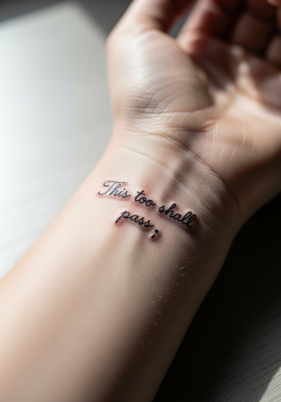
Pairing the phrase with a semicolon can signal recovery or continuation for many people. The wrist area needs extra consideration for spacing. Ask your artist to place the semicolon so it reads as part of the phrase rather than an afterthought. A common mistake is making the semicolon too small which makes it look like a dot over time. Sessions are quick and pain is mild. Style it with a minimalist leather bracelet that sits below the script rather than directly on top of it.
16. Script Across the Upper Back Between the Shoulders
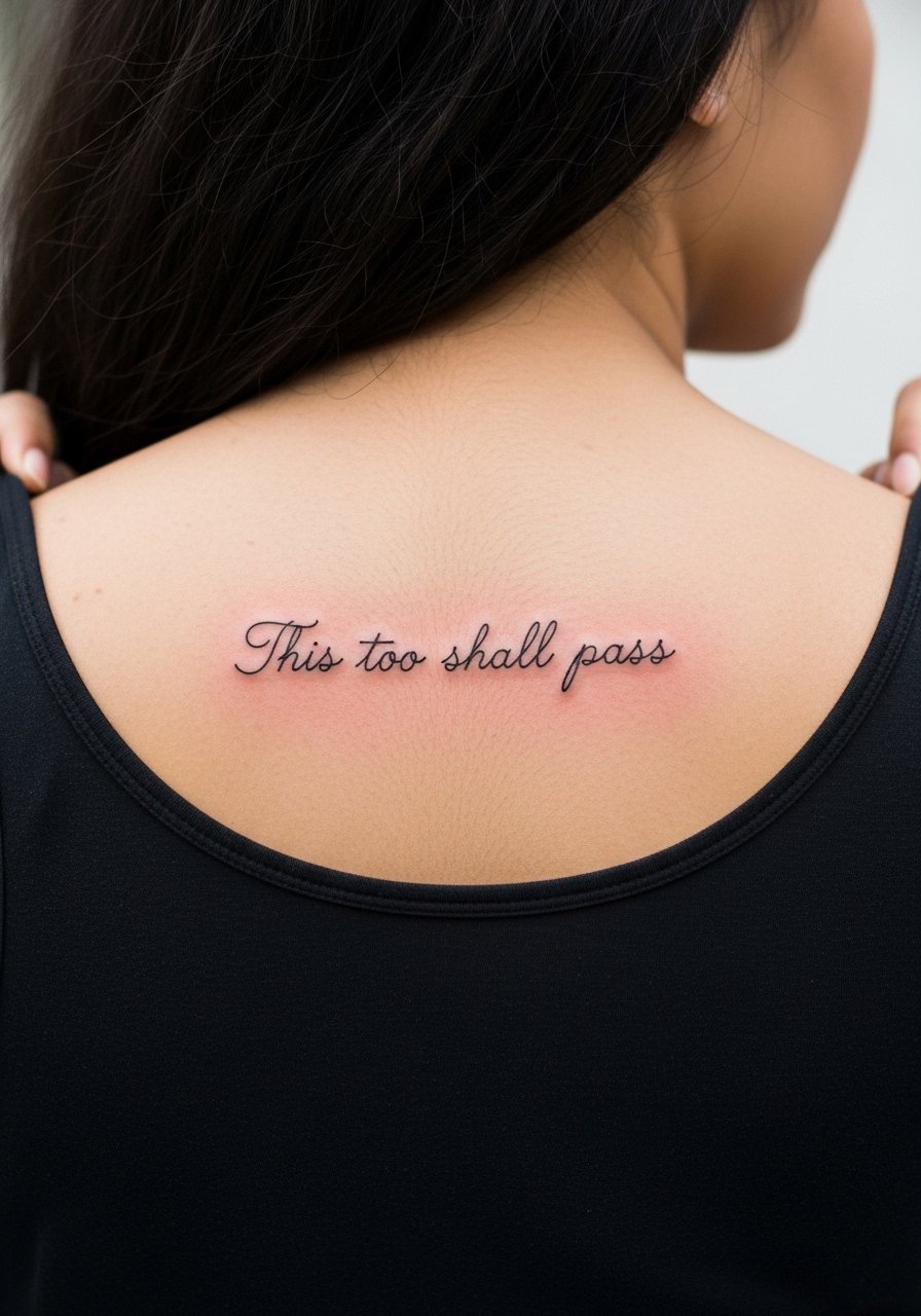
Upper back placements give space for slightly larger text that will hold well. The risk is letting the phrase sit too low toward the spine where movement can warp letters. Tell your artist to center the phrase on the scapular plateau and avoid the midline if you plan heavy backpack use. Sessions are moderate in length and pain is generally low. For the day wear a backless or strap-shiftable top so the artist can access the area without tugging.
17. Inner Thigh Script with Hidden Placement
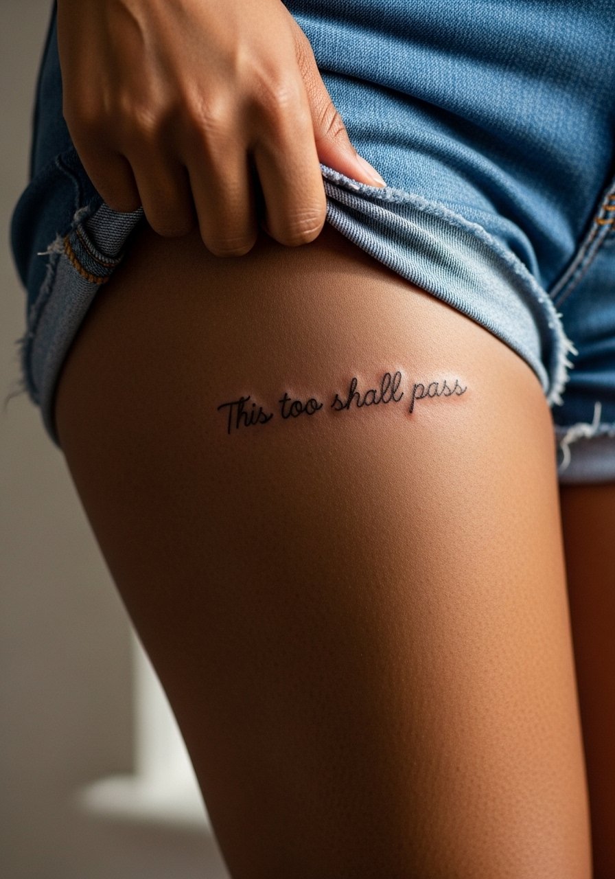
Inner thigh placements keep the quote private and allow for generous lettering that survives better than smaller, high-motion spots. The skin here varies and can hold ink well, but blowout can occur if the needle is pushed too deep. Ask for clean linework and a moderate session pace. Pain is variable and often a 5 to 7 out of 10. For the appointment wear loose shorts you can shift, like high-waisted shorts that still feel comfortable while the artist works.
18. Side Rib Script in Small Serif Letters
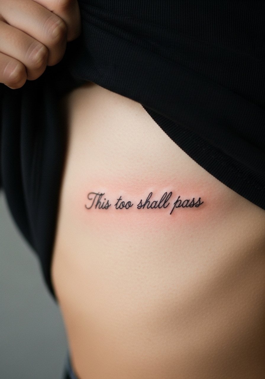
Serif lettering gives a classic vibe but the tiny feet of serifs can fill in over time on moving skin. Explain to your artist you want the serifs simplified rather than ornate. The debate about fine line ribs is active. One camp warns serifs will clog as skin shifts. The other camp says simplified serif structures with spacing survive. Expect significant pain and possibly two short sessions. Wear a cropped top you can lift to give the artist clean access.
19. Wrist Wrap in Script That Mimics a Bracelet
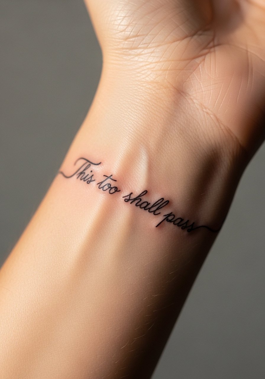
Designs that mimic jewelry work when the script is slightly bolder and spaced to avoid smudging. Avoid tiny flourishes that blur under constant motion. Tell the artist you want the piece to read like a bracelet at arm rest, not a straight line. The session is quick and pain is low. Pair this with a minimal cuff bracelet that sits below the tattoo to create a multi-layered wrist stack.
20. Vertical Spine-Aligned Script in Thin Block Letters
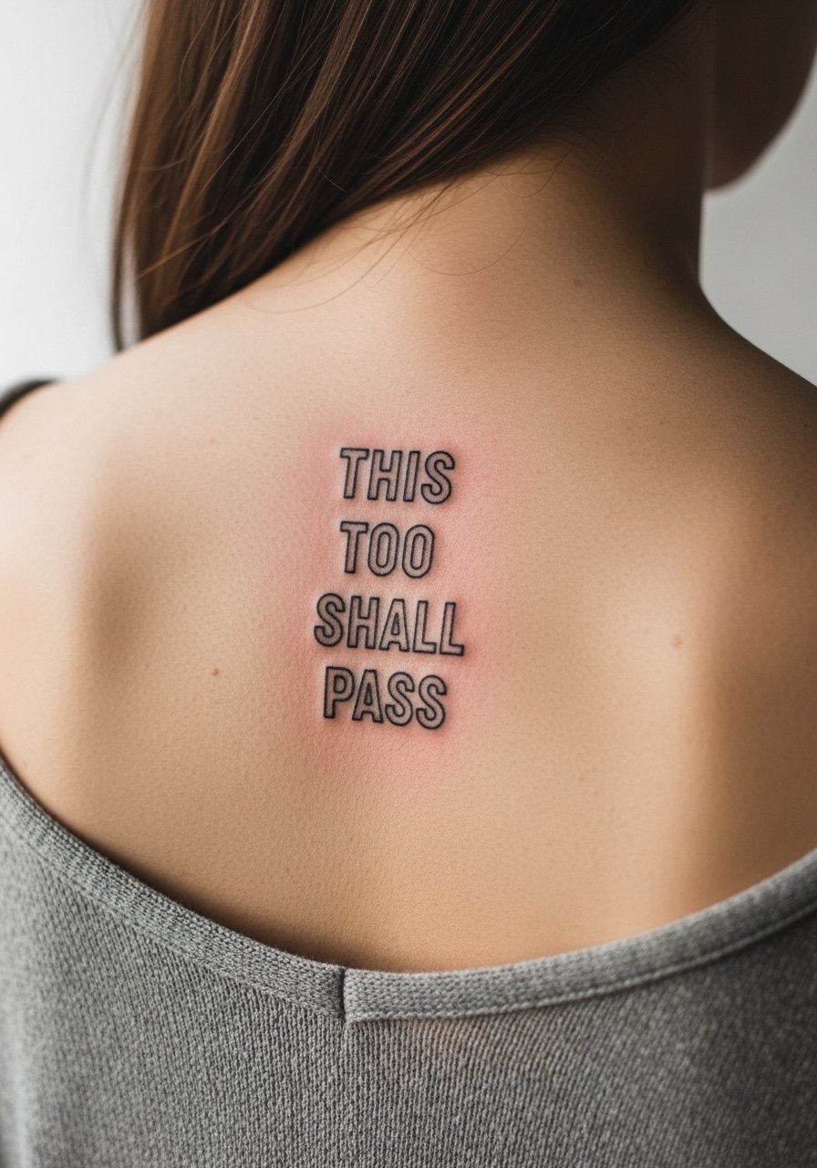
Stacked vertical text reads bold and graphic on the spine, especially when done in clean block letters. The spine moves a lot so keep the letters roomy. A common mistake is tight stacked type that merges within a few years. Sessions are longer and pain can spike near the vertebrae, rating 6 to 8 for many. For showing the design, choose open-back dresses or tops like an open-back midi dress that reveal the vertical flow.
21. Foot Arch Script with Tiny Wave Accent
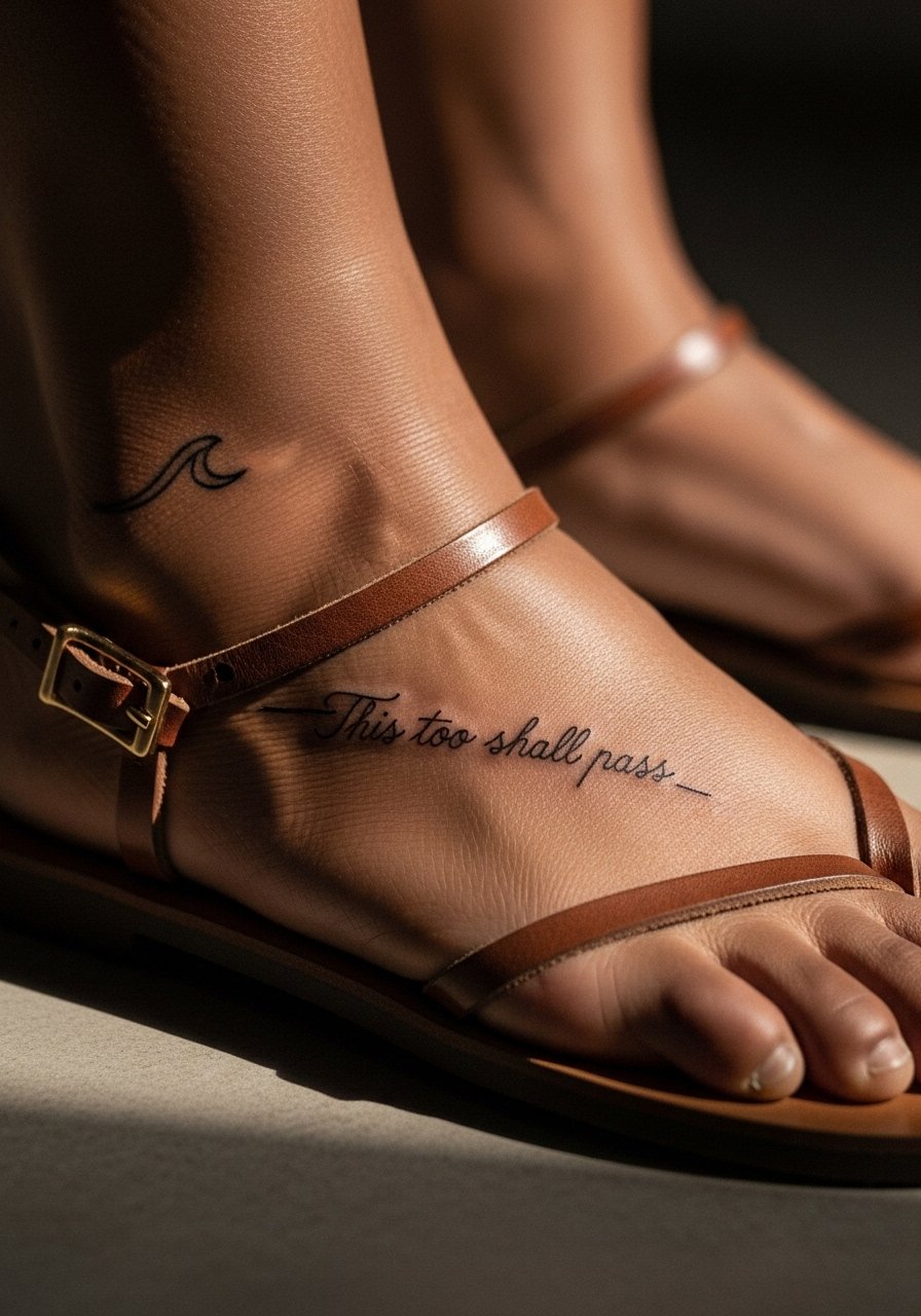
Foot tattoos face heavy wear from shoes and water exposure. The arch can retain ink better than the top of the foot, but expect fading and a likely touch-up. Tell your artist you want slightly increased line weight to cope with friction. The session's pain ranges widely but is often a 5 to 7. For the appointment choose open-toed sandals so the area stays dry and accessible during healing.
22. Upper Arm Script with Small Botanical Border
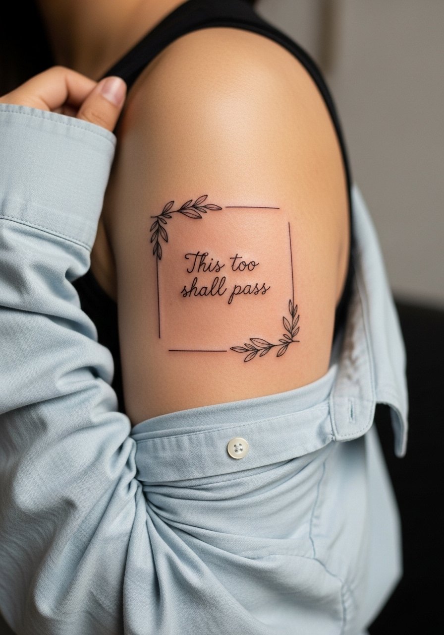
The outer upper arm is forgiving and ideal for slightly heavier script that holds its form. Botanical borders help anchor the phrase visually, but avoid heavy saturation behind small letters. Ask for delicate linework in the florals and a bolder baseline for the text. Sessions are comfortable and often finish in under an hour. Wear a loose button-down shirt you can pull aside so the artist has clear access.
23. Behind the Ear Micro Script Paired with Tiny Star
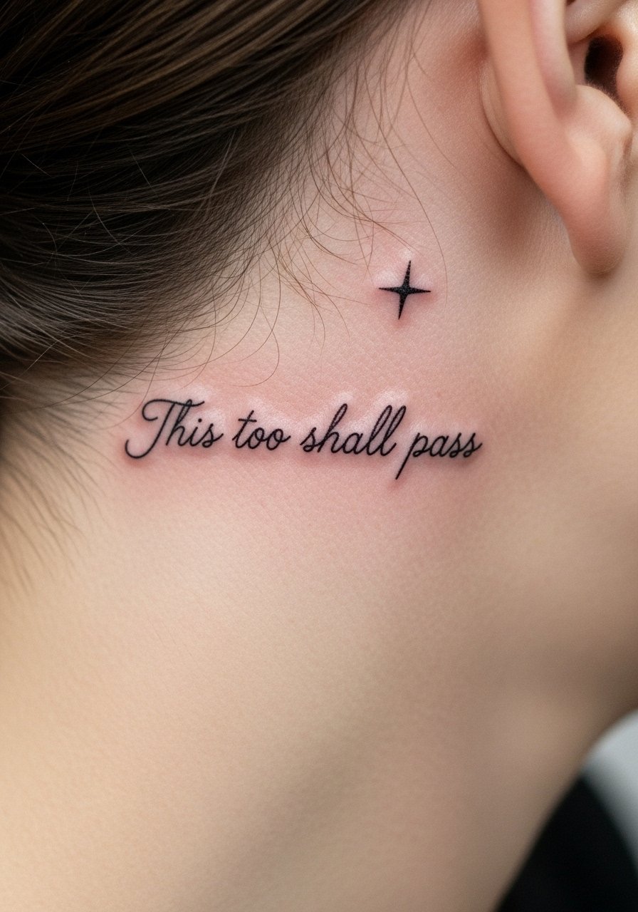
Micro text behind the ear reads like a secret reminder. Keep the letters slightly larger than you imagine so they do not dissolve into dots. The session is quick and pain is mild. For the appointment pull hair up and wear a wide-neck or low-collar shirt so the artist can see the area without tugging. Remember the visibility with certain hairstyles if you need discretion at work.
24. Inner Wrist Script with Tiny Leaf Accent
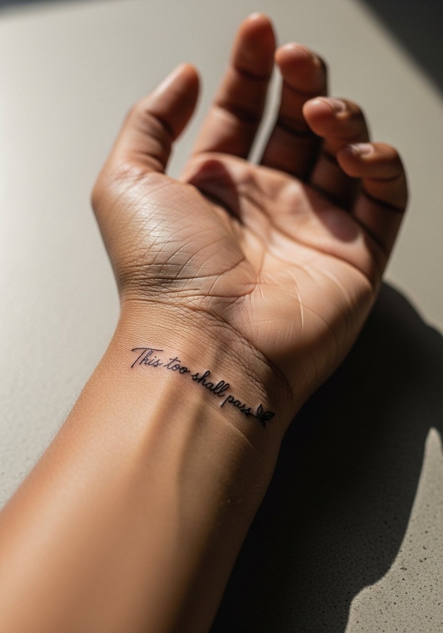
Inner wrist pieces are exposed to soap and frequent motion so spacing is key. A small botanical accent can balance the quote without crowding it. Let your artist know you want the leaf simplified to avoid clogging. Sessions are short and pain is mild. Style the piece with a minimalist watch strap that sits above the tattoo so the skin under the band is not constantly compressed.
25. Tiny Script on the Side of the Foot Near the Ankle
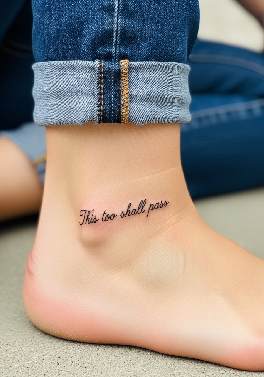
This spot faces similar wear to the ankle and top of foot. Keep the script slightly bolder and avoid ultra-fine tails. A frequent mistake is asking for micro tails that disappear with shoe friction. Sessions are short and pain varies. Wear footwear that eases pressure on the area during healing like slide sandals so the skin is not constantly rubbed.
26. Upper Chest Script with Negative Space Heart
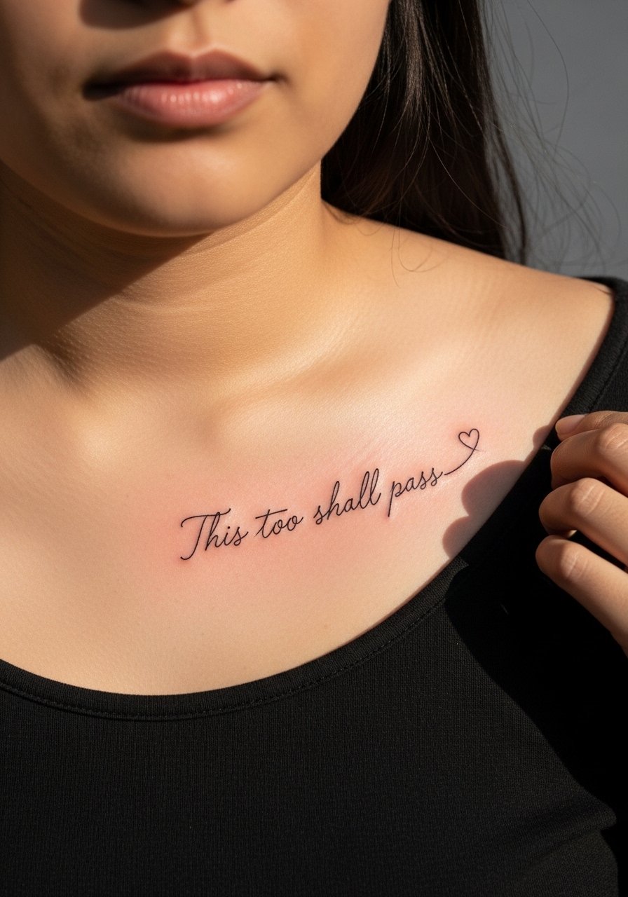
An upper chest piece reads as a personal statement. Negative space elements like a tiny heart add symbolism without adding saturation that might age badly. Tell the artist to keep the heart open rather than filled to avoid future muddiness. Pain is moderate and the session can be one longer sitting. For access wear a wide-neck shirt you can adjust without discomfort.
27. Simple Script on the Inner Wrist Facing the Wearer
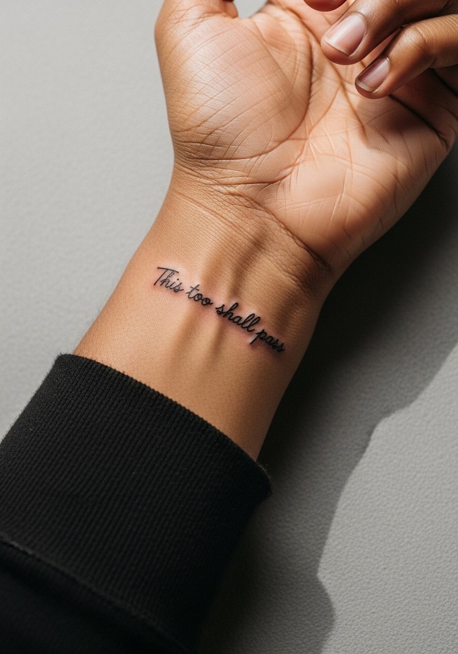
Orientation affects how personal the message feels. Having the phrase face you makes it a private mantra. The inner wrist needs clear spacing to avoid smudging over time. Tell your artist you want letters slightly larger than the standard micro script and a readable baseline. Sessions are quick and manageable. Pair the visible reminder with a thin leather wrap bracelet worn below the tattoo to avoid rubbing directly on the letters.
Frequently Asked Questions
Q: Will fine line script on the wrist blur faster than on the forearm?
A: In my experience wrist script faces more friction and washing than forearm work, so expect touch-ups sooner. Choosing slightly bolder baseline letters and wider spacing helps the wrist version hold up longer. Consider sun protection to extend clarity.
Q: Is it respectful to use the exact phrase "This too shall pass" in a script inspired by Persian calligraphy?
A: The phrase traces to Persian and Sufi traditions, so a respectful approach is to avoid copying sacred scripts verbatim. Ask your artist to adapt the phrasing into a personal calligraphic treatment rather than a literal replication.
Q: How long should I wait before scheduling a touch-up on small script tattoos on fingers or hands?
A: From what I have seen, fingers and hands often need a touch-up within 6 to 18 months depending on your daily abrasion and sun exposure. Plan for that possibility when choosing the placement and style.
Q: Do ribcage and sternum script pieces require different aftercare or session pacing than forearm designs?
A: Yes. Those areas are more painful and often need breath breaks or split sessions. Healing can be slower due to clothing contact, so plan clothing that minimizes rubbing for the first two weeks.
Q: Can I get a script tattoo that reads well on darker skin tones?
A: Absolutely. The trick is to choose slightly bolder line weights and avoid ultra-thin single-needle scripts for very small lettering. Discuss ink saturation and spacing with an artist who has a portfolio across skin tones.
Q: What should I wear to the studio for a sternum or ribcage session?
A: Wear clothing that gives easy access without exposing more skin than necessary, like a fitted sports bra or a cropped athletic top you can lift. That keeps the session efficient and your comfort intact.
Q: If I want a public-facing wrist tattoo but need discretion sometimes, which placement balances both?
A: The inner wrist oriented toward you reads private, while the outer wrist reads public. Consider a slightly inner placement or a thinner script and coordinate with sleeve cuffs that can cover it when needed.
