
Sitting in the chair with the stencil mapped across the sternum is a strange mix of nerves and clarity. The skin reads like a narrow canvas and small changes in scale or line weight alter the whole piece. For anyone who wants a chest-centered tattoo that still looks intentional under a bra strap, these 17 approaches show how line, negative space, and placement work together to keep the design graceful as it settles and ages.
1. Fine Line Botanical Cluster on the Sternum
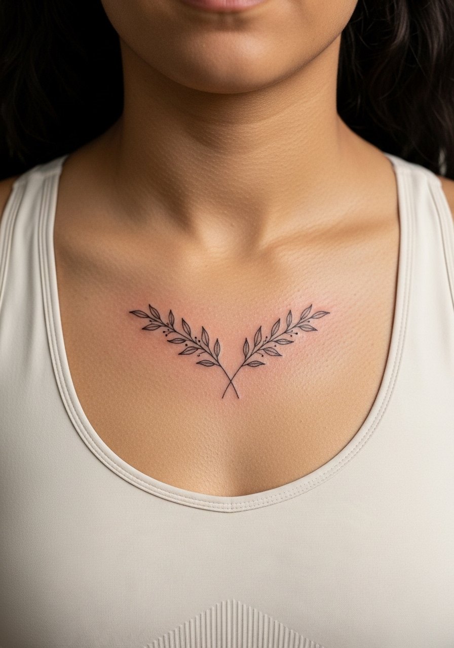
When I recommend a sternum piece that reads delicate, I point people to fine line botanical work. Fair warning, the sternum can be a 6 to 8 on common pain scales, but the session usually fits into a single one to two hour block if the artist keeps the scale modest. Tell your artist you want slightly heavier linework at focal points so the tiny leaves do not disappear after a year. A common mistake is placing too many tiny elements too close together. At six months the cluster looks crisp, at two years the thinnest stems may need a touch-up. For the session, wear a fitted sports bra you can easily pull down a little so the artist has clear access without exposing more than the immediate area.
2. Symmetrical Mandala with Negative Space
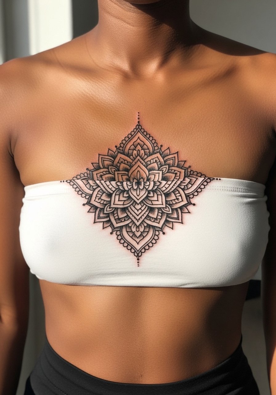
A symmetrical mandala centered on the sternum creates a structured focal point. Most artists will tell you the risk is overdetail in the center. For longevity, ask for wider spacing between the inner rings and more stipple shading rather than ultra-fine concentric lines. Expect a session of two to three hours for a medium-sized mandala with stippling. The controversy here is alive. One camp says dense mandala work is too fragile for the sternum and will blur. The other camp argues that with proper spacing and controlled needle depth the geometry holds up. If you plan to show it off, pair it with an open-back midi dress for evening wear so the piece sits framed against skin.
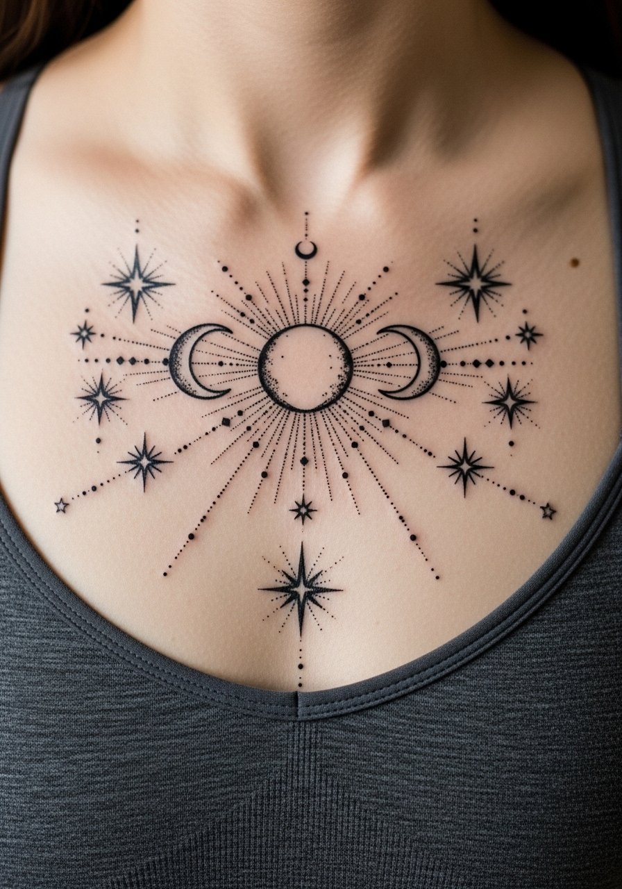
3. Micro-Realism Moon Phases Stack
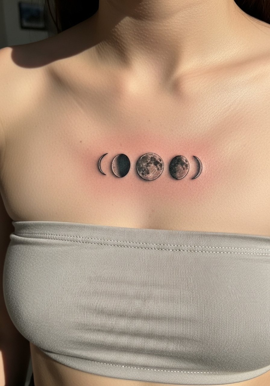
I've seen micro-realism moon stacks work beautifully on the sternum when kept small and separate. The key is to ask your artist for slightly heavier midtones and to avoid pure single-needle lines in the tiny crescents. Pain for the area is moderate to high, but session time stays under two hours if the scale is compact. The common mistake is packing five or six micro moons too close together. At two years finer moons often lose crisp contrast and may need a targeted touch-up. For session comfort, a strapless bralette makes it easy for the artist to work while keeping modesty intact.
4. Script Phrase Curving with the Breastbone
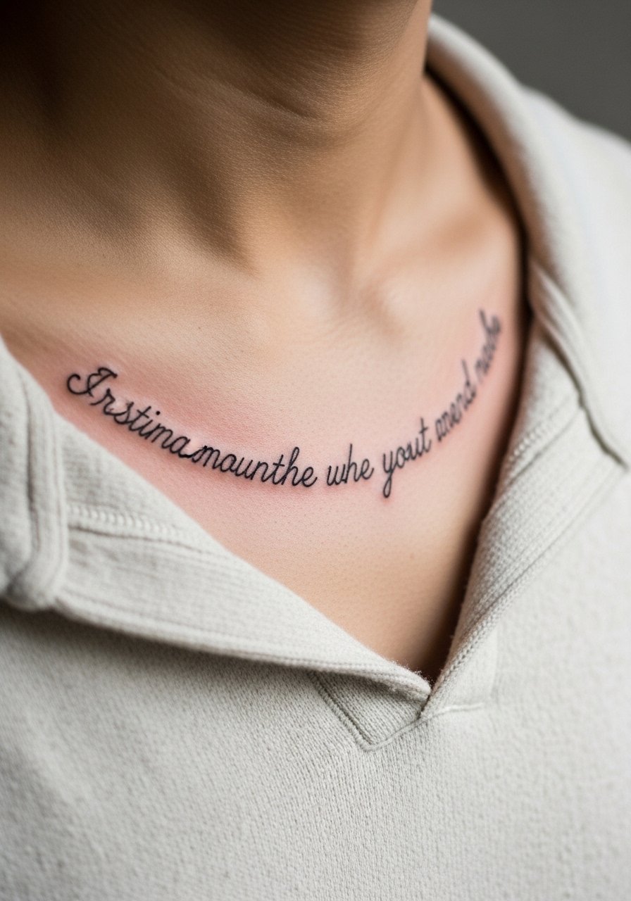
When someone wants a phrase, I advise curving it to follow the breastbone rather than placing it in a straight line. Visual impact begins in the consultation. Ask the artist to show the stencil in the exact position while you stand and while you sit, because posture changes the curve. The mistake I see most is requesting ultra-tiny script that reads like a smudge after a year. Expect the piece to look crisp at six months and softer by year three without a touch-up. For showing it off, a thin chain pendant necklace sits above the script without competing with the lettering.
5. Dot Work Crescent Framing the Underbust
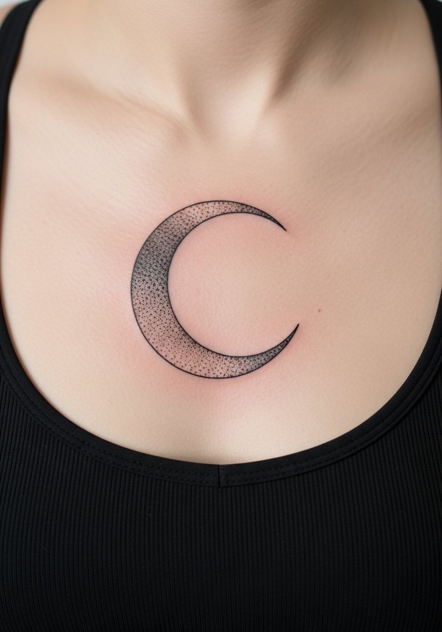
Dot work is forgiving because the technique builds tone gradually rather than relying on single continuous lines. If you want that soft halo look around the sternum, ask for stipple shading with larger gaps between dots toward the edges. Pain is moderate and session time often falls in the two hour range for a medium crescent. A common error is overfilling the surrounding skin which creates a flat patch instead of a delicate frame. Over time the dot gradients retain texture better than flooded shading, but expect to revisit the piece at year three for a light touch-up. For the appointment wear a bandeau top so the artist can access the area without you feeling exposed.
6. Ornamental Lace Panel with Tiny Pearls

This ornamental lace approach reads like jewelry on the sternum when scaled correctly. The biggest mistake is trying to recreate literal lace detail at too small a size. Tell the artist you want implied lace with clear negative-space "pearls" rather than full photorealism. Sessions are often two to three hours depending on how wide the panel goes. Lace patterns age well if the lines have breathing room and the pearls use small pellets of saturation. Expect to need a touch-up in the three to five year window if you want the tiny dots to stay crisp. For evening looks, a bandeau dress frames the lace without covering it.
Studio Day Picks
The sternum pieces above often need precise stencils and gentle first-week care so a few targeted items smooth both the session and the healing window.
-
Stencil transfer paper kit. Lets you preview the exact curve and scale of a centered sternum piece before the needle touches skin, which is crucial for symmetrical designs.
-
Low-residue healing balm. A thin, breathable balm that avoids heavy occlusion helps delicate chest linework during the first 48 to 72 hours.
-
Thin protective film roll. Useful for the first day after a sternum session when clothing friction could rub fresh ink.
-
Fragrance-free gentle body wash. Cleanses without stripping, which helps fine lines and stipple shading maintain contrast during the peeling phase.
-
Aquaphor healing ointment. A thin layer in the initial healing window keeps the surface from drying out while you avoid heavy creams that can clog small line channels.
7. Blackwork Crescent with Bold Fill
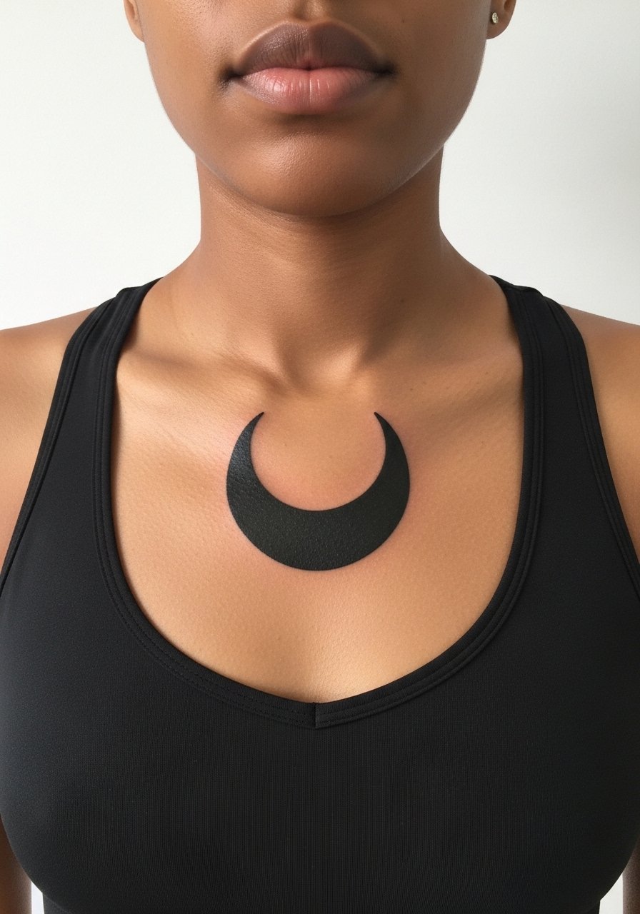
There is something about saturated blackwork that reads from a distance, and on the sternum it anchors the center of the chest. Pain is higher when artists pack solid fill near the bone, but the graphic holds for years when saturation is consistent. The mistake here is asking for a tiny solid that becomes an ambiguous blob as skin shifts. Ask for crisp edges and a plan for touch-up six months out if needed. Blackwork ages predictably well compared with ultra-fine script on the same canvas. For showing it off, a low-cut wrap top or an open-front blouse lets the shape be the focal point while maintaining modest coverage.
8. Watercolor Wash Accent Around a Fine Line Symbol
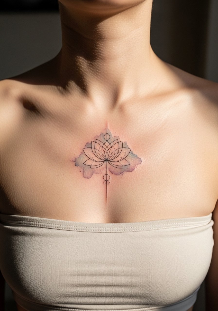
Watercolor accents around a central sternum symbol give a soft halo without heavy outlines. My advice is to use color sparingly and ask for desaturated tones so the wash does not compete with healing. Artists differ on how long watercolor-style color holds on the chest. One camp says the thin application makes it fade faster. The other camp says a muted palette and careful layering keeps it readable. Plan for a touch-up sooner than with blackwork, often within two years. For the session wear a strapless bralette so the artist can move easily without fabric disrupting the wet ink.
9. Minimalist Geometric Bar That Follows the Sternum Line
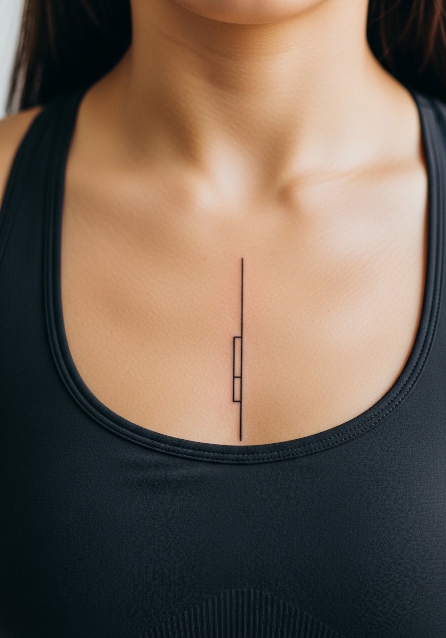
Minimalist geometry reads modern when the line weight is chosen for longevity. Fair warning, single-needle single-line tattoos on the sternum tend to soften faster than slightly heavier lines. I usually suggest a slightly bolder single line and a spacing variant so the negative-space breaks do not close up. This style is great for someone who wants a low-commitment visual that still functions with jewelry. Expect touch-ups at year two to keep the breaks crisp. During the session wear a stretchy camisole you can easily pull down a little for access.
10. Mirrored Celestial Motifs with Fine Dot Rays
Visual impact comes from symmetry and the rhythm of dot rays on either side of the sternum. A consultation must include stencil checks while you sit and while you stand because mirror symmetry can shift with posture. The pain is moderate and sessions usually fit into two hours for a medium spread. The usual mistake is asking for rays so dense they fuse into a shaded area. Dot rays tend to retain texture longer than thin continuous lines, but expect some softening in three to five years. For nights out try a v-neck wrap dress that frames the central motifs without covering them.
11. Filigree Panel with Negative Space Chains
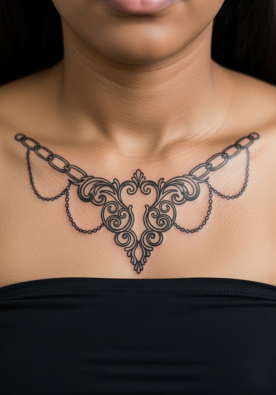
Filigree that flows outward from the sternum can mimic jewelry without the weight. In consultation request implied links and avoid tiny closed loops that can blur into one another. The session may run longer if the filigree reaches toward the clavicles. A common error is asking for too many tiny curls with no spacing. Healed filigree stays readable when artists use stipple for texture rather than dense linework. For showing off the piece, a low-scoop tank keeps the focus most nights.
12. Tiny Symbol Set Along the Midline
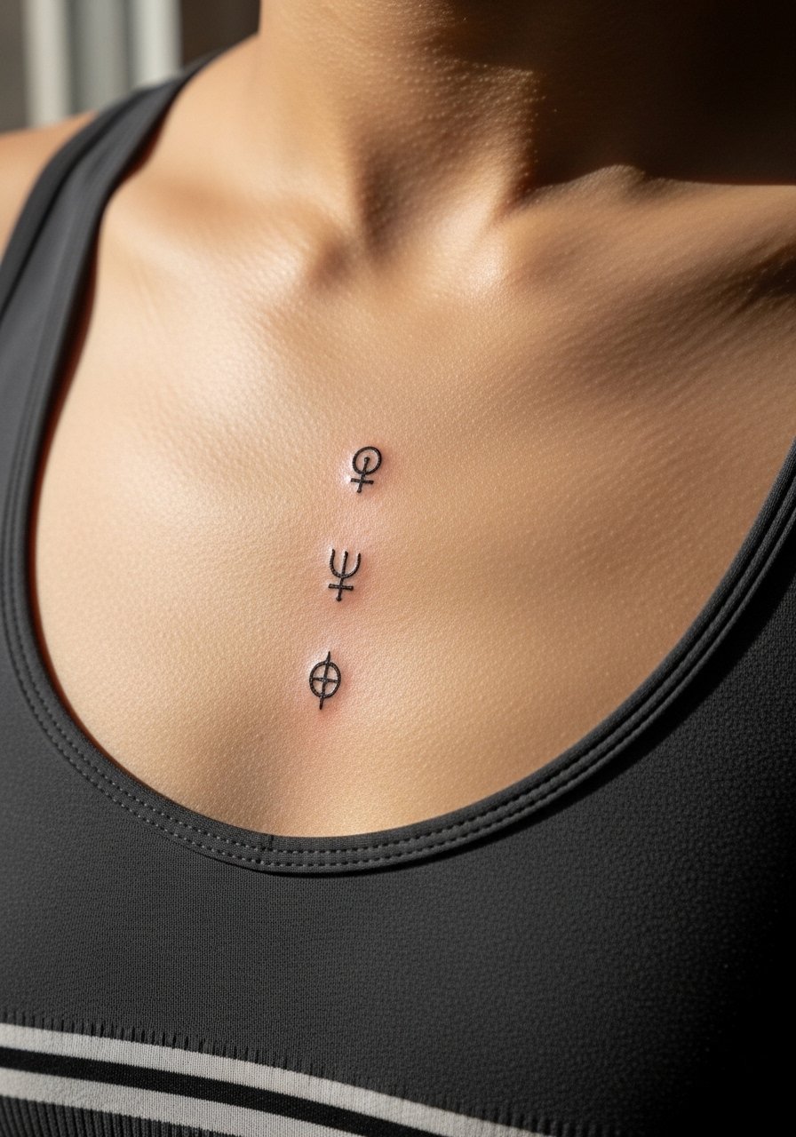
Tiny symbols work if you space them with deliberate gaps. My rule is no more than three small elements stacked in the sternum zone unless each symbol has at least 6 to 8 millimeters between focal points. Pain is short-lived for each dot or tiny glyph, but the session breaks into several tiny moments of needle work. The mistake is packing four to five tiny symbols too close which reads like a blur. At one year the icons look fine, but plan a touch-up at year two for any fading. For the appointment, a zip-up hoodie you can open completely helps you stay warm without disturbing the area.
13. Scripted Latin Phrase in Roman Numerals
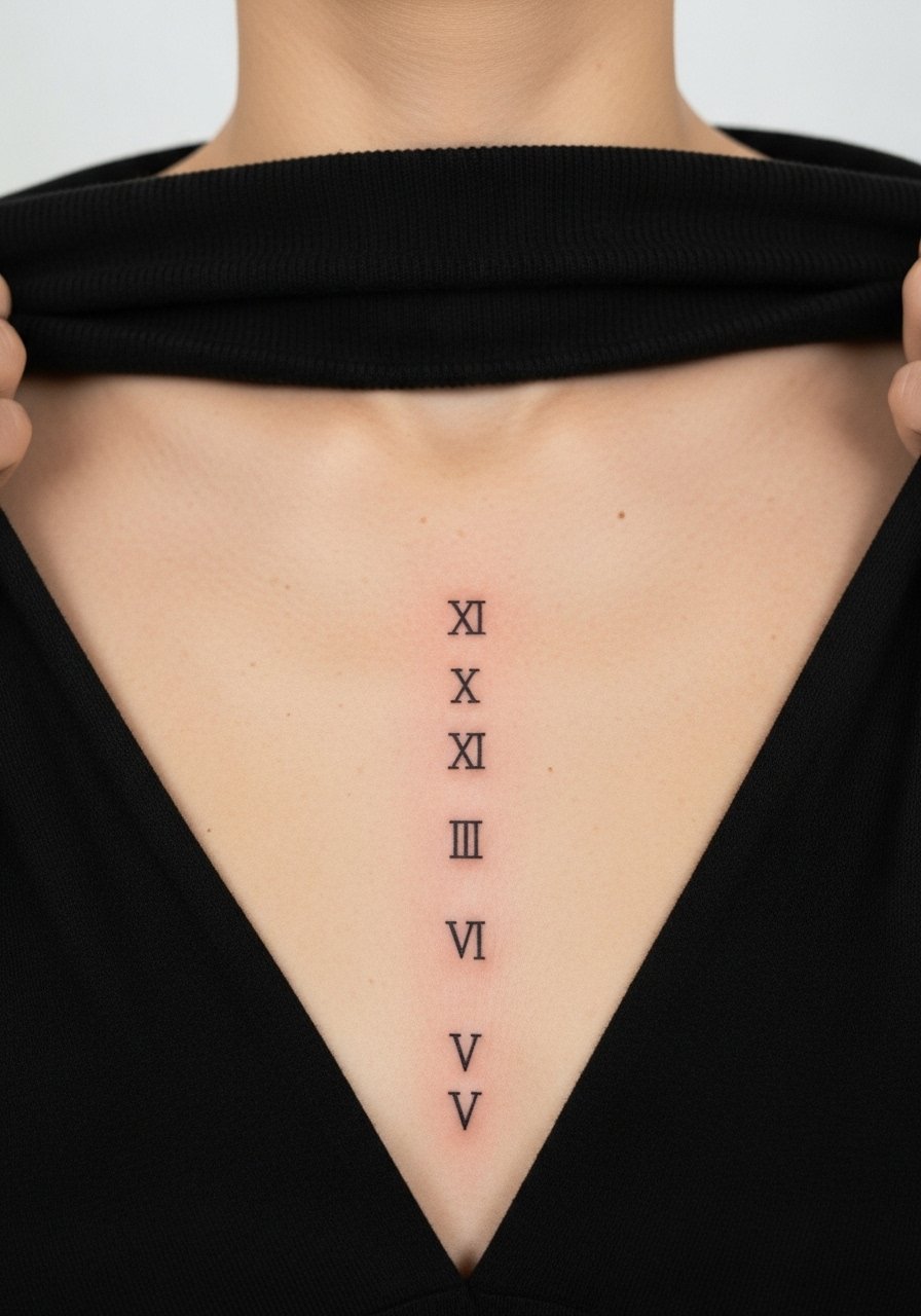
Roman numerals on the sternum have a crisp, architectural feel when the numerals are spaced and sized for the bone line. Ask your artist to stencil the numerals and confirm spacing while you move your torso. The common error is selecting a tight serif font at tiny scale that becomes illegible. Expect sharpness for the first year and a likely touch-up in two to three years depending on contrast and UV exposure. A thin chain pendant necklace sometimes sits above the numerals and draws the eye upward without covering the work.
14. Micro-Illustrative Shell or Nautical Motif
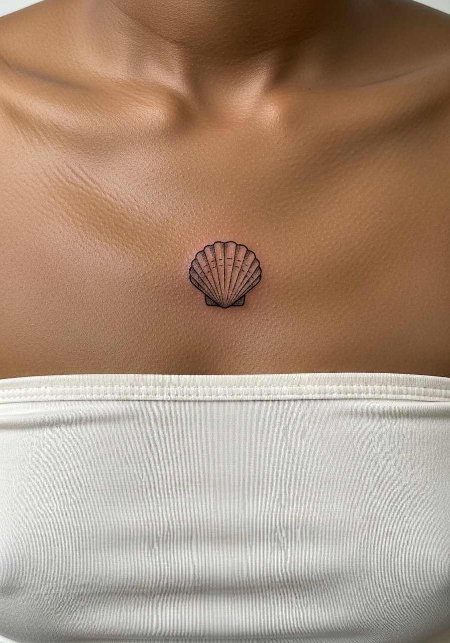
Micro-illustration like a small shell reads like an heirloom when executed with slightly heavier midtones and careful line weight. Tell the artist you want "engraved" texture rather than hairline etching. Pain is moderate and the session is short for a single small motif. A mistake I see is insisting on too much tiny stipple in the interior which can merge over time. Plan for a touch-up in the two to three year window to restore midtone contrast. For wearability, high-waisted pants and a cropped tee show the piece without the need for an open neckline.
15. Chainwork and Bead Line Accents
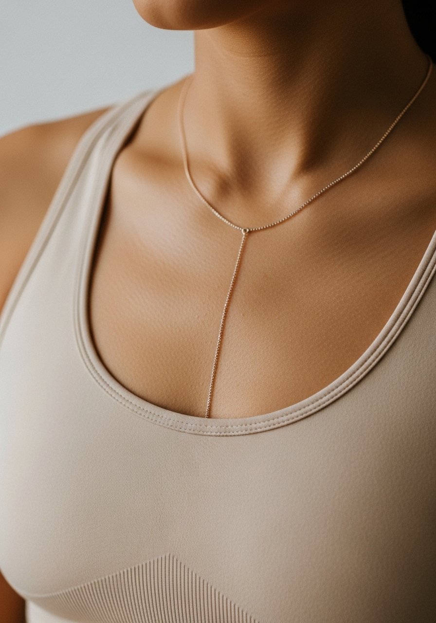
Chainwork that reads like layered necklaces is a common way to make a sternum tattoo feel like jewelry. The consultation should include how high the "chain" sits in relation to clothing lines. Artists vary on the recommended bead size. Too small and the beads blur together. Properly spaced beads and faint chain cues keep the look crisp and wearable. Expect touch-ups sooner for the tiny bead dots, often around year three. For showing it off without metal, layer a thin chain pendant necklace above the tattoo for a mixed-media look.
16. Negative Space Chevron That Sits Under the Bust
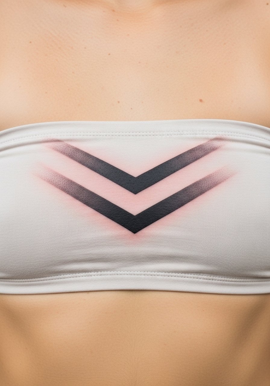
Negative space chevrons create contrast without relying on tiny lines. The technique uses surrounding saturation to make the bare skin read as the design. Pain rises when the saturated areas reach the rib bones, so plan the session accordingly. The most common mistake is making the chevron too small for the surrounding fill to read as negative space. This approach ages predictably well when the fill is consistent. For sessions, wear a bandeau top so the artist can precisely place the visible line relative to your bra or bikini.
17. Filigree and Single Pearl Accent at the Center
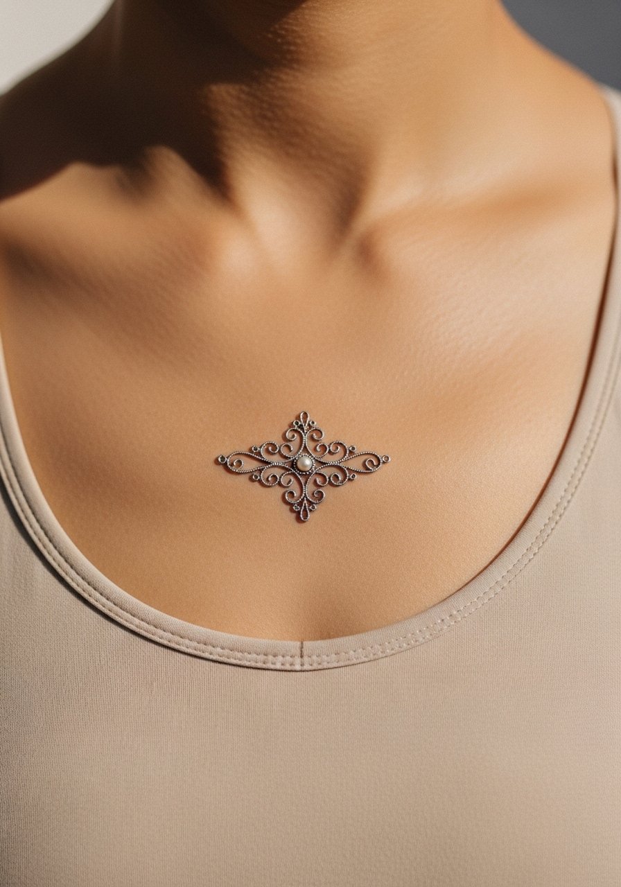
A single pearl accent at the heart of filigree is a subtle way to anchor a sternum design. During consultation request a slightly larger central dot so it reads as a pearl rather than a pinprick. Pain is localized and short for a single focal dot, and session time is usually under two hours. The usual error is making the pearl too small relative to surrounding filigree, which weakens the visual hierarchy. If you want a lasting center, plan on a targeted touch-up in three to five years. Professionally, sternum work benefits from an artist experienced with chest symmetry, so consider discovery paths like local portfolio directories or community forum threads when you choose a practitioner.
Frequently Asked Questions
Q: Will fine line sternum tattoos blur faster than bolder blackwork?
A: In my experience fine line on the sternum tends to soften sooner than saturated blackwork because the chest skin shifts with breath and movement. If you love fine line, ask for slightly heavier main strokes and plan for a possible touch-up around year two to three.
Q: How should I dress for a sternum session to stay comfortable and let the artist work?
A: Wear something you can easily pull down a little, like a fitted sports bra or a zip-up top, so the artist has clear access without exposing more than the immediate area. Loose clothing for after the session reduces friction during the first day.
Q: Do watercolor accents need different placement advice on the sternum than blackwork?
A: Yes, watercolor-style color often needs a softer, more sheltered placement and less direct sun exposure afterward. For longevity, designers recommend desaturated color and smaller washes that do not sit right on the sternum bone where wear can be greater.
Q: Are there design types to avoid entirely on the sternum?
A: I would caution against ultra-dense micro detail that tries to mimic photorealism at tiny scale. Those designs are prone to merging as skin moves. Choose implied detail, spacing, or slightly increased line weight instead.
Q: Should I worry about career implications with a sternum tattoo?
A: Sternum work is simple to conceal under most clothing, so it usually has less impact on professional settings than hand or neck tattoos. If you need occasional concealment, plan the placement just below a standard bra line or under a camisole.
