
Fine line script dominates feeds, and the tiny "this too shall pass" quote that looks perfect on-screen often needs a touch-up sooner than people expect. The trick is pairing the phrase with composition and placement that keep the letters legible as skin changes. These 27 abstract takes show how spacing, negative space, and unexpected pairings preserve the quote while giving you options that age better.
1. Micro-Abstract Script on Inner Forearm
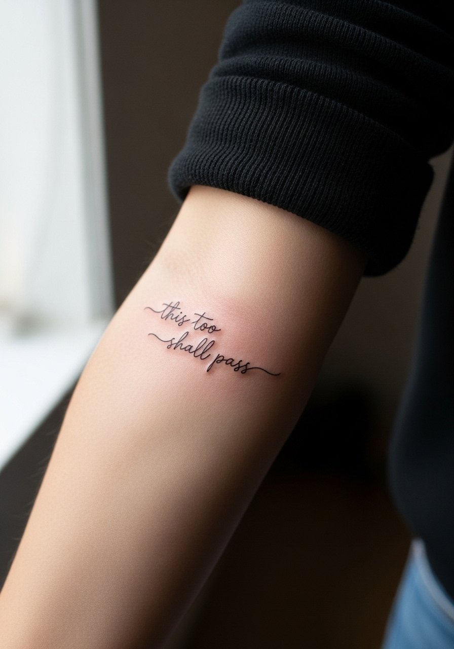
I recommend this when you want the quote visible but subtle. Ask your artist for slightly increased letter spacing and a looser baseline so letters do not merge as the skin settles. The inner forearm is moderate on pain and usually takes one short session. A common mistake is going too small with dense cursive, which blurs by year two. Expect a one-off touch-up in year three for most people. For showing it off, roll sleeves or pick a loose button-down shirt you can pull aside without disturbing the area.
2. Wrapped Wrist Quote with Negative Space
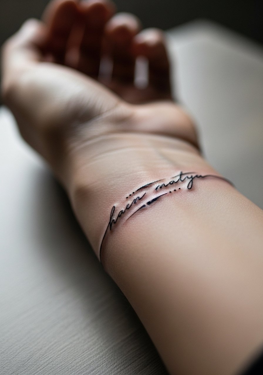
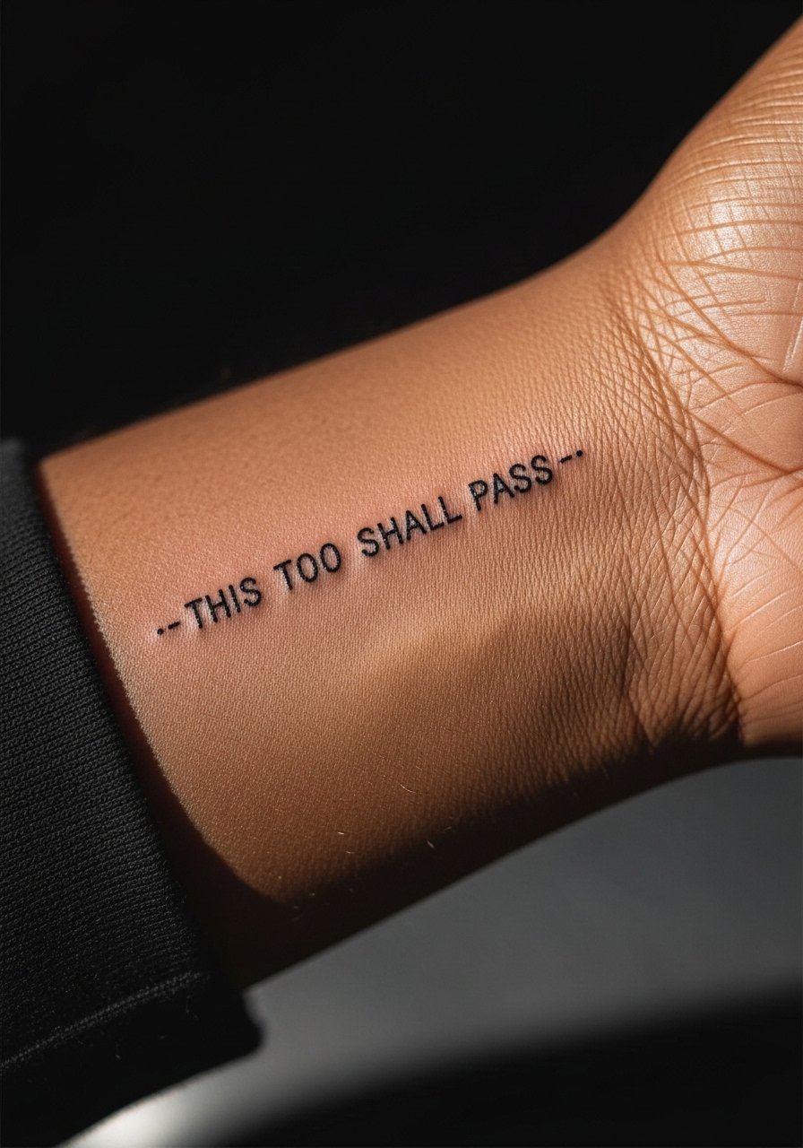
This wrapped treatment turns the quote into a band that reads differently from each angle. Fair warning, the wrist sees a lot of friction, so ask for slightly bolder linework and more spacing between letters. The biggest session-day mistake is wearing long sleeves that press on fresh lines. For session comfort and later styling, use thin layers and stack with a minimalist watch or slim bangles to frame the band without crowding the ink. Finger and wrist pieces often need touch-ups earlier than forearm work.
3. Ribcage Brushstroke Quote, Abstracted

The ribcage lets you play big with abstract strokes behind the text. Pain is higher here, so plan a relaxed session. Artists split on fine line on ribs. One camp says the stretch and movement blur lines within two years. The other camp says proper needle depth and spacing keep fine script legible. Ask the artist which camp they are in and look at healed examples. A common error is packing too many tiny details into the stroke. If you want coverage during sessions, wear a cropped top you can lift slightly.
4. Collarbones as Layered Geometry

A shallow geometric wash behind the quote makes the words read as foreground. The collarbone is a visible spot that ages well if you avoid placing tight script directly over moving seams. During consultation, ask for a low-contrast geometric wash and slightly bolder script so the letters remain legible after a year of sun exposure. For evenings out, the right top frames collarbone work. A wide-neck blouse lets the line breathe and keeps the composition clear when you want to show it.
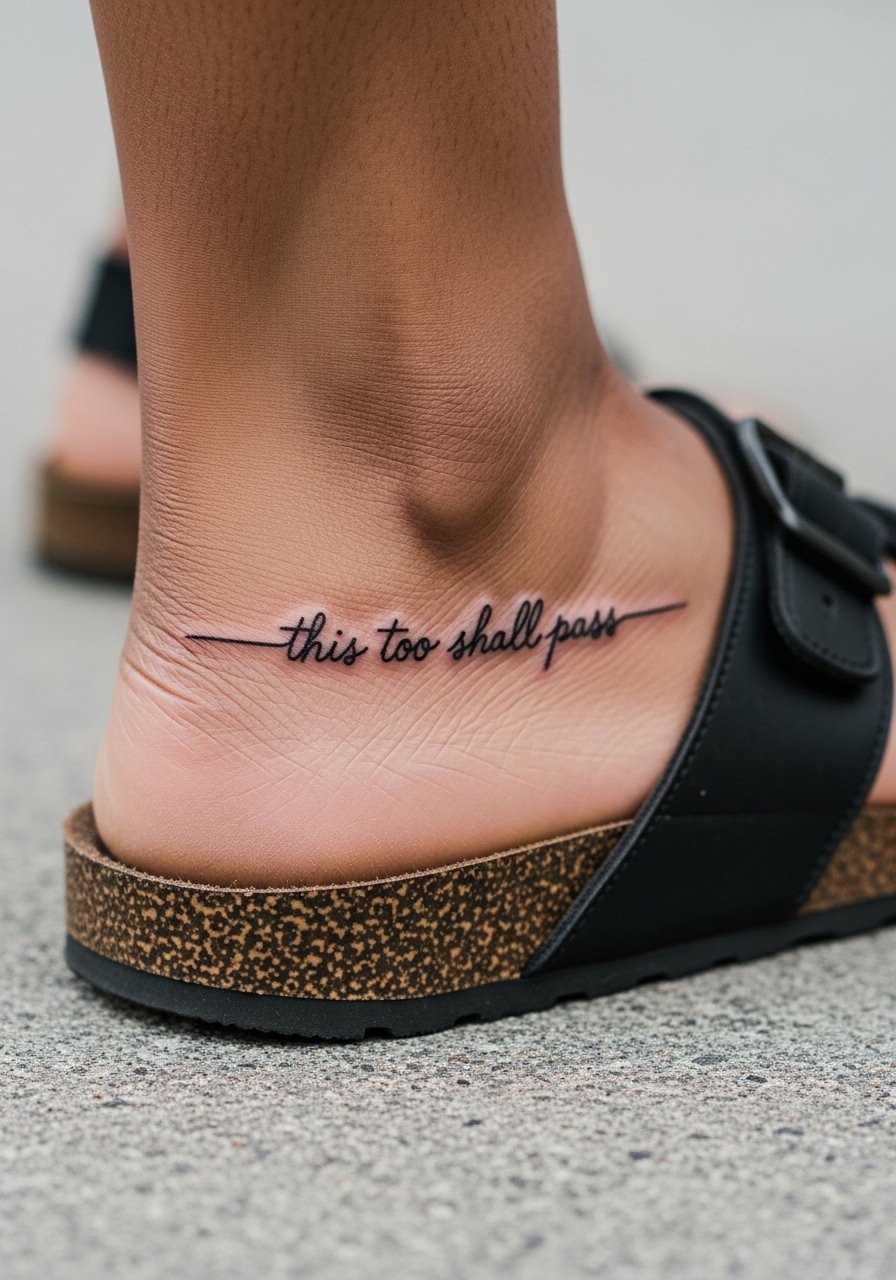
5. Constellation Ankle Script

An ankle placement feels delicate and discreet. Pain is low, session time is short, but the area gets shoes and socks friction. A common mistake is placing too much dense script on the ankle. Instead use spaced script with dot clusters or a tiny constellation to anchor the quote. For showing it off during warm months, roll cuffs or wear simple sandals that expose the ankle without rubbing the fresh ink. Expect touch-up by year three if you frequently wear ankle-strapping shoes.
6. Finger Negative Space Letters
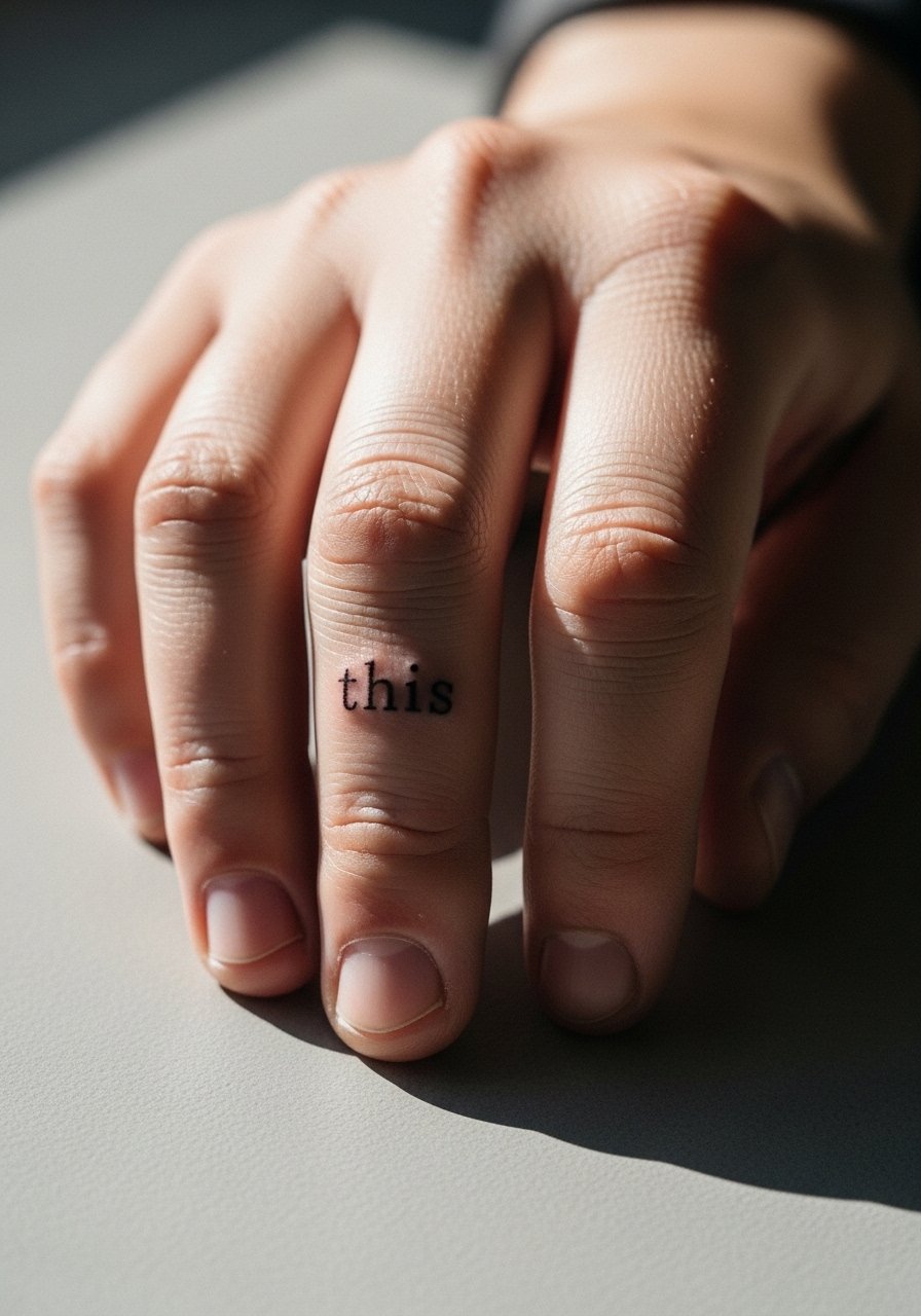
Finger lettering is seductive but high risk. The skin on fingers renews rapidly and is exposed to constant washing. If you want finger script, tell your artist you prefer negative space or small block letters instead of thin cursive. The session feels quick but sharp. Many finger tattoos fade fast and need yearly touch-ups. For styling, pair with a thin stacking ring set that complements the tiny letters without covering them. Also consider alternate placements if you want longevity over visibility.
Studio Day Picks
The wrist and finger pieces above heal differently from larger work, so a few small items smooth out the session and the first week.
-
Stencil transfer paper kit. Lets you preview lineweight on real skin for the forearm and wrist layouts in ideas above.
-
Topical numbing cream. Applied 45 minutes before eases the sharpness of finger and ribcage sessions without changing the artist's work when used properly.
-
Thin protective film roll. Keeps ankle and wrist pieces protected from friction during the first few showers and daily movements.
-
Fragrance-free gentle body wash. Cleanses delicate linework without stripping moisture from fine line forearm and collarbone pieces.
-
Aquaphor healing ointment. Thin layer for the first few days locks in moisture for tight script without suffocating the area.
7. Abstract Band on Upper Arm
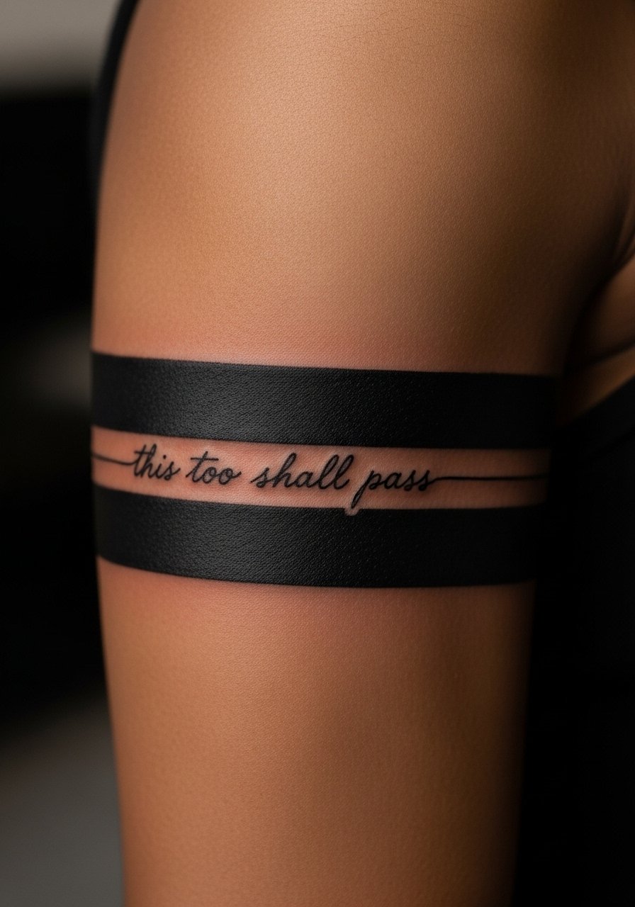
A wide abstract band frames the quote and keeps the letters away from high-movement zones. Upper arm work tolerates bolder saturation and ages cleanly, with low blowout risk. Tell your artist you want the script inset into negative space inside the band so the text does not sit on compromised edges. Sessions usually run moderate in length and are more comfortable than rib work. For the session, throw on a sleeveless tank so the artist has clear access without tugging clothing.
8. Tiny Curve Behind the Ear

Behind-the-ear placements read intimate and secretive. The area needs careful needle depth because the skin follows curves and hair grows near the stencil. A one-line note about professional considerations: visible neck or ear work can still affect client impressions in some fields. If you choose this spot, ask for a healed example from the artist taken months after the session. Session time is short but can feel sharp. Because of placement and hairline, keep expectations for touch-ups higher than for forearm pieces.
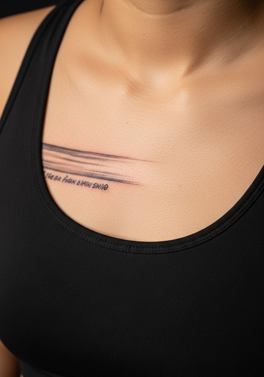
9. Sternum Minimal Composition
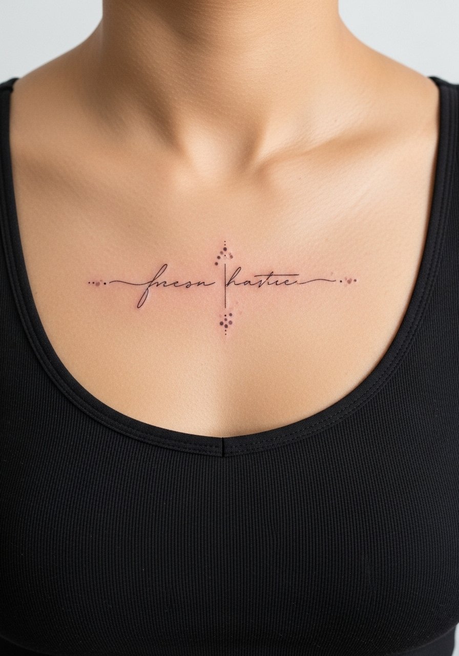
Sternum pieces look intimate and central. The skin there moves with breathing and chest changes, so thin cursive can spread if placed too close to the rib seams. Ask your artist for slightly more spacing and a touch more saturation in core strokes. Sessions can be uncomfortable because of proximity to bone and breathing. For session comfort, wear a fitted sports bra you can loosen or remove as needed. Many people prefer a slightly bolder script here to avoid early blurring.
10. Shoulder Blade Abstract Map
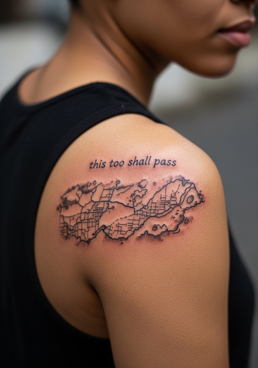
The shoulder blade gives canvas space for expressive abstraction behind the quote. It heals well because the area is low-friction, but heavy sun exposure can fade open washes. In consultation, request a higher contrast between the wash and the script so the words remain readable at year two and five. Sessions tend to be comfortable but can require the sitter to lie on their stomach for a while. For showing off, an open-back dress frames larger shoulder blade pieces elegantly.
11. Calf Column Script with Dotwork

A calf column stretches the quote so each word sits on its own line, which helps readability as skin ages. The calf tolerates saturation and ages better than shins or ankles. Tell your artist you want the letters slightly taller and spaced, not compressed. Expect a two-hour session in most cases. For casual show-off styling, pair with a midi skirt or sandals that keep the cut visible without rubbing the fresh ink.
12. Lower Back Crosshatch and Script
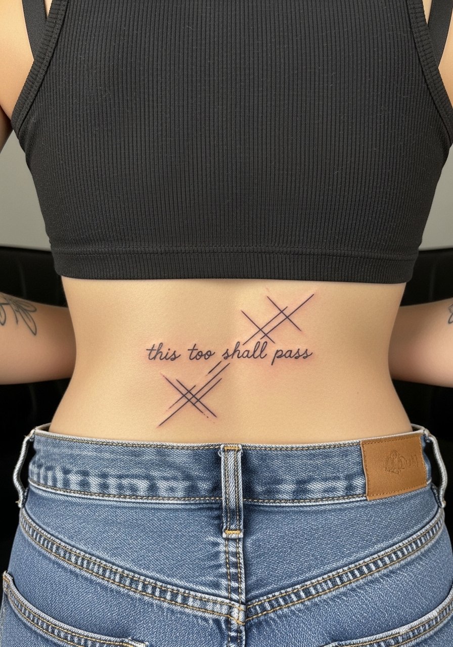
Lower back pieces let the quote sit in a larger visual texture that disguises small blur over time. The shot must be framed tightly so only the tattoo zone shows. Lower back work is moderately painful and sensitive to stretching. A common mistake is placing very small script where clothing waistbands will rub. For sessions, bring pants that you can pull slightly down at the waist without discomfort. Touch-ups are often needed if waistbands constantly sit over the area.
13. Hip Crescent Quote
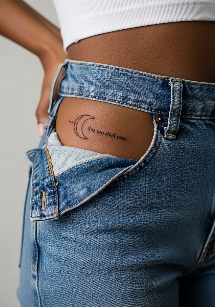
Hip placements can be playful and discreet. The skin here moves with clothing and sitting, so small script can warp if the baseline sits on a curve. Ask for a slightly curved baseline that follows your natural hip line, not a straight one forced across a rounded area. Sessions may be tender when the needle hits thin skin. For session day comfort, wear high-waisted bottoms you can lower just enough to expose the area without pinching.
14. Outer Thigh Abstract Line Cluster
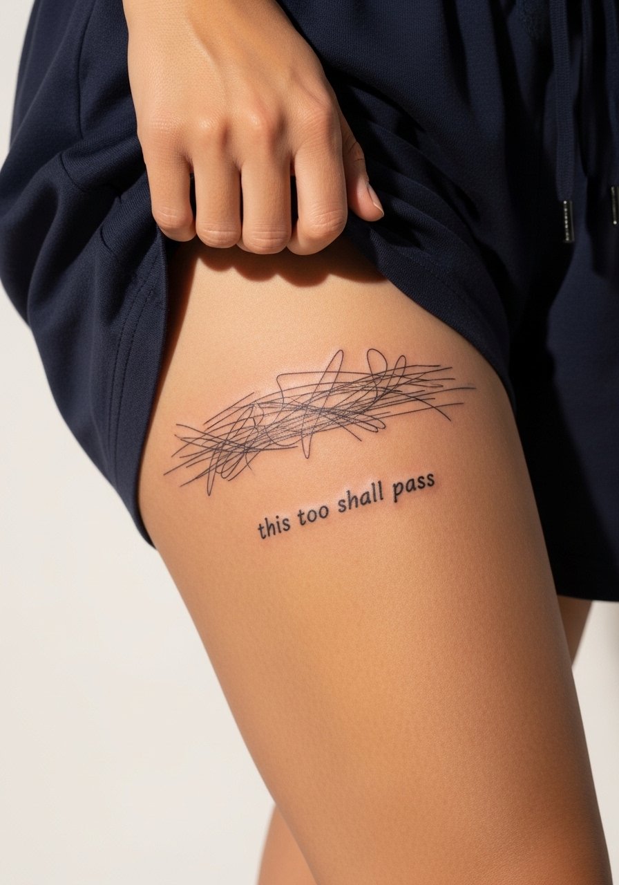
Outer thigh pieces age gracefully because the skin is stable and low friction. This is a good choice if you want a larger abstract background without worrying about frequent touch-ups. Tell your artist you want airy spacing between lines and a slightly larger script than you initially think. Session time can be longer for larger clusters but pain is generally manageable. For showing it off, a loose drawstring linen short makes the composition visible without squeezing the healing area.
15. Nape Script with Soft Gradient
Nape work reads like a private motto and can peek out under hair when you move. The skin there is thin, so tiny cursive can fade into fuzz if the artist uses too light a hand. One camp in the community treats neck linework like delicate fine line and recommends heavy spacing. Another camp believes denser stroke and shallow shading make it last longer. Ask your artist for healed photos from at least nine months post-session. For easy access during the appointment, wear a wide-neck top you can shift without tugging hair.
16. Palm-Edge Micro-Dot Script
Palm and edge-of-hand pieces are high maintenance. The skin renews quickly and is exposed to heavy use. If you want a statement that will remain visible for a short window, use micro-dot or negative-space letters rather than connected cursive. The session is brief but sharp. Many people accept a fade timeline of months rather than years for palm pieces. For styling, choose simple rings or a thin chain bracelet to keep attention on your hand while avoiding excessive rubbing.
17. Foot Arch Whisper Script
The foot arch holds fine work well because it is often protected by shoes. The trade-off is walking and shoe friction during the healing window. The major mistake is wearing tight closed shoes immediately after the session. For sessions on colder days, bring sandals or slip-ons to avoid pressure. For show-off moments, a pair of simple sandals that do not press the arch keeps the composition visible and comfortable while healing.
18. Sternum Side-Swipe with Small Type
A lateral sweep across the sternum creates a modern frame for short quotes. This spot moves with breathing so letterform spacing must account for expansion. Many artists will recommend slightly heavier strokes for marginally longer longevity. Session discomfort is often moderate because of proximity to ribs. For session freedom, pick a fitted sports bra you can reposition easily so the artist has access without you feeling exposed. This placement often reads best when kept slightly larger than anticipated.
19. Shoulder Cap Crescent Script
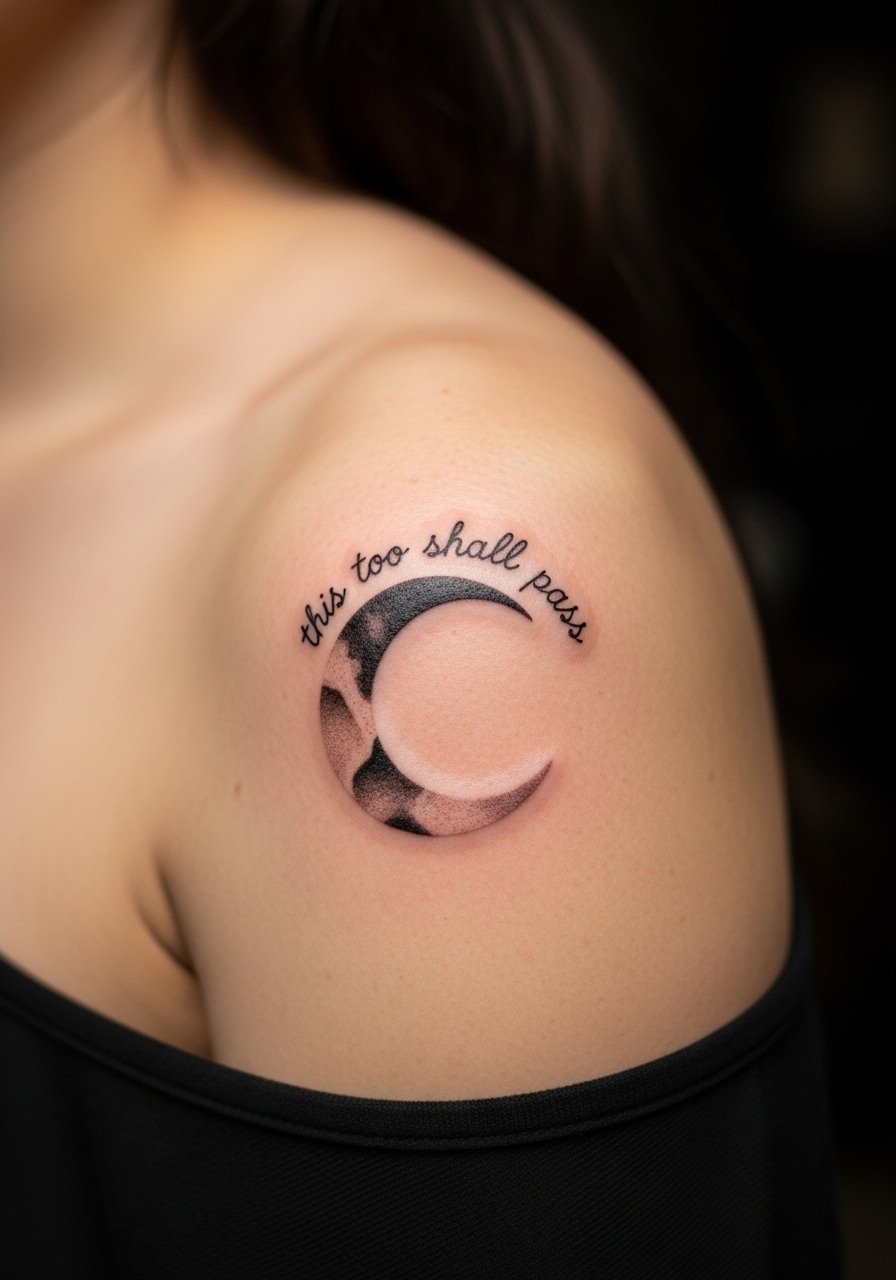
The shoulder cap experiences low friction and ages nicely. It is a top option if you want the quote to be visible with tank tops and sleeveless layers. In consultation, ask for the script to follow the bone curve rather than sit across it, which reduces distortion as muscles move. Sessions are comfortable and usually done in one sitting for modest sizes. For easy access during the appointment, wear a loose button-up shirt or a tank you can move aside.
20. Inner Bicep Whispered Script
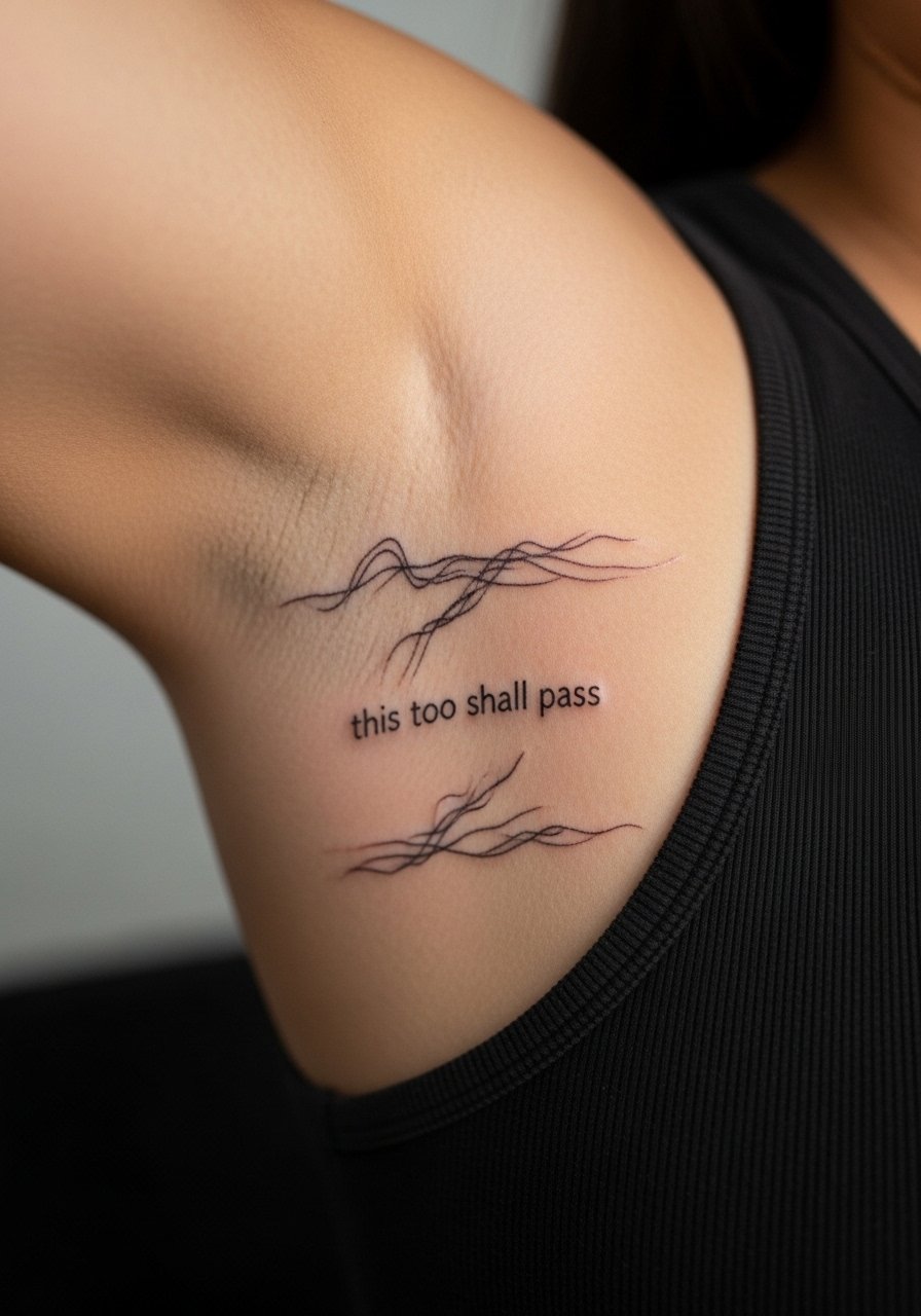
Inner bicep placements are private and age reasonably well when done with adequate spacing. Pain can spike because the area is sensitive. The common error is tight cursive that the skin cannot hold over time. Discuss baseline curvature with your artist so the quote sits naturally on the inner arm. Wear a loose tank top on session day so the artist can access the area without fabric tugging. Expect possible touch-up at year three if you train or change muscle size.
21. Spine-Facing Vertical Quote
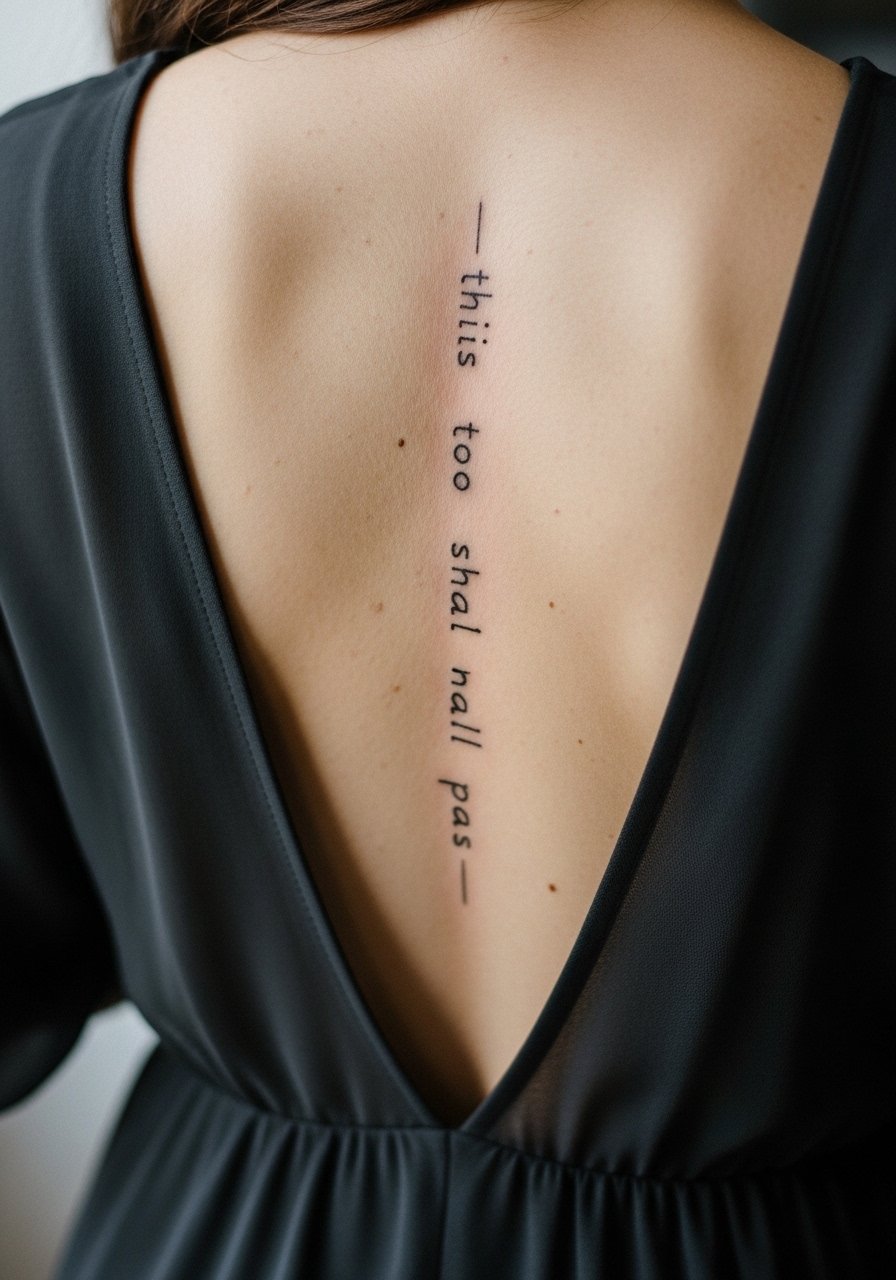
A spine-aligned quote reads like a backbone statement. The skin along the spine is relatively stable but sensitive in spots. Keep letters spaced and slightly larger than you think to avoid merging as the skin ages. Sessions require lying face down for a stretch, so plan for comfort. For showing it off, an open-back dress puts the vertical script in frame. Expect lower touch-up frequency than hands or fingers, but higher than biceps for long, thin scripts.
22. Side Neck Micro Script by the Hairline

Side-neck placements are visible and can feel bold. The thin skin and movement of the neck mean that tiny script needs extra spacing. Artists differ on how tight letters should be here. One view favors larger spacing and deeper saturation. The opposing view suggests shallower lines to avoid scarring, which may make subtle script fade faster. Ask the artist for healed images from at least one year out. Session discomfort is moderate; plan for a quick session with short breaks.
23. Upper Thigh Mandala Ring Around Quote
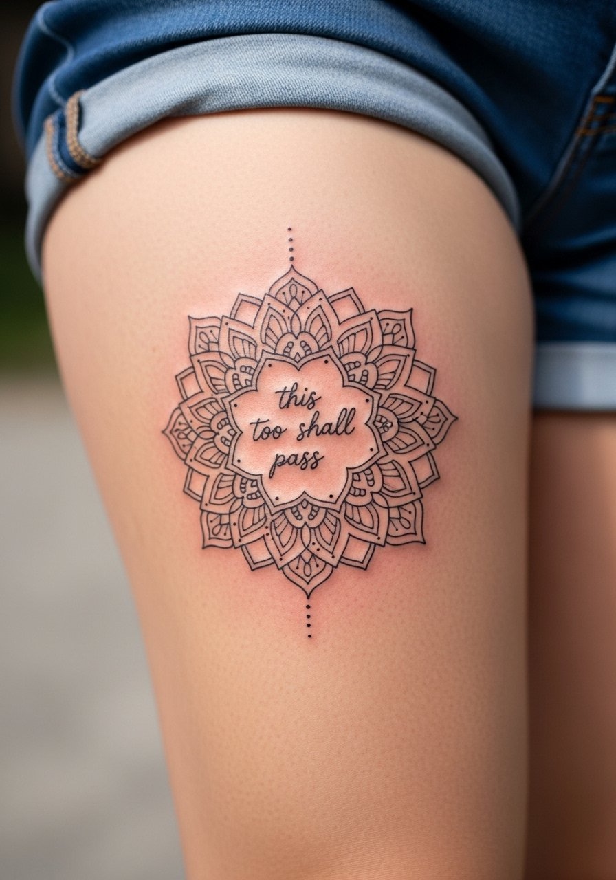
An upper thigh mandala gives a strong graphic anchor for the quote and hides early fading because of dense patterning. The area rarely gets sun and is low friction, so dense work can remain crisp for years. The common mistake is over-detailing the inner letters so they get lost among the mandala lines. Sessions can be longer depending on size but manageable in one sitting. Show-off pairings include high-waisted skirts or shorts that let the ring peek out.
24. Barcode-Style Linear Quote on Side Rib
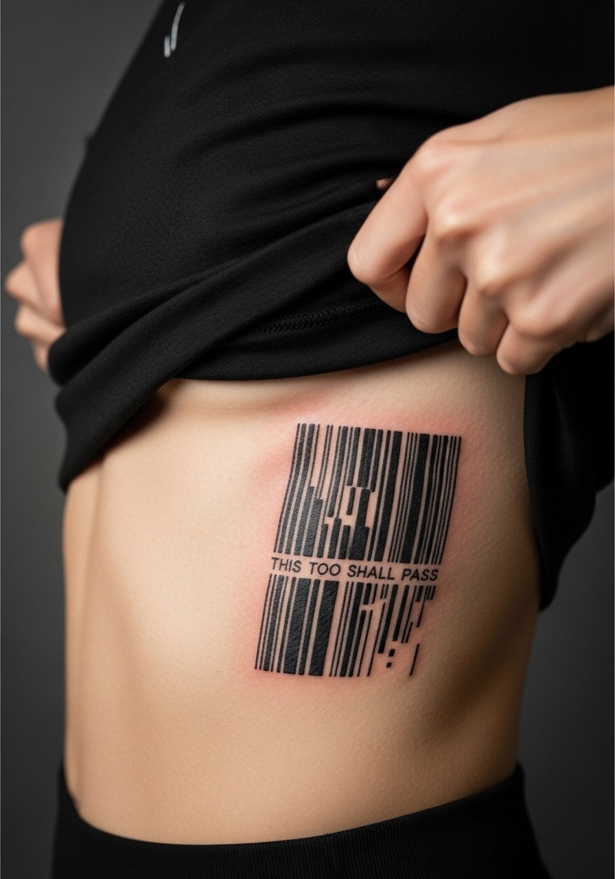
Turning the quote into a barcode-like graphic abstracts the words while keeping a readable pattern at close range. This works well on the side rib where vertical lines can follow the torso. Expect higher pain levels and discuss needle depth to avoid blowout. One practical mistake is making the lines too close together, which can merge. Keep at least a little breathing room between bars. For the session, wear a cropped top you can lift and pull aside without strain.
25. Mirror Script Across Collarbones, Split
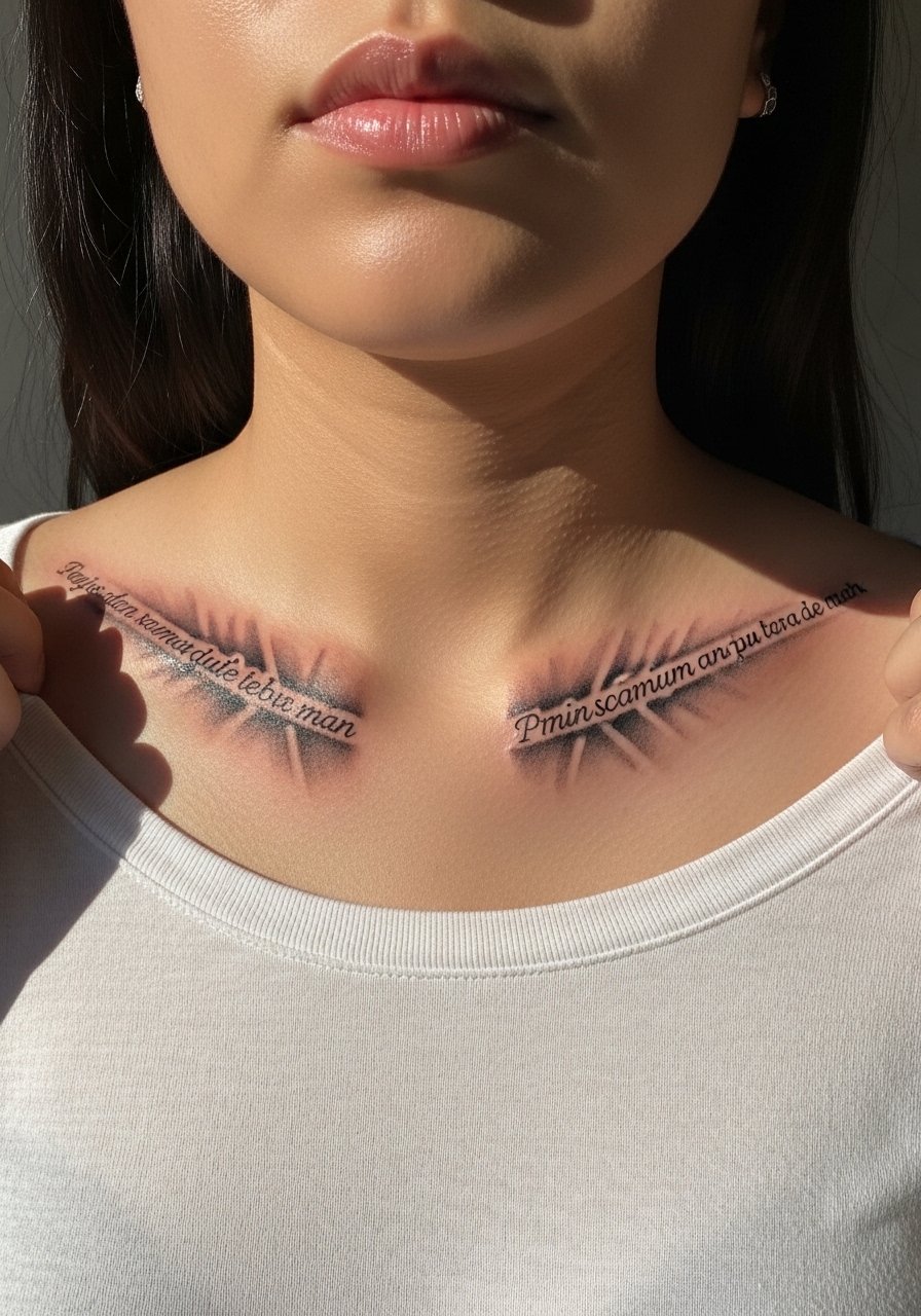
Mirroring the quote across both collarbones turns the phrase into a visual rhythm that reads when you move. Placement symmetry is critical here. Ask the artist to mark and photograph the stencil with you standing so you can confirm alignment before work begins. A typical mistake is trusting a photo on the table without checking the real-life mirror effect. Sessions are moderate. For styling, a wide-neck top makes both sides visible without overexposing the area.
26. Layered Transparent Shapes Behind Script on Upper Arm

Layering translucent shapes gives depth without overpowering fine script. This approach helps hide minor touch-up needs since the shapes distract from small line changes. Tell your artist to keep the shapes soft and the script slightly darker than the layers. The session will be longer than a simple script because of the layering, but pain remains moderate. For casual showing, sleeveless shirts and tanks let the layers sit naturally.
27. Morse Code Dots and Dashes Encoding the Quote on Wrist
Encoding the phrase in Morse code gives a private, abstract take that reads as pattern at a glance. The wrist is subject to friction so keep the dots and dashes slightly larger than typical Morse tattoo sizes. A frequent mistake is compressing symbols too tightly, which makes them blur together. The session is quick. For showing off, a thin chain bracelet complements without covering the code. Expect touch-up within two to four years depending on your hand use.
Frequently Asked Questions
Q: Will tiny script like this blur faster on my ribs than on my forearm?
A: Yes, ribs and other high-movement areas tend to distort fine line more because the skin stretches and shifts. The forearm is more stable and often keeps tight script cleaner for longer. When considering ribs, ask the artist for slightly larger spacing and heavier contrast so the letters remain legible after healing.
Q: How should I find an artist who can execute abstract layouts without making the letters fuzzy?
A: Search local shop directories, recent convention portfolios, and community threads on Reddit. Look specifically for healed photos taken months after the session. Pay attention to how they handle negative space and spacing in text. Ask to see similar healed work during consultation so you get a realistic expectation.
Q: Do abstract washes require different aftercare than fine line script?
A: The aftercare itself does not change much, but dense washes can scab differently than single-line script. Keep the area clean and avoid heavy friction. The small supplies recommended in the Studio Day Picks help protect both washes and lines in the first week.
Q: If I want to hide a quote for work but show it sometimes, which placement is best?
A: Collarbone, shoulder blade, and upper thigh are good choices because they are easy to cover with common clothing yet reveal neatly when you want to show them. Pairing with a wide-neck blouse or tank lets you control visibility.
Q: How often should I expect touch-ups on finger, wrist, and ankle pieces?
A: Fingers and wrists usually need touch-ups more often, commonly in the first one to three years. Ankles vary with footwear and rubbing, so expect possible touch-ups around year two to three. Proper spacing and slight boldening at the start reduce the number of touch-ups needed.
Q: Are there cultural or origin concerns with abstract mandala-style backgrounds?
A: Some mandala patterns come from specific spiritual traditions. If you want a mandala, mention you respect the origin and discuss subtle variations rather than copying sacred or ritual designs directly. Most artists appreciate that openness and can suggest tasteful adaptations.
