
Bold color with washed edges can read poetic and still last, if you set contrast and placement first. Watercolor high contrast tattoos pair saturated blacks or deep linework with soft washes so the shapes stay readable as the color fades. Think about where movement and sun will test the edges before you book, and you will avoid the common mistakes that force early touch-ups. The first idea below shows how to keep watercolor breathy without losing form.
1. Painterly Botanical on Inner Forearm
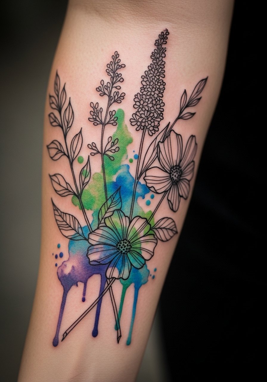
A forearm botanical that uses bold black veins to anchor loose color keeps the design readable from day one through year five. Fair warning, the inner forearm sees frequent sun exposure so expect gradual color softening at the edges. Tell your artist you want the black linework to carry the composition, not the color alone. The session feels moderate on pain and usually finishes in one to two hours, depending on size. For showing it off, roll sleeves or pick a linen short-sleeve shirt so the piece sits in natural light and the washes read true.
2. High-Contrast Watercolor Collarbone Script
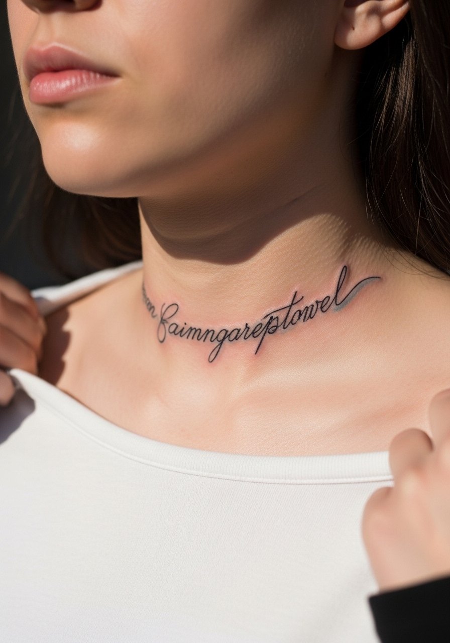
A script across the collarbone benefits from a dark spine line behind the color so the words stay legible as pigment fades. The area is sensitive but quick, often completed in under an hour for short phrases. A common mistake is asking for pale color without anchoring ink, which turns letters into smudges over time. For the appointment wear a wide-neck shirt you can pull aside to give the artist clear access and avoid awkward roster adjustments. Hand this to an artist who demonstrates clean lettering and steady linework in healed photos.
3. Watercolor High-Contrast Wrist Band

Wrist pieces age under friction from sleeves and daily washing, so a dense black outer edge prevents early feathering. Expect the session to be short but sharp; wrist skin is thin so pain registers higher than forearm work. The mistake I see often is making the watercolor too sprawling for the wrist circumference, which blurs into the hand within two years. For show-off styling, pair the band with a minimal leather bracelet that frames the ink without rubbing it raw. Plan a touch-up around year two for fine color refresh.
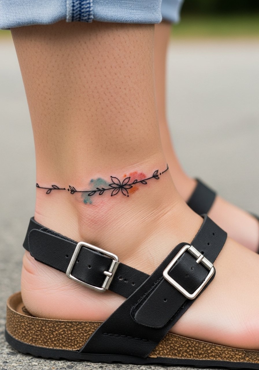
4. Saturated Floral Ankle Accent
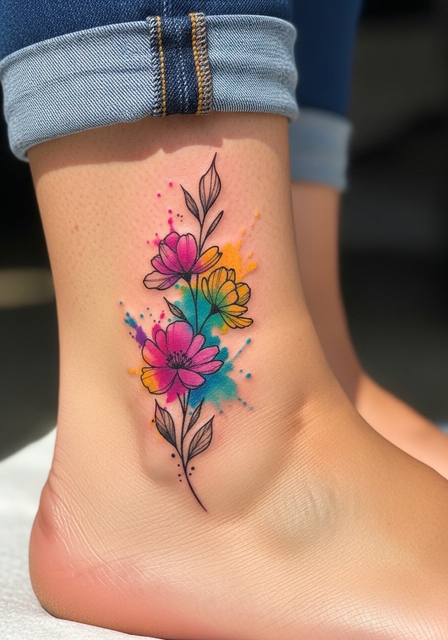
Ankle tattoos face constant rubbing from shoes and socks, so high-contrast black stems are essential to keep the floral readable. Pain is low to moderate but sessions can feel longer because the artist must work carefully around bone. A common error is heavy stipple shading that invites fast fading from friction. Wear low-rise sneakers or sandals after your session to keep pressure off the area for the first week. Expect the color to mellow at six months and then stabilize if you protect it from daily abrasion.
5. Bold Outline Ribcage Watercolor Bouquet
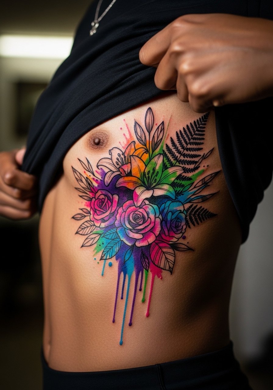
Ribcage work looks incredible but is a high-pain area, so sessions are slower and often split across visits. Artists split into two camps about fine detail on ribs. One camp warns that skin stretch and movement blur fine lines within two years. The other camp says that with proper spacing and depth, lines settle fine. Be explicit in consultation about spacing, and be ready to book touch-ups rather than expect perfect longevity. For the session wear a cropped athletic top you can lift to give the artist access without overexposure.
6. Contrast-First Watercolor Sternum Sprig

Sternum placements need careful black anchoring so the soft color does not wash away into an illegible patch. Pain runs high and sessions are often broken into shorter passes to manage discomfort and swelling. A mistake is asking for tiny, faint washes centered on the sternum without clear linework, which ages into a patch within a few years. For the appointment choose a fitted sports bra so the artist can work without constant wardrobe adjustments. Be aware of specialized aftercare options the studio recommends.
Studio Day Picks
The smaller chest and wrist pieces above need different prep than full-sleeve work, so these items help smooth session day and the first week of healing.
-
Stencil transfer paper kit. Lets you preview placement on skin, especially useful for the collarbone and wrist designs above.
-
Topical numbing cream. Applied prior to the session this reduces rib and sternum flinch without affecting line placement.
-
Thin protective film roll. Keeps ankle and wrist tattoos clean during the first week when friction is highest.
-
Fragrance-free gentle body wash. Cleanses healing areas like forearms and ankles without stripping pigment.
-
Aquaphor healing ointment. A thin layer supports early moisture retention for fine line and high-contrast pieces.
7. Watercolor High-Contrast Sleeve Accent
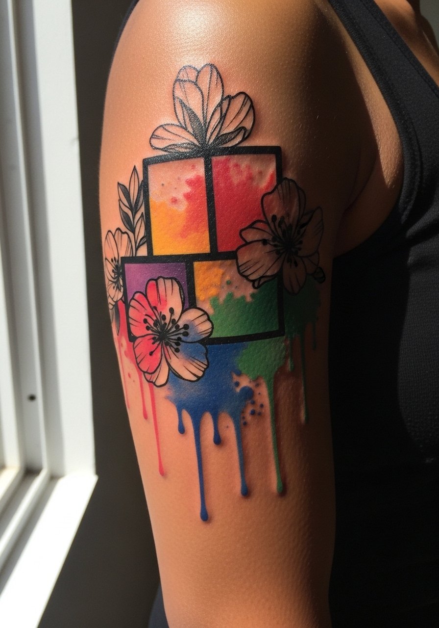
A sleeve accent that blends strong black shapes with washes holds up far better than color-only areas. When you sit for this, expect multiple sessions depending on coverage and saturation. The visual impact lead here is the black shapes reading from a distance while the washes add depth without needing heavy saturation. Common mistakes include tiny color-only patches that fade into blotches within a year. For show-off styling, roll sleeve edges or wear a sleeveless linen top to keep the cuff visible without competing textures.
8. High-Contrast Watercolor Calf Scene
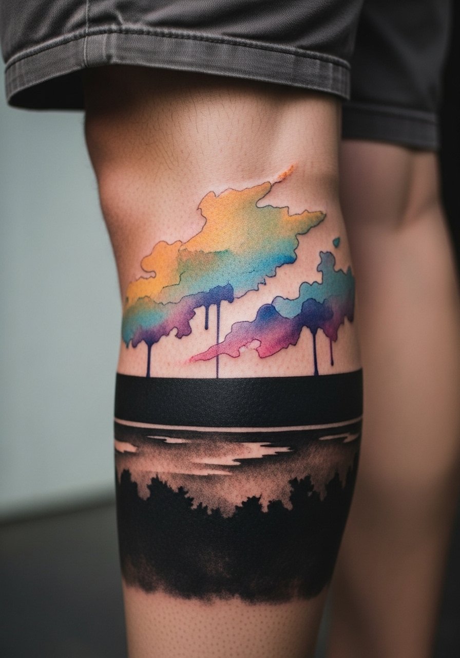
Calf placements allow for larger washes and higher saturation because they get less daily abrasion and sun than forearms. Pain is typically low to moderate and sessions can be longer. A mistake is packing color so densely that the wash loses its airy character, which makes touch-ups more intrusive later on. For the appointment wear loose drawstring shorts so the artist can shift fabric without pulling on the area. Expect color to settle substantially in the first six months before stabilizing.
9. High-Contrast Watercolor Hand Accent

Hand tattoos are exposed to constant washing and friction, so high-contrast black lines are non-negotiable for readability. The controversy here centers on employment risk versus self-expression, and people split into two camps: those who accept the visible trade-offs and those who avoid hands for career reasons. Pain is sharp and sessions are short but intense. Avoid asking for large, delicate washes on the hand, they rarely hold beyond a couple of years. For showing it off, stack a thin chain ring set to draw eyes without smudging the area.
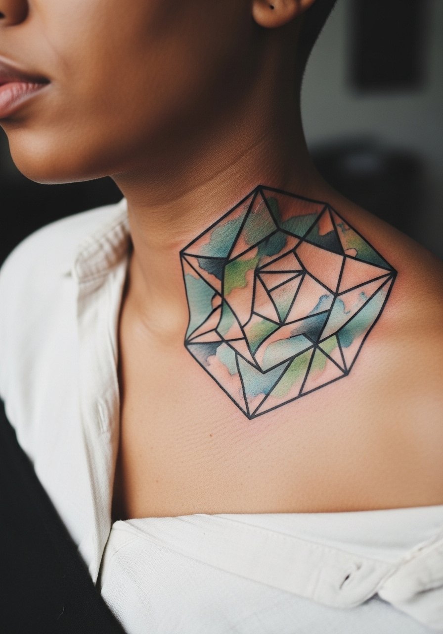
10. Watercolor High-Contrast Neck Script
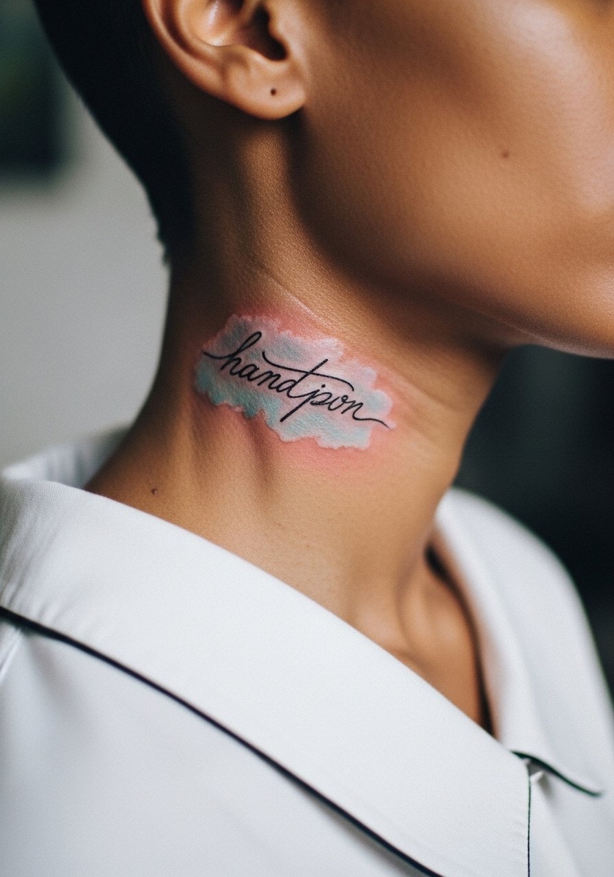
Neck scripts are bold statements and need dark backbone lines to stay legible against movement and sun. The area is sensitive and touch-ups are common by year three if the color is light. The real mistake is asking for faint, unordered washes without readable lettering, especially on the side neck where skin shifts. For the session wear a wide-neck shirt you can adjust and discuss how visible you want the piece to be for work considerations.
11. Watercolor High-Contrast Spine Motif

Spine tattoos benefit from a strong vertical black anchor so the wash reads as atmosphere rather than lost pigment. Sessions can be painful and are often broken into shorter sittings to manage the nerves along the back. The common error is packing too much fine detail into a narrow column, which merges as the skin moves. For showing the piece, pair with an open-back dress so the design sits in a clean frame without distraction. Ask about touch-up timelines since the center spine can dull faster than surrounding color.
12. High-Contrast Watercolor Thigh Panel

Thigh pieces allow for bold washes because they live under clothing most of the time and avoid constant sun exposure. Pain ranges from low to moderate and sessions can cover large areas in one sitting. A frequent mistake is choosing a fine washed edge that blends into fabric dye or leggings, so request a darker perimeter to separate the art from clothing. For the session wear high-waisted shorts you can shift easily and that keep fabric away from the fresh ink.
13. Watercolor High-Contrast Finger Cluster
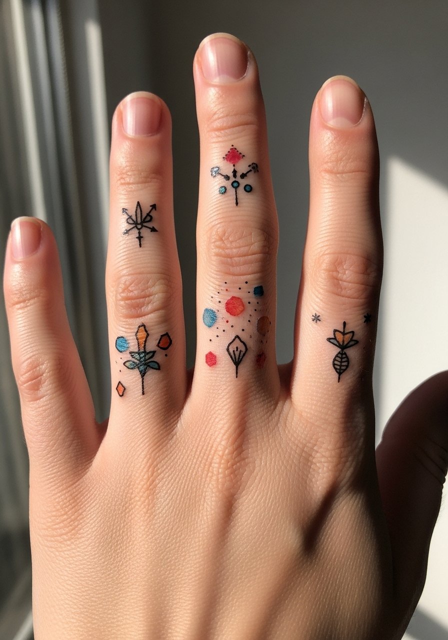
Finger tattoos take abuse from hand use and washing, so compact black anchors are what keep tiny designs readable. Expect touch-ups more often than other placements, usually within the first year. The mistake people make is requesting large color fills on fingers; those wear unevenly and become patchy. For showing it off, choose minimal stacking like a delicate midi ring set that complements without smudging. Plan for maintenance sessions to keep edges crisp.
14. High-Contrast Watercolor Back Shoulder Bloom
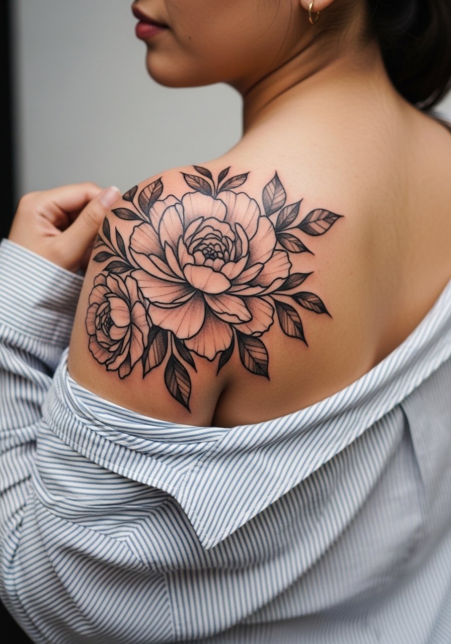
Upper back shoulder pieces have forgiving skin and hold color well when anchored with dark shapes. Pain is moderate and work often completes in a single longer session. A common mistake is over-detailing where clothing will cover most of the design, wasting both placement and budget. For the appointment wear a loose button-down shirt you can pull aside easily so the artist works without tugging. The color typically softens at six months then keeps its shape for years.
15. High-Contrast Watercolor Micro-Realism Portrait Accent

Micro-realism paired with watercolor washes demands strong black contrast to preserve facial features as color breaks down. Sessions are technical and may require multiple short sittings to avoid overworking the skin. Artists differ on whether micro-detail and washes mix well in high-movement spots, so ask your artist how their healed portfolio looks. For showing it off, a short-sleeve tee works well so the arm silhouette reads without covering the portrait. Expect a touch-up window at year two for subtle refines.
16. Watercolor High-Contrast Ear-Adjacent Sprig
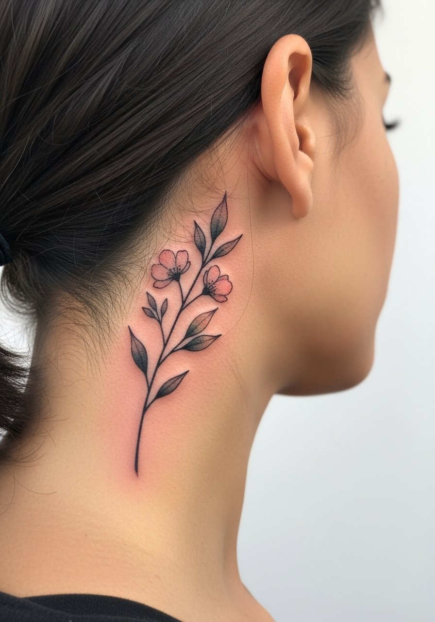
Behind-the-ear placements require a precise, small black spine so the wash retains shape in a tiny footprint. Pain is low but the area can be awkward for the artist, making steady handwork essential. Avoid asking for sprawling washes that rely on large canvas area; they do not translate here. Note that behind-the-ear work needs careful placement relative to hairlines and growth. For showing it off choose hairstyles that tuck behind the ear or simple studs that do not compete for attention.
17. High-Contrast Watercolor Elbow Halo
Elbow tattoos face a high blowout risk if linework is too tight near the joint, so bold, simple shapes with spaced washes work best. The session can feel rough because the area sits over bone, so expect quick passes and breaks. A mistake is insisting on intricate detail directly over the joint where skin movement blurs the work. For the session wear loose drawstring pants so you can move without forcing fabric against the fresh ink. Plan on a follow-up touch-up to refine any early spreading.
18. Watercolor High-Contrast Calf Sleeve Finish
A calf sleeve can carry large, saturated washes because it avoids constant friction and gets less sun than forearms. Sessions may be long and require good circulation breaks. The mistake is combining tiny fine-line elements with broad washes without a unifying dark structure, which makes the piece read disjointed after healing. For showing it off, pair with sporty slide sandals that keep the calf visible and let the color pop against neutral footwear.
19. High-Contrast Watercolor Chest Cluster

Chest clusters that combine deep blacks with translucent color keep composition readable as the pigment settles. Pain varies but expect sensitivity near the collarbones and sternum. The error I see most is asking for very pale washes without clear anchors, which makes the piece look patchy once healed. For the session wear a wide-neck shirt you can pull aside and discuss how visible you want the piece for professional settings.
20. Watercolor High-Contrast Minimalist Anklet
Anklet tattoos must deal with shoe and sock friction, so a clear black perimeter keeps the wash from blurring. Pain is low but the area can be temperamental because of constant movement. A common mistake is asking for diffuse color that will be rubbed away during walking and shoe wear. For showing the piece off, choose minimalist sandals that keep the ankle exposed and reduce rubbing. Expect to refresh fine gaps within two years.
21. High-Contrast Watercolor Sternum Script Pairing
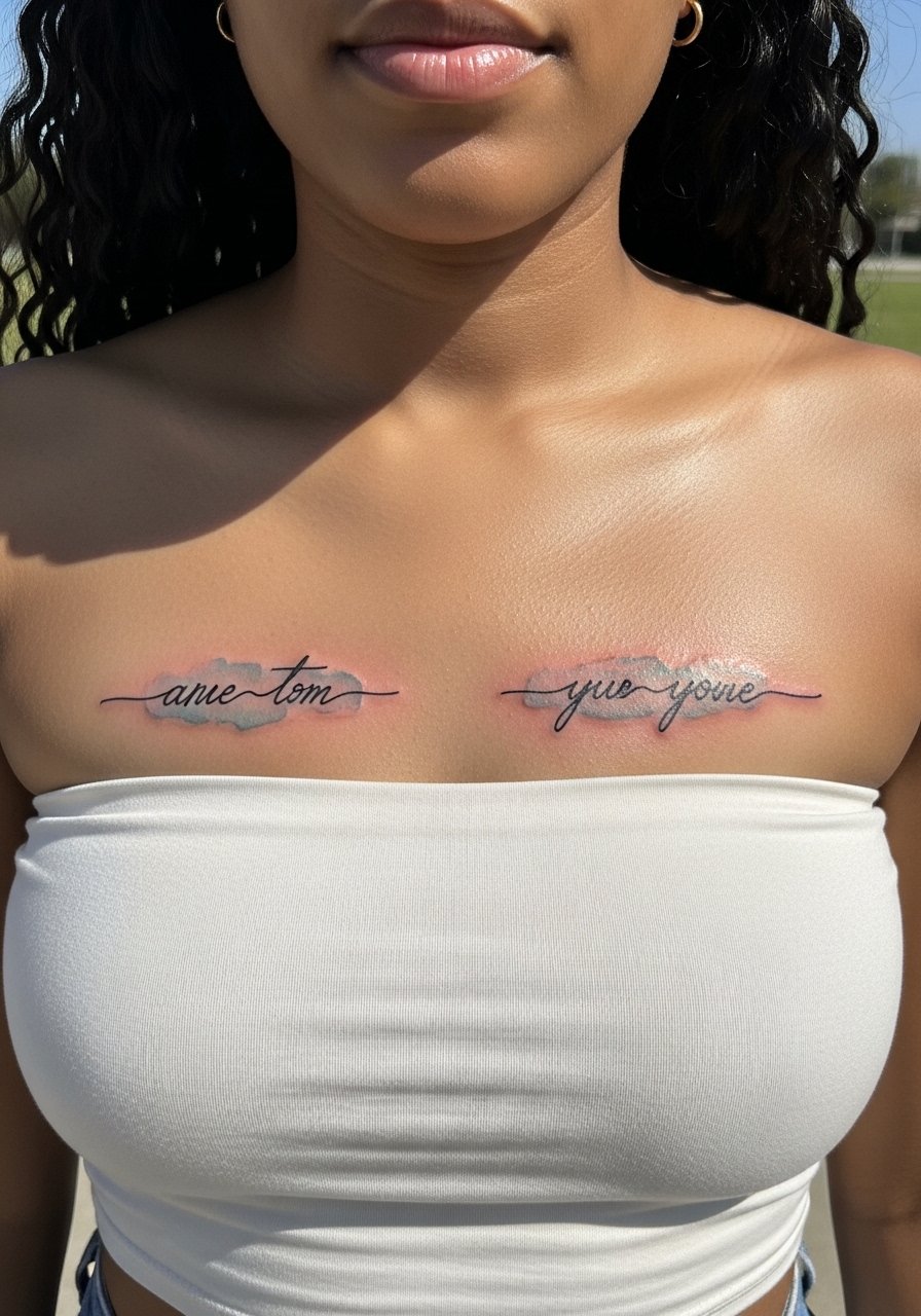
Paired scripts across the sternum need crisp black lettering so the phrase remains readable as color fades. Sessions are intense and may require short passes to manage swelling. A mistake is requesting faint washes that compete with the contours of the chest; it makes reading the phrase harder over time. For session comfort wear a bandeau or fitted sports bra that gives access without being cumbersome. Discuss whether you want the piece visible in low-cut tops ahead of time.
22. Watercolor High-Contrast Hip Bloom

Hip placements are flattering for larger washes because they stay mostly covered and avoid sun. Pain varies by individual but is often moderate. A common error is choosing colors that echo nearby clothing dyes, which can look muddy when you wear certain fabrics. For the session wear high-waisted denim you can shift so the artist has clear, stable access without pulling fabric over the site. Expect a softening of washes around six months then gradual stabilization.
23. High-Contrast Watercolor Wrist Constellation
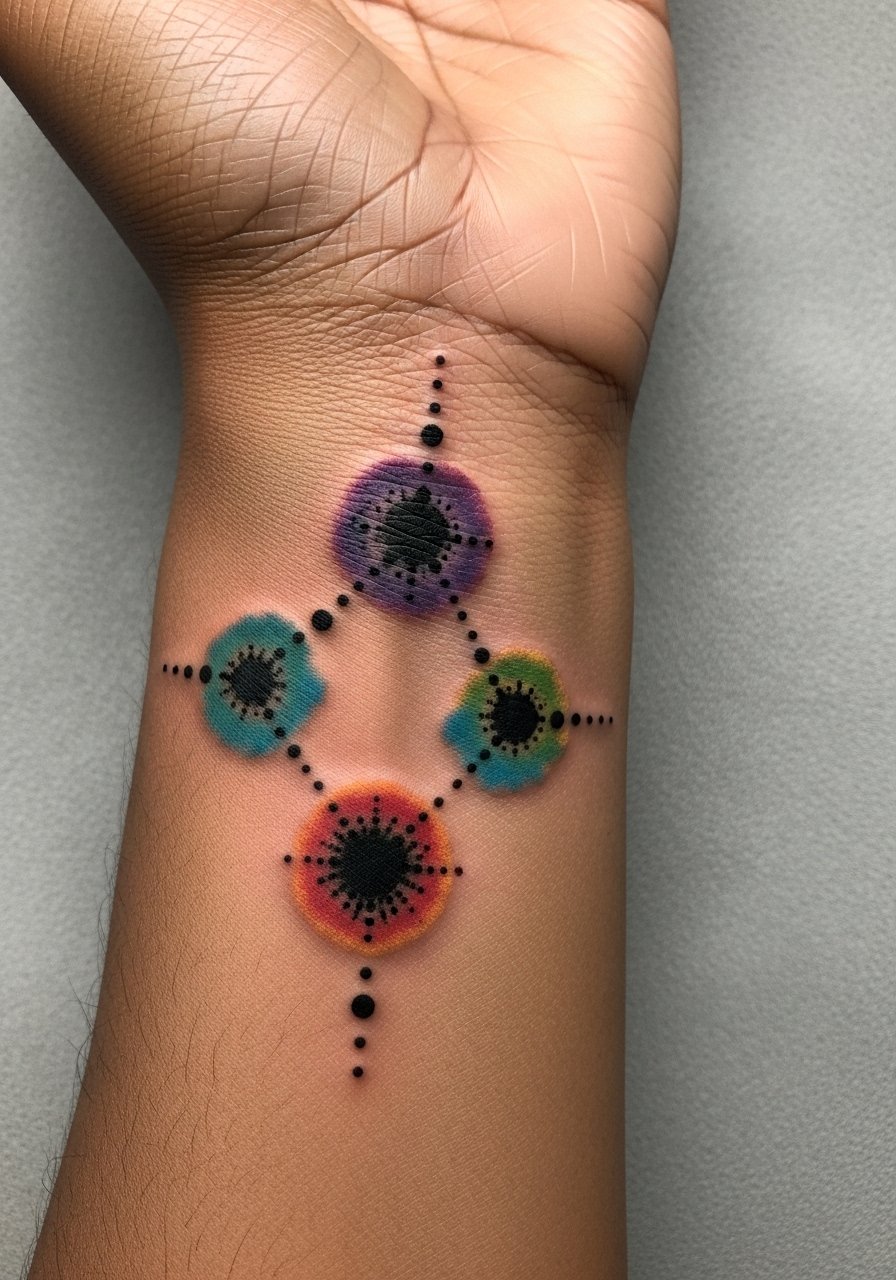
Constellation designs on the wrist need precise black dot anchors so the stars keep their shape as the halo washes fade. The wrist takes repeated contact and washing, so expect edge loss unless lines are deliberate and bold. A common mistake is faint halos without structural dots, which become indistinct quickly. For showing it off match with a thin chain pendant necklace that frames the wrist without crowding the field. Plan for a minor touch-up in year one for spot sharpening.
24. Watercolor High-Contrast Upper Thigh Script

Upper thigh pieces carry color well under clothing and allow for larger, painterly washes with strong black scripts to keep legibility. Pain is lower for many people and sessions can be longer. The typical mistake is expecting ultra-delicate washes to stay intact under tight clothing; choose a darker anchor instead. For the session wear loose shorts you can shift and avoid compression garments right after. Touch-ups are less frequent here because the area avoids constant abrasion.
25. High-Contrast Watercolor Nape Motif
Nape tattoos can be cropped and subtle, but they need crisp black anchors to keep shape as hair and collars rub the area. Pain is moderate and sessions are often quick. The main mistake is choosing pale washes that blend into shadows cast by hair. For the appointment wear a turtleneck or wide-neck sweater you can pull down to allow access without full exposure. Discuss visibility preferences if your job has dress policies.
26. Watercolor High-Contrast Clavicle Geometric
Clavicle geometry holds up when a solid black structure defines the shapes and the colors sit inside without bleeding. Expect sensitivity near bone and a session that may be interrupted for breaks. A mistake is packing too many tiny shapes close to the collarbone, which can blur into a single mass over time. For session ease wear a wide-neck top you can pull aside and ask your artist about spacing that favors longevity.
27. High-Contrast Watercolor Full Back Wash Accent

Full back watercolor that uses dark graphic shapes to hold large washes is one of the most durable ways to wear this aesthetic. Sessions are long and often split into multiple appointments to avoid overworking the skin. People sometimes pick heavy, competing colors without a unifying black structure, which makes the image fall apart as pigment migrates. For the session wear a loose button-down or robe that is easy to move without tugging the area. Expect the washes to mellow dramatically in the first six months then settle into a soft presence.
Frequently Asked Questions
Q: How does a watercolor high contrast tattoo age compared with solid traditional work?
A: Watercolor high contrast tattoos age more like hybrids. The dark linework or black anchors behave like traditional work and hold shape, while the washes fade faster. Expect the washes to soften noticeably by year two, and plan touch-ups for color if you want the original saturation back.
Q: Will a watercolor high contrast piece on the ribs last if I exercise a lot?
A: It depends on movement and stretching patterns. Ribs see a lot of expansion and contraction, which can blur fine lines faster. If you exercise a lot, ask for more spacing and stronger black anchors so the washes have room to fade but the form stays readable.
Q: Are there placement choices I should avoid for high-contrast watercolor if I want low maintenance?
A: Yes. Hands, fingers, and high-friction ankles need frequent refreshes. Forearms, upper back, and thighs typically require less maintenance because they avoid constant abrasion and daily sun exposure. Choose placement based on how much upkeep you want to accept.
Q: How should I dress on session day for a sternum or ribcage watercolor tattoo?
A: Wear a fitted sports bra or a bandeau that gives the artist access without exposing more than necessary. A zip-front hoodie also works if you need coverage post-session and want minimal fabric movement during the work.
Q: Should I ask my artist about their healed photos or portfolios when booking a watercolor high contrast piece?
A: Yes. Look specifically for healed photos that show both the black anchors and the color washes after months or years. That gives you a realistic sense of how their technique translates to longevity and how touch-ups might look later.
