
Fine line and sketch-style spine quotes look effortless in photos, but what holds up over time depends on spacing, line weight, and placement more than on how pretty the stencil appears on screen. The sketch approach asks for movement in the lettering, and that movement needs room to breathe along the spine so letters do not blur together with time. Read on for 21 quote placements and practical notes to bring one into real life.
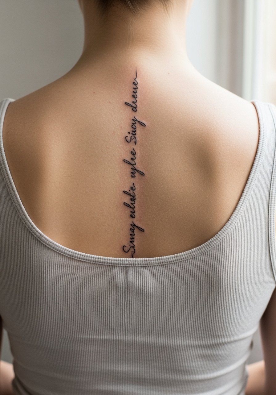
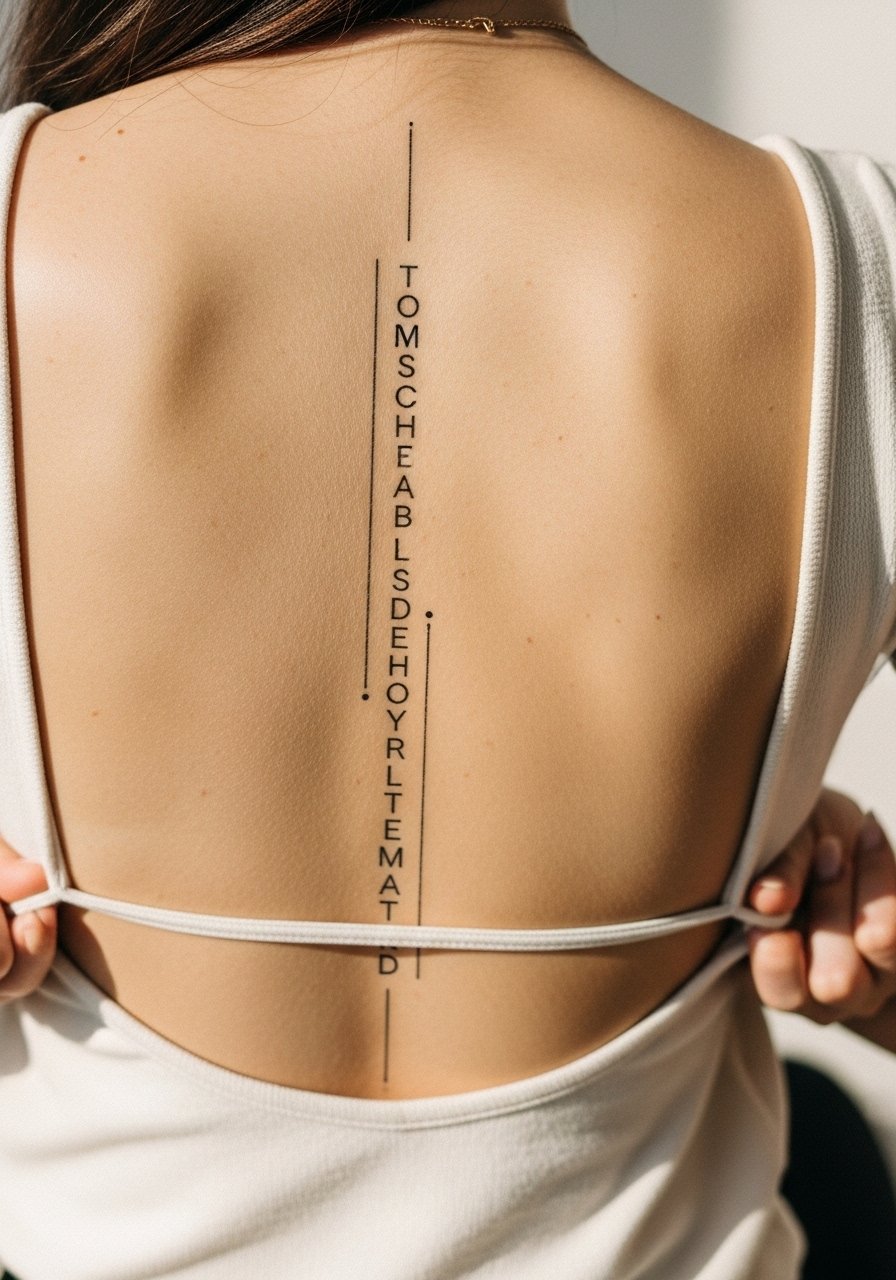
1. Single-Word Script Running Down the Upper Spine
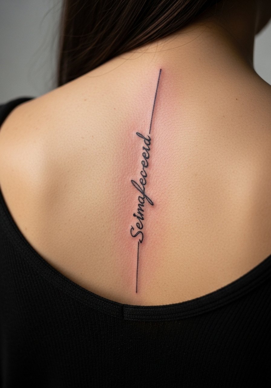
I've seen single-word spine pieces survive years when they are spaced like tiny pillars rather than a continuous thin line. Ask your artist for slightly heavier primary strokes with sketchy hairlines around them, not a single whisper of ink. Fair warning, the mid-back sits at a moderate pain level, and long thin letters can blur if they are too close together. During consultation, say you want clear separations between letters and a touch-up allowance at year two. For showing it off, an open-back midi dress frames the vertical script without covering it and keeps the silhouette clean.
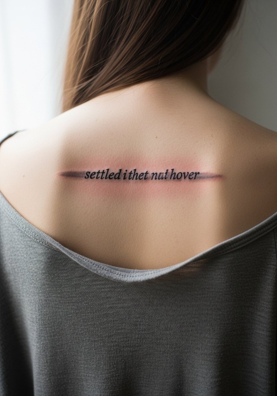
2. Two-Line Quote With Uneven Baseline
Most people want everything perfectly straight, but a purposely uneven baseline makes the quote read like handwriting pulled from a sketchbook. When you sit with your artist, show examples that emphasize organic baseline shifts and ask for spacing that preserves breath between lines. The session feels longer because the artist will reposition often to keep the flow centered on the spine. A common mistake is squashing two lines into the same vertical space, which causes merging after a couple of years. For outfit pairing, a backless halter top highlights the irregular linework without distraction.
3. Short Latin Phrase in Script and Dot Work
There is a debate about script plus dot work on spine pieces. One camp says the dots anchor the lettering and age well. The other camp warns that too many tiny dots near script create a stipple that fills in. State both concerns in the consult and ask for dots placed at least a few millimeters from thin strokes. Expect a mid-level pain experience when the needle moves across the rib-adjacent spine. Tell the artist you want stronger primary strokes and lighter stipple so touch-ups at year three are minimal. For show-off looks, a simple racerback tank leaves space for the phrase to breathe.
4. Multi-Language Line With Sketch Flourishes
When you mix scripts or languages on the spine, the risk is visual crowding. The design works best when you choose one dominant script weight and let the secondary language sit lighter and higher on the vertebrae. Tell the artist which language should anchor the piece. A mistake I see is making both scripts equally thin. That causes the two to blur together in a few years. The session will include frequent stencil checks so the vertical alignment stays true. For evenings out, pair this with a low-back wrap dress to keep attention on the flow without competing jewelry.
5. Quote With Sketchy Illustrative Marks
Adding tiny sketch illustrations around a spine quote can give it an editorial look. Recommend to your artist that the imagery use stipple or light whip shading rather than dense saturation. Dense shading next to thin script is a common error because the heavier ink will age differently and draw attention away from the words. The spine is a trickier canvas for touch-ups, so ask for a plan to revisit the shading after a year if needed. For daytime showing, a loose linen button-down worn open at the back keeps the sketch elements visible while staying casual.
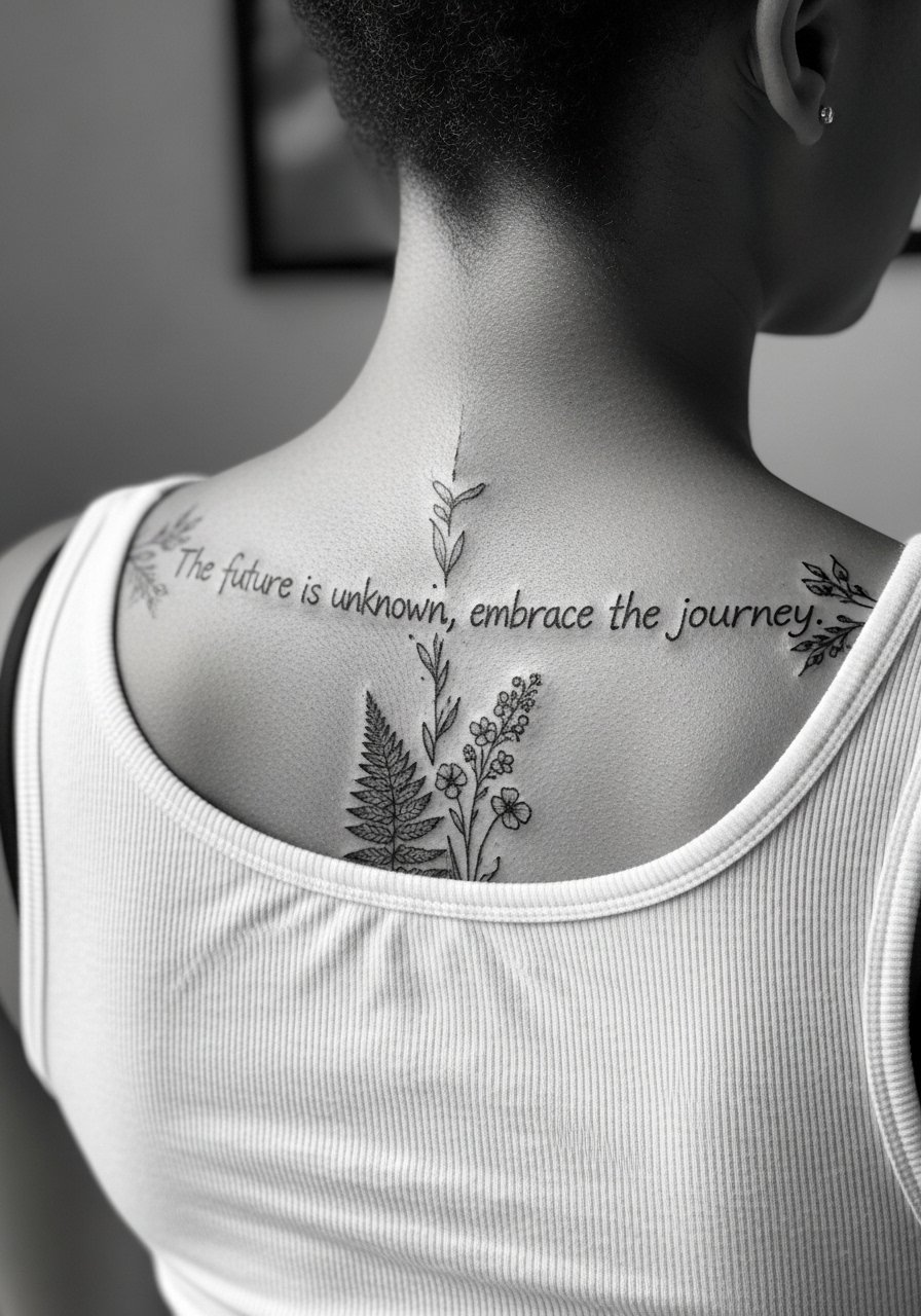
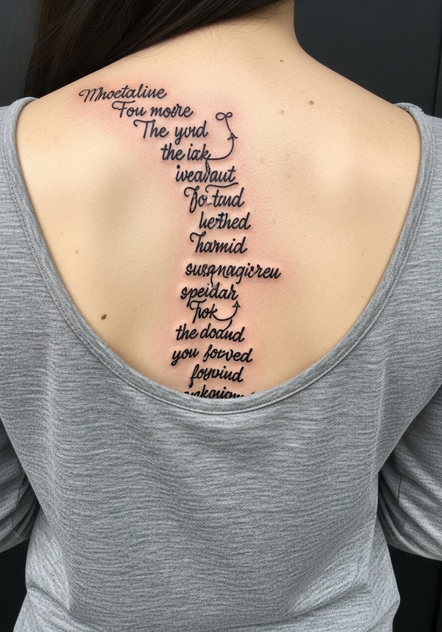
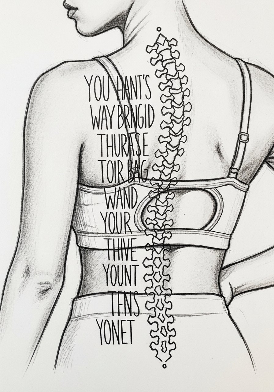
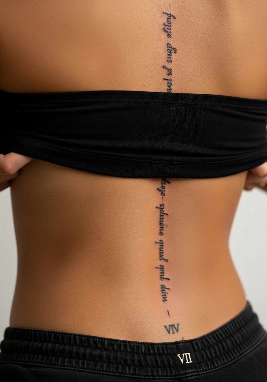
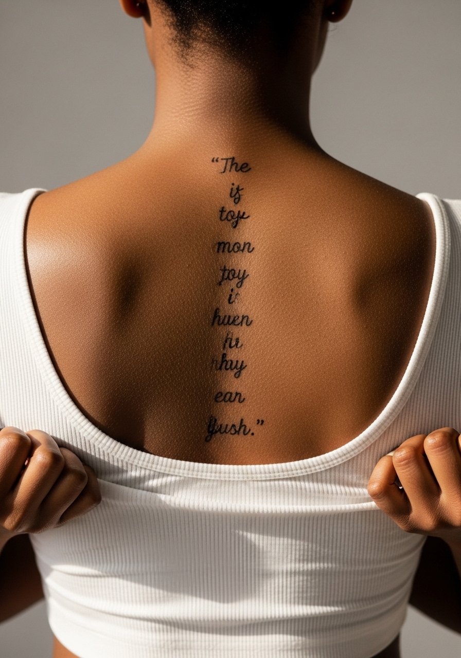
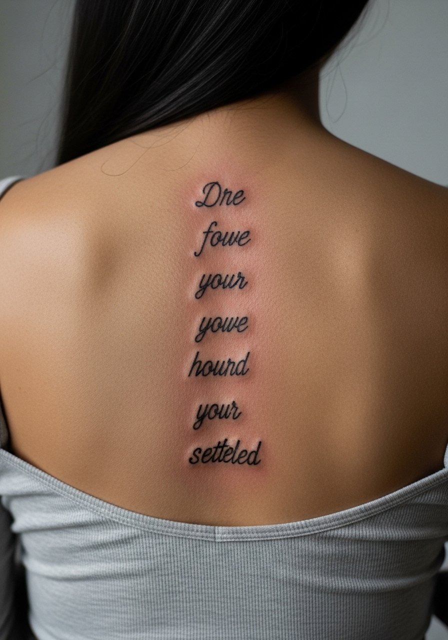
6. One-Sentence Quote From Collarbone To Tailbone
The longer the sentence, the more planning required. The biggest mistake is trying to cram a long line into a short span. When you bring reference, also bring a measured template so the artist can map vertebrae spacing. Pain will vary from mild at the top to sharper near the lower back. Expect the session to be staged across multiple sittings if the sentence covers most of the spine. For wardrobe, pair the long vertical with an open-back midi dress to let the entire line read clearly.
Studio Day Picks
The quote and sketch combos above include upper, mid, and lower spine work, and prepping for each zone requires slightly different items.
-
Stencil transfer paper kit. Lets you preview placement on skin so long quotes and uneven baselines sit where you expect them.
-
Topical numbing cream. Useful for lower back passages where sensitivity spikes, applied per artist guidance.
-
Thin protective film roll. Helps protect the mid-spine area from shirt friction during the first week.
-
Fragrance-free body wash. Cleans the tattooed zone without irritating thin script lines that need gentle handling.
-
Aquaphor healing ointment. Thin layer in the initial days locks in moisture for delicate lettering without suffocating the skin.
7. Two-Word Command in Heavy Sketch Script
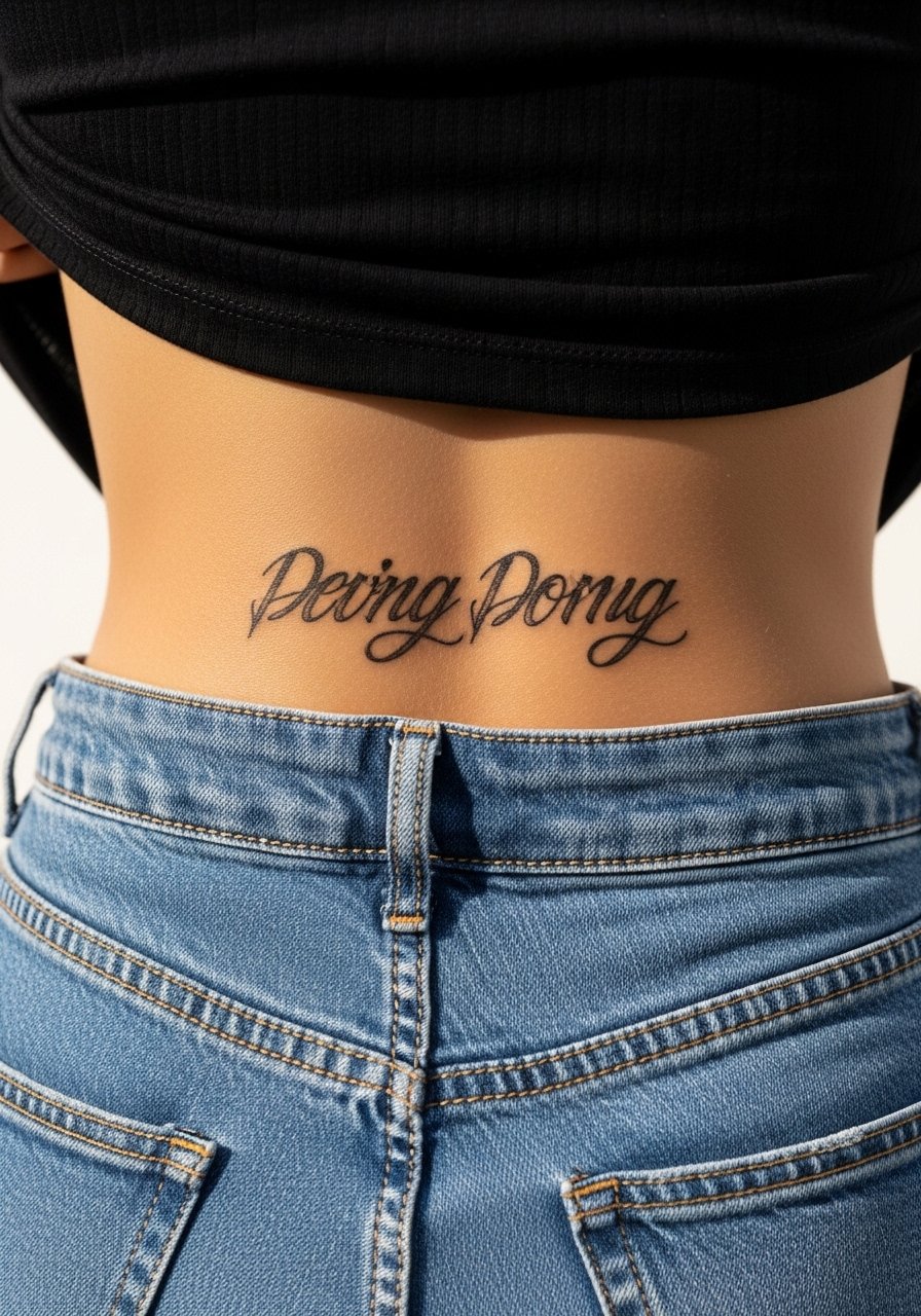
Personal observation: two-word statements can read louder than long sentences when placed down the lower spine. Ask your artist for heavier anchor strokes and sketchy tails, not full black fills. Expect the lower spine to be more painful when the needle crosses bony areas. A common aging issue is when artists make the inner strokes too thin, which disappears first. Tell the artist you want touch-up lines thicker than you think necessary. For showing off, a high-waisted midi skirt and cropped top creates a natural frame for the lower vertical.
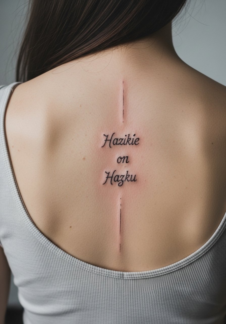
8. Split Quote Framing the Spine
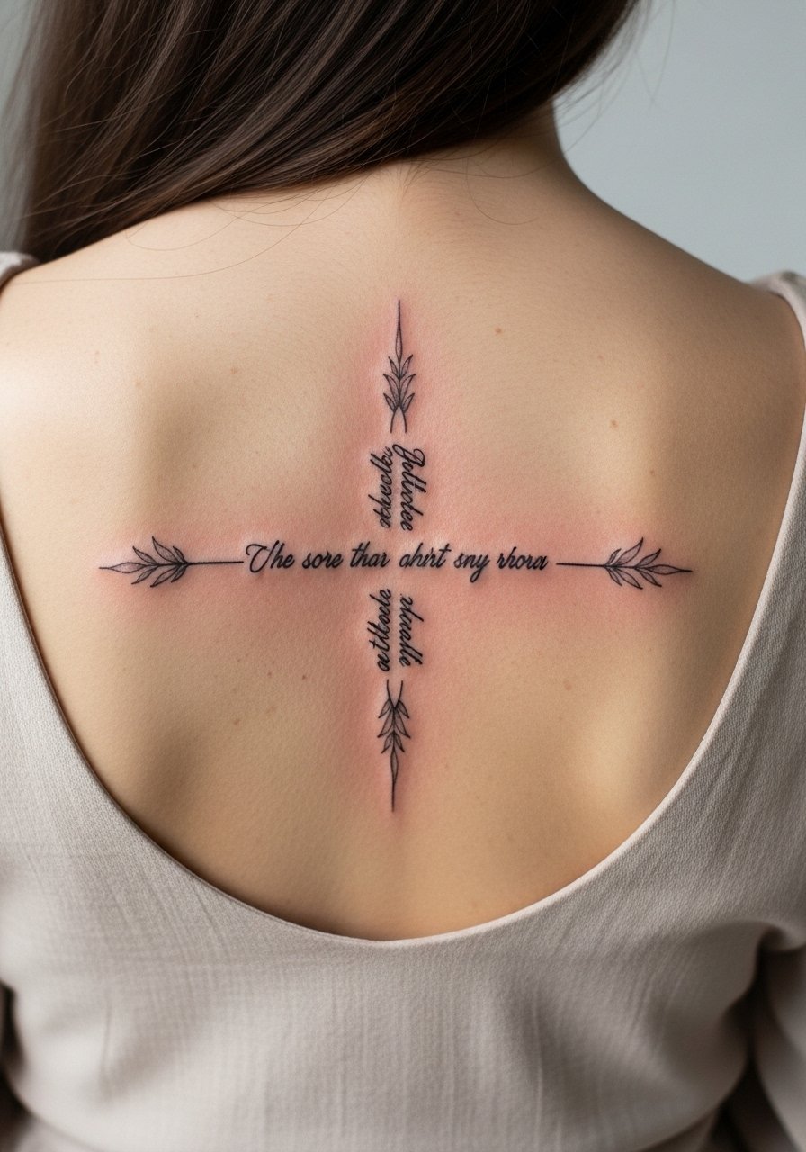
A visual impact lead works for mirror quotes. This layout places two halves on each side of the spine and makes the center a negative space. When you consult, request symmetrical balance rather than identical letter shapes on both sides. The mistake people make is insisting on exact mirroring, which looks mechanical when healed. The session will require frequent checking of symmetry on both sides of each vertebra. For a night out, an open-back blouse reveals just the mirrored composition and keeps jewelry from crowding the lines.
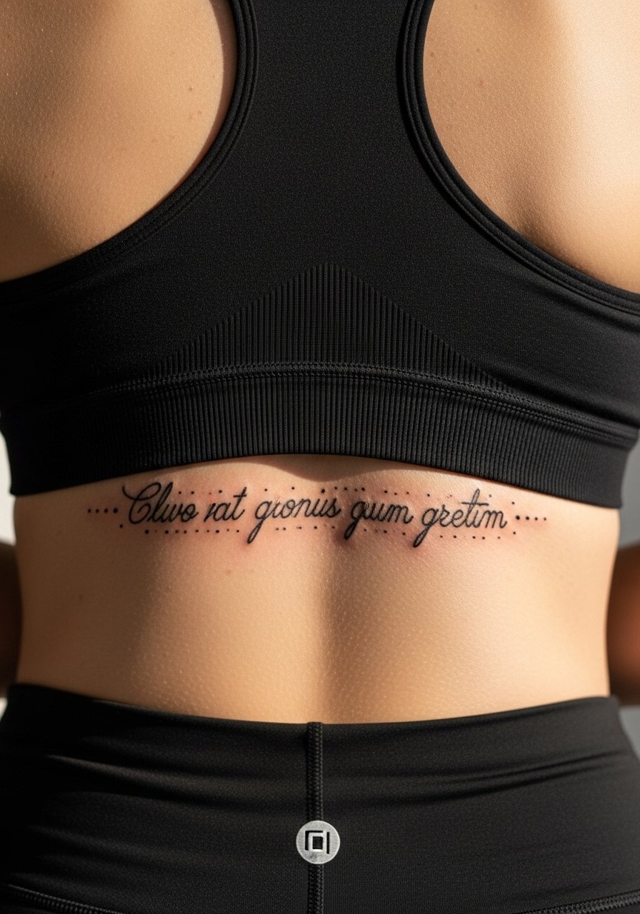
9. Tiny Lower-Spine Script Hidden Under Waistline
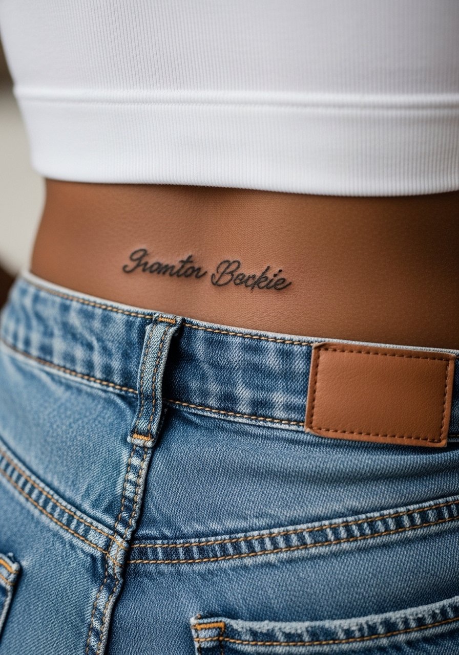
Fair warning: tiny scripts placed just above the waistband face constant friction from clothing. I advise stronger primary strokes than you might expect and a plan for touch-up after a year. Tell the artist you want the letters compact but with clear negative space around each character. The session is quick but rather sensitive because of the low-back nervous tissue. For session comfort bring a pair of high-waisted jeans and a loose crop top so you can expose the exact strip of skin without feeling cold.
10. Curved Quote Following the Natural Spine Arc
When a phrase follows the spine arc, it reads more bodily and intimate. The consultation should include a live stencil check while you stand and bend so the curve sits naturally. The mistake many make is asking for a straight baseline on a curved canvas. Expect a slightly longer session because the artist must redraw and re-center the stencil in different positions. For showing it off consider a scoop-back top that curves with the ink and avoids crossing the letters with straps.
11. Single-Word All Caps With Sketchy Edges
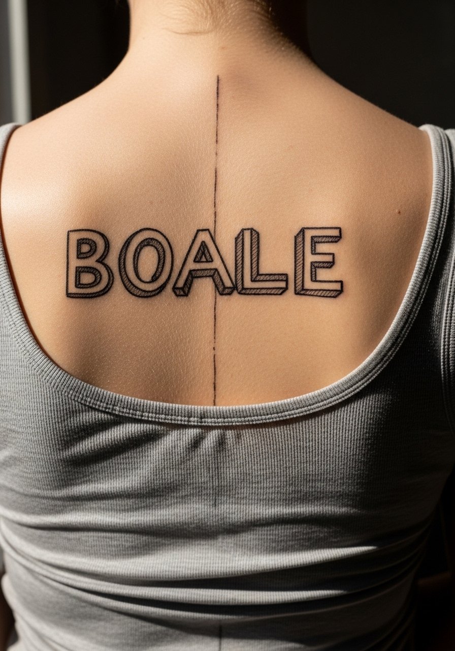
Visual impact lead: all caps demand authority. The risk is heavy caps on spine that look blocky after settling. Ask for a balanced approach where primary strokes carry weight and the sketchy edges remain delicate. The spine accepts heavier work well, but be mindful of blowout risk in lower midline zones. Ask the artist about their experience with all caps in vertical placements and request a touch-up plan in the invoice. Pair this with a loose button-down shirt worn open at the back so the caps are on display without competition.
12. Script Quote With Crossed-Out Lines for Emphasis
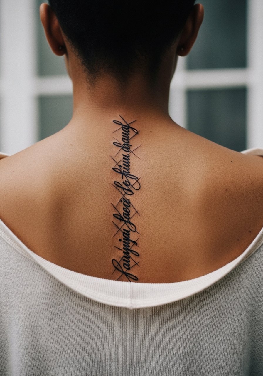
Consultation lead: crossed-out lines are a stylistic choice that reads as drafts on skin. During the consult, show examples of how much of the word you want obscured. The controversy here is whether crossing out counts as damage or as honest sketching. One camp sees it as expressive and modern. The other worries the extra ink causes the area to fill in faster. Say your preference and request test strokes at different opacities. For wardrobe, a wide-neck sweater pulled slightly to the side frames the upper spine without covering the layered marks.
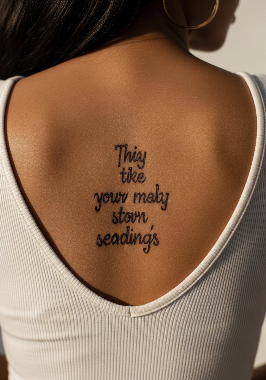
13. Minimalist Quote With Negative Space Lettering
Aging and healing lead: negative space lettering can look crisp if the surrounding ink is applied consistently. The trick is asking for slightly bolder outer strokes so the carved-out letters remain visible as the skin changes. A common mistake is making the surrounding ink too thin, which causes the negative letters to vanish over time. Expect a steady session since the artist will need precise depth control. For showing off, a backless strappy top keeps the negative space readable and simple.
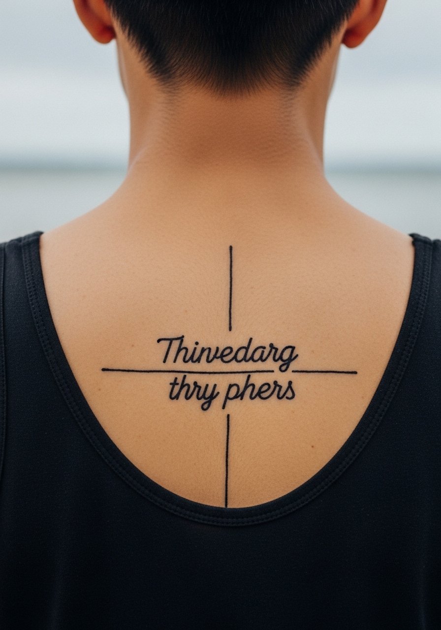
14. Quote Interlaced With Tiny Geometric Marks
Mistake lead: too many geometric marks near a delicate script create visual noise that ages unevenly. When you consult, specify which marks are primary anchors and which are decorative. The session will be detail-heavy and may be split to maintain crispness. Blowout risk rises if tiny geometric pieces sit directly over bony ridges, so ask for slightly softer placement over muscles. For daytime looks, a sports bra with thin straps reveals the interlaced details without distraction.
15. Handwritten Quote That Mimics Your Own Pen
Consultation lead: bringing a handwriting sample changes everything. Ask the artist to transcribe your sample into a vertical layout and to show a stencil before ink. The mistake I see is forcing a handwriting sample that is too dense for vertical spacing. Expect a slow session because the artist may redraw the script several times to match the spine flow. For showing it off, pair with a backless evening top that lets the script feel intimate and personal.
16. Short Quote With Light Brushstroke Shading
Personal observation: brushstroke shading gives a phrase a painterly finish without heavy saturation. Tell your artist you want the shading faint, more atmosphere than block. The mistake is asking for dense brushstrokes next to thin script. That mismatch can speed aging of the shaded areas. Pain is moderate and the shading requires a softer pass that extends the chair time. For outfits, a racerback dress reveals a hint of shading without covering the quote.
17. Short Quote in Script With Roman Numerals Accent
Controversy lead: adding numerals introduces a practical angle. One group likes numerals for dates because they age predictably. The other group warns small numerals can blur into tick marks. Be explicit about font weight for the numerals and ask for slight spacing around them. The session is quick for the small addition, but the artist must place the numerals off any high-friction zones. For showing the pairing, a thin chain pendant necklace sits above the script without competing.
18. Fractured Quote With Intentional Gaps
Mistake lead: gaps can be powerful, but if they are too close the negative space fills and the design loses rhythm. When you consult, mark the exact gaps on the stencil and ask the artist to mirror them on the body while you move. The session will involve frequent posture checks so the gap rhythm reads well standing and sitting. For clothing, a scoop-back tee keeps the negative spaces readable and intentional.
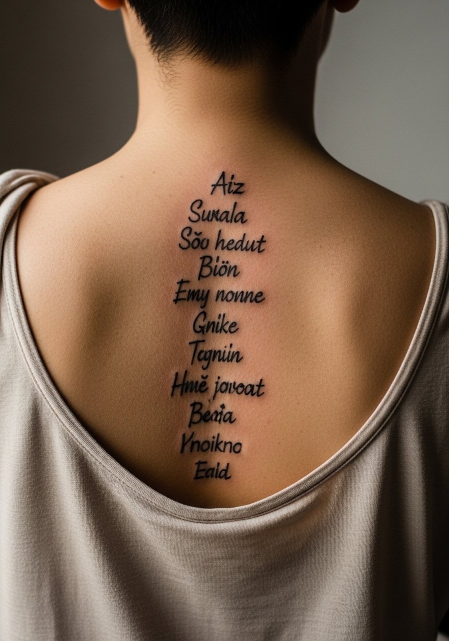
19. Vertical Haiku With Sketchy Line Endings
Aging lead: short staggered lines age differently than continuous script. Tell your artist you want each line to hold as a unit with small breathing space above and below. The mistake is stacking lines too close, which makes them read as a single block after a few years. The session is tidy but requires precise mapping every time you change posture. For showing off, an open-back tank displays the haiku without interruption.
20. Quote Integrated With Spine Anatomy Sketch
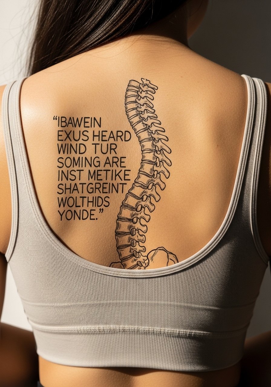
Styling lead: integrating anatomy draws eyes to both word and form. Clarify with the artist whether the anatomical lines are decorative or educational. One camp loves the honesty of an anatomical line, the other worries it turns a quote into a diagram. If you choose integration, ask for lighter bone lines and stronger script strokes. The session can be longer because the composition must respect vertebrae landmarks. For casual wear, a fitted sports bra reveals the piece cleanly and keeps straps from breaking the composition.
21. Short Affirmation With Subtle Shading Halo
Consultation lead: halos can give a quote presence without heavy ink. Ask for the halo to be feathered and pale, more suggestion than fill. A mistake I see is asking for a halo as a blunt shade, which will age into a messy edge. The session is comfortable for short phrases, but shading demands a separate pass if you want subtlety. For evenings, a backless evening dress keeps the halo readable and lets the affirmation hover visually.
Frequently Asked Questions
Q: Will fine sketch script blur on the spine faster than bold text?
A: It depends on spacing and line weight. Fine sketch script can blur sooner if letters sit too close or the strokes are too whisper thin. Ask for stronger anchor strokes and clear negative space during your consult, and expect a possible touch-up around year two to three.
Q: How should I dress for a long session that covers most of my spine?
A: Wear layers that let you expose the exact strip of spine without being cold. A good option is a loose button-down shirt you can pull aside or a tank plus a zip hoodie you can remove. Comfort and easy access beat style during the chair time.
Q: Are spine quotes riskier for blowout than forearm script?
A: The spine crosses bony ridges and variable tissue, so blowout risk changes by exact location. Mid and lower spine near muscle handles well. Close to vertebrae there is slightly higher risk. Ask the artist about their technique for bony areas and plan for touch-ups rather than expecting a one-and-done result.
Q: Can religious or culturally specific phrases be used as sketch quotes?
A: You should be mindful. Some phrases and symbols have cultural origin and meaning. A common approach is to adapt elements respectfully rather than copying sacred scripts directly. Discuss provenance with your artist and choose wording and styling that honors the source.
Q: How often will I need touch-ups for a spine script done in a sketch style?
A: From what I have seen, many sketch-style spine pieces benefit from a light touch-up around year two to three, depending on sun exposure, clothing friction, and initial line weight. Planning a maintenance check is sensible, especially if you want the lettering to remain crisp.
