
Fine line hand pieces look gorgeous on saved boards. The reality is they behave differently in real life after months of handwashing and sanitizer. Trends show celestial and micro designs everywhere, but what holds up depends on placement, line weight, and how you plan for touch-ups. Read these compact ideas with practical notes on aging, what to ask your artist, and simple wardrobe tips that actually help a small hand design stay readable.
1. Fine Line Lotus on the Side of the Hand
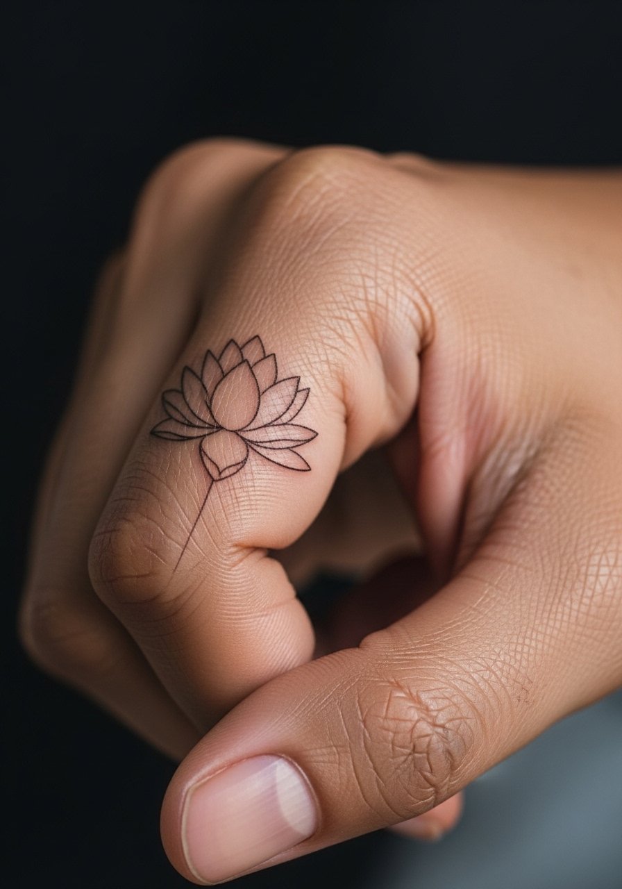
I open with this because the lotus reads delicate without demanding tiny dots that blur. Expect a medium pain level near the bone, and a single session under an hour. Tell your artist you want slightly heavier main stems and airier petal interiors so the outline keeps definition after healing. A common mistake is asking for ultra-single-needle shading across many petals, which often softens into a wash. Plan a touch-up around year one for hands. For showing it off, stack thin silver rings on other fingers and pair with neutral nude nail polish to keep the focus on the motif.
2. Swirly Leaf Outline on the Lower Finger
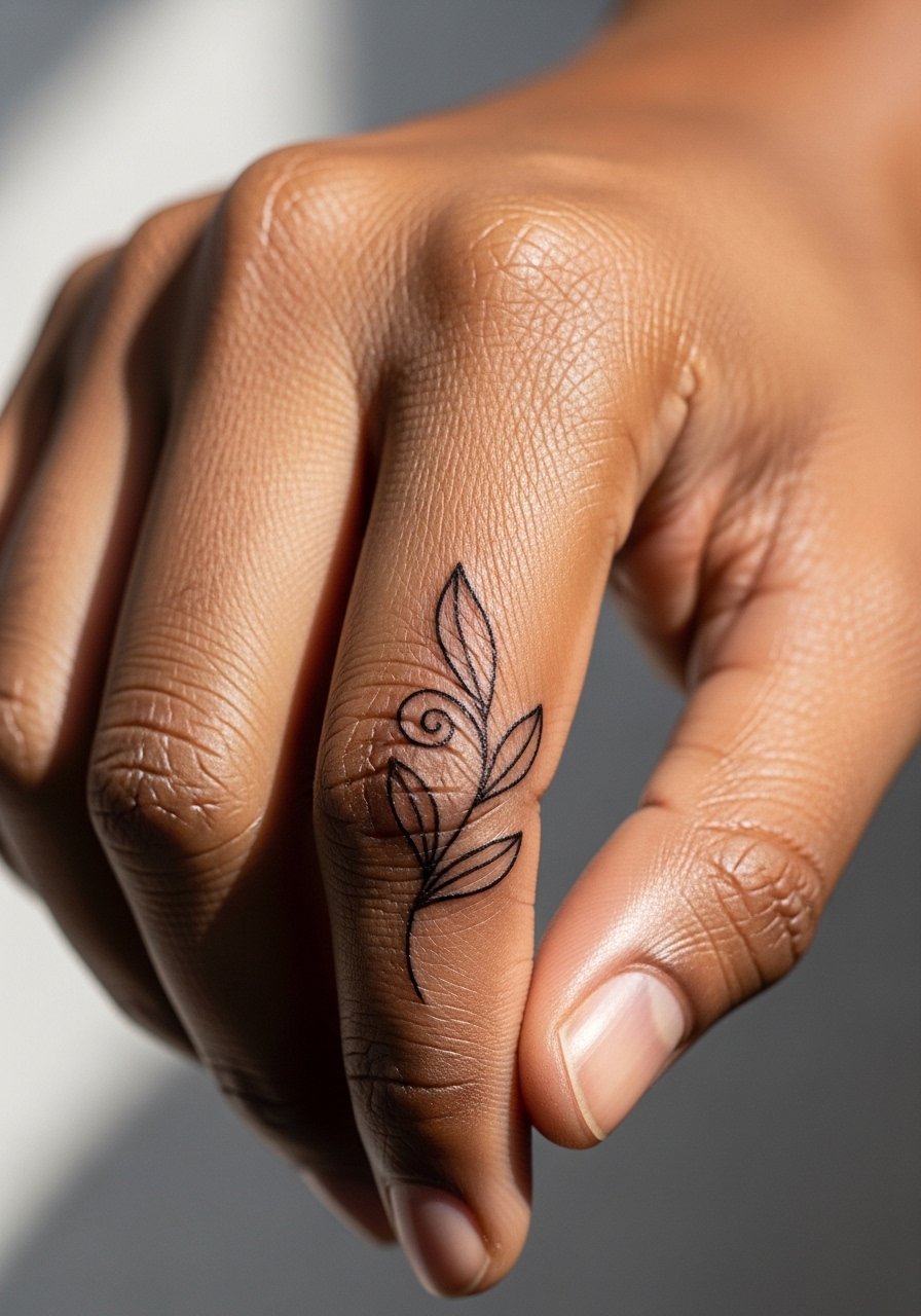
Fair warning: fingers change with swelling and daily motion. I prefer slightly bolder single strokes here so the ring-like design survives frequent washing. During consultation, ask for continuous flow across the curve instead of disconnected little lines. The session feels quick but sharp on the bone, so expect a twinge rather than a long burn. Avoid tiny internal details that will fuse over time. For an everyday look, pair this with a thin silver ring stack on the index finger and keep polish minimal to prevent visual clutter.
3. Geometric Dot Cluster on the Back of the Hand
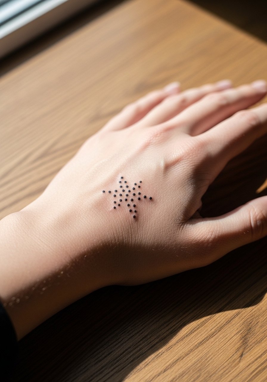
Most people love this for balance across knuckles and the hand contour. Ask for slightly wider spacing between dense dot areas so the stipple shading does not merge in two to three years. The back of the hand takes direct sunlight more often, so expect gradual softening of tiny dots. A common mistake is stacking dots too tightly when the goal was airy symmetry. This placement pairs well with a chunky cuff bracelet to draw the eye down, try a chunky cuff bracelet when you want to emphasize the geometry.
4. Minimalist Script "joy" on the Finger Side
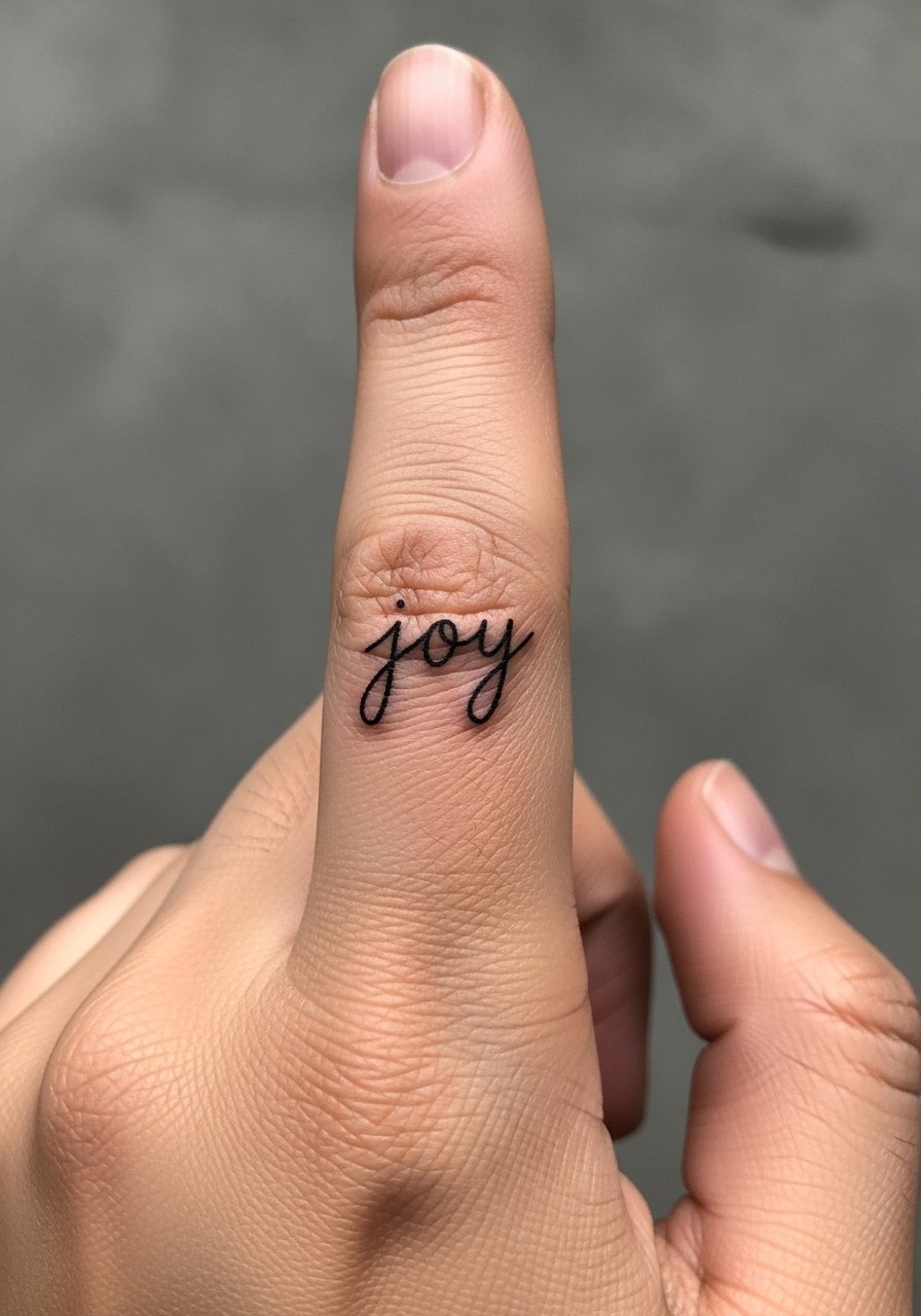
The trick to script on a finger side is height and spacing. Tell your artist you want 0.5 inch letter height and slightly heavier downstrokes so letters keep shape when the skin shifts. Expect sharp needle contact and a short session, but note that frequent hand use accelerates fading. A common regret is choosing an ornate script too small. Months later the word can look faint in photos, so plan a touch-up at 9 to 18 months. For session comfort, wear a shirt with short sleeves and no jewelry so the artist has clear access.
5. Crescent Moon on the Palm Edge
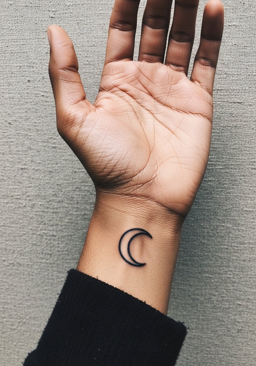
This placement follows the hand curve and reads organic. Pain is higher on the palm edge compared with the back of the hand, and the session is brief. Ask for a clean outline with gentle interior spacing so the curve keeps its arc as skin stretches. Many people go too small here and end up with a smudged curve after months of hand friction. For photos, hold an open palm pose while wearing a linen short sleeve shirt to frame the moon and keep attention on the curve.
6. Micro Ocean Wave on the Top Finger
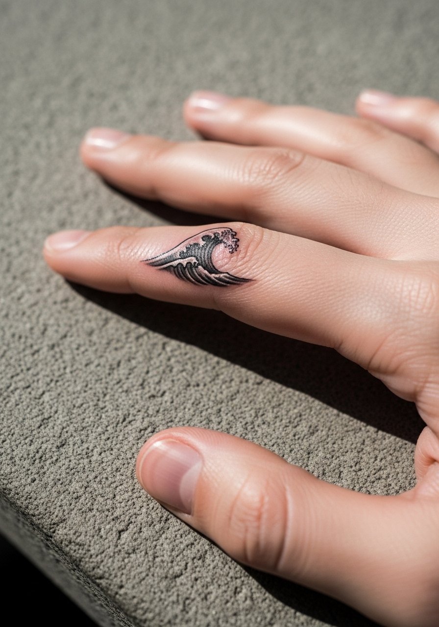
I've seen this design as a discreet nod to the beach that still reads in professional settings. The top-finger area hurts more than expected because the needle hits tendon zones, but sessions are very short. Ask your artist for a compact silhouette with minimal gray fill to prevent blur. The mistake is over-shading a piece this small. For casual wear, a minimalist watch on the opposite wrist keeps the design noticeable without hiding it behind rings.
Pre-Session Essentials
The palm, finger, and lower wrist placements above need small prep items to protect linework and reduce irritation during the first week.
-
Ink-Ich Tattoo Relief. Lightweight balm that community members recommend for itch and dryness on high-friction hand tattoos without leaving a heavy residue.
-
Tattopi Tattoo Balm. A breathable balm that can help hands avoid clogged pores during the first week for people with oilier skin types.
-
Rescuer Tattoo Salve. Antimicrobial salve useful for areas that get frequent contact and washing, like the thumb web and finger sides.
-
Dad Ink Aftercare Balm. A matte finish balm that reduces shiny residue on hand pieces, handy when you want healed photos without glare.
-
Hustle Butter Deluxe. Thinner than heavier ointments, this helps during the initial days for hand pieces without a greasy film that traps dirt.
7. Tiny Heart Outline on the Thumb Base
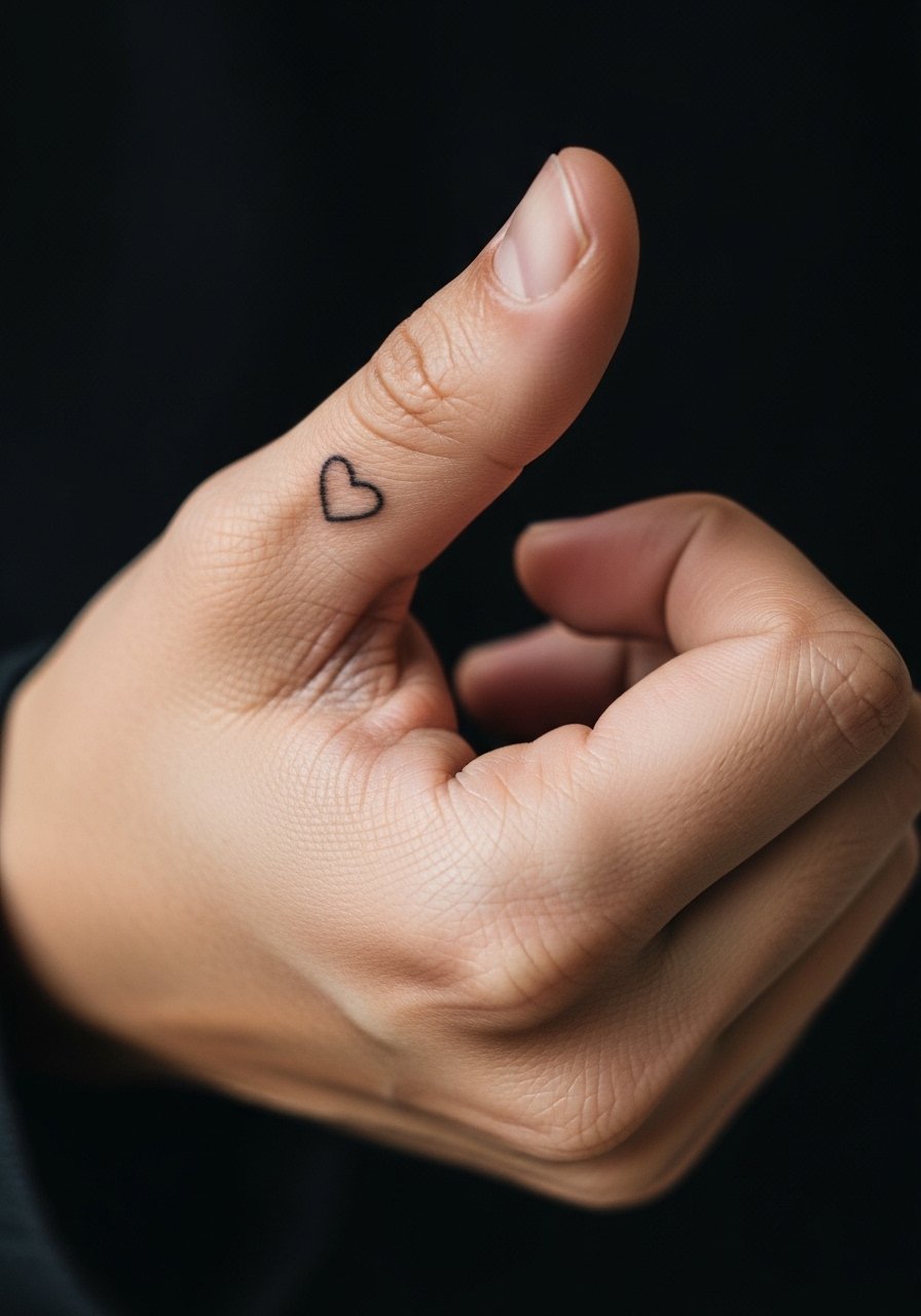
This spot is charming but surprisingly sensitive and functional. The session is short and the pain is sharp when the needle nears the web. Tell your artist you want the heart small and with a bolder outline rather than hairline strokes so it remains visible after regular use. A frequent error is picking a hairline heart that disappears under daily friction. For a tidy look, wear a minimalist leather watch on the opposite wrist to balance hand jewelry without crowding the thumb area.
8. Single Line Wave Across the Knuckles
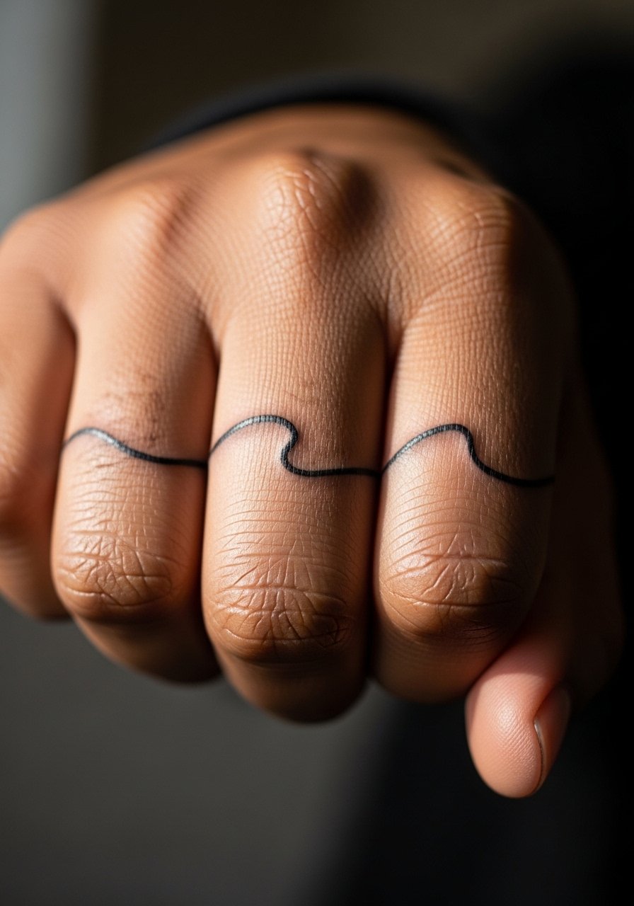
The knuckle ridge wants bold, confident strokes. Expect a higher pain level because the needle moves over bone in quick passes. The common mistake is breaking the wave into disconnected segments. Ask for a single fluid pass that follows the gesture of your hand. Overly tight spacing invites blowout as the ink spreads under constant motion. Pair this with fingerless leather gloves or a black leather jacket in cooler weather to enhance the edgy vibe without hiding the work.
9. Dotwork Mandala Fragment on the Palm Center

The palm center is a high-friction, high-saturation-loss area. Expect the piece to need more sessions and touch-ups than back-of-hand work. When you consult, request a fragment rather than a fully dense mandala so the negative space helps the dots breathe as they settle. Artists divide on whether palm dotwork keeps crispness long term. One camp believes dense stipple fades fast because the skin regenerates quickly, while the other says intentional spacing and saturation can make fragments last. If you work with your hands daily, plan for a touch-up around 6 to 12 months.
10. Fine Line Butterfly on the Finger Joint
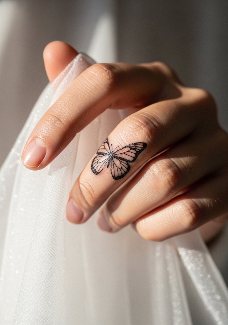
Most people love this for the transformation symbolism and delicate silhouette. The joint area changes with swelling and movement, so request a simplified wing structure with clear primary outlines. Tiny internal veins will blur over time. Pain is moderate and session time is short. Don't pick ultra-thin veins unless you are prepared for touch-ups. For events, sheer overlay gloves can frame the joint while keeping the tattoo visible; try a sheer mesh gloves look if you want to dress it up.
11. Minimal Star Constellation on the Back of the Hand
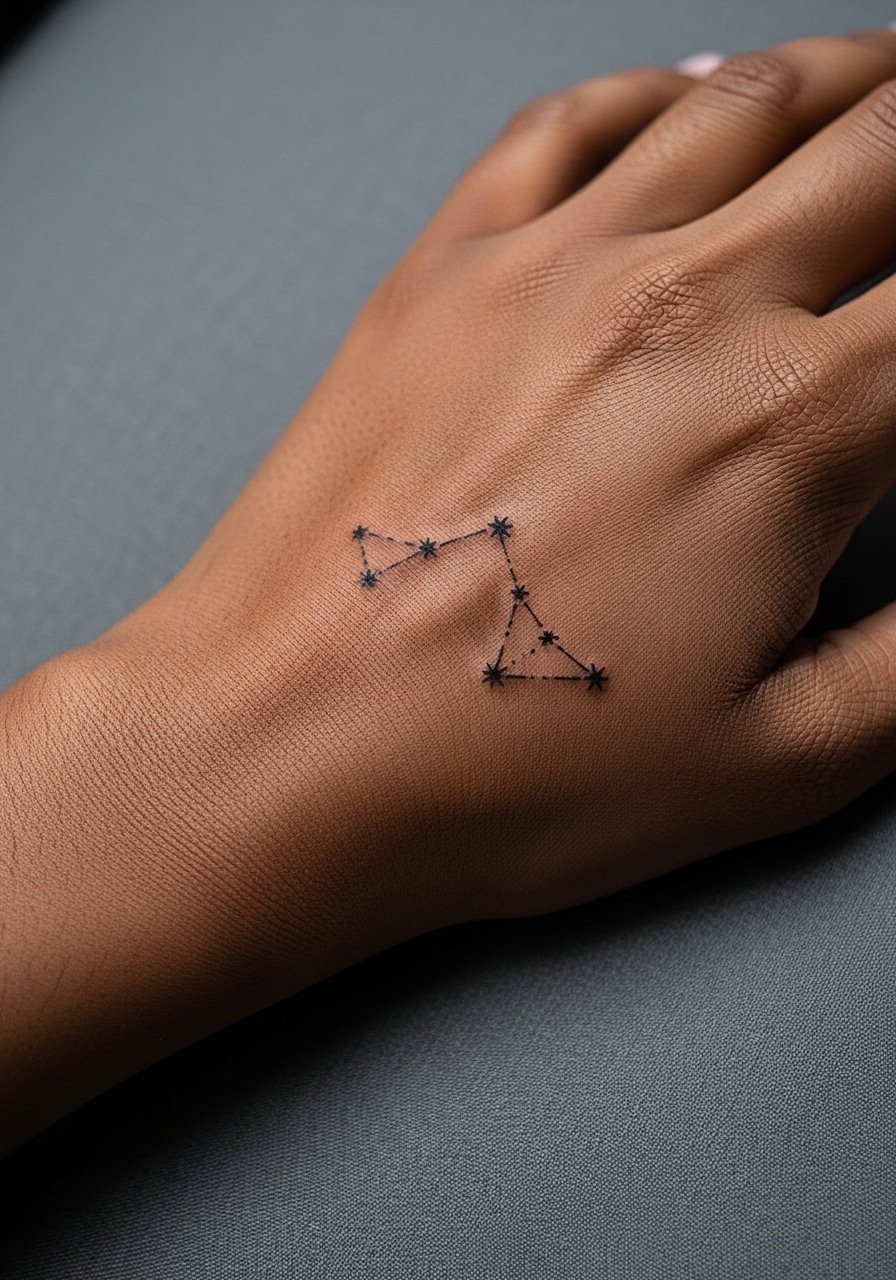
This style reads as a personal map and works when dots are spaced to avoid early merging. Ask for slightly larger star points and thin connector lines rather than micro-dots joined tightly. The back of the hand is exposed to sun, so expect gradual softening in exposed areas. A mistake is cramming a full constellation into a very small space. Pair it with a solid color crewneck tee to keep attention on the stars in casual settings.
12. Micro Geometric Ring on the Side Finger
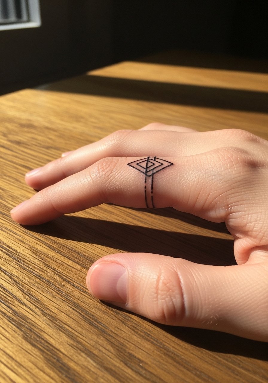
A hand-ring design is a practical way to replace jewelry. The key is even pressure and a little extra line weight so the ring reads months later. Many request extremely thin bands that vanish with regular wear. For longevity, ask the artist to space the elements and add a touch of saturation on the outline. The session is brief and aches more than it burns. Keep complementary rings off the tattoo finger during the first healing days so metal does not rub the new ink.
13. Minimalist Arrow on the Inner Wrist-Hand Junction
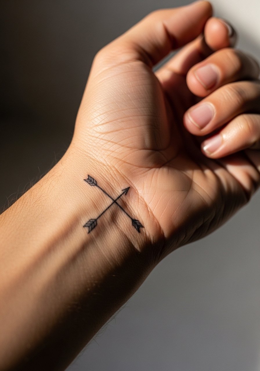
When you want a directional symbol, the inner wrist-hand junction frames movement well. The artist should anchor the arrowhead so orientation stays clear as skin stretches. A common error is centering the arrow too far onto the palm where friction eats detail. Pain is lower than knuckles and session time is short. For outfits, roll up a chambray rolled cuff shirt and wear a thin chain on the opposite wrist to frame the piece without crowding it.
14. Tiny Anchor Near the Thumb Web
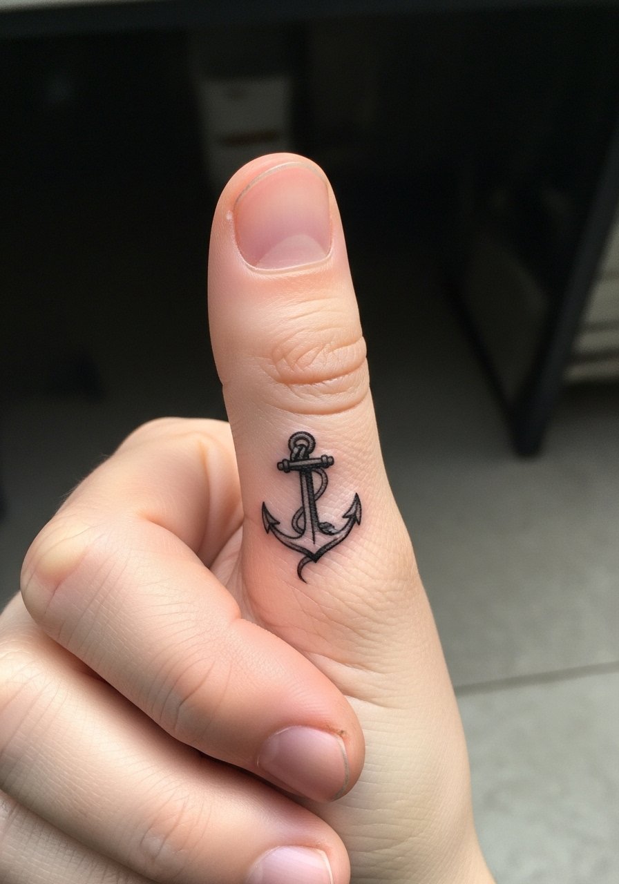
An anchor in the thumb web is discreet and symbolic for steadying. The area is sensitive and the session is short but poky. Ask for clean, slightly thicker outer lines so the interior does not wash out. Avoid dense crosshatching; it tends to smear in tight spaces. Expect touch-ups sooner if you wash hands often. For everyday balance, skip thumb rings and wear a minimalist leather watch on the other wrist.
15. Micro Lettering Along the Finger Ridge
Text on the finger ridge can look intimate in person and vanishes in photos if too light. Ask for slightly heavier downstrokes and spaced lettering rather than compressed script. The mistake people make is choosing ornate type at very small sizes. Expect the letters to need a touch-up at around a year. For the session, bare hands help the artist stabilize the finger. If you want it visible without jewelry, keep nails natural.
16. Fragmented Dot Mandala Near the Thumb Base
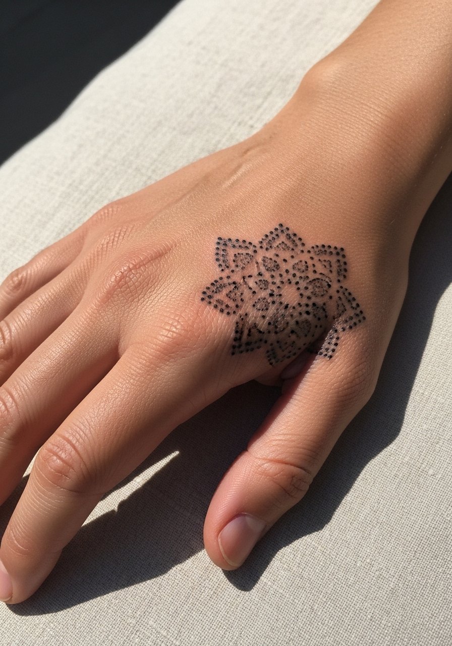
Fragmented mandalas work better than full dense circles on hands. I recommend asking for deliberate gaps so the pattern ages into a pleasing fragment rather than a muddy disc. The palm-adjacent skin moves a lot, so plan on a two-step session for saturation if you want the dots to last. A mistake is trying to compress a full mandala into an inch. Pair this with a wide wrist cuff when you want to frame the design in photos.
17. Tiny Crescent and Star Duo on the Finger Side
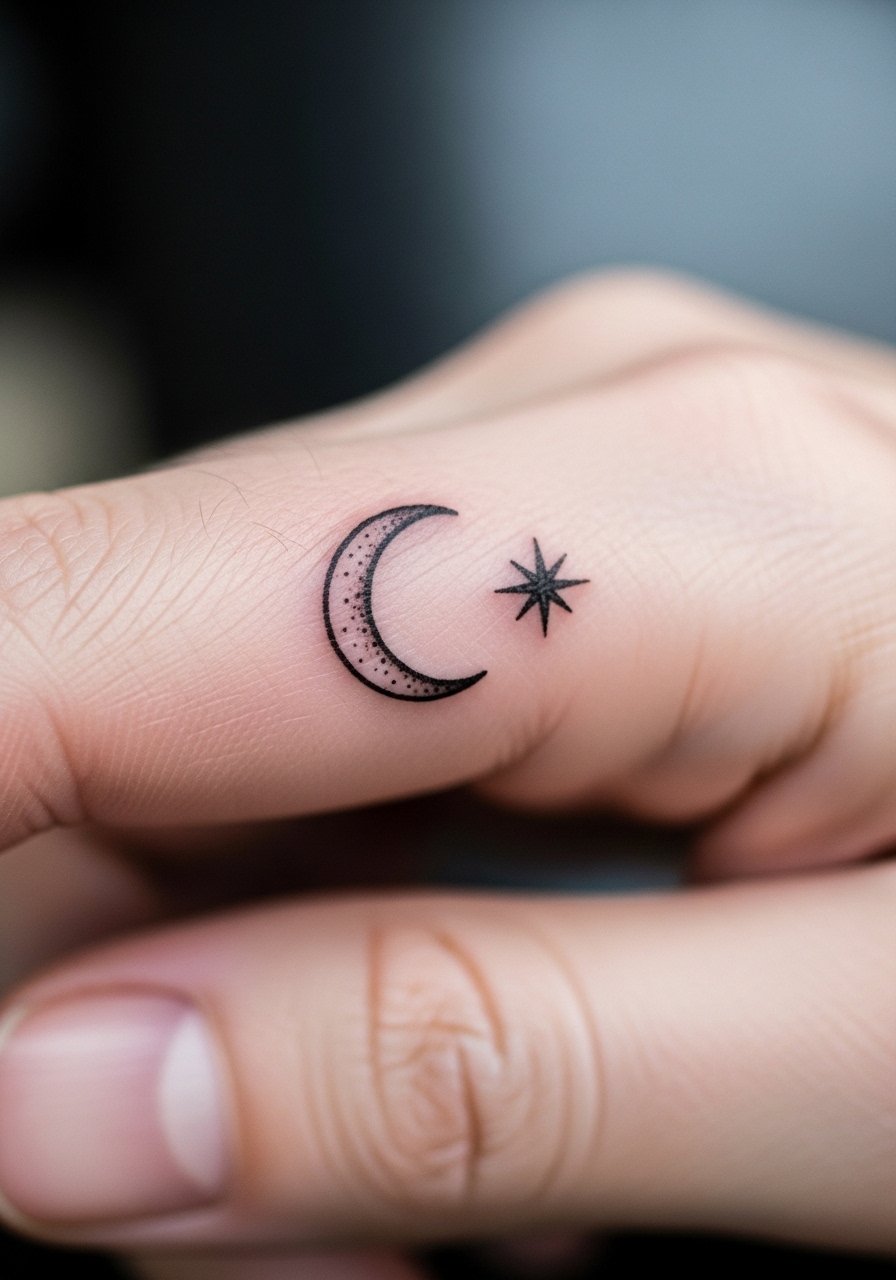
Celestial motifs are trending for festival season and they work as tiny companions on fingers. Ask for a thin crescent with a slightly bolder star point so the duo keeps identity as they soften. The common mistake is making both elements identically fine. Expect slight fade from sanitizer use, and plan touch-ups at a year. For session wear, short sleeves and no rings are simplest so the artist can position the stencil cleanly.
18. Single Dot Accent on the Knuckle
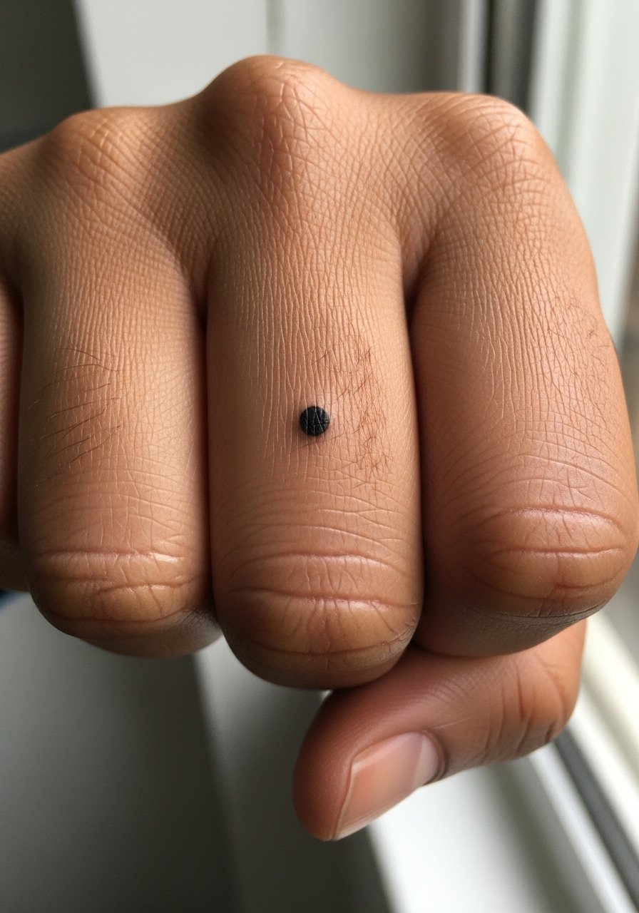
A single dot reads minimal but relies on placement precision. Ask the artist to center the dot on the knuckle ridge and to use a small yet solid shot so the pigment does not disperse into a ring. People sometimes underplay how visible a single dark dot can be in workplace settings. Pain is brief and sharp. For an edgy look, layer with knuckle rings set when you are off the clock.
19. Micro Floral Motif on the Lower Hand
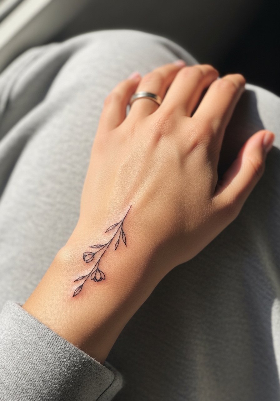
Floral motifs translate well when scaled conservatively. During consultation, specify that stems should be slightly thicker and petal interiors open to avoid blurring. A frequent error is requesting dense dot shading inside petals. The lower hand is less exposed than the top, so this spot often keeps detail slightly longer. Session time is moderate. For shows, rolled-up sleeves and a thin bracelet on the opposite wrist keep attention balanced.
20. Minimal Compass Punctuation on the Thumb Side
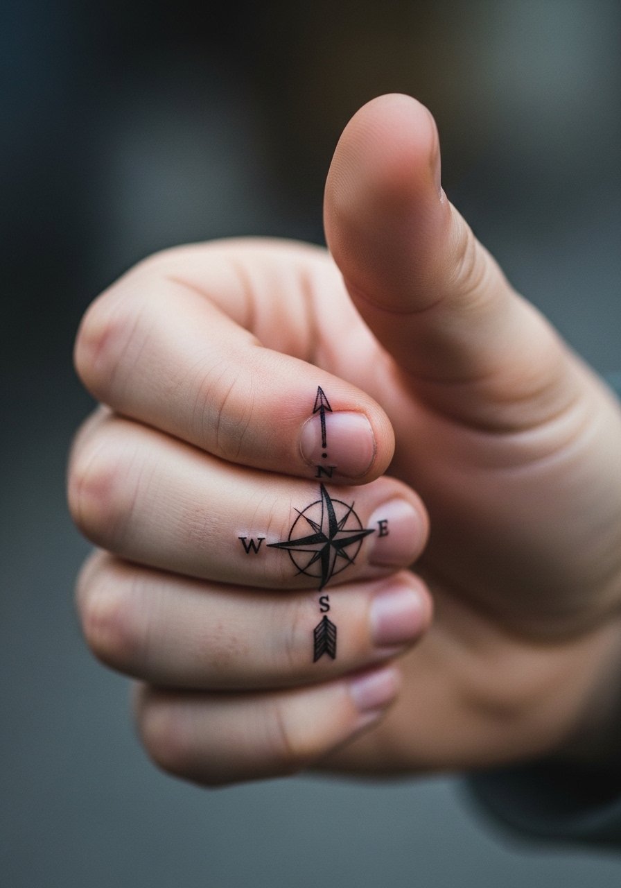
A compass accent near the thumb reads like a directional micro piece. Ask for clear north and south markers and modest negative space between points. Too many ticks invite a blurred look over time. Expect sharper pain than flat skin areas because of underlying structures. For appointments, keep the thumb exposed with no rings and wear a thin fabric shirt you do not mind adjusting.
21. Paired Negative Space on Opposite Hands
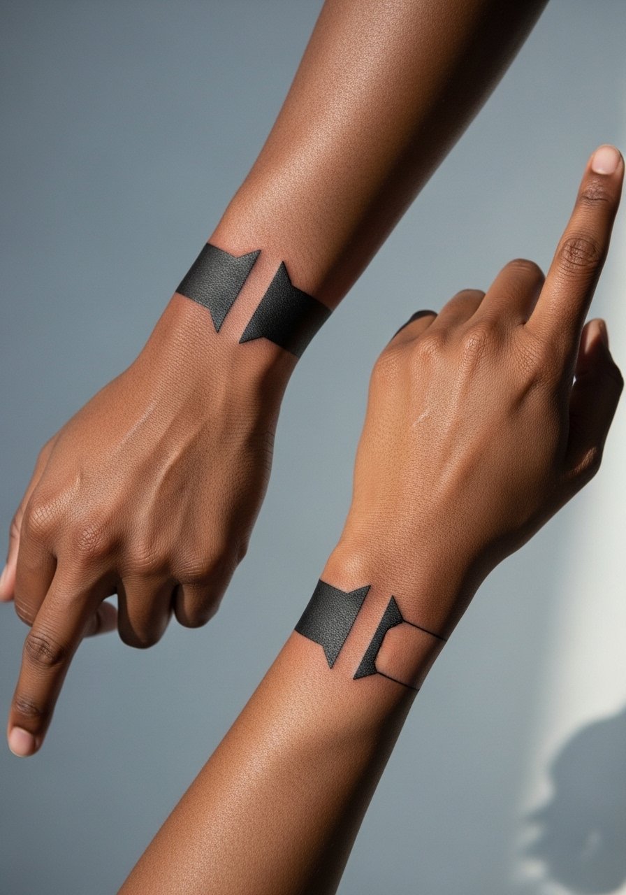
Pairing designs across both hands is an underused idea that plays into gesture art. Decide in consultation whether you want mirrored or complementary negative space so the designs animate when you clasp your hands. The mistake is making both sides identical without testing how they read together in motion. Pain and session times mirror each other, so book slots back-to-back. For showing it off, wear a minimalist watch on one wrist and nothing on the other so the hand pairing is readable.
Frequently Asked Questions
Q: How fast do fine line hand tattoos fade compared with bolder blackwork?
A: From what I've seen, fine line pieces on hands lose crispness faster than bold blackwork because daily friction and sanitizer use wear down ultra-thin channels. Bold saturation often softens into a readable shape that still looks intentional years later. If longevity matters more than the fresh look, ask your artist to increase main line weight while keeping the delicate feel.
Q: Should I expect more touch-ups for finger and palm tattoos than for back-of-hand pieces?
A: Yes. Fingers and palms sit in higher friction zones and usually need touch-ups earlier, often within 6 to 18 months depending on daily activity. Back-of-hand pieces still fade faster than shoulder or thigh work, but they tend to hold detail slightly longer than palm areas.
Q: Artists disagree on Saniderm versus dry healing for hands. What should I do?
A: There are two camps. One side favors Saniderm because it keeps the area moist and reduces early scabbing. The other side prefers dry healing, arguing that coverings can trap bacteria on hands and that an open healing phase helps ink set. The best approach depends on your lifestyle and the artist's protocol. Ask the artist which method they use specifically for hands and why.
Q: How painful is a knuckle or finger tattoo compared with the palm edge?
A: Knuckles and finger tops tend to hit bone and tendon, so they feel sharper and more intense for brief periods. The palm edge can feel like sustained pressure across a sensitive spot. Both are shorter sessions than larger pieces, but they can surprise first-timers with localized discomfort.
Q: Can I test visibility before booking by trying a stencil or pen?
A: Absolutely. Ask the shop to transfer a stencil or draw the design with a pen and photograph it under your usual office lighting. That reveals how readable the size and spacing will be, especially for fine line work on darker skin tones. For in-person fittings, bring a neutral manicure and minimal jewelry to see the real balance.
