
Fine line quotes look gorgeous fresh but I have noticed they demand more placement planning than most people expect. Trends push long vertical scripts down the spine, and then reality shows up at year three in the form of soft edges and uneven gaps. Start by picking a line weight and an exact read direction, and the options below will help you find a quote that both looks sharp now and holds up over time.
1. Fine Line "Still I Rise" Running Upper to Lower Spine
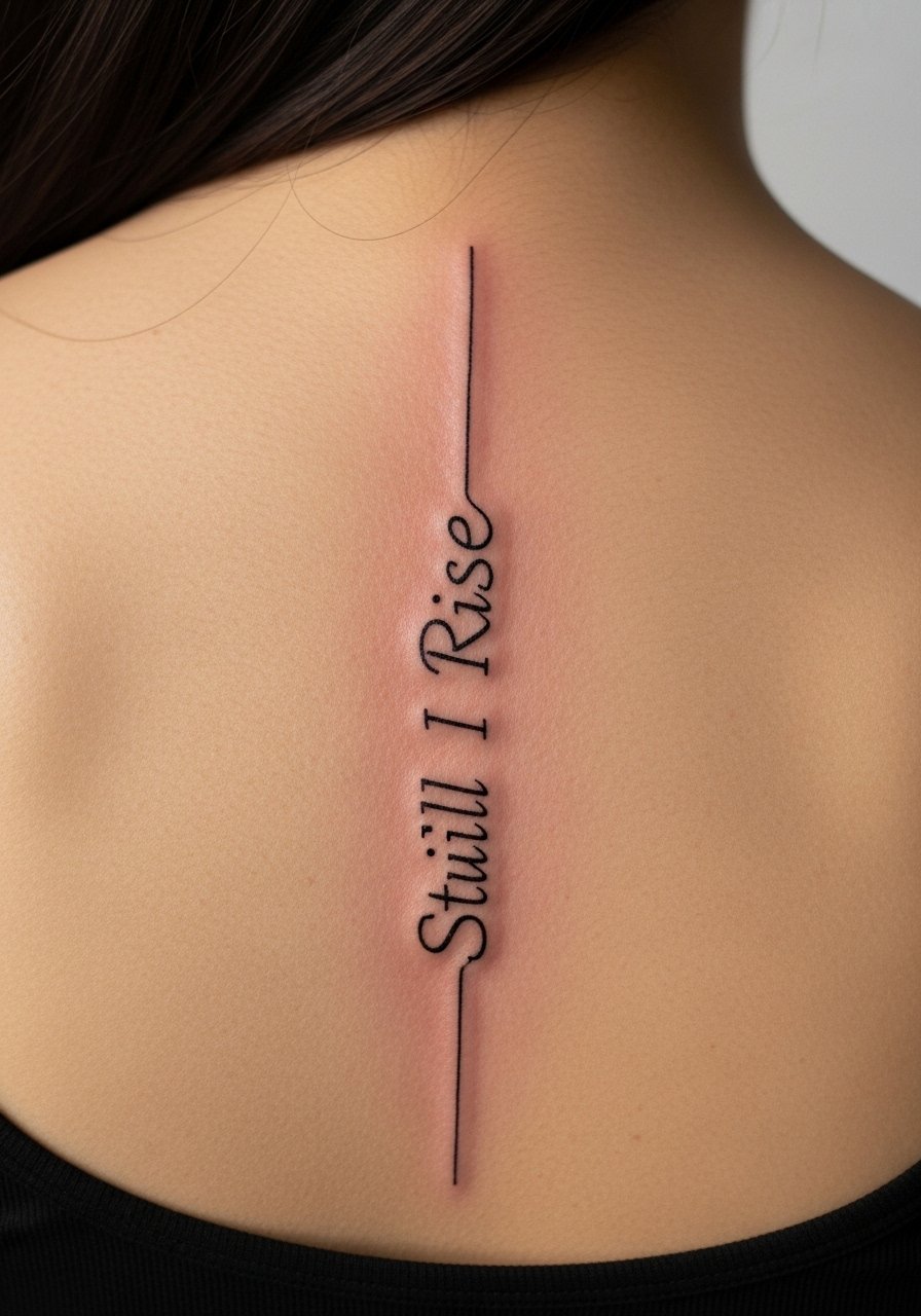
"Still I Rise" works as a spine quote because the natural vertical strengthens the rhythm of each word. I recommend a slightly heavier single-needle weight than the hairline scripts you see online. Ask your artist for a mock stencil that follows the curvature of your vertebrae during consultation. A common mistake is placing the script perfectly straight on a tilted torso, which makes it read off-kilter when you stand naturally. Expect a moderate pain level for full-spine work and a session that runs one to two hours. Over two to five years the thin lines may need touch-ups in the lowest segments where clothing rubs most. For the appointment, plan to wear a loose tank top that lifts easily so the artist has clean access.
2. Minimalist "I Am Enough" with Tiny Stars, Central Spine
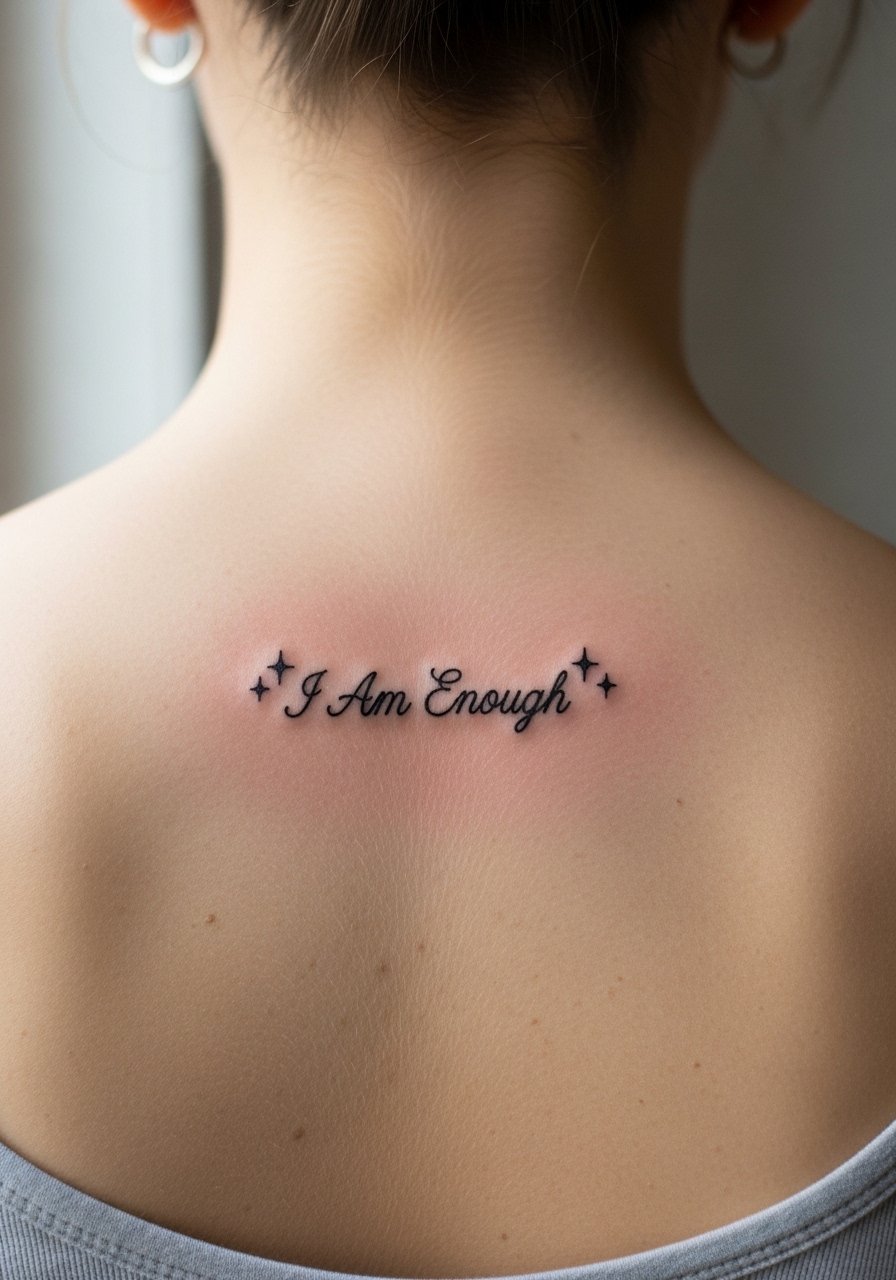
This compact, central spine quote is for someone who wants a private reminder rather than a full-back headline. Stick to short, clear lettering and leave room for small star motifs above and below the text. The biggest aging risk is choosing letters too narrow. Narrow letters can blur and merge around year three on people who sleep on their backs. Tell your artist you want 1.5 to 2 mm minimum letter width so the characters retain negative space as they heal. Session time is short, usually under an hour. For showing it off at events, a backless halter top silk pairs well because it frames the vertical script without distraction.
3. Neo-Traditional "Lights Will Guide You Home" with Lanterns
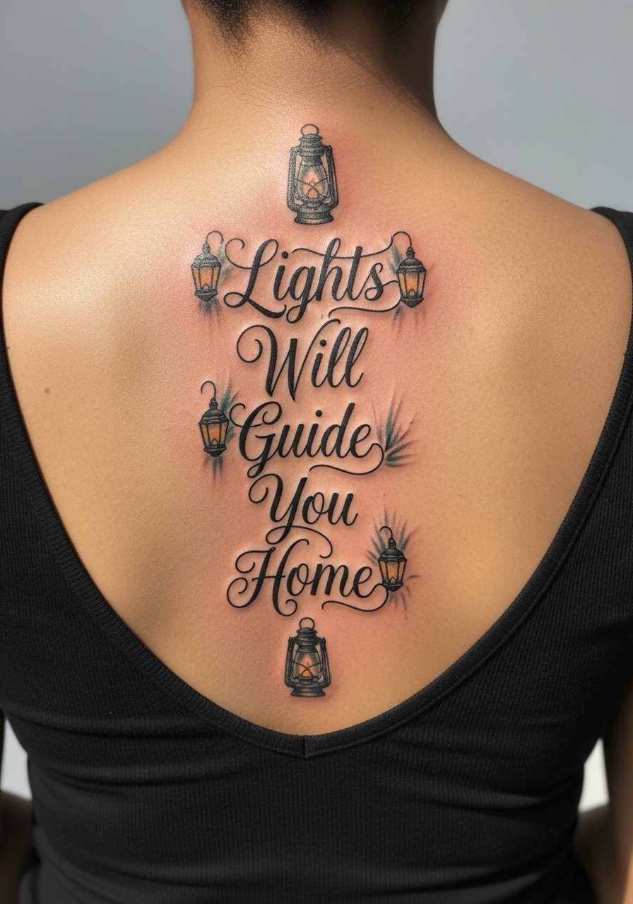
Longer narrative quotes suit neo-traditional framing because added graphics like lanterns or banners anchor the text. If you want color, ask for high-contrast black outlines first and soft color washes on a second session. A common mistake is cramming the lanterns and script too close, which ages into a busy block where the letters lose clarity. Expect two to three sessions and honest talk about saturation. Over time the color will soften more than the black outlines, so plan on a touch-up between years two and four for the pigments. For the session, wear a loose button-down shirt you can pull aside so the artist can work comfortably on the back.
4. Fine Line "Not All Who Wander Are Lost" Arched at Lower Spine
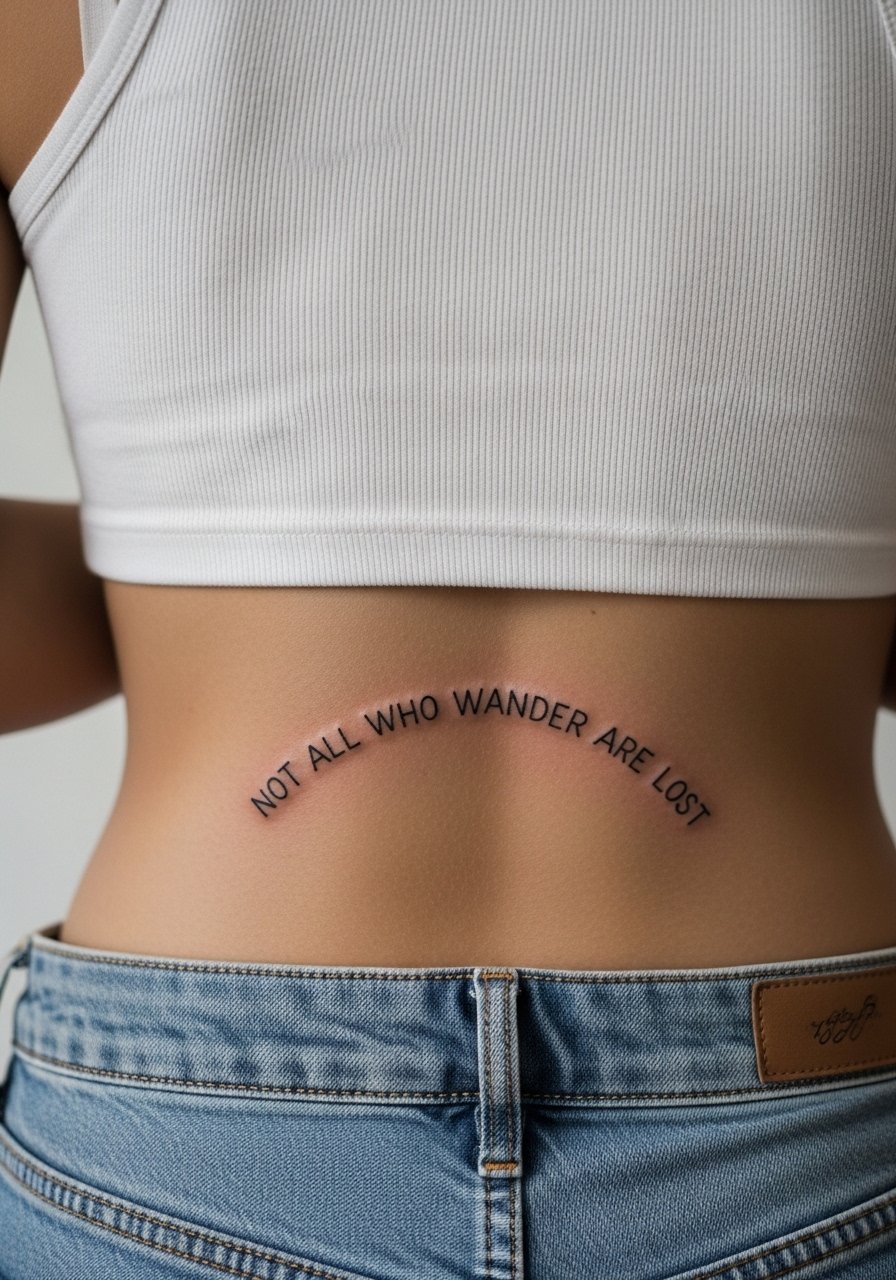
An arched composition at the lower spine reads like a tiny banner across your lumbar curve. The lower back sees a lot of friction from waistbands, so the common error is placing ultra-thin script too low. Move the arch a touch higher and increase line weight slightly for longevity. Tell your artist you plan to wear high-waisted bottoms most days so they can advise optimal vertical placement. Pain at the lower spine is generally lower than the upper spine, but touch-ups are more common here because of fabric rubbing. To style it for summer, pair with a high waisted crop top set that frames the arch without pressing on the healed linework.
5. Ornamental "To Thine Own Self Be True" with Floral Borders
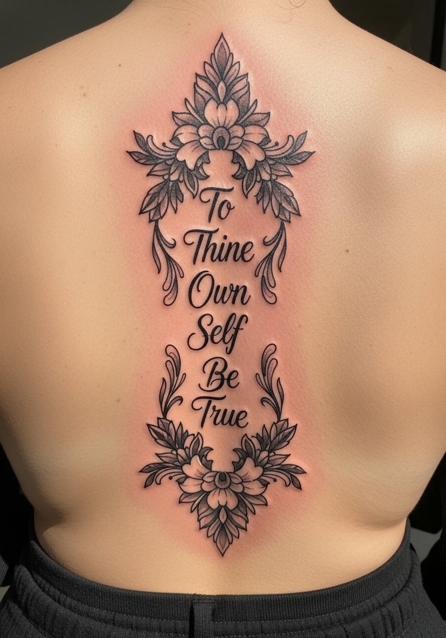
Shakespearean lines pair well with ornamental borders because the flora gives the text breathing room. The most common mistake is over-decorating the margins which makes the quote feel cramped in the long run. Ask for a floral scale mockup during consultation so you can see how the petals interact with each letter from six inches away. Mid-spine work sits under a lot of shoulder movement so expect medium pain and two sessions for balanced shading. At six months the outlines will be crisp. At year three the shading may soften. For session comfort wear an elastic waist lounge pant so you can shift clothing without extra pressure on the area.
6. Watercolor "Courage Dear Heart" Blended Top to Bottom
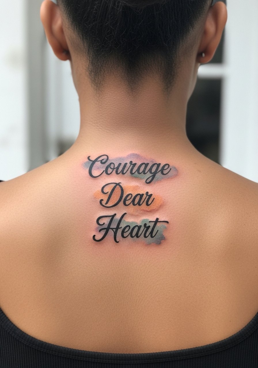
Watercolor on the spine looks like movement but it ages differently than black script. The watercolor fields will soften and fade faster. A common mistake is relying on watercolor as the primary way to read the quote. Keep the letters in solid black so the sentence reads even when pigments fade. Watercolor requires three sessions for large blends and frequent touch-ups for the color. This style is emotionally resonant and pairs with yoga or wellness motifs well, so consider subtle lotus accents if that fits your practice. For after-session comfort keep a loose racerback tank on hand so straps do not rub the fresh ink.
Studio Day Picks
The first six spine pieces above include both upper and lower placements and fine line and color work, so a few prep and healing items smooth the chair time and the first few days.
-
Stencil transfer paper kit. Lets you preview exact line placement on skin before the needle touches down, which helps with long vertical quotes.
-
Topical numbing cream. Applied as directed before a sensitive mid- or lower-spine session it can take the edge off without interfering with linework.
-
Thin protective film roll. Useful for the first 24 hours on lower spine pieces to keep clothing friction from lifting scabs.
-
Fragrance-free body wash. Gentle cleansers reduce irritation during showers when fine line script needs careful care.
-
Aquaphor healing ointment. A thin layer in the first days helps keep the epidermis supple which benefits delicate letter strokes.
7. Blackwork "Warrior of Light" Upper Spine with Geometry
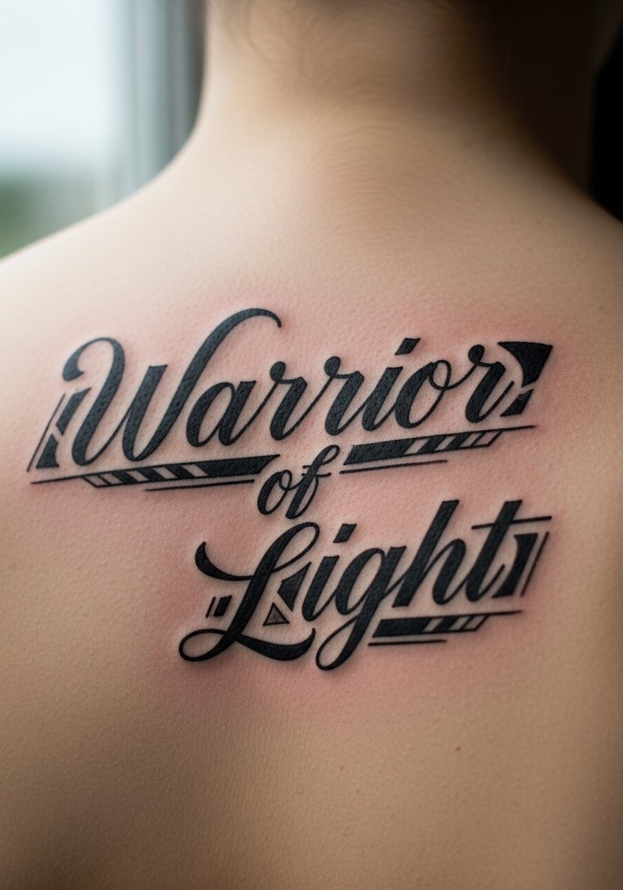
Bold blackwork quotes wear well on the upper spine because saturation resists blur better than thin strokes. If you want a spiritual, solid feel, ask for clean, heavy outlines and spare negative space between geometric accents. The main mistake is going too small. Solid black requires areas large enough to avoid blowout as the skin ages. Expect two sessions and some soreness across the shoulders. The upper spine sees lots of sun when you wear low-back tops, so factor in sun protection after healing. For showing the piece layer a sheer mesh long sleeve top over a simple bralette so the contrast of blackwork reads through texture.
8. Micro-Realism "Turn Your Wounds Into Wisdom" Portrait-Style Lower Spine
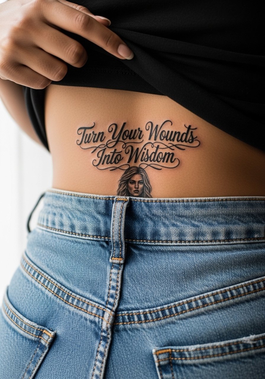
Micro-realism converts a quote into an intimate scene when paired with a small portrait or symbol. This approach requires an artist experienced in tiny tonal transitions. The risk is packing too much detail into a narrow vertical span, which can blur after a few years. Ask for a grayscale test panel on similar skin if you can. Sessions run long, often three to four hours across multiple appointments. Lower spine areas see friction from belts and waistbands, so touch-ups are likely. For recovery wear high waisted crop top sets that avoid rubbing the fresh piece.
9. Ignorant-Style "Free Spirit" with Abstract Bird, Central Spine
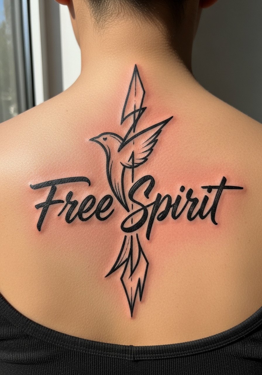
Ignorant style brings a raw, hand-drawn energy to a quote. The charm is intentional imperfection, so do not ask to polish every wobble. The error is asking for a precise font effect that conflicts with the style. For central spine pieces, keep the bird motif slightly offset so the eye reads the quote first. One session is usually enough. This style ages into a more graphic block, which some people prefer. If you want to show it off, a low back evening dress highlights the central spine without competing with the raw lines.
10. Fine Line "Embrace the Glorious Mess That You Are" Full Spine Cursive
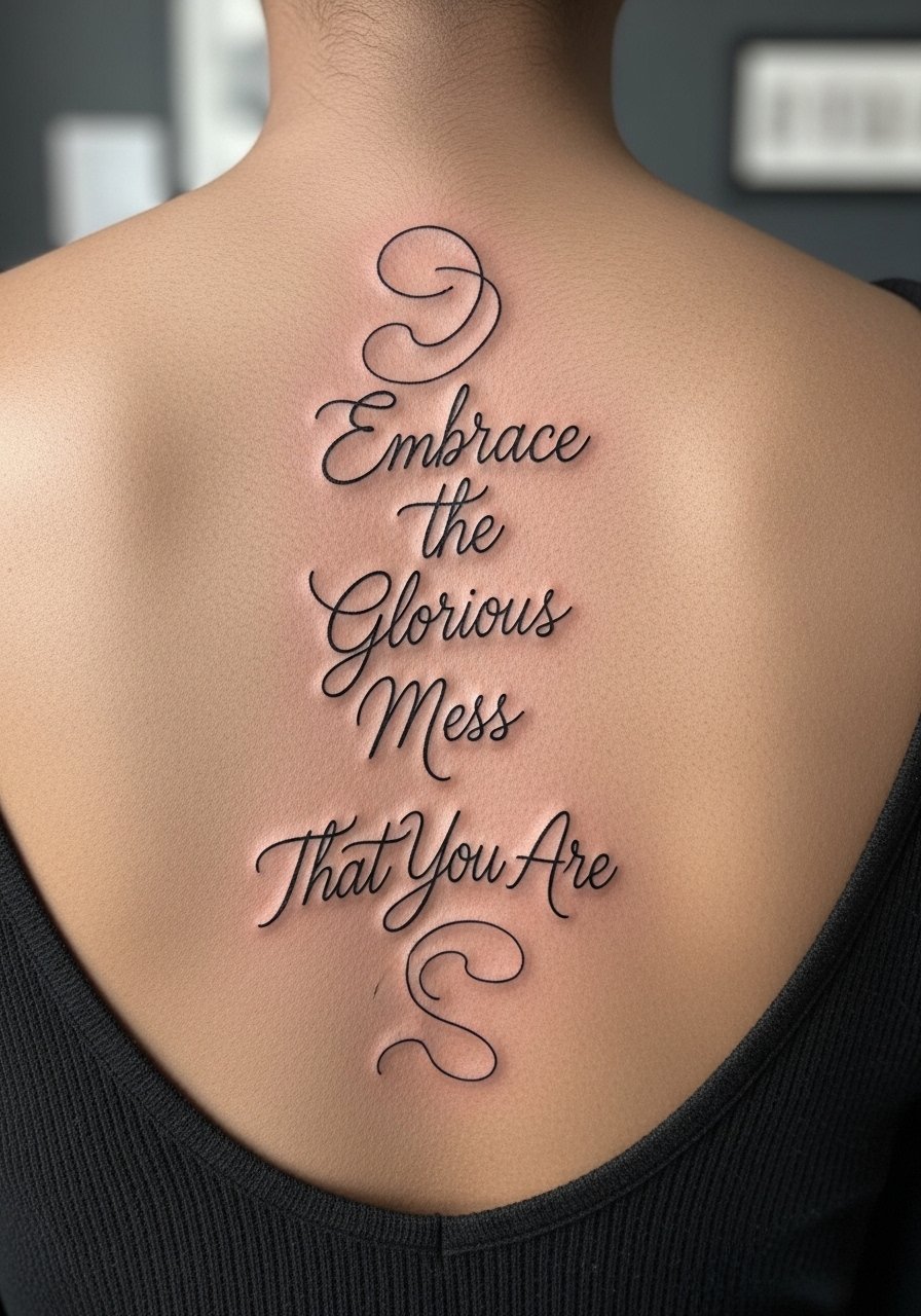
Long flowing cursive across the entire spine looks elegant but demands spacing discipline. The common mistake is writing the quote in a single narrow column. Instead, allow small letter flourishes to tuck slightly into adjacent vertebral gaps so the eye can follow the flow. Expect two sessions and plan notes for posture during the stencil check. Over years the lowest letters may soften first due to consistent waistband contact. For tattoo sessions and wardrobe, a loose button-down shirt or a racerback tank makes access easier without adding pressure to fresh ink.
11. Traditional Banner "Let Your Faith Be Bigger Than Your Fear" Mid-Spine
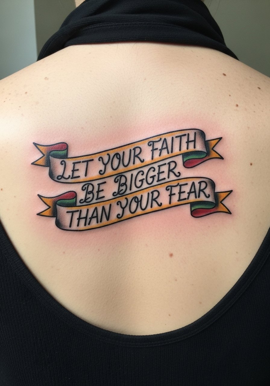
A banner gives classic structure to a motivational line. Traditional saturation tends to age into a pleasing patina if done with confident outlines. The frequent error is scaling the banner too thin which then loses its shape. Ask your artist to show the banner at seated and standing positions so you see how it settles across posture. Two sessions are common if you include color. Mid-spine pieces react to backpacks and strap pressure, so factor that into wardrobe choices. pair the healed piece with an open back cardigan black layered over minimal tops to keep lines visible without friction.
12. Minimalist "Life Goes On" with Hourglass, Lower Spine
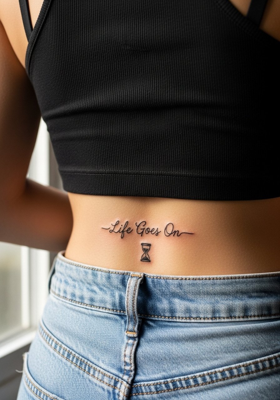
Short, stoic phrases like "Life Goes On" need negative space to read for the long term. The hourglass anchor helps the eye locate the sentiment. The mistake is squeezing the icon and the words into a small rectangle. Make the icon a subtle complement, not a vessel. One quick session usually does the job. For lower spine placements expect more rubbing from clothing, and plan high-waisted options during healing. For show-off looks try a back cutout summer dress that frames the lower spine without rubbing the area.
13. Short Single-Word "Breathe" Vertical Script Along Spine
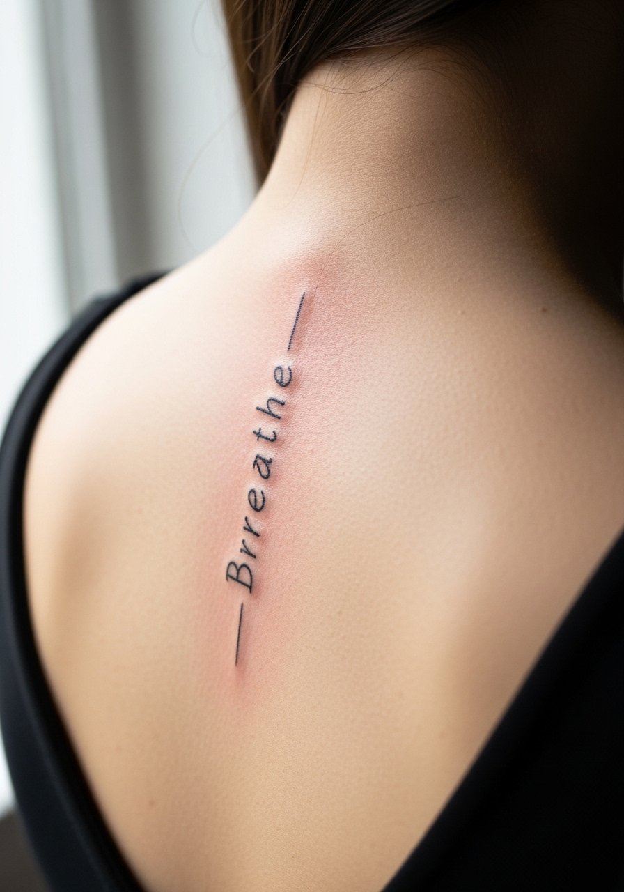
Single-word spine tattoos function like anchors you can glance at during a seated day. The real choice is font weight. Too thin and the single word dissolves after a few years. Ask for modest spacing between letters and a slightly heavier hairline. This is a low session time piece but a high emotional return. For posture and healing, avoid tight waistbands during the first two weeks. A loose tank top for the session makes access painless.
14. Latin "Memento Mori" in Blackletter with Floral Accents
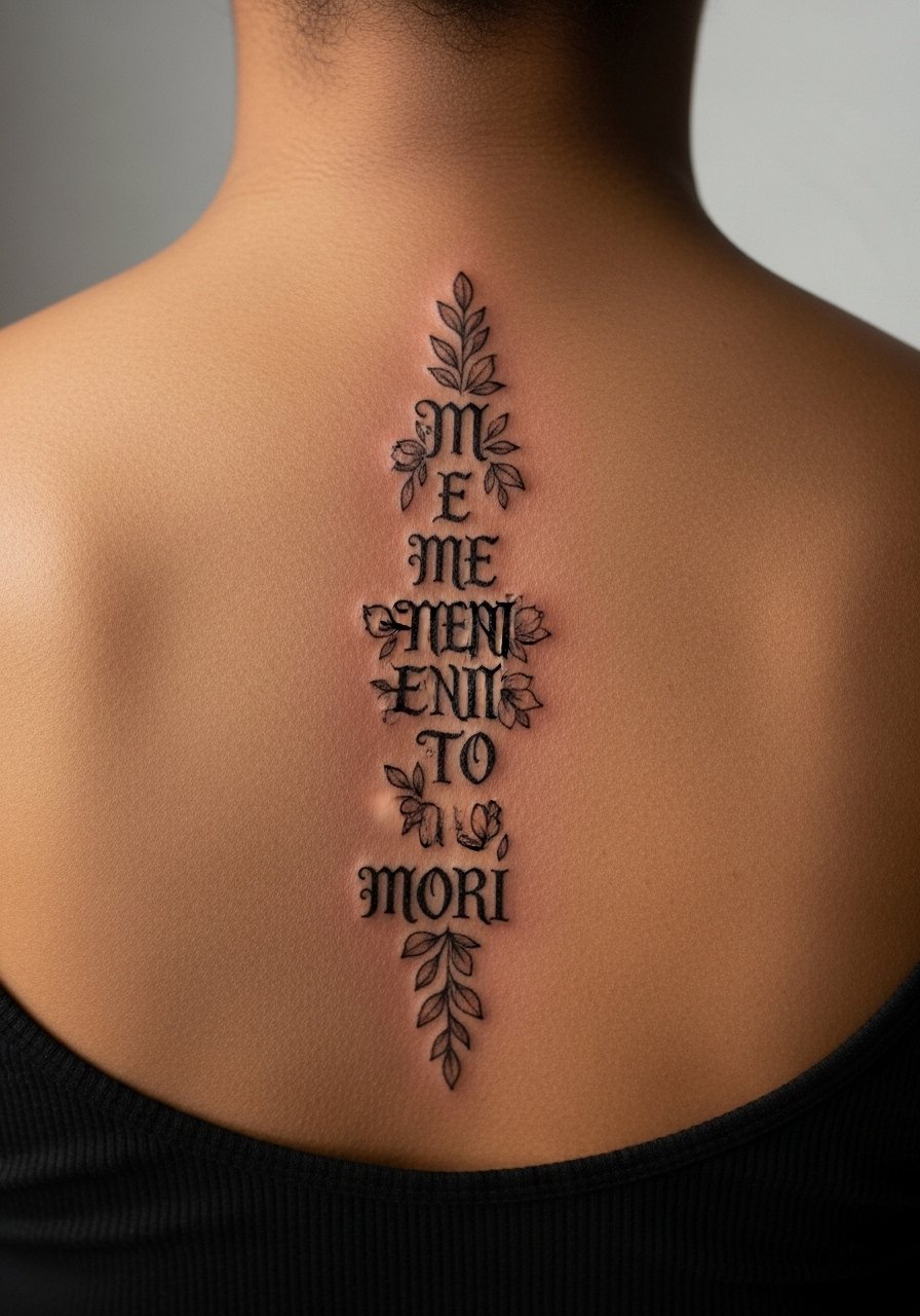
Blackletter reads with gravitas on a vertical axis, but legibility depends on scale. The error is choosing a dense blackletter at a small size. Instead, expand the characters slightly and pair them with thin floral separators. Artists sometimes split on whether blackletter ages better on ribs or the spine. One group says high-contrast letters hold longer. The other group argues the intricacy leaves less room for touch-ups. Ask for portfolio examples and a clear plan for future refreshes. For evenings pair this with simple neutrals that let the lettering read.
15. Coordinates or Roman Numerals as a Vertical Line
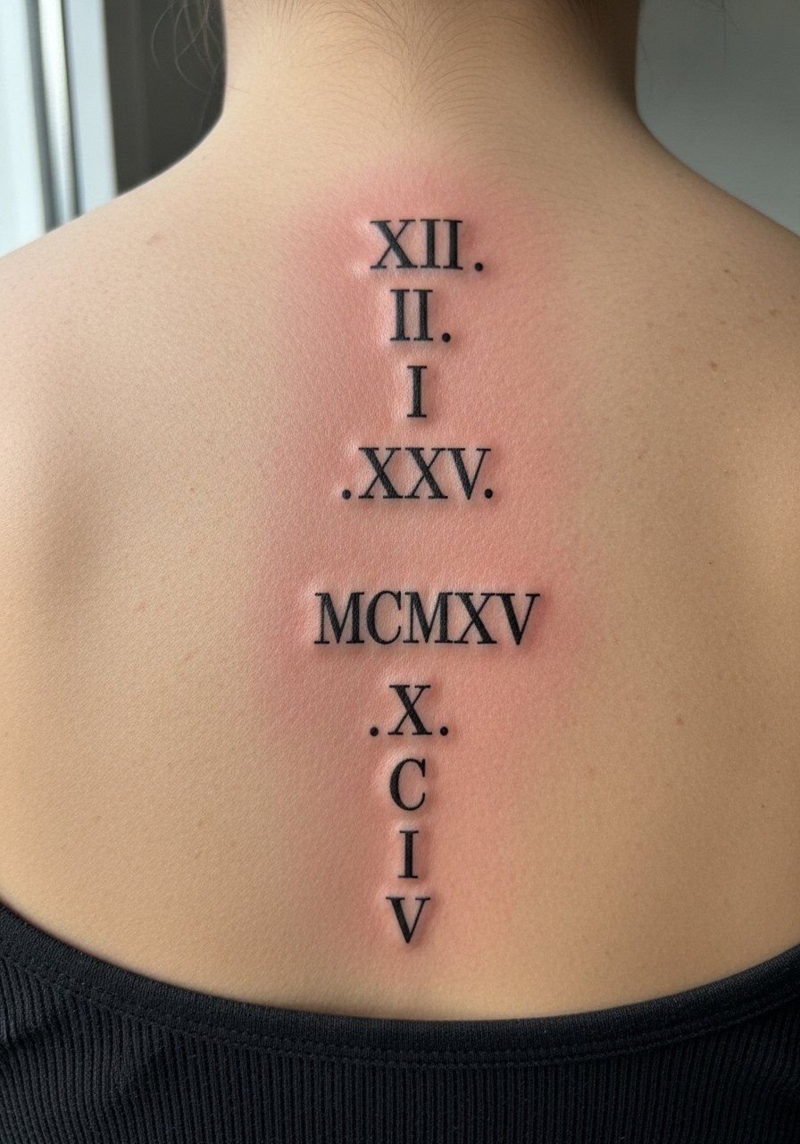
Numbers and coordinates make tidy vertical columns that avoid the clutter of long sentences. They are forgiving when kept bold enough to survive years of movement. The usual mistake is placing tiny numerals too close together. Leave breathing room between each line and check the final spacing on a mirror. These are low-pain, quick sessions. For wardrobe, high-waisted skirts or tops with low backs highlight the vertical line gracefully.
16. Yoga-Inspired "Courage" with Lotus and Subtle Linework
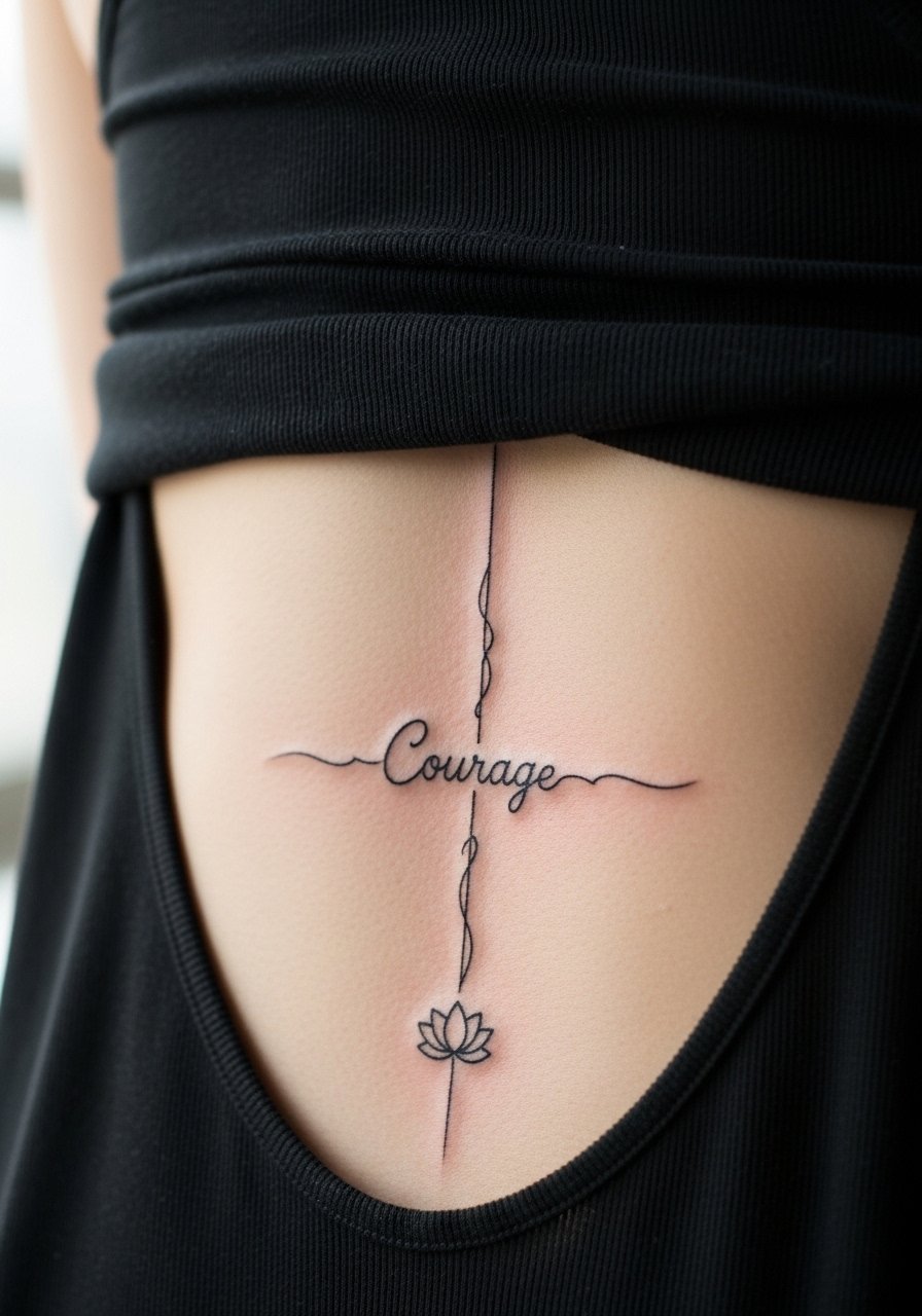
Pairing a short quote with yoga motifs ties the image to a lifestyle. The mistake I see is over-ornamenting a word that functions best when simple. Keep the lotus discreet and place it below the baseline so it reads as support instead of decoration. This placement reads well in open-back yoga tops. For session day wear a racerback tank so the artist can work without you being fully undressed. Artists sometimes split on needle depth for lotus shading. One camp pushes softer stipple shading. The other likes denser fill. Ask for examples on similar skin tones.
17. Tiny Script "She Persisted" Curving with the Spine
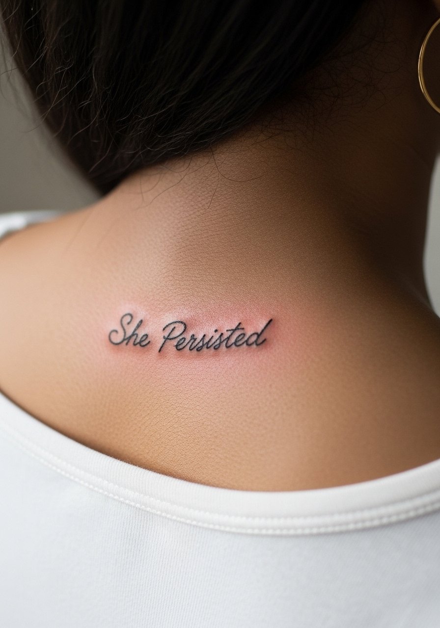
Short slogans like "She Persisted" read like bookmarks when curved slightly to match posture. The error is keeping the same baseline across a curved anatomy. Ask the artist to draft a few stencils in different arc degrees so you can see which one sits naturally while standing. This is a quick one-session piece but plan on touch-ups if you sleep on your back often. For a night out a low back evening dress will show the curve without compressing the healed linework.
Frequently Asked Questions
Q: Will fine line script down the spine blur faster than bolder styles?
A: In my experience fine line does require more care because the thinner the stroke the less margin for minor blowout. Bold blackwork tends to hold shape longer. If you want delicate script, ask for slightly wider strokes and leave more negative space so the letters do not merge as the skin ages.
Q: How should I pick between upper, mid, and lower spine placement for a long quote?
A: Think about daily friction and clothing first. Lower spine hits waistbands so it often needs touch-ups. Upper spine sees shoulder movement but is easier to hide under shirts. Mid-spine balances visibility and wear. Try stenciling in each spot and wear it for a day to see how it feels.
Q: Do watercolor spine quotes require different aftercare than black-and-gray script?
A: The physical aftercare steps are similar, but watercolor pigments fade faster so you should avoid heavy sun exposure and expect a color refresh sooner. Keep the area covered or use high SPF when fully healed to protect soft washes.
Q: Artists disagree about fine line on curved placements like ribs and spine. How do I navigate that?
A: Name both camps and ask where your artist stands. One camp says curved, thin placements blur quickly because skin shifts. The other says careful spacing and proper needle depth make thin lines survive. Request portfolio examples of healed work on comparable placements and skin tones before booking.
Q: What should I wear to a spine tattoo session to make the process easier?
A: Wear clothing that gives the artist clean access without you having to fully undress. For spine work a loose button-down shirt or a racerback tank is practical. Pick garments that sit away from the exact area until the first scab falls.
