
The tattoos that still read crisp after a few years are often the bold ones people dismiss as obvious. Simple shapes with confident linework survive skin shifts, repeated sun exposure, and daily wear better than tiny, delicate scripts. These 17 bold matching tattoo ideas focus on designs that age with dignity, placements that hold detail, and wardrobe notes that actually help your new ink look intentional from day one. Read the first idea and you will know what to ask at your consultation.
1. Bold Roman Numeral Anniversary Date on Inner Forearm
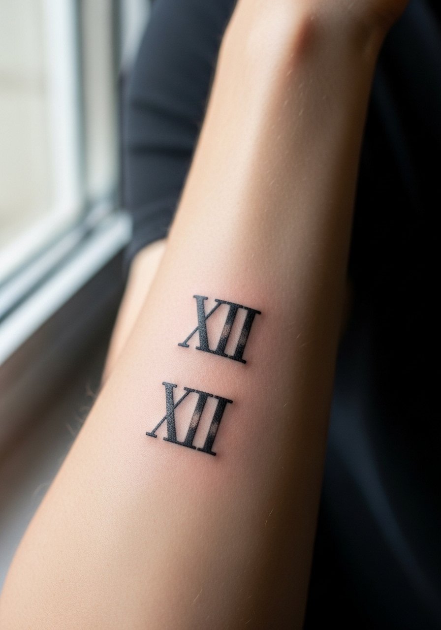
A Roman numeral anniversary on the inner forearm reads like a graphic statement that still reads at arm's length. I suggest a medium weight line and slightly expanded spacing so the numerals do not merge later as the skin shifts. Tell your artist you want the numerals bold enough to keep negative space between strokes, and ask for a healed mockup on skin before needle down. Expect moderate pain and a single short session. Common mistakes are tiny, script-like numerals that blur in two years. For showing this off, roll up a sleeve or wear a short sleeve fitted tee in solid black to frame the mark without distraction.
2. Complementary Puzzle Pieces on Wrists
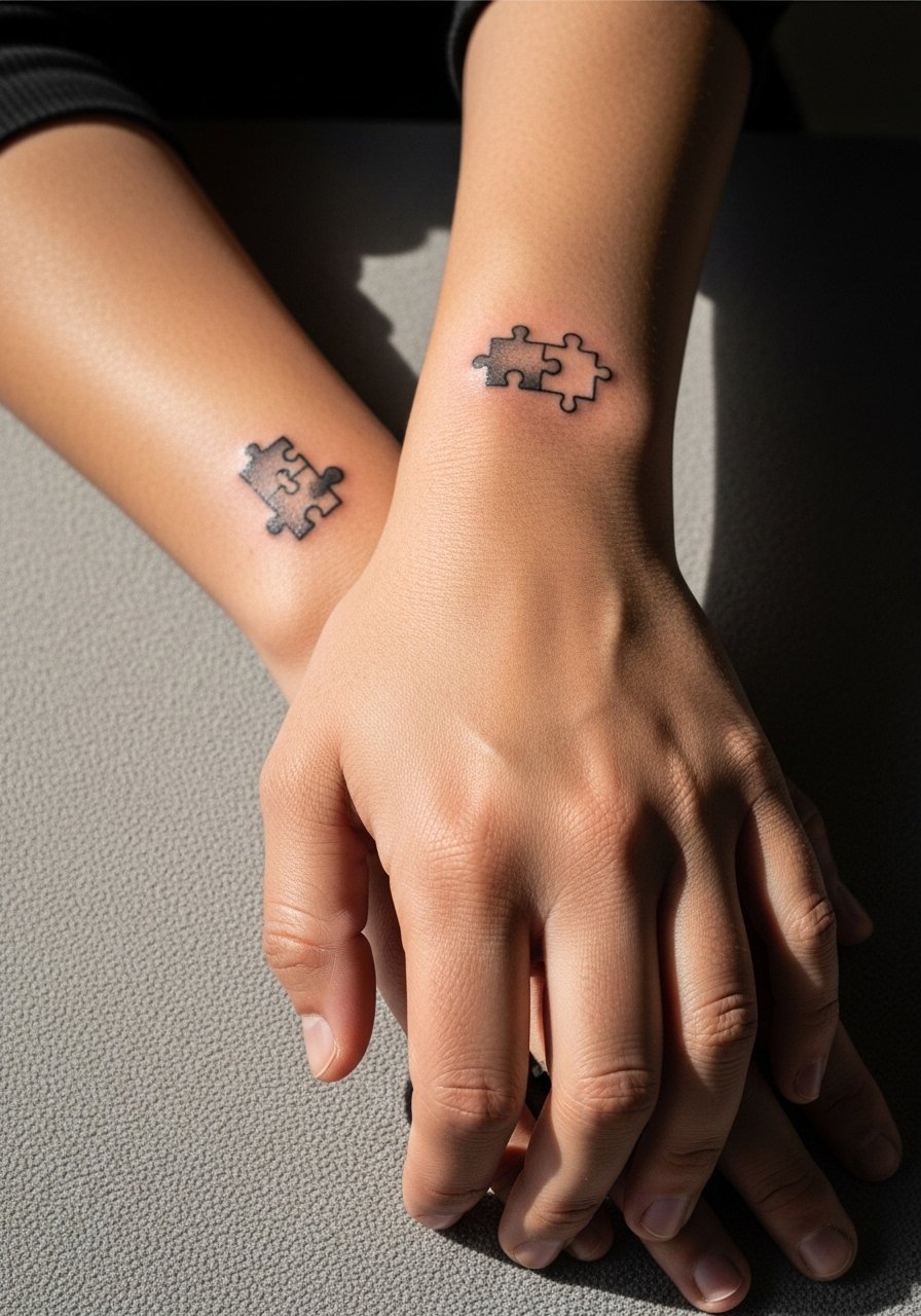
Puzzle pieces can be playful and bold when simplified into thick outlines with a bit of negative space inside each tab. For wrists, the risk is blowout where the ink spreads under thin skin. Ask your artist for slightly heavier linework than you might choose for a micro design and for a shallow but consistent needle depth during the session. At six months the joins will read clean if saturation is solid, and by year three a touch-up is common for wrist work. During the session wear a minimalist leather watch on the opposite wrist and remove jewelry from the tattooed side so the artist has clear access.
3. Matching Cartoon Characters on Shoulders
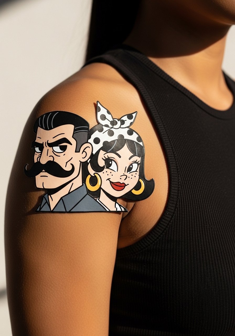
Playful cartoon characters read best when the linework is decisive and the color fields are saturated. Shoulder placement handles medium-sized color work well and gives room for a single session in many cases. Tell your artist you want simplified faces rather than photoreal detail to avoid muddy color when healed. The biggest mistake is insisting on micro shading in tiny faces, which can blow out and lose expression. For showing it off, pick an off shoulder top linen or a sleeveless tank so the design is visible without competing accessories.
4. Love Birds Pair on the Collarbone
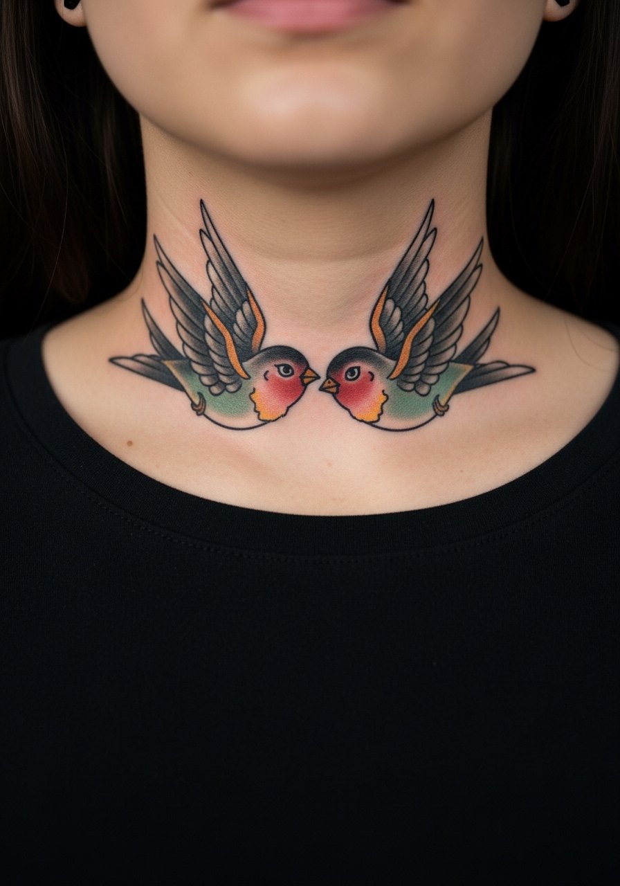
Small to medium love birds at the collarbone work well because the area sits between high visibility and enough flat surface for clean linework. Expect a bit of sting when the needle hits the bony area near the clavicle, but the session is usually short. Tell your artist you want defined beaks and wing linework with stipple shading rather than dense gray wash, that helps the texture age more predictably. A common error is overfilling tiny feathers which can merge as the piece settles. For nights out, an open-neck blouse keeps attention on the motif without overwhelming it.
5. Matching Initials in Script Behind the Ear
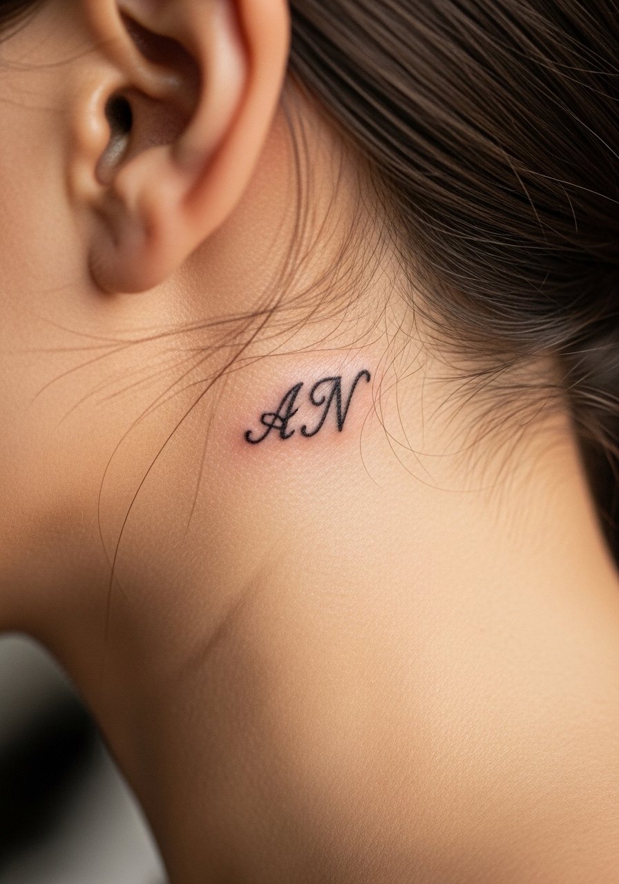
Behind the ear offers a micro location that can be discreet and bold when the script is confident and slightly thicker than a true micro line. Artists debate whether fine script there holds perfectly. One camp says the skin and movement blur ultra-fine letters within a couple of years. The other camp argues that with correct needle depth and a slightly heavier stroke, script can settle nicely. Ask your artist which approach they use and for a healed mockup. Session time is short but the area is sensitive. For the appointment plan to wear hair up and bring a jacket with a wide neck so the artist can work without tugging.
6. Interlocking Bold Infinity Symbols on Fingers
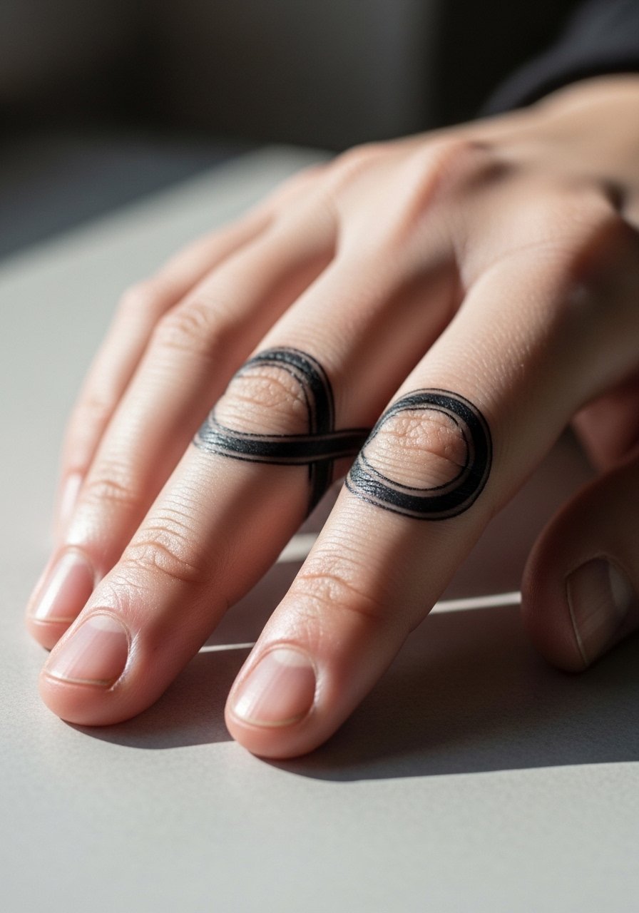
Finger placements demand bold simplicity or they fade into illegibility quickly. Interlocking infinity loops that use clean, thick linework maintain contrast longer than delicate looping script. Fingers are high friction zones so expect earlier touch-ups, often at year one or two depending on hand use. Tell your artist to place the symbols slightly away from joint creases when possible and to prioritize saturation over tiny detail. For everyday wear pair the tattoo with stackable thin rings on non-tattooed fingers and avoid heavy rings that rub the ink while it heals.
Studio Day Picks
The inner forearm, wrist, shoulder, and finger ideas above require different prep, so a few targeted items smooth the session and the first week.
-
Stencil transfer paper kit. Lets you preview the linework placement on skin before committing, which is useful for Roman numerals and script behind the ear.
-
Topical numbing cream. Applied under a wrap before the appointment can reduce edge pain on bony collarbone and finger sessions without changing the artist's approach.
-
Thin protective film roll. Useful for wrist and finger pieces where friction from washing and clothing is constant in the first days.
-
Fragrance-free body wash. Cleanses healing areas without irritation, especially helpful for shoulder and collarbone work.
-
Aquaphor healing ointment. A thin layer for the first few days can lock in moisture for small bold lines without clogging the needle channels.
7. Coordinating Hearts, Outlined or Filled, on Inner Forearm
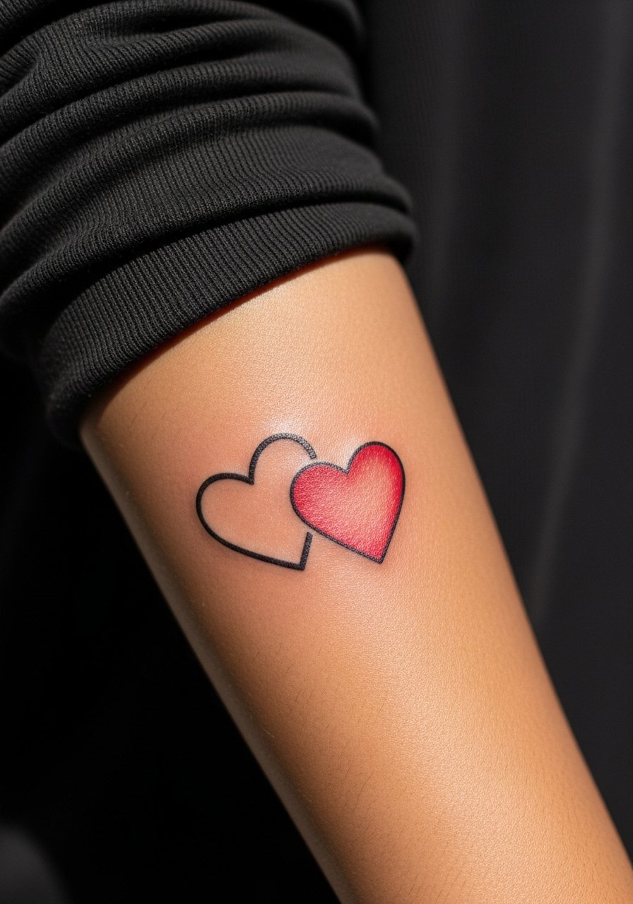
Coordinating hearts work across many aesthetics when you decide upfront if both should match exactly or be semi-matching. A bold outline paired with a filled counterpart reads intentionally modern. For inner forearm placement ask for even saturation inside the filled heart and consistent line thickness so the pair ages uniformly. A common mistake is mismatched line weight that makes one heart dominate visually. At two years a filled heart can soften a touch more than an outline, so plan a touch-up if you want the color solid. For show-off outfits try a fitted short sleeve tee and a thin leather cuff on the opposite arm to balance the look.
8. Coordinating Quotes Split Across Ribcages
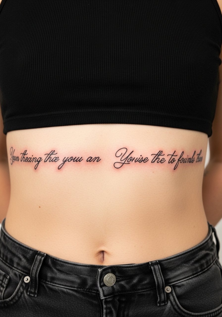
Split quotes on the ribcage let each person carry half the sentence with dramatic placement, but the rib area is notorious for movement and sensitivity. Fine line script there splits artists into camps. One group says the skin stretch and frequent motion blur fine lettering fast. The other group believes that with slightly larger script and secure needle placement, lines can remain crisp. Ask your artist which camp they fall into and for a larger baseline letter height if you want longevity. Pain is higher, session times are often longer, and touch-ups may be needed at year two. For the session wear a loose tank top or cropped tee so the artist can access the side cleanly.
9. Sun and Moon Halves for Shoulders or Upper Back
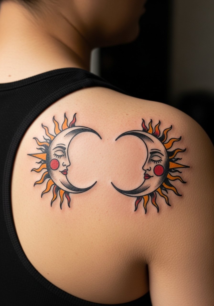
Sun and moon halves look balanced when the silhouettes are bold and the faces are simplified. Shoulder and upper back placements let color and blackwork breathe without crowding. During consultation say you want solid black outlines and flat color fills instead of intricate textures that can lose clarity. For healed appearance expect the black to anchor the colors at six months and for the highlights to soften over years. If you plan paired placements across two people, align scale and horizon lines in the stencil stage. For session wear bring a loose button-down shirt you can pull aside to give the artist full access without exposing more than the tattoo zone.
10. Half Avocado Pair on Forearm
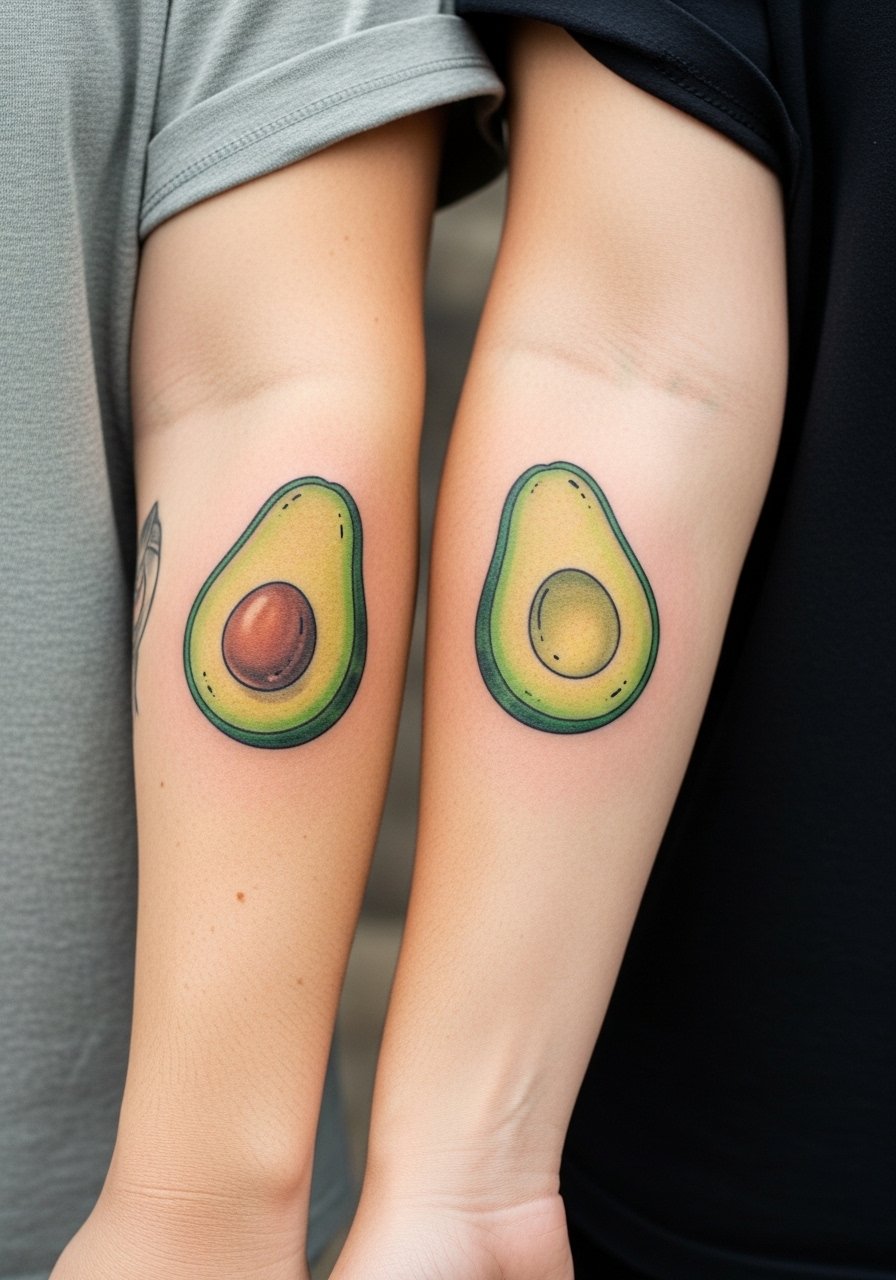
Quirky motifs like a half avocado pair are a chance to make bold illustrative work feel personal. Outer forearm placement gives room for color and shape, and the bold pit area helps the piece read from a distance. Tell the artist you want a simplified pit and a solid color block so the green does not fade into a muddy wash. Common mistakes include tiny seed detailing that becomes indistinct. Session pain is low to moderate and most forearm pairs finish in one session. To show off, roll sleeves or wear a short sleeve fitted tee in a neutral color so the green pops.
11. Lock and Key Set on Ankles
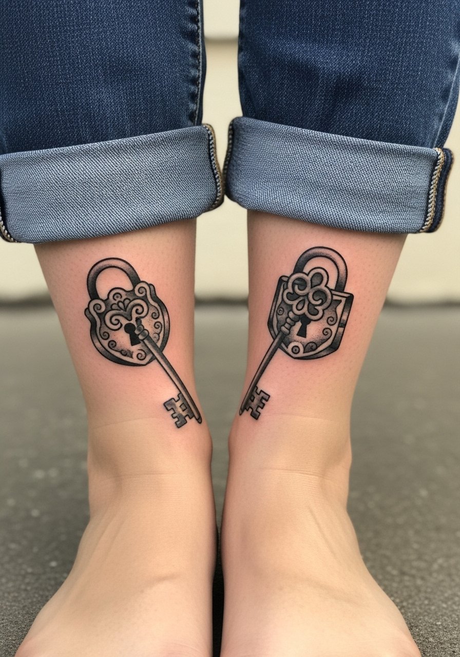
Ankle work reads bold when the lock and key are rendered with clear negative space and decisive outlines. The ankle is a high friction area and heals differently from arm or shoulder work. Ask your artist to avoid overly thin lines near the bone and to keep any filigree minimal. Plan for a short session and expect touch-ups sooner than you would for forearm pieces. For showing off try cuffed straight-leg jeans or a midi skirt paired with ankle boots. For the session wear loose joggers or shorts so the artist can access the area without pressure.
12. Yin Yang Complementary on Thighs
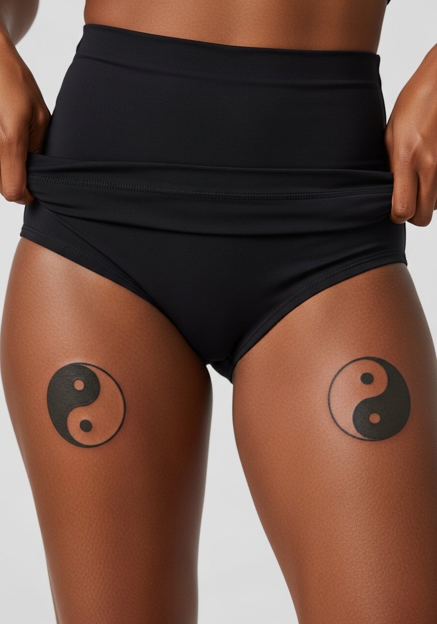
The thigh provides surface area for medium-sized bold geometry that ages predictably. Yin yang symbols benefit from strong contrast and clean boundaries between black and negative space. The inner thigh is sensitive during the session, so expect a higher pain score but a steady needle speed helps reduce trauma. A common mistake is squeezing too much detail into the circle, which makes the halves lose definition as skin stretches. For the appointment wear high-waisted bottoms you can shift slightly so the artist can work without exposing unnecessary areas.
13. Word "Love" with a Heart in Bold Type on Inner Arm
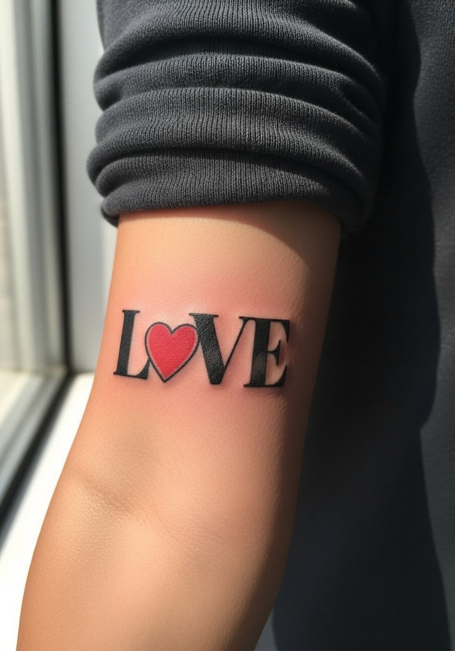
Typography can be graphic and durable when the letterforms are bold and spacing is deliberate. Inner arm placement holds thicker strokes well, and the heart accent gives a visual anchor. Tell your artist the exact font weight you want and ask for slightly increased letter height to avoid merging later. Typical mistakes include picking a hairline script that disappears into the grain of the skin within a couple of years. For showing this off pair the mark with a thin chain bracelet on the opposite wrist or keep sleeves rolled with a crewneck sweater pushed up.
14. Semi-Matching Outline vs Filled Outer Forearm Pair
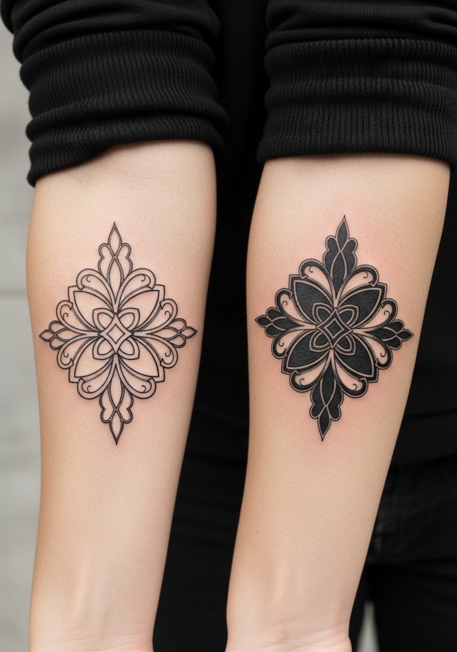
Semi-matching tattoos let each person keep a personal spin while still reading as a pair. An outline versus filled execution creates contrast and reduces the chance both people regret identical choices. On the outer forearm ask for identical scale and alignment in the stencil stage so the two look intentional together. This approach also reduces the need for identical touch-ups because an outlined version and a filled version age differently yet harmoniously. For the session wear a short-sleeve top and bring visual references so the artist can match scale precisely.
15. Myth-Inspired Symbol Pair on Upper Chest Near Collarbone
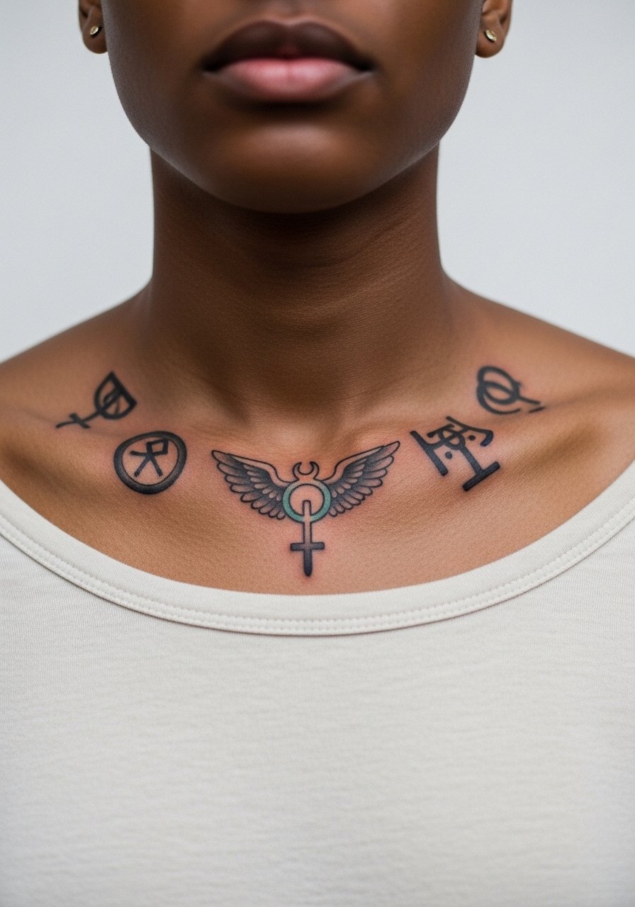
Symbols drawn from mythic traditions can feel timeless when treated respectfully and simplified into bold shapes. Upper chest placements near the collarbone require a shirt you can pull slightly aside for access and a steady artist hand to navigate the slight curvature. A common pitfall is copying complex cultural patterns without variation, which can cross into appropriation for some motifs. Consider slight personalization that references the original rather than a direct replica. For the session pick a wide-neck shirt you can adjust to expose only the necessary area.
16. Hidden-Meaning Micro Marks on Fingers or Behind the Ear
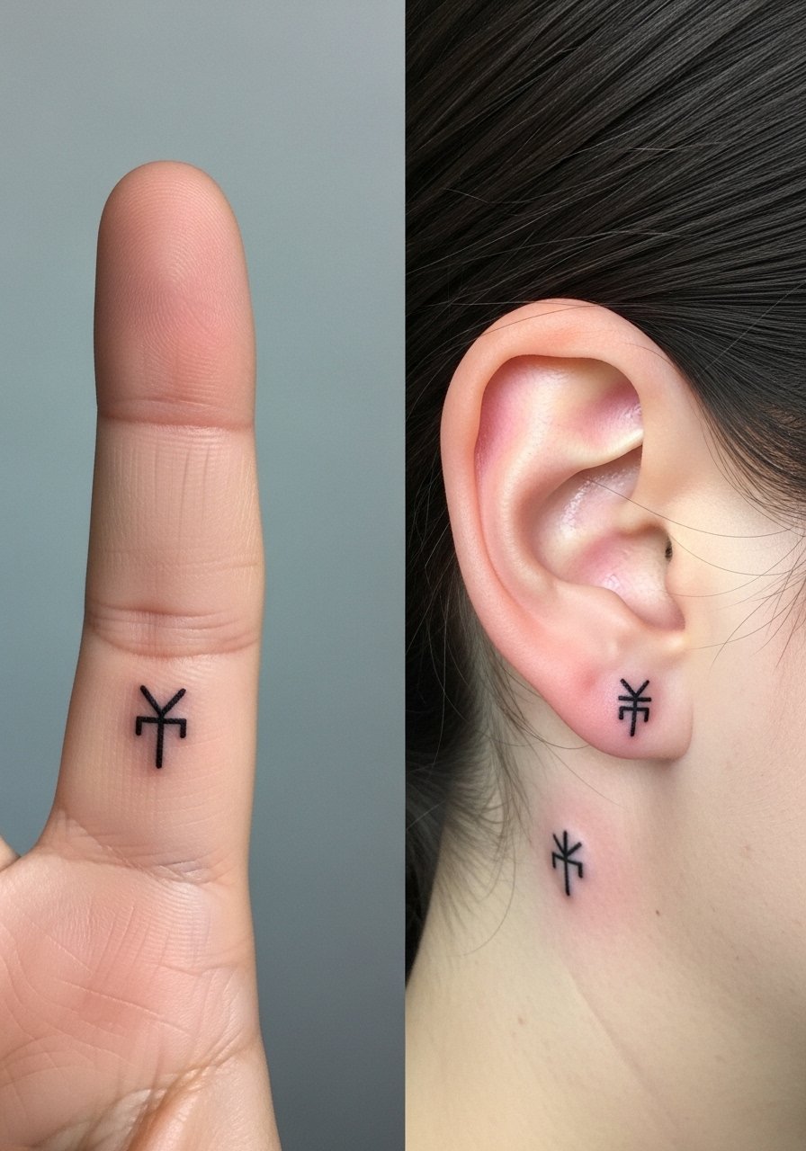
Hidden micro marks let partners keep an inside meaning without large visual signals. Fingers and behind-the-ear placements are intimate and require bold simplification to last. For behind the ear you must describe the exact spot as skin below the hairline on the neck, and for fingers avoid lines that cross joint creases. A common mistake is choosing intricate glyphs that blur. Expect early touch-ups for finger marks and a short session for the ear spot. For the appointment wear hair up and remove rings so the artist has clear access.
17. Bold Minimalist Coordinates on Ankle or Wrist

Coordinates make for meaningful marks that also read boldly when the numbers are sized correctly. On ankle or wrist pick a font with clear counters so the digits do not blur. For numbers and punctuation tell your artist the exact characters you want tattooed so the stencil is precise. The ankle version will need protection from shoes and socks during healing, and the wrist version will experience more friction with watchbands. A typical touch-up timeline is within the first two years for high-friction locations. For the session wear pants or sleeves that can be rolled up easily so access is smooth.
Frequently Asked Questions
Q: How much should I expect to touch up bold matching pieces like these?
A: Touch-up frequency depends on placement and daily wear. High friction areas like fingers and ankles commonly need a touch-up within one to three years. Forearms and shoulders usually hold longer and may only need refreshes at year three to five. Ask your artist about their usual touch-up window for the specific ink and placement.
Q: Are there staffing or industry debates I should know about before booking a fine line rib or chest script?
A: Yes, artists split into two camps on fine line in mobile or moving skin zones. One camp warns that ribs and thin chest skin can blur fine script quickly. The other camp says larger baseline letter height and correct needle depth can avoid early blur. The safest move is to ask the artist which approach they use and request a healed mockup or slightly larger lettering if longevity is your priority.
Q: What should I wear to a shoulder or upper back session so the artist has easy access?
A: Wear a loose button-down or a tank top you can pull aside. A loose button-down shirt that buttons at the front is useful because you can open only the side the artist needs. Avoid tight clothing and bring a jacket for after the session.
Q: Can two people get semi-matching designs and still keep the tattoos coherent over time?
A: Yes, semi-matching works well when you match scale, lineweight, and placement, while allowing different fill treatments or color choices. The key is to decide scale in the consultation and have both stencils checked together on skin so the pair reads intentional.
Q: Do bold styles need different aftercare than fine line pieces?
A: The fundamentals are the same, but bold, saturated fills can need more attention to keep color bright in the first week. Avoid heavy rubbing during showers and follow the artist's instruction on washing. Aftercare product recommendations are included in the Studio Day Picks block above.
